
Search results for "Pre existing challenges" in Home Design Ideas
 Dream Kitchens, Inc.
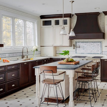
The goal of the project was to create a more functional kitchen, but to remodel with an eco-friendly approach. To minimize the waste going into the landfill, all the old cabinetry and appliances were donated, and the kitchen floor was kept intact because it was in great condition. The challenge was to design the kitchen around the existing floor and the natural soapstone the client fell in love with. The clients continued with the sustainable theme throughout the room with the new materials chosen: The back splash tiles are eco-friendly and hand-made in the USA.. The custom range hood was a beautiful addition to the kitchen. We maximized the counter space around the custom sink by extending the integral drain board above the dishwasher to create more prep space. In the adjacent laundry room, we continued the same color scheme to create a custom wall of cabinets to incorporate a hidden laundry shoot, and dog area. We also added storage around the washer and dryer including two different types of hanging for drying purposes.
 Amazing Spaces
The existing U-shaped kitchen was tucked away in a small corner while the dining table was swimming in a room much too large for its size. The client’s needs and the architecture of the home made it apparent that the perfect design solution for the home was to swap the spaces.
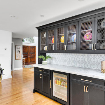
The homeowners entertain frequently and wanted the new layout to accommodate a lot of counter seating, a bar/buffet for serving hors d’oeuvres, an island with prep sink, and all new appliances. They had a strong preference that the hood be a focal point and wanted to go beyond a typical white color scheme even though they wanted white cabinets.
While moving the kitchen to the dining space gave us a generous amount of real estate to work with, two of the exterior walls are occupied with full-height glass creating a challenge how best to fulfill their wish list. We used one available wall for the needed tall appliances, taking advantage of its height to create the hood as a focal point. We opted for both a peninsula and island instead of one large island in order to maximize the seating requirements and create a barrier when entertaining so guests do not flow directly into the work area of the kitchen. This also made it possible to add a second sink as requested. Lastly, the peninsula sets up a well-defined path to the new dining room without feeling like you are walking through the kitchen. We used the remaining fourth wall for the bar/buffet.
Black cabinetry adds strong contrast in several areas of the new kitchen. Wire mesh wall cabinet doors at the bar and gold accents on the hardware, light fixtures, faucets and furniture add further drama to the concept. The focal point is definitely the black hood, looking both dramatic and cohesive at the same time.
 Arise Art Group
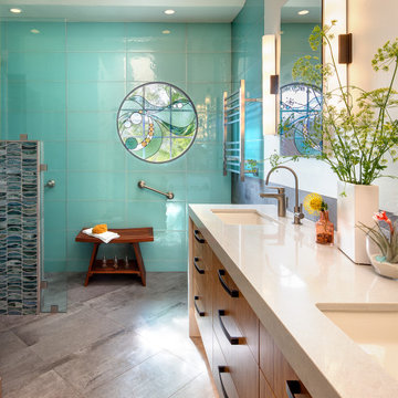
These clients have a high sense of design and have always built their own homes. They just downsized into a typical town home and needed this new space to stand out but also be accommodating of aging in place. The client, Jim, has a handful of challenges ahead of him with dealing with Parkinson and all of it symptoms. We optimized the shower, enlarging it by eliminating the tub and not using a shower door. We were able to do a curbless shower, reducing the likelihood of falling. We used larger tiles in the bathroom and shower but added the anti slip porcelain. I included a built-in seat in the shower and a stand-alone bench on the other side. We used a separate hand shower and easy to grab handles.
A natural palette peppered with some aqua and green breathes fresh, new life into a re-imagined UTC town home. Choosing materials and finishes that have higher contrast helps make the change from flooring to wall, as well as cabinet to counter, more obvious. Large glass wall tiles make the bathroom seem much larger. A flush installation of drywall to tile is easy on the eye while showing the attention to detail.
A modern custom floating vanity allows for walker wheels if needed. Personal touches like adding a filter faucet at the sink makes his trips to take medicine a bit easier.
One of my favorite things in design for any project is lighting. Not only can lighting add to the look and feel of the space, but it can also create a safer environment. Installing different types of lighting, including scones on either side of the mirror, recessed can lights both inside and outside of the shower, and LED strip lighting under the floating vanity, keep this modern bathroom current and very functional. Because of the skylight and the round window, light is allowed in to play with the different colors in the glass and the shapes around the room, which created a bright and playful bathroom.
It is not often that I get to play with stain-glass, but this existing circular window, that we could NOT change, needed some love. We used a local craftsman that allowed us to design a playful stain-glass piece for the inside of the bathroom window, reminding them of their front door in their custom home years ago.
Find the right local pro for your project
 Drury Design
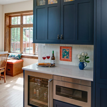
The 100-year old home’s kitchen was old and just didn’t function well. A peninsula in the middle of the main part of the kitchen blocked the path from the back door. This forced the homeowners to mostly use an odd, U-shaped corner of the kitchen.
Design objectives:
-Add an island
-Wow-factor design
-Incorporate arts and crafts with a touch of Mid-century modern style
-Allow for a better work triangle when cooking
-Create a seamless path coming into the home from the backdoor
-Make all the countertops in the space 36” high (the old kitchen had different base cabinet heights)
Design challenges to be solved:
-Island design
-Where to place the sink and dishwasher
-The family’s main entrance into the home is a back door located within the kitchen space. Samantha needed to find a way to make an unobstructed path through the kitchen to the outside
-A large eating area connected to the kitchen felt slightly misplaced – Samantha wanted to bring the kitchen and materials more into this area
-The client does not like appliance garages/cabinets to the counter. The more countertop space, the better!
Design solutions:
-Adding the right island made all the difference! Now the family has a couple of seats within the kitchen space. -Multiple walkways facilitate traffic flow.
-Multiple pantry cabinets (both shallow and deep) are placed throughout the space. A couple of pantry cabinets were even added to the back door wall and wrap around into the breakfast nook to give the kitchen a feel of extending into the adjoining eating area.
-Upper wall cabinets with clear glass offer extra lighting and the opportunity for the client to display her beautiful vases and plates. They add and an airy feel to the space.
-The kitchen had two large existing windows that were ideal for a sink placement. The window closest to the back door made the most sense due to the fact that the other window was in the corner. Now that the sink had a place, we needed to worry about the dishwasher. Samantha didn’t want the dishwasher to be in the way of people coming in the back door – it’s now in the island right across from the sink.
-The homeowners love Motawi Tile. Some fantastic pieces are placed within the backsplash throughout the kitchen. -Larger tiles with borders make for nice accent pieces over the rangetop and by the bar/beverage area.
-The adjacent area for eating is a gorgeous nook with massive windows. We added a built-in furniture-style banquette with additional lower storage cabinets in the same finish. It’s a great way to connect and blend the two areas into what now feels like one big space!
 Pool Environments, Inc.
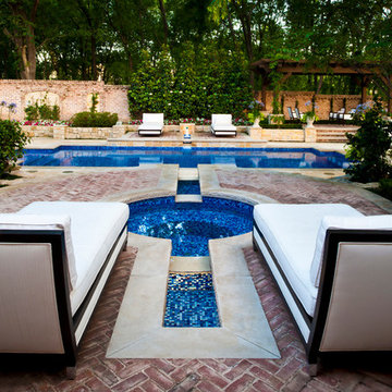
Randy Angell, Designer The beautiful estate already had a well-designed backyard by a prominent landscape architect. This included the upper spa area, which we had built for the previous owner. The challenge presented by the new homeowner was to create a seamless design that integrated the new with the existing, remained true to the original architects vision, and created a space to be enjoyed by the family's children, as well as the many business and charity event guests that would be frequenting the home.
 White Sands Coastal Development
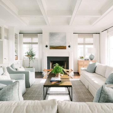
We remodeled this 5,400-square foot, 3-story home on ’s Second Street to give it a more current feel, with cleaner lines and textures. The result is more and less Old World Europe, which is exactly what we were going for. We worked with much of the client’s existing furniture, which has a southern flavor, compliments of its former South Carolina home. This was an additional challenge, because we had to integrate a variety of influences in an intentional and cohesive way.
We painted nearly every surface white in the 5-bed, 6-bath home, and added light-colored window treatments, which brightened and opened the space. Additionally, we replaced all the light fixtures for a more integrated aesthetic. Well-selected accessories help pull the space together, infusing a consistent sense of peace and comfort.
 Dear Garden Associates, Inc.
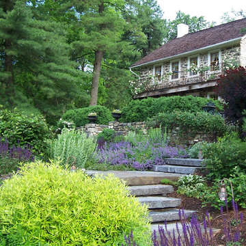
In the past this house had been at the heart of a busy farm. The function of the property has long since changed but it yet remains someone’s home. The challenge is to retrofit existing farm buildings, and the surrounding landscape, to better reflect both the different lifestyle and needs of the present owners.
At the back of the farmhouse slopes have been modified to accommodate terraces, gardens and pathways linking through them. View sheds have been emphasized to showcase the property and the landscape filled with four seasons of interest.
The geometry of the hard-scaping (walls, stairs, and walkways) is softened by the addition of lush plant material selected for both textural and colour qualities (evergreen, flowering and foliage).
This view includes Smooth Viburnum (Viburnum nudum ‘Winterthur’), Purple Smokebush (Cotinus coggygria ‘Royal Purple’), Mellow Yellow Spiraea (Spiraea thunbergii ‘Ogon’), and Russian Sage (Perovskia atriplicifolia).

Sponsored
Columbus, OH

Hope Restoration & General Contracting
Columbus Design-Build, Kitchen & Bath Remodeling, Historic Renovations
 Wiedemann Architects LLC
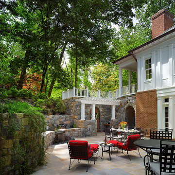
Our client was drawn to the property in Wesley Heights as it was in an established neighborhood of stately homes, on a quiet street with views of park. They wanted a traditional home for their young family with great entertaining spaces that took full advantage of the site.
The site was the challenge. The natural grade of the site was far from traditional. The natural grade at the rear of the property was about thirty feet above the street level. Large mature trees provided shade and needed to be preserved.
The solution was sectional. The first floor level was elevated from the street by 12 feet, with French doors facing the park. We created a courtyard at the first floor level that provide an outdoor entertaining space, with French doors that open the home to the courtyard.. By elevating the first floor level, we were able to allow on-grade parking and a private direct entrance to the lower level pub "Mulligans". An arched passage affords access to the courtyard from a shared driveway with the neighboring homes, while the stone fountain provides a focus.
A sweeping stone stair anchors one of the existing mature trees that was preserved and leads to the elevated rear garden. The second floor master suite opens to a sitting porch at the level of the upper garden, providing the third level of outdoor space that can be used for the children to play.
The home's traditional language is in context with its neighbors, while the design allows each of the three primary levels of the home to relate directly to the outside.
Builder: Peterson & Collins, Inc
Photos © Anice Hoachlander
 TKS Design Group
Free ebook, Creating the Ideal Kitchen. DOWNLOAD NOW
This young family of four came in right after closing on their house and with a new baby on the way. Our goal was to complete the project prior to baby’s arrival so this project went on the expedite track. The beautiful 1920’s era brick home sits on a hill in a very picturesque neighborhood, so we were eager to give it the kitchen it deserves. The clients’ dream kitchen included pro-style appliances, a large island with seating for five and a kitchen that feels appropriate to the home’s era but that also is fresh and modern. They explicitly stated they did not want a “cookie cutter” design, so we took that to heart.
The key challenge was to fit in all of the items on their wish given the room’s constraints. We eliminated an existing breakfast area and bay window and incorporated that area into the kitchen. The bay window was bricked in, and to compensate for the loss of seating, we widened the opening between the kitchen and formal dining room for more of an open concept plan.
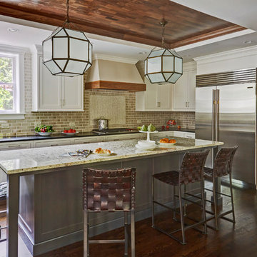
The ceiling in the original kitchen is about a foot lower than the rest of the house, and once it was determined that it was to hide pipes and other mechanicals, we reframed a large tray over the island and left the rest of the ceiling as is. Clad in walnut planks, the tray provides an interesting feature and ties in with the custom walnut and plaster hood.
The space feels modern yet appropriate to its Tudor roots. The room boasts large family friendly appliances, including a beverage center and cooktop/double oven combination. Soft white inset cabinets paired with a slate gray island provide a gentle backdrop to the multi-toned island top, a color echoed in the backsplash tile. The handmade subway tile has a textured pattern at the cooktop, and large pendant lights add more than a bit of drama to the room.
Designed by: Susan Klimala, CKD, CBD
Photography by: Mike Kaskel
For more information on kitchen and bath design ideas go to: www.kitchenstudio-ge.com
 Wiedemann Architects LLC
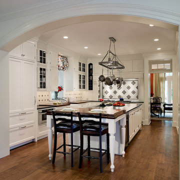
arched passage, carrera marble, dignified, elegantly decorated, family home, majestic, dark wood bar stools, hanging pot rack, transom window, recessed lighting
Our client was drawn to the property in Wesley Heights as it was in an established neighborhood of stately homes, on a quiet street with views of park. They wanted a traditional home for their young family with great entertaining spaces that took full advantage of the site.
The site was the challenge. The natural grade of the site was far from traditional. The natural grade at the rear of the property was about thirty feet above the street level. Large mature trees provided shade and needed to be preserved.
The solution was sectional. The first floor level was elevated from the street by 12 feet, with French doors facing the park. We created a courtyard at the first floor level that provide an outdoor entertaining space, with French doors that open the home to the courtyard.. By elevating the first floor level, we were able to allow on-grade parking and a private direct entrance to the lower level pub "Mulligans". An arched passage affords access to the courtyard from a shared driveway with the neighboring homes, while the stone fountain provides a focus.
A sweeping stone stair anchors one of the existing mature trees that was preserved and leads to the elevated rear garden. The second floor master suite opens to a sitting porch at the level of the upper garden, providing the third level of outdoor space that can be used for the children to play.
The home's traditional language is in context with its neighbors, while the design allows each of the three primary levels of the home to relate directly to the outside.
Builder: Peterson & Collins, Inc
Photos © Anice Hoachlander
 Nakamoto Forestry
Project Overview:
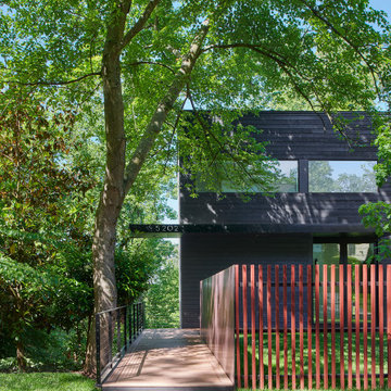
(via Architectural Record) The four-story house was designed to fit into the compact site on the footprint of a pre-existing house that was razed because it was structurally unsound. Architect Robert Gurney designed the four-bedroom, three-bathroom house to appear to be two-stories when viewed from the street. At the rear, facing the Potomac River, the steep grade allowed the architect to add two additional floors below the main house with minimum intrusion into the wooded site. The house is anchored by two concrete end walls, extending the four-story height. Wood framed walls clad in charred Shou Sugi Ban connect the two concrete walls on the street side of the house while the rear elevation, facing southwest, is largely glass.
 LaMantia Design and Remodeling
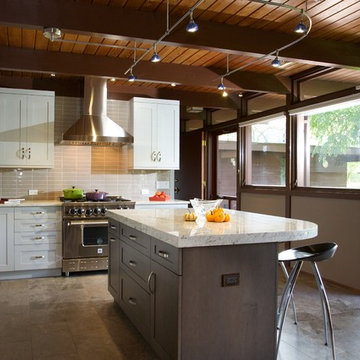
Imagine the surprise of LaMantia designer Gina Mazzone, CKD, CBD when she arrived for a first appointment to find this LaGrange Ranch home had two existing kitchens back-to-back. How very unusual! Upon further investigation she also found a “powder room” without a sink. This was just the challenge that Mazzone excels at…and excel she did!
Read more about this project on our blog: http://lamantia.com/two-to-one-renovation-la-grange/
 Vetter Architects
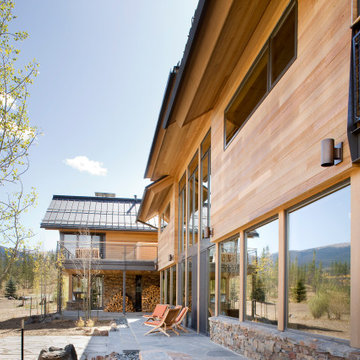
The owners requested that their home harmonize with the spirit of the surrounding Colorado mountain setting and enhance their outdoor recreational lifestyle - while reflecting their contemporary architectural tastes. The site was burdened with a myriad of strict design criteria enforced by the neighborhood covenants and architectural review board. Creating a distinct design challenge, the covenants included a narrow interpretation of a “mountain style” home which established predetermined roof pitches, glazing percentages and material palettes - at direct odds with the client‘s vision of a flat-roofed, glass, “contemporary” home.
Our solution finds inspiration and opportunities within the site covenant’s strict definitions. It promotes and celebrates the client’s outdoor lifestyle and resolves the definition of a contemporary “mountain style” home by reducing the architecture to its most basic vernacular forms and relying upon local materials.
The home utilizes a simple base, middle and top that echoes the surrounding mountains and vegetation. The massing takes its cues from the prevalent lodgepole pine trees that grow at the mountain’s high altitudes. These pine trees have a distinct growth pattern, highlighted by a single vertical trunk and a peaked, densely foliated growth zone above a sparse base. This growth pattern is referenced by placing the wood-clad body of the home at the second story above an open base composed of wood posts and glass. A simple peaked roof rests lightly atop the home - visually floating above a triangular glass transom. The home itself is neatly inserted amongst an existing grove of lodgepole pines and oriented to take advantage of panoramic views of the adjacent meadow and Continental Divide beyond.
The main functions of the house are arranged into public and private areas and this division is made apparent on the home’s exterior. Two large roof forms, clad in pre-patinated zinc, are separated by a sheltering central deck - which signals the main entry to the home. At this connection, the roof deck is opened to allow a cluster of aspen trees to grow – further reinforcing nature as an integral part of arrival.
Outdoor living spaces are provided on all levels of the house and are positioned to take advantage of sunrise and sunset moments. The distinction between interior and exterior space is blurred via the use of large expanses of glass. The dry stacked stone base and natural cedar cladding both reappear within the home’s interior spaces.
This home offers a unique solution to the client’s requests while satisfying the design requirements of the neighborhood covenants. The house provides a variety of indoor and outdoor living spaces that can be utilized in all seasons. Most importantly, the house takes its cues directly from its natural surroundings and local building traditions to become a prototype solution for the “modern mountain house”.
Overview
Ranch Creek Ranch
Winter Park, Colorado
Completion Date
October, 2007
Services
Architecture, Interior Design, Landscape Architecture

Sponsored
Columbus, OH
Hope Restoration & General Contracting
Columbus Design-Build, Kitchen & Bath Remodeling, Historic Renovations
 Kimberlee Marie Interiors
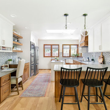
It’s always a blessing when your clients become friends - and that’s exactly what blossomed out of this two-phase remodel (along with three transformed spaces!). These clients were such a joy to work with and made what, at times, was a challenging job feel seamless. This project consisted of two phases, the first being a reconfiguration and update of their master bathroom, guest bathroom, and hallway closets, and the second a kitchen remodel.
In keeping with the style of the home, we decided to run with what we called “traditional with farmhouse charm” – warm wood tones, cement tile, traditional patterns, and you can’t forget the pops of color! The master bathroom airs on the masculine side with a mostly black, white, and wood color palette, while the powder room is very feminine with pastel colors.
When the bathroom projects were wrapped, it didn’t take long before we moved on to the kitchen. The kitchen already had a nice flow, so we didn’t need to move any plumbing or appliances. Instead, we just gave it the facelift it deserved! We wanted to continue the farmhouse charm and landed on a gorgeous terracotta and ceramic hand-painted tile for the backsplash, concrete look-alike quartz countertops, and two-toned cabinets while keeping the existing hardwood floors. We also removed some upper cabinets that blocked the view from the kitchen into the dining and living room area, resulting in a coveted open concept floor plan.
Our clients have always loved to entertain, but now with the remodel complete, they are hosting more than ever, enjoying every second they have in their home.
 Dado Interior Design
Location: Denver, CO, USA
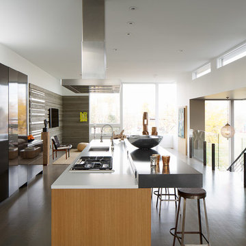
THE CHALLENGE: Create a unique and inventive space that supported the client’s beloved art collection.
THE SOLUTION: A neutral color palette, with textural interest is used throughout the home to serve as supporting elements to the artwork. Natural finishes were added to contrast the homes existing modern aesthetic, creating a warm, rustic, yet progressive home.
Dado Interior Design
DAVID LAUER PHOTOGRAPHY
 Tamara Rosenbloom Design LLC
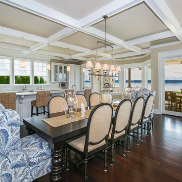
My clients purchased a grand home on a spectacular waterfront setting, but the interior felt dark and drab. Our challenge was to turn the existing home into a high end Hampton-style residence without major construction. We choose to focus on color, contrast and texture, changing almost every surface in the home and reversing the contrast to make the home light and airy. We invested the construction expense on elements crucial to style and function. Removing a row of out of scale upper cabinetry in the kitchen and replacing it with 3 double hung windows expands the view to 180 degrees and floods the room with light. To create symmetry and balance in the kitchen, we moved the cooktop and centered the sink. The wine cellar entry opened awkwardly into the kitchen and there was no pantry, so we modified the wine cellar and moved the door for better flow, allowing for a large pantry. On the opposite end of the great room, we balanced the fireplace with cabinetry and tall wainscoting. The floors were stained dark espresso while all other trim and cabinetry went a bright white. It took 14 tries to get the perfect wall color – a pale beige/color reminiscent of sand. The blue and white furniture and details pull the entire space together and creates a sophisticated yet casual feel.
Photos by Steve Armstrong www.cascadepromedia.com
 Nathan Taylor for Obelisk Home
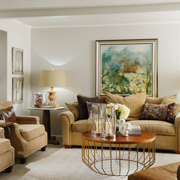
This 1970’s Ranch was purchased by a young family with active boys and animals. Changes were needed in this home for the family to be comfortable. With a very limited budget, Obelisk Home was challenged to be creative but keep with the clients sensibilities. We painted paneling, painted trim in custom colors, and took the room to a new level. High gloss paint on brick added to a bright open feel. New art, lighting, furniture and accessories were brought in to work with existing furniture that was incorporated from the clients Oklahoma home. Old, dark and full becomes light, airy and cozy.
Photos by Jeremy Mason McGraw
Sponsored
Columbus, OH
Hope Restoration & General Contracting
Columbus Design-Build, Kitchen & Bath Remodeling, Historic Renovations
 Kerstin Hellmann Architecture
The Hive
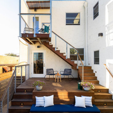
This remodel transforms three small, crowded rooms into an expansive, open kitchen connecting directly onto a new backyard deck. The coziness of a former breakfast nook is re-created with a built-in bench with discreet storage, and a pre-existing island is re-imagined with a new marble surface and complementary marble slab installed above the counters. The new modern kitchen, combines bamboo, white, and glass cabinet materials and integrates an original Wedgewood range stove providing a spacious, open environment.
Outside, the new deck design addresses a previous basement flooding problem and brings together the upper and lower floors with a floating “crow’s nest” balcony, maximizing available outdoor space for use by both couples. To avoid the need for a support post, the balcony is supported by steel beams cantilevered into the house itself. Its custom rail system is galvanized steel and stainless steel cable, leaving as much space open as possible, and a steel awning overhead protects the new door from potential rain damage. The deck itself, as well as its railings and trellis structure, are built in durable ipe, a smooth barefoot-friendly hardwood. Stairs and seating create a smooth transition from the elevated deck down into the yard, where the new owners installed flagstones and setup their own bee hives.
 Tamara Rosenbloom Design LLC
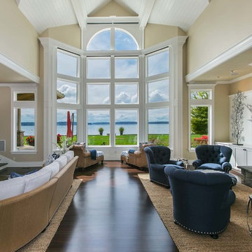
My clients purchased a grand home on a spectacular waterfront setting, but the interior felt dark and drab. Our challenge was to turn the existing home into a high end Hampton-style residence without major construction. We choose to focus on color, contrast and texture, changing almost every surface in the home and reversing the contrast to make the home light and airy. We invested the construction expense on elements crucial to style and function. Removing a row of out of scale upper cabinetry in the kitchen and replacing it with 3 double hung windows expands the view to 180 degrees and floods the room with light. To create symmetry and balance in the kitchen, we moved the cooktop and centered the sink. The wine cellar entry opened awkwardly into the kitchen and there was no pantry, so we modified the wine cellar and moved the door for better flow, allowing for a large pantry. On the opposite end of the great room, we balanced the fireplace with cabinetry and tall wainscoting. The floors were stained dark espresso while all other trim and cabinetry went a bright white. It took 14 tries to get the perfect wall color – a pale beige/color reminiscent of sand. The blue and white furniture and details pull the entire space together and creates a sophisticated yet casual feel.
Photos by Steve Armstrong www.cascadepromedia.com
 Designs by KS
Project: Kitsilano House
Builder: Grenor Homes
About this Project
When our clients asked us to design their new house in the heart of Kitsilano, they wanted a space that showcased their personalities, travels, and experiences. Naturally, our team was instantly excited and eager to make this house a home.
Layout:
Prior to the renovation, the family room was adjacent to the kitchen and the formal living room at the other end of the space; in the middle was the dinning area. We looked at the main floor as an entire space and decided to combine the two living spaces into one and move the dining area towards the kitchen.
The Kitchen:
had always been an L shape with an island; previously there was a kitchen table by the windows. In the space planning period, we decided to eliminate the kitchen table to increase the overall size of the kitchen, giving us a bigger island for casual eating.
The perimeter of the kitchen has many great features; a coffee nook, a freezer column, double ovens, a cooktop with drawers below, an appliance garage in the awkward corner, a pantry with ample storage and free-standing fridge.
The Island also has many key features; a built-in unit for garbage/recycling/compost, a slide out tray underneath the sink for easy access to cleaning products, a dishwasher, and a bank of four drawer. On the outside of the island is an open shelf for cookbooks and display items. Below the countertop overhang is additional hidden storage for the items not accessed frequently.
Dinning Area:
we utilized the pre-existing niche by incorporating floating shelves in an asymmetrical design, which became the perfect area for the clients to display the art collected during their travels.
Bar Area:
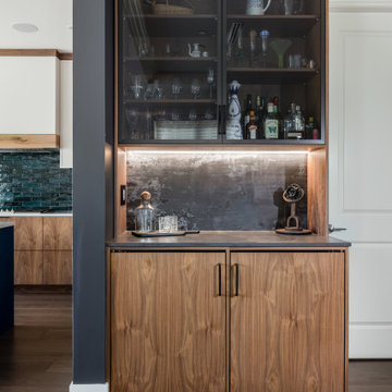
The space between the kitchen and powder room became the perfect place to add a bar. Storage, counter space, and 2 bar fridges brought this little entertaining area to life.
Fireplace:
Using existing fireplace unit we cladded the surround with Dekton material, paneled the wall above with Walnut and a mantel made from Quarkus. These materials repeat them selves through the entire space.
7