
Search results for "Primary function" in Home Design Ideas
 JPL Creative Design Solutions
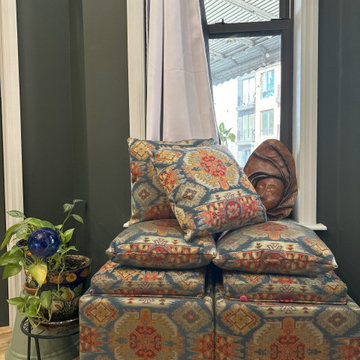
The goal of this project was to transform the room into a serene and sophisticated space that serves as both a sanctuary for rest and a functional area for daily use. At the core of this design is the philosophy of blending modern functionality with an organic connection to nature through color, texture, and spatial harmony.
The deep green walls are central to this design, creating a cocoon-like atmosphere while grounding the space. Inspired by nature, the color promotes relaxation and adds a rich contrast to the lighter elements in the room. This contrast enhances the room's natural lighting and brings depth to the design. The process involved pairing this bold backdrop with natural wood tones and textured fabrics to elevate the space, while still maintaining a modern aesthetic.
This newly designed primary bedroom evokes feelings of peace and luxury. The deep, moody greens make the room feel cozy and inviting, while the light wood floors and white accents provide a sense of brightness and balance. It’s a space where one can truly relax, escape the demands of everyday life, and enjoy quiet moments of reflection or rejuvenation.
 Rockledge Design + Architecture
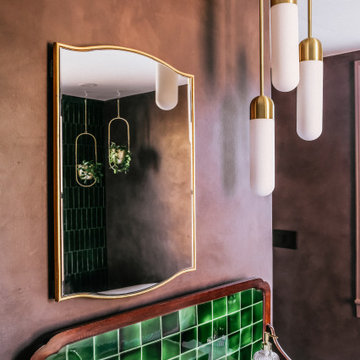
From the plum-brown limewashed walls to the curated mix of antique and contemporary elements, this en suite primary bath exudes quiet luxury. The inspiration for this space began with the early 20th century English washstand. The warm wood, Carrara marble top, and striking backsplash featuring original Racing Green pool glazed tiles set the tone for the rest of the room’s materials palette. To help transform the piece into a functioning modern day vanity, we added custom brass feet, new cabinet and drawer hardware, and an offset matte stone sink paired with a brushed brass single handle faucet.
We kept the space feeling relaxed and not too formal by incorporating fun, current silhouettes for the rest of our selections. A repeating pill-shaped motif shows up in the statement-making light fixtures, tub filler, hanging planters, and tub-side mirrored table. Similarly, reeded/fluted patterns can be found on the pocket door glass, bathroom accessories, artwork, and louvered linen closet door.
On the walls, natural limewash in the moody shade “Anise” from Bauwerk Color has been treated with a hand-burnished wax coating, making the textured surface safe for use in wet spaces. The suede-like finish adds rich character to the space, changing with the varying sunlight throughout the day. We’ve used a two-tone hexagon mosaic floor tile in both classic Carrara and dramatic Nero Marquina to help delineate the wet and dry halves of the bathroom. The soaking tub is placed on a 4” angled platform, breaking up the floor plan and making the space more dynamic.
Radiant heat floors, a hidden medicine cabinet, extra wide tiled shower niche, and new privacy glass windows are a few more features balancing form and function.
 Capital Kitchen & Bath
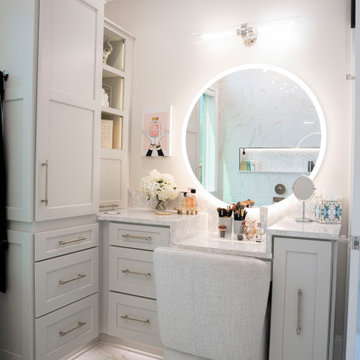
Soft layers, thoughtful function, and every detail designed with intention. This luxury primary suite and custom closet were created to feel like a private retreat while working beautifully for everyday life. From the creative use of space and tailored storage solutions to the integrated morning bar tucked inside the closet, every inch was designed for effortless living and elevated routines.
The solid wood herringbone flooring adds warmth and timeless character throughout, while custom furnishings and layered rugs bring softness and comfort to the space. Expertly designed & custom built woodwork and architectural wall paneling frame the room with understated elegance, complemented by integrated sconces that create the perfect atmosphere for winding down at the end of the day.
Finished with custom motorized layered sheers and draperies, this suite balances luxury, comfort, and functionality in a way that feels both refined and deeply personal.
Find the right local pro for your project
 Rockledge Design + Architecture
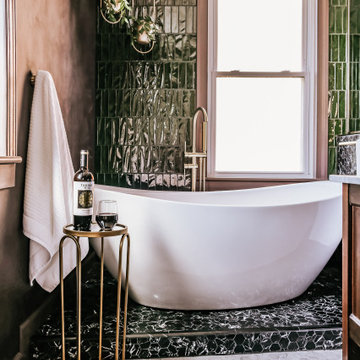
From the plum-brown limewashed walls to the curated mix of antique and contemporary elements, this en suite primary bath exudes quiet luxury. The inspiration for this space began with the early 20th century English washstand. The warm wood, Carrara marble top, and striking backsplash featuring original Racing Green pool glazed tiles set the tone for the rest of the room’s materials palette. To help transform the piece into a functioning modern day vanity, we added custom brass feet, new cabinet and drawer hardware, and an offset matte stone sink paired with a brushed brass single handle faucet.
We kept the space feeling relaxed and not too formal by incorporating fun, current silhouettes for the rest of our selections. A repeating pill-shaped motif shows up in the statement-making light fixtures, tub filler, hanging planters, and tub-side mirrored table. Similarly, reeded/fluted patterns can be found on the pocket door glass, bathroom accessories, artwork, and louvered linen closet door.
On the walls, natural limewash in the moody shade “Anise” from Bauwerk Color has been treated with a hand-burnished wax coating, making the textured surface safe for use in wet spaces. The suede-like finish adds rich character to the space, changing with the varying sunlight throughout the day. We’ve used a two-tone hexagon mosaic floor tile in both classic Carrara and dramatic Nero Marquina to help delineate the wet and dry halves of the bathroom. The soaking tub is placed on a 4” angled platform, breaking up the floor plan and making the space more dynamic.
Radiant heat floors, a hidden medicine cabinet, extra wide tiled shower niche, and new privacy glass windows are a few more features balancing form and function.
 Studio Dearborn
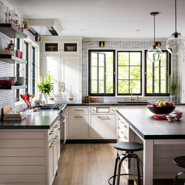
INTERNATIONAL AWARD WINNER. 2018 NKBA Design Competition Best Overall Kitchen. 2018 TIDA International USA Kitchen of the Year. 2018 Best Traditional Kitchen - Westchester Home Magazine design awards.
The designer's own kitchen was gutted and renovated in 2017, with a focus on classic materials and thoughtful storage. The 1920s craftsman home has been in the family since 1940, and every effort was made to keep finishes and details true to the original construction. For sources, please see the website at www.studiodearborn.com. Photography, Adam Kane Macchia and Timothy Lenz
 Changras & Frey Construction Inc.
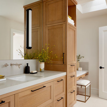
Inspiration for a mid-sized transitional master porcelain tile and single-sink bathroom remodel in San Francisco with shaker cabinets, a one-piece toilet, an undermount sink, marble countertops, a hinged shower door and a built-in vanity
 J.P. Hoffman Design Build
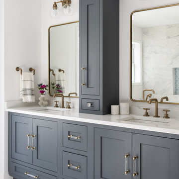
Located right off the Primary bedroom – this bathroom is located in the far corners of the house. It should be used as a retreat, to rejuvenate and recharge – exactly what our homeowners asked for. We came alongside our client – listening to the pain points and hearing the need and desire for a functional, calming retreat, a drastic change from the disjointed, previous space with exposed pipes from a previous renovation. We worked very closely through the design and materials selections phase, hand selecting the marble tile on the feature wall, sourcing luxe gold finishes and suggesting creative solutions (like the shower’s linear drain and the hidden niche on the inside of the shower’s knee wall). The Maax Tosca soaker tub is a main feature and our client's #1 request. Add the Toto Nexus bidet toilet and a custom double vanity with a countertop tower for added storage, this luxury retreat is a must for busy, working parents.

Sponsored
Columbus, OH

Structural Remodeling
Franklin County's Heavy Timber Specialists | Best of Houzz 2020!
 Geneva Cabinet
www.genevacabinet.com
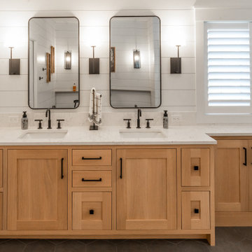
Geneva Cabinet Company, Lake Geneva WI, It is very likely that function is the key motivator behind a bathroom makeover. It could be too small, dated, or just not working. Here we recreated the primary bath by borrowing space from an adjacent laundry room and hall bath. The new design delivers a spacious bathroom suite with the bonus of improved laundry storage.
 KS Designs LLC
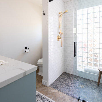
This guest bath has a light and airy feel with an organic element and pop of color. The custom vanity is in a midtown jade aqua-green PPG paint Holy Glen. It provides ample storage while giving contrast to the white and brass elements. A playful use of mixed metal finishes gives the bathroom an up-dated look. The 3 light sconce is gold and black with glass globes that tie the gold cross handle plumbing fixtures and matte black hardware and bathroom accessories together. The quartz countertop has gold veining that adds additional warmth to the space. The acacia wood framed mirror with a natural interior edge gives the bathroom an organic warm feel that carries into the curb-less shower through the use of warn toned river rock. White subway tile in an offset pattern is used on all three walls in the shower and carried over to the vanity backsplash. The shower has a tall niche with quartz shelves providing lots of space for storing shower necessities. The river rock from the shower floor is carried to the back of the niche to add visual interest to the white subway shower wall as well as a black Schluter edge detail. The shower has a frameless glass rolling shower door with matte black hardware to give the this smaller bathroom an open feel and allow the natural light in. There is a gold handheld shower fixture with a cross handle detail that looks amazing against the white subway tile wall. The white Sherwin Williams Snowbound walls are the perfect backdrop to showcase the design elements of the bathroom.
Photography by LifeCreated.
 Amy Pearson Design
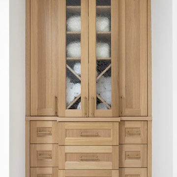
APD was hired to update the kitchen, living room, primary bathroom and bedroom, and laundry room in this suburban townhome. The design brought an aesthetic that incorporated a fresh updated and current take on traditional while remaining timeless and classic. The kitchen layout moved cooking to the exterior wall providing a beautiful range and hood moment. Removing an existing peninsula and re-orienting the island orientation provided a functional floorplan while adding extra storage in the same square footage. A specific design request from the client was bar cabinetry integrated into the stair railing, and we could not be more thrilled with how it came together!
The primary bathroom experienced a major overhaul by relocating both the shower and double vanities and removing an un-used soaker tub. The design added linen storage and seated beauty vanity while expanding the shower to a luxurious size. Dimensional tile at the shower accent wall relates to the dimensional tile at the kitchen backsplash without matching the two spaces to each other while tones of cream, taupe, and warm woods with touches of gray are a cohesive thread throughout.

 Fratantoni Design / Residential Architects
This elegant primary closet features custom built-in cabinetry, glass-front storage, a center island, and a tufted seat that adds both comfort and style. A crystal chandelier and tailored finishes elevate the space, creating a refined dressing room feel with beautifully organized function.
 Nicole Arnold Interiors
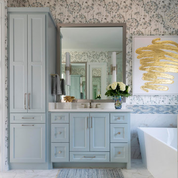
This house has great bones and just needed some current updates. We started by renovating all four bathrooms and the main staircase. All lighting was updated to be clean and bright. We then layered in new furnishings for the dining room, living room, family room and entry, increasing the functionality and aesthetics of each of these areas. Spaces that were previously avoided and unused now have meaning and excitement so that the clients eagerly use them both casually every day as well as for entertaining.
 CARBO Landscape Architecture
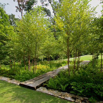
Rear garden terraces are framed by forest and lower rain gardens, filled with native birch, willow, fern and iris. Roof drains on the residence and french drains in the lawn terrace fill the space defined by low stone walls. Cypress logs were harvested from nearby river bottoms and milled to create the bridge that connects the terraces. The rain garden extends from forest edge to a large window in the master suite of residence. Photo Credit :Rebecca A O'Neal


 Klopf Architecture
Nestled in the hills of Orinda, California, this 1951 residence is one of only seven extant homes, now known as “The Magnificent Seven”, designed by architect Olof Dahlstrand, a protégé of Frank Lloyd Wright. With its low-slung rooflines, natural materials, and deep integration with the sloping landscape, the home is a pristine example of mid-century modern design inspired by Wright’s organic principles. Over the years, prior homeowners have emphasized preservation, ensuring that the house remained relatively untouched. Each owner has respected the original architecture and stayed true to Dahlstrand’s intent. When a family of five—two college-aged sons and a middle school-aged daughter—acquired the property, they were captivated by its history, legacy of care, and architectural significance. While they appreciated Dahlstrand’s original vision, they also recognized the need to adapt the home for contemporary living while preserving its design integrity.
The remodel was conceived as a thoughtful response to the past—an effort to bring the house into the 21st century without compromising its soul. The primary mandate was to maintain architectural continuity while improving the functionality, comfort, and livability for a modern family. The design team—architects and contractor alike—worked with a shared reverence for the original architecture, allowing that mindset to guide even the most technical or pragmatic decisions.
A key objective was to increase natural light in the kitchen—a departure from Wrightian principles of enclosed, intimate cooking spaces—while maintaining the home’s architectural language. The kitchen was reconfigured to foster a stronger connection to adjacent living spaces while retaining the underlying concept of spatial separation. One of the most transformative architectural changes was the removal of a ridge beam that was originally planned to remain visible through the kitchen. During construction, the team collaborated on a better solution: a wide-flanged steel beam concealed within the roof envelope. This subtle move preserved the clean lines and ceiling continuity, a modern update carried out with utmost respect for the existing framework.
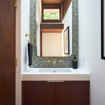
The home’s original powder room, previously accessible only through the kitchen, was relocated for better flow and privacy. A new powder room was carved out of former kitchen cabinetry—a narrow, interior space that could have felt dark and enclosed. To avoid this, the design extended the line of original transom windows into the new powder room and added a skylight above the vanity. The result is a bright and airy space that feels consistent with the rest of the home. Other updates included the installation of new solid-core interior doors with veneers carefully matched to the original mahogany, enhancing the continuity of the interiors. Even smaller decisions, such as placing the door knobs at 42 inches high, mirrored the original proportions. Every choice reflected a shared belief between the architect, contractor, and client: that new work should serve the integrity of the old.
The home’s extensive interior redwood millwork and paneling was meticulously restored. Where new materials were introduced—such as the replacement redwood soffit paneling—the contractor took pains to find finish nails that matched the original, rather than using modern equivalents. This level of craftsmanship and collaboration defined the project. It extended even to the detailing of a blind door to the new powder room, which had to disappear into the existing redwood board-and-batten wall. It was a team effort: the owner found a suitable handle, the architects devised the custom in-swing mechanism, and the contractor executed it so the door aligned precisely with the battens. Throughout, the homeowners were deeply engaged in the design process. One, a meticulous design enthusiast, focused on aesthetic integrity and historic detail. The other brought a practical and function-driven perspective, ensuring that new fixtures and materials would be durable and require minimal maintenance.
While the home’s location posed no major site challenges, sustainability was a key concern. The team upgraded the roof insulation, installed solar panels with battery storage, and added ductless mini-split cooling systems. Lighting was another area where modern technology was woven into a historic framework: new square LED fixtures echo the original custom perimeter soffit lights, maintaining the design language while offering advanced performance.
A planned expansion of a bedroom into suite with a bathroom had to be shelved due to budget constraints and the high cost of below-grade foundation work. Still, the team focused their efforts on making the most of the existing footprint, resolving constraints through design ingenuity rather than adding square footage. This renovation represents a collaborative achievement in preserving and evolving a historically significant home. Every decision was shaped by a shared ethos among clients, architects, and contractor: to maintain the home’s architectural soul while updating it for contemporary life. The result is a timeless modernist residence that continues Olof Dahlstrand’s legacy, remaining grounded in nature, craftsmanship, and human-scale design.
Klopf Architecture Team: John Klopf, AIA, Klara Kevane, Fernanda Bernardes
Interior Architectural Design: Klopf Architecture
Structural Engineer: Daniel Bastiao
Contractor: Don Larwood, Larwood Construction
Photography: Mariko Reed
Year Completed: 2022
 J.P. Hoffman Design Build
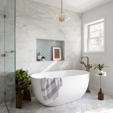
Located right off the Primary bedroom – this bathroom is located in the far corners of the house. It should be used as a retreat, to rejuvenate and recharge – exactly what our homeowners asked for. We came alongside our client – listening to the pain points and hearing the need and desire for a functional, calming retreat, a drastic change from the disjointed, previous space with exposed pipes from a previous renovation. We worked very closely through the design and materials selections phase, hand selecting the marble tile on the feature wall, sourcing luxe gold finishes and suggesting creative solutions (like the shower’s linear drain and the hidden niche on the inside of the shower’s knee wall). The Maax Tosca soaker tub is a main feature and our client's #1 request. Add the Toto Nexus bidet toilet and a custom double vanity with a countertop tower for added storage, this luxury retreat is a must for busy, working parents.
 Klopf Architecture
The Roger Lee designed house from 1962 was purchased by the current homeowners in almost original condition, as the previous owners elected to defer most maintenance projects over the years. The clients were able to see beyond the dated materials and finishes, single-paned glass and uninsulated walls and they approached Klopf Architecture to help them expand and update the entire home, one the family could settle into and enjoy for years to come. It was important that the new designs were aligned with Lee's original intent not only because of the client's appreciation for mid-century modern architecture, but also because the house was deemed historical. The Stanford Real Estate Office requires a stringent design review which safeguards the integrity of the community, which Klopf Architecture was happy to oblige going into their updated designs.
As with many original mid-century modern homes, the house was scaled to the 1960s lifestyle where rooms were smaller and openings to views were limited and tightly framed. The original conditions defined the direction the family of four would take in updating the house and making it comfortable for their modern lifestyle. Klopf designed a full gut remodel and major addition to bring the house into the 21st century and provide the living area needed for the client's family. The newly expanded house added just about 1,100 sf to create an airy, comfortable and family friendly house, taking full advantage of the beautiful southwestern views that extend out to the hills beyond. The enclosed garage created an additional 240 sf of covered space for long-term storage.
A cracked swimming pool created an eyesore taking up a majority of the backyard landscape, so it was one of the first elements to go during the transformation. Working with Outer Space Landscape Architects, the family asked for a mix of relaxing outdoor patio spaces that eventually blend into the native landscaping, extending their views outward toward the natural greenery of the trees beyond their property. Filling in the old pool was a smart way to expand the living spaces outward. The orientation of the house was designed to enjoy the views, but the original architecture provided the first homeowners with mere glimpses of the landscape outside.
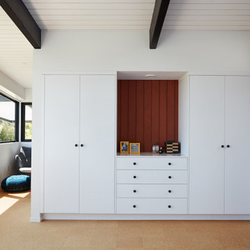
Klopf was able to broaden those views, continuing and extending on the original architecture to take full advantage of the unobstructed natural views across the rear facade of the house. Small horizontal openings in the primary bedroom and office were replaced with much taller windows that now follow the angled roof line upward, extending across almost all of the facade. We worked with Western Windows, whose designs included an oblique-shaped, operable casement that allowed our design to rise with the slope. A new corner office added to the primary suite, offers a bright and functional work-from-home solution that looks out at the distant views and added natural light from the expanded window configuration that now wraps around the corner.
The existing lower level was designed by Lee as a utilitarian space, serving as a wet pool room with a drain in the center of the floor, bathroom, laundry and storage areas. Without the need for a pool room, Klopf was able to convert the area into a much more comfortable and functional living space with a new family room and guest suite. The new spaces enjoy easy access to a new outdoor patio through floor to ceiling, full-width glass sliders.
Continuing along the rear facade, a previously exposed deck extending from the living room and hallway provided access to the backyard through a single set of stairs leading toward the side of the house which made sense when the pool was in place. The new deck was re-envisioned as an extension of the main living room and now serves as a second outdoor living room. A new slatted pergola above provides the homeowners welcome relief from the hot afternoon sun. A second set of stairs now creates a better connection to the redesigned lower level. Klopf was able to reconfigure the spaces, extending the living room outward toward the views, where the family now claims it as the heart of the home, spending a large majority of their time outdoors.
Back inside, the original wood-burning Malm fireplace was beautifully restored and a gas burner installed to comply with California's strict air standards. It now rests in front of a wall of Heath accent tiles where a dated red brick wall used to stand. A new taller window brings more light and views into the refreshed interior living room. The original glass doors opposite the fireplace were replaced by larger sliders that when fully opened, create a seamless transition to the new outdoor living area so the two spaces feel like one connected space. The original utilitarian kitchen was needlessly tucked into the far back corner and closed-off, out of sight from the living room, so the clients asked Klopf to open it up and expand the kitchen forward so it felt more connected. Today the much larger kitchen is connected to the living area where a short wall with a cutout offers a visual glimpse into the kitchen and a handy pass-through counter for serving guests. A new breakfast nook was also added to create another spot where the family can gather for casual meals. Just outside, a new built-in outdoor grill and prep area extends the kitchen outside and connects to a new outdoor dining spot nestled amongst the trees, taking advantage of the views out back.
Klopf was able to expand the other two bedrooms, add a new laundry room and half-bath and convert the carport to an enclosed garage to add more storage areas which was lost when the pool house was converted to the family and guest room.
To maintain a historical connection to the original designs, the exterior siding was repeated on all exterior walls, a full-height stained glass window at the front entryway restored, and an interior slatted screen element repeated outside at the exterior entry courtyard and over the new outdoor living room to create a shade trellis. The new house stands proudly and shines against it's new landscaping features, while respecting and expanding on the original intent of Roger Lee's designs epitomizing the comforts of indoor-outdoor living in Northern California.
Completion year: 2020
Klopf Architecture project team: John Klopf, Klara Kevane, Noel Andrade
Contractor: ORB Construction, Brendan O'Reilly
Structural engineer: Sezen and Moon
Landscape architect: Outer space
Furnishings and decoration: Urbanism Designs
Photographer: Mariko Reed
 Dyer Studio Inc.
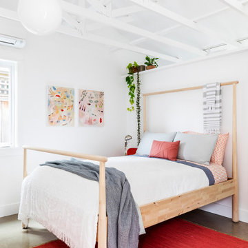
Converted from an existing Tuff Shed garage, the Beech Haus ADU welcomes short stay guests in the heart of the bustling Williams Corridor neighborhood.
Natural light dominates this self-contained unit, with windows on all sides, yet maintains privacy from the primary unit. Double pocket doors between the Living and Bedroom areas offer spatial flexibility to accommodate a variety of guests and preferences. And the open vaulted ceiling makes the space feel airy and interconnected, with a playful nod to its origin as a truss-framed garage.
A play on the words Beach House, we approached this space as if it were a cottage on the coast. Durable and functional, with simplicity of form, this home away from home is cozied with curated treasures and accents. We like to personify it as a vacationer: breezy, lively, and carefree.
 Renée Céleste Flanders
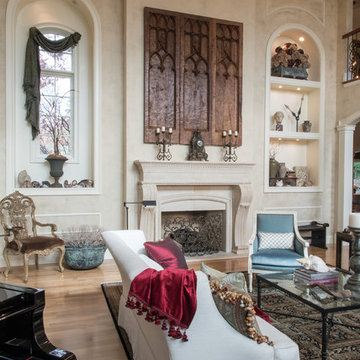
Living room - traditional formal medium tone wood floor and brown floor living room idea in St Louis with beige walls and a standard fireplace

 Ashley Campbell Interior Design
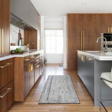
Mid-sized trendy l-shaped light wood floor eat-in kitchen photo in Denver with a single-bowl sink, flat-panel cabinets, medium tone wood cabinets, quartz countertops, yellow backsplash, quartz backsplash, paneled appliances, an island and white countertops
78