
Search results for "Primary normal" in Home Design Ideas
 Hsu McCullough
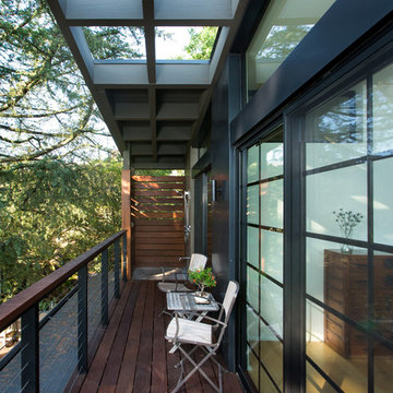
Balcony overlooking canyon at second floor primary suite.
Tree at left nearly "kisses" house while offering partial privacy for outdoor shower. Photo by Clark Dugger

 Eclectic Builders
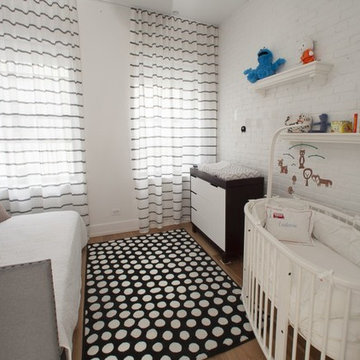
Look beyond the primary colors with this creative use for your baby’s nursery. The black and white theme is eclectic and vibrant, creating visual interest without clash.
Eclectic Builders has placed soft, restful wall coverings against the original brick work – here painted white for the main black and white theme. It is an non-traditional and gender-neutral take on the typical baby’s nursery that normally includes bright colors or variations on pink and blue.
Further, because visual interest is so important for a baby’s development, the high-contrast black and white theme can keep a baby’s mind active even as his eyes develop.
-Eclectic Builders
Find the right local pro for your project



 Sashya Thind
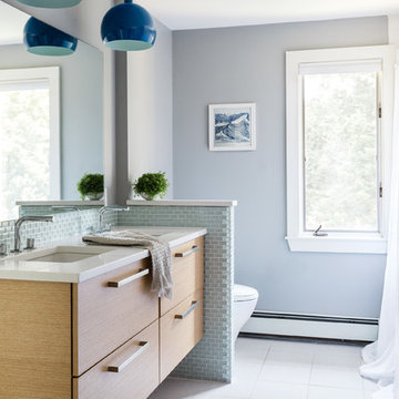
Transitional 3/4 gray tile bathroom photo in Boston with flat-panel cabinets, medium tone wood cabinets, gray walls, an undermount sink and white countertops
 Visbeen Architects
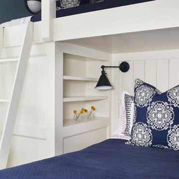
This cozy lake cottage skillfully incorporates a number of features that would normally be restricted to a larger home design. A glance of the exterior reveals a simple story and a half gable running the length of the home, enveloping the majority of the interior spaces. To the rear, a pair of gables with copper roofing flanks a covered dining area that connects to a screened porch. Inside, a linear foyer reveals a generous staircase with cascading landing. Further back, a centrally placed kitchen is connected to all of the other main level entertaining spaces through expansive cased openings. A private study serves as the perfect buffer between the homes master suite and living room. Despite its small footprint, the master suite manages to incorporate several closets, built-ins, and adjacent master bath complete with a soaker tub flanked by separate enclosures for shower and water closet. Upstairs, a generous double vanity bathroom is shared by a bunkroom, exercise space, and private bedroom. The bunkroom is configured to provide sleeping accommodations for up to 4 people. The rear facing exercise has great views of the rear yard through a set of windows that overlook the copper roof of the screened porch below.
Builder: DeVries & Onderlinde Builders
Interior Designer: Vision Interiors by Visbeen
Photographer: Ashley Avila Photography
 Jordan Design Build Group
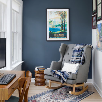
Outside of the primary bedroom suite, we created a small nook that serves double duty as a home office space and reading nook.
Example of a small transitional freestanding desk light wood floor home office design in DC Metro with blue walls
Example of a small transitional freestanding desk light wood floor home office design in DC Metro with blue walls
 InsideWright
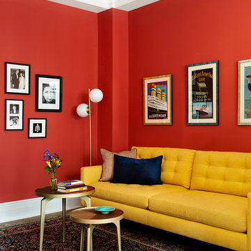
Off of the dining room is a lounging area. A perfect spot for a little TV, or reading, or homework.
Photos: Brittany Ambridge
Example of a mid-century modern family room design in New York with red walls
Example of a mid-century modern family room design in New York with red walls
 Storie Collective
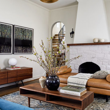
Boho meets Portuguese design in a stunning transformation of this Van Ness tudor in the upper northwest neighborhood of Washington, DC. Our team’s primary objectives were to fill space with natural light, period architectural details, and cohesive selections throughout the main level and primary suite. At the entry, new archways are created to maximize light and flow throughout the main level while ensuring the space feels intimate. A new kitchen layout along with a peninsula grounds the chef’s kitchen while securing its part in the everyday living space. Well-appointed dining and living rooms infuse dimension and texture into the home, and a pop of personality in the powder room round out the main level. Strong raw wood elements, rich tones, hand-formed elements, and contemporary nods make an appearance throughout the newly renovated main level and primary suite of the home.
 Margaret Dean at Design Studio West
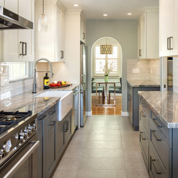
This 1949, 1020 SF home was in need of an update to better suite the needs of the owners. As empty nesters, the couple wanted better storage, flow and livability.
This project entailed design and construction on the entire home. We took one of the three bedrooms and split it to enlarge the tiny bathroom and to create a walk in closet. The new bath is accessible from both the Primary Bedroom closet and the main living room.
The original Primary Bedroom Closet was closed off from the bedroom and opened into the kitchen to create a step-in pantry complete with wine storage unit. The new pantry keeps the kitchen free of counter top clutter.
The kitchen remained in the same footprint as the original kitchen but moved the range to the sink run. This allowed better flow through the kitchen to the outside entertainment area. The cabinet depth on the pantry side of the kitchen is narrower than normal to allow a better walk through.
Beverly Blue kitchen counter.
Tile from Arizona Tile. Gioia Ash kitchen backsplash tile.
Kitchen paint, Dunn Edwards, Covered in Platinum.
Bertazzoni range, hood, and refrigerator
 Zelaya Properties LLC
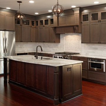
We used: Custom cherry cabinetry in Arts & Crafts Shaker style by Kabinart in Boulder and Espresso stains. Liberty Hardware Venetian bronze 1-1/2" cabinet knobs. KitchenAid Architect II Series 22 CF counter-depth French door refrigerator. KitchenAid Architect Series II 27" convection single wall oven. KitchenAid 36" 6-burner dual fuel freestanding commercial-style range. KitchenAid Architect II Series 24" dishwasher. Sharp Insight Pro Series 24" built-in microwave drawer (Model #KB6524PS). Crystorama Solaris 12" wide pendant lights in English bronze. Granite countertops in Brown Fantasy. 3"x6" polished marble backsplash.
Paint colors:
Walls: Glidden Silver Cloud 30YY 63/024
Ceilings/Trims/Doors: Glidden Swan White GLC23
Robert B. Narod Photography

 Trilogy Partners
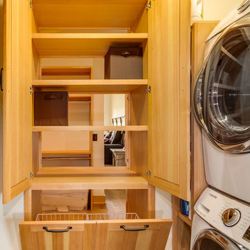
The built-ins connect to the master closet
Pass Through from Master Closet to Laundry Room
Design By Trilogy Partners
Photo Credit: Michael Yearout
 McGuire + Co. Kitchen & Bath
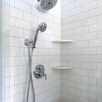
Primary bathroom remodel with steel blue double vanity and tower linen cabinet, quartz countertop, petite free-standing soaking tub, custom shower with floating bench and glass doors, herringbone porcelain tile floor, v-groove wall paneling, white ceramic subway tile in shower, and a beautiful color palette of blues, taupes, creams and sparkly chrome.

 Hurst Design Build Remodel
Darren Sinnett
Transitional kitchen photo in Cleveland with a farmhouse sink and stainless steel appliances
Transitional kitchen photo in Cleveland with a farmhouse sink and stainless steel appliances
 Amy Pearson Design
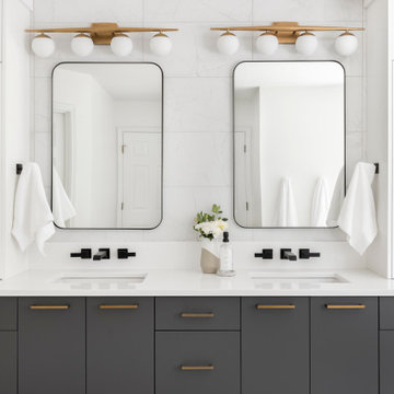
A dated and non-functional primary bathroom receives a modern refresh! Crisp whites combined with charcoal gray ground the space with contrast. Matte black fixtures combined with brushed brass cabinet hardware and sconces for a casual mixed metal look. A luxurious freestanding tub and floor mount tub filler create a relaxing oasis and restful space to enjoy the lush landscape beyond. Ample storage is provided at the vanity, including towers with clever pull-out storage. Marble look tiles are combined for a cohesive look filled with texture and movement.

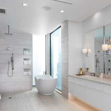
 AIBD - American Institute of Building Design
This Palm Springs inspired, one story, 8,245 sq. ft. modernist “party pad” merges golf and Rat Pack glamour. The net-zero home provides resort-style living and overlooks fairways and water views. The front elevation of this mid-century, sprawling ranch showcases a patterned screen that provides transparency and privacy. The design element of the screen reappears throughout the home in a manner similar to Frank Lloyd Wright’s use of design patterns throughout his homes. The home boasts a HERS index of zero. A 17.1 kW Photovoltaic and Tesla Powerwall system provides approximately 100% of the electrical energy needs.
A Grand ARDA for Custom Home Design goes to
Phil Kean Design Group
Designer: Phil Kean Design Group
From: Winter Park, Florida
 Smart Remodeling LLC
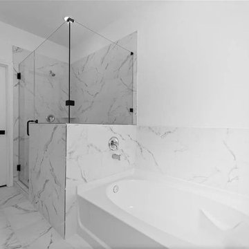
The color scheme is key when it comes to decorating any bathroom. In this Medium size bathroom, we used primary calm colors (white and grey) that work great to give a stylish look that the client desire. It gives a great visual appeal while also complementing the interior of the house and matching the client's lifestyle. Because we have a consistent design, we went for a vanity that matches the floor design, and other accessories in the bathroom. We used accent lighting in some areas such as the vanity, bathtub, and shower which brings a unique effect to the bathroom. Besides the artificial light, we go natural by allowing in more natural lights using windows. In the walk-in shower, the shower door was clear glass therefore, the room looked brighter and gave a fantastic result. Also, the garden tub was effective in providing a deeper soak compared to a normal bathtub and it provides a thoroughly relaxing environment. The bathroom also contains a one-piece toilet room for more privacy. The final look was fantastic.
5