
Search results for "Properly designed" in Home Design Ideas
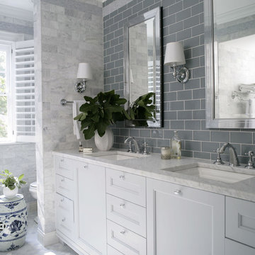
 Heather Garrett Design
A growing family, a rambling Georgian estate. The question: how to imbue tradition with a fresh spirit? The charge was to maintain the idea of old school charm without the interior feeling just… old. An illustration could be found in picture molding (which we added, then painted to disappear into the walls) or a modern plaster sculpture teetering upon an old barrister bookcase. Charm, with a wink.
Photography by John Bessler
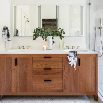
 Caroline Myers Interior Design
A modern yet welcoming master bathroom with . Photographed by Thomas Kuoh Photography.
Bathroom - mid-sized transitional master white tile and stone tile marble floor and white floor bathroom idea in San Francisco with medium tone wood cabinets, white walls, an integrated sink, quartz countertops, white countertops and flat-panel cabinets
Bathroom - mid-sized transitional master white tile and stone tile marble floor and white floor bathroom idea in San Francisco with medium tone wood cabinets, white walls, an integrated sink, quartz countertops, white countertops and flat-panel cabinets
 TKS Design Group
Download our free ebook, Creating the Ideal Kitchen. DOWNLOAD NOW
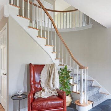
Lakefront property in the northwest suburbs of Chicago is hard to come by, so when we were hired by this young family with exactly that, we were immediately inspired by not just the unusually large footprint of this 1950’s colonial revival but also the lovely views of the manmade lake it was sited on. The large 5-bedroom home was solidly stuck in the 1980’s, but we saw tons of potential. We started out by updating the existing staircase with a fresh coat of paint and adding new herringbone slate to the entry hall.
The powder room off the entryway also got a refresh - new flooring, new cabinets and fixtures. We ran the new slate right through into this space for some consistency. A fun wallpaper and shiplap trim add a welcoming feel and set the tone for the home.
Next, we tackled the kitchen. Located away from the rest of the first floor, the kitchen felt a little isolated, so we immediately began planning for how to better connect it to the rest of the first floor. We landed on removing the wall between the kitchen and dining room and designed a modified galley style space with separate cooking and clean up zones. The cooking zone consists of the refrigerator, prep sink and cooktop, along with a nice long run of prep space at the island. The cleanup side of the kitchen consists of the main sink and dishwasher. Both areas are situated so that the user can view the lake during prep work and cleanup!
One of the home’s main puzzles was how to incorporate the mudroom and area in front of the patio doors at the back of the house. We already had a breakfast table area, so the space by the patio doors was a bit of a no man’s land. We decided to separate the kitchen proper from what became the new mudroom with a large set of barn doors. That way you can quickly hide any mudroom messes but have easy access to the light coming in through the patio doors as well as the outdoor grilling station. We also love the impact the barn doors add to the overall space.
The homeowners’ first words to us were “it’s time to ditch the brown,” so we did! We chose a lovely blue pallet that reflects the home’s location on the lake which is also vibrant yet easy on the eye. Countertops are white quartz, and the natural oak floor works well with the other honey accents. The breakfast table was given a refresh with new chairs, chandelier and window treatments that frame the gorgeous views of the lake out the back.
We coordinated the slate mudroom flooring with that used in the home’s main entrance for a consistent feel. The storage area consists of open and closed storage to allow for some clutter control as needed.
Next on our “to do” list was revamping the dated brown bar area in the neighboring dining room. We eliminated the clutter by adding some closed cabinets and did some easy updates to help the space feel more current. One snag we ran into here was the discovery of a beam above the existing open shelving that had to be modified with a smaller structural beam to allow for our new design to work. This was an unexpected surprise, but in the end we think it was well worth it!
We kept the colors here a bit more muted to blend with the homeowner’s existing furnishings. Open shelving and polished nickel hardware add some simple detail to the new entertainment zone which also looks out onto the lake!
Next we tackled the upstairs starting with the homeowner’s son’s bath. The bath originally had both a tub shower and a separate shower, so we decided to swap out the shower for a new laundry area. This freed up some space downstairs in what used to be the mudroom/laundry room and is much more convenient for daily laundry needs.
We continued the blue palette here with navy cabinetry and the navy tile in the shower. Porcelain floor tile and chrome fixtures keep maintenance to a minimum while matte black mirrors and lighting add some depth the design. A low maintenance runner adds some warmth underfoot and ties the whole space together.
We added a pocket door to the bathroom to minimize interference with the door swings. The left door of the laundry closet is on a 180 degree hinge to allow for easy full access to the machines. Next we tackled the master bath which is an en suite arrangement. The original was typical of the 1980’s with the vanity outside of the bathroom, situated near the master closet. And the brown theme continued here with multiple shades of brown.
Our first move was to segment off the bath and the closet from the master bedroom. We created a short hall from the bedroom to the bathroom with his and hers walk-in closets on the left and right as well as a separate toilet closet outside of the main bathroom for privacy and flexibility.
The original bathroom had a giant soaking tub with steps (dangerous!) as well as a small shower that did not work well for our homeowner who is 6’3”. With other bathtubs in the home, they decided to eliminate the tub and create an oversized shower which takes up the space where the old tub was located. The double vanity is on the opposite wall and a bench is located under the window for morning conversations and a place to set a couple of towels.
The pallet in here is light and airy with a mix of blond wood, creamy porcelain and marble tile, and brass accents. A simple roman shade adds some texture and it’s top-down mechanism allows for light and privacy.
This large whole house remodel gave our homeowners not only the ability to maximize the potential of their home but also created a lovely new frame from which to view their fabulous lake views.
Designed by: Susan Klimala, CKD, CBD
Photography by: Michael Kaskel
For more information on kitchen and bath design ideas go to: www.kitchenstudio-ge.com
Find the right local pro for your project
 ZeroEnergy Design
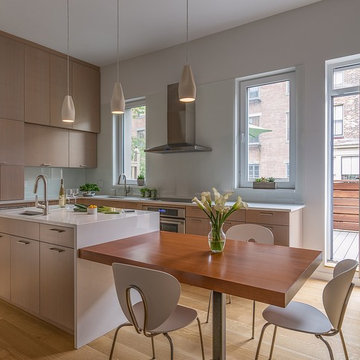
This renovated brick rowhome in Boston’s South End offers a modern aesthetic within a historic structure, creative use of space, exceptional thermal comfort, a reduced carbon footprint, and a passive stream of income.
DESIGN PRIORITIES. The goals for the project were clear - design the primary unit to accommodate the family’s modern lifestyle, rework the layout to create a desirable rental unit, improve thermal comfort and introduce a modern aesthetic. We designed the street-level entry as a shared entrance for both the primary and rental unit. The family uses it as their everyday entrance - we planned for bike storage and an open mudroom with bench and shoe storage to facilitate the change from shoes to slippers or bare feet as they enter their home. On the main level, we expanded the kitchen into the dining room to create an eat-in space with generous counter space and storage, as well as a comfortable connection to the living space. The second floor serves as master suite for the couple - a bedroom with a walk-in-closet and ensuite bathroom, and an adjacent study, with refinished original pumpkin pine floors. The upper floor, aside from a guest bedroom, is the child's domain with interconnected spaces for sleeping, work and play. In the play space, which can be separated from the work space with new translucent sliding doors, we incorporated recreational features inspired by adventurous and competitive television shows, at their son’s request.
MODERN MEETS TRADITIONAL. We left the historic front facade of the building largely unchanged - the security bars were removed from the windows and the single pane windows were replaced with higher performing historic replicas. We designed the interior and rear facade with a vision of warm modernism, weaving in the notable period features. Each element was either restored or reinterpreted to blend with the modern aesthetic. The detailed ceiling in the living space, for example, has a new matte monochromatic finish, and the wood stairs are covered in a dark grey floor paint, whereas the mahogany doors were simply refinished. New wide plank wood flooring with a neutral finish, floor-to-ceiling casework, and bold splashes of color in wall paint and tile, and oversized high-performance windows (on the rear facade) round out the modern aesthetic.
RENTAL INCOME. The existing rowhome was zoned for a 2-family dwelling but included an undesirable, single-floor studio apartment at the garden level with low ceiling heights and questionable emergency egress. In order to increase the quality and quantity of space in the rental unit, we reimagined it as a two-floor, 1 or 2 bedroom, 2 bathroom apartment with a modern aesthetic, increased ceiling height on the lowest level and provided an in-unit washer/dryer. The apartment was listed with Jackie O'Connor Real Estate and rented immediately, providing the owners with a source of passive income.
ENCLOSURE WITH BENEFITS. The homeowners sought a minimal carbon footprint, enabled by their urban location and lifestyle decisions, paired with the benefits of a high-performance home. The extent of the renovation allowed us to implement a deep energy retrofit (DER) to address air tightness, insulation, and high-performance windows. The historic front facade is insulated from the interior, while the rear facade is insulated on the exterior. Together with these building enclosure improvements, we designed an HVAC system comprised of continuous fresh air ventilation, and an efficient, all-electric heating and cooling system to decouple the house from natural gas. This strategy provides optimal thermal comfort and indoor air quality, improved acoustic isolation from street noise and neighbors, as well as a further reduced carbon footprint. We also took measures to prepare the roof for future solar panels, for when the South End neighborhood’s aging electrical infrastructure is upgraded to allow them.
URBAN LIVING. The desirable neighborhood location allows the both the homeowners and tenant to walk, bike, and use public transportation to access the city, while each charging their respective plug-in electric cars behind the building to travel greater distances.
OVERALL. The understated rowhouse is now ready for another century of urban living, offering the owners comfort and convenience as they live life as an expression of their values.
Photography: Eric Roth Photo
 Gelling & Judd Inc.
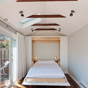
Inspiration for a contemporary guest dark wood floor bedroom remodel in San Francisco with white walls and no fireplace
 Synergy Design & Construction
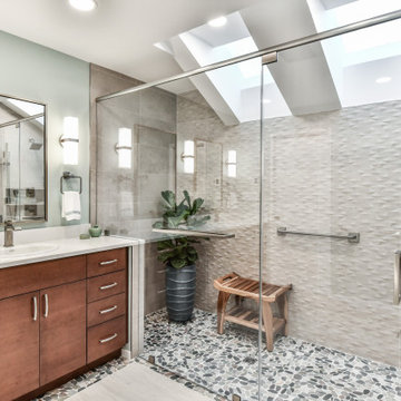
After. We could look at this stunning curbless shower all day! Universal design features which aid in safe access are beautifully and subtly worked into the design.
 Wiedemann Architects LLC
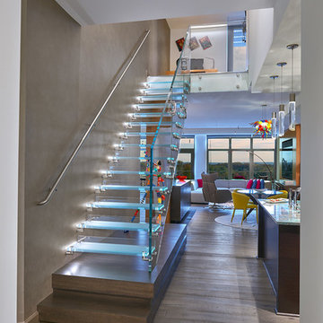
To create a more open plan, our solution was to replace the current enclosed stair with an open, glass stair and to create a proper dining space where the third bedroom used to be. This allows the light from the large living room windows to cascade down the length of the apartment brightening the front entry. The Venetian plaster wall anchors the new stair case and LED lights illuminate each glass tread.
Photography: Anice Hoachlander, Hopachlander Davis Photography
Sponsored
Columbus, OH

EverHome Improvement & Design
Top Choice for Reliable Tile & Stone | Franklin County, Ohio
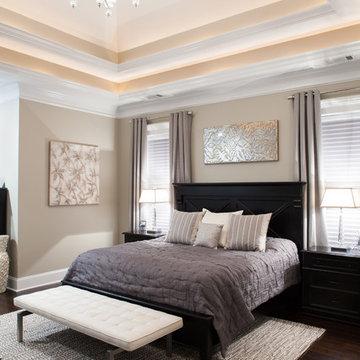
 Andrew Sherman Photography
Andrew Sherman. www.AndrewSherman.co
Limited Edition Photographs
https://www.etsy.com/shop/AndrewShermanFineArt
 FOUR POINT DESIGN BUILD INC
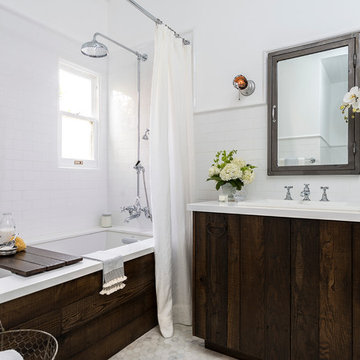
DESIGN BUILD REMODEL | Vintage Bathroom Transformation | FOUR POINT DESIGN BUILD INC
This vintage inspired master bath remodel project is a FOUR POINT FAVORITE. A complete design-build gut and re-do, this charming space complete with swap meet finds, new custom pieces, reclaimed wood, and extraordinary fixtures is one of our most successful design solution projects.
THANK YOU HOUZZ and Becky Harris for FEATURING this very special PROJECT!!! See it here at http://www.houzz.com/ideabooks/23834088/list/old-hollywood-style-for-a-newly-redone-los-angeles-bath
Photography by Riley Jamison
AS SEEN IN
Houzz
Martha Stewart
 J Korsbon Designs
BRANDON STENGER
Please email sarah@jkorsbondesigns for pricing
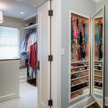
Inspiration for a large timeless women's dark wood floor dressing room remodel in Minneapolis with open cabinets and white cabinets
Inspiration for a large timeless women's dark wood floor dressing room remodel in Minneapolis with open cabinets and white cabinets

 Change Your Bathroom©
The goal of this project was to upgrade the builder grade finishes and create an ergonomic space that had a contemporary feel. This bathroom transformed from a standard, builder grade bathroom to a contemporary urban oasis. This was one of my favorite projects, I know I say that about most of my projects but this one really took an amazing transformation. By removing the walls surrounding the shower and relocating the toilet it visually opened up the space. Creating a deeper shower allowed for the tub to be incorporated into the wet area. Adding a LED panel in the back of the shower gave the illusion of a depth and created a unique storage ledge. A custom vanity keeps a clean front with different storage options and linear limestone draws the eye towards the stacked stone accent wall.
Houzz Write Up: https://www.houzz.com/magazine/inside-houzz-a-chopped-up-bathroom-goes-streamlined-and-swank-stsetivw-vs~27263720
The layout of this bathroom was opened up to get rid of the hallway effect, being only 7 foot wide, this bathroom needed all the width it could muster. Using light flooring in the form of natural lime stone 12x24 tiles with a linear pattern, it really draws the eye down the length of the room which is what we needed. Then, breaking up the space a little with the stone pebble flooring in the shower, this client enjoyed his time living in Japan and wanted to incorporate some of the elements that he appreciated while living there. The dark stacked stone feature wall behind the tub is the perfect backdrop for the LED panel, giving the illusion of a window and also creates a cool storage shelf for the tub. A narrow, but tasteful, oval freestanding tub fit effortlessly in the back of the shower. With a sloped floor, ensuring no standing water either in the shower floor or behind the tub, every thought went into engineering this Atlanta bathroom to last the test of time. With now adequate space in the shower, there was space for adjacent shower heads controlled by Kohler digital valves. A hand wand was added for use and convenience of cleaning as well. On the vanity are semi-vessel sinks which give the appearance of vessel sinks, but with the added benefit of a deeper, rounded basin to avoid splashing. Wall mounted faucets add sophistication as well as less cleaning maintenance over time. The custom vanity is streamlined with drawers, doors and a pull out for a can or hamper.
A wonderful project and equally wonderful client. I really enjoyed working with this client and the creative direction of this project.
Brushed nickel shower head with digital shower valve, freestanding bathtub, curbless shower with hidden shower drain, flat pebble shower floor, shelf over tub with LED lighting, gray vanity with drawer fronts, white square ceramic sinks, wall mount faucets and lighting under vanity. Hidden Drain shower system. Atlanta Bathroom.
 Hurlbutt Designs
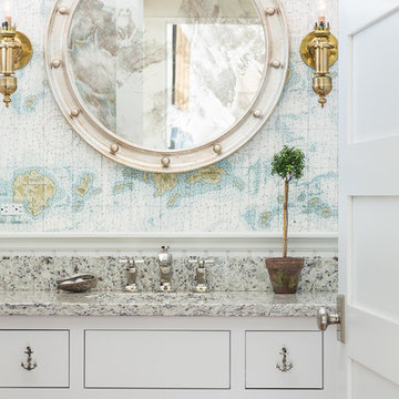
Beach style bathroom photo in Portland Maine with recessed-panel cabinets, white cabinets, multicolored walls and gray countertops
 41 West
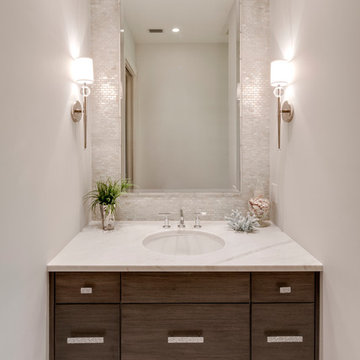
41 West Coastal Retreat Series reveals creative, fresh ideas, for a new look to define the casual beach lifestyle of Naples.
More than a dozen custom variations and sizes are available to be built on your lot. From this spacious 3,000 square foot, 3 bedroom model, to larger 4 and 5 bedroom versions ranging from 3,500 - 10,000 square feet, including guest house options.
Sponsored
Columbus, OH

Hope Restoration & General Contracting
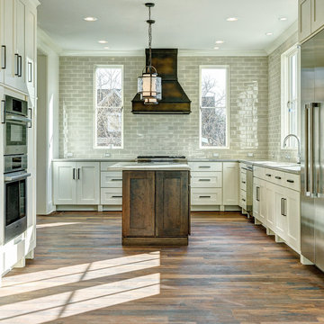
Columbus Design-Build, Kitchen & Bath Remodeling, Historic Renovations
 Frusterio Design, Inc.
John Jackovich-Grande Custom Homes
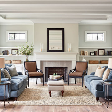
Inspiration for a transitional formal light wood floor living room remodel in Charlotte with gray walls, a standard fireplace and no tv
Inspiration for a transitional formal light wood floor living room remodel in Charlotte with gray walls, a standard fireplace and no tv
 Canter Construction
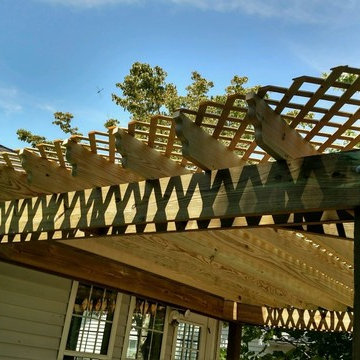
Client had an existing deck and pergola off of the back of their home that was not properly built in the original construction. This caused sagging of some of the support beams and overall an unsafe structure.
In order to give this a thicker and better look, we used 6X6 beams (instead of 4x4's) and properly bolted all members so that the structure did not move.

 Barbara Grushow Designs Inc.
Jim Bartsch Photography
Bathroom - mid-sized transitional master white tile and subway tile mosaic tile floor and gray floor bathroom idea in Los Angeles with a wall-mount sink, gray walls, a hinged shower door and a niche
Bathroom - mid-sized transitional master white tile and subway tile mosaic tile floor and gray floor bathroom idea in Los Angeles with a wall-mount sink, gray walls, a hinged shower door and a niche
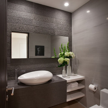
 SDH Studio Architecture and Interior Design
SDH Studio - Architecture and Design
Location: Golden Beach, Florida, USA
Overlooking the canal in Golden Beach 96 GB was designed around a 27 foot triple height space that would be the heart of this home. With an emphasis on the natural scenery, the interior architecture of the house opens up towards the water and fills the space with natural light and greenery.

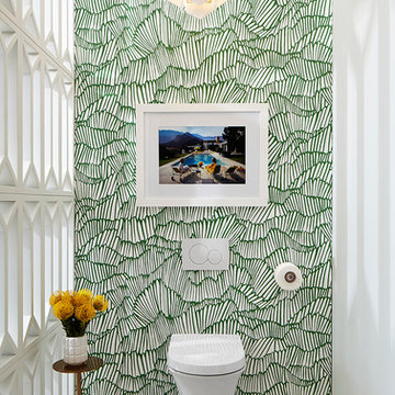
 Carolina V. Gentry, RID
Timeless Palm Springs glamour meets modern in Pulp Design Studios' bathroom design created for the DXV Design Panel 2016. The design is one of four created by an elite group of celebrated designers for DXV's national ad campaign. Faced with the challenge of creating a beautiful space from nothing but an empty stage, Beth and Carolina paired mid-century touches with bursts of colors and organic patterns. The result is glamorous with touches of quirky fun -- the definition of splendid living.
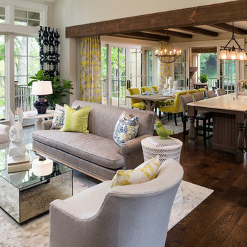
 Kyle Hunt & Partners, Incorporated
James Kruger, LandMark Photography
Interior Design: Martha O'Hara Interiors
Architect: Sharratt Design & Company
Inspiration for a large french country open concept and formal dark wood floor and brown floor living room remodel in Minneapolis with beige walls, a standard fireplace and a stone fireplace
Inspiration for a large french country open concept and formal dark wood floor and brown floor living room remodel in Minneapolis with beige walls, a standard fireplace and a stone fireplace
 Designline
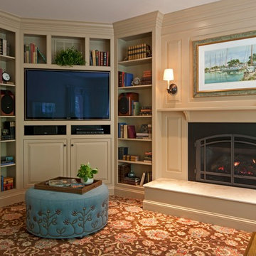
This room was redesigned to accommodate the latest in audio/visual technology. The exposed brick fireplace was clad with wood paneling, sconces were added and the hearth covered with marble.
photo by Anne Gummerson
3