
Search results for "Prototypes" in Home Design Ideas
 Form Found Design
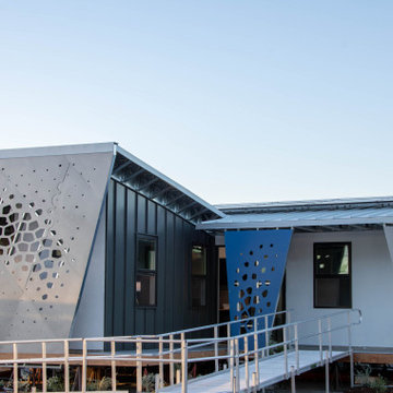
Inspired by the multi-functional performance of a shell structure in nature, the design of this two-bedroom, two-bath ADU explored a performance-based roof geometry that becomes the building façade and privacy screen. Coupled with deep roof overhangs, this second skin allows dappled light to penetrate the interior during the day while reflecting the detrimental UV radiation on the southern exposure. The perforations in the second skin are based on the effects of the sun path on the southern exposure and the location of the windows behind the screen. At night, the interior light glows through the perforations, contributing to the name of the project, “LuminOCity”.
Orange Coast College and UC Irvine formed a partnership called "Team MADE" to enter the 2023 Orange County Sustainability Decathlon. "MADE" is an acronym for Modular, Affordable Dwellings for the Environment. LuminOCity won second place in the competition and 9 awards in various categories. Following the competition, the home was donated to Homeless Intervention Services, Orange County, where it serves as an ADU on an existing property to provide transitional housing for youth experiencing housing insecurities.
This 750sf prefabricated, modular home is built on four, eight foot wide modules that nest together. The building system is predicated on a software-to-manufacturing pipeline called the FrameCAD Machine. This roll-former for light-gauge steel allowed Team MADE to prototype as well as site-manufacture every stud and track in the steel-framed home they would design. Over 100 student volunteers aided in the construction of the steel framing, MEP installation, building envelope, and site work. The use of prefabricated Light Gauge Steel allowed for higher construction tolerances with simplified assembly diagrams that could be followed by student volunteers. Joseph Sarafian, AIA was the lead architect as well as one of four faculty advisors on the project, leading the design of the project from conception to completion.
 Athena Garden - Hand Sculpted Home & Garden Decor
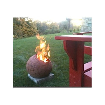
Precast fire ball prototype.
Offers heat in small patios and decks during cool summer evenings!
Photo of a rustic landscaping in Other.
Photo of a rustic landscaping in Other.
 Novu Designs
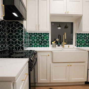
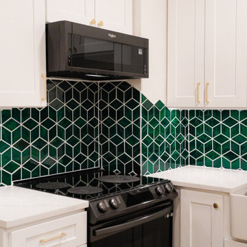
Our goal is to make your kitchen remodel as comfortable as possible. After establishing rapport with our client, we used our ingenuity to redesign and build their ideal kitchen in this stunning 10-foot-ceiling Brooklyn home. The warm tones of wood, quartz, and rich greens strike the ideal balance in creating this appealing design.
How did we achieve this look?
The Backsplash
Our client wanted a simple kitchen remodel in the shaker design, but she also wanted to include green. Initially, we proposed green cabinets to create a bold green look in the kitchen. The main objective was to incorporate our complimenting colors while keeping a feeling of lightness. After going through a number of ideas and 3D prototypes, installing as many cabinets as we could without overpowering the kitchen was our goal of optimizing space. We determined that the best way to brighten the space would be to install white shaker cabinets in addition to higher lumen recessed LED lighting. We decided that finding exquisite green backsplash tiles would be the best way to give it the desired green pop. After numerous searches, we came across a company called Mercury Mosaics.
While there were many green backsplash tiles to choose from, we opted for the mercury mosaics bluegrass diamond tiles. We loved these tiles because its created an illusion of cubes but at times, diamonds. The pattern is an art of illusion and its really gave us the personality we were looking for.
The Flooring of Choice
The flooring of choice was made by our client. We wanted the floors to feel soft and natural while capturing every bit of warmth to balance the whites and the greens and bring them together. While we could’ve opted for wood look tiles or luxury vinyl plank flooring, we ended up going with a premium slightly distressed white oak engineered hardwood flooring from Floor and Decor.
Accents
Although the flooring and the backsplash brought most of the kitchen together, we were still missing the cherry on top. The hardware and maybe something else?
We decided on thin profiled brushed brass hardware to give us that luxurious feel we were looking for every time we opened the cabinet. The cherry on top for us were the hand made quarter round oak shelves which really tied in the floors and cabinets together and gave us that final pop we were looking for. It truly added the perfect character for our client who is also a teen-fiction author of multiple books.
Find the right local pro for your project
 LETTER FOUR, INC.
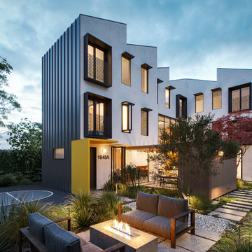
The Watts of Power Teaching Village will be the first development of its kind. Offering affordable housing options for black, male teachers in the Los Angeles area in conjunction with teacher training. This design is a 5-unit prototype which will scale to larger developments to serve communities in need.
A major aspect of the design is communal space to encourage interaction among the young teachers in residence. You'll find a cozy living area, a full size shared kitchen, and large dining space for teachers to gather together to enjoy meals. In the backyard you will find multiple areas to lounge and eat, as well as a half basketball court as a multi-use space for sports and/or fitness. We've created a fun, modern exterior with lots of windows and doors which open to shared communal spaces. Inside each unit, you will find a small kitchenette, sitting area, and bedroom.
For more information on Watts of Power please see their website: www.wattsofpowerfoundation.org
 Novu Designs
Our goal is to make your kitchen remodel as comfortable as possible. After establishing rapport with our client, we used our ingenuity to redesign and build their ideal kitchen in this stunning 10-foot-ceiling Brooklyn home. The warm tones of wood, quartz, and rich greens strike the ideal balance in creating this appealing design.
How did we achieve this look?
The Backsplash
Our client wanted a simple kitchen remodel in the shaker design, but she also wanted to include green. Initially, we proposed green cabinets to create a bold green look in the kitchen. The main objective was to incorporate our complimenting colors while keeping a feeling of lightness. After going through a number of ideas and 3D prototypes, installing as many cabinets as we could without overpowering the kitchen was our goal of optimizing space. We determined that the best way to brighten the space would be to install white shaker cabinets in addition to higher lumen recessed LED lighting. We decided that finding exquisite green backsplash tiles would be the best way to give it the desired green pop. After numerous searches, we came across a company called Mercury Mosaics.
While there were many green backsplash tiles to choose from, we opted for the mercury mosaics bluegrass diamond tiles. We loved these tiles because its created an illusion of cubes but at times, diamonds. The pattern is an art of illusion and its really gave us the personality we were looking for.
The Flooring of Choice
The flooring of choice was made by our client. We wanted the floors to feel soft and natural while capturing every bit of warmth to balance the whites and the greens and bring them together. While we could’ve opted for wood look tiles or luxury vinyl plank flooring, we ended up going with a premium slightly distressed white oak engineered hardwood flooring from Floor and Decor.
Accents
Although the flooring and the backsplash brought most of the kitchen together, we were still missing the cherry on top. The hardware and maybe something else?
We decided on thin profiled brushed brass hardware to give us that luxurious feel we were looking for every time we opened the cabinet. The cherry on top for us were the hand made quarter round oak shelves which really tied in the floors and cabinets together and gave us that final pop we were looking for. It truly added the perfect character for our client who is also a teen-fiction author of multiple books.
 Shuler Architecture
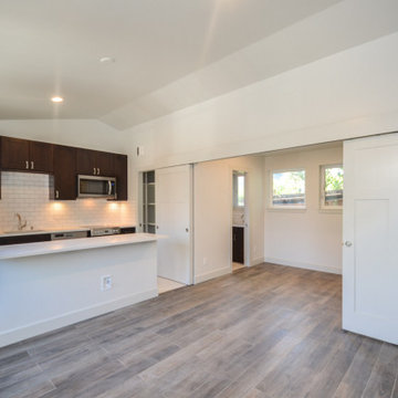
Like many West Coast cities, Seattle is facing a severe housing shortage at a time when labor and material costs have skyrocketed. Combined with a lack of available dirt, housing vacancy rates stubbornly hover under 5%.
A response to this housing perfect storm has been the evolution of a new housing prototype called a detached Auxiliary Dwelling Unit (DADU). This is commonly referred to as a Mother-in-Law (MIL) unit. As the name implies, this is a small, self-contained housing type that allows for additional housing to be built on an existing lot, creating greater density within our urban fabric. Generally thought of as either starter housing or aging-in-place concepts, these are extremely efficient floor plans that squeeze all the basic living functions into a compact space while envisioning the urban fabric as one's living room. In the case of our little DADU, our footprint is 20' x 20' and provides a ground level garage/music studio and an upper level apartment.
The misconception of these structure - thanks in large part to the misinformation campaign of the Not-So-Big-House movement - is the smaller translates into cheaper. Since these are essentially small houses, the truth is these are very expensive structures on a cost/sf basis. We conceptualized this structure as inexpensively as we could think of and it still ended up costing more than $400,000 or around $500/sf.
 Corsini Stark Architects
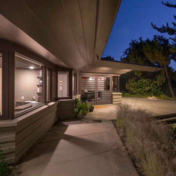
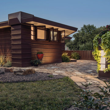
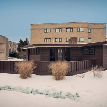
Lloyd Wright, son of Frank Lloyd Wright, designed the low-slung Gainsburg House in 1946 in the spirit of his father’s Usonian House prototypes of the 1930s. The new owners sought to reverse years of insensitive alterations while including a new kitchen, dining and family rooms, updated bathrooms, lighting and finishes, with accommodation for contemporary art display. The house was conceived as one area within an overall site geometry and the exterior can be seen from all interior angles and spaces. Our new palette compliments the original finishes and reinforces the existing geometry, enhancing a rhythm that moves throughout the house and engages the landscape in a continuous spatial composition. Images by Steve King Architectural Photography
 Tina McCants
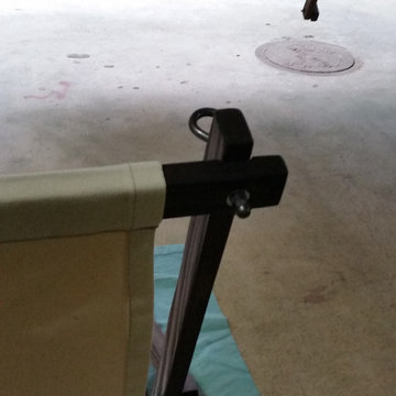
Detail of back of swing (prototype in the background hanging)
This is an example of an eclectic porch design in Other.
This is an example of an eclectic porch design in Other.
 dreamdoctor
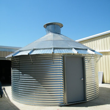
A prototype I developed with an Iowa company to be used for disaster relief. My Bin Experiment was the basis for it.
Inspiration for a small industrial gray one-story metal exterior home remodel in Other
Inspiration for a small industrial gray one-story metal exterior home remodel in Other
 Novu Designs
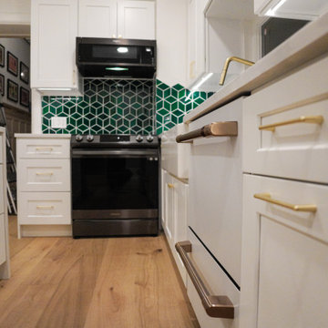
Our goal is to make your kitchen remodel as comfortable as possible. After establishing rapport with our client, we used our ingenuity to redesign and build their ideal kitchen in this stunning 10-foot-ceiling Brooklyn home. The warm tones of wood, quartz, and rich greens strike the ideal balance in creating this appealing design.
How did we achieve this look?
The Backsplash
Our client wanted a simple kitchen remodel in the shaker design, but she also wanted to include green. Initially, we proposed green cabinets to create a bold green look in the kitchen. The main objective was to incorporate our complimenting colors while keeping a feeling of lightness. After going through a number of ideas and 3D prototypes, installing as many cabinets as we could without overpowering the kitchen was our goal of optimizing space. We determined that the best way to brighten the space would be to install white shaker cabinets in addition to higher lumen recessed LED lighting. We decided that finding exquisite green backsplash tiles would be the best way to give it the desired green pop. After numerous searches, we came across a company called Mercury Mosaics.
While there were many green backsplash tiles to choose from, we opted for the mercury mosaics bluegrass diamond tiles. We loved these tiles because its created an illusion of cubes but at times, diamonds. The pattern is an art of illusion and its really gave us the personality we were looking for.
The Flooring of Choice
The flooring of choice was made by our client. We wanted the floors to feel soft and natural while capturing every bit of warmth to balance the whites and the greens and bring them together. While we could’ve opted for wood look tiles or luxury vinyl plank flooring, we ended up going with a premium slightly distressed white oak engineered hardwood flooring from Floor and Decor.
Accents
Although the flooring and the backsplash brought most of the kitchen together, we were still missing the cherry on top. The hardware and maybe something else?
We decided on thin profiled brushed brass hardware to give us that luxurious feel we were looking for every time we opened the cabinet. The cherry on top for us were the hand made quarter round oak shelves which really tied in the floors and cabinets together and gave us that final pop we were looking for. It truly added the perfect character for our client who is also a teen-fiction author of multiple books.

 YesterTec Design Company
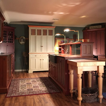
Our modestly sized original showroom (we've since moved to a different location) was designed to show some examples of how the workstation concept can work for almost any kitchen size or style. And even though the showroom features more finishes, colors, sizes and details than a real YesterTec kitchen would have, the variations are possible because the colors of the wall and floor surfaces meander between each piece, acting as the ‘glue’ that unifies the design.
Many of the prototype pieces that you see below were created in 1996 and three of them were tortured during our extensive Underwriter Laboratory tests that were required so that we could safely hide the ‘hot’ appliances when they are not being used. We still feel that the ability to conceal the ‘tech’ look of today’s appliances is what makes this concept so enduring.
 American Institute of Architects, San Francisco
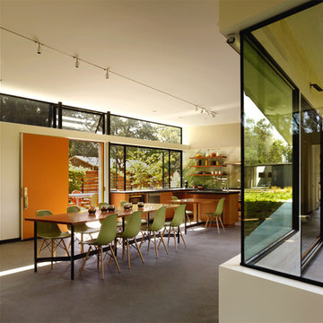
The design of this new 1,900 square foot home adjacent to a working vineyard in Sonoma, CA begins with a simple, one-story rectangular “box” floor plan, not unlike any number of recent prototypes for low cost, sustainable single-family homes. Yet while these new designs have been successful in many regards, they are typically less flexible in their ability to respond with nuance to their sites and particular environmental conditions. This project embraces the notion of an economy of means, but argues that within this economy, there is still great potential to customize the relationship of a home to its site. Image by Matthew Millman.
 Northern Roof Tiles
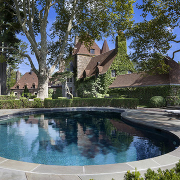
Architect: Andre Tchelistcheff Architects New York. NY
Builder: Xhema of Greenwich CT
Installer: TRM Enterprises Bridgehampton NY
Back story.
Northern has worked with both Xhema and TRM many tiles. We have worked with Andre before he branched out on his own.
Originally Xhema’s contact was to replace the roof and repair the garage, which as some point had been made into an indoor swimming pool without adequate ventilation. The budget was about $8m and there were 20 drawings.
By the time the job was 6 months old the scope of work has expanded to over $30m and over 200 drawings had been produced.
Northern was contacted to visit the site and evaluate the existing roof. Although the house had been added to over the years the same tile was used but due to the location of the house the color of the tile varied considerably from the front to the back.
Northern identified a large number of custom details which would require us to:
1) Match the existing Field tile in size, thickness (it was actually thicker at the butt and reduced to ½” where the tile is overlapped) , surface texture and the color.
2) Make tiles that are curved in their length to suit the curved rafter on the gabled dormers.
3) Make the curved tiles to suit the low slope octagonal tower.
4) Make the curved tiles and Arris style hips to suit the hipped dormers with the curved rafters.
5) Make the segmented tiles to suit the round turret.
6) Make the custom arris style hip tiles for the octagonal tower.
7) Make the custom Arris style hip to suit the different roof pitches as well as the varying splays at the eaves.
8) Make the custom pieces to suit the swept valleys
Simon broke down each section of the roof. He indented all items for each section and agreed the measure etc with the installers. This ‘Project Bible’ became an invaluable tool for the installer, our tile makers and us.
We shipped some samples from the original roof to Sahtas who replicated tall the details. I was visiting factory and delayed my return to the Saturday so that the tiles coming out of the kiln late Friday night could be wrapped and packed into newly purchase suit cases. I arrived home late Saturday evening and Simon picked me up Sunday afternoon and drove us down to Greenwich for an 8 am meeting with the clients. When we unpacked the tiles they were still warm and Hilfiger signed off on the color, although his wife suggested we make them a bit darker a ‘as he has a dreadful sense of color!’
We took Vincent Liot, owner of TRM to the factory twice so that he could oversee the prototyping of all the myriad custom pieces. This was an invaluable move as he pre-approved all the pieces before they were shipped.
The installation was completed and everyone was very pleased with the final outcome.
The Hilfiger’s estate manager told me that a group of friends who were staying the weekend after all the work was completed were heard to ask Mr. Hilfiger ‘I thought you were having a new roof’…to which he responded ‘we did but you can’t tell, which as the plan” …perfect!
In refection this is probably the most complicated roof Northern has ever had the pleasure to supply. We learned a lot of very valuable lessons but in future when we are asked how did we do it we will answer ‘that is for us to know and for you to pay for!’
 David Trubridge
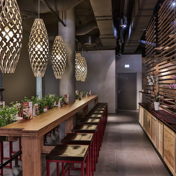
HIN-0900-WHI-WHI - Hīnaki - Bamboo Pendant - 36 - White
Hinaki (1995) could be classed as David’s first exploration into lighting. In 1995 he made a prototype based on fish traps which are called hinaki by Maori, though often the name is used specifically for an eel trap. They were made from woven vines, some in amazingly beautiful forms. He set it aside for many years, only to develop it later (2011) after Coral had gained international attention.
 Open Door Furniture
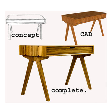
Nature itself inspires most of our designs. It has given us some amazing aesthetic proportions. These natural proportions tend to unify diverse objects into captivating compositions such as sunsets, mountainscapes, and bodies. Adhering to these ratios ensure that our designs embody nature’s beauty and are cohesive with a variety of décor. To accomplish this, our creative process entails multiple paper sketches, computer animated designs, and tweaks to real life prototypes. This progression ensures that anything brought into your home has the mark of great design.
 Val Glitsch, Architect
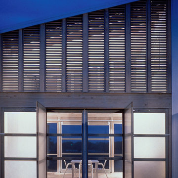
The clients for this house, descendants of a timber farming family, wanted a weekend house on their property in the Piney Woods. They imagined spending weekends and holidays year-round in a house suitable for three generations at once, including aging parents and children side-by-side.
The house, taking clues from the historic 'dogtrot' prototype, sets two bars (a two-story bedroom wing and a one-story living wing) straddling an open porch that buffers rowdiness at night and accommodates everyone for meals and games around the clock.
The porch is high, screened and louvered for breezes and against the sun in the summer, with operable translucent panels on the north side that close to deflect winter winds. The house, sited along the verge of the woods and the pasture, recalls the structure of the trees in its design while letting in filtered light (as in the woods) to interior spaces.
The house was the cover article for the "TexasArchitect" issue on East Texas. I have sense designed a renovation for the owners mid-century modern house in the city.
Paul Hester, Photographer
 qbic-ft
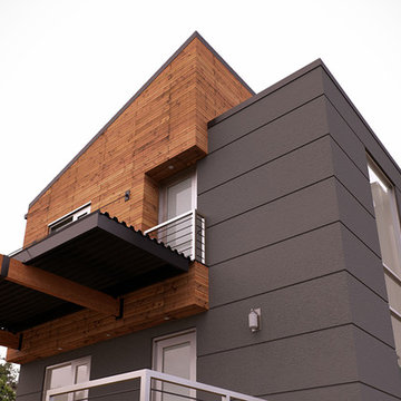
Prototype for an urban home in Minneapolis. Lot size 40'x120'
Mid-sized trendy gray two-story mixed siding exterior home photo in Minneapolis
Mid-sized trendy gray two-story mixed siding exterior home photo in Minneapolis
 Novu Designs
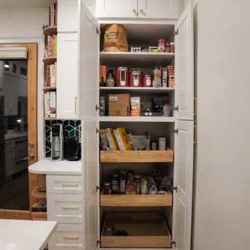
Our goal is to make your kitchen remodel as comfortable as possible. After establishing rapport with our client, we used our ingenuity to redesign and build their ideal kitchen in this stunning 10-foot-ceiling Brooklyn home. The warm tones of wood, quartz, and rich greens strike the ideal balance in creating this appealing design.
How did we achieve this look?
The Backsplash
Our client wanted a simple kitchen remodel in the shaker design, but she also wanted to include green. Initially, we proposed green cabinets to create a bold green look in the kitchen. The main objective was to incorporate our complimenting colors while keeping a feeling of lightness. After going through a number of ideas and 3D prototypes, installing as many cabinets as we could without overpowering the kitchen was our goal of optimizing space. We determined that the best way to brighten the space would be to install white shaker cabinets in addition to higher lumen recessed LED lighting. We decided that finding exquisite green backsplash tiles would be the best way to give it the desired green pop. After numerous searches, we came across a company called Mercury Mosaics.
While there were many green backsplash tiles to choose from, we opted for the mercury mosaics bluegrass diamond tiles. We loved these tiles because its created an illusion of cubes but at times, diamonds. The pattern is an art of illusion and its really gave us the personality we were looking for.
The Flooring of Choice
The flooring of choice was made by our client. We wanted the floors to feel soft and natural while capturing every bit of warmth to balance the whites and the greens and bring them together. While we could’ve opted for wood look tiles or luxury vinyl plank flooring, we ended up going with a premium slightly distressed white oak engineered hardwood flooring from Floor and Decor.
Accents
Although the flooring and the backsplash brought most of the kitchen together, we were still missing the cherry on top. The hardware and maybe something else?
We decided on thin profiled brushed brass hardware to give us that luxurious feel we were looking for every time we opened the cabinet. The cherry on top for us were the hand made quarter round oak shelves which really tied in the floors and cabinets together and gave us that final pop we were looking for. It truly added the perfect character for our client who is also a teen-fiction author of multiple books.
27