
Search results for "Public spaces" in Home Design Ideas
 Eileen Gordon Design
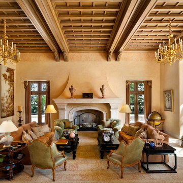
An imposing heritage oak and fountain frame a strong central axis leading from the motor court to the front door, through a grand stair hall into the public spaces of this Italianate home designed for entertaining, out to the gardens and finally terminating at the pool and semi-circular columned cabana. Gracious terraces and formal interiors characterize this stately home.
 Living Stone Design + Build
Tim Burleson
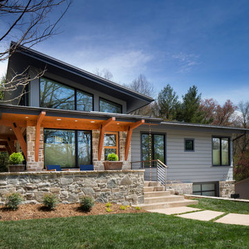
Small trendy gray two-story mixed siding house exterior photo in Other with a shed roof
Small trendy gray two-story mixed siding house exterior photo in Other with a shed roof
 A Direct Cabinet Distributor Corp
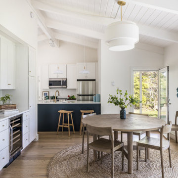
Example of a small beach style light wood floor, beige floor and exposed beam kitchen/dining room combo design in New York
Find the right local pro for your project
 François Lévy Architecture + Interiors
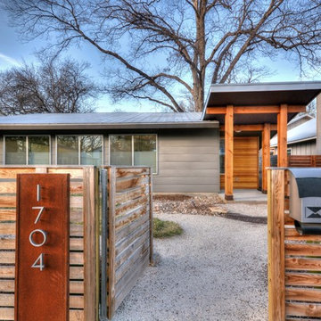
A 43” diameter heritage pecan guided the plan of this neighborhood-scaled, modestly-priced, single-story, L-shaped house. In Austin’s seemingly perpetual drought, the goal was to create a symbiotic relationship between house and tree: to complement, not combat each other. The roof’s east/west parallel ridges create a valley directly across from the base, where water is collected at a grate, nourishing the tree. The roof also maximizes south facing surfaces, elevated at 15 degrees for future solar collection. The open, public spaces of the home maximize the north-south light. The private zone of the bedrooms and bathrooms include a generous gallery; its angled walls and large sliding doors are faceted about the tree. The pecan becomes a central focus for indoor and outdoor living, participating in the house in both plan and section. The design welcomes and nurtures the tree as integral to its success. Photo Credit: Chris Diaz
 Dovetail Construction
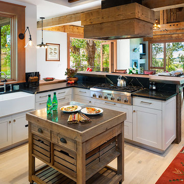
Example of a mountain style light wood floor open concept kitchen design in Other with a farmhouse sink, shaker cabinets, white cabinets, stainless steel appliances and an island
 Dibello Architects, PLLC
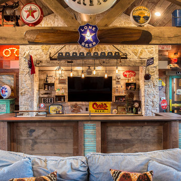
The 3,400 SF, 3 – bedroom, 3 ½ bath main house feels larger than it is because we pulled the kids’ bedroom wing and master suite wing out from the public spaces and connected all three with a TV Den.
Convenient ranch house features include a porte cochere at the side entrance to the mud room, a utility/sewing room near the kitchen, and covered porches that wrap two sides of the pool terrace.
We designed a separate icehouse to showcase the owner’s unique collection of Texas memorabilia. The building includes a guest suite and a comfortable porch overlooking the pool.
The main house and icehouse utilize reclaimed wood siding, brick, stone, tie, tin, and timbers alongside appropriate new materials to add a feeling of age.
 Gettliffe Architecture
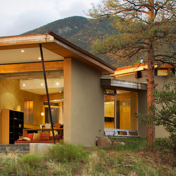
This custom green vacation home designed by Colorado architect Dominique Gettliffe features a stucco exterior, straw bale insulation, solar hot water and other sustainable features. A large rolling glass door opens onto an open patio and a beautiful view of the valley.

 Visbeen Architects
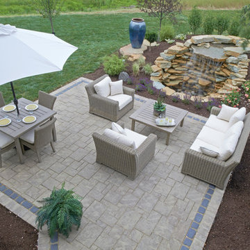
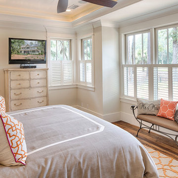
The best of past and present architectural styles combine in this welcoming, farmhouse-inspired design. Clad in low-maintenance siding, the distinctive exterior has plenty of street appeal, with its columned porch, multiple gables, shutters and interesting roof lines. Other exterior highlights included trusses over the garage doors, horizontal lap siding and brick and stone accents. The interior is equally impressive, with an open floor plan that accommodates today’s family and modern lifestyles. An eight-foot covered porch leads into a large foyer and a powder room. Beyond, the spacious first floor includes more than 2,000 square feet, with one side dominated by public spaces that include a large open living room, centrally located kitchen with a large island that seats six and a u-shaped counter plan, formal dining area that seats eight for holidays and special occasions and a convenient laundry and mud room. The left side of the floor plan contains the serene master suite, with an oversized master bath, large walk-in closet and 16 by 18-foot master bedroom that includes a large picture window that lets in maximum light and is perfect for capturing nearby views. Relax with a cup of morning coffee or an evening cocktail on the nearby covered patio, which can be accessed from both the living room and the master bedroom. Upstairs, an additional 900 square feet includes two 11 by 14-foot upper bedrooms with bath and closet and a an approximately 700 square foot guest suite over the garage that includes a relaxing sitting area, galley kitchen and bath, perfect for guests or in-laws.
 Eric Reinholdt, Architect
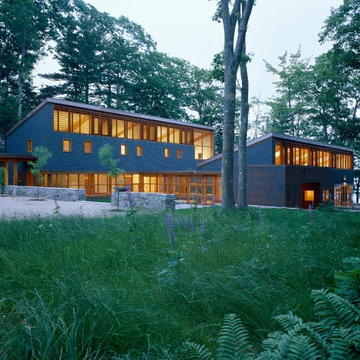
The building is comprised of three volumes, supported by a heavy timber frame, and set upon a terraced ground plane that closely follows the existing topography. Linking the volumes, the circulation path is highlighted by large cuts in the skin of the building. These cuts are infilled with a wood framed curtainwall of glass offset from the syncopated structural grid.
Eric Reinholdt - Project Architect/Lead Designer with Elliott, Elliott, Norelius Architecture
Photo: Brian Vanden Brink
 KURV Architecture DPC (Alex Hughes Architects)
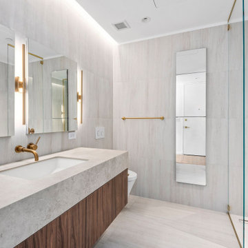
Located in the heart of Manhattan’s Lower East Side, the building was erected on a shallow commercial lot between two 120 year old masonry buildings and a new residential rental building. 330 Grand Street is a mix of 725 SF 1BRs and 1050 SF 2BR apartments. It also contains a 1100 SF two story duplex as well as private and public rooftop space, large private balconies for most units and two large private terraces for the ground floor units.
330 Grand Street was originally designed and approved at the NYC DOB as a prefabricated modular building. During the pandemic, as shipping costs skyrocketed putting the project at risk, we suggested redesigning the building as a reinforced cast-in-place concrete structure. Concrete was readily available and prices had not been affected by the demand increase that many other materials suffered in the pandemic. We took this opportunity to raise floor to ceiling heights, enlarge high performance windows and redistribute the buildings MEPFS and Structural Systems to create very open floor plans.
The challenge was to create a luxurious sensorial living experience with very limited means. In a city with very high construction costs, low cost residential buildings in the area are usually devoid of good quality, design and character. Our approach was to aim high for the end user, prioritizing natural light, open space with long visual perspectives, high ceilings and as always, rejecting the use of predefined building templates.
Our biggest challenge was to ensure that the small spaces feel as clean cut, large and bright as possible. Several unique design decisions were made to ensure low cost and high quality;
Floor plans were laid out so that spaces were wide open and free of clutter from mechanical or structural interruptions. Therefore all infrastructure was placed in lateral demising walls, which in turn act as the unit’s storage and kitchen. The apartments feel wide open, are super quiet and have more storage space than any other comparable apartment in the city.
To solve the problem of the site’s shallow commercial lot which is typically prone to dark interior spaces we focused our attention on the building’s envelope. Instead of the usual small punched window openings, oversized high performance windows were designed to ensure that light penetrated as far as possible into the units. In the smaller 1BR units, the full 50’ depth of the lot is perceived by partitioning spaces with sliding pocket doors that can be retracted to allow deep visual perspectives, making the sight lines in the space feel longer, larger, more ample than normal. In addition to the full height glazing, each unit above the 2nd floor receives a 7 foot covered balcony, adding 120 to 240 sf to each apartment, something unusual in New York City buildings. The space is large enough for a full size dining table, when the weather permits being outside.
We also worked hard to ensure modularity. For example, all kitchen units are all identical throughout the building. The idea of modularity and the economy of the repetitive unit is exercised to the maximum through the building.
Hardware, appliances, flooring, wall coverings and material finishes are all carefully selected to feel bespoke, high quality and unique.
It was important to KURV that the result of this work manifest into something that would deeply connect with the end user and sustain relationships with the consumers of this space.
All images by KURV Architecture ©
 Lafia/Arvin, A Design Corporation
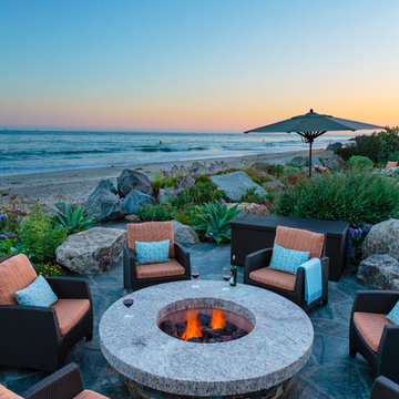
Beach style backyard stone patio photo in Santa Barbara with a fire pit and no cover
 CHRISTOPHER STROM ARCHITECTS
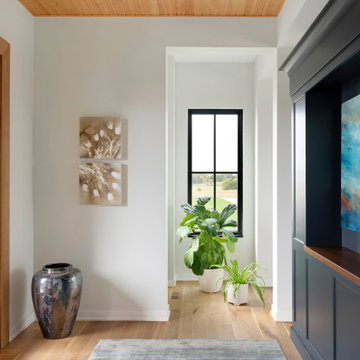
Eye-Land: Named for the expansive white oak savanna views, this beautiful 5,200-square foot family home offers seamless indoor/outdoor living with five bedrooms and three baths, and space for two more bedrooms and a bathroom.
The site posed unique design challenges. The home was ultimately nestled into the hillside, instead of placed on top of the hill, so that it didn’t dominate the dramatic landscape. The openness of the savanna exposes all sides of the house to the public, which required creative use of form and materials. The home’s one-and-a-half story form pays tribute to the site’s farming history. The simplicity of the gable roof puts a modern edge on a traditional form, and the exterior color palette is limited to black tones to strike a stunning contrast to the golden savanna.
The main public spaces have oversized south-facing windows and easy access to an outdoor terrace with views overlooking a protected wetland. The connection to the land is further strengthened by strategically placed windows that allow for views from the kitchen to the driveway and auto court to see visitors approach and children play. There is a formal living room adjacent to the front entry for entertaining and a separate family room that opens to the kitchen for immediate family to gather before and after mealtime.
 Wheeler Kearns Architects
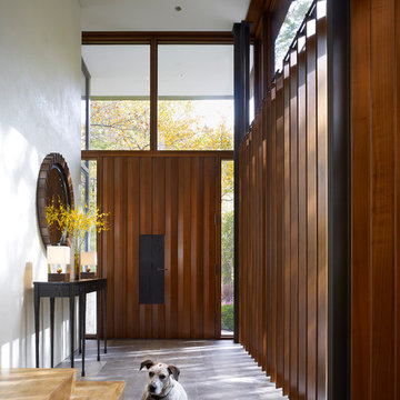
Pivoting louvers were devised inside the Entry, providing shading for the S façade, and privacy from the busy street and neighbors. As the louvers pivot, it transforms the Entry from transparent to opaque, reinforcing a welcoming gesture as an extension of the public spaces, or conveying privacy desired as an extension of the plinth mass.
Steve Hall - Hedrich Blessing
Sponsored
Columbus, OH
Free consultation for landscape design!

Peabody Landscape Group
Franklin County's Reliable Landscape Design & Contracting
 EDAD studio
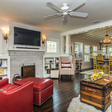
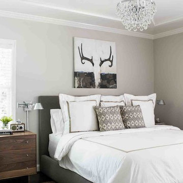
Living room - traditional dark wood floor living room idea in Tampa with white walls, a standard fireplace and a brick fireplace

 BlueWaterPictures- Dennis Anderson photographer
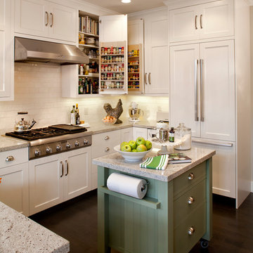
Kitchen - traditional u-shaped dark wood floor kitchen idea in San Francisco with shaker cabinets, white cabinets, white backsplash and subway tile backsplash
 Bruns Architecture
Tricia Shay Photography
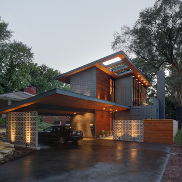
Inspiration for a mid-sized contemporary gray two-story mixed siding house exterior remodel in Milwaukee with a shed roof
Inspiration for a mid-sized contemporary gray two-story mixed siding house exterior remodel in Milwaukee with a shed roof
Sponsored
Columbus, OH
Free consultation for landscape design!
Peabody Landscape Group
Franklin County's Reliable Landscape Design & Contracting
 New Old, LLC
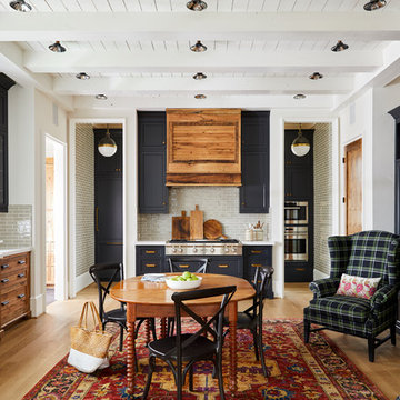
Large farmhouse light wood floor dining room photo in Charlotte with white walls and a standard fireplace
 Drewett Works
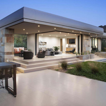
With adjacent neighbors within a fairly dense section of Paradise Valley, Arizona, C.P. Drewett sought to provide a tranquil retreat for a new-to-the-Valley surgeon and his family who were seeking the modernism they loved though had never lived in. With a goal of consuming all possible site lines and views while maintaining autonomy, a portion of the house — including the entry, office, and master bedroom wing — is subterranean. This subterranean nature of the home provides interior grandeur for guests but offers a welcoming and humble approach, fully satisfying the clients requests.
While the lot has an east-west orientation, the home was designed to capture mainly north and south light which is more desirable and soothing. The architecture’s interior loftiness is created with overlapping, undulating planes of plaster, glass, and steel. The woven nature of horizontal planes throughout the living spaces provides an uplifting sense, inviting a symphony of light to enter the space. The more voluminous public spaces are comprised of stone-clad massing elements which convert into a desert pavilion embracing the outdoor spaces. Every room opens to exterior spaces providing a dramatic embrace of home to natural environment.
Grand Award winner for Best Interior Design of a Custom Home
The material palette began with a rich, tonal, large-format Quartzite stone cladding. The stone’s tones gaveforth the rest of the material palette including a champagne-colored metal fascia, a tonal stucco system, and ceilings clad with hemlock, a tight-grained but softer wood that was tonally perfect with the rest of the materials. The interior case goods and wood-wrapped openings further contribute to the tonal harmony of architecture and materials.
Grand Award Winner for Best Indoor Outdoor Lifestyle for a Home This award-winning project was recognized at the 2020 Gold Nugget Awards with two Grand Awards, one for Best Indoor/Outdoor Lifestyle for a Home, and another for Best Interior Design of a One of a Kind or Custom Home.
At the 2020 Design Excellence Awards and Gala presented by ASID AZ North, Ownby Design received five awards for Tonal Harmony. The project was recognized for 1st place – Bathroom; 3rd place – Furniture; 1st place – Kitchen; 1st place – Outdoor Living; and 2nd place – Residence over 6,000 square ft. Congratulations to Claire Ownby, Kalysha Manzo, and the entire Ownby Design team.
Tonal Harmony was also featured on the cover of the July/August 2020 issue of Luxe Interiors + Design and received a 14-page editorial feature entitled “A Place in the Sun” within the magazine.
 Drewett Works
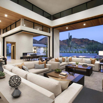
With adjacent neighbors within a fairly dense section of Paradise Valley, Arizona, C.P. Drewett sought to provide a tranquil retreat for a new-to-the-Valley surgeon and his family who were seeking the modernism they loved though had never lived in. With a goal of consuming all possible site lines and views while maintaining autonomy, a portion of the house — including the entry, office, and master bedroom wing — is subterranean. This subterranean nature of the home provides interior grandeur for guests but offers a welcoming and humble approach, fully satisfying the clients requests.
While the lot has an east-west orientation, the home was designed to capture mainly north and south light which is more desirable and soothing. The architecture’s interior loftiness is created with overlapping, undulating planes of plaster, glass, and steel. The woven nature of horizontal planes throughout the living spaces provides an uplifting sense, inviting a symphony of light to enter the space. The more voluminous public spaces are comprised of stone-clad massing elements which convert into a desert pavilion embracing the outdoor spaces. Every room opens to exterior spaces providing a dramatic embrace of home to natural environment.
Grand Award winner for Best Interior Design of a Custom Home
The material palette began with a rich, tonal, large-format Quartzite stone cladding. The stone’s tones gaveforth the rest of the material palette including a champagne-colored metal fascia, a tonal stucco system, and ceilings clad with hemlock, a tight-grained but softer wood that was tonally perfect with the rest of the materials. The interior case goods and wood-wrapped openings further contribute to the tonal harmony of architecture and materials.
Grand Award Winner for Best Indoor Outdoor Lifestyle for a Home This award-winning project was recognized at the 2020 Gold Nugget Awards with two Grand Awards, one for Best Indoor/Outdoor Lifestyle for a Home, and another for Best Interior Design of a One of a Kind or Custom Home.
At the 2020 Design Excellence Awards and Gala presented by ASID AZ North, Ownby Design received five awards for Tonal Harmony. The project was recognized for 1st place – Bathroom; 3rd place – Furniture; 1st place – Kitchen; 1st place – Outdoor Living; and 2nd place – Residence over 6,000 square ft. Congratulations to Claire Ownby, Kalysha Manzo, and the entire Ownby Design team.
Tonal Harmony was also featured on the cover of the July/August 2020 issue of Luxe Interiors + Design and received a 14-page editorial feature entitled “A Place in the Sun” within the magazine.
12