
Search results for "Pursued" in Home Design Ideas
 S3 Interior Design
Why we did it:
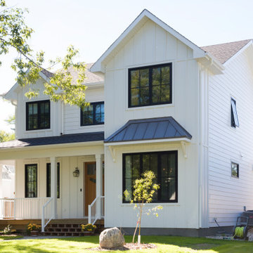
Our clients were born & raised in Winnipeg then travelled and lived around North America pursuing and developing their careers. Upon learning that they would be returning they wanted to build their forever home & bring the culture from their travels with them. Our goal was to recreate a modern farmhouse nestled close to the French area of the city. The aesthetic was a blend of clean architecture with hints of natural materials for a warm & welcoming environment.
What we did:
Established the client’s wants and needs
Exterior Finish Selection
Millwork & Detailing (Custom Glass Walls & Tile Design)
Reflected Ceiling Plan & Fixture Selection
Interior finishes
Construction Administration
The house is as charming as its owners & offers plenty of space for a growing family with busy lifestyles.
 InnovationLand
Houston Interior Designer Lisha Maxey took this Museum District condo from the dated, mirrored walls of the 1980s to Mid Century Modern with a gallery look featuring the client's art collection.
"The place was covered with glued-down, floor-to-ceiling mirrors," says Lisha Maxey, senior designer for Homescapes of Houston and principal at LGH Design Services in Houston. "When we took them off the walls, the walls came apart. We ended up taking them down to the studs."
The makeover took six months to complete, primarily because of strict condo association rules that only gave the Houston interior designers very limited access to the elevator - through which all materials and team members had to go.
"Monday through Friday, we could only be noisy from 10 a.m. to 2 p.m., and if we had to do something extra loud, like sawing or drilling, we had to schedule it with the management and they had to communicate that to the condo owners. So it was just a lot of coordination. But a lot of Inner City Loopers live in these kinds of buildings, so we're used to handling that kind of thing."
The client, a child psychiatrist in her 60s, recently moved to Houston from northeast Texas to be with friends. After being widowed three years ago, she decided it was time to let go of the traditionally styled estate that wasn't really her style anyway. An avid diver who has traveled around the world to pursue her passion, she has amassed a large collection of art from her travels. Downsizing to 1,600 feet and wanting to go more contemporary, she wanted the display - and the look - more streamlined.
"She wanted clean lines and muted colors, with the main focus being her artwork," says Maxey. "So we made the space a palette for that."
Enter the white, gallery-grade paint she chose for the walls: "It's halfway between satin and flat," explains Maxey. "It's not glossy and it's not chalky - just very smooth and clean."
Adding to the gallery theme is the satin nickel track lighting with lamps aimed to highlight pieces of art. "This lighting has no wires," notes Maxey. "It's powered by a positive and negative conduit."
The new flooring throughout is a blended-grey porcelain tile that looks like wood planks. "It's gorgeous, natural-looking and combines all the beauty of wood with the durability of tile," says Maxey. "We used it throughout the condo to unify the space."
After Maxey started looking at the client's bright, vibrant, colorful artwork, she felt the palette couldn't stay as muted anymore. Hence the Mid Century Modern orange leather sofas from West Elm and bright green chairs from Joybird, plus the throw pillows in different textures, patterns and shades of gold, orange and green.
The concave lines of the Danish-inspired chairs, she notes, help them look beautiful from all the way around - a key to designing spaces for loft living.
"The table in the living room is very interesting," notes Maxey. "It was handmade for the client in 1974 and has a signature on it from the artist. She was adamant about including the piece, which has all these hand-painted black-and-white art tiles on the top. I took one look at it and said 'It's not really going to go.'"
However, after cutting 6 inches off the bottom and making it look a little distressed, the table ended up being the perfect complement to the sofas.
The dining room table - from Design Within Reach - is a solid piece of mahogany, the chair upholstery a mix of grey velvet and leather and the legs a shiny brass. "The side chairs are leather and the end ones are velvet," says Maxey. "It's a nice textural mix that lends depth and texture."
The galley kitchen, meanwhile, has been lightened and brightened, with new, white contemporary cabinetry, quartz countertops mimicking the look of Carrara marble, stainless steel appliances and a velvet green bench seat for a punch of color.
The two bathrooms have been updated with contemporary white vanities and vessel sinks and the master bath now features a walk-in shower tiled in Dolomite white marble (the floor is Bianco Carrara marble mosaic, done in a herringbone pattern.
In the master bedroom, Homescapes of Houston knocked down a wall between two smaller closets with swing doors to make one large walk-in closet with pocket doors. The closet in the guest bedroom also came out 13 more inches.
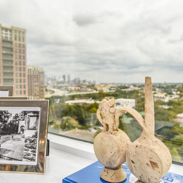
The client's artwork throughout personalizes the space and tells the story of a life. There's a huge bowl of shells from the client's diving adventures, framed art from her child psychiatry patients and a 16th century wood carving from a monastery that's been in her family forever.
"Her collection is quite impressive," says Maxey. "There's even a framed piece of autographed songs written by John Lennon." (You can see this black-framed piece of art on the wall in the photo above of two green chairs).
"We're extremely happy with how the project turned out, and so is the client," says Maxey. "No expense was spared for her. It was a labor of love and we were excited to do it."
 Designs Daly
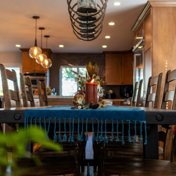
The objective of the project was to deliver a comprehensive remodel and redesign for two vacant Nestors. The clients expressed an interest in entertaining guests in their new common areas, residing in a more spacious and utilitarian master suite, pursuing their hobbies in the multipurpose room, having a functional home office, and offering comfortable accommodations for their visitors. Our team was driven to create a fresh look, style, and functionality that would cater to the clients’ needs.
Find the right local pro for your project
 InnovationLand
Houston Interior Designer Lisha Maxey took this Museum District condo from the dated, mirrored walls of the 1980s to Mid Century Modern with a gallery look featuring the client's art collection.
"The place was covered with glued-down, floor-to-ceiling mirrors," says Lisha Maxey, senior designer for Homescapes of Houston and principal at LGH Design Services in Houston. "When we took them off the walls, the walls came apart. We ended up taking them down to the studs."
The makeover took six months to complete, primarily because of strict condo association rules that only gave the Houston interior designers very limited access to the elevator - through which all materials and team members had to go.
"Monday through Friday, we could only be noisy from 10 a.m. to 2 p.m., and if we had to do something extra loud, like sawing or drilling, we had to schedule it with the management and they had to communicate that to the condo owners. So it was just a lot of coordination. But a lot of Inner City Loopers live in these kinds of buildings, so we're used to handling that kind of thing."
The client, a child psychiatrist in her 60s, recently moved to Houston from northeast Texas to be with friends. After being widowed three years ago, she decided it was time to let go of the traditionally styled estate that wasn't really her style anyway. An avid diver who has traveled around the world to pursue her passion, she has amassed a large collection of art from her travels. Downsizing to 1,600 feet and wanting to go more contemporary, she wanted the display - and the look - more streamlined.
"She wanted clean lines and muted colors, with the main focus being her artwork," says Maxey. "So we made the space a palette for that."
Enter the white, gallery-grade paint she chose for the walls: "It's halfway between satin and flat," explains Maxey. "It's not glossy and it's not chalky - just very smooth and clean."
Adding to the gallery theme is the satin nickel track lighting with lamps aimed to highlight pieces of art. "This lighting has no wires," notes Maxey. "It's powered by a positive and negative conduit."
The new flooring throughout is a blended-grey porcelain tile that looks like wood planks. "It's gorgeous, natural-looking and combines all the beauty of wood with the durability of tile," says Maxey. "We used it throughout the condo to unify the space."
After Maxey started looking at the client's bright, vibrant, colorful artwork, she felt the palette couldn't stay as muted anymore. Hence the Mid Century Modern orange leather sofas from West Elm and bright green chairs from Joybird, plus the throw pillows in different textures, patterns and shades of gold, orange and green.
The concave lines of the Danish-inspired chairs, she notes, help them look beautiful from all the way around - a key to designing spaces for loft living.
"The table in the living room is very interesting," notes Maxey. "It was handmade for the client in 1974 and has a signature on it from the artist. She was adamant about including the piece, which has all these hand-painted black-and-white art tiles on the top. I took one look at it and said 'It's not really going to go.'"
However, after cutting 6 inches off the bottom and making it look a little distressed, the table ended up being the perfect complement to the sofas.
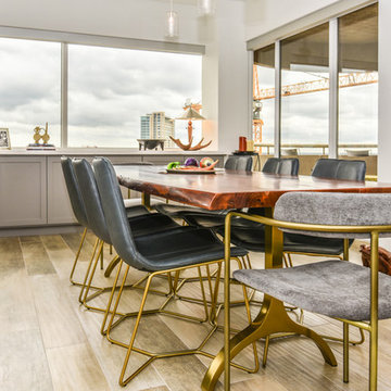
The dining room table - from Design Within Reach - is a solid piece of mahogany, the chair upholstery a mix of grey velvet and leather and the legs a shiny brass. "The side chairs are leather and the end ones are velvet," says Maxey. "It's a nice textural mix that lends depth and texture."
Over the table hang Fast Jack Saluti pendant lights from Edge Lighting.
The galley kitchen, meanwhile, has been lightened and brightened, with white quartz countertops and backsplashes mimicking the look of Carrara marble, stainless steel appliances and a velvet green bench seat for a punch of color. The cabinets are painted a cool grey color called "Silverplate."
The two bathrooms have been updated with contemporary white vanities and vessel sinks and the master bath now features a walk-in shower tiled in Dolomite white marble (the floor is Bianco Carrara marble mosaic, done in a herringbone pattern.
In the master bedroom, Homescapes of Houston knocked down a wall between two smaller closets with swing doors to make one large walk-in closet with pocket doors. The closet in the guest bedroom also came out 13 more inches.
The client's artwork throughout personalizes the space and tells the story of a life. There's a huge bowl of shells from the client's diving adventures, framed art from her child psychiatry patients and a 16th century wood carving from a monastery that's been in her family forever.
"Her collection is quite impressive," says Maxey. "There's even a framed piece of autographed songs written by John Lennon." (You can see this black-framed piece of art on the wall in the photo above of two green chairs).
"We're extremely happy with how the project turned out, and so is the client," says Maxey. "No expense was spared for her. It was a labor of love and we were excited to do it."
 Marcus Gleysteen Architects
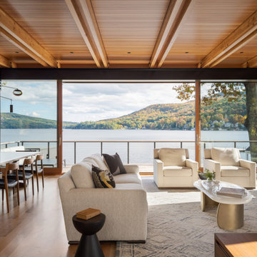
Cove House is a contemporary shoreline sanctuary in the lake region of New Hampshire. The wooded property, which includes several accessory outbuildings and an existing guest cottage, makes up a private micro-cove. The new modern house and existing traditional cottage turn both toward the lake and to each other. Thoughtful siting and landscape architecture establish a connective flow between the two residences, with a notched stone courtyard in the house inviting visitors to go back and forth.
Inspired by the craftsmanship of an antique mahogany powerboat, Cove House pursues architectural quality and beauty at the highest level. The design uses materiality, texture, and daylight to balance livability and artistry. The main entrance leads through a slot-canyon-like hall where a sequence of monumental granite walls reveals a glorious, light-filled living room. A steel moment frame spanning two levels imparts unobstructed panoramic views of the lake.
The magnetism of the New Hampshire waterfront is equalized by a coordinated series of openings, which attune daylight throughout the interior. Large sliding glass doors and windows draw light through the courtyard and into the home’s core – a bright and lofty kitchen. Below the kitchen, a walkout patio illuminates a refined wine-tasting room.
Near the front entry, a gracious granite and steel stair delivers daylight to each level though open risers and glass balustrades. Skylights draw light from above and cast grazing shadows against the textured tile walls of the upper bathrooms.
“We aimed to create a “beautiful reward” and an environment that our clients will enjoy for the rest of their lives.”
– Marcus Gleysteen
 Gill Design Co.
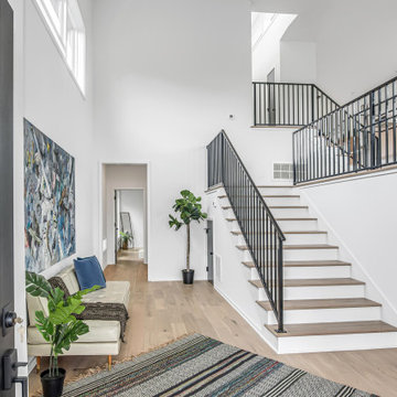
Designed around the sunset downtown views from the living room with open-concept living, the split-level layout provides gracious spaces for entertaining, and privacy for family members to pursue distinct pursuits.
 NILES
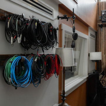
NILESThis private studio, built in collaboration with producer, engineer, and pianist Ian Miller, is a fully custom creative space designed around his workflow and artistic process. The project blended NILES’ technical execution with Ian’s hands-on finishing work, resulting in a studio where every corner has intention and every system supports a seamless, plug-and-play workflow.
The structure began as a barn-style two-car garage with a second floor. After exploring several layouts and engineering options, we landed on a design that leveraged the high ceilings and existing footprint to create a dynamic and spacious acoustic environment. Generous daylight from surrounding windows connects the interior to the outdoors, while layered textures, warm tones, and custom finishes create a grounded yet inspiring atmosphere.
The Control Room is fully isolated from the rest of the building with sound-reducing wall systems, a full soft-ceiling bass trap, tuned corner traps, treatment throughout, and full-lite doors for controlled transmission and visibility. Though modest in size, it delivers accurate monitoring and integrates smoothly with the larger live environment.
Roasted Bean Studio was built to support any direction Ian pursues—from producing to mixing to live performance. The space provides the sonic palette and creative flexibility needed for a wide range of projects, offering a visually inspiring and acoustically reliable environment that empowers his work every day.
 Bushman Dreyfus Architects
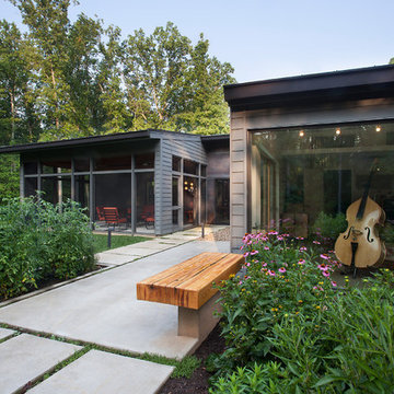
Following a single contour line for one-level living. With an attenuated plan and delicate folds in the roof, the origin of the name “Origami House” is clear. The house is built along a contour on a gentle south-facing slope. The different slopes of the black roof, the gray cement-board walls in a traditional Japanese clapboard style, and the Cor-Ten sheet metal accents at the entrances evoke a natural formation in the woods as much as traditional readings of “house.”
Requirements included rooms to pursue interests and support a lifestyle in very specific ways: an acoustically isolated music room, a sewing room, a screened porch, a wine room and room for a large collection of books. Low-maintenance and energy-efficiency were desired, with conveniences and arrangements that will continue to meet their needs as they age. A strong connection to the site, embracing the outdoors was essential.
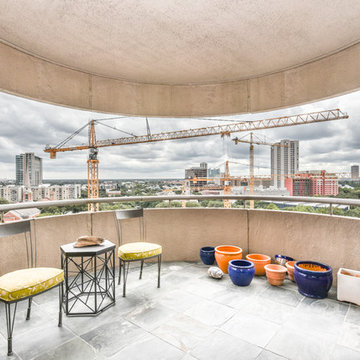 InnovationLand
Houston Interior Designer Lisha Maxey took this Museum District condo from the dated, mirrored walls of the 1980s to Mid Century Modern with a gallery look featuring the client’s art collection.
The place was covered with glued-down, floor-to-ceiling mirrors,” says Lisha Maxey, senior designer for Homescapes of Houston and principal at LGH Design Services in Houston. “When we took them off the walls, the walls came apart. We ended up taking them down to the studs."
The makeover took six months to complete, primarily because of strict condo association rules that only gave the Houston interior designers very limited access to the elevator – through which all materials and team members had to go.
“Monday through Friday, we could only be noisy from 10 a.m. to 2 p.m., and if we had to do something extra loud, like sawing or drilling, we had to schedule it with the management and they had to communicate that to the condo owners. So it was just a lot of coordination. But a lot of Inner City Loopers live in these kinds of buildings, so we’re used to handling that kind of thing.”
The client, a child psychiatrist in her 60s, recently moved to Houston from northeast Texas to be with friends. After being widowed three years ago, she decided it was time to let go of the traditionally styled estate that wasn’t really her style anyway. An avid diver who has traveled around the world to pursue her passion, she has amassed a large collection of art from her travels. Downsizing to 1,600 feet and wanting to go more contemporary, she wanted the display – and the look – more streamlined.
“She wanted clean lines and muted colors, with the main focus being her artwork,” says Maxey. “So we made the space a palette for that.”
Enter the white, gallery-grade paint she chose for the walls: “It’s halfway between satin and flat,” explains Maxey. “It’s not glossy and it’s not chalky – just very smooth and clean."
Adding to the gallery theme is the satin nickel track lighting with lamps aimed to highlight pieces of art. “This lighting has no wires,” notes Maxey. “It’s powered by a positive and negative conduit.”
The new flooring throughout is a blended-grey porcelain tile that looks like wood planks. “It’s gorgeous, natural-looking and combines all the beauty of wood with the durability of tile,” says Maxey. “We used it throughout the condo to unify the space.”
After Maxey started looking at the client’s bright, vibrant, colorful artwork, she felt the palette couldn’t stay as muted anymore. Hence the Mid Century Modern orange leather sofas from West Elm and bright green chairs from Joybird, plus the throw pillows in different textures, patterns and shades of gold, orange and green.
The concave lines of the Danish-inspired chairs, she notes, help them look beautiful from all the way around – a key to designing spaces for loft living.
“The table in the living room is very interesting,” notes Maxey. “It was handmade for the client in 1974 and has a signature on it from the artist. She was adamant about including the piece, which has all these hand-painted black-and-white art tiles on the top. I took one look at it and said ‘It’s not really going to go.’”
However, after cutting 6 inches off the bottom and making it look a little distressed, the table ended up being the perfect complement to the sofas.
The dining room table – from Design Within Reach – is a solid piece of mahogany, the chair upholstery a mix of grey velvet and leather and the legs a shiny brass. “The side chairs are leather and the end ones are velvet,” says Maxey. “It’s a nice textural mix that lends depth and texture.”The galley kitchen, meanwhile, has been lightened and brightened, with new, white contemporary cabinetry, quartz countertops mimicking the look of Carrara marble, stainless steel appliances and a velvet green bench seat for a punch of color.The two bathrooms have been updated with contemporary white vanities and vessel sinks and the master bath now features a walk-in shower tiled in Dolomite white marble (the floor is Bianco Carrara marble mosaic, done in a herringbone pattern).In the master bedroom, Homescapes of Houston knocked down a wall between two smaller closets with swing doors to make one large walk-in closet with pocket doors. The closet in the guest bedroom also came out 13 more inches.The client’s artwork throughout personalizes the space and tells the story of a life. There’s a huge bowl of shells from the client’s diving adventures, framed art from her child psychiatry patients and a 16th century wood carving from a monastery that’s been in her family forever.
“Her collection is quite impressive,” says Maxey. “There’s even a framed piece of autographed songs written by John Lennon.” (You can see this black-framed piece of art on the wall in the photo above of two green chairs).
“We’re extremely happy with how the project turned out, and so is the client,” says Maxey. “No expense was spared for her. It was a labor of love and we were excited to do it.”
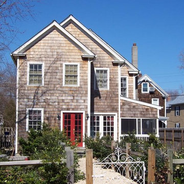
 MJH Construction, LLC
Full service residential and light commercial building, remodeling and design contractor
MJH Construction is committed to providing our customers with exceptional customer service, sound design, extreme craftsmanship, and the highest quality products to complete their projects and exceed expectations.
Owner and Founder, Michael J. Harkowa is a graduate of New York Institute of Technology with a Bachelor of Science Degree in Architecture. He has over 25 years of experience in the construction industry and has been a licensed contractor since 1989. He established MJH Construction in 1993 in Brentwood, NY, providing customers with remodeling and design services. In 1997, Mike moved to Maryland to pursue new opportunities in the remodeling and new construction markets as a founding member of Needwood Construction, LLC. He held the position of Senior Member/Partner of Needwood Construction, LLC for 15 years, as well as Vice President and later, President of Needwood Homes, Inc. for 9 years. In 2012, Mike re-established MJH Construction, LLC; providing building, remodeling & design services.

 User
UserThe story of the Cherry Log Tree Houses started in Summer of 2021. That July I (Jack Baldwin) met with our client to discuss the site location, design concepts and inspiration, and come with an approach for the architectural and structural design for these custom tree homes.
Our client shared inspiration images that had a modern influence.
Our lead designer James Knight conducted a floor plan exploration and design study with multiple concepts and options for the client to review. Once we agreed on an approach that matched with function, style and budget, we were able to pursue a concept together.
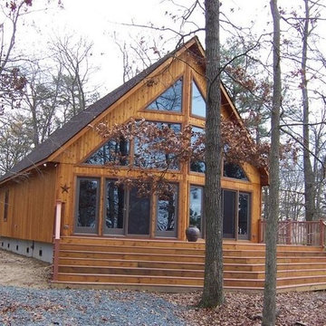 MJH Construction, LLC
Full service residential and light commercial building, remodeling and design contractor
MJH Construction is committed to providing our customers with exceptional customer service, sound design, extreme craftsmanship, and the highest quality products to complete their projects and exceed expectations.
Owner and Founder, Michael J. Harkowa is a graduate of New York Institute of Technology with a Bachelor of Science Degree in Architecture. He has over 25 years of experience in the construction industry and has been a licensed contractor since 1989. He established MJH Construction in 1993 in Brentwood, NY, providing customers with remodeling and design services. In 1997, Mike moved to Maryland to pursue new opportunities in the remodeling and new construction markets as a founding member of Needwood Construction, LLC. He held the position of Senior Member/Partner of Needwood Construction, LLC for 15 years, as well as Vice President and later, President of Needwood Homes, Inc. for 9 years. In 2012, Mike re-established MJH Construction, LLC; providing building, remodeling & design services.
 User
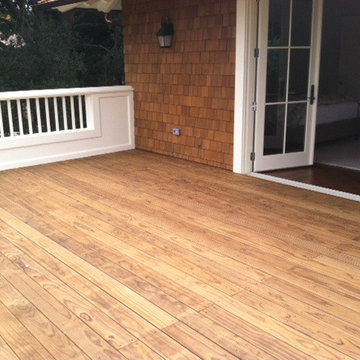
UserThis Tapia Construction & Restoration Project presents all the hallmarks of an estate with its grand main home, guest house, pool, and formal grounds of over one acre. Just completed by Tapia Construction, the home is reminiscent of a sophisticated East Coast manor with its cedar shingled exterior and ebony shutters. Inside, a classic neutral color palette and traditional design elements are replicated in every room -- beautifully detailed ceilings, crisp white custom millwork, and lavish use of honed Calacatta Oro marble.
The three-level main residence is magnificently appointed with everything needed for luxurious comfortable living, including a theatre, fitness center, steam shower, and wine cellar. There are 5 spacious bedrooms, each with en-suite bath, plus a wonderful 1-bedroom guest house also perfect for extended family, an au pair, or entertaining. A pool, fire pit, and vast terrace highlight the rear grounds for outdoor enjoyment, all surrounded by beautifully manicured lawn, a parterre rose garden, and the privacy afforded by a gated entrance. Topping it all off is the home's close proximity to fine dining and shopping, Stanford University, and all of Silicon Valley.
Located in the heart of the Peninsula, Tapia Construction and Restoration provide all aspects of construction services throughout the Bay Area. TCR was founded in December 2008 with the intent to start a privately owned company, without the corporate agenda, that provide its customers the highest level of service and product with the personal touch of a family based business. Owner David Tapia began his career in the mid 1970's under the guidance of some of San Francisco's leading construction industry professionals. It was their passion, guidance, and instruction that helped David identify his calling. In the 80's David spent the majority of his time with Lombardi Construction where he developed relationships with clients, subcontractors, and vendors, as well as providing him with the knowledge proven valuable over the course of his career. David has pursued certifications in plumbing, electrical, structural, carpentry/frame/fit/finish programs and is a certified safety professional. Confidence in this extensive experience and expertise coupled with his growing family, made the move to independent contractor a natural one. With years of experience and impeccable attention to detail TCR provides clients with an investment to projects and exceptional customer service. We would like to welcome you to the TCR family and invite you to share our vision of "Building the future- Restoring the past."
 SV Design
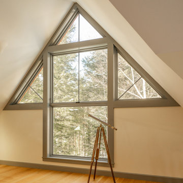
When an expanding family outgrew its beloved A frame vacation home, chaos followed. Outdoor gear multiplied exponentially, while any organized spot to stow it did not. Expected amenities were non-existent for needs of the crowd of outdoor enthusiasts. SV Design addressed the lacking elements and added practicality, with style: the multigenerational family members and friends can now appreciate space for the variety of hobbies and interests they pursue. Having worked with Siemasko + Verbridge in the past, the family turned to SV once again knowing we would design solution to address the growing list of concerns.
SV’s design of a three-story addition with a relatively small footprint was just what the home needed. A covered entry now provides the option of entering the main house or stopping off in the mud room to remove boots, drop off skis, and hang up wet clothes. Regardless of the way you enter the main house you will be greeted with a naturally lit, welcoming staircase of reclaimed white oak timber treads and steel stringers and rails. Each newel post is capped off with a polished granite sphere to pay homage to the Granite State in which the house resides.
The open stair invites you up to a spacious family space for playing board games, listening to music, gazing at the stars, or just lounging about in the warm comfort of the home. Traveling downstairs from the main level is a new, kid friendly media room for popcorn and movies, or a little video game sibling competition.
Perhaps the most striking new feature of the home is the custom designed Adirondack style bar built of varying tones of willow branches and bank. Topped off with a contrasting aged zinc counter, backsplash and shelf the bar is the perfect spot for the resident bar tender to mix up a tasty concoction for sitting by the crackling fire just steps away.
This home will provide comfort and ease for the family to relax and enjoy their getaway for years to come.
 Bentham Plank
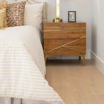
For those who prefer light-colored floors but do not wish for the consequent atmospheric coolness, Margot is the perfect solution: a light-colored floor that radiates an aura of warmth. In contrast to Sanzio and Burano, smooth and sophisticated Margot pursues a sense of unity, blurring the lines between floor planksboards. With its mellow texture and pleasantly bright ambience, Margot emanates an intoxicating impression of serene bliss.
 STUDIO TASHIMA
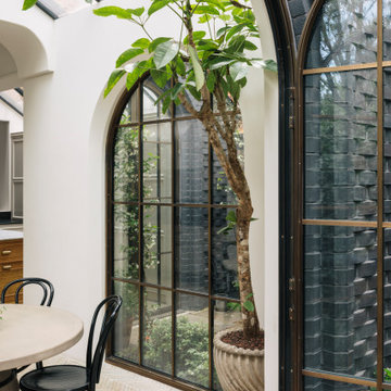
Keyes Road is a two-storey, semi-detached red brick house dating to around 1890-1910. The focus of our work was on the ground floor where we were asked to improve the layout and use of the main living areas of the house, for an active family of four. Important to the design was to maximise the quality and amount of light as well as connection to the garden and flow to the rest of the house.
Our proposal introduces three single storey extensions, comprising a central, large space that extends the main outrigger of the house. To each side are smaller volumes, affording a full width kitchen. While defining a series of discrete volumes, it was important for us to ensure that the kitchen, living, family and dining rooms that are interconnecting and continuous. The result is a big space punctuated by a series of differently sized arches, defining spaces to ensure their intimacy.
It was important for our client to have a sense of warmth and comfort - perhaps not dissimilar to the qualities of a hotel lobby. The colour scheme of the rooms are warm white painted plaster, natural wood flooring with black, bronze and brass accents. Indirect and carefully placed light fittings pulls together the atmosphere of the rooms - particularly in the evenings.
Externally, we felt it important to differentiate the extensions from the main house by using a dark, charcoal grey brick. This sets up a contrasting yet complimentary relationship to the rich red coloured brick house. The facets of the brick play with light and depth as do the graduated brick arches.
During the design process, we grappled with floor levels, the direction of sunlight, and care to not encroach on the neighbouring properties. As the house is in a conservation area, we worked closely with our trusted planning advisor. Throughout, we pursued a sensitive design strategy, using pitched roofs, matching materials and careful detailing. Internally, many of the original details are intact. This has enabled us to create an eclectic ensemble of elements, colours and materials varying in age and period.
 Better Builders
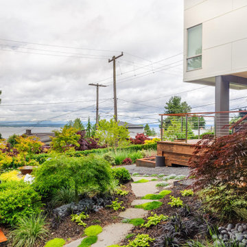
Completed in 2015, the Othello House was designed by PRDG Architecture + Design and built by Better Builders as a striking example of modern living in West Seattle. Though the homeowners chose not to pursue formal certification, the project was built to meet the rigorous standards of a Five-Star Built Green™ home.
From the ground up, sustainability and style were equally prioritized. The build preserved native vegetation, retained mature trees on-site, exceeded Washington State Energy Code requirements, and recycled over 70% of construction waste by weight. Recycled-content materials were thoughtfully incorporated throughout, reinforcing the home’s eco-conscious foundation.
Large windows on all sides flood the interiors with natural light, while the surrounding landscaping is designed to highlight lush greenery and native plantings. The result is a home that combines premium modern design with environmental responsibility—proving that sustainable construction can also deliver the ultimate in comfort and function.
 Sosna Inc
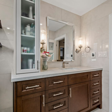
This project was a special one for us. We had the pleasure of working with a lovely retired couple in their early 70s who were returning clients! It's always a testament to our work when clients come back for more. This time, they were ready to tackle a full bathroom and basement renovation to truly make their Mississauga home a haven for their golden years. Before: Outdated and Cramped Both bathrooms were stuck in a time warp, sporting outdated fixtures and cramped layouts. Limited storage and bulky linen towers that blocked natural light added to the feeling of confinement. Downstairs, the basement was a sea of belongings with only one closet for storage. Peeling linoleum tiles and remnants of an acoustic ceiling definitely didn't create an inviting atmosphere. The Vision: Functionality, Light, and Style Our clients desired bathrooms that were both functional and stylish, with ample storage and a spa-like ambiance. In the basement, their dream was to create a space where they could relax, pursue hobbies, and entertain, all while keeping their belongings organized. The Transformation: Custom Solutions for a Perfect Fit
●Bathrooms: We banished the bulky linen towers and designed custom vanities withdrawers and shallow countertop towers to maximize storage without sacrificing light.Frameless glass shower enclosures added a modern touch and further enhanced thefeeling of spaciousness. Each bathroom, though similar in shape, boasts a distinctpersonality. The lower level bathroom has a contemporary spa-like feel with off-whitetextured tiles and a sleek white oak vanity, while the upper bathroom exudes elegancewith polished marble-look tiles, a richly stained oak vanity, and a luxurious showerbench.
●Basement: Forget basic drywall closets! We maximized the basement's potential withtwo large closets for storage, a custom media unit, and a clever cabinet designed tohouse the clients' roll-in sewing machine table and piano.
Challenges and Triumphs
During the renovation, we encountered some unexpected ductwork that threatened to interfere with a planned shower niche. Our team quickly adapted, shifting the niche and maximizing its width to maintain both functionality and design.
Life After Renovation: A New Chapter
The transformation is remarkable. The bathrooms are now bright, spacious, and functional oases. The basement has been reborn as a haven for relaxation and hobbies, with ample storage to keep everything organized. Our clients can now enjoy movie nights, play the piano, and indulge in their crafting passions in a space that truly reflects their lifestyle.
Memorable Moments
Working with these clients was an absolute joy. Their trust in our expertise, especially when it came to maximizing their basement's potential, was incredibly rewarding. Seeing their faces light up as they experienced their newly renovated spaces made all the effort worthwhile.
This project was a reminder that renovations are about more than just aesthetics. They're about creating spaces that enhance our clients' lives and allow them to embrace new possibilities. We're honored to have played a part in this couple's journey to a more comfortable, functional, and beautiful home.
 SV Design
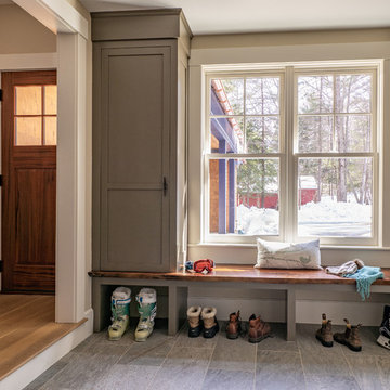
Nestled on the shore of New Hampshire’s Lake Winnipesaukee, is a family’s winter ski retreat. Contrary to the norm, this vacation home sees more use in the winter months than in the summer season. Breathtaking views of Mount Washington against a backdrop of shoreline dominate the scene; this vista was a driving force in the decision-making process. Doors and windows on the lakeside of the house were enlarged and expanded on to enhance the owners’ appreciation of their vantage point. The homeowners embraced, with a bit of convincing, a dark blue trim color for the exterior rather than the ubiquitous forest green common in the White Mountains. What began as a small renovation project morphed into a full renovation; the location warranted the upgrade. The client’s trust in the design team resulted in a home that is unique: contemporary while still offering the warmth and coziness of a winter retreat. The introduction of soft wood tones, a custom copper kitchen hood, and a warm muted color palate for interior trim and doors brings a coziness to the space without evoking a mountain ski lodge. The materials chosen further enhanced the natural elements of the site location: organic features include an antler chandelier, salvaged wood throughout for the mantel, ceilings, stair newels, and interior barn doors, and a live edge built-in bench in the mudroom.
Spaces were designed to encourage family interaction and togetherness. The importance of solitude was thoughtfully crafted into the architecture and interiors of the family’s vacation home. SV Design made sure there were spaces where individual family members can pursue their own interests: a dedicated craft space, a family office, and a kids’ loft area.
The redesign was forward thinking, to take the family into future phases in life, from the current teenage years through college years, and into the beyond of expanded family possibilities.
 Quarry View Building Group
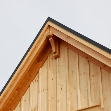
Our clients were debating between remodeling an existing structure and a new build. We showed them the value in a new structure and they ultimately decided to to pursue this route. The main goal was to create a structure that integrated with the rest of the property. To keep with the theme of the campus, we incorporated timber frame detailing and a traditional track & trolley on the sliding doors. We also used a metal roof since it was a better product that also fit with the theme. To finish the project, we used a copper style cupola.
17