
Search results for "Quick extender" in Home Design Ideas
 Klopf Architecture
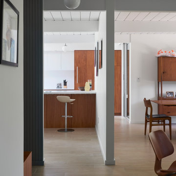
From Mid-Century Classic to the Present
An iconic design updated with comfort, function, and flow for today.
A Remodel That Balances Past and Present
What started as a desire to update a classic Eichler soon became an exploration of how Mid-Century Modern design can successfully evolve for today. The client, a tech professional with a passion for scuba diving and underwater photography, wanted a home that would both honor its original character and feel tailored to his daily life. A lifelong technology enthusiast, he still owns the very first Mac desktop he saved up for as a teenager working at Radio Shack, a detail that underscores his appreciation for design that melds function and form.
Honoring Separation While Expanding Possibility
Unlike many contemporary remodels where walls are opened up to create expansive living spaces, this project took a more restrained approach. The client valued the defined rooms of the original plan and wanted to preserve as much wall space as possible for displaying his large-format underwater photography. The emphasis was not on dramatic spatial reinvention, but on thoughtful refinements. Klopf Architecture shaped a gallery-like backdrop while also expanding the primary suite, modernizing materials and fixtures throughout the home, and improving the functionality and layout of the kitchen. The finished home feels at once timeless and renewed, an Eichler that continues to inspire while fully supporting the lifestyle of its present-day owner.
A major turning point came mid-design. The original project brief had not included an addition, but as the reconfiguration of the primary bedroom and bath unfolded, it became clear that an expansion was the best approach to achieve the client’s vision of a more spacious suite. Fortunately, the adjustment came at a stage when revisions were still manageable and was integrated seamlessly, showing how thoughtful course corrections can strengthen a project rather than hinder it.
Navigating Challenges With Precision
The design development included multiple conceptual rounds, balancing preservation with subtle expansion. During construction, an existing post previously thought to be load-bearing turned out not to be. The structural engineer was able to pivot quickly, and both the post and the cross beam that had been intended to replace it could be omitted, allowing the original rhythm of the Eichler beam bays to be preserved.
Sustainability was not just a checklist item, but a way to align the home with the client’s values of simplicity, efficiency, and long-term functionality. R-38 roof insulation reduced energy usage, solar panels with battery storage provided independence and resilience, and passive comfort strategies eliminated the need forenergy-intensive air conditioning. An electric vehicle charger and an on-demand hot water recirculation system (with call buttons as opposed to having constant circulation) add to the home’s long-term efficiency factors. Together, these moves created a home that is quieter, more comfortable, and better equipped for the future, qualities that supported the client’s pragmatic approach to design and living lightly.
Details That Respect the Eichler DNA
The remodel carries forward the Eichler’s original spirit while introducing new layers of modern livability. Originally, the house was approached along a deep, narrow walk, with the garage on one side and the house on the other, leaving the front door tucked far back within this chasm-like space. By pulling the entry forward, the design reshaped the arrival experience, creating a clearer threshold and a natural drop-off zone for bags, shoes, and keys. This shift also made room for a custom bench at the entry that extends seamlessly through the glass sidelight. The bench and drop-off zone now work together as a single, integrated sequence that supports everyday living while offering a tactile reminder of Eichler’s philosophy of connectedness.
At the client’s request, Klopf reintroduced a classic Eichler gesture by extending the exterior siding into the entry and living room. The detail reinforces a sense of indoor/outdoor continuity while providing a subtle architectural surface that allows the client’s photography to take visual precedence.
The signature concrete masonry wall at the front was reconstructed using blocks sourced to match the originals, now strengthened with rebar for seismic resilience while maintaining a private outdoor courtyard, visually extending the kitchen outward. A decorative trellis element, a detail borrowed from a neighboring Eichler, restores a familiar mid-century modern architectural motif. At the courtyard entry door, a custom etched glass sidelight with an ocean-themed design featuring kelp and jellyfish serves as a subtle homage to the client’s passion for deep-sea diving.
Landscaping became an integral part of the overall transformation. The homeowner engaged landscape architect Randi Johnsen of Third Nature Studio to shape a series of calm, inviting outdoor rooms that read as a natural extension of the interiors. While technically outside of the core construction scope, the landscape design proved central to achieving a sense of completeness and connectedness across the property. Such whole-property considerations often emerge as design ideas take shape, underscoring the importance of flexibility in planning and budgeting, as well as close collaboration among the design team starting early in the process.
The Value of Evolving Scope
As with many custom residential projects, the scope evolved during the design process. What began as a targeted remodel grew to include a new/expanded primary suite, a rebuilt CMU patio wall for strength and longevity, and a solar panel array and battery storage for energy resilience and carbon-reduction. Each thoughtful decision represented a conscious investment in the home’s performance and character, rather than a cost overrun.
The result was a project delivered on schedule, tailored precisely to the client’s lifestyle, and positioned to add long-term value both functionally and aesthetically. By embracing scope evolution as an opportunity rather than a challenge, and relying on good design paired with transparent communication, this remodel demonstrates how Eichler homes can be adapted for contemporary living without erasing their DNA.
Klopf Architecture project team: John Klopf, AIA, and Klara Kevane, Elise Webb and Nicholas LaNasa.
Contractor: Golden Cove Construction
Landscape Design: Third Nature Studio
Structural Engineer: Daniel Bastiao Design
Photography: ©2025 Mariko Reed
Year Completed: 2024
Location: Sunnyvale, CA

 Cascade West Development
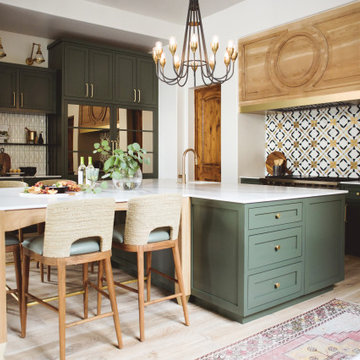
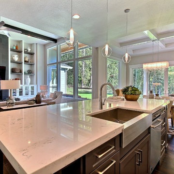
The Aerius - Modern Craftsman in Ridgefield Washington by Cascade West Development Inc.
Upon opening the 8ft tall door and entering the foyer an immediate display of light, color and energy is presented to us in the form of 13ft coffered ceilings, abundant natural lighting and an ornate glass chandelier. Beckoning across the hall an entrance to the Great Room is beset by the Master Suite, the Den, a central stairway to the Upper Level and a passageway to the 4-bay Garage and Guest Bedroom with attached bath. Advancement to the Great Room reveals massive, built-in vertical storage, a vast area for all manner of social interactions and a bountiful showcase of the forest scenery that allows the natural splendor of the outside in. The sleek corner-kitchen is composed with elevated countertops. These additional 4in create the perfect fit for our larger-than-life homeowner and make stooping and drooping a distant memory. The comfortable kitchen creates no spatial divide and easily transitions to the sun-drenched dining nook, complete with overhead coffered-beam ceiling. This trifecta of function, form and flow accommodates all shapes and sizes and allows any number of events to be hosted here. On the rare occasion more room is needed, the sliding glass doors can be opened allowing an out-pour of activity. Almost doubling the square-footage and extending the Great Room into the arboreous locale is sure to guarantee long nights out under the stars.
Cascade West Facebook: https://goo.gl/MCD2U1
Cascade West Website: https://goo.gl/XHm7Un
These photos, like many of ours, were taken by the good people of ExposioHDR - Portland, Or
Exposio Facebook: https://goo.gl/SpSvyo
Exposio Website: https://goo.gl/Cbm8Ya
Find the right local pro for your project
 Simply Home Decorating
This beautiful North Vancouver home belongs to a nature-loving and health-conscious couple, Emma and Vince (names changed), their two young children, and their dog, Jasper. When they contacted us about renovating and furnishing their kitchen and family room, we walked in and saw a world of potential waiting to be uncovered.
Before: Larkhall Crescent Home:
Like many original North Vancouver homes, the interior was definitely dated. We encountered late ‘80s finishes in powder pink and teal green, old carpet, and a kitchen that wasn’t maximized to suit this family’s modern-day lifestyle. However, the size of the rooms offered us a ton of space with which to get creative.
Knowing our clients’ love of cooking, need for work spaces (Emma and Vince both work remotely), and growing family, we developed a design concept that would increase usable space, optimize storage, and create intimacy in this large area. As for the style, we were inspired by their European roots, inventing a new and modern take on “Belgian Farmhouse” style. Now, the home is truly one-of-a-kind.
After: Warm & Cozy Family Room:
Fresh, bright, and comfortable, this living area has been transformed! We started with the fireplace as a focal point, selecting aged brick tiles for added texture and a crisp wood mantle. The taupe-coloured sectional infuses the room with visual warmth and serves the added purpose of separating the family room from the kitchen.
Emma and Vince were also keen on using non-toxic materials in their home, and we were happy to oblige. To meet their needs, we sourced natural wood elements and sought out Canadian-made products - that adhere to high health standards - whenever possible.
Look closer at the elements of this space, and you will find this stunning, honeycomb-patterned rug in earthy gold, beige, and charcoal tones. It’s plush to the touch and full of visual texture that brings this room’s colour palette together. We sourced these two-tone chairs with caning, petrified wood side table, black sconces, and botanical prints in greyscale from local artist, Heather Johnston.
We topped off the space with this dark wood and rattan console that offers storage facing the kitchen and presents an opportunity to display cherished items. The result is a cozy lounging space brimming with comfort and functionality. It’s perfect for enjoying quality family time, or Emma can simply slide the coffee table away to make room for her morning yoga practice.
Now, let’s turn around and give some attention to the kitchen. Do you remember what the original kitchen looked like? If not, scroll back up, because the transformation is shocking…
Moody & Welcoming Kitchen for Healthy Living:
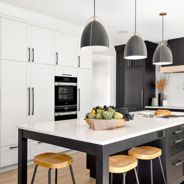
This kitchen looks very different from how it started, right? Though we didn’t touch any walls, the kitchen has almost doubled in usable space! We created a long, extended island with storage, an outlet for small appliances, and seating for comfortable prep, after-school snacking, or mingling among friends.
On the other side of the island, the family has even more storage and an integrated dishwasher within easy reach of the sink, perfect for quick clean-up. From this angle, you can also see the expansive custom Shaker cabinetry in white and the integrated double ovens. These facilitate their cooking experience and gave us the opportunity to add an additional surprise…
A coffee garage station and more hidden storage! Keeping these items located along the perimeter allows them to be accessed by the family or their guests without someone getting under the cook’s feet. These are the little details that make everyday life easier and more enjoyable.
Moving deeper into the kitchen, the seamless induction cooktop topped with a freestanding concealed hood fan commands attention in a soft yet prominent way. The natural wood accent mirrors the fireplace mantle, and the choice of off-black wood-grain cabinets not only continues our black-and-white colour palette but adds a sense of depth and contrast. The corner sink is located to the right and perfectly positioned with a view of their thriving backyard.
To invite more of this family’s character into the space, we mixed metals for interest — matte black, dark pewter, and warm brass — and created open shelves in white oak for their plants and decor. You can also glimpse the tumbled edge of the backsplash tile, which echoes the rustic brick of the fireplace. It adds that farmhouse charm while still feeling timeless and sophisticated.
Last but not least, we designed this dining banquette in the bay window (with integrated bench storage, of course), where the family can share a meal together, the kids can do homework, or Emma and Vince can work and enjoy a change of scenery from their offices. Like the other spaces in the home, it was designed to be beautiful, multi-functional, and long-lasting.
Praise from Our Clients:
It is clear that we love this home, but what did our clients have to say?
“Lori is a visionary and masters execution to the finest detail all at the same time. When she first met us to know more about who we are and how we live, she could right away envision how we could use the space in our kitchen and living room…The results exceeded our expectations.
Lori and her team were also a delight to work with — coordination with all the trades, fast problem-solving, regular updates, professional and friendly attitude of her entire team — made it the dream team. Thank you SHD for making our space so beautiful!”
In turn, we are so grateful for this family’s trust, their open communication, and for being wonderful people with whom to work. (So, thank you!)
 House of L
A 1927 colonial home in Shaker Heights, Ohio, received a breathtaking renovation that required extensive work, transforming it from a tucked away, utilitarian space, to an all-purpose gathering room, a role that most kitchens embrace in a home today. The scope of work changed over the course of the project, starting more minimalistically and then quickly becoming the main focus of the house's remodeling, resulting in a staircase being relocated and walls being torn down to create an inviting focal point to the home where family and friends could connect. The focus of the functionality was to allow for multiple prep areas with the inclusion of two islands and sinks, two eating areas (one for impromptu snacking and small meals of younger family members and friends on island no. two and a built-in bench seat for everyday meals in the immediate family). The kitchen was equipped with all Subzero and Wolf appliances, including a 48" range top with a 12" griddle, two double ovens, a 42" built-in side by side refrigerator and freezer, a microwave drawer on island no. one and a beverage center and icemaker in island no. two. The aesthetic feeling embraces the architectural feel of the home while adding a modern sensibility with the revamped layout and graphic elements that tie the color palette of whites, chocolate and charcoal. The cabinets were custom made and outfitted with beaded inset doors with a Shaker panel frame and finished in Benjamin Moore's OC-17 White Dove, a soft white that allowed for the kitchen to feel warm while still maintaining its brightness. Accents of walnut were added to create a sense of warmth, including a custom premium grade walnut countertop on island no. one from Brooks Custom and a TV cabinet with a doggie feeding station beneath. Bringing the cabinet line to the 8'6" ceiling height helps the room feel taller and bold light fixtures at the islands and eating area add detail to an otherwise simpler ceiling detail. The 1 1/4" countertops feature Calacatta Gold Marble with an ogee edge detail. Special touches on the interiors include secret storage panels, an appliance garage, breadbox, pull-out drawers behind the cabinet doors and all soft-close hinges and drawer glides. A kneading area was made as a part of island no. one for the homeowners' love of baking, complete with a stone top allowing for dough to stay cool. Baskets beneath store kitchen essentials that need air circulation. The room adjacent to the kitchen was converted to a hearth room (from a formal dining room) to extend the kitchen's living space and allow for a natural spillover for family and guests to spill into.
Jason Miller, Pixelate

 Jarrett Design
Upon meeting the homeowners of this Nazareth remodel, we quickly realized this was not their first rodeo when it came to kitchen renovations. The project started with a very orange oak kitchen with an awkward layout that did not work for their family. The new u-shaped layout keeps everything needed for preparing daily meals within arms reach, while a central island serves as a landing space and buffet for family gatherings. Undercabinet lighting highlights the gorgeous Fireclay Tile backsplash and Bianco Rafaele marble, while Kichler pendants illuminate the island. The wall was extended at the end of the sink run to allow us to create a small office nook, perfect for typing a quick email or looking up a recipe, and an adjacent bar area allows guests to concoct their own drinks, away from the food prep. Matt Villano Photography
 Elizabeth Taich Design
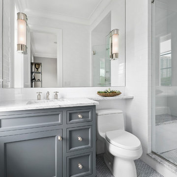
Elizabeth Taich Design is a Chicago-based full-service interior architecture and design firm that specializes in sophisticated yet livable environments.
IC360


 RJ Austin Interior Design
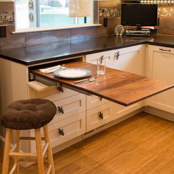
This pull out table provides a quick breakfast area when there is no room for a standard table.
JBL Photography
Example of a small eclectic u-shaped bamboo floor enclosed kitchen design in San Francisco with a farmhouse sink, shaker cabinets, beige cabinets, glass tile backsplash, stainless steel appliances and no island
Example of a small eclectic u-shaped bamboo floor enclosed kitchen design in San Francisco with a farmhouse sink, shaker cabinets, beige cabinets, glass tile backsplash, stainless steel appliances and no island
 Advance Design Studio, Ltd.
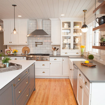
When this suburban family decided to renovate their kitchen, they knew that they wanted a little more space. Advance Design worked together with the homeowner to design a kitchen that would work for a large family who loved to gather regularly and always ended up in the kitchen! So the project began with extending out an exterior wall to accommodate a larger island and more moving-around space between the island and the perimeter cabinetry.
Style was important to the cook, who began collecting accessories and photos of the look she loved for months prior to the project design. She was drawn to the brightness of whites and grays, and the design accentuated this color palette brilliantly with the incorporation of a warm shade of brown woods that originated from a dining room table that was a family favorite. Classic gray and white cabinetry from Dura Supreme hits the mark creating a perfect balance between bright and subdued. Hints of gray appear in the bead board detail peeking just behind glass doors, and in the application of the handsome floating wood shelves between cabinets. White subway tile is made extra interesting with the application of dark gray grout lines causing it to be a subtle but noticeable detail worthy of attention.
Suede quartz Silestone graces the countertops with a soft matte hint of color that contrasts nicely with the presence of white painted cabinetry finished smartly with the brightness of a milky white farm sink. Old melds nicely with new, as antique bronze accents are sprinkled throughout hardware and fixtures, and work together unassumingly with the sleekness of stainless steel appliances.
The grace and timelessness of this sparkling new kitchen maintains the charm and character of a space that has seen generations past. And now this family will enjoy this new space for many more generations to come in the future with the help of the team at Advance Design Studio.
Dura Supreme Cabinetry
Photographer: Joe Nowak
 TKS Design Group
Download our free ebook, Creating the Ideal Kitchen. DOWNLOAD NOW
A tired primary bathroom, with varying ceiling heights and a beige-on-beige color scheme, was screaming for love. Squaring the room and adding natural materials erased the memory of the lack luster space and converted it to a bright and welcoming spa oasis. The home was a new build in 2005 and it looked like all the builder’s material choices remained. The client was clear on their design direction but were challenged by the differing ceiling heights and were looking to hire a design-build firm that could resolve that issue.
This local Glen Ellyn couple found us on Instagram (@kitchenstudioge, follow us ?). They loved our designs and felt like we fit their style. They requested a full primary bath renovation to include a large shower, soaking tub, double vanity with storage options, and heated floors. The wife also really wanted a separate make-up vanity. The biggest challenge presented to us was to architecturally marry the various ceiling heights and deliver a streamlined design.
The existing layout worked well for the couple, so we kept everything in place, except we enlarged the shower and replaced the built-in tub with a lovely free-standing model. We also added a sitting make-up vanity. We were able to eliminate the awkward ceiling lines by extending all the walls to the highest level. Then, to accommodate the sprinklers and HVAC, lowered the ceiling height over the entrance and shower area which then opens to the 2-story vanity and tub area. Very dramatic!
This high-end home deserved high-end fixtures. The homeowners also quickly realized they loved the look of natural marble and wanted to use as much of it as possible in their new bath. They chose a marble slab from the stone yard for the countertops and back splash, and we found complimentary marble tile for the shower. The homeowners also liked the idea of mixing metals in their new posh bathroom and loved the look of black, gold, and chrome.
Although our clients were very clear on their style, they were having a difficult time pulling it all together and envisioning the final product. As interior designers it is our job to translate and elevate our clients’ ideas into a deliverable design. We presented the homeowners with mood boards and 3D renderings of our modern, clean, white marble design. Since the color scheme was relatively neutral, at the homeowner’s request, we decided to add of interest with the patterns and shapes in the room.
We were first inspired by the shower floor tile with its circular/linear motif. We designed the cabinetry, floor and wall tiles, mirrors, cabinet pulls, and wainscoting to have a square or rectangular shape, and then to create interest we added perfectly placed circles to contrast with the rectangular shapes. The globe shaped chandelier against the square wall trim is a delightful yet subtle juxtaposition.
The clients were overjoyed with our interpretation of their vision and impressed with the level of detail we brought to the project. It’s one thing to know how you want a space to look, but it takes a special set of skills to create the design and see it thorough to implementation. Could hiring The Kitchen Studio be the first step to making your home dreams come to life?


 Christie Hausmann Design
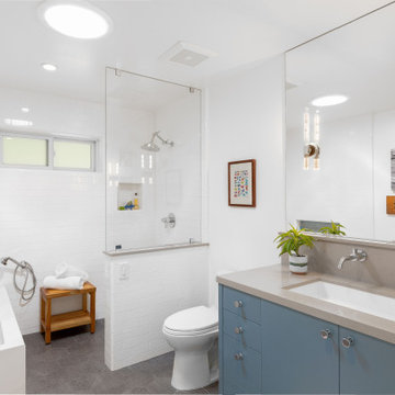
Example of a large transitional kids' white tile and ceramic tile ceramic tile and gray floor bathroom design in Other with flat-panel cabinets, blue cabinets, a two-piece toilet, white walls, a drop-in sink, quartz countertops and gray countertops
 Herrick Design Group
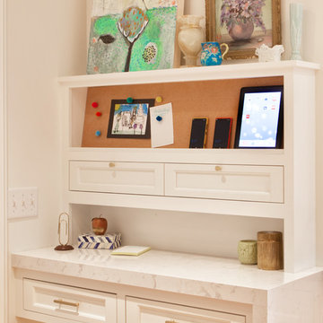
This custom charging station and communication desk was Knick-named, Grand Central Station. The cork back allows for notes to family members, lists and also charging, the cords are run into the space below through ‘mouse holes’. The desk is stand-up height and has a couple drawers for pens, paper, etc. the floor was left open for dog food bowls, tucked safely out of traffic. We also waterfalled the countertop down the side to reflect the same on the island, and provide cover for the dog bowls.
The top shelf was ideal for housing children’s art work and a portion of her collected and favorite finds.
 Nar Design Group
A combination of quarter sawn white oak material with kerf cuts creates harmony between the cabinets and the warm, modern architecture of the home. We mirrored the waterfall of the island to the base cabinets on the range wall. This project was unique because the client wanted the same kitchen layout as their previous home but updated with modern lines to fit the architecture. Floating shelves were swapped out for an open tile wall, and we added a double access countertwall cabinet to the right of the range for additional storage. This cabinet has hidden front access storage using an intentionally placed kerf cut and modern handleless design. The kerf cut material at the knee space of the island is extended to the sides, emphasizing a sense of depth. The palette is neutral with warm woods, dark stain, light surfaces, and the pearlescent tone of the backsplash; giving the client’s art collection a beautiful neutral backdrop to be celebrated.
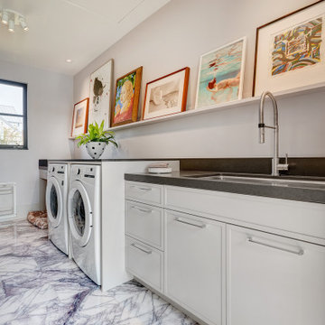
For the laundry we chose a micro shaker style cabinet door for a clean, transitional design. A folding surface over the washer and dryer as well as an intentional space for a dog bed create a space as functional as it is lovely. The color of the wall picks up on the tones of the beautiful marble tile floor and an art wall finishes out the space.
In the master bath warm taupe tones of the wall tile play off the warm tones of the textured laminate cabinets. A tiled base supports the vanity creating a floating feel while also providing accessibility as well as ease of cleaning.
An entry coat closet designed to feel like a furniture piece in the entry flows harmoniously with the warm taupe finishes of the brick on the exterior of the home. We also brought the kerf cut of the kitchen in and used a modern handleless design.
The mudroom provides storage for coats with clothing rods as well as open cubbies for a quick and easy space to drop shoes. Warm taupe was brought in from the entry and paired with the micro shaker of the laundry.
In the guest bath we combined the kerf cut of the kitchen and entry in a stained maple to play off the tones of the shower tile and dynamic Patagonia granite countertops.
 dSPACE Studio Architecture
Tony Soluri Photography
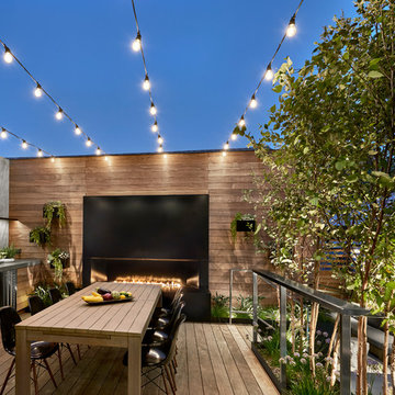
Example of a trendy backyard deck design in Chicago with a bbq area
Example of a trendy backyard deck design in Chicago with a bbq area
 Flavin Architects
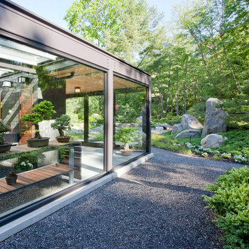
Modern glass house set in the landscape evokes a midcentury vibe. A modern gas fireplace divides the living area with a polished concrete floor from the greenhouse with a gravel floor. The frame is painted steel with aluminum sliding glass door. The front features a green roof with native grasses and the rear is covered with a glass roof.
Photo by: Peter Vanderwarker Photography
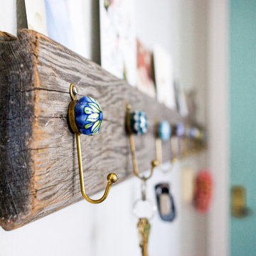
 Hoi Ning Wong
Photo: Hoi Ning Wong © 2014 Houzz
Home design - transitional home design idea in San Francisco
Home design - transitional home design idea in San Francisco
 Jameson Design Group
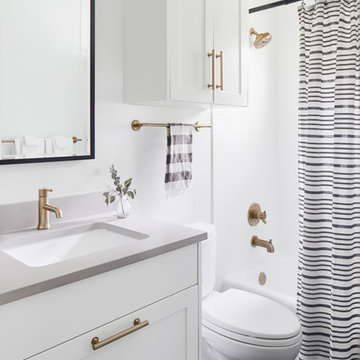
Re-using all existing locations, we were able to completely transform this hall bathroom. The new design is clean, modern, and minimal, with white walls & cabinets, mixed metal finishes and blue penny tiles. This room proves that simple can be impactful and
beautiful.
 Knock Architecture and Design
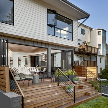
Inspiration for a mid-sized mid-century modern backyard deck container garden remodel in San Francisco with no cover
11