
Search results for "Quick thinking" in Home Design Ideas
 User
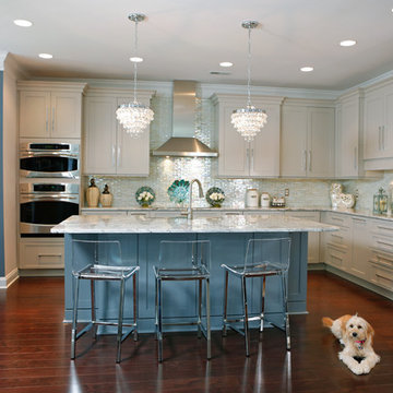
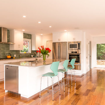
UserWhen a visual artist purchases a mass production home in one of Wilmington, NC’s developing neighborhoods, she quickly realizes that the builder’s standard house plans and amenity options lack the personality she craved. A chance visit to the Kitchen & Bath Design Studio showroom proves to be ‘love at first sight’ when a designer listens to the artist’s needs and immediately produces a tile sample that matches the artist’s vision. Can our designer achieve the client’s vision while respecting the production builder’s restrictions and architectural plans? Of course she can!
To satisfy the client’s wish list, the kitchen design required a larger island, more counter space, and semi-custom cabinetry. The client settled on Brazilian cherry-style flooring, her favorite of the builder-approved upgrades for flooring. Iridescent glass mosaic tile and multiple chandelier pendants brought in the “bling factor” at the top of the client’s list—she has penchant for “bright, shiny objects” and wanted her kitchen to reflect a Farmhouse Chic or Rustic Glam aesthetic. Left to her own devices, the client would have veered toward a more liberal, Liberace-esque application of bling, so the designer introduced a neutral color palette and warm, polished nickel finishes as a counterbalance to all of that sparkle and shine.
Working within the builder’s constraints, the designer made changes to the kitchen’s layout to increase island workspace and nearly double countertop space. The client had to go with an entry-level builder-approved refrigerator available in only one fridge counter depth size. So the designer moved the pantry location, situating it behind the refrigerator and then recessed the refrigerator into the pantry to cheat the counter depth needed to flow seamlessly with the semi-custom cabinetry line. She also maximized drawers and upper cabinets to increase storage space, but did not take the upper cabinets to the ceiling to respect the home’s half crown molding details.
Chris Davis Photography
 Gardner/Fox Associates, Inc
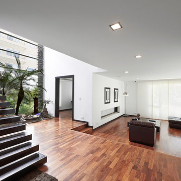
The kitchen & living room swapped spaces during the renovation & the fireplace was entirely removed in the interest of maximizing floor space. The reconfiguration gave the kitchen much needed breathing room & also accommodated a cozy dining nook. In the renovated family room, a new gas fireplace is flanked by built in bookcases that maximize functional storage and modern style.
 Innovation Design And Construction Inc.
Linoleum flooring is one of the only environmentally friendly flooring types.
Trendy living room photo in Los Angeles
Trendy living room photo in Los Angeles
Find the right local pro for your project
 Custom Surface Solutions
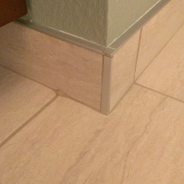
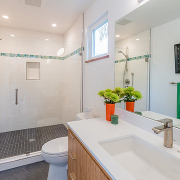
Custom Surface Solutions (www.css-tile.com) - Owner Craig Thompson (512) 430-1215. This project shows new 12 x 24 tile installed vertically with offset layout pattern on wall and floor. Includes shower box with linear glass accent tile back and vertical glass accent band. Tile edges are finished with Schluter Jolly satin aluminum profile edge trim.
 Costa Bella Builders
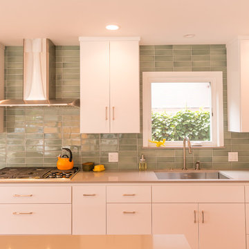
Our client was a family with younger children that came to us through the recommendations of former customers. Their existing house had been remodeled by them 10 years earlier and was well-suited to the married couple. With the addition of two younger children, they realized that the house just didn’t function very well for their family. Fortunately, the husband and wife took their time thinking about what they wanted, and by the time they met with us, had their needs well laid out. We brought in local Architect, James Stroupe, and recommended him to the client as a collaborative professional who could help us achieve their goals. This proved to be the case. Jim quickly produced design drawings for them within six weeks that clearly reflected all of the client’s needs and preferences while at the same time dramatically re-creating the home in a beautiful contemporary design.
The new home required a complete reconstruction of the existing house that left only one bathroom unaltered. New square footage was added at the lower level to expand and reconfigure the living area, while an entirely new upstairs wing was constructed to create space for a new master suite with views out toward the ocean. The entire roof was rebuilt, all new windows and interior doors were added and the full exterior received a new modern looking stucco finish. Stainless steel cable railings were added to the decks to create an updated look, and fine hardwood accents were used to pull the design together.
Our efforts produced a new three bedroom, three bath home with a large and inviting ground floor patio area, wide open living areas on the first floor with new kitchen, bathroom and dining room. The photographs in this section show the striking results- clean lines, dramatic architectural touches, and light, open and airy interior spaces. Our client was very pleased with the results.
 Jeffrey Design LLC
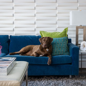
Example of a large trendy formal and open concept dark wood floor living room design in Dallas with multicolored walls, a standard fireplace, a tile fireplace and no tv
 Katie Hutchison Studio
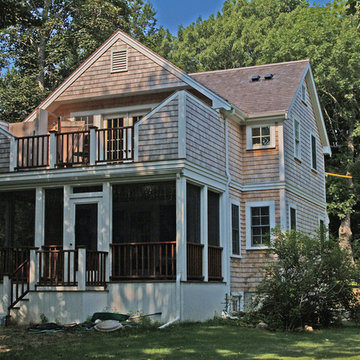
With two small children and a third on the way, the owners of an original eighteenth century Cape were quickly out-growing it, but they had no desire to move away from the Cape Cod home and location they loved. They simply needed a reconfigured layout and more space. Their goals included repurposing some existing rooms, adding a new kitchen/family area plus screen porch on the first level, and creating a master suite and roof deck with an outdoor shower on the second level, connected by a new stair.
Our challenge was to improve the flow between existing spaces, and design the two-story addition without overwhelming the pint-sized original Cape. We took advantage of the lower grade at the rear of the property to step the first floor of the addition down two steps from the existing main level. This allowed us to align the second floor in the addition with the existing second floor, while gaining ceiling height in the new first-floor kitchen/family area. We composed a cross-gabled form for the addition to improve the second floor headroom, while maintaining the existing eave line. We then extended some existing shed dormers to gain headroom and enhance function. We also expanded the outdoor living area with privacy walls along the roof deck.
New, larger, double–hung windows that match the lite configuration of the existing windows, along with new side-wall shingles and trim which resemble the existing exterior treatment help to tie the new addition to the old Cape. Though there’s no mistaking the new for the old, the two are simpatico.
Katie Hutchison Studio collaborated with Geoffrey Koper Architect of Yarmouth Port, Mass. on the Yarmouth Port Antique Cape Renovation and Addition. Kitchen fit-out and interior finishes, fixtures, and furnishings by others.
photo by Katie Hutchison


 Advance Design Studio, Ltd.
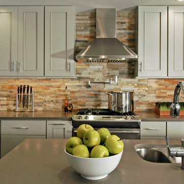
After six years of living in their Huntley IL home, Chris and Meghan were tired of their dark, dingy, outdated kitchen and it was finally time for a long-anticipated change. “The kitchen is the place where we live, it’s where we do everything,” Meghan said. “It was important that it be a space where we wanted to be.” Meghan loves cooking and enjoys including their girls in healthy meal prepping, this led them to want a brighter, more enjoyable kitchen with increased functionality and improved storage.
For Chris especially, the laundry room was an entirely dysfunctional eyesore. “We had a washer and a dryer, but it was all kind-of cobbled together!” Chris said. “There were always laundry piles everywhere, we weren’t really sure what we wanted to do in there, but it was time for us to make a change.” The mess of the space was stressful every time they walked in the door from the garage each day. Kids’ backpacks and shoes piled up haphazardly in the makeshift boot-bench closet left the family feeling disorganized and stressed. They needed space for folding clothes and locker cubbies to help keep the family organized.
Having known Christine and Todd in the Huntley community for years, Chris and Meghan were familiar with their work. “We already trusted them personally and having seen their projects for years we knew they did top notch work. After we reviewed the initial round of designs, we knew that hiring them was definitely the right choice,” Meghan and Chris said. Although Chris had done a lot of work in their home himself, the kitchen and laundry room renovation was such a large undertaking that he didn’t want to steal time away from his family to spend what would surely be many long weekends doing the job himself. “That would not have been a wise choice for us,” Chris laughed.
“Our designer, Michelle was very, very, easy to work with; anything we wanted to see or weren’t sure about, she went above and beyond to make this easy for us. She was easy to get hold of and always quick to respond,” the couple said. Michelle pulled ideas that mirrored the couple’s taste and style and was adept at directing the couple to limited choices that didn’t overwhelm them and kept the process moving. “I have a hard time making decisions. Michelle made the decision-making process so easy. I loved how she listened to what I liked and then presented three great options for me to choose from,” Meghan said.
The main objectives for the kitchen were better storage solutions, they wanted the space to reflect their lifestyle and taste, and they wanted it to last for years with low maintenance. One of the first steps in creating a more functional kitchen was relocating the refrigerator, creating an improved workflow for the busy family.
“We didn’t know that we could even move the refrigerator to a new location where it is now, that was something that we never would have thought of,” Chris said. “The new refrigerator location makes the kitchen feel so much bigger. We didn’t add any space, but our whole kitchen with the new design just seems like it’s so much larger than before!” Meghan said.
The perimeter mist colored cabinets helped warm and brighten the entire room, while the graphite colored cabinets on the island added contrast. Using this fresh, clean color palette satisfied the couple’s desire for a bright space that was the exact opposite of what they had before. Organization accessories were also added to the cabinets such as a spice drawer tray and roll outs to create hidden convenience.
“I absolutely love the hidden spices – it makes cooking so much more enjoyable!” Chris said. “And all the pull outs, and the double trash bin, who would think you could get so excited about organization!” the couple said in unison.
One thing they hated in their original kitchen was how dark the space felt. Added lighting on the ceiling with the new light fixtures combined with the lighter cabinetry colors throughout solved this problem. “Our new kitchen has this warm, almost cozy feeling that our old kitchen never had, it’s just a space that I love spending my time in now,” Meghan said. The light airy feeling was accentuated with the use of floating white shelves on either side of the decorative range hood. “We have so much cabinetry space, the new design is amazing we actually have more storage space than we will ever need,” Meghan said.
The island was extended to create more work surface and added space for stool seating. “The new island changes how we live. Now the kids can be in the kitchen with us, doing homework, eating breakfast, and the three of us have special dinners there when Chris is working late,” Meghan said.
The Carrara Marmi Quartz countertops were chosen because they are, not only beautiful, but are made from hard-working material that doesn’t require maintenance. The white subway tile backsplash that wraps to the ceiling behind the focal point cooktop range/hood compliments the crisp white countertops perfectly, while brushed brass hardware and light fixtures keep the design fresh and new.
The couple had a few fears at the beginning of the project, as most homeowners do. Their biggest fear was being out of their kitchen and laundry room for an extended time. The crew made it very easy for the family to work in a limited space keeping the washer and dryer hooked up the majority of the time, and also getting appliances working with minimal downtime.
“They above and beyond accommodated us to get us through the process,” Meghan said. “They did a great job making sure we were as comfortable as possible throughout the process,” Chris added.
“Our project manager DJ did a great job. He was very good at updating us on schedule changes, getting guys in as quickly as possible. Everyone that stepped in the house was nice and did great work,” said Chris. They thought Advance’s carpenter was phenomenal and were impressed when he took a conceptual idea from a photograph and worked with designer Michelle to create a one of a kind range/hood that has become the topic of conversation with friends and family who visit the new kitchen. “He was in our house literally every day for several weeks. He was easy to work with and good at what he did,” Meghan and Chris said.
The focal point of the kitchen; a hand-crafted, custom-built ventilation hood was clad with handpicked reclaimed barnwood. Advance Design’s carpenter built the framework and the cladding to create a one-of-a-kind design element that the couple loves.
“I think it was especially fun for him to create something unique from scratch, showcasing his talent in this area,” Meghan said. “I love that my kitchen is not like everyone else’s. I got to pick out the wood on my hood and watch it being built and was able to choose what pieces of wood went where on it. It’s totally unique.”
Red Oak flooring was toothed-in throughout the kitchen and the rest of the first floor anywhere changes were made. Then the whole floor was refinished to tone down the orange undertones in the existing floor stain, ultimately changing the color complexion of the entire first floor. The result is a completely new feeling to the entire home.
Renovating the laundry room was extremely important to Meghan and Chris, but they had trouble visualizing what the possibilities were for the seemingly small space. Michelle produced beautiful 3D illustrations that helped them envision the space in a whole new way.
“I must have told Michelle 100 times that I am a visual person, seeing the designs in 3D made it so easy to make decisions and see what we could really do with our space,” Meghan said.
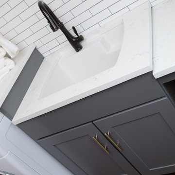
A dividing wall and doorway were removed between the existing laundry room and hallway formerly containing a coat closet, providing space to design specialized graphite colored cabinetry matching the kitchen island to house custom storage cubbies for each family member. Adding the tall utility cabinetry in the new laundry area helped solve the storage issue, tucking away cleaning supplies, household items, and even the cat got its own cubby.
“I love how everything is now hidden in its own space. I can’t tell you how much I hated coming home and seeing everything sitting around on counters,” Chris said.
Electrical outlets were planned for the inside of utility cabinets, so devices could charge in hidden locations. Stacking the washer and dryer allowed for wider countertop space to provide a folding area and a special space for clothes to hang. “The way I do laundry has been completely transformed! I can actually fold clothes and hang them now right out of the washer and dryer,” Meghan said.
“The end result in the kitchen and the laundry/mud room was an updated light and bright space, with a smarter work flow that better meets the needs of this family,” Michelle said.
“I would totally recommend Advance Design,” Meghan said. “Sometimes I sit and just look at my kitchen and laundry room and think ‘Wow, I can’t believe I get to live here!’ It’s an understatement to say we love our new space.”
 Costa Bella Builders
Our client was a family with younger children that came to us through the recommendations of former customers. Their existing house had been remodeled by them 10 years earlier and was well-suited to the married couple. With the addition of two younger children, they realized that the house just didn’t function very well for their family. Fortunately, the husband and wife took their time thinking about what they wanted, and by the time they met with us, had their needs well laid out. We brought in local Architect, James Stroupe, and recommended him to the client as a collaborative professional who could help us achieve their goals. This proved to be the case. Jim quickly produced design drawings for them within six weeks that clearly reflected all of the client’s needs and preferences while at the same time dramatically re-creating the home in a beautiful contemporary design.
The new home required a complete reconstruction of the existing house that left only one bathroom unaltered. New square footage was added at the lower level to expand and reconfigure the living area, while an entirely new upstairs wing was constructed to create space for a new master suite with views out toward the ocean. The entire roof was rebuilt, all new windows and interior doors were added and the full exterior received a new modern looking stucco finish. Stainless steel cable railings were added to the decks to create an updated look, and fine hardwood accents were used to pull the design together.
Our efforts produced a new three bedroom, three bath home with a large and inviting ground floor patio area, wide open living areas on the first floor with new kitchen, bathroom and dining room. The photographs in this section show the striking results- clean lines, dramatic architectural touches, and light, open and airy interior spaces. Our client was very pleased with the results.
 Rodwin Architecture & Skycastle Construction
Rodwin Architecture & Skycastle Homes
Location: Boulder, CO, United States
The homeowner wanted something bold and unique for his home. He asked that it be warm in its material palette, strongly connected to its site and deep green in its performance. This 3,000 sf. modern home’s design reflects a carefully crafted balance between capturing mountain views and passive solar design. On the ground floor, interior Travertine tile radiant heated floors flow out through broad sliding doors to the white concrete patio and then dissolves into the landscape. A built-in BBQ and gas fire pit create an outdoor room. The ground floor has a sunny, simple open concept floor plan that joins all the public social spaces and creates a gracious indoor/outdoor flow. The sleek kitchen has an urban cultivator (for fresh veggies) and a quick connection to the raised bed garden and small fruit tree orchard outside.
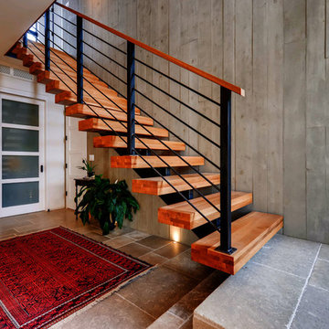
Follow the floating staircase up the board-formed concrete tile wall. At the landing your view continues out over a “live roof”. The second floor’s 14ft tall ceilings open to giant views of the Flatirons and towering trees. Clerestory windows allow in high light, and create a floating roof effect as the Doug Fir ceiling continues out to form the large eaves; we protected the house’s large windows from overheating by creating an enormous cantilevered hat. The upper floor has a bedroom on each end and is centered around the spacious family room, where music is the main activity. The family room has a nook for a mini-home office featuring a floating wood desk. Forming one wall of the family room, a custom-designed pair of laser-cut barn doors inspired by a forest of trees opens to an 18th century Chinese day-bed. The bathrooms sport hand-made glass mosaic tiles; the daughter’s shower is designed to resemble a waterfall. This near-Net-Zero Energy home achieved LEED Gold certification. It has 10kWh of solar panels discretely tucked onto the roof, a ground source heat pump & boiler, foam insulation, an ERV, Energy Star windows and appliances, all LED lights and water conserving plumbing fixtures. Built by Skycastle Construction.
 Custom Wallcovering with Leo
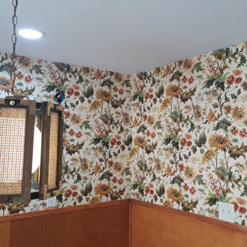
"Guest Room Wallpaper Installation in Coral Springs, FL – Create a Lasting Impression"
Transform your guest room into a welcoming retreat with luxury wallpaper installation that combines comfort and style. As Coral Springs' premier wallpaper installation specialist, I create spaces that make visitors feel pampered while standing up to frequent use.
Why Wallpaper Your Guest Room?
✔ Designer Looks – From tropical motifs to modern metallic finishes
✔ Durable Surfaces – Scratch-resistant materials for luggage and high traffic
✔ Temperature-Stable – Florida-humidity approved adhesives and materials
✔ Quick Transformations – Complete before your next guests arrive
✔ Airbnb Ready – Instagram-worthy accent walls that get 5-star reviews
Our Coral Springs Process:
✅ Complimentary Design Consultation – Virtual or in-home options
✅ Climate-Adapted Materials – Specialized for South Florida homes
✅ Precision Installation – Flawless pattern matching on all walls
✅ 1-2 Day Completion – Minimal disruption to your household
Most Popular Guest Room Styles:
• Florida Coastal – Nautical stripes and seashell textures
• Modern Resort – Palm leaf patterns and spa-like neutrals
• Boutique Hotel – Custom mural feature walls
• Tropical Glam – Metallic botanicals and lush greenery designs
Premium Features:
Fade-Resistant – Maintains vibrancy in sunny rooms
Easy Refresh – Simple to update between guest stays
Sound-Dampening – Some textures help reduce noise transfer
Serving All Coral Springs Areas: Including Wyndham Lakes, Forest Hills, and Ramblewood.
"Your guests will think they're at a five-star resort!"
 TKS Design Group
Download our free ebook, Creating the Ideal Kitchen. DOWNLOAD NOW
Lakefront property in the northwest suburbs of Chicago is hard to come by, so when we were hired by this young family with exactly that, we were immediately inspired by not just the unusually large footprint of this 1950’s colonial revival but also the lovely views of the manmade lake it was sited on. The large 5-bedroom home was solidly stuck in the 1980’s, but we saw tons of potential. We started out by updating the existing staircase with a fresh coat of paint and adding new herringbone slate to the entry hall.
The powder room off the entryway also got a refresh - new flooring, new cabinets and fixtures. We ran the new slate right through into this space for some consistency. A fun wallpaper and shiplap trim add a welcoming feel and set the tone for the home.
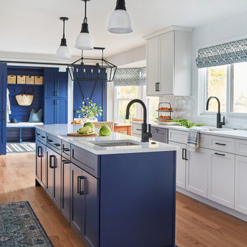
Next, we tackled the kitchen. Located away from the rest of the first floor, the kitchen felt a little isolated, so we immediately began planning for how to better connect it to the rest of the first floor. We landed on removing the wall between the kitchen and dining room and designed a modified galley style space with separate cooking and clean up zones. The cooking zone consists of the refrigerator, prep sink and cooktop, along with a nice long run of prep space at the island. The cleanup side of the kitchen consists of the main sink and dishwasher. Both areas are situated so that the user can view the lake during prep work and cleanup!
One of the home’s main puzzles was how to incorporate the mudroom and area in front of the patio doors at the back of the house. We already had a breakfast table area, so the space by the patio doors was a bit of a no man’s land. We decided to separate the kitchen proper from what became the new mudroom with a large set of barn doors. That way you can quickly hide any mudroom messes but have easy access to the light coming in through the patio doors as well as the outdoor grilling station. We also love the impact the barn doors add to the overall space.
The homeowners’ first words to us were “it’s time to ditch the brown,” so we did! We chose a lovely blue pallet that reflects the home’s location on the lake which is also vibrant yet easy on the eye. Countertops are white quartz, and the natural oak floor works well with the other honey accents. The breakfast table was given a refresh with new chairs, chandelier and window treatments that frame the gorgeous views of the lake out the back.
We coordinated the slate mudroom flooring with that used in the home’s main entrance for a consistent feel. The storage area consists of open and closed storage to allow for some clutter control as needed.
Next on our “to do” list was revamping the dated brown bar area in the neighboring dining room. We eliminated the clutter by adding some closed cabinets and did some easy updates to help the space feel more current. One snag we ran into here was the discovery of a beam above the existing open shelving that had to be modified with a smaller structural beam to allow for our new design to work. This was an unexpected surprise, but in the end we think it was well worth it!
We kept the colors here a bit more muted to blend with the homeowner’s existing furnishings. Open shelving and polished nickel hardware add some simple detail to the new entertainment zone which also looks out onto the lake!
Next we tackled the upstairs starting with the homeowner’s son’s bath. The bath originally had both a tub shower and a separate shower, so we decided to swap out the shower for a new laundry area. This freed up some space downstairs in what used to be the mudroom/laundry room and is much more convenient for daily laundry needs.
We continued the blue palette here with navy cabinetry and the navy tile in the shower. Porcelain floor tile and chrome fixtures keep maintenance to a minimum while matte black mirrors and lighting add some depth the design. A low maintenance runner adds some warmth underfoot and ties the whole space together.
We added a pocket door to the bathroom to minimize interference with the door swings. The left door of the laundry closet is on a 180 degree hinge to allow for easy full access to the machines. Next we tackled the master bath which is an en suite arrangement. The original was typical of the 1980’s with the vanity outside of the bathroom, situated near the master closet. And the brown theme continued here with multiple shades of brown.
Our first move was to segment off the bath and the closet from the master bedroom. We created a short hall from the bedroom to the bathroom with his and hers walk-in closets on the left and right as well as a separate toilet closet outside of the main bathroom for privacy and flexibility.
The original bathroom had a giant soaking tub with steps (dangerous!) as well as a small shower that did not work well for our homeowner who is 6’3”. With other bathtubs in the home, they decided to eliminate the tub and create an oversized shower which takes up the space where the old tub was located. The double vanity is on the opposite wall and a bench is located under the window for morning conversations and a place to set a couple of towels.
The pallet in here is light and airy with a mix of blond wood, creamy porcelain and marble tile, and brass accents. A simple roman shade adds some texture and it’s top-down mechanism allows for light and privacy.
This large whole house remodel gave our homeowners not only the ability to maximize the potential of their home but also created a lovely new frame from which to view their fabulous lake views.
Designed by: Susan Klimala, CKD, CBD
Photography by: Michael Kaskel
For more information on kitchen and bath design ideas go to: www.kitchenstudio-ge.com
 Jessie's Home
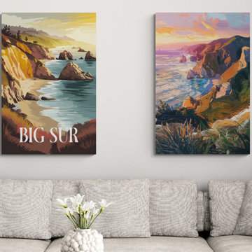
Boring walls? Not on our watch! At Jessie’s Home, we turn blank spaces into breathtaking scenes with high-quality canvas wall art, perfect for modern homes and stylish spaces. Our specialty? Skyline canvas prints that capture the beauty, energy, and character of iconic cities around the world — especially the one and only New York City.
Whether you’re a city lover, a frequent flyer, or just someone who wants your walls to have a little more “wow,” our collection has something for you. Think sweeping skylines, golden sunsets behind skyscrapers, and night scenes that sparkle just right. These aren’t just prints — they’re conversation starters.
Why Choose Jessie's Home?
At jessieshome.com, we focus entirely on canvas wall art. That means:
✅ Premium quality: Durable canvas, vibrant colors, fade-resistant ink.
✅ Ready to hang: No tools or headaches needed — just unwrap and go.
✅ Stylish variety: From bold and colorful to sleek and minimalist.
Our New York City Skyline Canvas is a customer favorite — capturing the city’s iconic skyline in all its glory. Want something calm and moody for your bedroom? Or a dramatic statement piece for your living room or office? We've got you covered.
Style That Fits Any Room
Canvas wall art is the easiest way to transform a space. A large skyline piece instantly gives your room depth, drama, and personality. Whether you’re decorating a brand-new apartment or just looking to spice things up, a cityscape adds just the right amount of edge and elegance.
Simple, Fast & Friendly
? Quick, secure shipping
? Safe, smooth checkout
? Friendly customer support
Plus, you’re supporting a passionate small business that puts heart into every order.
Let your walls reflect your style, your travels, and your love for design. Shop now at jessieshome.com and bring home the skyline!


 Custom Wallcovering with Leo
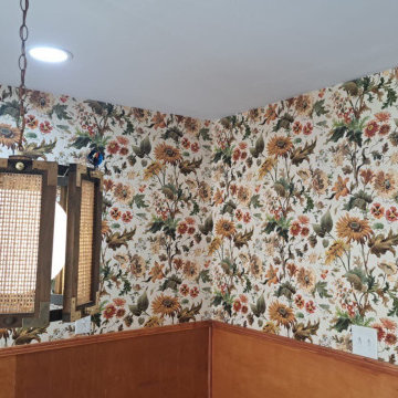
"Guest Room Wallpaper Installation in Coral Springs, FL – Create a Lasting Impression"
Transform your guest room into a welcoming retreat with luxury wallpaper installation that combines comfort and style. As Coral Springs' premier wallpaper installation specialist, I create spaces that make visitors feel pampered while standing up to frequent use.
Why Wallpaper Your Guest Room?
✔ Designer Looks – From tropical motifs to modern metallic finishes
✔ Durable Surfaces – Scratch-resistant materials for luggage and high traffic
✔ Temperature-Stable – Florida-humidity approved adhesives and materials
✔ Quick Transformations – Complete before your next guests arrive
✔ Airbnb Ready – Instagram-worthy accent walls that get 5-star reviews
Our Coral Springs Process:
✅ Complimentary Design Consultation – Virtual or in-home options
✅ Climate-Adapted Materials – Specialized for South Florida homes
✅ Precision Installation – Flawless pattern matching on all walls
✅ 1-2 Day Completion – Minimal disruption to your household
Most Popular Guest Room Styles:
• Florida Coastal – Nautical stripes and seashell textures
• Modern Resort – Palm leaf patterns and spa-like neutrals
• Boutique Hotel – Custom mural feature walls
• Tropical Glam – Metallic botanicals and lush greenery designs
Premium Features:
Fade-Resistant – Maintains vibrancy in sunny rooms
Easy Refresh – Simple to update between guest stays
Sound-Dampening – Some textures help reduce noise transfer
Serving All Coral Springs Areas: Including Wyndham Lakes, Forest Hills, and Ramblewood.
"Your guests will think they're at a five-star resort!"


 12/12 Architects & Planners
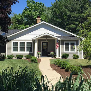
This family of 5 was quickly out-growing their 1,220sf ranch home on a beautiful corner lot. Rather than adding a 2nd floor, the decision was made to extend the existing ranch plan into the back yard, adding a new 2-car garage below the new space - for a new total of 2,520sf. With a previous addition of a 1-car garage and a small kitchen removed, a large addition was added for Master Bedroom Suite, a 4th bedroom, hall bath, and a completely remodeled living, dining and new Kitchen, open to large new Family Room. The new lower level includes the new Garage and Mudroom. The existing fireplace and chimney remain - with beautifully exposed brick. The homeowners love contemporary design, and finished the home with a gorgeous mix of color, pattern and materials.
The project was completed in 2011. Unfortunately, 2 years later, they suffered a massive house fire. The house was then rebuilt again, using the same plans and finishes as the original build, adding only a secondary laundry closet on the main level.

Sponsored
Sunbury, OH

J.Holderby - Renovations
Franklin County's Leading General Contractors - 2X Best of Houzz!

 Costa Bella Builders
Our client was a family with younger children that came to us through the recommendations of former customers. Their existing house had been remodeled by them 10 years earlier and was well-suited to the married couple. With the addition of two younger children, they realized that the house just didn’t function very well for their family. Fortunately, the husband and wife took their time thinking about what they wanted, and by the time they met with us, had their needs well laid out. We brought in local Architect, James Stroupe, and recommended him to the client as a collaborative professional who could help us achieve their goals. This proved to be the case. Jim quickly produced design drawings for them within six weeks that clearly reflected all of the client’s needs and preferences while at the same time dramatically re-creating the home in a beautiful contemporary design.
The new home required a complete reconstruction of the existing house that left only one bathroom unaltered. New square footage was added at the lower level to expand and reconfigure the living area, while an entirely new upstairs wing was constructed to create space for a new master suite with views out toward the ocean. The entire roof was rebuilt, all new windows and interior doors were added and the full exterior received a new modern looking stucco finish. Stainless steel cable railings were added to the decks to create an updated look, and fine hardwood accents were used to pull the design together.
Our efforts produced a new three bedroom, three bath home with a large and inviting ground floor patio area, wide open living areas on the first floor with new kitchen, bathroom and dining room. The photographs in this section show the striking results- clean lines, dramatic architectural touches, and light, open and airy interior spaces. Our client was very pleased with the results.

44