
Search results for "Redtube same origin" in Home Design Ideas
 S Squared Design, LLC
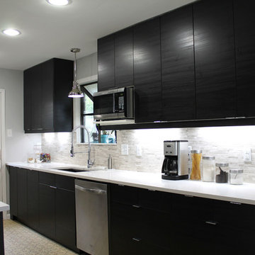
We wanted a clean design with maximum storage. We extended the kitchen about 3 feet, removed the bulkhead and took the cabinets up to the ceiling, Installed a professional style faucet and range hood. Next to the fridge (which we moved down for better access) we installed a floor to ceiling pullout pantry cabinet. Also installed under cabinet LED lights and replaced the old fluorescent lights with recessed cans and a chrome industrial style pendant above the black granite composite sink. We left the original side door as well as the greenhouse window. Black cabinets,white quartz counters, grey mini stacked limestone back splash, light grey walls, chrome accents and stainless steel appliances. The floor has yet to be done as the whole how will be getting those all at the same time.
 Kraft Custom Construction
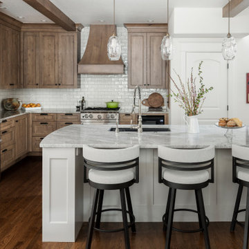
After a not-so-great experience with a previous contractor, this homeowner came to Kraft Custom Construction in search of a better outcome. Not only was she wanting a more functional kitchen to enjoy cooking in, she also sought out a team with a clear process and great communication.
Two elements of the original floorplan shaped the design of the new kitchen: a protruding pantry that blocked the flow from the front door into the main living space, and two large columns in the middle of the living room.
Using a refined French-Country design aesthetic, we completed structural modifications to reframe the pantry, and integrated a new custom buffet cabinet to tie in the old columns with new wood ceiling beams. Other design solutions include more usable countertop space, a recessed spice cabinet, numerous drawer organizers, and updated appliances and finishes all around.
This bright new kitchen is both comfortable yet elegant, and the perfect place to cook for the family or entertain a group of guests.
 TKS Design Group
Free ebook, Creating the Ideal Kitchen. DOWNLOAD NOW
Working with this Glen Ellyn client was so much fun the first time around, we were thrilled when they called to say they were considering moving across town and might need some help with a bit of design work at the new house.
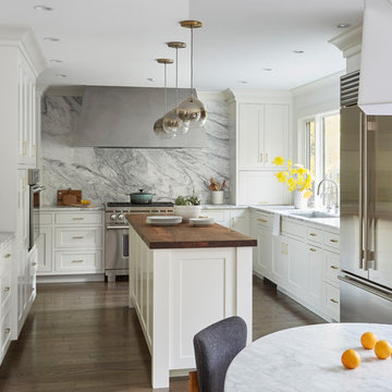
The kitchen in the new house had been recently renovated, but it was not exactly what they wanted. What started out as a few tweaks led to a pretty big overhaul of the kitchen, mudroom and laundry room. Luckily, we were able to use re-purpose the old kitchen cabinetry and custom island in the remodeling of the new laundry room — win-win!
As parents of two young girls, it was important for the homeowners to have a spot to store equipment, coats and all the “behind the scenes” necessities away from the main part of the house which is a large open floor plan. The existing basement mudroom and laundry room had great bones and both rooms were very large.
To make the space more livable and comfortable, we laid slate tile on the floor and added a built-in desk area, coat/boot area and some additional tall storage. We also reworked the staircase, added a new stair runner, gave a facelift to the walk-in closet at the foot of the stairs, and built a coat closet. The end result is a multi-functional, large comfortable room to come home to!
Just beyond the mudroom is the new laundry room where we re-used the cabinets and island from the original kitchen. The new laundry room also features a small powder room that used to be just a toilet in the middle of the room.
You can see the island from the old kitchen that has been repurposed for a laundry folding table. The other countertops are maple butcherblock, and the gold accents from the other rooms are carried through into this room. We were also excited to unearth an existing window and bring some light into the room.
Designed by: Susan Klimala, CKD, CBD
Photography by: Michael Alan Kaskel
For more information on kitchen and bath design ideas go to: www.kitchenstudio-ge.com
Find the right local pro for your project
 TKS Design Group
Free ebook, Creating the Ideal Kitchen. DOWNLOAD NOW
The Klimala’s and their three kids are no strangers to moving, this being their fifth house in the same town over the 20-year period they have lived there. “It must be the 7-year itch, because every seven years, we seem to find ourselves antsy for a new project or a new environment. I think part of it is being a designer, I see my own taste evolve and I want my environment to reflect that. Having easy access to wonderful tradesmen and a knowledge of the process makes it that much easier”.
This time, Klimala’s fell in love with a somewhat unlikely candidate. The 1950’s ranch turned cape cod was a bit of a mutt, but it’s location 5 minutes from their design studio and backing up to the high school where their kids can roll out of bed and walk to school, coupled with the charm of its location on a private road and lush landscaping made it an appealing choice for them.
“The bones of the house were really charming. It was typical 1,500 square foot ranch that at some point someone added a second floor to. Its sloped roofline and dormered bedrooms gave it some charm.” With the help of architect Maureen McHugh, Klimala’s gutted and reworked the layout to make the house work for them. An open concept kitchen and dining room allows for more frequent casual family dinners and dinner parties that linger. A dingy 3-season room off the back of the original house was insulated, given a vaulted ceiling with skylights and now opens up to the kitchen. This room now houses an 8’ raw edge white oak dining table and functions as an informal dining room. “One of the challenges with these mid-century homes is the 8’ ceilings. I had to have at least one room that had a higher ceiling so that’s how we did it” states Klimala.
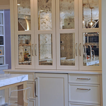
The kitchen features a 10’ island which houses a 5’0” Galley Sink. The Galley features two faucets, and double tiered rail system to which accessories such as cutting boards and stainless steel bowls can be added for ease of cooking. Across from the large sink is an induction cooktop. “My two teen daughters and I enjoy cooking, and the Galley and induction cooktop make it so easy.” A wall of tall cabinets features a full size refrigerator, freezer, double oven and built in coffeemaker. The area on the opposite end of the kitchen features a pantry with mirrored glass doors and a beverage center below.
The rest of the first floor features an entry way, a living room with views to the front yard’s lush landscaping, a family room where the family hangs out to watch TV, a back entry from the garage with a laundry room and mudroom area, one of the home’s four bedrooms and a full bath. There is a double sided fireplace between the family room and living room. The home features pops of color from the living room’s peach grass cloth to purple painted wall in the family room. “I’m definitely a traditionalist at heart but because of the home’s Midcentury roots, I wanted to incorporate some of those elements into the furniture, lighting and accessories which also ended up being really fun. We are not formal people so I wanted a house that my kids would enjoy, have their friends over and feel comfortable.”
The second floor houses the master bedroom suite, two of the kids’ bedrooms and a back room nicknamed “the library” because it has turned into a quiet get away area where the girls can study or take a break from the rest of the family. The area was originally unfinished attic, and because the home was short on closet space, this Jack and Jill area off the girls’ bedrooms houses two large walk-in closets and a small sitting area with a makeup vanity. “The girls really wanted to keep the exposed brick of the fireplace that runs up the through the space, so that’s what we did, and I think they feel like they are in their own little loft space in the city when they are up there” says Klimala.
Designed by: Susan Klimala, CKD, CBD
Photography by: Carlos Vergara
For more information on kitchen and bath design ideas go to: www.kitchenstudio-ge.com
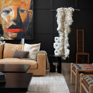
 Urbanology Designs
A captivating transformation in the coveted neighborhood of University Park, Dallas
The heart of this home lies in the kitchen, where we embarked on a design endeavor that would leave anyone speechless. By opening up the main kitchen wall, we created a magnificent window system that floods the space with natural light and offers a breathtaking view of the picturesque surroundings. Suspended from the ceiling, a steel-framed marble vent hood floats a few inches from the window, showcasing a mesmerizing Lilac Marble. The same marble is skillfully applied to the backsplash and island, featuring a bold combination of color and pattern that exudes elegance.
Adding to the kitchen's allure is the Italian range, which not only serves as a showstopper but offers robust culinary features for even the savviest of cooks. However, the true masterpiece of the kitchen lies in the honed reeded marble-faced island. Each marble strip was meticulously cut and crafted by artisans to achieve a half-rounded profile, resulting in an island that is nothing short of breathtaking. This intricate process took several months, but the end result speaks for itself.
To complement the grandeur of the kitchen, we designed a combination of stain-grade and paint-grade cabinets in a thin raised panel door style. This choice adds an elegant yet simple look to the overall design. Inside each cabinet and drawer, custom interiors were meticulously designed to provide maximum functionality and organization for the day-to-day cooking activities. A vintage Turkish runner dating back to the 1960s, evokes a sense of history and character.
The breakfast nook boasts a stunning, vivid, and colorful artwork created by one of Dallas' top artist, Kyle Steed, who is revered for his mastery of his craft. Some of our favorite art pieces from the inspiring Haylee Yale grace the coffee station and media console, adding the perfect moment to pause and loose yourself in the story of her art.
The project extends beyond the kitchen into the living room, where the family's changing needs and growing children demanded a new design approach. Accommodating their new lifestyle, we incorporated a large sectional for family bonding moments while watching TV. The living room now boasts bolder colors, striking artwork a coffered accent wall, and cayenne velvet curtains that create an inviting atmosphere. Completing the room is a custom 22' x 15' rug, adding warmth and comfort to the space. A hidden coat closet door integrated into the feature wall adds an element of surprise and functionality.
This project is not just about aesthetics; it's about pushing the boundaries of design and showcasing the possibilities. By curating an out-of-the-box approach, we bring texture and depth to the space, employing different materials and original applications. The layered design achieved through repeated use of the same material in various forms, shapes, and locations demonstrates that unexpected elements can create breathtaking results.
The reason behind this redesign and remodel was the homeowners' desire to have a kitchen that not only provided functionality but also served as a beautiful backdrop to their cherished family moments. The previous kitchen lacked the "wow" factor they desired, prompting them to seek our expertise in creating a space that would be a source of joy and inspiration.
Inspired by well-curated European vignettes, sculptural elements, clean lines, and a natural color scheme with pops of color, this design reflects an elegant organic modern style. Mixing metals, contrasting textures, and utilizing clean lines were key elements in achieving the desired aesthetic. The living room introduces bolder moments and a carefully chosen color scheme that adds character and personality.
The client's must-haves were clear: they wanted a show stopping centerpiece for their home, enhanced natural light in the kitchen, and a design that reflected their family's dynamic. With the transformation of the range wall into a wall of windows, we fulfilled their desire for abundant natural light and breathtaking views of the surrounding landscape.
Our favorite rooms and design elements are numerous, but the kitchen remains a standout feature. The painstaking process of hand-cutting and crafting each reeded panel in the island to match the marble's veining resulted in a labor of love that emanates warmth and hospitality to all who enter.
In conclusion, this tastefully lux project in University Park, Dallas is an extraordinary example of a full gut remodel that has surpassed all expectations. The meticulous attention to detail, the masterful use of materials, and the seamless blend of functionality and aesthetics create an unforgettable space. It serves as a testament to the power of design and the transformative impact it can have on a home and its inhabitants.
Project by Texas' Urbanology Designs. Their North Richland Hills-based interior design studio serves Dallas, Highland Park, University Park, Fort Worth, and upscale clients nationwide.
 Ashton Renovations
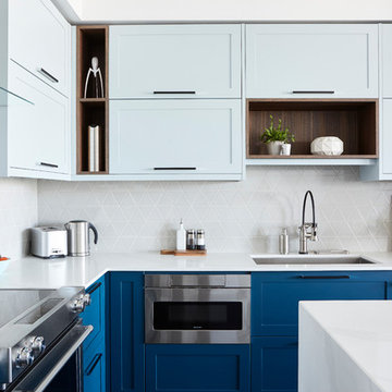
The original kitchen in this condominium was renovated arising from the need to replace Kitec plumbing. The work triangle remained generally the same, but numerous changes were made to improve the kitchen’s functionality, aesthetics, and lighting. Automation was also introduced. The goal was to design and build a modern contemporary functional kitchen with inspiring colours accented with textured wood features.
The functionality was improved with the addition of an under counter microwave, which freed up countertop space. Additional and improved storage was also created by incorporating under cabinet drawers throughout the kitchen, a bar area with open glass shelving above, and open shelving to the right of the seating area. Upper cabinet storage was as well increased with storage above the fridge.
Numerous lighting improvements were made including the addition of potlights. This was done by dropping the ceiling in the kitchen, which also created a visual division with the dining area. Automation was introduced as well into the space with HUE under cabinet lighting, and a touch faucet. The under cabinet lights are controlled by the Phillips Hue App that programs routines, scenes, and other settings.
The kitchen features painted Shaker cabinets accented by textured wood shelving. The countertop surfaces are quartz with waterfalls on both sides of the island, which is a focal point. Shapes are also strongly identified in the design with the use of triangular tiles in the backsplash along with rectangular upper cabinets, and appliance doors and drawers. The kitchen is made most unique though with the uplifting use of colour in the cabinets that make this a bright and cheerful space.
Aristea Photography
 Progressive Design Build
Challenge
This 2001 riverfront home was purchased by the owners in 2015 and immediately renovated. Progressive Design Build was hired at that time to remodel the interior, with tentative plans to remodel their outdoor living space as a second phase design/build remodel. True to their word, after completing the interior remodel, this young family turned to Progressive Design Build in 2017 to address known zoning regulations and restrictions in their backyard and build an outdoor living space that was fit for entertaining and everyday use.
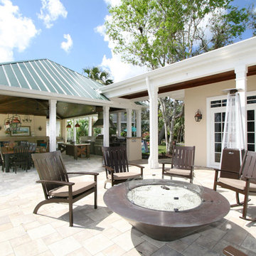
The homeowners wanted a pool and spa, outdoor living room, kitchen, fireplace and covered patio. They also wanted to stay true to their home’s Old Florida style architecture while also adding a Jamaican influence to the ceiling detail, which held sentimental value to the homeowners who honeymooned in Jamaica.
Solution
To tackle the known zoning regulations and restrictions in the backyard, the homeowners researched and applied for a variance. With the variance in hand, Progressive Design Build sat down with the homeowners to review several design options. These options included:
Option 1) Modifications to the original pool design, changing it to be longer and narrower and comply with an existing drainage easement
Option 2) Two different layouts of the outdoor living area
Option 3) Two different height elevations and options for the fire pit area
Option 4) A proposed breezeway connecting the new area with the existing home
After reviewing the options, the homeowners chose the design that placed the pool on the backside of the house and the outdoor living area on the west side of the home (Option 1).
It was important to build a patio structure that could sustain a hurricane (a Southwest Florida necessity), and provide substantial sun protection. The new covered area was supported by structural columns and designed as an open-air porch (with no screens) to allow for an unimpeded view of the Caloosahatchee River. The open porch design also made the area feel larger, and the roof extension was built with substantial strength to survive severe weather conditions.
The pool and spa were connected to the adjoining patio area, designed to flow seamlessly into the next. The pool deck was designed intentionally in a 3-color blend of concrete brick with freeform edge detail to mimic the natural river setting. Bringing the outdoors inside, the pool and fire pit were slightly elevated to create a small separation of space.
Result
All of the desirable amenities of a screened porch were built into an open porch, including electrical outlets, a ceiling fan/light kit, TV, audio speakers, and a fireplace. The outdoor living area was finished off with additional storage for cushions, ample lighting, an outdoor dining area, a smoker, a grill, a double-side burner, an under cabinet refrigerator, a major ventilation system, and water supply plumbing that delivers hot and cold water to the sinks.
Because the porch is under a roof, we had the option to use classy woods that would give the structure a natural look and feel. We chose a dark cypress ceiling with a gloss finish, replicating the same detail that the homeowners experienced in Jamaica. This created a deep visceral and emotional reaction from the homeowners to their new backyard.
The family now spends more time outdoors enjoying the sights, sounds and smells of nature. Their professional lives allow them to take a trip to paradise right in their backyard—stealing moments that reflect on the past, but are also enjoyed in the present.

Sponsored
Columbus, OH

Wannemacher Interiors
Customized Award-Winning Interior Design Solutions in Franklin Cnty OH

 MainStreet Design Build
This early 20th century Poppleton Park home was originally 2548 sq ft. with a small kitchen, nook, powder room and dining room on the first floor. The second floor included a single full bath and 3 bedrooms. The client expressed a need for about 1500 additional square feet added to the basement, first floor and second floor. In order to create a fluid addition that seamlessly attached to this home, we tore down the original one car garage, nook and powder room. The addition was added off the northern portion of the home, which allowed for a side entry garage. Plus, a small addition on the Eastern portion of the home enlarged the kitchen, nook and added an exterior covered porch.
Special features of the interior first floor include a beautiful new custom kitchen with island seating, stone countertops, commercial appliances, large nook/gathering with French doors to the covered porch, mud and powder room off of the new four car garage. Most of the 2nd floor was allocated to the master suite. This beautiful new area has views of the park and includes a luxurious master bath with free standing tub and walk-in shower, along with a 2nd floor custom laundry room!
Attention to detail on the exterior was essential to keeping the charm and character of the home. The brick façade from the front view was mimicked along the garage elevation. A small copper cap above the garage doors and 6” half-round copper gutters finish the look.
KateBenjamin Photography
 wengerkois architecture + design
Margaret Kois Photography
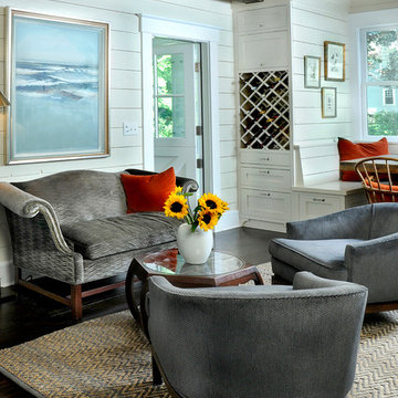
Example of a country dark wood floor family room design in New York with white walls
Example of a country dark wood floor family room design in New York with white walls
 ODS Architecture
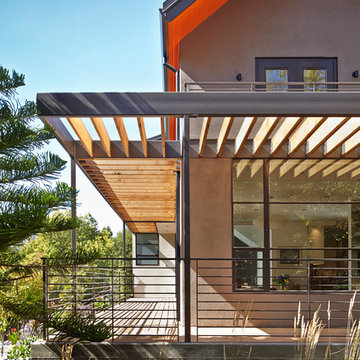
Originally a nearly three-story tall 1920’s European-styled home was turned into a modern villa for work and home. A series of low concrete retaining wall planters and steps gradually takes you up to the second level entry, grounding or anchoring the house into the site, as does a new wrap around veranda and trellis. Large eave overhangs on the upper roof were designed to give the home presence and were accented with a Mid-century orange color. The new master bedroom addition white box creates a better sense of entry and opens to the wrap around veranda at the opposite side. Inside the owners live on the lower floor and work on the upper floor with the garage basement for storage, archives and a ceramics studio. New windows and open spaces were created for the graphic designer owners; displaying their mid-century modern furnishings collection.
A lot of effort went into attempting to lower the house visually by bringing the ground plane higher with the concrete retaining wall planters, steps, wrap around veranda and trellis, and the prominent roof with exaggerated overhangs. That the eaves were painted orange is a cool reflection of the owner’s Dutch heritage. Budget was a driver for the project and it was determined that the footprint of the home should have minimal extensions and that the new windows remain in the same relative locations as the old ones. Wall removal was utilized versus moving and building new walls where possible.
Photo Credit: John Sutton Photography.
 Laurel Quint Interior Design
Emily Minton Redfield
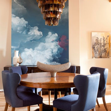
Inspiration for a mid-sized contemporary medium tone wood floor dining room remodel in Other with beige walls and no fireplace
Inspiration for a mid-sized contemporary medium tone wood floor dining room remodel in Other with beige walls and no fireplace
 Metropolis Drafting and Construction Inc
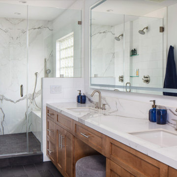
Creation of a new master bathroom, kids’ bathroom, toilet room and a WIC from a mid. size bathroom was a challenge but the results were amazing.
The master bathroom has a huge 5.5'x6' shower with his/hers shower heads.
The main wall of the shower is made from 2 book matched porcelain slabs, the rest of the walls are made from Thasos marble tile and the floors are slate stone.
The vanity is a double sink custom made with distress wood stain finish and its almost 10' long.
The vanity countertop and backsplash are made from the same porcelain slab that was used on the shower wall.
The two pocket doors on the opposite wall from the vanity hide the WIC and the water closet where a $6k toilet/bidet unit is warmed up and ready for her owner at any given moment.
Notice also the huge 100" mirror with built-in LED light, it is a great tool to make the relatively narrow bathroom to look twice its size.

Sponsored
Columbus, OH
Wannemacher Interiors
Customized Award-Winning Interior Design Solutions in Franklin Cnty OH
 Orren Pickell Building Group
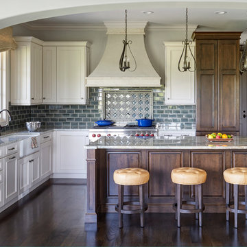
Chef's kitchen with white perimeter recessed panel cabinetry. In contrast, the island and refrigerator cabinets are a dark lager color. All cabinetry is by Brookhaven.
Kitchen back splash is 3x6 Manhattan Field tile in #1227 Peacock with 4.25x4.25 bullnose in the same color. Niche is 4.25" square Cordoba Plain Fancy fIeld tile in #1227 Peacock with fluid crackle finish and 3.12 square Turkistan Floral Fancy Field tile with 2.25x6 medium chair rail border. Design by Janet McCann.
Photo by Mike Kaskel.
 Patrice Munden Interior Design
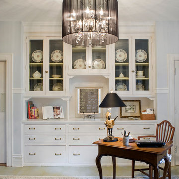
This 1920's era home had seen better days and was in need of repairs, updates and so much more. Our goal in designing the space was to make it functional for today's families. We maximized the ample storage from the original use of the room and also added a ladie's writing desk, tea area, coffee bar, wrapping station and a sewing machine. Today's busy Mom could now easily relax as well as take care of various household chores all in one, elegant room.
Michael Jacob-- Photographer
 ODS Architecture
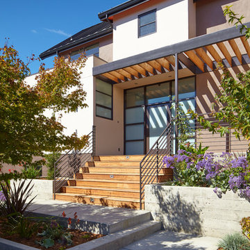
Originally a nearly three-story tall 1920’s European-styled home was turned into a modern villa for work and home. A series of low concrete retaining wall planters and steps gradually takes you up to the second level entry, grounding or anchoring the house into the site, as does a new wrap around veranda and trellis. Large eave overhangs on the upper roof were designed to give the home presence and were accented with a Mid-century orange color. The new master bedroom addition white box creates a better sense of entry and opens to the wrap around veranda at the opposite side. Inside the owners live on the lower floor and work on the upper floor with the garage basement for storage, archives and a ceramics studio. New windows and open spaces were created for the graphic designer owners; displaying their mid-century modern furnishings collection.
A lot of effort went into attempting to lower the house visually by bringing the ground plane higher with the concrete retaining wall planters, steps, wrap around veranda and trellis, and the prominent roof with exaggerated overhangs. That the eaves were painted orange is a cool reflection of the owner’s Dutch heritage. Budget was a driver for the project and it was determined that the footprint of the home should have minimal extensions and that the new windows remain in the same relative locations as the old ones. Wall removal was utilized versus moving and building new walls where possible.
Photo Credit: John Sutton Photography.

 Innovative Design Build
"I cannot say enough good things about the Innovative Construction team and work product.
They remodeled our water-damaged, 1930s basement, and exceeded all of our expectations - before and after photos simply cannot do this project justice. The original basement included an awkward staircase in an awkward location, one bedroom, one bathroom, a kitchen and small living space. We had a difficult time imagining that it could be much more than that. Innovative Construction's design team was creative, and thought completely out of the box. They relocated the stairwell in a way we did not think was possible, opening up the basement to reconfigure the bedroom, bathroom, kitchenette, living space, but also adding an office and finished storage room. The end result is as functional as it is beautiful.
As with all construction, particularly a renovation of an old house, there will be inconveniences, it will be messy, and plenty of surprises behind the old walls. The Innovative Construction team maintained a clean and safe work site for 100% of the project, with minimal disruption to our daily lives, even when there was a large hole cut into our main living room floor to accommodate new stairs down to the basement. The team showed creativity and an eye for design when working around some of the unexpected "character" revealed when opening the walls.
The team effectively uses technology to keep everyone on the same page about changes, requests, schedules, contracts, invoices, etc. Everyone is friendly, competent, helpful, and responsive. I felt heard throughout the process, and my requests were responded to quickly and thoroughly. I recommend Innovative Construction without reservation."

 Klopf Architecture
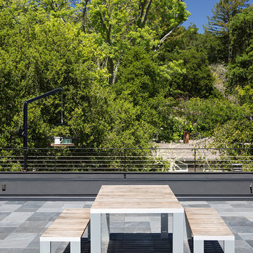
Sebastian and Tanja DiGrande's quest for natural light and open, modern design led them to Klopf Architecture in San Francisco. Working hand-in-hand with homeowner/designer Tanja DiGrande, Klopf collaborated on a modern addition to the rear of a traditional-style home. The idea was to depart from the original style completely to draw a distinction between the original house and any later additions, as well as observe a very minimal, clean, gallery-like modern style against which changing daylight, art, furniture, and of course the people provide the color and motion.
With its dark gray stuccoed walls, dark steel railing, and floor-to-ceiling windows, the exterior of the addition is at the same time an open, modern box as well as a receding volume that acts almost as a backdrop for the house, receding visually out of respect for the original home. From the interior, windows bring in nature and views from all around the lush property. They also allow views of the original house. Up on the roof deck the views magnify. The owners use a boom and crank to bring up food and drinks when entertaining!
Inside, the simple clean-lined spaces showcase the couple’s minimal, modern taste. The open bathroom epitomizes the clean, minimal style of the addition. On the exterior, steel elements bring a more industrial modern feeling to the addition from the rear.
Klopf Architecture Project Team: John Klopf, AIA, Geoff Campen, and Angela Todorova
Co-Designer: Tanja DiGrande
Contractor: Jose Ramirez & J-C General Contractors Inc.
Photography ©2015 Mariko Reed
Location: Orinda, CA
Year completed: 2014
 Julia Chasman Design
Sean Ryan Pierce
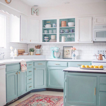
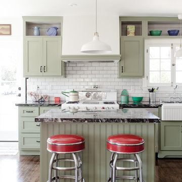
Kitchen - traditional kitchen idea in Los Angeles with green cabinets, white backsplash, subway tile backsplash, an island and a farmhouse sink
Kitchen - traditional kitchen idea in Los Angeles with green cabinets, white backsplash, subway tile backsplash, an island and a farmhouse sink

 Simply Home Decorating
This beautiful North Vancouver home belongs to a nature-loving and health-conscious couple, Emma and Vince (names changed), their two young children, and their dog, Jasper. When they contacted us about renovating and furnishing their kitchen and family room, we walked in and saw a world of potential waiting to be uncovered.
Before: Larkhall Crescent Home:
Like many original North Vancouver homes, the interior was definitely dated. We encountered late ‘80s finishes in powder pink and teal green, old carpet, and a kitchen that wasn’t maximized to suit this family’s modern-day lifestyle. However, the size of the rooms offered us a ton of space with which to get creative.
Knowing our clients’ love of cooking, need for work spaces (Emma and Vince both work remotely), and growing family, we developed a design concept that would increase usable space, optimize storage, and create intimacy in this large area. As for the style, we were inspired by their European roots, inventing a new and modern take on “Belgian Farmhouse” style. Now, the home is truly one-of-a-kind.
After: Warm & Cozy Family Room:
Fresh, bright, and comfortable, this living area has been transformed! We started with the fireplace as a focal point, selecting aged brick tiles for added texture and a crisp wood mantle. The taupe-coloured sectional infuses the room with visual warmth and serves the added purpose of separating the family room from the kitchen.
Emma and Vince were also keen on using non-toxic materials in their home, and we were happy to oblige. To meet their needs, we sourced natural wood elements and sought out Canadian-made products - that adhere to high health standards - whenever possible.
Look closer at the elements of this space, and you will find this stunning, honeycomb-patterned rug in earthy gold, beige, and charcoal tones. It’s plush to the touch and full of visual texture that brings this room’s colour palette together. We sourced these two-tone chairs with caning, petrified wood side table, black sconces, and botanical prints in greyscale from local artist, Heather Johnston.
We topped off the space with this dark wood and rattan console that offers storage facing the kitchen and presents an opportunity to display cherished items. The result is a cozy lounging space brimming with comfort and functionality. It’s perfect for enjoying quality family time, or Emma can simply slide the coffee table away to make room for her morning yoga practice.
Now, let’s turn around and give some attention to the kitchen. Do you remember what the original kitchen looked like? If not, scroll back up, because the transformation is shocking…
Moody & Welcoming Kitchen for Healthy Living:
This kitchen looks very different from how it started, right? Though we didn’t touch any walls, the kitchen has almost doubled in usable space! We created a long, extended island with storage, an outlet for small appliances, and seating for comfortable prep, after-school snacking, or mingling among friends.
On the other side of the island, the family has even more storage and an integrated dishwasher within easy reach of the sink, perfect for quick clean-up. From this angle, you can also see the expansive custom Shaker cabinetry in white and the integrated double ovens. These facilitate their cooking experience and gave us the opportunity to add an additional surprise…
A coffee garage station and more hidden storage! Keeping these items located along the perimeter allows them to be accessed by the family or their guests without someone getting under the cook’s feet. These are the little details that make everyday life easier and more enjoyable.
Moving deeper into the kitchen, the seamless induction cooktop topped with a freestanding concealed hood fan commands attention in a soft yet prominent way. The natural wood accent mirrors the fireplace mantle, and the choice of off-black wood-grain cabinets not only continues our black-and-white colour palette but adds a sense of depth and contrast. The corner sink is located to the right and perfectly positioned with a view of their thriving backyard.
To invite more of this family’s character into the space, we mixed metals for interest — matte black, dark pewter, and warm brass — and created open shelves in white oak for their plants and decor. You can also glimpse the tumbled edge of the backsplash tile, which echoes the rustic brick of the fireplace. It adds that farmhouse charm while still feeling timeless and sophisticated.
Last but not least, we designed this dining banquette in the bay window (with integrated bench storage, of course), where the family can share a meal together, the kids can do homework, or Emma and Vince can work and enjoy a change of scenery from their offices. Like the other spaces in the home, it was designed to be beautiful, multi-functional, and long-lasting.
Praise from Our Clients:
It is clear that we love this home, but what did our clients have to say?
“Lori is a visionary and masters execution to the finest detail all at the same time. When she first met us to know more about who we are and how we live, she could right away envision how we could use the space in our kitchen and living room…The results exceeded our expectations.
Lori and her team were also a delight to work with — coordination with all the trades, fast problem-solving, regular updates, professional and friendly attitude of her entire team — made it the dream team. Thank you SHD for making our space so beautiful!”
In turn, we are so grateful for this family’s trust, their open communication, and for being wonderful people with whom to work. (So, thank you!)
33