
Search results for "Redtube same origin" in Home Design Ideas
 StudioLAB
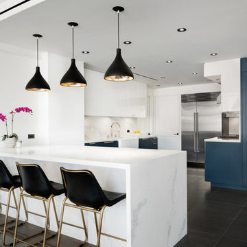
Across from Hudson River Park, the Classic 7 pre-war apartment had not renovated in over 50 years. The new owners, a young family with two kids, desired to open up the existing closed in spaces while keeping some of the original, classic pre-war details. Dark, dimly-lit corridors and clustered rooms that were a detriment to the brilliant natural light and expansive views the existing apartment inherently possessed, were demolished to create a new open plan for a more functional style of living. Custom charcoal stained white oak herringbone floors were laid throughout the space. The dark blue lacquered kitchen cabinets provide a sharp contrast to the otherwise neutral colored space. A wall unit in the same blue lacquer floats on the wall in the Den.
 Carl Mattison Design
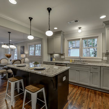
The renovated kitchen is in the exact same footprint as the original. Yet, it is now fresh, clean and romantically vintage in appeal while modern in approach. With the wall removed it extends into a fun, family and friend space to living and dining areas.
 Alair Homes Plano
Our clients house was built in 2012, so it was not that outdated, it was just dark. The clients wanted to lighten the kitchen and create something that was their own, using more unique products. The master bath needed to be updated and they wanted the upstairs game room to be more functional for their family.
The original kitchen was very dark and all brown. The cabinets were stained dark brown, the countertops were a dark brown and black granite, with a beige backsplash. We kept the dark cabinets but lightened everything else. A new translucent frosted glass pantry door was installed to soften the feel of the kitchen. The main architecture in the kitchen stayed the same but the clients wanted to change the coffee bar into a wine bar, so we removed the upper cabinet door above a small cabinet and installed two X-style wine storage shelves instead. An undermount farm sink was installed with a 23” tall main faucet for more functionality. We replaced the chandelier over the island with a beautiful Arhaus Poppy large antique brass chandelier. Two new pendants were installed over the sink from West Elm with a much more modern feel than before, not to mention much brighter. The once dark backsplash was now a bright ocean honed marble mosaic 2”x4” a top the QM Calacatta Miel quartz countertops. We installed undercabinet lighting and added over-cabinet LED tape strip lighting to add even more light into the kitchen.
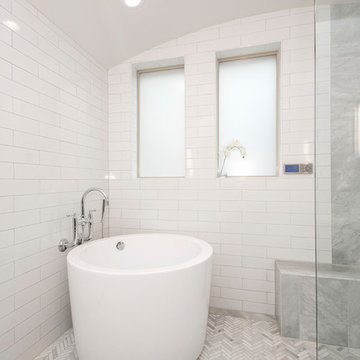
We basically gutted the Master bathroom and started from scratch. We demoed the shower walls, ceiling over tub/shower, demoed the countertops, plumbing fixtures, shutters over the tub and the wall tile and flooring. We reframed the vaulted ceiling over the shower and added an access panel in the water closet for a digital shower valve. A raised platform was added under the tub/shower for a shower slope to existing drain. The shower floor was Carrara Herringbone tile, accented with Bianco Venatino Honed marble and Metro White glossy ceramic 4”x16” tile on the walls. We then added a bench and a Kohler 8” rain showerhead to finish off the shower. The walk-in shower was sectioned off with a frameless clear anti-spot treated glass. The tub was not important to the clients, although they wanted to keep one for resale value. A Japanese soaker tub was installed, which the kids love! To finish off the master bath, the walls were painted with SW Agreeable Gray and the existing cabinets were painted SW Mega Greige for an updated look. Four Pottery Barn Mercer wall sconces were added between the new beautiful Distressed Silver leaf mirrors instead of the three existing over-mirror vanity bars that were originally there. QM Calacatta Miel countertops were installed which definitely brightened up the room!
Originally, the upstairs game room had nothing but a built-in bar in one corner. The clients wanted this to be more of a media room but still wanted to have a kitchenette upstairs. We had to remove the original plumbing and electrical and move it to where the new cabinets were. We installed 16’ of cabinets between the windows on one wall. Plank and Mill reclaimed barn wood plank veneers were used on the accent wall in between the cabinets as a backing for the wall mounted TV above the QM Calacatta Miel countertops. A kitchenette was installed to one end, housing a sink and a beverage fridge, so the clients can still have the best of both worlds. LED tape lighting was added above the cabinets for additional lighting. The clients love their updated rooms and feel that house really works for their family now.
Design/Remodel by Hatfield Builders & Remodelers | Photography by Versatile Imaging
Find the right local pro for your project
 Chi Renovation & Design
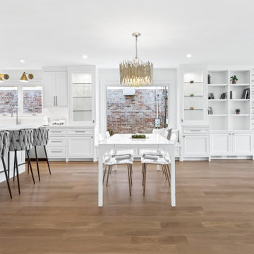
The original kitchen in this home had a cramped galley style kitchen with a poor work flow. The original cabinetry was dark and outdated. By removing the wall between the kitchen and the dining room, we were able to obtain the open concept the clients were hoping for.
With the addition of a kitchen island, we managed to salvage the same amount of kitchen storage after demolishing a wall of cabinets while adding some additional seating for kitchen entertaining and breakfast on the go. The built-in appliance wall creates a seamless path of travel from the kitchen to the laundry room. The dining room was also severely cramped and featured floral wallpaper and felt disconnected from the kitchen. The walls along both sides of the dining room were removed to open it up to the kitchen and living area. Our design team opted to accent the dining area with a gorgeous brass chandelier that plays off of the brass fixtures in the kitchen. A custom bench seat using the same cabinets used in the kitchen creates a sense of cohesion throughout the new open plan. Those same cabinets were also carried into the living room to frame the fireplace.

 safe ZOnea
Ask a kitchen designer in Chicago which countertop question comes up most and you will hear the same answer: white or off-white quartz, and which shade. Homeowners walk into showrooms with a photo saved on their phone, usually a bright, veined slab from a magazine spread, and leave an hour later realizing there are a dozen versions of that same look. The confusion is not about taste. It is about the fact that "white quartz" covers a huge range of patterns, undertones, and price points, and nobody explains the differences before the sale.
Older bungalows and newer builds alike are getting stripped of their dated laminate and butcher block in favor of quartz, and the reasons are practical rather than trendy. Quartz does not need sealing, resists the kind of staining that granite can suffer over decades, and holds up to the freeze-thaw humidity swings that Chicago basements and kitchens go through every year. Once a homeowner commits to quartz, though, the real decision starts: which white, and does the pattern justify the difference in cost.
This piece walks through three specific slabs that keep showing up in Chicago renovation projects, why designers reach for them in different rooms, and what actually separates a flat white surface from one with real depth. None of this requires a design background to follow. It is mostly about paying attention to how a slab behaves under kitchen lighting, how busy the vending gets, and how it photographs versus how it looks in person.
Why White Quartz Took Over Chicago Kitchens
Ten years ago, granite dominated Chicago kitchen remodels almost by default. It was durable, it looked expensive, and every fabricator in the metro area carried a wide range of colors. Quartz has since taken over that position, and the shift happened faster than most contractors expected. Engineered stone gave homeowners a more predictable surface, since natural granite varies slab to slab while quartz is manufactured to a consistent pattern batch after batch.
The other driver is light. Chicago winters are long and gray, and a lot of kitchens, especially in older two-flats and courtyard buildings, do not get much direct sun. A dark granite countertop in a dim kitchen can make the whole room feel smaller. White and light-toned quartz reflects what little natural light comes through the windows, and it makes a galley kitchen or a north-facing space feel noticeably brighter without touching the cabinetry or the layout.
There is also a resale argument that local real estate agents bring up constantly. White quartz photographs well for listings, reads as updated and low-maintenance to buyers touring in person, and does not compete visually with whatever cabinet color the next owner might prefer. It is a safer bet than a bold veined marble look or a colored quartz that might feel dated in five years.
Arctic White and the Cost Question
Among the flatter, more uniform whites, arctic white quartz price comes up constantly in budget conversations because the slab sits at a more approachable point than the heavily veined Italian-marble-inspired patterns. It reads as clean and bright without the busy movement that some homeowners find overwhelming in a small kitchen. Fabricators in the Chicago area tend to keep it in stock precisely because demand stays steady across both new construction and remodel projects.
Part of what keeps this slab affordable relative to its heavily patterned cousins comes down to manufacturing complexity. A quartz surface with minimal veining and a consistent white base is simpler to produce at scale than one that mimics the irregular, high-contrast movement of natural Calacatta marble. That production difference shows up directly in what a homeowner pays per square foot, and it is worth asking a fabricator to walk through that pricing before assuming every white quartz costs the same.
Homeowners planning a full kitchen, including an island, backsplash, and perimeter counters, often use a flatter white like this specifically because it lets other elements carry the visual interest. A patterned tile backsplash or a bold cabinet color reads more clearly against a calm countertop than against one already fighting for attention with heavy veining. Designers frequently pair simpler whites with statement lighting fixtures for exactly this reason.
What Makes Calacatta Patterns Different
Calacatta refers to a family of marble originally quarried in Italy, known for a bright white background broken up by bold, often gold-toned veining that moves in thick, dramatic streaks rather than thin gray lines. Natural Calacatta marble is soft, porous, and expensive to maintain, which is exactly why quartz manufacturers spent years developing engineered versions that replicate the look without the upkeep headaches.
The challenge with any Calacatta-style quartz is getting the veining to look organic instead of printed. Early generations of engineered stone struggled with repetitive patterns that gave away the fact the slab was manufactured rather than cut from actual marble. Modern digital printing and layering techniques have closed that gap considerably, and the better Calacatta-inspired quartz lines now vary the veining across each slab batch so two counters in the same kitchen do not look identical.
Chicago designers gravitate toward Calacatta patterns for kitchens that function as the visual centerpiece of an open floor plan, which describes a large share of the gut renovations happening in neighborhoods like Lincoln Park, Roscoe Village, and the North Shore suburbs. When the kitchen island is visible from the living room and dining area, a dramatic veined surface becomes part of the home's overall design language rather than a purely functional work surface.
Calacatta Arno Under Kitchen Lighting
One of the more popular options in this category, calacatta arno quartz, balances a warm white base with soft gray and gold veining that avoids looking too stark under the cooler LED lighting common in newer Chicago builds. Homeowners touring showrooms sometimes make the mistake of judging a slab entirely under warm incandescent lighting, then get surprised when the same surface looks slightly different once installed under their kitchen's actual fixtures.
What separates this particular pattern from flatter competitors is how the veining clusters rather than spreading evenly across the slab. That clustering mimics the way real quarried marble forms, with denser mineral deposits in some sections and cleaner stretches in others. Fabricators cutting a large island slab from a single piece will often orient the pattern intentionally so the busiest veining lands somewhere visually interesting rather than getting cut off at an edge.
Because the background reads warmer than a stark white, this pattern tends to pair well with brass or matte gold hardware, a combination that has been showing up repeatedly in Chicago kitchen remodels over the past few renovation seasons. Cabinet painters report a similar trend, with more clients requesting warm white or greige cabinet colors specifically because they complement this kind of veined quartz better than a cooler, blue-toned white would.
Silestone's Version of the Calacatta Look
Manufacturers compete directly in this Calacatta-inspired category, and silestone eternal calacatta gold represents one brand's specific take on the pattern, distinguished by richer gold veining set against a brighter white base than some competing slabs in the same family. Silestone has built a reputation around anti-bacterial surface treatments in addition to the standard quartz durability, a detail some homeowners specifically ask about for kitchens used heavily by families with young children.
The veining in this particular slab tends to run in longer, more continuous lines compared to the clustered pattern found in some other Calacatta-style options, which gives large island surfaces a sense of visual flow from one end to the other. Fabricators working with bigger islands, the kind increasingly common in open-concept Chicago remodels, often favor patterns like this because there is less need to worry about seams interrupting a busy, disconnected pattern.
Price positioning for this slab tends to sit toward the upper end of the engineered quartz category, reflecting both the brand's manufacturing process and the complexity of replicating that continuous gold veining consistently across production batches. Homeowners weighing this option against other Calacatta-style quartz should ask their fabricator directly about batch availability, since premium patterns sometimes have longer lead times than standard stock colors.
Living With Quartz Day to Day
Beyond how a slab looks in a showroom or a listing photo, the daily experience of owning quartz countertops matters more once the renovation dust settles. Quartz resists scratching far better than laminate and holds up to the acidic spills, hot pans, and general abuse of an active kitchen without the sealing maintenance that natural stone requires every year or two. That low-maintenance reputation is a large part of why quartz overtook granite in the first place.
Heat resistance is a detail that gets less attention than it should. While quartz handles moderate heat well, manufacturers generally recommend using a trivet or pad for very hot pots straight off the stove, since sudden temperature shock can occasionally cause stress marks in the resin binder that holds the engineered stone together. This is a minor precaution rather than a major limitation, but it is worth mentioning to anyone assuming quartz is entirely indestructible.
Cleaning routines stay simple across almost every pattern in this category. A damp cloth and mild soap handle daily messes, and the nonporous surface means wine, coffee, and tomato-based sauces do not soak in the way they can with unsealed granite or marble. Homeowners moving from an older stone counter often mention how much less they worry about everyday spills once quartz is installed, which is a quality-of-life change that rarely makes it into the initial design conversation.
Choosing Between the Three
There is no single correct answer among these three slabs, and that is exactly why they keep coming up together in the same design conversations across Chicago renovation projects. A flatter white with minimal veining suits kitchens where other elements need to carry the visual interest, while a bolder Calacatta-inspired pattern makes sense when the countertop itself is meant to be the centerpiece of an open floor plan.
Budget matters too, and it is worth having a direct conversation with a fabricator about where each option lands before falling in love with a specific slab in a showroom. Lighting, cabinet color, and how the kitchen connects to the rest of the home all play into which pattern will actually look right once installation is finished rather than just in a photo.
Whatever direction a homeowner leans, seeing a full slab in person under actual kitchen lighting remains the single most useful step before signing off. Photos only go so far once the countertop is sitting in the room it will live in for years.
 Copperstone Kitchens and Renovations
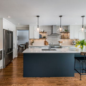
This kitchen was rearranged and opened up to allow a completely different way of living in the space. With the wall between the kitchen and family room removed, one window in the old eating area deleted and the doorway to the dining room moved over and enlarged, we were able to take a relatively small, closed off, u-shaped kitchen with a separate eating area and turn it into a large inviting kitchen with a huge island with room for stools, while improving traffic flow and sightlines at the same time. A pantry with roll outs, spice pull out, a double garbage pull out, lots of drawers for storage and an abundance of counter space make the space much more functional than the original kitchen!
Renovation Highlights include:
Complete re-arrangement of space
Hardwood added to kitchen and remainder of main level hardwood was refinished
Two colours for cabinetry plus a stained wood for the open shelving
Hanstone Montauk countertops
Layered lighting achieved with the use of pot lights in kitchen and family room, under cabinet puck lights and pendants over the island, all on dimmers to allow flexibility.
 Simply Home Decorating
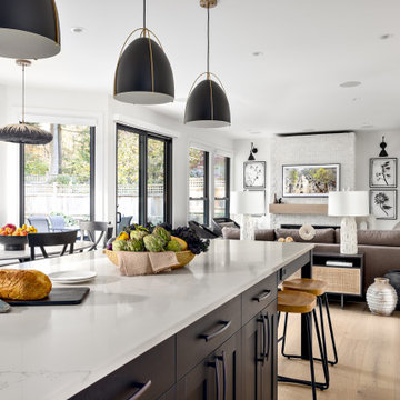
This beautiful North Vancouver home belongs to a nature-loving and health-conscious couple, Emma and Vince (names changed), their two young children, and their dog, Jasper. When they contacted us about renovating and furnishing their kitchen and family room, we walked in and saw a world of potential waiting to be uncovered.
Before: Larkhall Crescent Home:
Like many original North Vancouver homes, the interior was definitely dated. We encountered late ‘80s finishes in powder pink and teal green, old carpet, and a kitchen that wasn’t maximized to suit this family’s modern-day lifestyle. However, the size of the rooms offered us a ton of space with which to get creative.
Knowing our clients’ love of cooking, need for work spaces (Emma and Vince both work remotely), and growing family, we developed a design concept that would increase usable space, optimize storage, and create intimacy in this large area. As for the style, we were inspired by their European roots, inventing a new and modern take on “Belgian Farmhouse” style. Now, the home is truly one-of-a-kind.
After: Warm & Cozy Family Room:
Fresh, bright, and comfortable, this living area has been transformed! We started with the fireplace as a focal point, selecting aged brick tiles for added texture and a crisp wood mantle. The taupe-coloured sectional infuses the room with visual warmth and serves the added purpose of separating the family room from the kitchen.
Emma and Vince were also keen on using non-toxic materials in their home, and we were happy to oblige. To meet their needs, we sourced natural wood elements and sought out Canadian-made products - that adhere to high health standards - whenever possible.
Look closer at the elements of this space, and you will find this stunning, honeycomb-patterned rug in earthy gold, beige, and charcoal tones. It’s plush to the touch and full of visual texture that brings this room’s colour palette together. We sourced these two-tone chairs with caning, petrified wood side table, black sconces, and botanical prints in greyscale from local artist, Heather Johnston.
We topped off the space with this dark wood and rattan console that offers storage facing the kitchen and presents an opportunity to display cherished items. The result is a cozy lounging space brimming with comfort and functionality. It’s perfect for enjoying quality family time, or Emma can simply slide the coffee table away to make room for her morning yoga practice.
Now, let’s turn around and give some attention to the kitchen. Do you remember what the original kitchen looked like? If not, scroll back up, because the transformation is shocking…
Moody & Welcoming Kitchen for Healthy Living:
This kitchen looks very different from how it started, right? Though we didn’t touch any walls, the kitchen has almost doubled in usable space! We created a long, extended island with storage, an outlet for small appliances, and seating for comfortable prep, after-school snacking, or mingling among friends.
On the other side of the island, the family has even more storage and an integrated dishwasher within easy reach of the sink, perfect for quick clean-up. From this angle, you can also see the expansive custom Shaker cabinetry in white and the integrated double ovens. These facilitate their cooking experience and gave us the opportunity to add an additional surprise…
A coffee garage station and more hidden storage! Keeping these items located along the perimeter allows them to be accessed by the family or their guests without someone getting under the cook’s feet. These are the little details that make everyday life easier and more enjoyable.
Moving deeper into the kitchen, the seamless induction cooktop topped with a freestanding concealed hood fan commands attention in a soft yet prominent way. The natural wood accent mirrors the fireplace mantle, and the choice of off-black wood-grain cabinets not only continues our black-and-white colour palette but adds a sense of depth and contrast. The corner sink is located to the right and perfectly positioned with a view of their thriving backyard.
To invite more of this family’s character into the space, we mixed metals for interest — matte black, dark pewter, and warm brass — and created open shelves in white oak for their plants and decor. You can also glimpse the tumbled edge of the backsplash tile, which echoes the rustic brick of the fireplace. It adds that farmhouse charm while still feeling timeless and sophisticated.
Last but not least, we designed this dining banquette in the bay window (with integrated bench storage, of course), where the family can share a meal together, the kids can do homework, or Emma and Vince can work and enjoy a change of scenery from their offices. Like the other spaces in the home, it was designed to be beautiful, multi-functional, and long-lasting.
Praise from Our Clients:
It is clear that we love this home, but what did our clients have to say?
“Lori is a visionary and masters execution to the finest detail all at the same time. When she first met us to know more about who we are and how we live, she could right away envision how we could use the space in our kitchen and living room…The results exceeded our expectations.
Lori and her team were also a delight to work with — coordination with all the trades, fast problem-solving, regular updates, professional and friendly attitude of her entire team — made it the dream team. Thank you SHD for making our space so beautiful!”
In turn, we are so grateful for this family’s trust, their open communication, and for being wonderful people with whom to work. (So, thank you!)

Sponsored
Sunbury, OH

J.Holderby - Renovations
Franklin County's Leading General Contractors - 2X Best of Houzz!
 BLDG Workshop Inc.
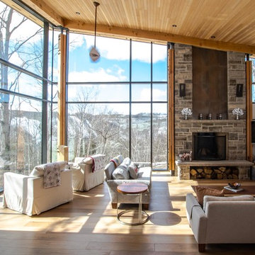
The owner of this Devil’s Glen Ski Resort chalet was determined to honour the original structure built by his father.
At the same time, a growing family created the need for an amplified space. The design for the enlarged chalet attempts to incorporate proportions and angles from the original craftsman styled structure while simultaneously taking cues from the challenging mountain site.
Stonework and timber beams create a framework for expansive glazing that affords sweeping views to the mountain, snow and sky. As a result, a new generation of skiers is engaged with the mountain and it’s community in the same way the owner’s father provided him.
 Simply Home Decorating
This beautiful North Vancouver home belongs to a nature-loving and health-conscious couple, Emma and Vince (names changed), their two young children, and their dog, Jasper. When they contacted us about renovating and furnishing their kitchen and family room, we walked in and saw a world of potential waiting to be uncovered.
Before: Larkhall Crescent Home:
Like many original North Vancouver homes, the interior was definitely dated. We encountered late ‘80s finishes in powder pink and teal green, old carpet, and a kitchen that wasn’t maximized to suit this family’s modern-day lifestyle. However, the size of the rooms offered us a ton of space with which to get creative.
Knowing our clients’ love of cooking, need for work spaces (Emma and Vince both work remotely), and growing family, we developed a design concept that would increase usable space, optimize storage, and create intimacy in this large area. As for the style, we were inspired by their European roots, inventing a new and modern take on “Belgian Farmhouse” style. Now, the home is truly one-of-a-kind.
After: Warm & Cozy Family Room:
Fresh, bright, and comfortable, this living area has been transformed! We started with the fireplace as a focal point, selecting aged brick tiles for added texture and a crisp wood mantle. The taupe-coloured sectional infuses the room with visual warmth and serves the added purpose of separating the family room from the kitchen.
Emma and Vince were also keen on using non-toxic materials in their home, and we were happy to oblige. To meet their needs, we sourced natural wood elements and sought out Canadian-made products - that adhere to high health standards - whenever possible.
Look closer at the elements of this space, and you will find this stunning, honeycomb-patterned rug in earthy gold, beige, and charcoal tones. It’s plush to the touch and full of visual texture that brings this room’s colour palette together. We sourced these two-tone chairs with caning, petrified wood side table, black sconces, and botanical prints in greyscale from local artist, Heather Johnston.
We topped off the space with this dark wood and rattan console that offers storage facing the kitchen and presents an opportunity to display cherished items. The result is a cozy lounging space brimming with comfort and functionality. It’s perfect for enjoying quality family time, or Emma can simply slide the coffee table away to make room for her morning yoga practice.
Now, let’s turn around and give some attention to the kitchen. Do you remember what the original kitchen looked like? If not, scroll back up, because the transformation is shocking…
Moody & Welcoming Kitchen for Healthy Living:
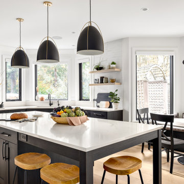
This kitchen looks very different from how it started, right? Though we didn’t touch any walls, the kitchen has almost doubled in usable space! We created a long, extended island with storage, an outlet for small appliances, and seating for comfortable prep, after-school snacking, or mingling among friends.
On the other side of the island, the family has even more storage and an integrated dishwasher within easy reach of the sink, perfect for quick clean-up. From this angle, you can also see the expansive custom Shaker cabinetry in white and the integrated double ovens. These facilitate their cooking experience and gave us the opportunity to add an additional surprise…
A coffee garage station and more hidden storage! Keeping these items located along the perimeter allows them to be accessed by the family or their guests without someone getting under the cook’s feet. These are the little details that make everyday life easier and more enjoyable.
Moving deeper into the kitchen, the seamless induction cooktop topped with a freestanding concealed hood fan commands attention in a soft yet prominent way. The natural wood accent mirrors the fireplace mantle, and the choice of off-black wood-grain cabinets not only continues our black-and-white colour palette but adds a sense of depth and contrast. The corner sink is located to the right and perfectly positioned with a view of their thriving backyard.
To invite more of this family’s character into the space, we mixed metals for interest — matte black, dark pewter, and warm brass — and created open shelves in white oak for their plants and decor. You can also glimpse the tumbled edge of the backsplash tile, which echoes the rustic brick of the fireplace. It adds that farmhouse charm while still feeling timeless and sophisticated.
Last but not least, we designed this dining banquette in the bay window (with integrated bench storage, of course), where the family can share a meal together, the kids can do homework, or Emma and Vince can work and enjoy a change of scenery from their offices. Like the other spaces in the home, it was designed to be beautiful, multi-functional, and long-lasting.
Praise from Our Clients:
It is clear that we love this home, but what did our clients have to say?
“Lori is a visionary and masters execution to the finest detail all at the same time. When she first met us to know more about who we are and how we live, she could right away envision how we could use the space in our kitchen and living room…The results exceeded our expectations.
Lori and her team were also a delight to work with — coordination with all the trades, fast problem-solving, regular updates, professional and friendly attitude of her entire team — made it the dream team. Thank you SHD for making our space so beautiful!”
In turn, we are so grateful for this family’s trust, their open communication, and for being wonderful people with whom to work. (So, thank you!)
 The Myers Touch
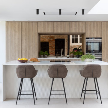
In collaboration with the client’s architect, AR Design the layout of the kitchen was already in place. However, upon meeting the client it was clear she wanted a ‘wow’ island, symmetry in design and plenty of functional storage.
As well as a contemporary, family-friendly space it was also important the space that still respected the heritage of the house. The original walls of the property had many angled walls and featured some tight spaces, so careful consideration of SieMatic's cabinetry choices was given to ensure maximum functionality in those spaces. After much consideration, The Myers Touch specified SieMatic’s SC10 Cabinetry in a Provence Oak Laminate finish which was placed in a framed-style at the rear wall.
The same cabinetry was specified for under the island to create contrast with the new and original material features in the space. In order for the family to keep the kitchen uncluttered, careful planning of internal storage systems was considered in the form of using SieMatic’s internal Drawer boxes and their MultiMatic internal storage system which were used to store smaller items such as spices and sauces, as well whilst providing space for slide-out drawers and storage baskets.
To ensure an elegant yet ‘wow’ factor central island, The Myers Touch combined contrasting textures by using 30mm Silestone Eternal Calacatta natural stone, polished worktops with ‘waterfall island’ edges and a Corian solid surface back panel. The distinctive geometric patterned Corian panel in Cameo White looks particularly spectacular at night when the owner's turn on the architectural-toned lighting under the island.
Appliances chosen for the island included a sophisticated Elica Illusion extractor hood so it could be totally integrated in the new architectural space without visual distraction, a Siemens iQ500 Induction Hob with touch-slide control and a Caple Under-counter Wine cabinet.
To maximise every inch of the new space, and to ensure the owners had a place for everything, The Myers Touch also used additional cabinetry and storage options in the island such as extra deep drawers to store saucepans, cutlery, and everyday crockery.
The eye-catching Antique-bronze mirrored splashback not only helps to provide the illusion of extra space, but reinforces family ‘togetherness’ as it reflects and links the rear of the kitchen ‘snug’ area where family members can sit and relax or work when not in the main kitchen extension area.
The original toned brickwork and 18th Century steel windows in the original part of the extension also helps to tell the story about the older part of the house which now juxtaposes to the new, contemporary kitchen living extension. A handy door was also included in the extension which leads to the garage on the main road for family convenience and over-flow storage.
Photography by Paul Craig (Reproduction of image by request only - joy@bakerpr.co.uk)
 My House Design|Build|Team
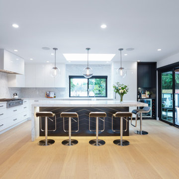
The family who owned this 1965 home chose a dramatic upgrade for their Coquitlam full home renovation. They wanted more room for gatherings, an open concept kitchen, and upgrades to bathrooms and the rec room. Their neighbour knew of our work, and we were glad to bring our skills to another project in the area.
Choosing Dramatic Lines
In the original house, the entryway was cramped, with a closet being the first thing everyone saw.
We opened the entryway and moved the closet, all while maintaining separation between the entry and the living space.
To draw the attention from the entry into the living room, we used a dramatic, flush, black herringbone ceiling detail across the ceiling. This detail goes all the way to the entertainment area on the main floor.
The eye arrives at a stunning waterfall edge walnut mantle, modern fireplace.
Open Concept Kitchen with Lots of Seating
The dividing wall between the kitchen and living areas was removed to create a larger, integrated entertaining space. The kitchen also has easy access to a new outdoor social space.
A new large skylight directly over the kitchen floods the space with natural light.
The kitchen now has gloss white cabinetry, with matte black accents and the same herringbone detail as the living room, and is tied together with a low maintenance Caesarstone’s white Attica quartz for the island countertop.
This over-sized island has barstool seating for five while leaving plenty of room for homework, snacking, socializing, and food prep in the same space.
To maximize space and minimize clutter, we integrated the kitchen appliances into the kitchen island, including a food warming drawer, a hidden fridge, and the dishwasher. This takes the eyes to focus off appliances, and onto the design elements which feed throughout the home.
We also installed a beverage center just beside the kitchen so family and guests can fix themselves a drink, without disrupting the flow of the kitchen.
Updated Downstairs Space, Updated Guest Room, Updated Bathrooms
It was a treat to update this entire house. Upstairs, we renovated the master bedroom with new blackout drapery, new decor, and a warm light grey paint colour. The tight bathroom was transformed with modern fixtures and gorgeous grey tile the homeowners loved.
The two teen girls’ rooms were updated with new lighting and furniture that tied in with the whole home decor, but which also reflected their personal taste.
In the basement, we updated the rec room with a bright modern look and updated fireplace. We added a needed door to the garage. We upgraded the bathrooms and created a legal second suite which the young adult daughter will use, for now.
Laundry Its Own Room, Finally
In a family with four women, you can imagine how much laundry gets done in this house. As part of the renovation, we built a proper laundry room with plenty of storage space, countertops, and a large sink.
 BLDG Workshop Inc.
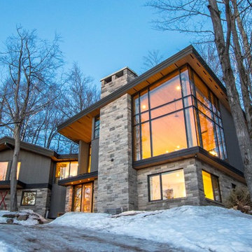
The owner of this Devil’s Glen Ski Resort chalet was determined to honour the original structure built by his father.
At the same time, a growing family created the need for an amplified space. The design for the enlarged chalet attempts to incorporate proportions and angles from the original craftsman styled structure while simultaneously taking cues from the challenging mountain site.
Stonework and timber beams create a framework for expansive glazing that affords sweeping views to the mountain, snow and sky. As a result, a new generation of skiers is engaged with the mountain and it’s community in the same way the owner’s father provided him.
 Fernanda Zulzke Interiores
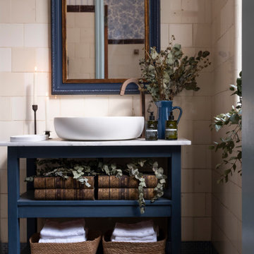
Fernanda Zulzke gifted São Paulo with an authentic experience by preserving the original 1920s tiles and architecture of the building. Many broken tiles were replaced, and missing ones were carefully sourced to breathe new life into a long-forgotten space. The floor tiles received the same care, though they posed an even greater challenge, as the original baseboard pieces could not be found even in the city’s largest tile archives. Beyond mere maintenance, the decoration aims to show visitors that history and its imperfections bring beauty, vitality, originality, and exclusivity to a space—a combination that can never be replicated, a luxury in its essence.
In the realm of restoration, the solid wood bathroom doors were personally tended to by Flávio Galli, a skilled designer and expert in raw materials, who followed the guidelines of the Parque da Água Branca manual. Four days of cleaning, sanding, and varnishing brought the doors back to life. In terms of carpentry, damaged baseboards and frames were crafted by Construverde using the building’s original wood—a true gift that Fernanda Zulzke was determined to offer the public and the park.
Completing the bathroom’s composition, imported wallpapers from Cordão Decor and a Roman curtain in cambric demonstrate the decorator’s ability to honor history while making bold, unexpected choices. Few can combine vintage, classic, and diverse colors and patterns in such a small space, transforming it into a light and fresh work of art, like the eucalyptus resting atop the marble and classic encyclopedias.

Sponsored
Sunbury, OH
J.Holderby - Renovations
Franklin County's Leading General Contractors - 2X Best of Houzz!
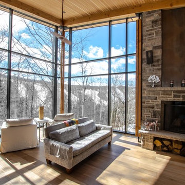 BLDG Workshop Inc.
The owner of this Devil’s Glen Ski Resort chalet was determined to honour the original structure built by his father.
At the same time, a growing family created the need for an amplified space. The design for the enlarged chalet attempts to incorporate proportions and angles from the original craftsman styled structure while simultaneously taking cues from the challenging mountain site.
Stonework and timber beams create a framework for expansive glazing that affords sweeping views to the mountain, snow and sky. As a result, a new generation of skiers is engaged with the mountain and it’s community in the same way the owner’s father provided him.
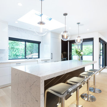 My House Design|Build|Team
The family who owned this 1965 home chose a dramatic upgrade for their Coquitlam full home renovation. They wanted more room for gatherings, an open concept kitchen, and upgrades to bathrooms and the rec room. Their neighbour knew of our work, and we were glad to bring our skills to another project in the area.
Choosing Dramatic Lines
In the original house, the entryway was cramped, with a closet being the first thing everyone saw.
We opened the entryway and moved the closet, all while maintaining separation between the entry and the living space.
To draw the attention from the entry into the living room, we used a dramatic, flush, black herringbone ceiling detail across the ceiling. This detail goes all the way to the entertainment area on the main floor.
The eye arrives at a stunning waterfall edge walnut mantle, modern fireplace.
Open Concept Kitchen with Lots of Seating
The dividing wall between the kitchen and living areas was removed to create a larger, integrated entertaining space. The kitchen also has easy access to a new outdoor social space.
A new large skylight directly over the kitchen floods the space with natural light.
The kitchen now has gloss white cabinetry, with matte black accents and the same herringbone detail as the living room, and is tied together with a low maintenance Caesarstone’s white Attica quartz for the island countertop.
This over-sized island has barstool seating for five while leaving plenty of room for homework, snacking, socializing, and food prep in the same space.
To maximize space and minimize clutter, we integrated the kitchen appliances into the kitchen island, including a food warming drawer, a hidden fridge, and the dishwasher. This takes the eyes to focus off appliances, and onto the design elements which feed throughout the home.
We also installed a beverage center just beside the kitchen so family and guests can fix themselves a drink, without disrupting the flow of the kitchen.
Updated Downstairs Space, Updated Guest Room, Updated Bathrooms
It was a treat to update this entire house. Upstairs, we renovated the master bedroom with new blackout drapery, new decor, and a warm light grey paint colour. The tight bathroom was transformed with modern fixtures and gorgeous grey tile the homeowners loved.
The two teen girls’ rooms were updated with new lighting and furniture that tied in with the whole home decor, but which also reflected their personal taste.
In the basement, we updated the rec room with a bright modern look and updated fireplace. We added a needed door to the garage. We upgraded the bathrooms and created a legal second suite which the young adult daughter will use, for now.
Laundry Its Own Room, Finally
In a family with four women, you can imagine how much laundry gets done in this house. As part of the renovation, we built a proper laundry room with plenty of storage space, countertops, and a large sink.
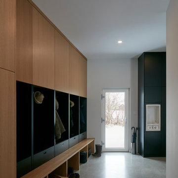
 Christopher Simmonds Architect
The client’s brief was to create a space reminiscent of their beloved downtown Chicago industrial loft, in a rural farm setting, while incorporating their unique collection of vintage and architectural salvage. The result is a custom designed space that blends life on the farm with an industrial sensibility.
The new house is located on approximately the same footprint as the original farm house on the property. Barely visible from the road due to the protection of conifer trees and a long driveway, the house sits on the edge of a field with views of the neighbouring 60 acre farm and creek that runs along the length of the property.
The main level open living space is conceived as a transparent social hub for viewing the landscape. Large sliding glass doors create strong visual connections with an adjacent barn on one end and a mature black walnut tree on the other.
The house is situated to optimize views, while at the same time protecting occupants from blazing summer sun and stiff winter winds. The wall to wall sliding doors on the south side of the main living space provide expansive views to the creek, and allow for breezes to flow throughout. The wrap around aluminum louvered sun shade tempers the sun.
The subdued exterior material palette is defined by horizontal wood siding, standing seam metal roofing and large format polished concrete blocks.
The interiors were driven by the owners’ desire to have a home that would properly feature their unique vintage collection, and yet have a modern open layout. Polished concrete floors and steel beams on the main level set the industrial tone and are paired with a stainless steel island counter top, backsplash and industrial range hood in the kitchen. An old drinking fountain is built-in to the mudroom millwork, carefully restored bi-parting doors frame the library entrance, and a vibrant antique stained glass panel is set into the foyer wall allowing diffused coloured light to spill into the hallway. Upstairs, refurbished claw foot tubs are situated to view the landscape.
The double height library with mezzanine serves as a prominent feature and quiet retreat for the residents. The white oak millwork exquisitely displays the homeowners’ vast collection of books and manuscripts. The material palette is complemented by steel counter tops, stainless steel ladder hardware and matte black metal mezzanine guards. The stairs carry the same language, with white oak open risers and stainless steel woven wire mesh panels set into a matte black steel frame.
The overall effect is a truly sublime blend of an industrial modern aesthetic punctuated by personal elements of the owners’ storied life.
Photography: James Brittain
 BLDG Workshop Inc.
The owner of this Devil’s Glen Ski Resort chalet was determined to honour the original structure built by his father.
At the same time, a growing family created the need for an amplified space. The design for the enlarged chalet attempts to incorporate proportions and angles from the original craftsman styled structure while simultaneously taking cues from the challenging mountain site.
Stonework and timber beams create a framework for expansive glazing that affords sweeping views to the mountain, snow and sky. As a result, a new generation of skiers is engaged with the mountain and it’s community in the same way the owner’s father provided him.

Sponsored
Delaware, OH

Buckeye Basements, Inc.
Central Ohio's Basement Finishing ExpertsBest Of Houzz '13-'21
 Christopher Simmonds Architect
The client’s brief was to create a space reminiscent of their beloved downtown Chicago industrial loft, in a rural farm setting, while incorporating their unique collection of vintage and architectural salvage. The result is a custom designed space that blends life on the farm with an industrial sensibility.
The new house is located on approximately the same footprint as the original farm house on the property. Barely visible from the road due to the protection of conifer trees and a long driveway, the house sits on the edge of a field with views of the neighbouring 60 acre farm and creek that runs along the length of the property.
The main level open living space is conceived as a transparent social hub for viewing the landscape. Large sliding glass doors create strong visual connections with an adjacent barn on one end and a mature black walnut tree on the other.
The house is situated to optimize views, while at the same time protecting occupants from blazing summer sun and stiff winter winds. The wall to wall sliding doors on the south side of the main living space provide expansive views to the creek, and allow for breezes to flow throughout. The wrap around aluminum louvered sun shade tempers the sun.
The subdued exterior material palette is defined by horizontal wood siding, standing seam metal roofing and large format polished concrete blocks.
The interiors were driven by the owners’ desire to have a home that would properly feature their unique vintage collection, and yet have a modern open layout. Polished concrete floors and steel beams on the main level set the industrial tone and are paired with a stainless steel island counter top, backsplash and industrial range hood in the kitchen. An old drinking fountain is built-in to the mudroom millwork, carefully restored bi-parting doors frame the library entrance, and a vibrant antique stained glass panel is set into the foyer wall allowing diffused coloured light to spill into the hallway. Upstairs, refurbished claw foot tubs are situated to view the landscape.
The double height library with mezzanine serves as a prominent feature and quiet retreat for the residents. The white oak millwork exquisitely displays the homeowners’ vast collection of books and manuscripts. The material palette is complemented by steel counter tops, stainless steel ladder hardware and matte black metal mezzanine guards. The stairs carry the same language, with white oak open risers and stainless steel woven wire mesh panels set into a matte black steel frame.
The overall effect is a truly sublime blend of an industrial modern aesthetic punctuated by personal elements of the owners’ storied life.
Photography: James Brittain
 WW Design Studio
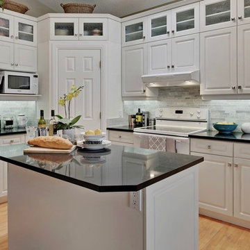
A former kitchen with a staggered sight line, tiled countertop, and brass trim gains a fresh perspective with small updates. The cabinetry was in excellent shape, so the kitchen was largely re-purposed with all the original cabinetry intact and the same footprint used. The wish list included extra storage and with a vaulted ceiling, the obvious choice was to gain additional storage in height. As the original cabinets were no longer being manufactured, glass front uppers were chosen and painted to match. With the addition of new side panels and crown moulding, the new uppers cabinets blend seamlessly in place. The pantry walls were also painted to match the cabinetry to give it the appearance of a built-in. New countertops in black Caesarstone, marble backsplash, Blanco sink, brushed nickel knobs, and kitchen faucet gives this kitchen a fresh updated look!
Photo Credit: Zoon Media
 Kon-strux Developments
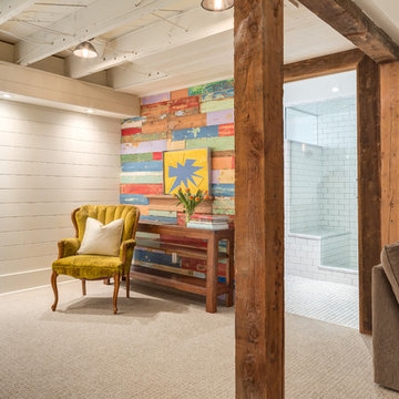
Harnessing this antique barn board in it original colours is the soul of this basement space. In the centre of the photo you can see into the glorious new bathroom with glass surround shower and subway tiling throughout.
9