
Search results for "Redtube same origin" in Home Design Ideas
 Alair Homes Plano
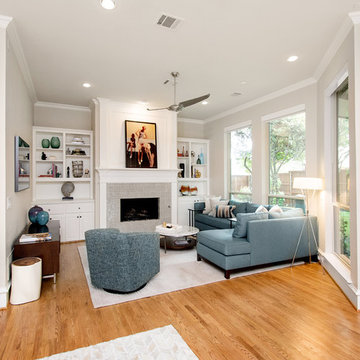
This house was built in 1994 and our clients have been there since day one. They wanted a complete refresh in their kitchen and living areas and a few other changes here and there; now that the kids were all off to college! They wanted to replace some things, redesign some things and just repaint others. They didn’t like the heavy textured walls, so those were sanded down, re-textured and painted throughout all of the remodeled areas.
The kitchen change was the most dramatic by painting the original cabinets a beautiful bluish-gray color; which is Benjamin Moore Gentleman’s Gray. The ends and cook side of the island are painted SW Reflection but on the front is a gorgeous Merola “Arte’ white accent tile. Two Island Pendant Lights ‘Aideen 8-light Geometric Pendant’ in a bronze gold finish hung above the island. White Carrara Quartz countertops were installed below the Viviano Marmo Dolomite Arabesque Honed Marble Mosaic tile backsplash. Our clients wanted to be able to watch TV from the kitchen as well as from the family room but since the door to the powder bath was on the wall of breakfast area (no to mention opening up into the room), it took up good wall space. Our designers rearranged the powder bath, moving the door into the laundry room and closing off the laundry room with a pocket door, so they can now hang their TV/artwork on the wall facing the kitchen, as well as another one in the family room!
We squared off the arch in the doorway between the kitchen and bar/pantry area, giving them a more updated look. The bar was also painted the same blue as the kitchen but a cool Moondrop Water Jet Cut Glass Mosaic tile was installed on the backsplash, which added a beautiful accent! All kitchen cabinet hardware is ‘Amerock’ in a champagne finish.
In the family room, we redesigned the cabinets to the right of the fireplace to match the other side. The homeowners had invested in two new TV’s that would hang on the wall and display artwork when not in use, so the TV cabinet wasn’t needed. The cabinets were painted a crisp white which made all of their decor really stand out. The fireplace in the family room was originally red brick with a hearth for seating. The brick was removed and the hearth was lowered to the floor and replaced with E-Stone White 12x24” tile and the fireplace surround is tiled with Heirloom Pewter 6x6” tile.
The formal living room used to be closed off on one side of the fireplace, which was a desk area in the kitchen. The homeowners felt that it was an eye sore and it was unnecessary, so we removed that wall, opening up both sides of the fireplace into the formal living room. Pietra Tiles Aria Crystals Beach Sand tiles were installed on the kitchen side of the fireplace and the hearth was leveled with the floor and tiled with E-Stone White 12x24” tile.
The laundry room was redesigned, adding the powder bath door but also creating more storage space. Waypoint flat front maple cabinets in painted linen were installed above the appliances, with Top Knobs “Hopewell” polished chrome pulls. Elements Carrara Quartz countertops were installed above the appliances, creating that added space. 3x6” white ceramic subway tile was used as the backsplash, creating a clean and crisp laundry room! The same tile on the hearths of both fireplaces (E-Stone White 12x24”) was installed on the floor.
The powder bath was painted and 12x36” Ash Fiber Ceramic tile was installed vertically on the wall behind the sink. All hardware was updated with the Signature Hardware “Ultra”Collection and Shades of Light “Sleekly Modern” new vanity lights were installed.
All new wood flooring was installed throughout all of the remodeled rooms making all of the rooms seamlessly flow into each other. The homeowners love their updated home!
Design/Remodel by Hatfield Builders & Remodelers | Photography by Versatile Imaging
 StudioLAB
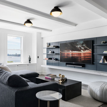
Across from Hudson River Park, the Classic 7 pre-war apartment had not renovated in over 50 years. The new owners, a young family with two kids, desired to open up the existing closed in spaces while keeping some of the original, classic pre-war details. Dark, dimly-lit corridors and clustered rooms that were a detriment to the brilliant natural light and expansive views the existing apartment inherently possessed, were demolished to create a new open plan for a more functional style of living. Custom charcoal stained white oak herringbone floors were laid throughout the space. The dark blue lacquered kitchen cabinets provide a sharp contrast to the otherwise neutral colored space. A wall unit in the same blue lacquer floats on the wall in the Den.
 Studio Dearborn
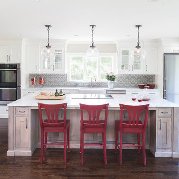
 Grey stained cabinetry compliments the white perimeter cabinetry and carerra countertops. Cement backsplash in "Nantes" by Original Mission Tile in soft grey and white add flair to the muted palette. Kitchen design and custom cabinetry by Sarah Robertson of Studio Dearborn. Refrigerator by LIebherr. Cooktop by Wolf. Bosch dishwasher. Farmhouse sink by Blanco. Cabinetry pulls by Jeffrey Alexander Belcastle collection. Photo credit: Neil Landino
Find the right local pro for your project
 Klopf Architecture
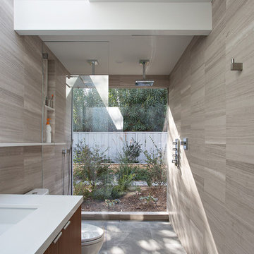
Klopf Architecture, Arterra Landscape Architects, and Flegels Construction updated a classic Eichler open, indoor-outdoor home. Expanding on the original walls of glass and connection to nature that is common in mid-century modern homes. The completely openable walls allow the homeowners to truly open up the living space of the house, transforming it into an open air pavilion, extending the living area outdoors to the private side yards, and taking maximum advantage of indoor-outdoor living opportunities. Taking the concept of borrowed landscape from traditional Japanese architecture, the fountain, concrete bench wall, and natural landscaping bound the indoor-outdoor space. The Truly Open Eichler is a remodeled single-family house in Palo Alto. This 1,712 square foot, 3 bedroom, 2.5 bathroom is located in the heart of the Silicon Valley.
Klopf Architecture Project Team: John Klopf, AIA, Geoff Campen, and Angela Todorova
Landscape Architect: Arterra Landscape Architects
Structural Engineer: Brian Dotson Consulting Engineers
Contractor: Flegels Construction
Photography ©2014 Mariko Reed
Location: Palo Alto, CA
Year completed: 2014
 Kitchen Design Concepts
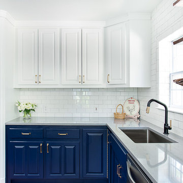
We introduce to you one of our newer services we are providing here at Kitchen Design Concepts: spaces that just need a little reviving! As of recent, we are taking on projects that are in need of minimal updating, as in, spaces that don’t need a full-on remodel. Yes, you heard right! If your space has good bones, you like the layout of your kitchen, and you just need a few cosmetic changes, then today’s feature is for you! Recently, we updated a space where we did just this! The kitchen was in need of a little love, some fresh paint, and new finishes. And if we’re being honest here, the result looks almost as if the kitchen had a full-on remodel! To learn more about this space and how we did our magic, continue reading below:
The Before and After
First, see what an impact new finishes can make! The “before” image shows a kitchen with outdated finishes such as the tile countertops, backsplash, and cabinetry finish. The “after” image, is a kitchen that looks almost as if its brand new, the image speaks for itself!
Cabinetry
With the wooden cabinetry in this kitchen already having great bones, all we needed to do was our refinishing process that involved removing door and drawer fronts, sanding, priming, and painting. The main color of the cabinetry is white (Sherwin Williams Pure White 7005) and as an accent, we applied a deep navy blue that really pops in this space (Sherwin Willaims Naval 6244). As a special design element, we incorporated a natural wooden band across the hood which is subtle but adds an element of surprise.
Countertops
The original countertops in this space were a 12×12 tile with cracks and discolored grout from all the wear and tear. To replace the countertops, we installed a clean and crisp quartz that is not only durable but easy to maintain (no grout here!). The 3cm countertops are a Cambria quartz in a grey-tone color (Carrick).
Backsplash
Keeping things simple, yet classic, we installed a 3×6 subway tile from Interceramic. The crisp white pairs well with all the other finishes of the space and really brighten the space up! To spice things up, we paired the white tile with a contrasting grout color (Cape Grey) that matches the countertop. This is a simple method to add interest to your white backsplash!
Fixtures and Fittings
For the fixtures and fittings of the kitchen, we wanted pieces that made a statement. That’s why we selected this industrial style faucet from Brizo! The faucet is a Brizo LITZE™ PULL-DOWN FAUCET WITH ARC SPOUT AND INDUSTRIAL HANDLE (63044LF-BLGL). The matte black paired with the luxe gold elements really make a statement! To match the gold elements of the faucet, we installed cabinetry hardware from Topknobs in the same gold finish. The hardware is a Channing pull TK743HB. Lastly, the large single bowl sink (who doesn’t want a large sink?!) is a great functional touch to the kitchen. The sink is a Blanco Precision 16″ R10 super single with 16″ Drainer in stainless steel (516216).
 Boheen & Co
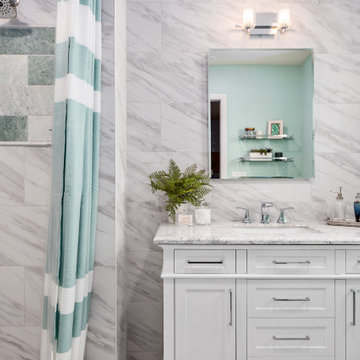
This was a small, enclosed shower in this Master Bathroom. We wanted to give all the glitz and glam this homeowner deserved and make this small space feel larger. We achieved this by running the same wall tile in the shower as the sink wall. It was a tight budget that we were able to make work with real and faux marble mixed together in a clever way. We kept everything light and in cool colors to give that luxurious spa feel.
 Uniquely Your Own
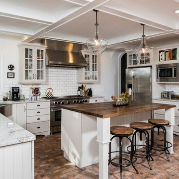
Renovated kitchen gets a new lay out with corner farm house sink, new shaker cabinets, bead board trim, coffered ceiling, large wood top island, 6 burner and gridle Blue Star Range and Chicago Brick Tile to hark to the original 1923 brick lanolium that was found as the original floor.

Sponsored
Sunbury, OH

J.Holderby - Renovations
Franklin County's Leading General Contractors - 2X Best of Houzz!
 ODS Architecture
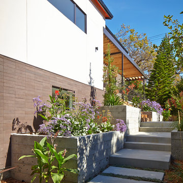
Originally a nearly three-story tall 1920’s European-styled home was turned into a modern villa for work and home. A series of low concrete retaining wall planters and steps gradually takes you up to the second level entry, grounding or anchoring the house into the site, as does a new wrap around veranda and trellis. Large eave overhangs on the upper roof were designed to give the home presence and were accented with a Mid-century orange color. The new master bedroom addition white box creates a better sense of entry and opens to the wrap around veranda at the opposite side. Inside the owners live on the lower floor and work on the upper floor with the garage basement for storage, archives and a ceramics studio. New windows and open spaces were created for the graphic designer owners; displaying their mid-century modern furnishings collection.
A lot of effort went into attempting to lower the house visually by bringing the ground plane higher with the concrete retaining wall planters, steps, wrap around veranda and trellis, and the prominent roof with exaggerated overhangs. That the eaves were painted orange is a cool reflection of the owner’s Dutch heritage. Budget was a driver for the project and it was determined that the footprint of the home should have minimal extensions and that the new windows remain in the same relative locations as the old ones. Wall removal was utilized versus moving and building new walls where possible.
Photo Credit: John Sutton Photography.
 Dura Supreme Cabinetry
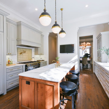
With an ideal location in the Pacific Heights neighborhood of San Francisco, this dated Victorian residence had "beautiful bones" but had been sitting on the market for a year before being purchased with plans to revitalize the interior. Interior designer, Noel Han, explained, "Historical Victorian homes in this area often have beautiful architectural elements that I aim to preserve, but the floor plan and layout tend to be stuffy, not live-able and not light filled. Modern families want bright, light-filled, spacious rooms that take advantage of outdoor views and living spaces, and function well for storage, meals and entertaining."
Preserving the architectural integrity and special features of the home was one of Han's goals but at the same time, she re-designed the space, moving walls and adding windows to create an open floorplan that flowed easily between the kitchen and outdoor living spaces. Where the range once stood in the original design, now an entire wall of windows provides panoramic views of the outdoors and fills the kitchen with light. Below the windows, Han designed a long bank of base cabinets with drawers to provide plenty of storage and work surface. Light now pours into the space even on foggy days. The range was moved to the opposite wall so that beautiful window views could be added to the kitchen.
Han selected a palette of finishes with an eye toward creating a "soft color aesthetic". "White painted finishes are very popular right now but would have felt stark and cold in this space," she explained. "The French grey paint from Dura Supreme was a perfect complement for this vintage Victorian home, to create a classic color scheme".
"This beautiful home already had hardware elements with a vintage brass finish, so I carefully selected antiqued, brushed brass hardware, plumbing and metal finishes to blend with the original elements," said Han. She continued, "The La Cornue French Range adds modern function with a French antique look."
"I appreciate working with Dura Supreme cabinetry because of the quality of the cabinetry, fast delivery and the custom options. I'm able to create beautiful architectural details like the pull-out columns on both sides of the range and the curved mullion doors on the furniture hutch, and they offer a stunning palette of finishes and styles," explained Han. For the bath cabinetry, Han created a similar palette of finishes and styles to create a complementary look throughout the entire home.
Product Details:
Perimeter: Dura Supreme Cabinetry shown in the St. Augustine door style and Mullion Pattern #15 door style with a “Zinc” painted finish.
Kitchen Island: Dura Supreme Cabinetry shown in the St. Augustine door style with a Clove stain and Black Accent finish on Cherry wood.
For more information about Noel Han, Interior Designer, click to her website here www.atelnoel.com.
For more information about Gilmans Kitchens and Baths, click to their website here www.gkandb.com.
Photography by: Ned Bonzi www.nedbonzi.com.
Request a FREE Dura Supreme Brochure Packet:
http://www.durasupreme.com/request-brochure
 Adrienne DeRosa
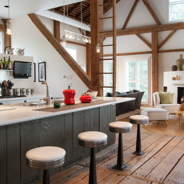
Tucked neatly into an existing bay of the barn, the open kitchen is a comfortable hub of the home. Rather than create a solid division between the kitchen and the children's TV area, Franklin finished only the lower portion of the post-and-beam supports.
The ladder is one of the original features of the barn that Franklin could not imagine ever removing. Cleverly integrated into the support post, its original function allowed workers to climb above large haystacks and pick and toss hay down a chute to the feeding area below. Franklin's children, 10 and 14, also enjoy this aspect of their home. "The kids and their friends run, slide, climb up the ladder and have a ton of fun," he explains, "It’s a barn! It is a place to share with friends and family."
Adrienne DeRosa Photography
 Alair Homes Plano
Our clients house was built in 2012, so it was not that outdated, it was just dark. The clients wanted to lighten the kitchen and create something that was their own, using more unique products. The master bath needed to be updated and they wanted the upstairs game room to be more functional for their family.
The original kitchen was very dark and all brown. The cabinets were stained dark brown, the countertops were a dark brown and black granite, with a beige backsplash. We kept the dark cabinets but lightened everything else. A new translucent frosted glass pantry door was installed to soften the feel of the kitchen. The main architecture in the kitchen stayed the same but the clients wanted to change the coffee bar into a wine bar, so we removed the upper cabinet door above a small cabinet and installed two X-style wine storage shelves instead. An undermount farm sink was installed with a 23” tall main faucet for more functionality. We replaced the chandelier over the island with a beautiful Arhaus Poppy large antique brass chandelier. Two new pendants were installed over the sink from West Elm with a much more modern feel than before, not to mention much brighter. The once dark backsplash was now a bright ocean honed marble mosaic 2”x4” a top the QM Calacatta Miel quartz countertops. We installed undercabinet lighting and added over-cabinet LED tape strip lighting to add even more light into the kitchen.
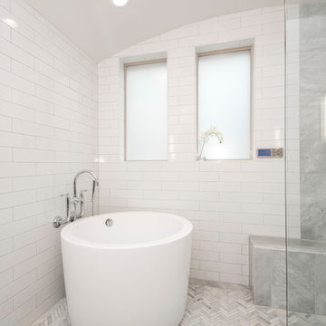
We basically gutted the Master bathroom and started from scratch. We demoed the shower walls, ceiling over tub/shower, demoed the countertops, plumbing fixtures, shutters over the tub and the wall tile and flooring. We reframed the vaulted ceiling over the shower and added an access panel in the water closet for a digital shower valve. A raised platform was added under the tub/shower for a shower slope to existing drain. The shower floor was Carrara Herringbone tile, accented with Bianco Venatino Honed marble and Metro White glossy ceramic 4”x16” tile on the walls. We then added a bench and a Kohler 8” rain showerhead to finish off the shower. The walk-in shower was sectioned off with a frameless clear anti-spot treated glass. The tub was not important to the clients, although they wanted to keep one for resale value. A Japanese soaker tub was installed, which the kids love! To finish off the master bath, the walls were painted with SW Agreeable Gray and the existing cabinets were painted SW Mega Greige for an updated look. Four Pottery Barn Mercer wall sconces were added between the new beautiful Distressed Silver leaf mirrors instead of the three existing over-mirror vanity bars that were originally there. QM Calacatta Miel countertops were installed which definitely brightened up the room!
Originally, the upstairs game room had nothing but a built-in bar in one corner. The clients wanted this to be more of a media room but still wanted to have a kitchenette upstairs. We had to remove the original plumbing and electrical and move it to where the new cabinets were. We installed 16’ of cabinets between the windows on one wall. Plank and Mill reclaimed barn wood plank veneers were used on the accent wall in between the cabinets as a backing for the wall mounted TV above the QM Calacatta Miel countertops. A kitchenette was installed to one end, housing a sink and a beverage fridge, so the clients can still have the best of both worlds. LED tape lighting was added above the cabinets for additional lighting. The clients love their updated rooms and feel that house really works for their family now.
Design/Remodel by Hatfield Builders & Remodelers | Photography by Versatile Imaging
 Mãkena Interiors
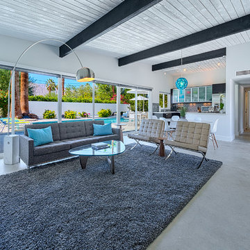
Original Mid-Century Home in Sunmor Palm Springs, built by the Alexander Construction Co in 1958
available for vacation rentals
Living room - 1960s open concept living room idea in Other with white walls
Living room - 1960s open concept living room idea in Other with white walls
 Klopf Architecture
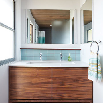
Klopf Architecture and Jesse Ososki Art remodeled an existing Eichler atrium home into a brighter, more open, and more functional version of its original self.
The goals were to preserve the Eichler look and feel without the need to strictly adhere to it. The scope of work included re-configuring the master bedroom/bath, the kitchen, and the hall bath/laundry area, as well as updating interior finishes throughout to be more sophisticated.
The owners are detail-oriented and were very involved in the design process, down to the selection of lighting controls and stainless steel faceplates.Their design aesthetic leans toward the Scandinavian — light and bright, with simple straight lines and pure geometric shapes.
The finish flooring is large porcelain tile (24” x 24”) in a neutral grey tone, providing a uniform backdrop against which other materials can stand out. The same tile continues into the shower floor (with a different finish texture for slip-resistance) and up the shower/tub walls (in a smaller size). Heath Classic Field ceramic tile in Modern Blue was used sparingly, to add color at the hall bath vanity backsplash and at the shampoo niches in both bathrooms. Back-painted soda glass in pale blue to match the Heath tile was used at the kitchen backsplash. This same accent color was also used at the front entry atrium door. Kitchen cabinetry, countertops, appliances, and light fixtures are all white, making the kitchen feel more airy and light. Countertops are Caesarstone Blizzard.
The owners chose to keep some of the original Eichler elements: the concrete masonry fireplace; the stained tongue-and-groove redwood ceiling decking; and the luan wall paneling. The luan paneling was lightly sanded, cleaned, and re-stained. The owners also kept an added element that was installed by a previous owner: sliding shoji panels at all bedroom windows and sliding glass doors, for both privacy and sun control. Grooves were cut into the new tile flooring for the shoji panels to slide in, creating a more integrated look. Walnut was used to add warmth and contrast at the kitchen bar top and niche, the bathroom vanities, and the window sill/ledge under the kitchen window.
This Burlingame Eichler Remodel is a 2,121 sf, 4 bedroom/2 bath home located in the heart of Silicon Valley.
Klopf Architecture Project Team: John Klopf, Klara Kevane and Yegvenia Torres Zavala
Contractor: Jesse Ososki Art
Structural Engineer: Emmanuel Pun
Photography ©2018 Mariko Reed
Location: Burlingame, CA
Year completed: 2017

Sponsored
Columbus, OH

Wannemacher Interiors
Customized Award-Winning Interior Design Solutions in Franklin Cnty OH
 Irene Designs
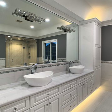
This dream bathroom has everything one can wish for an ideal bathroom escape. It doesn’t just look fabulous – it works well and it is built to stand the test of time.
This bathroom was designed as a private oasis, a place to relax and unwind. Spa-like environment is created by expansive double-sink custom vanity, an elegant free standing tub, and a spacious two-person barrier-free shower with a floating bench. Toilet is concealed within a separate nook behind a pocket door.
Main bathroom area is outlined by a tray ceiling perimeter. The room looks open, airy and spacious. Nothing interferes with the ceiling design and overall space configuration. It hasn’t always been that way. Former layout had serious pitfalls that made the room look much smaller. The shower concealed behind solid walls protruded into the main area clashing with the tray ceiling geometry. Massive shower stall took up significant amount of the room leaving no continuous wall space for a double sink vanity. There were two separate vanities with a dead corner space between them. At the same time, the toilet room was quite spacious with just one fixture in the far end.
New layout not only looks better, it allows for a better functionality and fully reveals the space potential. The toilet was relocated to occupy the former linen closet space slightly expanded into adjacent walk-in closet. Shower was moved into the bigger alcove, away from the tray ceiling area. It opened up the room while giving space for a gorgeous wall-to-wall vanity. Having a full glass wall, the shower extends the space even further. Sparkling glass creates no barrier to the eyesight. The room feels clean, breezy and extra spacious. Gorgeous frameless shower enclosure with glass-to-glass clamps and hinges shows off premium tile designs of the accent shower wall.
Free standing tub remained in its original place in front of the window. With no solid shower walls nearby, it became a focal point adorned with the new crystal chandelier above it. This two-tier gorgeous chandelier makes the bathroom feel incredibly grand. A touch of luxury is showing up in timeless polished chrome faucet finish selections as well.
New expansive custom vanity has his and her full height linen towers, his and her sink cabinets with two individual banks of drawers on the sides and one shared drawer cabinet in the middle containing a charging station in the upper drawer.
Vanity counter tops and floating shower seat top are made of high-end quartz.
Vessel sinks resemble the shape and style of the free-standing tub.
To make the room feel even more spacious and to showcase the shower area in the reflection, a full size mirror is installed over the vanity. Crystal sconces are installed directly into the mirror.
Crisp classic white tile gives the room a timeless sense of polish and luxury. Walls around the perimeter of the entire bathroom are tiled half way. Three rows of 12”x 24” porcelain tile resembling white marble are crowned with a thin row of intricate glass tiles with marble accents, and a chair rail tile.
Tile design flows into a spacious barrier-free two-person walk-in shower. Two more tile patterns of the same tile collection are brought into play. Rear wall is adorned with a picture frame made out of 12”x12” tiles laid at 45 degree angle within the same chair rail and glass tile border. Shower floor is made of small hexagon tiles for proper drainage.
Shower area has two hidden from plain sight niches to contain shampoo bottles and toiletries. The rear side of the niches is made of glass mosaics for a waterfall effect.
To showcase the picture frame inside the shower, the accent shower wall is washed with cascading light from a discrete LED strip tucked in a cove behind “floating” shower ceiling platform.
Multiple shower heads (two ceiling-mount rain heads, one multi-functional wall mount shower head, and a handheld shower) are able to provide a fully customizable shower experience.
Despite of many hard surfaces and shiny finishes, which can sometimes lead to a cold impersonal feeling, this bathroom is cozy and truly welcoming. This sense of warms is maintained by exclusive multi-functional layered lighting. Carefully designed groups of lights (all having a dimmer control) can be used simultaneously, in various combinations, or separately to create numerous different effects and perfect atmosphere for every mood and occasion. Some lights have smart controls and can be operated remotely.
Amazing effect can be achieved by dimmable toe kick perimeter lighting. With the ceiling lights turned off, the vanity looks as if it is floating in the air. Multifaceted crystal fixtures produce cascades of sparkling rainbow reflections dancing around the room and creating an illusion of a starry sky.
Programmable radiant heating floor offers additional warmth and comfort to the room.
This bathroom is well suited for either a quick morning shower or a night in for ultimate relaxation with a champagne toast and a long soak in the freestanding tub.
 Innovative Design Build
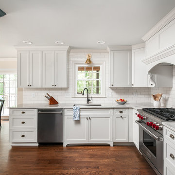
"I cannot say enough good things about the Innovative Construction team and work product.
They remodeled our water-damaged, 1930s basement, and exceeded all of our expectations - before and after photos simply cannot do this project justice. The original basement included an awkward staircase in an awkward location, one bedroom, one bathroom, a kitchen and small living space. We had a difficult time imagining that it could be much more than that. Innovative Construction's design team was creative, and thought completely out of the box. They relocated the stairwell in a way we did not think was possible, opening up the basement to reconfigure the bedroom, bathroom, kitchenette, living space, but also adding an office and finished storage room. The end result is as functional as it is beautiful.
As with all construction, particularly a renovation of an old house, there will be inconveniences, it will be messy, and plenty of surprises behind the old walls. The Innovative Construction team maintained a clean and safe work site for 100% of the project, with minimal disruption to our daily lives, even when there was a large hole cut into our main living room floor to accommodate new stairs down to the basement. The team showed creativity and an eye for design when working around some of the unexpected "character" revealed when opening the walls.
The team effectively uses technology to keep everyone on the same page about changes, requests, schedules, contracts, invoices, etc. Everyone is friendly, competent, helpful, and responsive. I felt heard throughout the process, and my requests were responded to quickly and thoroughly. I recommend Innovative Construction without reservation."
 Tammara Stroud Design
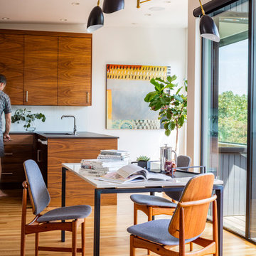
In 1949, one of mid-century modern’s most famous NW architects, Paul Hayden Kirk, built this early “glass house” in Hawthorne Hills. Rather than flattening the rolling hills of the Northwest to accommodate his structures, Kirk sought to make the least impact possible on the building site by making use of it natural landscape. When we started this project, our goal was to pay attention to the original architecture--as well as designing the home around the client’s eclectic art collection and African artifacts. The home was completely gutted, since most of the home is glass, hardly any exterior walls remained. We kept the basic footprint of the home the same—opening the space between the kitchen and living room. The horizontal grain matched walnut cabinets creates a natural continuous movement. The sleek lines of the Fleetwood windows surrounding the home allow for the landscape and interior to seamlessly intertwine. In our effort to preserve as much of the design as possible, the original fireplace remains in the home and we made sure to work with the natural lines originally designed by Kirk.
 Soucie Horner, Ltd.
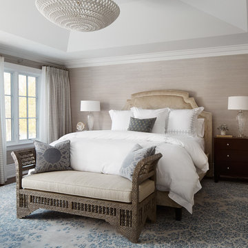
A fresh take on traditional style, this sprawling suburban home draws its occupants together in beautifully, comfortably designed spaces that gather family members for companionship, conversation, and conviviality. At the same time, it adroitly accommodates a crowd, and facilitates large-scale entertaining with ease. This balance of private intimacy and public welcome is the result of Soucie Horner’s deft remodeling of the original floor plan and creation of an all-new wing comprising functional spaces including a mudroom, powder room, laundry room, and home office, along with an exciting, three-room teen suite above. A quietly orchestrated symphony of grayed blues unites this home, from Soucie Horner Collections custom furniture and rugs, to objects, accessories, and decorative exclamationpoints that punctuate the carefully synthesized interiors. A discerning demonstration of family-friendly living at its finest.

Sponsored
Sunbury, OH
J.Holderby - Renovations
Franklin County's Leading General Contractors - 2X Best of Houzz!
 TKS Design Group
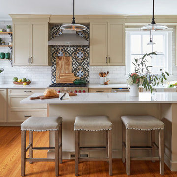
This vintage home was built in 1897 in Downers Grove. The homeowner is an avid chef and needed a better design work flow. She wanted to keep the same vintage feel in the kitchen as throughout the home. We added a work / dining island, new cabinetry and storage, upgraded the cooking equipment and widened and upgraded the windows for additional natural light. We added the archway into the dining room to repeat the original archway elsewhere in the home.
Designed by: Susan Klimala, CKD, CBD
Photography by: Michael Alan Kaskel
For more information on kitchen and bath design ideas go to: www.kitchenstudio-ge.com
 Ackerman Art & Design
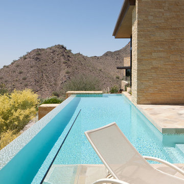
Services provided by Wendy; concept collaboration, original custom design of; furniture, area rugs, mosaic floors, doors, elevator interiors, cabinetry,
finish selection; paint ,flooring,stone, tile, cabinetry, counters, lighting fixtures, plumbing fixtures,and hardware. Selection of upholstery,furniture indoor and outdoor.
Photo credit: Pat Kofahl
 cg interiors group
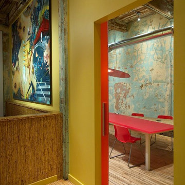
Two adjacent warehouse units in a circa 1915 building, listed on the National Register of Historic Places, were combined into a single modern live / work space. Careful consideration was paid to honoring and preserving original elements like exposed brick walls, timber beams and columns, hardwood and concrete floors and plaster walls.
7