
Search results for "Redtube same origin" in Home Design Ideas
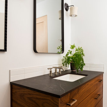
 Tammara Stroud Design
In 1949, one of mid-century modern’s most famous NW architects, Paul Hayden Kirk, built this early “glass house” in Hawthorne Hills. Rather than flattening the rolling hills of the Northwest to accommodate his structures, Kirk sought to make the least impact possible on the building site by making use of it natural landscape. When we started this project, our goal was to pay attention to the original architecture--as well as designing the home around the client’s eclectic art collection and African artifacts. The home was completely gutted, since most of the home is glass, hardly any exterior walls remained. We kept the basic footprint of the home the same—opening the space between the kitchen and living room. The horizontal grain matched walnut cabinets creates a natural continuous movement. The sleek lines of the Fleetwood windows surrounding the home allow for the landscape and interior to seamlessly intertwine. In our effort to preserve as much of the design as possible, the original fireplace remains in the home and we made sure to work with the natural lines originally designed by Kirk.
 Tammara Stroud Design
In 1949, one of mid-century modern’s most famous NW architects, Paul Hayden Kirk, built this early “glass house” in Hawthorne Hills. Rather than flattening the rolling hills of the Northwest to accommodate his structures, Kirk sought to make the least impact possible on the building site by making use of it natural landscape. When we started this project, our goal was to pay attention to the original architecture--as well as designing the home around the client’s eclectic art collection and African artifacts. The home was completely gutted, since most of the home is glass, hardly any exterior walls remained. We kept the basic footprint of the home the same—opening the space between the kitchen and living room. The horizontal grain matched walnut cabinets creates a natural continuous movement. The sleek lines of the Fleetwood windows surrounding the home allow for the landscape and interior to seamlessly intertwine. In our effort to preserve as much of the design as possible, the original fireplace remains in the home and we made sure to work with the natural lines originally designed by Kirk.
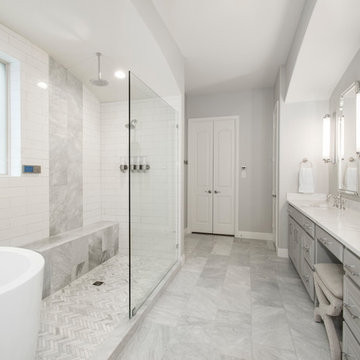
 Alair Homes Plano
Our clients house was built in 2012, so it was not that outdated, it was just dark. The clients wanted to lighten the kitchen and create something that was their own, using more unique products. The master bath needed to be updated and they wanted the upstairs game room to be more functional for their family.
The original kitchen was very dark and all brown. The cabinets were stained dark brown, the countertops were a dark brown and black granite, with a beige backsplash. We kept the dark cabinets but lightened everything else. A new translucent frosted glass pantry door was installed to soften the feel of the kitchen. The main architecture in the kitchen stayed the same but the clients wanted to change the coffee bar into a wine bar, so we removed the upper cabinet door above a small cabinet and installed two X-style wine storage shelves instead. An undermount farm sink was installed with a 23” tall main faucet for more functionality. We replaced the chandelier over the island with a beautiful Arhaus Poppy large antique brass chandelier. Two new pendants were installed over the sink from West Elm with a much more modern feel than before, not to mention much brighter. The once dark backsplash was now a bright ocean honed marble mosaic 2”x4” a top the QM Calacatta Miel quartz countertops. We installed undercabinet lighting and added over-cabinet LED tape strip lighting to add even more light into the kitchen.
We basically gutted the Master bathroom and started from scratch. We demoed the shower walls, ceiling over tub/shower, demoed the countertops, plumbing fixtures, shutters over the tub and the wall tile and flooring. We reframed the vaulted ceiling over the shower and added an access panel in the water closet for a digital shower valve. A raised platform was added under the tub/shower for a shower slope to existing drain. The shower floor was Carrara Herringbone tile, accented with Bianco Venatino Honed marble and Metro White glossy ceramic 4”x16” tile on the walls. We then added a bench and a Kohler 8” rain showerhead to finish off the shower. The walk-in shower was sectioned off with a frameless clear anti-spot treated glass. The tub was not important to the clients, although they wanted to keep one for resale value. A Japanese soaker tub was installed, which the kids love! To finish off the master bath, the walls were painted with SW Agreeable Gray and the existing cabinets were painted SW Mega Greige for an updated look. Four Pottery Barn Mercer wall sconces were added between the new beautiful Distressed Silver leaf mirrors instead of the three existing over-mirror vanity bars that were originally there. QM Calacatta Miel countertops were installed which definitely brightened up the room!
Originally, the upstairs game room had nothing but a built-in bar in one corner. The clients wanted this to be more of a media room but still wanted to have a kitchenette upstairs. We had to remove the original plumbing and electrical and move it to where the new cabinets were. We installed 16’ of cabinets between the windows on one wall. Plank and Mill reclaimed barn wood plank veneers were used on the accent wall in between the cabinets as a backing for the wall mounted TV above the QM Calacatta Miel countertops. A kitchenette was installed to one end, housing a sink and a beverage fridge, so the clients can still have the best of both worlds. LED tape lighting was added above the cabinets for additional lighting. The clients love their updated rooms and feel that house really works for their family now.
Design/Remodel by Hatfield Builders & Remodelers | Photography by Versatile Imaging
Find the right local pro for your project
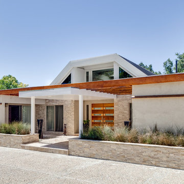
 Mark Brand Architecture
The original design of this late Mid-century Modern house featured a horrifically ugly entry which the owners needed our help to fix. In addition, they wanted to add a master suite, create a home theatre, and remodel the family room. Although they originally considered adding a second floor, our final design resulted in an extension of the house which accentuated its existing linear quality. Our solution to the entry problem included cutting back part of the vaulted roof to allow more light in and adding a cantilevered canopy instead. A new entry bridge crosses a koi pond, and new clerestory windows, stone planters and cedar trim complete the makeover of the previously bland plywood-clad box. The new master suite features 12 foot ceilings, clerestory windows, 8 foot high French doors and a fireplace. The exterior of the addition employs the same pallet of materials as the new façade but with a carefully composed composition of form and proportion. The new family room features the same stone cladding as we used on the exterior.
Photo by Christopher Stark Photography.
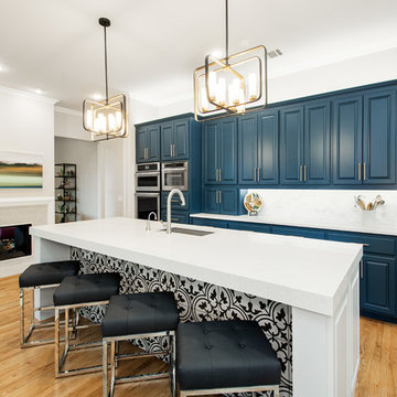 Alair Homes Plano
This house was built in 1994 and our clients have been there since day one. They wanted a complete refresh in their kitchen and living areas and a few other changes here and there; now that the kids were all off to college! They wanted to replace some things, redesign some things and just repaint others. They didn’t like the heavy textured walls, so those were sanded down, re-textured and painted throughout all of the remodeled areas.
The kitchen change was the most dramatic by painting the original cabinets a beautiful bluish-gray color; which is Benjamin Moore Gentleman’s Gray. The ends and cook side of the island are painted SW Reflection but on the front is a gorgeous Merola “Arte’ white accent tile. Two Island Pendant Lights ‘Aideen 8-light Geometric Pendant’ in a bronze gold finish hung above the island. White Carrara Quartz countertops were installed below the Viviano Marmo Dolomite Arabesque Honed Marble Mosaic tile backsplash. Our clients wanted to be able to watch TV from the kitchen as well as from the family room but since the door to the powder bath was on the wall of breakfast area (no to mention opening up into the room), it took up good wall space. Our designers rearranged the powder bath, moving the door into the laundry room and closing off the laundry room with a pocket door, so they can now hang their TV/artwork on the wall facing the kitchen, as well as another one in the family room!
We squared off the arch in the doorway between the kitchen and bar/pantry area, giving them a more updated look. The bar was also painted the same blue as the kitchen but a cool Moondrop Water Jet Cut Glass Mosaic tile was installed on the backsplash, which added a beautiful accent! All kitchen cabinet hardware is ‘Amerock’ in a champagne finish.
In the family room, we redesigned the cabinets to the right of the fireplace to match the other side. The homeowners had invested in two new TV’s that would hang on the wall and display artwork when not in use, so the TV cabinet wasn’t needed. The cabinets were painted a crisp white which made all of their decor really stand out. The fireplace in the family room was originally red brick with a hearth for seating. The brick was removed and the hearth was lowered to the floor and replaced with E-Stone White 12x24” tile and the fireplace surround is tiled with Heirloom Pewter 6x6” tile.
The formal living room used to be closed off on one side of the fireplace, which was a desk area in the kitchen. The homeowners felt that it was an eye sore and it was unnecessary, so we removed that wall, opening up both sides of the fireplace into the formal living room. Pietra Tiles Aria Crystals Beach Sand tiles were installed on the kitchen side of the fireplace and the hearth was leveled with the floor and tiled with E-Stone White 12x24” tile.
The laundry room was redesigned, adding the powder bath door but also creating more storage space. Waypoint flat front maple cabinets in painted linen were installed above the appliances, with Top Knobs “Hopewell” polished chrome pulls. Elements Carrara Quartz countertops were installed above the appliances, creating that added space. 3x6” white ceramic subway tile was used as the backsplash, creating a clean and crisp laundry room! The same tile on the hearths of both fireplaces (E-Stone White 12x24”) was installed on the floor.
The powder bath was painted and 12x36” Ash Fiber Ceramic tile was installed vertically on the wall behind the sink. All hardware was updated with the Signature Hardware “Ultra”Collection and Shades of Light “Sleekly Modern” new vanity lights were installed.
All new wood flooring was installed throughout all of the remodeled rooms making all of the rooms seamlessly flow into each other. The homeowners love their updated home!
Design/Remodel by Hatfield Builders & Remodelers | Photography by Versatile Imaging
 cg interiors group
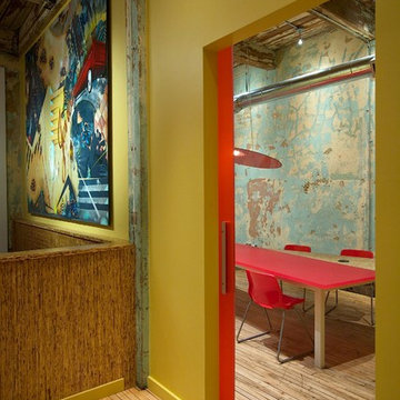
Two adjacent warehouse units in a circa 1915 building, listed on the National Register of Historic Places, were combined into a single modern live / work space. Careful consideration was paid to honoring and preserving original elements like exposed brick walls, timber beams and columns, hardwood and concrete floors and plaster walls.
 ODS Architecture
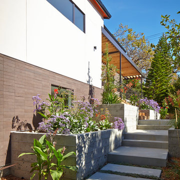
Originally a nearly three-story tall 1920’s European-styled home was turned into a modern villa for work and home. A series of low concrete retaining wall planters and steps gradually takes you up to the second level entry, grounding or anchoring the house into the site, as does a new wrap around veranda and trellis. Large eave overhangs on the upper roof were designed to give the home presence and were accented with a Mid-century orange color. The new master bedroom addition white box creates a better sense of entry and opens to the wrap around veranda at the opposite side. Inside the owners live on the lower floor and work on the upper floor with the garage basement for storage, archives and a ceramics studio. New windows and open spaces were created for the graphic designer owners; displaying their mid-century modern furnishings collection.
A lot of effort went into attempting to lower the house visually by bringing the ground plane higher with the concrete retaining wall planters, steps, wrap around veranda and trellis, and the prominent roof with exaggerated overhangs. That the eaves were painted orange is a cool reflection of the owner’s Dutch heritage. Budget was a driver for the project and it was determined that the footprint of the home should have minimal extensions and that the new windows remain in the same relative locations as the old ones. Wall removal was utilized versus moving and building new walls where possible.
Photo Credit: John Sutton Photography.

Sponsored
Sunbury, OH

J.Holderby - Renovations
Franklin County's Leading General Contractors - 2X Best of Houzz!

 Soucie Horner, Ltd.
A fresh take on traditional style, this sprawling suburban home draws its occupants together in beautifully, comfortably designed spaces that gather family members for companionship, conversation, and conviviality. At the same time, it adroitly accommodates a crowd, and facilitates large-scale entertaining with ease. This balance of private intimacy and public welcome is the result of Soucie Horner’s deft remodeling of the original floor plan and creation of an all-new wing comprising functional spaces including a mudroom, powder room, laundry room, and home office, along with an exciting, three-room teen suite above. A quietly orchestrated symphony of grayed blues unites this home, from Soucie Horner Collections custom furniture and rugs, to objects, accessories, and decorative exclamationpoints that punctuate the carefully synthesized interiors. A discerning demonstration of family-friendly living at its finest.
 Alair Homes Plano
Our clients house was built in 2012, so it was not that outdated, it was just dark. The clients wanted to lighten the kitchen and create something that was their own, using more unique products. The master bath needed to be updated and they wanted the upstairs game room to be more functional for their family.
The original kitchen was very dark and all brown. The cabinets were stained dark brown, the countertops were a dark brown and black granite, with a beige backsplash. We kept the dark cabinets but lightened everything else. A new translucent frosted glass pantry door was installed to soften the feel of the kitchen. The main architecture in the kitchen stayed the same but the clients wanted to change the coffee bar into a wine bar, so we removed the upper cabinet door above a small cabinet and installed two X-style wine storage shelves instead. An undermount farm sink was installed with a 23” tall main faucet for more functionality. We replaced the chandelier over the island with a beautiful Arhaus Poppy large antique brass chandelier. Two new pendants were installed over the sink from West Elm with a much more modern feel than before, not to mention much brighter. The once dark backsplash was now a bright ocean honed marble mosaic 2”x4” a top the QM Calacatta Miel quartz countertops. We installed undercabinet lighting and added over-cabinet LED tape strip lighting to add even more light into the kitchen.
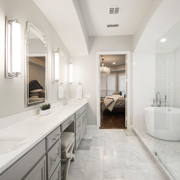
We basically gutted the Master bathroom and started from scratch. We demoed the shower walls, ceiling over tub/shower, demoed the countertops, plumbing fixtures, shutters over the tub and the wall tile and flooring. We reframed the vaulted ceiling over the shower and added an access panel in the water closet for a digital shower valve. A raised platform was added under the tub/shower for a shower slope to existing drain. The shower floor was Carrara Herringbone tile, accented with Bianco Venatino Honed marble and Metro White glossy ceramic 4”x16” tile on the walls. We then added a bench and a Kohler 8” rain showerhead to finish off the shower. The walk-in shower was sectioned off with a frameless clear anti-spot treated glass. The tub was not important to the clients, although they wanted to keep one for resale value. A Japanese soaker tub was installed, which the kids love! To finish off the master bath, the walls were painted with SW Agreeable Gray and the existing cabinets were painted SW Mega Greige for an updated look. Four Pottery Barn Mercer wall sconces were added between the new beautiful Distressed Silver leaf mirrors instead of the three existing over-mirror vanity bars that were originally there. QM Calacatta Miel countertops were installed which definitely brightened up the room!
Originally, the upstairs game room had nothing but a built-in bar in one corner. The clients wanted this to be more of a media room but still wanted to have a kitchenette upstairs. We had to remove the original plumbing and electrical and move it to where the new cabinets were. We installed 16’ of cabinets between the windows on one wall. Plank and Mill reclaimed barn wood plank veneers were used on the accent wall in between the cabinets as a backing for the wall mounted TV above the QM Calacatta Miel countertops. A kitchenette was installed to one end, housing a sink and a beverage fridge, so the clients can still have the best of both worlds. LED tape lighting was added above the cabinets for additional lighting. The clients love their updated rooms and feel that house really works for their family now.
Design/Remodel by Hatfield Builders & Remodelers | Photography by Versatile Imaging
 Studio Dearborn
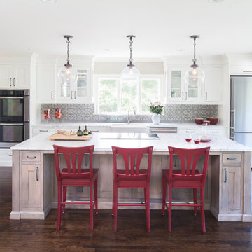
 Grey stained cabinetry compliments the white perimeter cabinetry and carerra countertops. Cement backsplash in "Nantes" by Original Mission Tile in soft grey and white add flair to the muted palette. Kitchen design and custom cabinetry by Sarah Robertson of Studio Dearborn. Refrigerator by LIebherr. Cooktop by Wolf. Bosch dishwasher. Farmhouse sink by Blanco. Cabinetry pulls by Jeffrey Alexander Belcastle collection. Photo credit: Neil Landino
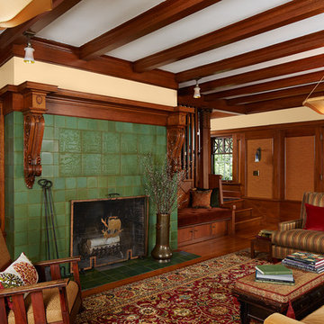
 David Heide Design Studio
Architecture & Interior Design: David Heide Design Studio
Photos: Susan Gilmore Photography
Living room - craftsman formal and enclosed medium tone wood floor living room idea in Minneapolis with beige walls, a standard fireplace, a tile fireplace and no tv
Living room - craftsman formal and enclosed medium tone wood floor living room idea in Minneapolis with beige walls, a standard fireplace, a tile fireplace and no tv
 Kitchen Design Concepts
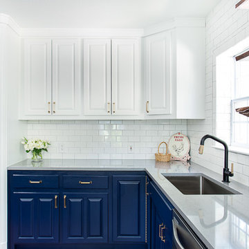
We introduce to you one of our newer services we are providing here at Kitchen Design Concepts: spaces that just need a little reviving! As of recent, we are taking on projects that are in need of minimal updating, as in, spaces that don’t need a full-on remodel. Yes, you heard right! If your space has good bones, you like the layout of your kitchen, and you just need a few cosmetic changes, then today’s feature is for you! Recently, we updated a space where we did just this! The kitchen was in need of a little love, some fresh paint, and new finishes. And if we’re being honest here, the result looks almost as if the kitchen had a full-on remodel! To learn more about this space and how we did our magic, continue reading below:
The Before and After
First, see what an impact new finishes can make! The “before” image shows a kitchen with outdated finishes such as the tile countertops, backsplash, and cabinetry finish. The “after” image, is a kitchen that looks almost as if its brand new, the image speaks for itself!
Cabinetry
With the wooden cabinetry in this kitchen already having great bones, all we needed to do was our refinishing process that involved removing door and drawer fronts, sanding, priming, and painting. The main color of the cabinetry is white (Sherwin Williams Pure White 7005) and as an accent, we applied a deep navy blue that really pops in this space (Sherwin Willaims Naval 6244). As a special design element, we incorporated a natural wooden band across the hood which is subtle but adds an element of surprise.
Countertops
The original countertops in this space were a 12×12 tile with cracks and discolored grout from all the wear and tear. To replace the countertops, we installed a clean and crisp quartz that is not only durable but easy to maintain (no grout here!). The 3cm countertops are a Cambria quartz in a grey-tone color (Carrick).
Backsplash
Keeping things simple, yet classic, we installed a 3×6 subway tile from Interceramic. The crisp white pairs well with all the other finishes of the space and really brighten the space up! To spice things up, we paired the white tile with a contrasting grout color (Cape Grey) that matches the countertop. This is a simple method to add interest to your white backsplash!
Fixtures and Fittings
For the fixtures and fittings of the kitchen, we wanted pieces that made a statement. That’s why we selected this industrial style faucet from Brizo! The faucet is a Brizo LITZE™ PULL-DOWN FAUCET WITH ARC SPOUT AND INDUSTRIAL HANDLE (63044LF-BLGL). The matte black paired with the luxe gold elements really make a statement! To match the gold elements of the faucet, we installed cabinetry hardware from Topknobs in the same gold finish. The hardware is a Channing pull TK743HB. Lastly, the large single bowl sink (who doesn’t want a large sink?!) is a great functional touch to the kitchen. The sink is a Blanco Precision 16″ R10 super single with 16″ Drainer in stainless steel (516216).
 Storie Collective
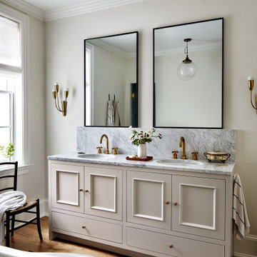
Stripped of its original charm with sagging floors and water leaks, this 1900 row house was prime for a full renovation. While the staircase and marble fireplace are original, everything from the white oak flooring, crown, applied, and base moldings, to the archways and brass door hardware is new; yet they all feel original to the house. Other projects included removing soffits and tucking away randomly placed support beams and posts, relocating and expanding the kitchen, renovating each bathroom – and adding a new one, upgrading all the mechanical, electric and plumbing systems, removing a fireplace, and regrading the back patio for proper drainage and added greenery. The project is a perfect study of juxtaposing new and old, classic and modern.
Photography Stacy Zarin Goldberg

Sponsored
Sunbury, OH
J.Holderby - Renovations
Franklin County's Leading General Contractors - 2X Best of Houzz!
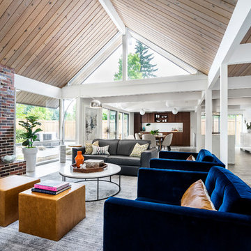
Living room - small 1950s open concept concrete floor and gray floor living room idea in Portland with white walls, a standard fireplace and a brick fireplace
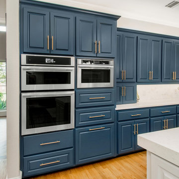 Alair Homes Plano
This house was built in 1994 and our clients have been there since day one. They wanted a complete refresh in their kitchen and living areas and a few other changes here and there; now that the kids were all off to college! They wanted to replace some things, redesign some things and just repaint others. They didn’t like the heavy textured walls, so those were sanded down, re-textured and painted throughout all of the remodeled areas.
The kitchen change was the most dramatic by painting the original cabinets a beautiful bluish-gray color; which is Benjamin Moore Gentleman’s Gray. The ends and cook side of the island are painted SW Reflection but on the front is a gorgeous Merola “Arte’ white accent tile. Two Island Pendant Lights ‘Aideen 8-light Geometric Pendant’ in a bronze gold finish hung above the island. White Carrara Quartz countertops were installed below the Viviano Marmo Dolomite Arabesque Honed Marble Mosaic tile backsplash. Our clients wanted to be able to watch TV from the kitchen as well as from the family room but since the door to the powder bath was on the wall of breakfast area (no to mention opening up into the room), it took up good wall space. Our designers rearranged the powder bath, moving the door into the laundry room and closing off the laundry room with a pocket door, so they can now hang their TV/artwork on the wall facing the kitchen, as well as another one in the family room!
We squared off the arch in the doorway between the kitchen and bar/pantry area, giving them a more updated look. The bar was also painted the same blue as the kitchen but a cool Moondrop Water Jet Cut Glass Mosaic tile was installed on the backsplash, which added a beautiful accent! All kitchen cabinet hardware is ‘Amerock’ in a champagne finish.
In the family room, we redesigned the cabinets to the right of the fireplace to match the other side. The homeowners had invested in two new TV’s that would hang on the wall and display artwork when not in use, so the TV cabinet wasn’t needed. The cabinets were painted a crisp white which made all of their decor really stand out. The fireplace in the family room was originally red brick with a hearth for seating. The brick was removed and the hearth was lowered to the floor and replaced with E-Stone White 12x24” tile and the fireplace surround is tiled with Heirloom Pewter 6x6” tile.
The formal living room used to be closed off on one side of the fireplace, which was a desk area in the kitchen. The homeowners felt that it was an eye sore and it was unnecessary, so we removed that wall, opening up both sides of the fireplace into the formal living room. Pietra Tiles Aria Crystals Beach Sand tiles were installed on the kitchen side of the fireplace and the hearth was leveled with the floor and tiled with E-Stone White 12x24” tile.
The laundry room was redesigned, adding the powder bath door but also creating more storage space. Waypoint flat front maple cabinets in painted linen were installed above the appliances, with Top Knobs “Hopewell” polished chrome pulls. Elements Carrara Quartz countertops were installed above the appliances, creating that added space. 3x6” white ceramic subway tile was used as the backsplash, creating a clean and crisp laundry room! The same tile on the hearths of both fireplaces (E-Stone White 12x24”) was installed on the floor.
The powder bath was painted and 12x36” Ash Fiber Ceramic tile was installed vertically on the wall behind the sink. All hardware was updated with the Signature Hardware “Ultra”Collection and Shades of Light “Sleekly Modern” new vanity lights were installed.
All new wood flooring was installed throughout all of the remodeled rooms making all of the rooms seamlessly flow into each other. The homeowners love their updated home!
Design/Remodel by Hatfield Builders & Remodelers | Photography by Versatile Imaging
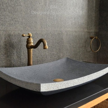
 User
UserReference: BB512-US
Model: BALI
Color: gray
Shape: rectangular
Finish: thinly bushhammered side , matted and honned inside
US Dimensions: 23-2/3" x 16-3/4 "x 4-1/3"
EU Dimensions: 60 x 40 x 11cm
Weight: 51 lbs
US Drain size: 1-1/2"
Material: Trendy gray granite grade A
LivingRoc creations unique bathware products redefine the traditional bathroom space with its sleek, classy design and flowing forms. BALI granite vessel sink stone - 23"x16" - genuine interior decoration trendy gray is a beautiful basin made from a superb block of gray granite with sleek lines. The sculptured edges and honed-matte finish provides classy and elegant originality. Granite warrants easy maintenance and strength. Aesthetic, practical with exceptional quality BALI will add style in your bathroom. You will definitely not let anyone feel indifferent with this 100% natural stone unique in the US and exclusively available on Living'ROC.net.
All of our vessel sinks are the creation of a combined group of talented masons dedicated to the idea of creating bathware made from natural material, which is environmentally friendly. Waterproofed BALI is ready to use, sitting on a vanity counter top. If you wish to standardize your project, you can choose among a wide range of our Trendy gray granite shower trays carved from the same material (very similar color and same honed finish) as it came from the same quarry and most often from the same block of stone. Spacium, Palaos, Quasar or Dalaos. This vessel sink is Highly resistant to chipping and scratching, withstands hot temperatures, tolerant to very high temperature changes.
Our creation is delivered without an overflow drain (not included) - every US drains models you can find on the market will fit perfectly on Living'ROC vessel sink. This model is ready to use over the countertop.
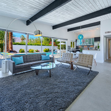
 Mãkena Interiors
Original Mid-Century Home in Sunmor Palm Springs, built by the Alexander Construction Co in 1958
available for vacation rentals
Living room - 1960s open concept living room idea in Other with white walls
Living room - 1960s open concept living room idea in Other with white walls

Sponsored
Sunbury, OH
J.Holderby - Renovations
Franklin County's Leading General Contractors - 2X Best of Houzz!
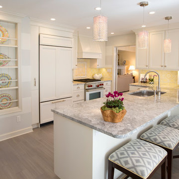
 Lee Meier Interiors
Designer: Barbara Stowe, Allied ASID
The clients were looking for a complete update of their original 1960's kitchen. They requested a clean and fresh look that would withstand the test of time. Although the footprint remained the same, eliminating soffits allowed for full height cabinets and made the space look larger. Brookhaven by Wood-Mode cabinetry, a narrow pull-out pantry cabinet and custom built-in plate rack provide plenty of storage and the dual-fuel Wolf range and Sub-Zero refrigerator are welcome upgrades.
Classic colors of gray and yellow are repeated in the handmade ceramic tile back splash, the granite counter tops, porcelain plank tile flooring, decorative valance and the numerous fabrics.
Antique chairs upholstered with new fabrics and a farmhouse table made from old doors add warmth, while polished nickel hardware and Schonbek crystal pendants add a bit of bling.
The result is a kitchen that is wonderful to cook in as well as being a lovely gathering place for family and friends.
 Boheen & Co
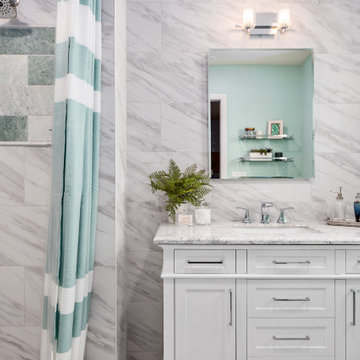
This was a small, enclosed shower in this Master Bathroom. We wanted to give all the glitz and glam this homeowner deserved and make this small space feel larger. We achieved this by running the same wall tile in the shower as the sink wall. It was a tight budget that we were able to make work with real and faux marble mixed together in a clever way. We kept everything light and in cool colors to give that luxurious spa feel.
 ODS Architecture
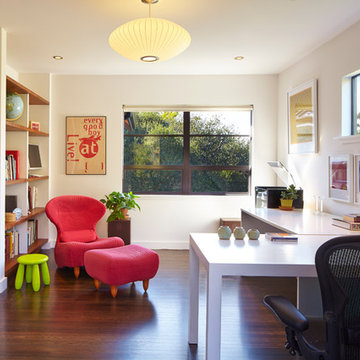
Originally a nearly three-story tall 1920’s European-styled home was turned into a modern villa for work and home. A series of low concrete retaining wall planters and steps gradually takes you up to the second level entry, grounding or anchoring the house into the site, as does a new wrap around veranda and trellis. Large eave overhangs on the upper roof were designed to give the home presence and were accented with a Mid-century orange color. The new master bedroom addition white box creates a better sense of entry and opens to the wrap around veranda at the opposite side. Inside the owners live on the lower floor and work on the upper floor with the garage basement for storage, archives and a ceramics studio. New windows and open spaces were created for the graphic designer owners; displaying their mid-century modern furnishings collection.
A lot of effort went into attempting to lower the house visually by bringing the ground plane higher with the concrete retaining wall planters, steps, wrap around veranda and trellis, and the prominent roof with exaggerated overhangs. That the eaves were painted orange is a cool reflection of the owner’s Dutch heritage. Budget was a driver for the project and it was determined that the footprint of the home should have minimal extensions and that the new windows remain in the same relative locations as the old ones. Wall removal was utilized versus moving and building new walls where possible.
Photo Credit: John Sutton Photography.
6