
Search results for "Redtube same origin" in Home Design Ideas
 Alair Homes Plano
This house was built in 1994 and our clients have been there since day one. They wanted a complete refresh in their kitchen and living areas and a few other changes here and there; now that the kids were all off to college! They wanted to replace some things, redesign some things and just repaint others. They didn’t like the heavy textured walls, so those were sanded down, re-textured and painted throughout all of the remodeled areas.
The kitchen change was the most dramatic by painting the original cabinets a beautiful bluish-gray color; which is Benjamin Moore Gentleman’s Gray. The ends and cook side of the island are painted SW Reflection but on the front is a gorgeous Merola “Arte’ white accent tile. Two Island Pendant Lights ‘Aideen 8-light Geometric Pendant’ in a bronze gold finish hung above the island. White Carrara Quartz countertops were installed below the Viviano Marmo Dolomite Arabesque Honed Marble Mosaic tile backsplash. Our clients wanted to be able to watch TV from the kitchen as well as from the family room but since the door to the powder bath was on the wall of breakfast area (no to mention opening up into the room), it took up good wall space. Our designers rearranged the powder bath, moving the door into the laundry room and closing off the laundry room with a pocket door, so they can now hang their TV/artwork on the wall facing the kitchen, as well as another one in the family room!
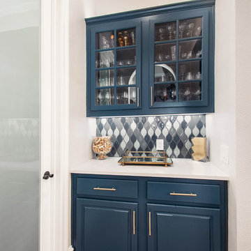
We squared off the arch in the doorway between the kitchen and bar/pantry area, giving them a more updated look. The bar was also painted the same blue as the kitchen but a cool Moondrop Water Jet Cut Glass Mosaic tile was installed on the backsplash, which added a beautiful accent! All kitchen cabinet hardware is ‘Amerock’ in a champagne finish.
In the family room, we redesigned the cabinets to the right of the fireplace to match the other side. The homeowners had invested in two new TV’s that would hang on the wall and display artwork when not in use, so the TV cabinet wasn’t needed. The cabinets were painted a crisp white which made all of their decor really stand out. The fireplace in the family room was originally red brick with a hearth for seating. The brick was removed and the hearth was lowered to the floor and replaced with E-Stone White 12x24” tile and the fireplace surround is tiled with Heirloom Pewter 6x6” tile.
The formal living room used to be closed off on one side of the fireplace, which was a desk area in the kitchen. The homeowners felt that it was an eye sore and it was unnecessary, so we removed that wall, opening up both sides of the fireplace into the formal living room. Pietra Tiles Aria Crystals Beach Sand tiles were installed on the kitchen side of the fireplace and the hearth was leveled with the floor and tiled with E-Stone White 12x24” tile.
The laundry room was redesigned, adding the powder bath door but also creating more storage space. Waypoint flat front maple cabinets in painted linen were installed above the appliances, with Top Knobs “Hopewell” polished chrome pulls. Elements Carrara Quartz countertops were installed above the appliances, creating that added space. 3x6” white ceramic subway tile was used as the backsplash, creating a clean and crisp laundry room! The same tile on the hearths of both fireplaces (E-Stone White 12x24”) was installed on the floor.
The powder bath was painted and 12x36” Ash Fiber Ceramic tile was installed vertically on the wall behind the sink. All hardware was updated with the Signature Hardware “Ultra”Collection and Shades of Light “Sleekly Modern” new vanity lights were installed.
All new wood flooring was installed throughout all of the remodeled rooms making all of the rooms seamlessly flow into each other. The homeowners love their updated home!
Design/Remodel by Hatfield Builders & Remodelers | Photography by Versatile Imaging
 Dura Supreme Cabinetry
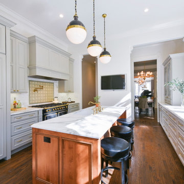
With an ideal location in the Pacific Heights neighborhood of San Francisco, this dated Victorian residence had "beautiful bones" but had been sitting on the market for a year before being purchased with plans to revitalize the interior. Interior designer, Noel Han, explained, "Historical Victorian homes in this area often have beautiful architectural elements that I aim to preserve, but the floor plan and layout tend to be stuffy, not live-able and not light filled. Modern families want bright, light-filled, spacious rooms that take advantage of outdoor views and living spaces, and function well for storage, meals and entertaining."
Preserving the architectural integrity and special features of the home was one of Han's goals but at the same time, she re-designed the space, moving walls and adding windows to create an open floorplan that flowed easily between the kitchen and outdoor living spaces. Where the range once stood in the original design, now an entire wall of windows provides panoramic views of the outdoors and fills the kitchen with light. Below the windows, Han designed a long bank of base cabinets with drawers to provide plenty of storage and work surface. Light now pours into the space even on foggy days. The range was moved to the opposite wall so that beautiful window views could be added to the kitchen.
Han selected a palette of finishes with an eye toward creating a "soft color aesthetic". "White painted finishes are very popular right now but would have felt stark and cold in this space," she explained. "The French grey paint from Dura Supreme was a perfect complement for this vintage Victorian home, to create a classic color scheme".
"This beautiful home already had hardware elements with a vintage brass finish, so I carefully selected antiqued, brushed brass hardware, plumbing and metal finishes to blend with the original elements," said Han. She continued, "The La Cornue French Range adds modern function with a French antique look."
"I appreciate working with Dura Supreme cabinetry because of the quality of the cabinetry, fast delivery and the custom options. I'm able to create beautiful architectural details like the pull-out columns on both sides of the range and the curved mullion doors on the furniture hutch, and they offer a stunning palette of finishes and styles," explained Han. For the bath cabinetry, Han created a similar palette of finishes and styles to create a complementary look throughout the entire home.
Product Details:
Perimeter: Dura Supreme Cabinetry shown in the St. Augustine door style and Mullion Pattern #15 door style with a “Zinc” painted finish.
Kitchen Island: Dura Supreme Cabinetry shown in the St. Augustine door style with a Clove stain and Black Accent finish on Cherry wood.
For more information about Noel Han, Interior Designer, click to her website here www.atelnoel.com.
For more information about Gilmans Kitchens and Baths, click to their website here www.gkandb.com.
Photography by: Ned Bonzi www.nedbonzi.com.
Request a FREE Dura Supreme Brochure Packet:
http://www.durasupreme.com/request-brochure
 Architect Heather Johnston
CASA 1O
Contemporary on a Mid-century Scaffold.
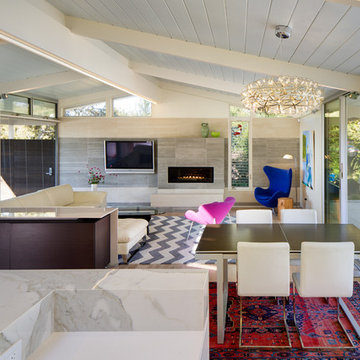
Largely unmodified since its design by Russell Forester and construction in 1957, the structure housed the original family until 2013. An intimate 1,910 square foot space, the house acquired a separate 600 square foot cottage in the 70’s designed by another architect. New owners purchased the house with the idea of keeping the original architect’s intent intact – the simple accommodation of everyday life with a focus on outdoor living only possible in Southern California. At the same time the house needed insulation, new electrical, plumbing, siding – everything but new studs and foundations.
A single roof beam travels south from the north fireplace wall all the way to the bedrooms in the back. Functions occur to either side, with private access to exterior courtyards. How do we accentuate the uncomplicated while enhancing the qualities of the chosen materials? Contemporary applied to a mid-century scaffold.
We focused on reduction, a few things performing many tasks. Each component, material or color performs more than one duty.
Lighting is paramount, enhancing the design’s procession from front to back, north to south, public to private. Strip LED’s reinforce the beam’s linear presence and spot LED’s make punctuation points of the roof purlins. Hidden up and down-lights in the cabinets and elsewhere provide the rooms with a quiet glow.
Exterior grass plantings give the only vertical dimension to the design, waving as the breeze moves them. All else is horizontal: caramelized bamboo siding, porcelain tile, roof line and ocean horizon.
Architect: Heather Johnston Architect
Landscaping: HJA
Photography: Brady Architectural Photography
Find the right local pro for your project
 Alexandra Rae Design
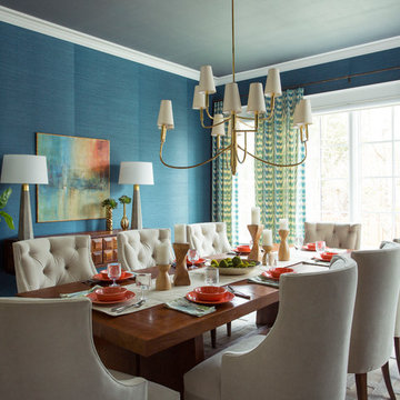
This dining room was built around an artisan table that was a prized possesion of the clients. It was made entirely without nails by a Seattle artist. To compliment the table, Alexandra Rae created a room in the vein of master Mid Century furniture makers. The brass chandelier, carved floating buffet and tufted velvet saber leg chairs subtly nod to Mad Men chic. Details like the sculptural vases, hand carved candle sticks and poured concrete lamps ground the space with the same post modern artisanal personality of the dining table
 Studio 511
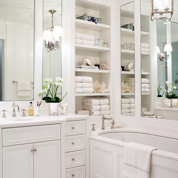
A beautiful, clean, cool, classic, white Master Bath. Interior Design by Ashley Whittaker.
Small elegant master white tile mosaic tile floor bathroom photo in New York with an undermount sink, white cabinets, marble countertops, an undermount tub, white walls, raised-panel cabinets and white countertops
Small elegant master white tile mosaic tile floor bathroom photo in New York with an undermount sink, white cabinets, marble countertops, an undermount tub, white walls, raised-panel cabinets and white countertops
 User
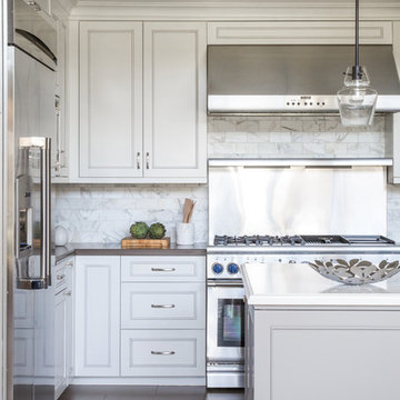
UserThe original kitchen was dark, dingy and dated! With the criteria given, we transformed this space into a bright uplifting and family friendly space. We retained the original kitchen footprint and kept plumbing and electrical in the same locations for budgetary considerations.
The kitchen was redesigned with entertaining in mind. From custom two-toned cabinetry to sophisticated banquette seating, we re-imagined a bright space with a new personality reaping the benefits of the influx of natural light from the double height windows in the adjacent great room.
From the calcutta marble tile backsplash, caesarstone counter tops and porcelain tile floors, this updated kitchen provided my clients with their dream kitchen …a bright white entertainers delight.
Photo Credit: Bethany Nauert

 CG&S Design-Build
Design by Joanna Hartman
Photography by Ryann Ford
Styling by Adam Fortner
The kitchen features 3cm Bianco Carrara Marble counters, hardware salvaged from original kitchen, a mixture of new and old oak flooring, Rittenhouse 3x6 white gloss tile for the backsplash, Benjamin Moore "Simply White" paint on the ceiling, "Revere Pewter" on the walls by the same, and a clear Shades of Light Teardrop Seeded Pendant above the island.

Sponsored
Sunbury, OH

J.Holderby - Renovations
Franklin County's Leading General Contractors - 2X Best of Houzz!
 Landis Architects | Builders
Photo: Michael K. Wilkinson
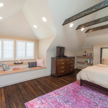
The owners of this 1923 home in Washington DC wanted a master suite, and originally considered combining two rooms on the second floor to serve this purpose. However, they showed our team the home’s attic and expressed an interest in seeing a design option for a master suite in that space.
Our designer was immediately inspired. The appeal of moving the master suite to the attic was that it offered an opportunity to create a unique space that was larger and had more design options than combining two bedrooms.
The original attic had wood paneling on the walls and ceiling and was mostly used for storage and as a retreat for the cats. The 7-foot walls did not capture the volume of the roof line, nor did it take advantage of the square footage.
We removed the existing paneling and pushed the existing walls back so they had a lower height around the perimeter. This provides a dramatic contrast to the new high ceiling and dramatic angles of the roofline. We maintained an open floor plan and used glass panels and doors for privacy and separation of different functions. The finished square footage is 650 sq.ft. There is about 350 sq.ft. of unfinished the storage area.
We also installed larger windows in the front dormer. The new windows are casement windows for egress purposes, which are required by code in a bedroom. The front dormer was also reframed in a shape that follows the original frame, which adds more volume. We installed two long steps inside the dormer to hide the ducts underneath and provide seating and storage.
The space needed some detailing to balance the large volume. The open plan also required a visual delineation of the different areas. Our designer added three beams across the ceiling over the bed to define the master bedroom. The beams were finished with the same dark stain used to refinish the attic’s original pine flooring. Dimmable recessed lights in the ceiling are placed in accordance with the beams location.
 StudioLAB
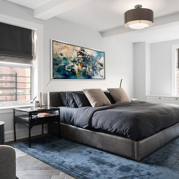
Across from Hudson River Park, the Classic 7 pre-war apartment had not renovated in over 50 years. The new owners, a young family with two kids, desired to open up the existing closed in spaces while keeping some of the original, classic pre-war details. Dark, dimly-lit corridors and clustered rooms that were a detriment to the brilliant natural light and expansive views the existing apartment inherently possessed, were demolished to create a new open plan for a more functional style of living. Custom charcoal stained white oak herringbone floors were laid throughout the space. The dark blue lacquered kitchen cabinets provide a sharp contrast to the otherwise neutral colored space. A wall unit in the same blue lacquer floats on the wall in the Den.
 Selle Valley Construction, Inc.
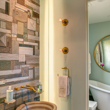
Custom layered quartz vessel sink with Kohler Purist wall mounted faucet, and the reclaimed patchwork wood wall complete this bathroom in the laundry room. The one-piece Kohler Reve dual flush toilet and Americh International Emperor freestanding tub can be seen in the background. Flooring and trim is the same Pennsylvania bluestone tiles from the entry way and laundry room. Photography by Marie-Dominique Verdier.
 Misiaszek Turpin pllc
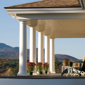
This 2,700 square-foot renovation of an existing brick structure has provided a stunning, year round vacation home in the Lake Sunapee region. Located on the same footprint as the original brick structure, the new, one-story residence is oriented on the site to take advantage of the expansive views of Mts. Sunapee and Kearsarge. By implementing a mix of siding treatments, textures and materials, and unique rooflines the home complements the surrounding site, and caps off the top of the grassy hill.
New entertainment rooms and porches are located so that the spectacular views of the surrounding mountains are always prominent. Dressed in bright and airy colors, the spaces welcome conversation and relaxation in spectacular settings. The design of three unique spaces, each of which experience the site differently, contributed to the overall layout of the residence. From the Adirondack chairs on the colonnaded porch to the cushioned sofas of the sunroom, personalized touches of exquisite taste provide an undeniably comforting atmosphere to the site.
Photographer: Joseph St. Pierre
 Alair Homes Plano
Our clients house was built in 2012, so it was not that outdated, it was just dark. The clients wanted to lighten the kitchen and create something that was their own, using more unique products. The master bath needed to be updated and they wanted the upstairs game room to be more functional for their family.
The original kitchen was very dark and all brown. The cabinets were stained dark brown, the countertops were a dark brown and black granite, with a beige backsplash. We kept the dark cabinets but lightened everything else. A new translucent frosted glass pantry door was installed to soften the feel of the kitchen. The main architecture in the kitchen stayed the same but the clients wanted to change the coffee bar into a wine bar, so we removed the upper cabinet door above a small cabinet and installed two X-style wine storage shelves instead. An undermount farm sink was installed with a 23” tall main faucet for more functionality. We replaced the chandelier over the island with a beautiful Arhaus Poppy large antique brass chandelier. Two new pendants were installed over the sink from West Elm with a much more modern feel than before, not to mention much brighter. The once dark backsplash was now a bright ocean honed marble mosaic 2”x4” a top the QM Calacatta Miel quartz countertops. We installed undercabinet lighting and added over-cabinet LED tape strip lighting to add even more light into the kitchen.
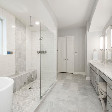
We basically gutted the Master bathroom and started from scratch. We demoed the shower walls, ceiling over tub/shower, demoed the countertops, plumbing fixtures, shutters over the tub and the wall tile and flooring. We reframed the vaulted ceiling over the shower and added an access panel in the water closet for a digital shower valve. A raised platform was added under the tub/shower for a shower slope to existing drain. The shower floor was Carrara Herringbone tile, accented with Bianco Venatino Honed marble and Metro White glossy ceramic 4”x16” tile on the walls. We then added a bench and a Kohler 8” rain showerhead to finish off the shower. The walk-in shower was sectioned off with a frameless clear anti-spot treated glass. The tub was not important to the clients, although they wanted to keep one for resale value. A Japanese soaker tub was installed, which the kids love! To finish off the master bath, the walls were painted with SW Agreeable Gray and the existing cabinets were painted SW Mega Greige for an updated look. Four Pottery Barn Mercer wall sconces were added between the new beautiful Distressed Silver leaf mirrors instead of the three existing over-mirror vanity bars that were originally there. QM Calacatta Miel countertops were installed which definitely brightened up the room!
Originally, the upstairs game room had nothing but a built-in bar in one corner. The clients wanted this to be more of a media room but still wanted to have a kitchenette upstairs. We had to remove the original plumbing and electrical and move it to where the new cabinets were. We installed 16’ of cabinets between the windows on one wall. Plank and Mill reclaimed barn wood plank veneers were used on the accent wall in between the cabinets as a backing for the wall mounted TV above the QM Calacatta Miel countertops. A kitchenette was installed to one end, housing a sink and a beverage fridge, so the clients can still have the best of both worlds. LED tape lighting was added above the cabinets for additional lighting. The clients love their updated rooms and feel that house really works for their family now.
Design/Remodel by Hatfield Builders & Remodelers | Photography by Versatile Imaging
 ODS Architecture
Originally a nearly three-story tall 1920’s European-styled home was turned into a modern villa for work and home. A series of low concrete retaining wall planters and steps gradually takes you up to the second level entry, grounding or anchoring the house into the site, as does a new wrap around veranda and trellis. Large eave overhangs on the upper roof were designed to give the home presence and were accented with a Mid-century orange color. The new master bedroom addition white box creates a better sense of entry and opens to the wrap around veranda at the opposite side. Inside the owners live on the lower floor and work on the upper floor with the garage basement for storage, archives and a ceramics studio. New windows and open spaces were created for the graphic designer owners; displaying their mid-century modern furnishings collection.
A lot of effort went into attempting to lower the house visually by bringing the ground plane higher with the concrete retaining wall planters, steps, wrap around veranda and trellis, and the prominent roof with exaggerated overhangs. That the eaves were painted orange is a cool reflection of the owner’s Dutch heritage. Budget was a driver for the project and it was determined that the footprint of the home should have minimal extensions and that the new windows remain in the same relative locations as the old ones. Wall removal was utilized versus moving and building new walls where possible.
Photo Credit: John Sutton Photography.

Sponsored
Columbus, OH

Wannemacher Interiors
Customized Award-Winning Interior Design Solutions in Franklin Cnty OH
 L Marie Interior Design
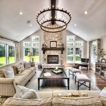
Clients' first home and there forever home with a family of four and in laws close, this home needed to be able to grow with the family. This most recent growth included a few home additions including the kids bathrooms (on suite) added on to the East end, the two original bathrooms were converted into one larger hall bath, the kitchen wall was blown out, entrying into a complete 22'x22' great room addition with a mudroom and half bath leading to the garage and the final addition a third car garage. This space is transitional and classic to last the test of time.
 Alair Homes Plano
This house was built in 1994 and our clients have been there since day one. They wanted a complete refresh in their kitchen and living areas and a few other changes here and there; now that the kids were all off to college! They wanted to replace some things, redesign some things and just repaint others. They didn’t like the heavy textured walls, so those were sanded down, re-textured and painted throughout all of the remodeled areas.
The kitchen change was the most dramatic by painting the original cabinets a beautiful bluish-gray color; which is Benjamin Moore Gentleman’s Gray. The ends and cook side of the island are painted SW Reflection but on the front is a gorgeous Merola “Arte’ white accent tile. Two Island Pendant Lights ‘Aideen 8-light Geometric Pendant’ in a bronze gold finish hung above the island. White Carrara Quartz countertops were installed below the Viviano Marmo Dolomite Arabesque Honed Marble Mosaic tile backsplash. Our clients wanted to be able to watch TV from the kitchen as well as from the family room but since the door to the powder bath was on the wall of breakfast area (no to mention opening up into the room), it took up good wall space. Our designers rearranged the powder bath, moving the door into the laundry room and closing off the laundry room with a pocket door, so they can now hang their TV/artwork on the wall facing the kitchen, as well as another one in the family room!
We squared off the arch in the doorway between the kitchen and bar/pantry area, giving them a more updated look. The bar was also painted the same blue as the kitchen but a cool Moondrop Water Jet Cut Glass Mosaic tile was installed on the backsplash, which added a beautiful accent! All kitchen cabinet hardware is ‘Amerock’ in a champagne finish.
In the family room, we redesigned the cabinets to the right of the fireplace to match the other side. The homeowners had invested in two new TV’s that would hang on the wall and display artwork when not in use, so the TV cabinet wasn’t needed. The cabinets were painted a crisp white which made all of their decor really stand out. The fireplace in the family room was originally red brick with a hearth for seating. The brick was removed and the hearth was lowered to the floor and replaced with E-Stone White 12x24” tile and the fireplace surround is tiled with Heirloom Pewter 6x6” tile.
The formal living room used to be closed off on one side of the fireplace, which was a desk area in the kitchen. The homeowners felt that it was an eye sore and it was unnecessary, so we removed that wall, opening up both sides of the fireplace into the formal living room. Pietra Tiles Aria Crystals Beach Sand tiles were installed on the kitchen side of the fireplace and the hearth was leveled with the floor and tiled with E-Stone White 12x24” tile.
The laundry room was redesigned, adding the powder bath door but also creating more storage space. Waypoint flat front maple cabinets in painted linen were installed above the appliances, with Top Knobs “Hopewell” polished chrome pulls. Elements Carrara Quartz countertops were installed above the appliances, creating that added space. 3x6” white ceramic subway tile was used as the backsplash, creating a clean and crisp laundry room! The same tile on the hearths of both fireplaces (E-Stone White 12x24”) was installed on the floor.
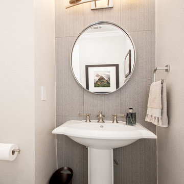
The powder bath was painted and 12x36” Ash Fiber Ceramic tile was installed vertically on the wall behind the sink. All hardware was updated with the Signature Hardware “Ultra”Collection and Shades of Light “Sleekly Modern” new vanity lights were installed.
All new wood flooring was installed throughout all of the remodeled rooms making all of the rooms seamlessly flow into each other. The homeowners love their updated home!
Design/Remodel by Hatfield Builders & Remodelers | Photography by Versatile Imaging
 Balboa Design Group
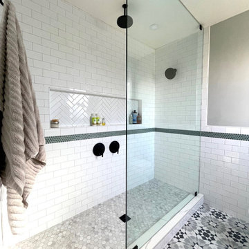
Our clients wanted a REAL master bathroom with enough space for both of them to be in there at the same time. Their house, built in the 1940’s, still had plenty of the original charm, but also had plenty of its original tiny spaces that just aren’t very functional for modern life.
The original bathroom had a tiny stall shower, and just a single vanity with very limited storage and counter space. Not to mention kitschy pink subway tile on every wall. With some creative reconfiguring, we were able to reclaim about 25 square feet of space from the bedroom. Which gave us the space we needed to introduce a double vanity with plenty of storage, and a HUGE walk-in shower that spans the entire length of the new bathroom!
While we knew we needed to stay true to the original character of the house, we also wanted to bring in some modern flair! Pairing strong graphic floor tile with some subtle (and not so subtle) green tones gave us the perfect blend of classic sophistication with a modern glow up.
Our clients were thrilled with the look of their new space, and were even happier about how large and open it now feels!
 Mosby Building Arts
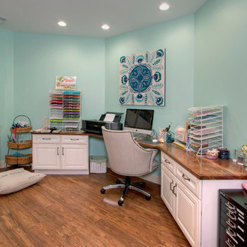
The home office portion of the gift wrapping room uses the same white maple Wellborn cabinets connected by walnut countertops. The office space was originally set up so the lady of the house had a computer and printer for her craft projects, but the man of the house finds himself (and their dog!) spending a lot of time at this station because it's inviting and inspiring.
Photo by Toby Weiss
Sponsored
Sunbury, OH
J.Holderby - Renovations
Franklin County's Leading General Contractors - 2X Best of Houzz!
 Studio Z Architecture
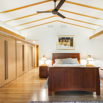
The master suite in this 1970’s Frank Lloyd Wright-inspired home was transformed from open and awkward to clean and crisp. The original suite was one large room with a sunken tub, pedestal sink, and toilet just a few steps up from the bedroom, which had a full wall of patio doors. The roof was rebuilt so the bedroom floor could be raised so that it is now on the same level as the bathroom (and the rest of the house). Rebuilding the roof gave an opportunity for the bedroom ceilings to be vaulted, and wood trim, soffits, and uplighting enhance the Frank Lloyd Wright connection. The interior space was reconfigured to provide a private master bath with a soaking tub and a skylight, and a private porch was built outside the bedroom.
Contractor: Meadowlark Design + Build
Interior Designer: Meadowlark Design + Build
Photographer: Emily Rose Imagery
 Flavin Architects
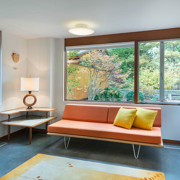
This house west of Boston was originally designed in 1958 by the great New England modernist, Henry Hoover. He built his own modern home in Lincoln in 1937, the year before the German émigré Walter Gropius built his own world famous house only a few miles away. By the time this 1958 house was built, Hoover had matured as an architect; sensitively adapting the house to the land and incorporating the clients wish to recreate the indoor-outdoor vibe of their previous home in Hawaii.
The house is beautifully nestled into its site. The slope of the roof perfectly matches the natural slope of the land. The levels of the house delicately step down the hill avoiding the granite ledge below. The entry stairs also follow the natural grade to an entry hall that is on a mid level between the upper main public rooms and bedrooms below. The living spaces feature a south- facing shed roof that brings the sun deep in to the home. Collaborating closely with the homeowner and general contractor, we freshened up the house by adding radiant heat under the new purple/green natural cleft slate floor. The original interior and exterior Douglas fir walls were stripped and refinished.
Photo by: Nat Rea Photography
 cg interiors group
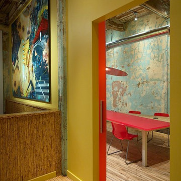
Two adjacent warehouse units in a circa 1915 building, listed on the National Register of Historic Places, were combined into a single modern live / work space. Careful consideration was paid to honoring and preserving original elements like exposed brick walls, timber beams and columns, hardwood and concrete floors and plaster walls.
5