
Search results for "Redtube same origin" in Home Design Ideas
 User
UserReference: BB512-US
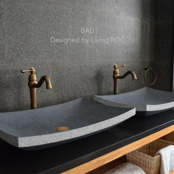
Model: BALI
Color: gray
Shape: rectangular
Finish: thinly bushhammered side , matted and honned inside
US Dimensions: 23-2/3" x 16-3/4 "x 4-1/3"
EU Dimensions: 60 x 40 x 11cm
Weight: 51 lbs
US Drain size: 1-1/2"
Material: Trendy gray granite grade A
LivingRoc creations unique bathware products redefine the traditional bathroom space with its sleek, classy design and flowing forms. BALI granite vessel sink stone - 23"x16" - genuine interior decoration trendy gray is a beautiful basin made from a superb block of gray granite with sleek lines. The sculptured edges and honed-matte finish provides classy and elegant originality. Granite warrants easy maintenance and strength. Aesthetic, practical with exceptional quality BALI will add style in your bathroom. You will definitely not let anyone feel indifferent with this 100% natural stone unique in the US and exclusively available on Living'ROC.net.
All of our vessel sinks are the creation of a combined group of talented masons dedicated to the idea of creating bathware made from natural material, which is environmentally friendly. Waterproofed BALI is ready to use, sitting on a vanity counter top. If you wish to standardize your project, you can choose among a wide range of our Trendy gray granite shower trays carved from the same material (very similar color and same honed finish) as it came from the same quarry and most often from the same block of stone. Spacium, Palaos, Quasar or Dalaos. This vessel sink is Highly resistant to chipping and scratching, withstands hot temperatures, tolerant to very high temperature changes.
Our creation is delivered without an overflow drain (not included) - every US drains models you can find on the market will fit perfectly on Living'ROC vessel sink. This model is ready to use over the countertop.
 Alair Homes Plano
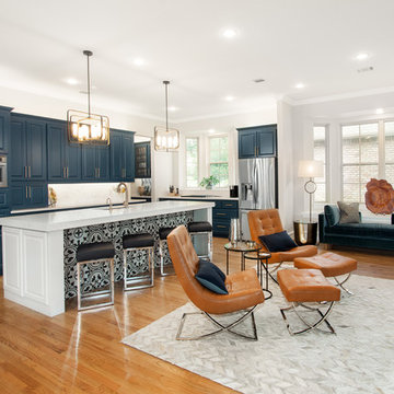
This house was built in 1994 and our clients have been there since day one. They wanted a complete refresh in their kitchen and living areas and a few other changes here and there; now that the kids were all off to college! They wanted to replace some things, redesign some things and just repaint others. They didn’t like the heavy textured walls, so those were sanded down, re-textured and painted throughout all of the remodeled areas.
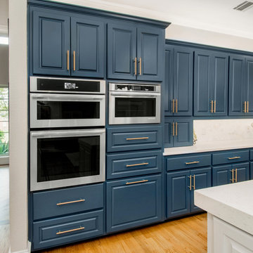
The kitchen change was the most dramatic by painting the original cabinets a beautiful bluish-gray color; which is Benjamin Moore Gentleman’s Gray. The ends and cook side of the island are painted SW Reflection but on the front is a gorgeous Merola “Arte’ white accent tile. Two Island Pendant Lights ‘Aideen 8-light Geometric Pendant’ in a bronze gold finish hung above the island. White Carrara Quartz countertops were installed below the Viviano Marmo Dolomite Arabesque Honed Marble Mosaic tile backsplash. Our clients wanted to be able to watch TV from the kitchen as well as from the family room but since the door to the powder bath was on the wall of breakfast area (no to mention opening up into the room), it took up good wall space. Our designers rearranged the powder bath, moving the door into the laundry room and closing off the laundry room with a pocket door, so they can now hang their TV/artwork on the wall facing the kitchen, as well as another one in the family room!
We squared off the arch in the doorway between the kitchen and bar/pantry area, giving them a more updated look. The bar was also painted the same blue as the kitchen but a cool Moondrop Water Jet Cut Glass Mosaic tile was installed on the backsplash, which added a beautiful accent! All kitchen cabinet hardware is ‘Amerock’ in a champagne finish.
In the family room, we redesigned the cabinets to the right of the fireplace to match the other side. The homeowners had invested in two new TV’s that would hang on the wall and display artwork when not in use, so the TV cabinet wasn’t needed. The cabinets were painted a crisp white which made all of their decor really stand out. The fireplace in the family room was originally red brick with a hearth for seating. The brick was removed and the hearth was lowered to the floor and replaced with E-Stone White 12x24” tile and the fireplace surround is tiled with Heirloom Pewter 6x6” tile.
The formal living room used to be closed off on one side of the fireplace, which was a desk area in the kitchen. The homeowners felt that it was an eye sore and it was unnecessary, so we removed that wall, opening up both sides of the fireplace into the formal living room. Pietra Tiles Aria Crystals Beach Sand tiles were installed on the kitchen side of the fireplace and the hearth was leveled with the floor and tiled with E-Stone White 12x24” tile.
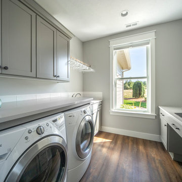
The laundry room was redesigned, adding the powder bath door but also creating more storage space. Waypoint flat front maple cabinets in painted linen were installed above the appliances, with Top Knobs “Hopewell” polished chrome pulls. Elements Carrara Quartz countertops were installed above the appliances, creating that added space. 3x6” white ceramic subway tile was used as the backsplash, creating a clean and crisp laundry room! The same tile on the hearths of both fireplaces (E-Stone White 12x24”) was installed on the floor.
The powder bath was painted and12x36” Ash Fiber Ceramic tile was installed vertically on the wall behind the sink. All hardware was updated with the Signature Hardware “Ultra”Collection and Shades of Light “Sleekly Modern” new vanity lights were installed.
All new wood flooring was installed throughout all of the remodeled rooms making all of the rooms seamlessly flow into each other. The homeowners love their updated home!
Design/Remodel by Hatfield Builders & Remodelers | Photography by Versatile Imaging
 Mark Brand Architecture
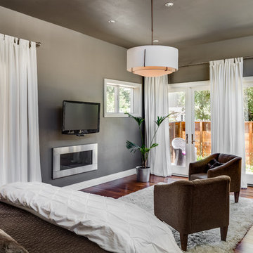
The original design of this late Mid-century Modern house featured a horrifically ugly entry which the owners needed our help to fix. In addition, they wanted to add a master suite, create a home theatre, and remodel the family room. Although they originally considered adding a second floor, our final design resulted in an extension of the house which accentuated its existing linear quality. Our solution to the entry problem included cutting back part of the vaulted roof to allow more light in and adding a cantilevered canopy instead. A new entry bridge crosses a koi pond, and new clerestory windows, stone planters and cedar trim complete the makeover of the previously bland plywood-clad box. The new master suite features 12 foot ceilings, clerestory windows, 8 foot high French doors and a fireplace. The exterior of the addition employs the same pallet of materials as the new façade but with a carefully composed composition of form and proportion. The new family room features the same stone cladding as we used on the exterior.
Photo by Christopher Stark Photography.
Find the right local pro for your project
 Remodeling by Classic Homes
The original ranch style home was built in 1962 by the homeowner’s father. She grew up in this home; now her and her husband are only the second owners of the home. The existing foundation and a few exterior walls were retained with approximately 800 square feet added to the footprint along with a single garage to the existing two-car garage. The footprint of the home is almost the same with every room expanded. All the rooms are in their original locations; the kitchen window is in the same spot just bigger as well. The homeowners wanted a more open, updated craftsman feel to this ranch style childhood home. The once 8-foot ceilings were made into 9-foot ceilings with a vaulted common area. The kitchen was opened up and there is now a gorgeous 5 foot by 9 and a half foot Cambria Brittanicca slab quartz island.
 Gore Design Co., LLC
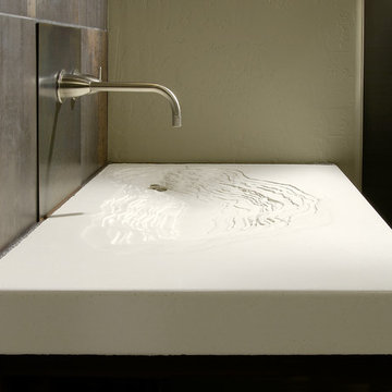
The Erosion Sink is a defining design for Gore Design Co. First created for a client in 2004 and shortly thereafter published in Dwell Magazine™, the Erosion Sink remains special to us.
Each one is unique, no two are the same. All aspects of this topographic sink can be customized, from color and size to the shape and layout of the erosion pattern. Brandon Gore personally creates each concrete Erosion Sink, spending more than 40 hours on the form and 200-300% more time hand-finishing the cast sink.
This original design is often imitated but never duplicated as the essence and nuance cannot be gained by impersonation. If you want to learn more, please visit our website at www.goredesignco.com
 Gore Design Co., LLC
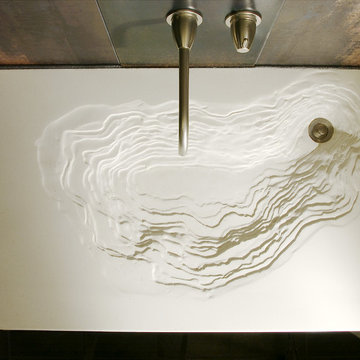
The Erosion Sink is a defining design for Gore Design Co. First created for a client in 2004 and shortly thereafter published in Dwell Magazine™, the Erosion Sink remains special to us.
Each one is unique, no two are the same. All aspects of this topographic sink can be customized, from color and size to the shape and layout of the erosion pattern. Brandon Gore personally creates each concrete Erosion Sink, spending more than 40 hours on the form and 200-300% more time hand-finishing the cast sink.
This original design is often imitated but never duplicated as the essence and nuance cannot be gained by impersonation. If you want to learn more, please visit our website at www.goredesignco.com
 Klopf Architecture
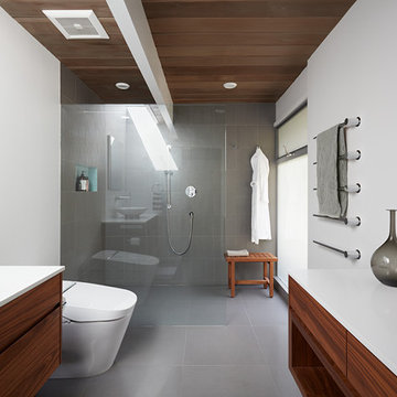
Klopf Architecture and Jesse Ososki Art remodeled an existing Eichler atrium home into a brighter, more open, and more functional version of its original self.
The goals were to preserve the Eichler look and feel without the need to strictly adhere to it. The scope of work included re-configuring the master bedroom/bath, the kitchen, and the hall bath/laundry area, as well as updating interior finishes throughout to be more sophisticated.
The owners are detail-oriented and were very involved in the design process, down to the selection of lighting controls and stainless steel faceplates.Their design aesthetic leans toward the Scandinavian — light and bright, with simple straight lines and pure geometric shapes.
The finish flooring is large porcelain tile (24” x 24”) in a neutral grey tone, providing a uniform backdrop against which other materials can stand out. The same tile continues into the shower floor (with a different finish texture for slip-resistance) and up the shower/tub walls (in a smaller size). Heath Classic Field ceramic tile in Modern Blue was used sparingly, to add color at the hall bath vanity backsplash and at the shampoo niches in both bathrooms. Back-painted soda glass in pale blue to match the Heath tile was used at the kitchen backsplash. This same accent color was also used at the front entry atrium door. Kitchen cabinetry, countertops, appliances, and light fixtures are all white, making the kitchen feel more airy and light. Countertops are Caesarstone Blizzard.
The owners chose to keep some of the original Eichler elements: the concrete masonry fireplace; the stained tongue-and-groove redwood ceiling decking; and the luan wall paneling. The luan paneling was lightly sanded, cleaned, and re-stained. The owners also kept an added element that was installed by a previous owner: sliding shoji panels at all bedroom windows and sliding glass doors, for both privacy and sun control. Grooves were cut into the new tile flooring for the shoji panels to slide in, creating a more integrated look. Walnut was used to add warmth and contrast at the kitchen bar top and niche, the bathroom vanities, and the window sill/ledge under the kitchen window.
This Burlingame Eichler Remodel is a 2,121 sf, 4 bedroom/2 bath home located in the heart of Silicon Valley.
Klopf Architecture Project Team: John Klopf, Klara Kevane and Yegvenia Torres Zavala
Contractor: Jesse Ososki Art
Structural Engineer: Emmanuel Pun
Photography ©2018 Mariko Reed
Location: Burlingame, CA
Year completed: 2017

Sponsored
Columbus, OH

Wannemacher Interiors
Customized Award-Winning Interior Design Solutions in Franklin Cnty OH
 Remodeling by Classic Homes
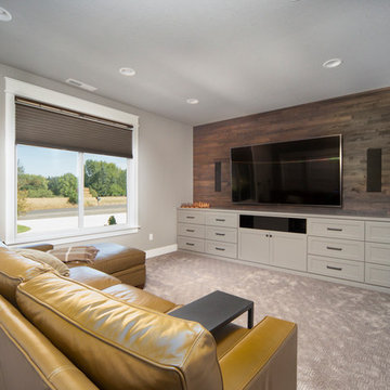
The original ranch style home was built in 1962 by the homeowner’s father. She grew up in this home; now her and her husband are only the second owners of the home. The existing foundation and a few exterior walls were retained with approximately 800 square feet added to the footprint along with a single garage to the existing two-car garage. The footprint of the home is almost the same with every room expanded. All the rooms are in their original locations; the kitchen window is in the same spot just bigger as well. The homeowners wanted a more open, updated craftsman feel to this ranch style childhood home. The once 8-foot ceilings were made into 9-foot ceilings with a vaulted common area. The kitchen was opened up and there is now a gorgeous 5 foot by 9 and a half foot Cambria Brittanicca slab quartz island.
 Alair Homes Plano
This house was built in 1994 and our clients have been there since day one. They wanted a complete refresh in their kitchen and living areas and a few other changes here and there; now that the kids were all off to college! They wanted to replace some things, redesign some things and just repaint others. They didn’t like the heavy textured walls, so those were sanded down, re-textured and painted throughout all of the remodeled areas.
The kitchen change was the most dramatic by painting the original cabinets a beautiful bluish-gray color; which is Benjamin Moore Gentleman’s Gray. The ends and cook side of the island are painted SW Reflection but on the front is a gorgeous Merola “Arte’ white accent tile. Two Island Pendant Lights ‘Aideen 8-light Geometric Pendant’ in a bronze gold finish hung above the island. White Carrara Quartz countertops were installed below the Viviano Marmo Dolomite Arabesque Honed Marble Mosaic tile backsplash. Our clients wanted to be able to watch TV from the kitchen as well as from the family room but since the door to the powder bath was on the wall of breakfast area (no to mention opening up into the room), it took up good wall space. Our designers rearranged the powder bath, moving the door into the laundry room and closing off the laundry room with a pocket door, so they can now hang their TV/artwork on the wall facing the kitchen, as well as another one in the family room!
We squared off the arch in the doorway between the kitchen and bar/pantry area, giving them a more updated look. The bar was also painted the same blue as the kitchen but a cool Moondrop Water Jet Cut Glass Mosaic tile was installed on the backsplash, which added a beautiful accent! All kitchen cabinet hardware is ‘Amerock’ in a champagne finish.
In the family room, we redesigned the cabinets to the right of the fireplace to match the other side. The homeowners had invested in two new TV’s that would hang on the wall and display artwork when not in use, so the TV cabinet wasn’t needed. The cabinets were painted a crisp white which made all of their decor really stand out. The fireplace in the family room was originally red brick with a hearth for seating. The brick was removed and the hearth was lowered to the floor and replaced with E-Stone White 12x24” tile and the fireplace surround is tiled with Heirloom Pewter 6x6” tile.
The formal living room used to be closed off on one side of the fireplace, which was a desk area in the kitchen. The homeowners felt that it was an eye sore and it was unnecessary, so we removed that wall, opening up both sides of the fireplace into the formal living room. Pietra Tiles Aria Crystals Beach Sand tiles were installed on the kitchen side of the fireplace and the hearth was leveled with the floor and tiled with E-Stone White 12x24” tile.
The laundry room was redesigned, adding the powder bath door but also creating more storage space. Waypoint flat front maple cabinets in painted linen were installed above the appliances, with Top Knobs “Hopewell” polished chrome pulls. Elements Carrara Quartz countertops were installed above the appliances, creating that added space. 3x6” white ceramic subway tile was used as the backsplash, creating a clean and crisp laundry room! The same tile on the hearths of both fireplaces (E-Stone White 12x24”) was installed on the floor.
The powder bath was painted and 12x36” Ash Fiber Ceramic tile was installed vertically on the wall behind the sink. All hardware was updated with the Signature Hardware “Ultra”Collection and Shades of Light “Sleekly Modern” new vanity lights were installed.
All new wood flooring was installed throughout all of the remodeled rooms making all of the rooms seamlessly flow into each other. The homeowners love their updated home!
Design/Remodel by Hatfield Builders & Remodelers | Photography by Versatile Imaging
 Adrienne DeRosa
Photo: Adrienne DeRosa © 2015 Houzz
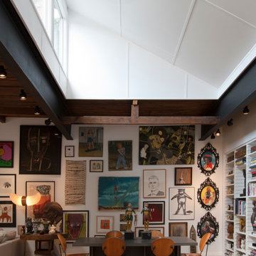
Save for a few refinements, the layout of the space took shape exactly as Weiss had envisioned it from day one. Knowing that they were looking to design a loft-like environment, the couple kept to an open layout for the majority of the living space.
One of the most fantastic features of the space is a bank of clerestory windows that flood the interior with seemingly endless amounts of daylight. Originally added back when the building served as an artist studio, Weiss and Carpenter agreed that keeping them was a must. "The only original part of the house is the ceiling and the existing skylights and clerestory," Weiss describes. "We basically changed everything else."
The ceiling compliments the contents of the environment, but also continues the story of the homeowners' design philosophy. "We loved the original wood and steel ceiling, including steel beams forged at the Carnegie Steel Works," Carpenter explains. "In coming up with our design approach, we wanted to reflect some of the previous uses of the structure ... Keeping elements from the past not only
interested us aesthetically." he says, "It was important to us to reuse structures and objects in ways that are close to their originally intended use."
 Margaux Interiors
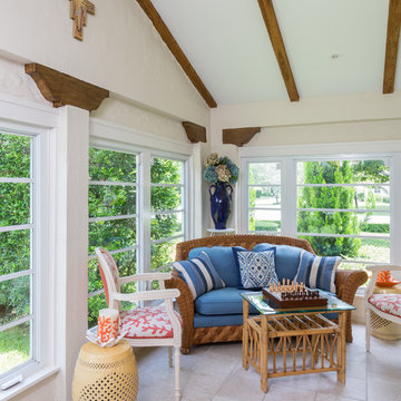
This nook like room is adjacent to the living room. Notice the original beams of the house. We placed a small loveseat upholstered in a blue linen fabric with custom pillows in the same motif as in the living room to create continuity. Two white accent chairs with a red coral needlepoint design adds to the tropical look.
Photography By: Claudia Uribe
 StudioLAB
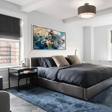
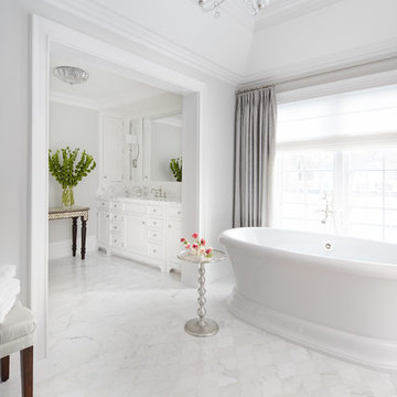
Across from Hudson River Park, the Classic 7 pre-war apartment had not renovated in over 50 years. The new owners, a young family with two kids, desired to open up the existing closed in spaces while keeping some of the original, classic pre-war details. Dark, dimly-lit corridors and clustered rooms that were a detriment to the brilliant natural light and expansive views the existing apartment inherently possessed, were demolished to create a new open plan for a more functional style of living. Custom charcoal stained white oak herringbone floors were laid throughout the space. The dark blue lacquered kitchen cabinets provide a sharp contrast to the otherwise neutral colored space. A wall unit in the same blue lacquer floats on the wall in the Den.
 Soucie Horner, Ltd.
A fresh take on traditional style, this sprawling suburban home draws its occupants together in beautifully, comfortably designed spaces that gather family members for companionship, conversation, and conviviality. At the same time, it adroitly accommodates a crowd, and facilitates large-scale entertaining with ease. This balance of private intimacy and public welcome is the result of Soucie Horner’s deft remodeling of the original floor plan and creation of an all-new wing comprising functional spaces including a mudroom, powder room, laundry room, and home office, along with an exciting, three-room teen suite above. A quietly orchestrated symphony of grayed blues unites this home, from Soucie Horner Collections custom furniture and rugs, to objects, accessories, and decorative exclamationpoints that punctuate the carefully synthesized interiors. A discerning demonstration of family-friendly living at its finest.

Sponsored
Columbus, OH
Wannemacher Interiors
Customized Award-Winning Interior Design Solutions in Franklin Cnty OH
 Tammara Stroud Design
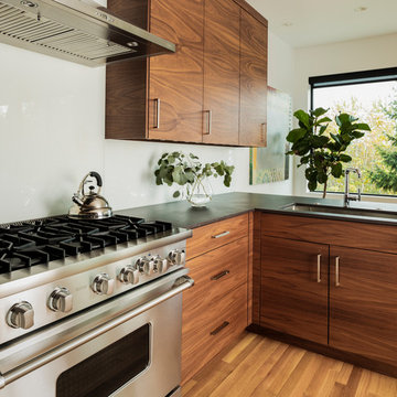
In 1949, one of mid-century modern’s most famous NW architects, Paul Hayden Kirk, built this early “glass house” in Hawthorne Hills. Rather than flattening the rolling hills of the Northwest to accommodate his structures, Kirk sought to make the least impact possible on the building site by making use of it natural landscape. When we started this project, our goal was to pay attention to the original architecture--as well as designing the home around the client’s eclectic art collection and African artifacts. The home was completely gutted, since most of the home is glass, hardly any exterior walls remained. We kept the basic footprint of the home the same—opening the space between the kitchen and living room. The horizontal grain matched walnut cabinets creates a natural continuous movement. The sleek lines of the Fleetwood windows surrounding the home allow for the landscape and interior to seamlessly intertwine. In our effort to preserve as much of the design as possible, the original fireplace remains in the home and we made sure to work with the natural lines originally designed by Kirk.
 Plain & Posh
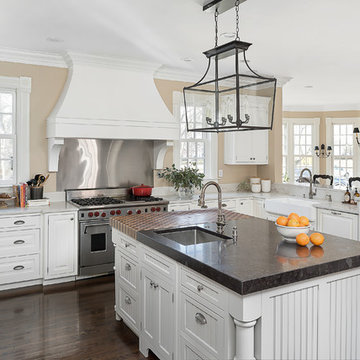
This historic home needed a kitchen refresh. We took out the black hood and had a custom wood hood built instead. We kept the original island, but painted it a new greige color. The original cutting board stayed as the homeowners love using it. We then added granite counters in a leathered finish to build it up to the same height as the wood end.
 Soucie Horner, Ltd.
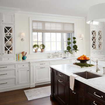
A fresh take on traditional style, this sprawling suburban home draws its occupants together in beautifully, comfortably designed spaces that gather family members for companionship, conversation, and conviviality. At the same time, it adroitly accommodates a crowd, and facilitates large-scale entertaining with ease. This balance of private intimacy and public welcome is the result of Soucie Horner’s deft remodeling of the original floor plan and creation of an all-new wing comprising functional spaces including a mudroom, powder room, laundry room, and home office, along with an exciting, three-room teen suite above. A quietly orchestrated symphony of grayed blues unites this home, from Soucie Horner Collections custom furniture and rugs, to objects, accessories, and decorative exclamationpoints that punctuate the carefully synthesized interiors. A discerning demonstration of family-friendly living at its finest.
 Balboa Design Group
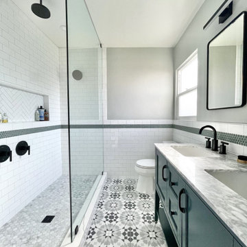
Our clients wanted a REAL master bathroom with enough space for both of them to be in there at the same time. Their house, built in the 1940’s, still had plenty of the original charm, but also had plenty of its original tiny spaces that just aren’t very functional for modern life.
The original bathroom had a tiny stall shower, and just a single vanity with very limited storage and counter space. Not to mention kitschy pink subway tile on every wall. With some creative reconfiguring, we were able to reclaim about 25 square feet of space from the bedroom. Which gave us the space we needed to introduce a double vanity with plenty of storage, and a HUGE walk-in shower that spans the entire length of the new bathroom!
While we knew we needed to stay true to the original character of the house, we also wanted to bring in some modern flair! Pairing strong graphic floor tile with some subtle (and not so subtle) green tones gave us the perfect blend of classic sophistication with a modern glow up.
Our clients were thrilled with the look of their new space, and were even happier about how large and open it now feels!

Sponsored
Delaware, OH

Buckeye Basements, Inc.
Central Ohio's Basement Finishing ExpertsBest Of Houzz '13-'21

 CG&S Design-Build
Design by Joanna Hartman
Photography by Ryann Ford
Styling by Adam Fortner
The kitchen features 3cm Bianco Carrara Marble counters, hardware salvaged from original kitchen, a mixture of new and old oak flooring, Rittenhouse 3x6 white gloss tile for the backsplash, Benjamin Moore "Simply White" paint on the ceiling, "Revere Pewter" on the walls by the same, and a clear Shades of Light Teardrop Seeded Pendant above the island.
 User
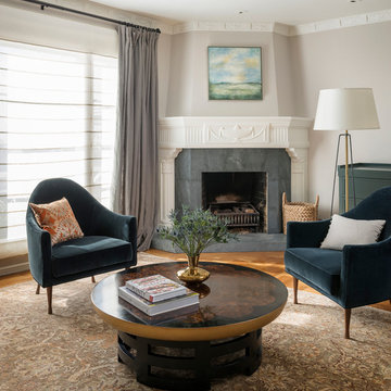
UserInspiration for a transitional formal and enclosed medium tone wood floor living room remodel in San Francisco with gray walls and a corner fireplace
 Amy Krane Color Consulting
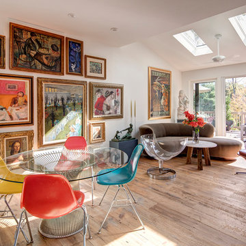
The centerpiece of the room is the colorful gallery wall of mid century original paintings. The room is modern and rustic at the same time.
Inspiration for an eclectic light wood floor living room remodel in New York with white walls
Inspiration for an eclectic light wood floor living room remodel in New York with white walls
8