
Search results for "Reduce same origin" in Home Design Ideas
 Susan Marocco Interiors
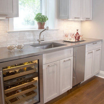
Original kitchen was gutted and the layout changed. A large bay window was added to give more space and add light.
Custom rift wood cabinets were designed and a custom paint applied in a soft strie pattern. Concrete counter tops added a contemporary feel. A light grey was used for the center island over the dark cabinetry and a darker grey concrete counter was used for the perimeter cabinets. Concrete is very versatile, seams are reduced, color can be any paint choice, and the material is very stain resistant with very little maintenance.
The client wanted a pop of red- so we had an auto body shop apply 16 coats of red paint to the new Best Hood.
 Thomas Roszak Architecture, LLC
Photo credit: Scott McDonald @ Hedrich Blessing
7RR-Ecohome:
The design objective was to build a house for a couple recently married who both had kids from previous marriages. How to bridge two families together?
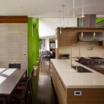
The design looks forward in terms of how people live today. The home is an experiment in transparency and solid form; removing borders and edges from outside to inside the house, and to really depict “flowing and endless space”. The house floor plan is derived by pushing and pulling the house’s form to maximize the backyard and minimize the public front yard while welcoming the sun in key rooms by rotating the house 45-degrees to true north. The angular form of the house is a result of the family’s program, the zoning rules, the lot’s attributes, and the sun’s path. We wanted to construct a house that is smart and efficient in terms of construction and energy, both in terms of the building and the user. We could tell a story of how the house is built in terms of the constructability, structure and enclosure, with a nod to Japanese wood construction in the method in which the siding is installed and the exposed interior beams are placed in the double height space. We engineered the house to be smart which not only looks modern but acts modern; every aspect of user control is simplified to a digital touch button, whether lights, shades, blinds, HVAC, communication, audio, video, or security. We developed a planning module based on a 6-foot square room size and a 6-foot wide connector called an interstitial space for hallways, bathrooms, stairs and mechanical, which keeps the rooms pure and uncluttered. The house is 6,200 SF of livable space, plus garage and basement gallery for a total of 9,200 SF. A large formal foyer celebrates the entry and opens up to the living, dining, kitchen and family rooms all focused on the rear garden. The east side of the second floor is the Master wing and a center bridge connects it to the kid’s wing on the west. Second floor terraces and sunscreens provide views and shade in this suburban setting. The playful mathematical grid of the house in the x, y and z axis also extends into the layout of the trees and hard-scapes, all centered on a suburban one-acre lot.
Many green attributes were designed into the home; Ipe wood sunscreens and window shades block out unwanted solar gain in summer, but allow winter sun in. Patio door and operable windows provide ample opportunity for natural ventilation throughout the open floor plan. Minimal windows on east and west sides to reduce heat loss in winter and unwanted gains in summer. Open floor plan and large window expanse reduces lighting demands and maximizes available daylight. Skylights provide natural light to the basement rooms. Durable, low-maintenance exterior materials include stone, ipe wood siding and decking, and concrete roof pavers. Design is based on a 2' planning grid to minimize construction waste. Basement foundation walls and slab are highly insulated. FSC-certified walnut wood flooring was used. Light colored concrete roof pavers to reduce cooling loads by as much as 15%. 2x6 framing allows for more insulation and energy savings. Super efficient windows have low-E argon gas filled units, and thermally insulated aluminum frames. Permeable brick and stone pavers reduce the site’s storm-water runoff. Countertops use recycled composite materials. Energy-Star rated furnaces and smart thermostats are located throughout the house to minimize duct runs and avoid energy loss. Energy-Star rated boiler that heats up both radiant floors and domestic hot water. Low-flow toilets and plumbing fixtures are used to conserve water usage. No VOC finish options and direct venting fireplaces maintain a high interior air quality. Smart home system controls lighting, HVAC, and shades to better manage energy use. Plumbing runs through interior walls reducing possibilities of heat loss and freezing problems. A large food pantry was placed next to kitchen to reduce trips to the grocery store. Home office reduces need for automobile transit and associated CO2 footprint. Plan allows for aging in place, with guest suite than can become the master suite, with no need to move as family members mature.
 Julia Chasman Design
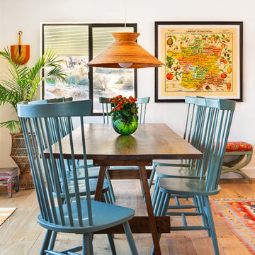
The mid-century slanted ceiling of the open dining room creates a cozy but spacious area for a custom 9' dining table made of reclaimed oak, surrounded by 8 matching vintage Windsor chairs painted in Farrow & Ball's Green Smoke. Vintage mid-century wicker pendant is echoed by Moroccan straw accents with the plant stand, and wall fan. A large French colorful agricultural map adds charm and an unexpected twist to the decor.
Photo by Bet Gum for Flea Market Decor Magazine
Find the right local pro for your project
 BEVOLO GAS & ELECTRIC LIGHTS
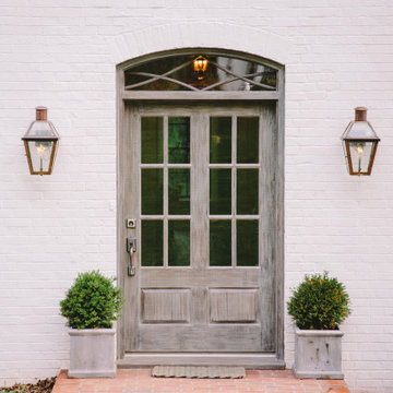
This Bevolo® original was designed in the 1940s by world renowned architect A. Hays Town and Andrew Bevolo Sr. This Original French Quarter® lantern adorns many historic buildings across the country. The light can be used with a wide range of architectural styles. It is available in natural gas, liquid propane, and electric.
Standard Lantern Sizes
Height Width Depth
14.0" 9.25" 9.25"
18.0" 10.5" 10.5"
21.0" 11.5" 11.5"
24.0" 13.25" 13.25"
27.0" 14.5" 14.5"
*30" 17.5" 17.5"
*36" 21.5" 21.5"
 ZeroEnergy Design
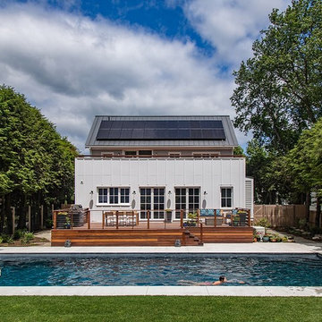
This LEED Platinum certified house reflects the homeowner's desire for an exceptionally healthy and comfortable living environment, within a traditional neighborhood.
INFILL SITE. The family, who moved from another area of Wellesley, sought out this property to be within walking distance of the high school and downtown area. An existing structure on the tight lot was removed to make way for the new home. 84% of the construction waste, from both the previous structure and the new home, was diverted from a landfill. ZED designed to preserve the existing mature trees on the perimeter of the property to minimize site impacts, and to maintain the character of the neighborhood as well as privacy on the site.
EXTERIOR EXPRESSION. The street facade of the home relates to the local New England vernacular. The rear uses contemporary language, a nod to the family’s Californian roots, to incorporate a roof deck, solar panels, outdoor living space, and the backyard swimming pool. ZED’s careful planning avoided to the need to face the garage doors towards the street, a common syndrome of a narrow lot.
THOUGHTFUL SPACE. Homes with dual entries can often result in duplicate and unused spaces. In this home, the everyday and formal entry areas are one and the same; the front and garage doors share the entry program of coat closets, mudroom storage with bench for removing your shoes, and a laundry room with generous closets for the children's sporting equipment. The entry area leads directly to the living space, encompassing the kitchen, dining and sitting area areas in an L-shaped open plan arrangement. The kitchen is placed at the south-west corner of the space to allow for a strong connection to the dining, sitting and outdoor living spaces. A fire pit on the deck satisfies the family’s desire for an open flame while a sealed gas fireplace is used indoors - ZED’s preference after omitting gas burning appliances completely from an airtight home. A small study, with a window seat, is conveniently located just off of the living space. A first floor guest bedroom includes an accessible bathroom for aging visitors and can be used as a master suite to accommodate aging in place.
HEALTHY LIVING. The client requested a home that was easy to clean and would provide a respite from seasonal allergies and common contaminants that are found in many indoor spaces. ZED selected easy to clean solid surface flooring throughout, provided ample space for cleaning supplies on each floor, and designed a mechanical system with ventilation that provides a constant supply of fresh outdoor air. ZED selected durable materials, finishes, cabinetry, and casework with low or no volatile organic compounds (VOCs) and no added urea formaldehyde.
YEAR-ROUND COMFORT. The home is super insulated and air-tight, paired with high performance triple-paned windows, to ensure it is draft-free throughout the winter (even when in front of the large windows and doors). ZED designed a right-sized heating and cooling system to pair with the thermally improved building enclosure to ensure year-round comfort. The glazing on the home maximizes passive solar gains, and facilitates cross ventilation and daylighting.
ENERGY EFFICIENT. As one of the most energy efficient houses built to date in Wellesley, the home highlights a practical solution for Massachusetts. First, the building enclosure reduces the largest energy requirement for typical houses (heating). Super-insulation, exceptional air sealing, a thermally broken wall assembly, triple pane windows, and passive solar gain combine for a sizable heating load reduction. Second, within the house only efficient systems consume energy. These include an air source heat pump for heating & cooling, a heat pump hot water heater, LED lighting, energy recovery ventilation, and high efficiency appliances. Lastly, photovoltaics provide renewable energy help offset energy consumption. The result is an 89% reduction in energy use compared to a similar brand new home built to code requirements.
RESILIENT. The home will fare well in extreme weather events. During a winter power outage, heat loss will be very slow due to the super-insulated and airtight envelope– taking multiple days to drop to 60 degrees even with no heat source. An engineered drainage system, paired with careful the detailing of the foundation, will help to keep the finished basement dry. A generator will provide full operation of the all-electric house during a power outage.
OVERALL. The home is a reflection of the family goals and an expression of their values, beautifully enabling health, comfort, safety, resilience, and utility, all while respecting the planet.
ZED - Architect & Mechanical Designer
Bevilacqua Builders Inc - Contractor
Creative Land & Water Engineering - Civil Engineering
Barbara Peterson Landscape - Landscape Design
Nest & Company - Interior Furnishings
Eric Roth Photography - Photography
 Progressive Design Build
Challenge
This 2001 riverfront home was purchased by the owners in 2015 and immediately renovated. Progressive Design Build was hired at that time to remodel the interior, with tentative plans to remodel their outdoor living space as a second phase design/build remodel. True to their word, after completing the interior remodel, this young family turned to Progressive Design Build in 2017 to address known zoning regulations and restrictions in their backyard and build an outdoor living space that was fit for entertaining and everyday use.
The homeowners wanted a pool and spa, outdoor living room, kitchen, fireplace and covered patio. They also wanted to stay true to their home’s Old Florida style architecture while also adding a Jamaican influence to the ceiling detail, which held sentimental value to the homeowners who honeymooned in Jamaica.
Solution
To tackle the known zoning regulations and restrictions in the backyard, the homeowners researched and applied for a variance. With the variance in hand, Progressive Design Build sat down with the homeowners to review several design options. These options included:
Option 1) Modifications to the original pool design, changing it to be longer and narrower and comply with an existing drainage easement
Option 2) Two different layouts of the outdoor living area
Option 3) Two different height elevations and options for the fire pit area
Option 4) A proposed breezeway connecting the new area with the existing home
After reviewing the options, the homeowners chose the design that placed the pool on the backside of the house and the outdoor living area on the west side of the home (Option 1).
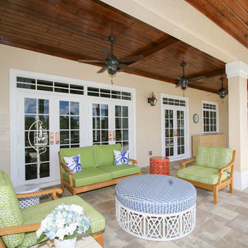
It was important to build a patio structure that could sustain a hurricane (a Southwest Florida necessity), and provide substantial sun protection. The new covered area was supported by structural columns and designed as an open-air porch (with no screens) to allow for an unimpeded view of the Caloosahatchee River. The open porch design also made the area feel larger, and the roof extension was built with substantial strength to survive severe weather conditions.
The pool and spa were connected to the adjoining patio area, designed to flow seamlessly into the next. The pool deck was designed intentionally in a 3-color blend of concrete brick with freeform edge detail to mimic the natural river setting. Bringing the outdoors inside, the pool and fire pit were slightly elevated to create a small separation of space.
Result
All of the desirable amenities of a screened porch were built into an open porch, including electrical outlets, a ceiling fan/light kit, TV, audio speakers, and a fireplace. The outdoor living area was finished off with additional storage for cushions, ample lighting, an outdoor dining area, a smoker, a grill, a double-side burner, an under cabinet refrigerator, a major ventilation system, and water supply plumbing that delivers hot and cold water to the sinks.
Because the porch is under a roof, we had the option to use classy woods that would give the structure a natural look and feel. We chose a dark cypress ceiling with a gloss finish, replicating the same detail that the homeowners experienced in Jamaica. This created a deep visceral and emotional reaction from the homeowners to their new backyard.
The family now spends more time outdoors enjoying the sights, sounds and smells of nature. Their professional lives allow them to take a trip to paradise right in their backyard—stealing moments that reflect on the past, but are also enjoyed in the present.
 Stone Standard
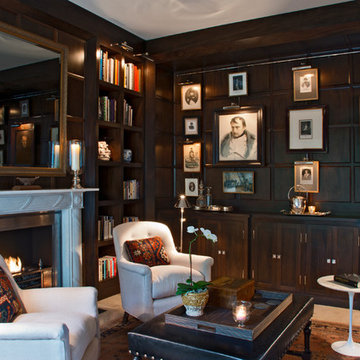
 The client provided a unique collection of framed images of Napoleon Bonaparte which were collected over several decades. The images are hung on a custom gallery rail system designed. Holes were drilled through the stems of Visual Comfort picture lights to allow the gallery rods to pass through the lights. This allowed centering of the picture lights to each rod. The bookcase lights are from the same series but they were modified to accept a one inch diameter custom rosette. The cabinet hardware, as with all of the metal finishes in the room, is polished nickel and includes Baldwin flush ring pulls, Von Morris mortise butt hinges and Brusso ball catches.
The beveled mirror and frame above the hearth is actually a Seura television mirror with Premier Glass. The television is completely undetectable when it is off and, when it is on, the picture is clear and bright. Undetectable behind the mirror is a Russound IR receiver that transfers IR signals to a cable box, DVD player, and Apple TV receiver located in the lower cabinets. The source components are connected to the television with HDMI cables. Bose wall-mounted speakers, positioned in the lower alcoves of the bookcase, are supplemented with a Sonos subwoofer placed under the sofa.
Surrounding the mantle and mirror is a three inch wide frame, identical to the frame around the gallery wall, that allows the Chesney's Edinburgh Carrara marble mantle and the steel Andover register grate to be set back from the bookcases. The mantle rests securely on a hearth stone of honed black granite which was recessed into the concrete floor. Suspended within the grate is an EcoSmart Bioethonal burner specifically designed for historic register grates. Volcanic stone was placed between the burner and the grate to conceal the front of the burner.
The bookcases, cabinets and wall paneling are fabricated from a combination of solid mahogany and mahogany plywood. Crown and base molding were eliminated from the design to minimize the impact of the library in an otherwise contemporary house. The fascia above the bookcases and mantle, as well as the fascia above the gallery wall, are single pieces of solid mahogany carefully shaved to follow the irregular contours of the drywall ceiling and eliminate the need for caulk or fillers. The same method was employed at the bottom rail of the face frame to allow it to follow the slight undulations of the concrete floor. Eloy Estrada built the wood components and installed them along with all of the other components in the room.
The two adjustable height Galerie des Lamps floor lamps on either side of the mantle are from the Grasshopper series. The Visual Comfort Dorchester Pharmacy floor lamps, on either side of the sofa, plug into a recessed Lew electrical floor box that was recessd into the floor under the sofa. The room originally had a chandelier and recessed lights all of which were all removed. The Lutron light switches, in matte Midnight, allow for independent dimming of the bookcase and picture lights. Within three of the bookcase alcoves are Littlight gooseneck lamps used to highlight various artifacts. The outlets for these lamps, and their transformers, are concealed under a removable wood panel at the back of the alcove. The cords for the display lamps cleanly pass through a Mockett grommet.
The layout of the room and gallery rail system were designed by Leland Stone.
Sponsored
Sunbury, OH

J.Holderby - Renovations
Franklin County's Leading General Contractors - 2X Best of Houzz!
 MDB Design Group
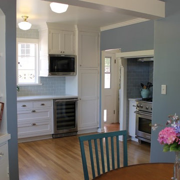
State-of-the-art appliances were included in the new floor plan: a microwave set in the upper cabinet, wine cooler below, new dishwasher with a panel to match the cabinets, a new stainless steel refrigerator, and a new professional style range and hood. The alcove for the range received the same tile backsplash, but we used a herringbone pattern to accent the feature wall. We also created a niche in the side wall to provide handy storage for spices. The base cabinets contain spice pullout storage. The original wood framing around the alcove was treated to a new coat of white paint to match the cabinets.
The new cabinets, a simple shaker style, are very appropriate for the period of time when the house was built. We added crown molding and casings to the windows to complete this period style. We were able to shift the utility cabinet to the left of the refrigerator, and install a 5 pull-out shelf pantry to the right of the wine cooler. The home owners asked for a pull-out trash unit and this was placed to the left of the sink. To the right of the sink is a corner lazy-susan unit to maximize storage. With this in mind, we added 2 small storage units at the ceiling above the sink.
Mary Broerman, CCIDC
 Flavin Architects
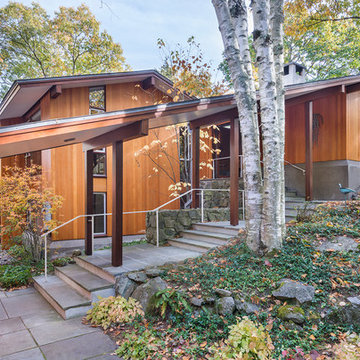
This house west of Boston was originally designed in 1958 by the great New England modernist, Henry Hoover. He built his own modern home in Lincoln in 1937, the year before the German émigré Walter Gropius built his own world famous house only a few miles away. By the time this 1958 house was built, Hoover had matured as an architect; sensitively adapting the house to the land and incorporating the clients wish to recreate the indoor-outdoor vibe of their previous home in Hawaii.
The house is beautifully nestled into its site. The slope of the roof perfectly matches the natural slope of the land. The levels of the house delicately step down the hill avoiding the granite ledge below. The entry stairs also follow the natural grade to an entry hall that is on a mid level between the upper main public rooms and bedrooms below. The living spaces feature a south- facing shed roof that brings the sun deep in to the home. Collaborating closely with the homeowner and general contractor, we freshened up the house by adding radiant heat under the new purple/green natural cleft slate floor. The original interior and exterior Douglas fir walls were stripped and refinished.
Photo by: Nat Rea Photography
 Kitchen Design Concepts
We introduce to you one of our newer services we are providing here at Kitchen Design Concepts: spaces that just need a little reviving! As of recent, we are taking on projects that are in need of minimal updating, as in, spaces that don’t need a full-on remodel. Yes, you heard right! If your space has good bones, you like the layout of your kitchen, and you just need a few cosmetic changes, then today’s feature is for you! Recently, we updated a space where we did just this! The kitchen was in need of a little love, some fresh paint, and new finishes. And if we’re being honest here, the result looks almost as if the kitchen had a full-on remodel! To learn more about this space and how we did our magic, continue reading below:
The Before and After
First, see what an impact new finishes can make! The “before” image shows a kitchen with outdated finishes such as the tile countertops, backsplash, and cabinetry finish. The “after” image, is a kitchen that looks almost as if its brand new, the image speaks for itself!
Cabinetry
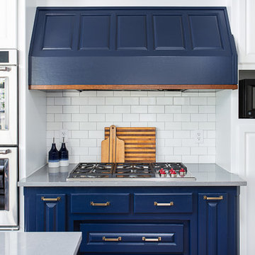
With the wooden cabinetry in this kitchen already having great bones, all we needed to do was our refinishing process that involved removing door and drawer fronts, sanding, priming, and painting. The main color of the cabinetry is white (Sherwin Williams Pure White 7005) and as an accent, we applied a deep navy blue that really pops in this space (Sherwin Willaims Naval 6244). As a special design element, we incorporated a natural wooden band across the hood which is subtle but adds an element of surprise.
Countertops
The original countertops in this space were a 12×12 tile with cracks and discolored grout from all the wear and tear. To replace the countertops, we installed a clean and crisp quartz that is not only durable but easy to maintain (no grout here!). The 3cm countertops are a Cambria quartz in a grey-tone color (Carrick).
Backsplash
Keeping things simple, yet classic, we installed a 3×6 subway tile from Interceramic. The crisp white pairs well with all the other finishes of the space and really brighten the space up! To spice things up, we paired the white tile with a contrasting grout color (Cape Grey) that matches the countertop. This is a simple method to add interest to your white backsplash!
Fixtures and Fittings
For the fixtures and fittings of the kitchen, we wanted pieces that made a statement. That’s why we selected this industrial style faucet from Brizo! The faucet is a Brizo LITZE™ PULL-DOWN FAUCET WITH ARC SPOUT AND INDUSTRIAL HANDLE (63044LF-BLGL). The matte black paired with the luxe gold elements really make a statement! To match the gold elements of the faucet, we installed cabinetry hardware from Topknobs in the same gold finish. The hardware is a Channing pull TK743HB. Lastly, the large single bowl sink (who doesn’t want a large sink?!) is a great functional touch to the kitchen. The sink is a Blanco Precision 16″ R10 super single with 16″ Drainer in stainless steel (516216).
 Finesse, Inc.
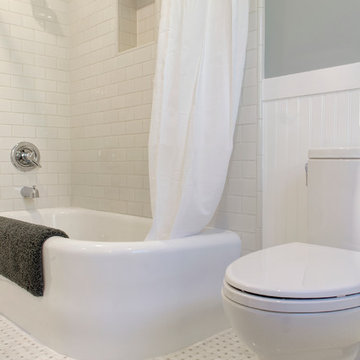
This 1927 Spanish Colonial home was in dire need of an upgraded Master bathroom. We completely gut the bathroom and re-framed the floor because the house had settled over time. The client selected hand crafted 3x6 white tile and we installed them over a full mortar bed in a Subway pattern. We reused the original pedestal sink and tub, but had the tub re-glazed. The shower rod is also original, but we had it dipped in Polish Chrome. We added two wall sconces and a store bought medicine cabinet.
Photos by Jessica Abler, Los Angeles, CA
 Stoneshop
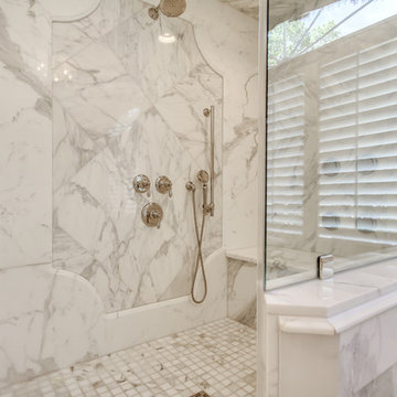
This spacious master bathroom is bright and elegant. It features white Calacatta marble tile on the floor, wainscoting treatment, and enclosed glass shower. The same Calacatta marble is also used on the two vanity countertops. Our crew spent time planning out the installation of the gorgeous water-jet floor tile insert, as well as the detailed Calacatta slab wall treatment in the shower.
This beautiful space was designed by Arnie of Green Eyed Designs.
Photography by Joseph Alfano.
 Howell Custom Building Group
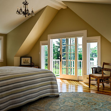
The homeowner's bought this antique farmhouse on the coast of Maine with the intention of renovating it to provide a peaceful summer retreat for their family. They wanted to maintain some of the charming antique features, while also adding space, modern amenities, and views of the marshland and ocean beyond. The home was expanded with a two story addition featuring complementary rooflines and the same simple, low slung shed dormers as the original home. The result is an eclectic, comfortable cottage that mixes the old with the new and features a variety of porches and balconies tucked under rooflines, as well as indoor spaces, to enjoy the exquisite views. The second floor features a new master suite at the far end, creating a luxurious retreat. A romantic, private gable-end balcony offers sweeping views of the marsh and ocean. The room also has access to a shared deck nestled between roof lines. Photography by Rob Karosis

Sponsored
Sunbury, OH
J.Holderby - Renovations
Franklin County's Leading General Contractors - 2X Best of Houzz!
 Julie Kardatzke Architect, LLC
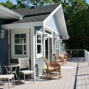
The existing wood siding and wood trim and much of at the existing stucco were replaced with engineered wood lap siding and shakes. The new exterior color scheme of french blue with accents of white and pale gray gives a more nautical feel to the house.
The original cottage was wrapped by a deck on all four sides, most of which was not used. The new composite deck is located primarily on the south (lake) side of the house, as well as at the entry. The chalet-style railings were replaced with crisp-looking cable railings. Scalloped trim connects the posts supporting the new deck.
Lowering the grade between the house and the garage placed the entry walkway at the same level as the back patio, eliminating the need to walk up a set of stairs to get from the back yard to the front.
 Treefrog Design
Photography by: Amy Birrer
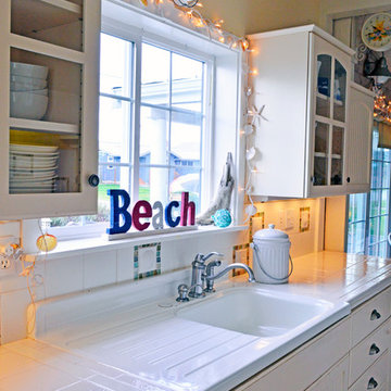
This lovely beach cabin was completely remodeled to add more space and make it a bit more functional. Many vintage pieces were reused in keeping with the vintage of the space. We carved out new space in this beach cabin kitchen, bathroom and laundry area that was nonexistent in the previous layout. The original drainboard sink and gas range were incorporated into the new design as well as the reused door on the small reach-in pantry. The white tile countertop is trimmed in nautical rope detail and the backsplash incorporates subtle elements from the sea framed in beach glass colors. The client even chose light fixtures reminiscent of bulkhead lamps.
The bathroom doubles as a laundry area and is painted in blue and white with the same cream painted cabinets and countetop tile as the kitchen. We used a slightly different backsplash and glass pattern here and classic plumbing fixtures.
 McCabe By Design LLC
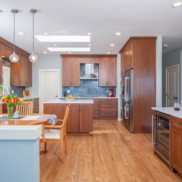
The original island size was reduced to create wider walkways. The smaller more streamlined island enables the owners to have ample room to cook together, and without the bulk of the larger island, the entire Kitchen is more spacious, visually and functionally.
 Urbanology Designs
A captivating transformation in the coveted neighborhood of University Park, Dallas
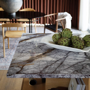
The heart of this home lies in the kitchen, where we embarked on a design endeavor that would leave anyone speechless. By opening up the main kitchen wall, we created a magnificent window system that floods the space with natural light and offers a breathtaking view of the picturesque surroundings. Suspended from the ceiling, a steel-framed marble vent hood floats a few inches from the window, showcasing a mesmerizing Lilac Marble. The same marble is skillfully applied to the backsplash and island, featuring a bold combination of color and pattern that exudes elegance.
Adding to the kitchen's allure is the Italian range, which not only serves as a showstopper but offers robust culinary features for even the savviest of cooks. However, the true masterpiece of the kitchen lies in the honed reeded marble-faced island. Each marble strip was meticulously cut and crafted by artisans to achieve a half-rounded profile, resulting in an island that is nothing short of breathtaking. This intricate process took several months, but the end result speaks for itself.
To complement the grandeur of the kitchen, we designed a combination of stain-grade and paint-grade cabinets in a thin raised panel door style. This choice adds an elegant yet simple look to the overall design. Inside each cabinet and drawer, custom interiors were meticulously designed to provide maximum functionality and organization for the day-to-day cooking activities. A vintage Turkish runner dating back to the 1960s, evokes a sense of history and character.
The breakfast nook boasts a stunning, vivid, and colorful artwork created by one of Dallas' top artist, Kyle Steed, who is revered for his mastery of his craft. Some of our favorite art pieces from the inspiring Haylee Yale grace the coffee station and media console, adding the perfect moment to pause and loose yourself in the story of her art.
The project extends beyond the kitchen into the living room, where the family's changing needs and growing children demanded a new design approach. Accommodating their new lifestyle, we incorporated a large sectional for family bonding moments while watching TV. The living room now boasts bolder colors, striking artwork a coffered accent wall, and cayenne velvet curtains that create an inviting atmosphere. Completing the room is a custom 22' x 15' rug, adding warmth and comfort to the space. A hidden coat closet door integrated into the feature wall adds an element of surprise and functionality.
This project is not just about aesthetics; it's about pushing the boundaries of design and showcasing the possibilities. By curating an out-of-the-box approach, we bring texture and depth to the space, employing different materials and original applications. The layered design achieved through repeated use of the same material in various forms, shapes, and locations demonstrates that unexpected elements can create breathtaking results.
The reason behind this redesign and remodel was the homeowners' desire to have a kitchen that not only provided functionality but also served as a beautiful backdrop to their cherished family moments. The previous kitchen lacked the "wow" factor they desired, prompting them to seek our expertise in creating a space that would be a source of joy and inspiration.
Inspired by well-curated European vignettes, sculptural elements, clean lines, and a natural color scheme with pops of color, this design reflects an elegant organic modern style. Mixing metals, contrasting textures, and utilizing clean lines were key elements in achieving the desired aesthetic. The living room introduces bolder moments and a carefully chosen color scheme that adds character and personality.
The client's must-haves were clear: they wanted a show stopping centerpiece for their home, enhanced natural light in the kitchen, and a design that reflected their family's dynamic. With the transformation of the range wall into a wall of windows, we fulfilled their desire for abundant natural light and breathtaking views of the surrounding landscape.
Our favorite rooms and design elements are numerous, but the kitchen remains a standout feature. The painstaking process of hand-cutting and crafting each reeded panel in the island to match the marble's veining resulted in a labor of love that emanates warmth and hospitality to all who enter.
In conclusion, this tastefully lux project in University Park, Dallas is an extraordinary example of a full gut remodel that has surpassed all expectations. The meticulous attention to detail, the masterful use of materials, and the seamless blend of functionality and aesthetics create an unforgettable space. It serves as a testament to the power of design and the transformative impact it can have on a home and its inhabitants.
Project by Texas' Urbanology Designs. Their North Richland Hills-based interior design studio serves Dallas, Highland Park, University Park, Fort Worth, and upscale clients nationwide.

 TKS Design Group
Free ebook, Creating the Ideal Kitchen. DOWNLOAD NOW
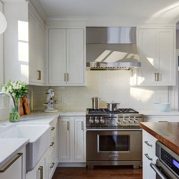
This Glen Ellyn couple wanted to transform their dated kitchen into a more family-friendly space to use on a daily basis for cooking family meals and for entertaining friends. The existing kitchen was quite chopped up with strange soffits and different ceiling heights. To make the space flow in a more logical manner, we borrowed an unused desk area from the adjoining hallway and reconfigured a neighboring bath. Getting it to work on paper was fairly straightforward, but there was a bit of complicated beam work involved as the new kitchen flows through what was an old exterior wall. The new ceiling is now completely flush as we were able to hide the support in the ceiling joists.
A new, larger window was added at the sink, the doorway to the room was widened and the resulting space creates a more easy flow from dining room to family room.
The clients chose white inset cabinets, white marble tops and an apron sink to keep the space feeling simple yet original to the home's Colonial styling.
Ship lap siding on the back of the island and at the pantry storage ceiling, a walnut butcher block, and antique brass details give the space an updated look.
Professional stainless appliances are functional and beautiful. In addition to a large built-in fridge and 36" range, a second oven is housed in the island for flexibility.
The pantry area has a convenience station that houses the family's espresso machine along with the microwave drawer. Another large bank of cabinets in the same area serves as pantry storage for dry goods.
The bathroom was also remodeled as part of this project. The full bath has a vanity, shower and convenient baby changing area.
The floor is encaustic tile, a type of concrete tile recognizable by its bold graphics. The mirror and lighting add a few modern touches to keep it in line with the Owner's personal style.
Designed by: Susan Klimala, CKD, CBD
Photography by: Carlos Vergara
For more information on kitchen and bath design ideas go to: www.kitchenstudio-ge.com
 Dimensions in Wood Inc
This client’s vision for their kitchen/hearth room remodel was to create a harmonious space for gathering and socializing with family and friends. Without the before and after photos, you would scarcely believe this was the same home.
This huge home renovation perfectly illustrates that Dimensions In Wood’s expert team can handle every aspect of your remodeling project. Plumbing, flooring, electrical wiring, custom cabinets, structural engineering, appliances, windows, interior and exterior doors, entertainment and more. Contact us today to discuss Translating Your Visions into Reality
The client was interested in new appliance technology, cabinetry to the ceiling, and an Island large enough to seat 3. They also wanted a built-in breakfast nook, improved pantry space, more functional storage on either side of their fireplace, and a built-in appearance for the TV above the mantel. The original built-in desk was not used, and they preferred for that space to serve as a small bar area with refrigeration and a place to store their printer. We designed several plans for the space before selecting the final layout.
The new design required the removal of the soffit over the old sink, as well as a small wall beside the old refrigerator. The wall beside the stairwell had to be shortened 13 inches and a new beam installed to carry the load of the home’s 2nd story to gain enough space for the large central island. The existing closet pantry walls were also reconfigured as per the new plan.
This serves as a great reminder that Dimensions In Wood is much more than just custom cabinets.
Central to the entire custom kitchen is an 8-foot Walnut island. The huge island, which comfortably seats three, is topped with Essenza Blue quartzite. The stone’s natural striations are beautiful. Quartzite is harder than granite, and less likely to stain than other stones because of its density. The couple had to look through multiple slabs to find a piece they LOVED. The island’s custom Walnut cabinetry, built to resemble a piece of custom furniture, was stained Bronzed Walnut by Sherwin Williams.
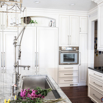
The 4-foot Galley Workstation in the island, handles all the kitchen’s prep, serving, and cleanup needs. The Galley’s culinary tools include an upper tier cutting board, upper tier drying rack, 2 lower tier platforms, 11″ colander with non-slip handles, and 11” mixing bowl with lid and non-slip bottom. Learn more about the amazing Galley Workstation here. A Waterstone gantry faucet in a pewter finish combines a pull-down sprayer for maximum mobility and a articulated swivel spout. A water tap with reverse osmosis filter provides the highest quality drinking water. To keep a clean and sleek counter we installed a raised air switch for the garbage disposal and integrated soap dispenser. The island also houses the Thermador Sapphire 7-Program Dishwasher with a hidden touch control panel and a custom Walnut wood front. The cabinetry under the Galley Workstation features a trash roll out, as well as storage for the culinary tools.
Shortening the stairwell wall, and reframing around the stairs, which included shortening the handrail, also made room for a bi-fold door walk-in pantry with extra roll out storage and space for a small microwave. Above the panty doors is a remote controlled, electric motor powered, lift up cabinet door which hides a flat screen TV, used while the family is cooking.
To the right of the walk-in pantry is cold food storage. The Thermador, 30-inch Freedom Collection refrigerator and 24-inch built-in freezer column with internal ice maker are covered with matching cabinetry fronts. An open display space was designed above the units, creating an aesthetically beautiful wall. To the right of the refrigerator & freezer columns is a tall cabinet designed for the built-in Thermador steam and convection oven. The convention steam oven is a relatively new technology for homes, but its versatility and food quality is amazing. To the right of this is a pull-out appliance pantry which provides easy access and storage for a stand mixer, blender, and any other appliance you do not want to clutter the counter.
The most visible wall of the kitchen features the 36-inch Thermador Professional Series Harmony Gas Range with Griddle. Between the range and custom designed wood hood, a framed mosaic tile accent in the backsplash, creates a focal point. To clear the air, the Professional Series Thermador 42-inch ventilation insert provides excellent exhaust capabilities, as well as providing multi-level, vivid LED lights for beautiful illumination.
The wall cabinetry symmetrically flanks the custom hood, utilizing deeper wall cabinetry on each end, allowing for storage of oversized dishware. The base cabinetry on this wall is made up of drawers, except for the corner, which is a Kesseböhmer LeMans II. This specially designed shelf system allows ease of access in underutilized blind corners. The dual action articulation system with soft close mechanism ensures a smooth open and close.
Rounding the corner to the outside wall, the base cabinetry was built to a narrower depth, providing additional space for the island, as well as easier access to the new larger pass-thru window which serves the screen porch. The client selected Black Vermont granite countertops with an ogee edge to contrast the Linen White painted cabinetry.
The door to the screen porch was replaced with a Marvin Exterior Door with a raised panel at the bottom of the 3⁄4 glass door.
Marvin Windows replaced the other windows in the space increasing the energy efficiency and value of the home. To establish the breakfast nook, a bench with drawers and an upholstered seat was built into the bay area of the room.
Custom bookshelves were built with open shelves, cabinet doors, and drawers on either side of the fireplace. A new stone hearth and fireplace surround were installed. Above the existing mantel we built a recessed space for the flat screen television hiding all wiring inside the walls for a completely clean look.
The space that was once a desk was transformed into a bar area. The glass shelves and glass cabinet front liquor cabinet stand out. But this bar area has hidden secrets. Tucked beneath the black granite is a Thermador under-counter double drawer refrigerator with matching wood front panels. They blend in perfectly with the cabinets. A wireless printer is easily accessed on a slide out drawer. Plus, what looks like merely wooden panels on the wall are concealing recessed storage for more bottles and glasses!
Overhead recessed lighting and speaker system provide illumination and entertainment through the entire space.
This luxury home had original, solid oak flooring through most of the first floor which the homeowner obviously wanted to keep but were in desperate need of repair and refinishing. Our master craftsmen wove in new wood flooring to match the old where needed, particularly where walls had been changed and where the floor was damaged. We sanded the floors, smoothing away years of wear and tear. The entire wood floor was then uniformly stained, making it impossible to differentiate where any repairs were made.
If this renovation has inspired you, then contact us today! There is no limit to our Dimensions.
 TKS Design Group
Free ebook, Creating the Ideal Kitchen. DOWNLOAD NOW
The Klimala’s and their three kids are no strangers to moving, this being their fifth house in the same town over the 20-year period they have lived there. “It must be the 7-year itch, because every seven years, we seem to find ourselves antsy for a new project or a new environment. I think part of it is being a designer, I see my own taste evolve and I want my environment to reflect that. Having easy access to wonderful tradesmen and a knowledge of the process makes it that much easier”.
This time, Klimala’s fell in love with a somewhat unlikely candidate. The 1950’s ranch turned cape cod was a bit of a mutt, but it’s location 5 minutes from their design studio and backing up to the high school where their kids can roll out of bed and walk to school, coupled with the charm of its location on a private road and lush landscaping made it an appealing choice for them.
“The bones of the house were really charming. It was typical 1,500 square foot ranch that at some point someone added a second floor to. Its sloped roofline and dormered bedrooms gave it some charm.” With the help of architect Maureen McHugh, Klimala’s gutted and reworked the layout to make the house work for them. An open concept kitchen and dining room allows for more frequent casual family dinners and dinner parties that linger. A dingy 3-season room off the back of the original house was insulated, given a vaulted ceiling with skylights and now opens up to the kitchen. This room now houses an 8’ raw edge white oak dining table and functions as an informal dining room. “One of the challenges with these mid-century homes is the 8’ ceilings. I had to have at least one room that had a higher ceiling so that’s how we did it” states Klimala.
The kitchen features a 10’ island which houses a 5’0” Galley Sink. The Galley features two faucets, and double tiered rail system to which accessories such as cutting boards and stainless steel bowls can be added for ease of cooking. Across from the large sink is an induction cooktop. “My two teen daughters and I enjoy cooking, and the Galley and induction cooktop make it so easy.” A wall of tall cabinets features a full size refrigerator, freezer, double oven and built in coffeemaker. The area on the opposite end of the kitchen features a pantry with mirrored glass doors and a beverage center below.
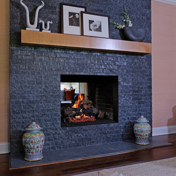
The rest of the first floor features an entry way, a living room with views to the front yard’s lush landscaping, a family room where the family hangs out to watch TV, a back entry from the garage with a laundry room and mudroom area, one of the home’s four bedrooms and a full bath. There is a double sided fireplace between the family room and living room. The home features pops of color from the living room’s peach grass cloth to purple painted wall in the family room. “I’m definitely a traditionalist at heart but because of the home’s Midcentury roots, I wanted to incorporate some of those elements into the furniture, lighting and accessories which also ended up being really fun. We are not formal people so I wanted a house that my kids would enjoy, have their friends over and feel comfortable.”
The second floor houses the master bedroom suite, two of the kids’ bedrooms and a back room nicknamed “the library” because it has turned into a quiet get away area where the girls can study or take a break from the rest of the family. The area was originally unfinished attic, and because the home was short on closet space, this Jack and Jill area off the girls’ bedrooms houses two large walk-in closets and a small sitting area with a makeup vanity. “The girls really wanted to keep the exposed brick of the fireplace that runs up the through the space, so that’s what we did, and I think they feel like they are in their own little loft space in the city when they are up there” says Klimala.
Designed by: Susan Klimala, CKD, CBD
Photography by: Carlos Vergara
For more information on kitchen and bath design ideas go to: www.kitchenstudio-ge.com
70