
Search results for "Referenced" in Home Design Ideas
 Donald Lococo Architects
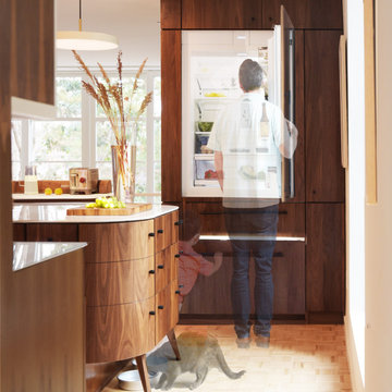
The kitchen was designed two years ago and was then erased and redesigned when the world became a different place a year later. As everyone attempted to flatten the curve, our goal in this regard was to create a kitchen that looked forward to a sharp curve down and of a happier time To that promise for happier times, the redesign, a goal was to make the kitchen brighter and more optimistic. This was done by using simple, primary shapes and circular pendants and emphasizing them in contrast, adding a playful countenance. The selection of a dynamic grain of figured walnut also contributes as this once-living material and its sinuous grain adds motion, rhythm, and scale.
Proud of their 1970s home, one challenge of the design was to balance a 1970's feel and stay current. However, many ‘70s references looked and felt outdated. The first step was a changed mindset. Just like the return of the ‘40s bath and the retro movement a few years ago, every era returns in some way. Chronologically, the '70s will soon be here. Our design looked to era-specific furniture and materials of the decade. Figured walnut was so pervasive in the era: this motif was used on car exteriors such as the 1970 Town and Country Station Wagon, which debuted the same year the existing home was built. We also looked at furniture specific to the decade. The console stereo is referenced not only by high legs on the island but also by the knurled metal cabinet knobs reminiscent of often-used stereo dials. Knurled metalwork is also used on the kitchen faucet. The design references the second piece of '70s furniture in our modern TV tray, which is angled to face the television in the family room. Its round pencil and mug holder cutouts follow the design of walnut consoles and dashboard of the station wagon and other elements of the time.
 Moto Designshop
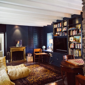
Originally built in 1809 and situated on 20+ acres, this country farm house was extensively renovated to serve as a getaway for the owners. With a strong desire to entertain, play, swim and relax, the owners requirement for spatial flexibility provided context for the various design interventions. To make use of the relatively small upper floors of the main house, a new stair tower was created external to the main footprint. Separated by glass and clad in copper the tower modernizes the property while referencing its history. The ground floor restores the historic fireplace and rock walls and is opened to the sprawling hillside, creek and pool through a retractable glazing system. Throughout the project’s interior, are unique moments of mixed materials, pattern and texture. The chef’s kitchen is warmly detailed with glazed tiles, steel and wood and is accented with found relics making up the island. Many of the wood floors, ceilings, and furniture were milled from fallen walnut, oak and elm trees harvested from the property. The guest house is executed in a minimalist Japanese palate and highlighted by exquisite detailing. The garage was rebuilt and expanded with an art studio and work/play space.
 Axis Mundi | Chicago
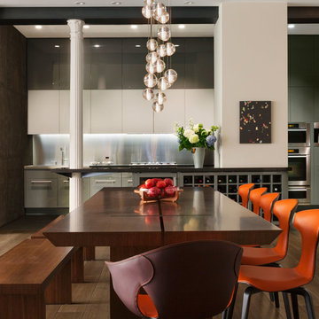
This NoHo apartment, in a landmarked circa 1870 building designed by Stephen Decatur Hatch and converted to lofts in 1987, had been interestingly renovated by a rock musician before being purchased by a young hedge fund manager and his gallery director girlfriend. Naturally, the couple brought to the project their collection of painting, photography and sculpture, mostly by young emerging artists. Axis Mundi accommodated these pieces within a neutral palette accented with occasional flashes of bright color that referenced the various artworks. Major furniture pieces – a sectional in the library, a 12-foot-long dining table–along with a rich blend of textures such as leather, linen, fur and warm woods, helped bring the sprawling dimensions of the loft down to human scale.
Size: 3,400 sf
Design Team: John Beckmann and Nick Messerlian
Architect: Nemaworkshop
Photography: Durston Saylor, and Mark Roskams
© Axis Mundi Design LLC.
Find the right local pro for your project
 Brooks + Scarpa Architects
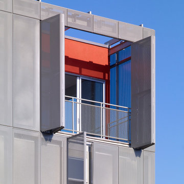
Located in a neighborhood characterized by traditional bungalow style single-family residences, Orange Grove is a new landmark for the City of West Hollywood. The building is sensitively designed and compatible with the neighborhood, but differs in material palette and scale from its neighbors. Referencing architectural conventions of modernism rather than the pitched roof forms of traditional domesticity, the project presents a characteristic that is consistent with the eclectic and often unconventional demographic of West Hollywood. Distinct from neighboring structures, the building creates a strong relationship to the street by virtue of its large amount of highly usable balcony area in the front façade.
While there are dramatic and larger scale elements that define the building, it is also broken down into comprehensible human scale parts, and is itself broken down into two different buildings. Orange Grove displays a similar kind of iconoclasm as the Schindler House, an icon of California modernism, located a short distance away. Like the Schindler House, the conventional architectural elements of windows and porches become part of an abstract sculptural ensemble. At the Schindler House, windows are found in the gaps between structural concrete wall panels. At Orange Grove, windows are inserted in gaps between different sections of the building.
The design of Orange Grove is generated by a subtle balance of tensions. Building volumes and the placement of windows, doors and balconies are not static but rather constitute an active three-dimensional composition in motion. Each piece of the building is a strong and clearly defined shape, such as the corrugated metal surround that encloses the second story balcony in the east and north facades. Another example of this clear delineation is the use of two square profile balcony surrounds in the front façade that set up a dialogue between them—one is small, the other large, one is open at the front, the other is veiled with stainless steel slats. At the same time each balcony is balanced and related to other elements in the building, the smaller one to the driveway gate below and the other to the roll-up door and first floor balcony. Each building element is intended to read as an abstract form in itself—such as a window becoming a slit or windows becoming a framed box, while also becoming part of a larger whole. Although this building may not mirror the status quo it answers to the desires of consumers in a burgeoning niche market who want large, simple interior volumes of space, and a paradigm based on space, light and industrial materials of the loft rather than the bungalow.
 Weldrick & Co.
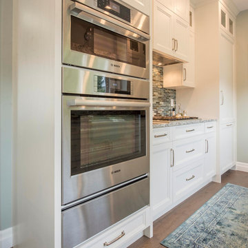
Premium finishes and appliances were used to create a cook's dream kitchen. The palette provides a soft and serene environment, while referencing the property's proximity to water and woods.
 hungryeye
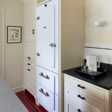
Kitchen in a 1926 bungalow, done to my client's brief that it should look 'original' to the house.
The three 'jewels' of the kitchen are the immaculately restored 1928 Wedgwood high-oven stove, the SubZero refrigerator/freezer designed to look like an old-fashioned ice box, and the island referencing a farmhouse table with pie-save cabinet underneath, done in ebonized oak and painted bead-board.
The red Marmoleum floor has double inlaid borders, the counters are honed black granite, and the walls, cabinets, and trim are all painted a soft ocher-based cream-colour taken from a 1926 DutchBoy paint deck. Virtually everything is custom, save the sink, faucets, and pulls, done to my original designs. The Bosch dishwasher, washer, and dryer are all hidden in the cabinetry.
All photographs courtesy David Duncan Livingston. (Kitchen featured in Fall 2018 AMERICAN BUNGALOW magazine)
 Arizona Tile
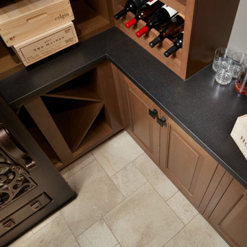
Indian Premium Black is cross-referenced as Absolute Black. The size and color of each block is fairly consistent between the slabs and tile and will have minimal variation.
 Dynia Architects
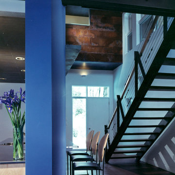
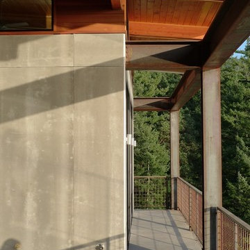
This 2,500 square foot “studio” is located in a neighborhood bisected by alleys and containing charming remnants of indigenous outbuildings common to the region. The desire was to create a clean, open, contemporary interior in a building that outwardly referenced its context. The primary form of the house took shape from the long, narrow lot. On the north end, which faces an alley, a patinated clad steel structure forms a canopy for the entry. This carefully scaled “cabin”, raised above the upper level to access a glimpse of the mountains, pays homage to the many sheds lining the alley.
The south end features a terrace above the garage that is an extension of the primary interior space. The masonry west wall of the building provides privacy from the adjacent lot. This functional “spine” contains program elements on both levels and is visible internally and externally. A gently curved wall provides continuity between the floors and shields a bathroom and dressing area. This wall stops short of the ceiling, allowing the uninterrupted plane of maple veneer plywood to form a canopy unifying the spaces.
A.I.A. Wyoming Chapter Design Award of Honor 2004
 Frankel Design Build
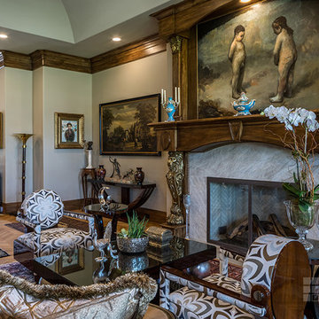
This estate on Rivercrest incorporates more than 27,000. The house is 26,369, the Pool House is 2,181, the stables are 3,597 (total covered area) square feet of covered structure, including poolside entertaining space, and stables.
This home is very much a traditional meets modern layout. It’s formalized. Referencing heavily upon Andrea Palladio, the home uses symmetry as a major design element.
Connie Anderson Photography

 Blondie's Treehouse Inc
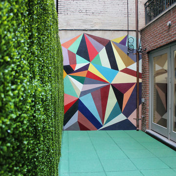
Referencing this square footage as an internal courtyard might be a stretch. A more accurate description would perhaps be the awesome things that New Yorkers can do with the tiny spaces we have.
The parameters of the project lend to its description. This Tribeca residential building’s shared amenity space and gym on the lower level opens up onto a 350 square foot space of brick walls and concrete pavers. The south wall of this space is made up by the terraces belonging to the residential units above and while the setting allows for minimal ambient light, each balcony looks down onto the shared space below.
In order to provide visual interest from the gym and the overhead views, Blondie’s designers Sara Baerwald and Eva Vessio utilized Jay Scott’s rectangle containers lining the north wall as well as surrounding the utilities in the southwest corner. They then created 8 foot faux boxwood hedge on the north wall and the appropriate height to conceal the utilities. From below the hedge creates the feeling of a courtyard and from above it softens the view of the once barren space. Adding color and functionality, the concrete pavers were replaced with rubber tiles in a bright aqua. To play off of this color and add a unique level of visual impact, artist Chris Pearson designed and painted a multi-color prism mural. Primarily on the east wall and then stretching over the hedges to the south, the depth and dimension that this mural provides for the space is incredible. It is a testament to the successful solutions we conjure when thinking outside the box and allowing for unique site specific resolutions.
 Naikoon Contracting Ltd
Architect: M3 Architecture Inc.
Interior Design: Mocoro Studio
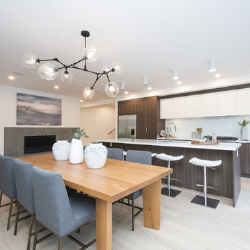
We recently completed a development project in the Pemberton Heights area of North Vancouver. These 2 houses were built to benefit the long-term durability through the selection of efficient materials and process which will give a longer lifespan with lower maintenance and energy costs. This project was a perfect fit for us to assist in the design and execute the construction while working with some outstanding clients and consultants. A win for all of us!
The original home was recycled hitting our target goals of 90%, leading way to a couple of stealth looking homes with performance levels right there with the best of them. Our mechanical engineer designed the mechanical systems to achieve maximum efficiency and hit our internal target goals that we have set for ourselves in accordance with our Vision here at Naikoon. These homes came in at EnerGuide score of 85% which can also be referenced in GJ with a score of 54GJ. To give you an idea of how this rating relates to an average home of this size, these 2 beauties on Mackay are about 80% more efficient. The main components in the design and equipment selection that leads to this are:
1) Space heating and Cooling
2) Water Heating
3) Lights and Appliances
4) Wall assemblies and insulation
Like all of our projects, we take pride in looking at the small details of the house. Things like, insulated water lines, domestic hot water heat recovery units, electric car plug-ins, solar power ready, extensive use of environmentally friendly materials, hot water heat pumps and stringent testing and inspection point along the way, led to a successful completion of 2 certified high-performance homes with Built Green Platinum and EnergyStar certifications.
Photo credits: vopenhouse.ca
 Shorebird Interiors, LLC
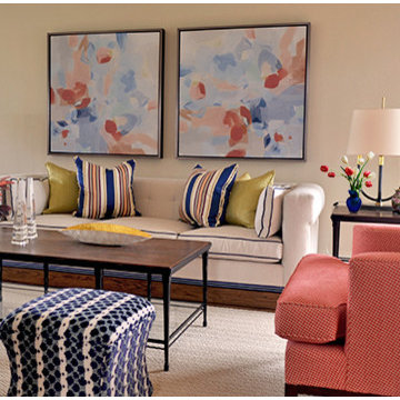
A house on Popponesset Beach in New Seabury, MA gets a Living/Dining Room and Master Bedroom Makeover. The clients, who are from the Boston area, wanted the living room to have a nautical feel, without being too “beachy cute” or kitsch. We referenced nautical themes in the palette and materials, trying not to be too literal in our approach. Brass and oil rubbed bronze fixtures, as well as dark wood tones and sail cloth help achieve the look. The furniture in the living room and sitting areas, as well as the herringbone topped dining table, were custom made for the client. The floor coverings were custom cut to fit the octagonal shape of the Master Bedroom and the sitting area of the Living Room.
In the Master Bedroom, serenity was the order of the day with a softer palette reminiscent of beach tones found in the sand, sky water and driftwood. We were careful with the palette so that it was not too flat, but also that the juxtapositions were harmonious, not too jarring. Light blues, taupes, driftwood tones with hits of white were the basic tools to achieve this.
 studioWTA
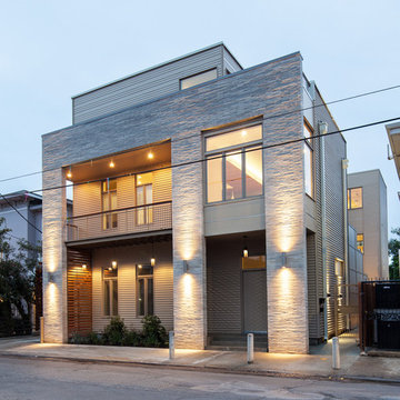
The project is the outcome of two major design challenges; the clients desire to create a contemporary building capable of referencing its historic setting and maximizing the built square footage on a limited site.
Photo by Jeffrey Johnston
 Naikoon Contracting Ltd
Architect: M3 Architecture Inc.
Interior Design: Mocoro Studio
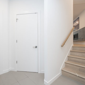
We recently completed a development project in the Pemberton Heights area of North Vancouver. These 2 houses were built to benefit the long-term durability through the selection of efficient materials and process which will give a longer lifespan with lower maintenance and energy costs. This project was a perfect fit for us to assist in the design and execute the construction while working with some outstanding clients and consultants. A win for all of us!
The original home was recycled hitting our target goals of 90%, leading way to a couple of stealth looking homes with performance levels right there with the best of them. Our mechanical engineer designed the mechanical systems to achieve maximum efficiency and hit our internal target goals that we have set for ourselves in accordance with our Vision here at Naikoon. These homes came in at EnerGuide score of 85% which can also be referenced in GJ with a score of 54GJ. To give you an idea of how this rating relates to an average home of this size, these 2 beauties on Mackay are about 80% more efficient. The main components in the design and equipment selection that leads to this are:
1) Space heating and Cooling
2) Water Heating
3) Lights and Appliances
4) Wall assemblies and insulation
Like all of our projects, we take pride in looking at the small details of the house. Things like, insulated water lines, domestic hot water heat recovery units, electric car plug-ins, solar power ready, extensive use of environmentally friendly materials, hot water heat pumps and stringent testing and inspection point along the way, led to a successful completion of 2 certified high-performance homes with Built Green Platinum and EnergyStar certifications.
Photo credits: vopenhouse.ca
 Patrician Design
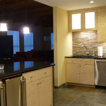
This dated interior provided a challenging starting point for a single man who found value in the purchase and saw beyond the current appearance. Recognizing certain elements such as the wooden ceilings, handsome exposed adobe, stone fireplace… he asked that we create a design that spoke of modern finishes and clean lines. Read more and see before and after pictures at the above referenced website.
 Axis Mundi
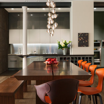
This NoHo apartment, in a landmarked circa 1870 building designed by Stephen Decatur Hatch and converted to lofts in 1987, had been interestingly renovated by a rock musician before being purchased by a young hedge fund manager and his gallery director girlfriend. Naturally, the couple brought to the project their collection of painting, photography and sculpture, mostly by young emerging artists. Axis Mundi accommodated these pieces within a neutral palette accented with occasional flashes of bright color that referenced the various artworks. Major furniture pieces – a sectional in the library, a 12-foot-long dining table–along with a rich blend of textures such as leather, linen, fur and warm woods, helped bring the sprawling dimensions of the loft down to human scale.
Size: 3,400 sf
Design Team: John Beckmann and Nick Messerlian
Architect: Nemaworkshop
Photography: Durston Saylor, and Mark Roskams
© Axis Mundi Design LLC
 MATHISON | MATHISON ARCHITECTS
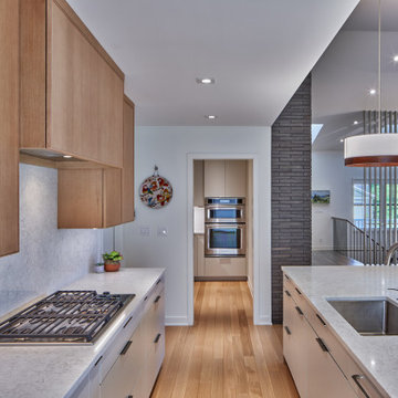
Watermark Residence was conceived as a “downsizing” project for Owners looking to transition from the home where they raised their family to a simpler lifestyle. The footprint and exterior massing of the single family condo was prescribed, but MMA wove new details into these constraints and was urged by the Owner to completely reinvent the interior experience.
From the exterior, the home sits subtly on a corner lot, referencing the neighborhood in its style, but with a warmth and crispness that speaks also to the interiors.
The primary goal of the project was to provide an open, inviting atmosphere of connected spaces that allowed natural light into all areas of the home. Upon entry, there is an immediate involvement in the daily activities with the living and dining rooms being the focal point, and a more intimate kitchen slightly out of view.
Throughout the home, the idea of privacy and transparency plays an important role in the organization of spaces and materials chosen. More private corridors lead to intimate bedroom spaces and functional laundry and mudrooms. A two-floor, semi-transparent slat wall shields direct visibility from the street, while also providing connection between the entertaining spaces of the home. Combined with the white oak, open staircase, the movement between levels feels intuitive and inviting.
A simple palette of materials, understated in their appearance but detailed in their execution, are threaded throughout the home. Gathering spaces are represented with open slats, grounding brick, white oak, and bright walls. Movement deeper into the house brings refined slat panels with integrated hardware at kitchen millwork, softly painted cabinetry, and warm tones of walnut in furniture elements. The most private spaces of the home further extrude the slat element into fluted panels, painted in deeper colors.
 Patrician Design
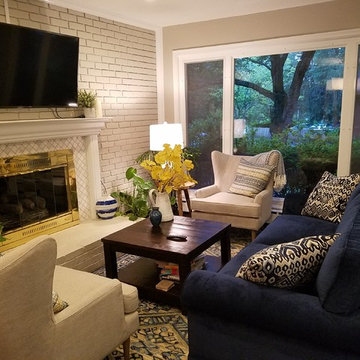
We all know that traditional housing floor plans are changing to maximize smaller footprints. The result is a more open layout. This preference, often seen in “loft” design where warehouse space is converted to living spaces – without many walls and with an eye on the interestingly industrial finishes of the existing space. But this same concept applies to new home construction for starters or down-sizing to smaller homes and is definitely applicable in remodels of existing traditionally compartmentalized plans. Read more and see before and after pictures at the above referenced website.
 Luxoria
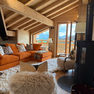
The living room centres on a cylindrical wood-burning stove finished in matte black. Its clean lines contrast with the pale timbers above, while the flicker of firelight animates the simple plaster walls. We paired the stove with a streamlined sofa in a vibrant orange fabric—no boucle here—choosing a smooth weave that’s easy to maintain yet striking against the neutral backdrop. A low coffee table in dark ash sits nearby, flanked by a pair of lounge chairs dressed in soft sheepskin throws. Overhead, an antler-inspired light fitting casts a warm, even glow, referencing alpine character without feeling cliché.
20