
Search results for "Remembering" in Home Design Ideas
 Deville Custom Homes
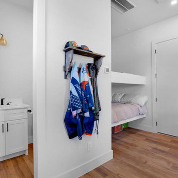
Welcome to Texas Hill Country living at its finest! This stunning almost new modern farmhouse features a one story 5/3 with 2 half bath home with a movie room, and a guesthouse nestled on over 5+ acres in a fenced neighborhood in Lake Travis ISD with lake access!
The home was built in 2021 and was built/designed by the award winning Deville Custom Homes and is the builder's personal home. The home is almost completely wheelchair/ADA accessible, and features a flat lot, an entertaining back yard with a pool for even the youngest of children to enjoy (shallow depths with side walls for the just in case moments), a 30k rainwater collection tank, an inground trampoline, and a partially turfed backyard that meets another sodded acre so the whole group can run barefoot! There is even an inside/outside bathroom that allows those in the pool to quickly run in and out without getting the house wet!
All of the small details have been thought about including Christmas plugs in the soffit, RV outlets, wired for solar and an electric vehicle, entire house is wired with Sonos speakers (even the pool) and 8 cameras with an alarm. This home was designed for the entertaining and discerning buyer who wants their privacy but is conscientious and cautious and likes to feel protected.
Additional details are: completely spray foamed home, large 12x16 metal storage building that matches the house, level 4 drywall, a large Fleetwood back door, most cactus has been eradicated, 12 foot ceilings in main rooms, and an outdoor kitchen with built in grill and wired for a tv. The guest house features two large full size bunkbeds, an open living area, and a half bathroom (just in case you want your friends to visit but not move in)!
Remember to bring your horses and your boat!
 Interiors by J. Curry
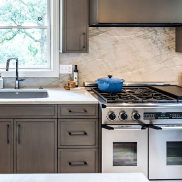
The River Bluff Beauty is one of our favorite remodels from 2024 as this is a space that stayed with in the original footprint yet was a very dramatic change from before to after. Its always a good lesson to remember how the right design along with color, a mixture of materials, and creativity can amply elevate a space with out a major addition or structural changes. A number one ask of the homeowner: no white painted cabinets!! So we proposed a more moody theme and used a unique palette of finishes with Dusk Stain over walnut in a thin shaker door, complimented with natural walnut accents & warm walnut interiors. Dusk is an artisan finish in an opaque stain creating a rich gray tone, with underlying warmth of the wood peaking through. We used natural quartzite counter tops in a soft matte finish for both counters and the full height backsplash, creating a clean flow there helped the space seem more connected and less busy to the eye. A special feature just off the kitchen was a small wine bar and liquor storage cabinet wrapped in walnut waterfall counters, what once was a lose furniture piece now is a beautiful and coordinated extension of the room. Another gorgeous detail was the remodeling of the two-sided fireplace area, this was a fairly major change that did open up the view between kitchen dining and living as well as the view of their great wooded property. We worked with a furniture maker to create a one of a kind modern wood surround made of white oak and walnut and paired with a pressed somewhat rustic concrete that has a blend of gray and taupe’s to blend with the rest of the new color scheme.
 TKS Design Group
Download our free ebook, Creating the Ideal Kitchen. DOWNLOAD NOW
Lakefront property in the northwest suburbs of Chicago is hard to come by, so when we were hired by this young family with exactly that, we were immediately inspired by not just the unusually large footprint of this 1950’s colonial revival but also the lovely views of the manmade lake it was sited on. The large 5-bedroom home was solidly stuck in the 1980’s, but we saw tons of potential. We started out by updating the existing staircase with a fresh coat of paint and adding new herringbone slate to the entry hall.
The powder room off the entryway also got a refresh - new flooring, new cabinets and fixtures. We ran the new slate right through into this space for some consistency. A fun wallpaper and shiplap trim add a welcoming feel and set the tone for the home.
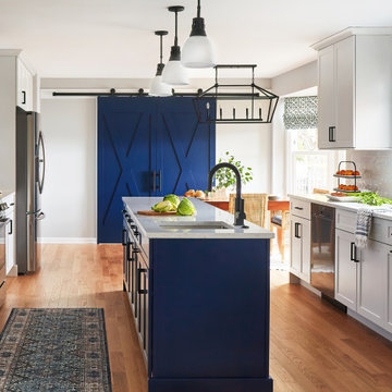
Next, we tackled the kitchen. Located away from the rest of the first floor, the kitchen felt a little isolated, so we immediately began planning for how to better connect it to the rest of the first floor. We landed on removing the wall between the kitchen and dining room and designed a modified galley style space with separate cooking and clean up zones. The cooking zone consists of the refrigerator, prep sink and cooktop, along with a nice long run of prep space at the island. The cleanup side of the kitchen consists of the main sink and dishwasher. Both areas are situated so that the user can view the lake during prep work and cleanup!
One of the home’s main puzzles was how to incorporate the mudroom and area in front of the patio doors at the back of the house. We already had a breakfast table area, so the space by the patio doors was a bit of a no man’s land. We decided to separate the kitchen proper from what became the new mudroom with a large set of barn doors. That way you can quickly hide any mudroom messes but have easy access to the light coming in through the patio doors as well as the outdoor grilling station. We also love the impact the barn doors add to the overall space.
The homeowners’ first words to us were “it’s time to ditch the brown,” so we did! We chose a lovely blue pallet that reflects the home’s location on the lake which is also vibrant yet easy on the eye. Countertops are white quartz, and the natural oak floor works well with the other honey accents. The breakfast table was given a refresh with new chairs, chandelier and window treatments that frame the gorgeous views of the lake out the back.
We coordinated the slate mudroom flooring with that used in the home’s main entrance for a consistent feel. The storage area consists of open and closed storage to allow for some clutter control as needed.
Next on our “to do” list was revamping the dated brown bar area in the neighboring dining room. We eliminated the clutter by adding some closed cabinets and did some easy updates to help the space feel more current. One snag we ran into here was the discovery of a beam above the existing open shelving that had to be modified with a smaller structural beam to allow for our new design to work. This was an unexpected surprise, but in the end we think it was well worth it!
We kept the colors here a bit more muted to blend with the homeowner’s existing furnishings. Open shelving and polished nickel hardware add some simple detail to the new entertainment zone which also looks out onto the lake!
Next we tackled the upstairs starting with the homeowner’s son’s bath. The bath originally had both a tub shower and a separate shower, so we decided to swap out the shower for a new laundry area. This freed up some space downstairs in what used to be the mudroom/laundry room and is much more convenient for daily laundry needs.
We continued the blue palette here with navy cabinetry and the navy tile in the shower. Porcelain floor tile and chrome fixtures keep maintenance to a minimum while matte black mirrors and lighting add some depth the design. A low maintenance runner adds some warmth underfoot and ties the whole space together.
We added a pocket door to the bathroom to minimize interference with the door swings. The left door of the laundry closet is on a 180 degree hinge to allow for easy full access to the machines. Next we tackled the master bath which is an en suite arrangement. The original was typical of the 1980’s with the vanity outside of the bathroom, situated near the master closet. And the brown theme continued here with multiple shades of brown.
Our first move was to segment off the bath and the closet from the master bedroom. We created a short hall from the bedroom to the bathroom with his and hers walk-in closets on the left and right as well as a separate toilet closet outside of the main bathroom for privacy and flexibility.
The original bathroom had a giant soaking tub with steps (dangerous!) as well as a small shower that did not work well for our homeowner who is 6’3”. With other bathtubs in the home, they decided to eliminate the tub and create an oversized shower which takes up the space where the old tub was located. The double vanity is on the opposite wall and a bench is located under the window for morning conversations and a place to set a couple of towels.
The pallet in here is light and airy with a mix of blond wood, creamy porcelain and marble tile, and brass accents. A simple roman shade adds some texture and it’s top-down mechanism allows for light and privacy.
This large whole house remodel gave our homeowners not only the ability to maximize the potential of their home but also created a lovely new frame from which to view their fabulous lake views.
Designed by: Susan Klimala, CKD, CBD
Photography by: Michael Kaskel
For more information on kitchen and bath design ideas go to: www.kitchenstudio-ge.com
Find the right local pro for your project

 Christopher's Kitchen & Bath
Unique lighting fixtures bring so much light to this space
Mid-sized transitional master beige tile and ceramic tile ceramic tile alcove shower photo in Denver with an undermount sink, flat-panel cabinets, medium tone wood cabinets, a two-piece toilet and beige walls
Mid-sized transitional master beige tile and ceramic tile ceramic tile alcove shower photo in Denver with an undermount sink, flat-panel cabinets, medium tone wood cabinets, a two-piece toilet and beige walls

 ALL Renovation & Design LLC
Cramped space, narrow doorways, and dated cabinets – that is what the Trupe's had.
The time was right to set a transformation in motion.
The first step was to call Amos from ALL Renovation & Design.
They had been friends for the past 20 years, thanks to a deck he had built for them.
And Amos immediately caught their vision for the kitchen.
More space.
An island for entertainment.
And a striking look.
The Trupe's dream kitchen wasn't going to be without challenges.
The door leading to the outside had to go.
But how to match the 20-year-old siding?
The narrow doorway between the kitchen and the dining room had to go too.
But what to do with the wires in the wall?
And though getting rid of the outside door and the doorway gave more room, how would an island, big enough to be useful, fit?
Space. That was the challenge.
Countless design concepts.
Countless ideas to work through.
From the beginning, Amos committed to the extra mile.
Once the island size and cabinet placement were decided, Amos’s team began work in earnest.
The custom-built oak cabinets with an espresso stain finish were the starting place for the project.
All other colors and materials were chosen to compliment the cabinetry.
Like the Daltile glazed porcelain tile floor in the Saddle Brook style and the Farmhouse color.
The backsplash proved to be a challenge. Have you ever settled on the absolutely perfect option only to find that it is forever discontinued by the manufacturer? That's what happened. Thankfully the Trupe's second choice of Anatolia Bliss Fusion Ice mosaic blended beautifully with the granite countertop.
Amazingly, the team was able to match the 20-year-old siding perfectly.
The corner cabinet took creativity as well. Cutting the corner (literally) did the trick. By adding a corner cabinet and cutting the corner of the island countertop, the Trupe's are delighted to have a usable walkway around the island.
“It sounds trivial,” Mr. Trupe remembers, but, instead of going with a plain side to the wood-work around the fridge, the ALL R&D team suggested matching the detail of the cabinet paneling: “I love it.”
Trivial? Not at all. That is part of making your dreams even better in reality.
 ALL Renovation & Design LLC
Cramped space, narrow doorways, and dated cabinets – that is what the Trupe's had.
The time was right to set a transformation in motion.
The first step was to call Amos from ALL Renovation & Design.
They had been friends for the past 20 years, thanks to a deck he had built for them.
And Amos immediately caught their vision for the kitchen.
More space.
An island for entertainment.
And a striking look.
The Trupe's dream kitchen wasn't going to be without challenges.
The door leading to the outside had to go.
But how to match the 20-year-old siding?
The narrow doorway between the kitchen and the dining room had to go too.
But what to do with the wires in the wall?
And though getting rid of the outside door and the doorway gave more room, how would an island, big enough to be useful, fit?
Space. That was the challenge.
Countless design concepts.
Countless ideas to work through.
From the beginning, Amos committed to the extra mile.
Once the island size and cabinet placement were decided, Amos’s team began work in earnest.
The custom-built oak cabinets with an espresso stain finish were the starting place for the project.
All other colors and materials were chosen to compliment the cabinetry.
Like the Daltile glazed porcelain tile floor in the Saddle Brook style and the Farmhouse color.
The backsplash proved to be a challenge. Have you ever settled on the absolutely perfect option only to find that it is forever discontinued by the manufacturer? That's what happened. Thankfully the Trupe's second choice of Anatolia Bliss Fusion Ice mosaic blended beautifully with the granite countertop.
Amazingly, the team was able to match the 20-year-old siding perfectly.
The corner cabinet took creativity as well. Cutting the corner (literally) did the trick. By adding a corner cabinet and cutting the corner of the island countertop, the Trupe's are delighted to have a usable walkway around the island.
“It sounds trivial,” Mr. Trupe remembers, but, instead of going with a plain side to the wood-work around the fridge, the ALL R&D team suggested matching the detail of the cabinet paneling: “I love it.”
Trivial? Not at all. That is part of making your dreams even better in reality.

 An Original, Inc.
This contemporary kitchen uses subtle tones of grey blended with a strong black island, bases, and tall cabinets. The finish on all of the cabinetry and custom hood surround is a super-matte black finish. Black on black handles finish the look, while the upper cabinets have a handleless touch latch (by Blum). Wolf cooking appliances and an integrated Subzero fridge provide a finished look for this high-quality kitchen space.
SpartaPhoto - Alex Rentzis

 Sherri Blum | Jack and Jill Interiors, Inc.
Children’s waiting room interior design project at Princeton University. I was beyond thrilled when contacted by a team of scientists ( psychologists and neurologists ) at Princeton University. This group of professors and graduate students from the Turk-Brown Laboratory are conducting research on the infant’s brain by using functional magnetic resonance imaging (or fMRI), to see how they learn, remember and think. My job was to turn a tiny 7’x10′ windowless study room into an inviting but not too “clinical” waiting room for the mothers or fathers and siblings of the babies being studied.
We needed to ensure a comfortable place for parents to rock and feed their babies while waiting their turn to go back to the laboratory, as well as a place to change the babies if needed. We wanted to stock some shelves with good books and while the room looks complete, we’re still sourcing something interactive to mount to the wall to help entertain toddlers who want something more active than reading or building blocks.
Since there are no windows, I wanted to bring the outdoors inside. Princeton University‘s colors are orange, gray and black and the history behind those colors is very interesting. It seems there are a lot of squirrels on campus and these colors were selected for the three colors of squirrels often seem scampering around the university grounds. The orange squirrels are now extinct, but the gray and black squirrels are abundant, as I found when touring the campus with my son on installation day. Therefore we wanted to reflect this history in the room and decided to paint silhouettes of squirrels in these three colors throughout the room.
While the ceilings are 10′ high in this tiny room, they’re very drab and boring. Given that it’s a drop ceiling, we can’t paint it a fun color as I typically do in my nurseries and kids’ rooms. To distract from the ugly ceiling, I contacted My Custom Creation through their Etsy shop and commissioned them to create a custom butterfly mobile to suspend from the ceiling to create a swath of butterflies moving across the room. Their customer service was impeccable and the end product was exactly what we wanted!
The flooring in the space was simply coated concrete so I decided to use Flor carpet tiles to give it warmth and a grass-like appeal. These tiles are super easy to install and can easily be removed without any residual on the floor. I’ll be using them more often for sure!
See more photos of our commercial interior design job below and contact us if you need a unique space designed for children. We don’t just design nurseries and bedrooms! We’re game for anything!

 Element 5 Architecture
Location: Austin, Texas, United States
5,400 sf house in the Texas Hill Country outside Austin. The house sits that the start of a narrow ravine that opens up to views of the hills to the north. The entry and approach to the house is purposely modest and the house reveals itself as one enters. The great room features 10' tall sliding glass doors and a 14' high ceiling.
James Bruce Photography


 Demlang Builders
Imagine yourself in a perfectly designed, 2,800 sq. ft. split-bedroom ranch. The Dakota, Demlang Builders newest design is awe-inspiring including the amenities today’s families are looking for. The Dakota’s exceptional architectural details and curb appeal are showcased by an impressive stone entry.
A welcoming foyer draws you into the heart of the Dakota, where you’ll find 10’ high ceilings, an abundance of stately windows and wood beam ceiling treatments throughout. The great room is highlighted by an impressive stone/wood fireplace and expansive entertaining space that flows into the kitchen. The kitchen is tastefully appointed in every way with impressive maple painted cabinets, over-sized island, stainless steel apron sink and quartz counter tops. The kitchen features a walk-in pantry, induction cook top, and built-in double-ovens.
The dinette right off the kitchen opens up to a cozy hearth room that focuses on a dramatic fireplace. An impressive cathedral ceiling with a unique truss ceiling treatment makes this space a favorite room.
Our most exciting design element is the “Family Command Center”, you can’t help but stay organized with this space. The Family Command Center is a functional area you can play, work, craft, accomplish chores or simply create memories. This one-of-a-kind room even remembers your favorite furry family member by including a dog wash station.
The Dakota is full of surprises, such as its “Multi-Use Retreat” on the second floor which is perfect for boomerang kids or for visiting guests. This exclusive space includes a private bath, bedroom and sitting room.
The first floor master suite features expansive windows and a patio door leading to an intimate, covered, screened-in porch, his-and-hers walk-in closets and beamed ceiling treatment. The spa-like master bath includes a custom tile/glass shower, Kohler free-standing tub and dual his-and-hers vanities with quartz tops.
Rounding out this distinctive home is a powder room located off the back hallway and two spacious bedrooms with a Jack-and-Jill bathroom.
 French Creek Designs Kitchen & Bath Design Center
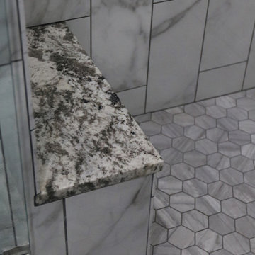
Marble Mosaic Tile shower remodel is designed with elegance in mind. From the marble diamond shaped marble mosaic tiles intricately placed in shower niche as well as elaborately displayed behind the shower fixtures. In addition, to the 8×24 marble-look porcelain tiles running up the shower walls surround the porcelain hexagon shower floor tiles. Finalized with Granite pony wall top, granite niche, and threshold surrounding the glass door. This master bath remodel is luxurious and will be enjoyed for years to come. Marble Mosaic tile accents in addition to Marble-look tiles complete in Client Project Shower Remodel Project ~ Thank you for sharing! Planning and designing shower remodels with mosaic tiles adds striking features to any shower or tub remodel. Choosing to add a stylish mosaic tile to a shower niche or the addition of surrounding the shower fixtures as shown are two elements that are not only striking, but elegant in design. In addition, choose to run a mosaic accent tile down the full length of the shower wall for a waterfall effect drawing the eye. Choose to run a traditional horizontal line across the walls is a beautiful addition. Furthermore, choosing from a traditional threshold shower design shown to a curbless or zero-entry shower for aging in place and simpler cleaning. Purchasing Schluter Shower-systems makes designing a shower simple, easy, and waterproof. In addition, to shelves, grates and tile edge profiles available. Remember to add granite or quartz for shelves, niches, benches, and threshold or pony wall tops. With so many options stop in to ask an expert bathroom designer regarding your next bathroom remodel or renovation design options. Large selection of samples available in marble mosaics and accent tiles. In addition, to marble-look tiles located at our showroom. Stop in and check out samples today. Find your locally owned Home Improvement Store, French Creek Designs, on MeWe or Facebook, and follow us! Read more about our process and read regular updates on client projects and updated materials selections and choices at FCD News a reliable source of information and current trends.
 ALL Renovation & Design LLC
Cramped space, narrow doorways, and dated cabinets – that is what the Trupe's had.
The time was right to set a transformation in motion.
The first step was to call Amos from ALL Renovation & Design.
They had been friends for the past 20 years, thanks to a deck he had built for them.
And Amos immediately caught their vision for the kitchen.
More space.
An island for entertainment.
And a striking look.
The Trupe's dream kitchen wasn't going to be without challenges.
The door leading to the outside had to go.
But how to match the 20-year-old siding?
The narrow doorway between the kitchen and the dining room had to go too.
But what to do with the wires in the wall?
And though getting rid of the outside door and the doorway gave more room, how would an island, big enough to be useful, fit?
Space. That was the challenge.
Countless design concepts.
Countless ideas to work through.
From the beginning, Amos committed to the extra mile.
Once the island size and cabinet placement were decided, Amos’s team began work in earnest.
The custom-built oak cabinets with an espresso stain finish were the starting place for the project.
All other colors and materials were chosen to compliment the cabinetry.
Like the Daltile glazed porcelain tile floor in the Saddle Brook style and the Farmhouse color.
The backsplash proved to be a challenge. Have you ever settled on the absolutely perfect option only to find that it is forever discontinued by the manufacturer? That's what happened. Thankfully the Trupe's second choice of Anatolia Bliss Fusion Ice mosaic blended beautifully with the granite countertop.
Amazingly, the team was able to match the 20-year-old siding perfectly.
The corner cabinet took creativity as well. Cutting the corner (literally) did the trick. By adding a corner cabinet and cutting the corner of the island countertop, the Trupe's are delighted to have a usable walkway around the island.
“It sounds trivial,” Mr. Trupe remembers, but, instead of going with a plain side to the wood-work around the fridge, the ALL R&D team suggested matching the detail of the cabinet paneling: “I love it.”
Trivial? Not at all. That is part of making your dreams even better in reality.


 Spring Lake Garden Design
This is an example of an asian landscaping in New York.
This is an example of an asian landscaping in New York.

 INSPIRED KITCHEN DESIGN
While Teresa did countless hours of research on design Web sites such as Pinterest, she also wanted to get the kitchen done quickly.
That meant taking some risks, she says.
“I wanted to renovate the kitchen immediately after moving into the new house. This required me to take measurements, pictures and video all in one visit. So, my measurements were a little off,” she explains. Luckily IKD’s design team provided her with a detailed inventory list [as part of its design process and helped out with specific custom looks, she notes.
“With IKD’s design guidance I actually over ordered versus under ordered and simply had to return a few cabinets and pieces [rather than make a return trip to IKEA],” she concludes.
With her project now complete, Teresa says she is ready to move onto greener pastures.
But first, there are some specific tips she wanted to share for any future IKEA kitchen remodeler.
“I would say to do your research, and remember that no detail is too small. Also, be sure to visit an IKEA no matter where you live at least once to be able to see the kitchens in person. And, definitely use IKD but be sure to have a clear kitchen idea to convey!” she says.
With that said, Teresa was able to complete her IKEA kitchen in a timely manner and in a budget friendly way as well.
“I would say our budget was mid-level [for this project]. Since we did most of the work ourselves we saved a ton of money. We really have a glowing pride in accomplishing this project and it turned out to be not as difficult as we thought!” she concludes.
 Zume Builders
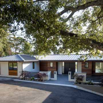
This project was a MAJOR addition and remodel project. It is practically, a new house! Beautiful IPA wood finishing surrounds the exterior of the house while a decorative and durable metal roof sits on top. It has an "oasis" - a pool, grass area, concrete play area. And, let's not forget a full two bedroom and one full bath ADU at the bottom of the house!

 Kelly Rogers Interiors
Eric Roth Photography
Inspiration for a transitional dark wood floor bathroom remodel in Boston with orange walls and a wall-mount sink
Inspiration for a transitional dark wood floor bathroom remodel in Boston with orange walls and a wall-mount sink
 INSPIRED KITCHEN DESIGN
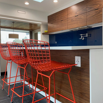
Regarding the island, Jeffery notes it was initially a source of concern.
“My wife wanted the island and I was worried it would feel cramped. But, IKD got it to feel perfect,” he says.
Not only that, but the live edge walnut pass-through is Jeffrey’s favorite part of the design. “I bought it from a local sawmill and my daughter and I sanded it and oiled it together. The warmth of the wood and soft feel creates a nice contrast to our modern white IKEA kitchen. I also used a piece of ¼” walnut veneer plywood to back my island. It all matched beautifully. The island face cost me under $100,” he concludes.
According to Jeffery, there are necessary things to remember with your IKEA kitchen remodel.
He explains: “Check your order carefully. I had to source from three different IKEAs due to COVID closures — and I was always delivered wrong items. On one visit they tried to send me away without an entire cart load of merchandise. Thankfully I was meticulous about using the IKD plan and my online order to check each item and caught all the mistakes.”
He also says to save your receipts. “IKEA marked down several section cabinet components and when I went in for a price adjustment they refunded me over $200,” he offers.
From a design perspective, he also notes that “it pays to learn to scribe fillers and cabinet panels. Scribing gives a nice clean fit to your walls and ceilings, and it’s a simple concept you can learn from YouTube.”
As you can see, it’s very possible to transform your current kitchen into a stunning IKEA kitchen. And if you’re leaning toward a DIY remodel all you need is a clear vision and top partner with the right design (and installation) professionals. Then, like Jeffery, you too can have a bold new IKEA kitchen created in a budget-friendly way.
 ALL Renovation & Design LLC
Cramped space, narrow doorways, and dated cabinets – that is what the Trupe's had.
The time was right to set a transformation in motion.
The first step was to call Amos from ALL Renovation & Design.
They had been friends for the past 20 years, thanks to a deck he had built for them.
And Amos immediately caught their vision for the kitchen.
More space.
An island for entertainment.
And a striking look.
The Trupe's dream kitchen wasn't going to be without challenges.
The door leading to the outside had to go.
But how to match the 20-year-old siding?
The narrow doorway between the kitchen and the dining room had to go too.
But what to do with the wires in the wall?
And though getting rid of the outside door and the doorway gave more room, how would an island, big enough to be useful, fit?
Space. That was the challenge.
Countless design concepts.
Countless ideas to work through.
From the beginning, Amos committed to the extra mile.
Once the island size and cabinet placement were decided, Amos’s team began work in earnest.
The custom-built oak cabinets with an espresso stain finish were the starting place for the project.
All other colors and materials were chosen to compliment the cabinetry.
Like the Daltile glazed porcelain tile floor in the Saddle Brook style and the Farmhouse color.
The backsplash proved to be a challenge. Have you ever settled on the absolutely perfect option only to find that it is forever discontinued by the manufacturer? That's what happened. Thankfully the Trupe's second choice of Anatolia Bliss Fusion Ice mosaic blended beautifully with the granite countertop.
Amazingly, the team was able to match the 20-year-old siding perfectly.
The corner cabinet took creativity as well. Cutting the corner (literally) did the trick. By adding a corner cabinet and cutting the corner of the island countertop, the Trupe's are delighted to have a usable walkway around the island.
“It sounds trivial,” Mr. Trupe remembers, but, instead of going with a plain side to the wood-work around the fridge, the ALL R&D team suggested matching the detail of the cabinet paneling: “I love it.”
Trivial? Not at all. That is part of making your dreams even better in reality.
219