
Search results for "Removing unused" in Home Design Ideas
 Amy Pearson Design
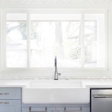
A cramped and dated kitchen becomes a light, bright, and spacious great room through the removal of a wall dividing the kitchen from the living and dining rooms. The new cabinet plan is expanded into an unused breakfast nook enlarging the functional space. Efficient storage is designed with the addition of a tall pantry cabinet fitted with roll-out shelves, ample use of convenient drawer storage, trash and recycling pull-out, and an appliance garage designed to hide away an assortment of countertop appliances. Pro-style appliances by Jennair make this kitchen a chef’s dream and thoughtful design details complete the overall look.
 Saikley Architects
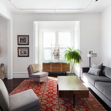
This beautiful 1881 Alameda Victorian cottage, wonderfully embodying the Transitional Gothic-Eastlake era, had most of its original features intact. Our clients, one of whom is a painter, wanted to preserve the beauty of the historic home while modernizing its flow and function.
From several small rooms, we created a bright, open artist’s studio. We dug out the basement for a large workshop, extending a new run of stair in keeping with the existing original staircase. While keeping the bones of the house intact, we combined small spaces into large rooms, closed off doorways that were in awkward places, removed unused chimneys, changed the circulation through the house for ease and good sightlines, and made new high doorways that work gracefully with the eleven foot high ceilings. We removed inconsistent picture railings to give wall space for the clients’ art collection and to enhance the height of the rooms. From a poorly laid out kitchen and adjunct utility rooms, we made a large kitchen and family room with nine-foot-high glass doors to a new large deck. A tall wood screen at one end of the deck, fire pit, and seating give the sense of an outdoor room, overlooking the owners’ intensively planted garden. A previous mismatched addition at the side of the house was removed and a cozy outdoor living space made where morning light is received. The original house was segmented into small spaces; the new open design lends itself to the clients’ lifestyle of entertaining groups of people, working from home, and enjoying indoor-outdoor living.
Photography by Kurt Manley.
https://saikleyarchitects.com/portfolio/artists-victorian/
 Design Connection, Inc.
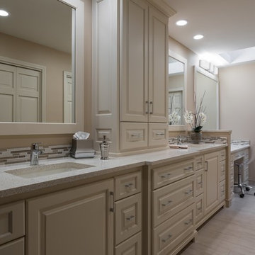
Custom designed for the way they live and move throughout their space, each cabinet was well thought out and planned with the clients’ exact needs and ease-of-use in mind. By enlarging the shower, removing the unused bathtub, and installing a large makeup area, the clients are able to make better use of their space.
Arlene assisted the clients with their material selections, including countertops, tiles, lighting, plumbing fixtures, colors, and cabinet design. Arlene also met with the cabinet company and the contractors, ensuring precise designs and quality craftsmanship.
Design Connection, Inc. provided; AutoCAD drawings, tile, plumbing, countertops, light fixtures, and project management.
Kansas City Interior Designers, Overland Park Interior Designers, Leawood Kansas Interior Designers
Find the right local pro for your project
 Riverside Construction, LLC
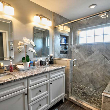
Riverside Construction’s creative solution started with removing the shower and converting it into a new hallway, and subsequently creating convenient door access to the existing home office. In place of the unused tub, a new custom tiled shower designed and built with 18×18 Severino Cenere Daltile. The new Emser Cultura™ Autumn Pebble mosaic tile floor pairs beautifully with the main bathroom floor—Daltiles Willow Bend Smoky Brown. Other shower features include a practical oversize bench, integrated shower shelving, and Delta stainless steel fixtures.
Riverside updated the existing vanity with a Lennon granite countertop. Smaller undermount sinks were used to increase the counter space, exactly what the homeowners asked for. In addition, the existing sconces were repositioned appropriately away from the mirrors.
Last but not least, Riverside properly insulated the freeze-prone pipes on the outside wall to prevent them from freezing again.
 Edgewater Design Group
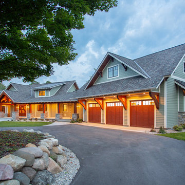
Our clients already had a cottage on Torch Lake that they loved to visit. It was a 1960s ranch that worked just fine for their needs. However, the lower level walkout became entirely unusable due to water issues. After purchasing the lot next door, they hired us to design a new cottage. Our first task was to situate the home in the center of the two parcels to maximize the view of the lake while also accommodating a yard area. Our second task was to take particular care to divert any future water issues. We took necessary precautions with design specifications to water proof properly, establish foundation and landscape drain tiles / stones, set the proper elevation of the home per ground water height and direct the water flow around the home from natural grade / drive. Our final task was to make appealing, comfortable, living spaces with future planning at the forefront. An example of this planning is placing a master suite on both the main level and the upper level. The ultimate goal of this home is for it to one day be at least a 3/4 of the year home and designed to be a multi-generational heirloom.
- Jacqueline Southby Photography
 Advance Design Studio, Ltd.
Jackie and Sean loved the Algonquin neighborhood they lived in with the peaceful neighborhood and the close proximity to work and school. What they didn’t love was how outdated their home had become. With a cramped kitchen and an unused dining room, they decided a remodel was the perfect solution to their problem. They would be able to continue to live in the area they loved, while at the same time they could have the dream home they envisioned.
After a thorough search, Jackie came across Advance Design Studio. She was impressed by all of the positive reviews she saw on the internet and saw herself identifying with all of the project stories she saw on the website. Once they met with designer Scott Christensen and owner Todd Jurs, they knew Advance Design was the right company to make their dreams a reality.
The project consisted of four main areas: the kitchen/dining/powder room, the laundry room, the master bathroom, and the kid’s bathroom. They wanted to expand the kitchen into the seldom used dining room and add a large island for hosting parties and family gatherings. They also wanted new hardwood flooring throughout the first level. The laundry room needed to be more functional, and all three bathrooms were in dire need of updating.
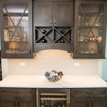
The closed off kitchen was opened up to create a sweeping space between the new eating area and the much larger kitchen. A handsome dry bar complete with a beverage refrigerator and lighted glass door cabinetry makes an elegant transition across from a peninsula area filled with storage. An additional decorative cabinet lighting up elegant dishware through the mullioned glass sits directly across from the drybar.
An expansive island was critical to the kitchen plans. Jackie, Sean and Scott worked closely together to create just the right details for their design. They wanted the island to be functional in addition to being the centerpiece of the room. Added storage for the kid’s school supplies was hidden behind cabinet doors so the children could do their schoolwork right at the island, and a microwave drawer glides open with the touch of a finger hidden inconspicuously within the island space. The easy to care for Cambria Britannica Quartz island top with its sweeping grey and white marble look perched atop hand-carved Craftsman corbels was absolutely what they were hoping for, blending both beauty and function perfectly.
Adding a nice contrast to the brightness of the quartz and the white cabinetry, Kodiak - Leather granite countertops were used to balance the light and dark tones of the space. Dura Supreme Classic White painted cabinets grace the perimeter, while Maple Poppy Seed stained cabinets with a beautiful soft grey woodgrain were used in the beverage center and island. The two tones compliment the large space balancing it out nicely creating interest and elegance with the simple Craftsman style full overlay doors.
A deep warm Barnwood White Oak flooring was added throughout the lower level. The new floor brings additional contrast to the bright kitchen and provides unity with the now open floorplan as it rolls in to the foyer and family room. Final details like the show-stopping lunar like duo light fixtures complete the space and intermix expertly with crisscross details of the glass door mullions, the island bar seating and even accessories in the space.
The small cluttered laundry room needed more space and more storage. With a busy family it seemed to overflow daily and did not have anywhere to hide the families “in and out stuff.” Scott designed the new space with a stackable washer and dryer and much more efficiently organized cabinetry. Doing laundry is now (almost!) a pleasure and keeping everyone’s “stuff” hidden, but readily accessible is now a snap.
The master bath was not a place where the couple enjoyed spending time getting ready for their day. The tub almost never was used, so removing it made it possible to build an extra-large shower, replacing the small cramped cube of the previous shower they hated. Clean, horizontal lines softly draw your eye around the space with porcelain tile called Driftwood Sea spray. Full overlay cabinetry in a soft white vanity with double sinks makes getting ready for the day much more convenient for the busy couple.
Long floor planks made of porcelain tile mimic real hardwood floors in a soft grey to compliment the shower, but with the ease and care of a tile surface. Cambrian Black Granite counters with a matte finish and under mount porcelain sinks with handsome brushed chrome hardware complete the handsome space. A real bonus in any master bath; a custom built in storage nook was tucked in the corner of the space for linens and heavenly storage.
The kid’s bath was in sad shape because it was original to the house. To keep the budget in control, the tub which was in great condition was retained, but focus was on the new large brick style porcelain charcoal tile on the floor, crisp white new Craftsman style cabinetry with pretty furniture details on the corner base, a striking granite top with white under mount porcelain sinks and fresh hardware and faucets. Some beautiful soft grey wood mirrors to match mom and dads were custom sized and placed under new lighting, and 4 hooks were smartly arranged down the wall for kids’ towels.
This couple was determined not to move, and made their house their dream home. Not only does their home function greatly now, but Jackie says, “When the neighbors come to visit, they’re asking if they can “steal” the design”! The added functionality, elegance, and open floor plan were exactly what this family needed in order to stay.
Advance Design Studio, Joe Nowak
 Saltwater Kitchen & Bath Studio
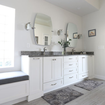
A builder grade bathroom gets a major upgrade. The client was amazing as she did this remodel while having a torn Achilles tendon while she was in a boot before and after surgery all while her husband was out of town for work. This prompted the request for a large, curbless shower with a barn door. We removed the dated unused corner tub to expand the shower and added a bench under the window for additional storage. The vanity got a functional make-over with better storage for toiletries. His and hers pull-outs and drawers provided ample space. The traditional fixtures blend with the more contemporary tile and color pallet giving the bathroom an elegant soothing feel.


 The Expert Touch Interiors
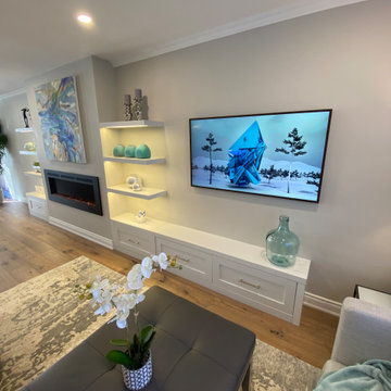
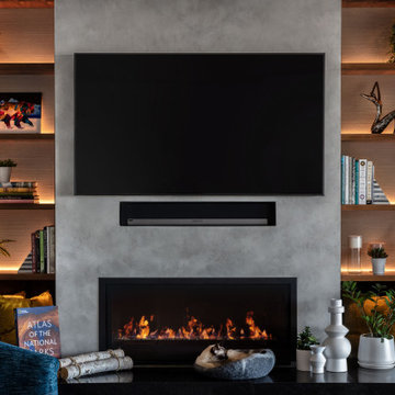
My clients asked me to transform their current living and dining room into a music room as their children enjoy playing their Baby Grand piano on a regular basis. The wall and french door was removed that was between the living room and dining room and we installed a linear electric fireplace with storage pullouts for some of their music books along the bottom on either side as well as floating shelves above the pullouts. Their wall to wall carpet was removed and new hardwood was laid down. Ceilings were scraped and pot lights were also placed throughout the space and lighting was installed underneath the floating shelves. My client loves artwork by Toronto based artist Sharon Barr so she commissioned a piece from her and that sits above the fireplace. We also installed the "Frame" TV by Samsung on the other side of the fireplace which looks like another piece of artwork nicely framed. My client already had 2 beautiful occasional chairs that we designed at Gresham House 6 years earlier so we re-purposed them in this room to sit in front of the fireplace. In the cozy sitting area, we grounded it with a beautiful silk and wool area rug, added a comfortable leather ottoman, a small round swivel chair, a beautiful contemporary sectional and a set of nesting end tables. All of this furniture was designed by The Expert Touch Interiors at The Decorating Centre. Final touches with accessories and the floor lamp and pouff were found at Urban Barn. My client's once dated and unused space is now a well-used dual purpose room that the whole family can enjoy!
 Spaces Designed, Interior Design Studio, LLC
“We could never have envisioned what could be” – Steiner Ranch Homeowner and Client
It is an especially fulfilling Project for an Interior Designer when the outcome exceeds Client expectations, and imagination. This remodeling project required instilling modern sensibilities, openness, styles and textures into a dated house that was past its prime. Strategically, the goal was to tear down where it made sense without doing a complete teardown.
Starting with the soul of the home, the kitchen, we expanded out room by room to create a cohesiveness and flow that invites, supports and provides the warmth and relaxation that only a home can.
In the Kitchen, we started by removing the wooden beams and adding bright recessed lighting. We removed the old limestone accent wall and moved the sink and cooktop from the island on to the countertop – the key goal was to create room for the family to gather around the kitchen. We replaced all appliances with modern Energy Star ones, along with adding a wine rack.
The first order of business for the Living Room was to brighten it up by adding more lighting and replacing an unused section with a glass door to the backyard. Multi-section windows were replaced with large no-split glass overlooking the backyard. Once more, the limestone accent was removed to create a clean, modern look. Replacing the dated wooden staircase with the clean lines of a metal, wire and wooded staircase added interest and freshness. An odd bend in the staircase was removed to clean things up.
The Master Bedroom went from what looked like a motel room with green carpet and cheap blinds to an oasis of luxury and charm. A section of the wraparound doors were closed off to increase privacy, accentuate the best view from the bedroom and to add usable space. Artwork, rug, contemporary bed and other accent pieces brought together the seamless look across the home.
The Master Bathroom remodel started by replacing the standard windows with a single glass pane that enhanced the view of the outdoors. The dated shower was replaced by a walk-in shower and soaking tub to create the ultimate at-home spa experience. Lighted LED mirrors frame His & Hers sinks and bathe them in a soft light.
The flooring was upgraded throughout the house to reflect the contemporary color scheme.
Each of the smaller bedrooms were similarly upgraded to match the clean and modern décor of the rest of the house.
After such a transformation inside, it was only appropriate that the exterior needed an upgrade as well. All of the legacy limestone accents were replaced by stucco and the color scheme extended from the interior of the house to the gorgeous wrap around balconies, trim, garage doors etc. to complete the inside outside transformation.
 TKS Design Group
Free ebook, CREATING THE IDEAL KITCHEN
Download now → http://bit.ly/idealkitchen
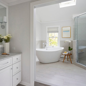
After having remodeled their kitchen, and two other baths in the home, the master bathroom was the last on the list of rooms to update for this couple. The existing bath had a small sink area with his and hers sinks and then a pocket door into the main bath which housed the tub, shower and commode. The main problem was the outdated look of the space, which was rather dark and dreary, and the giant unused whirlpool tub which took up more than its fair share of the footprint.
To brighten the space, we used a pallet of soft gray porcelain tile on the floor and ceramic subway tiles on the walls. Carrera marble and nickel plumbing brighten the room and help amplify the sunlight streaming in through the existing skylight and vaulted ceiling.
We first placed the new freestanding tub on an angle near the window so that users can take advantage of the view and light while soaking in the tub. A new, much larger shower takes up the other corner and delivers some symmetry to the room and is now a luxurious, useable and comfortable size. The commode was relocated to the right of the new shower, so it is visually tucked away. The existing opening between the sink area and the main area was widened and the door removed so that the homeowners can enjoy the light from the larger room while using the sinks each morning.
A step up into the tub/shower area provides additional interest and was a happy accident and solution required to accommodate running the plumbing through the existing floor joists. Because the existing room felt quite contemporary with the vaulted ceiling, we added a run of crown molding around the top and a chair rail to the top of the tile to provide some traditional touches to the room. We think this space is lovely, relaxing and serene and are so honored to have been chosen by these wonderful homeowners to help provide them with a relaxing master bath sanctuary!
Designer: Susan Klimala
Assistant Designer: Keri Rogers
 Tate Enterprises
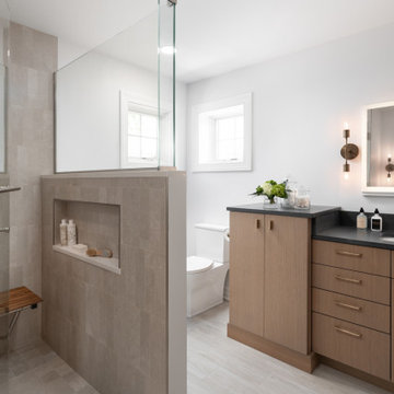
This master bath transformation was just what our client needed. The unused corner jetted deck tub and small vanity area needed a transformation. Our clients wish list included a large shower with a seat and more storage. We removed the tub completely and added a large shower with handheld spray and a seat that folds up when not in use. To maximize storage with separated the vanities to his and hers with a taller cabinet, for towel storage, to offer privacy for the toilet area. The clients want a space that had a contemporary feel which includes flat panel doors in Quarter sawn white oak, with a contrasting quartz countertop in a soapstone look. The medicine cabinets were the special touch with the lift system and interior lighting.
 Kitchen Solvers of Charleston
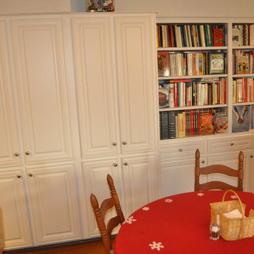
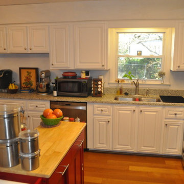
This 60’s home had a peninsula with base cabinets as well as upper cabinets with a double wall oven at the end, smack dab in the middle of the room. Basically closing the kitchen off to the rest of the space.
We removed all of the peninsula cabinets, old wall oven, and the existing cooktop, and re-installed much of the cabinetry on the outer wall. We built a new false soffit to match the existing one, replaced the bead board walls with drywall, and installed and refaced the removed peninsula cabinets along the extension of the kitchen wall, accompanied by some new cabinetry to enhance functionality. Many new custom made drawer boxes with soft close glides were installed to complete that side of the room.
On the opposite side of the kitchen, an unused kitchen desk area was torn out and a duplicate pantry was custom built, and refaced to match. The bookcase was refaced and outfitted with new doors and new drawer boxes as well. The owner chose to go with Northern Contours Manchester II doors done in Glacier White thermofoil.
New Quartz countertops, New hardwood floors, and some new furniture was the finishing touches that brought the transformation together.
Still a warm, and inviting, traditional cooks kitchen, but now, brought into modern times with finishes, space and functionality that brings the whole family together.
 Kitchen Solvers of Charleston
This 60’s home had a peninsula with base cabinets as well as upper cabinets with a double wall oven at the end, smack dab in the middle of the room. Basically closing the kitchen off to the rest of the space.
We removed all of the peninsula cabinets, old wall oven, and the existing cooktop, and re-installed much of the cabinetry on the outer wall. We built a new false soffit to match the existing one, replaced the bead board walls with drywall, and installed and refaced the removed peninsula cabinets along the extension of the kitchen wall, accompanied by some new cabinetry to enhance functionality. Many new custom made drawer boxes with soft close glides were installed to complete that side of the room.
On the opposite side of the kitchen, an unused kitchen desk area was torn out and a duplicate pantry was custom built, and refaced to match. The bookcase was refaced and outfitted with new doors and new drawer boxes as well. The owner chose to go with Northern Contours Manchester II doors done in Glacier White thermofoil.
New Quartz countertops, New hardwood floors, and some new furniture was the finishing touches that brought the transformation together.
Still a warm, and inviting, traditional cooks kitchen, but now, brought into modern times with finishes, space and functionality that brings the whole family together.

 Saikley Architects
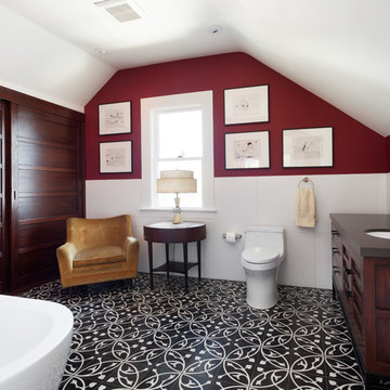
This beautiful 1881 Alameda Victorian cottage, wonderfully embodying the Transitional Gothic-Eastlake era, had most of its original features intact. Our clients, one of whom is a painter, wanted to preserve the beauty of the historic home while modernizing its flow and function.
From several small rooms, we created a bright, open artist’s studio. We dug out the basement for a large workshop, extending a new run of stair in keeping with the existing original staircase. While keeping the bones of the house intact, we combined small spaces into large rooms, closed off doorways that were in awkward places, removed unused chimneys, changed the circulation through the house for ease and good sightlines, and made new high doorways that work gracefully with the eleven foot high ceilings. We removed inconsistent picture railings to give wall space for the clients’ art collection and to enhance the height of the rooms. From a poorly laid out kitchen and adjunct utility rooms, we made a large kitchen and family room with nine-foot-high glass doors to a new large deck. A tall wood screen at one end of the deck, fire pit, and seating give the sense of an outdoor room, overlooking the owners’ intensively planted garden. A previous mismatched addition at the side of the house was removed and a cozy outdoor living space made where morning light is received. The original house was segmented into small spaces; the new open design lends itself to the clients’ lifestyle of entertaining groups of people, working from home, and enjoying indoor-outdoor living.
Photography by Kurt Manley.
https://saikleyarchitects.com/portfolio/artists-victorian/
 Gayler Design Build
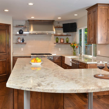
Like many homes today with unused dining room/living spaces, this homeowner had a plan to repurpose her unused dining space by creating an open concept large cooks’ kitchen/dining area.
The new design included removing a wall between the existing kitchen and dining room to enlarge the kitchen space. A new wall was built with a corner walk-in pantry for additional storage. A large island was designed into the kitchen with room for additional seating, more cabinetry space and a wine refrigerator. To improve the flow in the room, we also created a new entry into the kitchen.
To create ample seating, space was designated for a dining room table and an island bar. The dropped ceiling in the kitchen was raised and a new window was added to open up the space and let in more natural light. To accommodate the homeowner’s hutch, additional room was added along the outer wall of the kitchen. For beauty and aesthetics, a new powder-coated steel stair railing was installed to guide people from the entry to the upper floor. The stair case risers were completed with a contrasting white and dark wood finish and matching posts were added to the island bar area.
Knotty Alder cabinets and a New World stain complete this Rustic Napa-inspired look. The light color counter tops are Kashmire Cream granite. The contrast between the dark cabinets with beautiful visible grain detail and light countertops gives this kitchen a timeless, rustic feel. The Blanco apron front sink, in white SiliGranite material is surrounded by antique nickel finish faucets and Antique Pewter hardware. The steel posts are powder coated to match the Antique Nickel faucets. Behind the cooktop in 4” x 16” Pumice color Portcelain tile, is a full height-tiled backsplash—a perfect backdrop for floating shelves that match the cabinets. Beautiful!
 Design Connection, Inc.
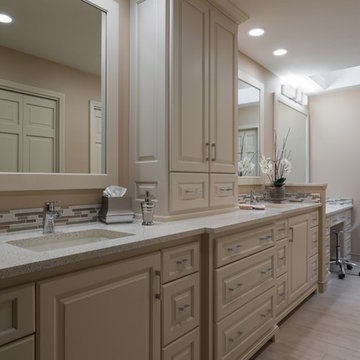
Custom designed for the way they live and move throughout their space, each cabinet was well thought out and planned with the clients’ exact needs and ease-of-use in mind. By enlarging the shower, removing the unused bathtub, and installing a large makeup area, the clients are able to make better use of their space.
Arlene assisted the clients with their material selections, including countertops, tiles, lighting, plumbing fixtures, colors, and cabinet design. Arlene also met with the cabinet company and the contractors, ensuring precise designs and quality craftsmanship.
Design Connection, Inc. provided; AutoCAD drawings, tile, plumbing, countertops, light fixtures, and project management.
Kansas City Interior Designers, Overland Park Interior Designers, Leawood Kansas Interior Designers
 Kitchen Solvers of Charleston
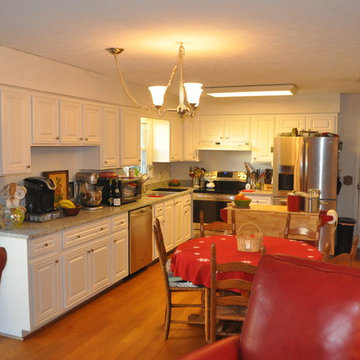
This 60’s home had a peninsula with base cabinets as well as upper cabinets with a double wall oven at the end, smack dab in the middle of the room. Basically closing the kitchen off to the rest of the space.
We removed all of the peninsula cabinets, old wall oven, and the existing cooktop, and re-installed much of the cabinetry on the outer wall. We built a new false soffit to match the existing one, replaced the bead board walls with drywall, and installed and refaced the removed peninsula cabinets along the extension of the kitchen wall, accompanied by some new cabinetry to enhance functionality. Many new custom made drawer boxes with soft close glides were installed to complete that side of the room.
On the opposite side of the kitchen, an unused kitchen desk area was torn out and a duplicate pantry was custom built, and refaced to match. The bookcase was refaced and outfitted with new doors and new drawer boxes as well. The owner chose to go with Northern Contours Manchester II doors done in Glacier White thermofoil.
New Quartz countertops, New hardwood floors, and some new furniture was the finishing touches that brought the transformation together.
Still a warm, and inviting, traditional cooks kitchen, but now, brought into modern times with finishes, space and functionality that brings the whole family together.
 Riverside Construction, LLC
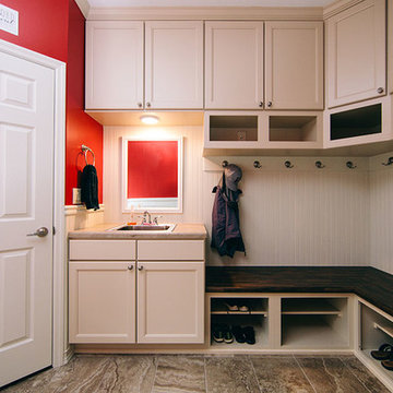
Not surprising, mudrooms are gaining in popularity, both for their practical and functional use. This busy Lafayette family was ready to build a mudroom of their own.
Riverside Construction helped them plan a mudroom layout that would work hard for the home. The design plan included combining three smaller rooms into one large, well-organized space. Several walls were knocked down and an old cabinet was removed, as well as an unused toilet.
As part of the remodel, a new upper bank of cabinets was installed along the wall, which included open shelving perfect for storing backpacks to tennis rackets. In addition, a custom wainscoting back wall was designed to hold several coat hooks. For shoe changing, Riverside Construction added a sturdy built-in bench seat and a lower bank of open shelves to store shoes. The existing bathroom sink was relocated to make room for a large closet.
To finish this mudroom/laundry room addition, the homeowners selected a fun pop of color for the walls and chose easy-to-clean, durable 13 x 13 tile flooring for high-trafficked areas.
 MRF Construction, Inc.
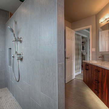
A new bathroom was designed using the same space, and allowing for a large curbless shower, two generous sink vanities and a large storage cabinet. An unused soaking tub was removed to make space for the new layout.
The new shower is spacious and refreshing, with a large window with etched glass, a curb-less and door-less entry and a barely noticeable infinity drain all adding to the openness. Large satin-etched glass panels were installed with shower door hardware over the large window to welcome light while protecting the window from splash and providing privacy.
 Saikley Architects
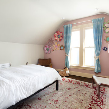
This beautiful 1881 Alameda Victorian cottage, wonderfully embodying the Transitional Gothic-Eastlake era, had most of its original features intact. Our clients, one of whom is a painter, wanted to preserve the beauty of the historic home while modernizing its flow and function.
From several small rooms, we created a bright, open artist’s studio. We dug out the basement for a large workshop, extending a new run of stair in keeping with the existing original staircase. While keeping the bones of the house intact, we combined small spaces into large rooms, closed off doorways that were in awkward places, removed unused chimneys, changed the circulation through the house for ease and good sightlines, and made new high doorways that work gracefully with the eleven foot high ceilings. We removed inconsistent picture railings to give wall space for the clients’ art collection and to enhance the height of the rooms. From a poorly laid out kitchen and adjunct utility rooms, we made a large kitchen and family room with nine-foot-high glass doors to a new large deck. A tall wood screen at one end of the deck, fire pit, and seating give the sense of an outdoor room, overlooking the owners’ intensively planted garden. A previous mismatched addition at the side of the house was removed and a cozy outdoor living space made where morning light is received. The original house was segmented into small spaces; the new open design lends itself to the clients’ lifestyle of entertaining groups of people, working from home, and enjoying indoor-outdoor living.
Photography by Kurt Manley.
https://saikleyarchitects.com/portfolio/artists-victorian/
41