
Search results for "Restriction" in Home Design Ideas
 Michael Nash Design, Build & Homes
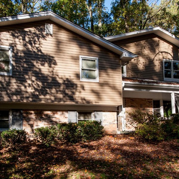
 This 1975 split-level home in a wooded area of Reston, Virginia, is home to a growing family of six. Needless to say, space was at a premium and they needed more of it. So they turned to Michael Nash Design, Build & Homes to create a second-story expansion.
With limited ability to expand the footprint of the home due to lot restrictions, the design team created a 25’ x 35’ master suite addition to be placed over the existing first floor. The space would be located above the living room, dining room and kitchen, creating a private and secluded oasis for mom and dad. The children would have the home’s three middle level bedrooms and a bath of their own.
A New Master Suite
A new custom wooden staircase leads the homeowner to the doorstep of what she now calls her “heavenly space.” It’s a large master bedroom complete with a seating area, vaulted ceiling and skylights, and a beautiful Bordeaux-finish maple wood floor. Bright color paint was selected for the walls to complement the wood flooring and bedroom furniture.
The new 11’x12’ master bathroom offers a spa-like experience. The new bath touts a large shower stall with a built-in bench and storage niches covered with flagstone tiles; a soaking whirlpool tub; and a long double vanity with granite top and fancy fixtures.
Exterior Ties It Together
Like any large addition, this one required exterior renovation to make the addition look like the rest of the home. New vinyl siding and architectural shingles replaced the old cedar siding and run down shingles on the original structure.
A new front porch with half-stone columns and pillars maintains the home’s cottage look. A new double car garage replaces the original carport. Both are a big part of the home’s new front elevation which greatly improves its curbside appeal.
The end result of this project offers everyone in the family a place of their own. The children have new bedrooms and the parents have their sanctuary in their new master suite.
 Joni Spear Interior Design
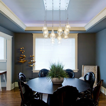
This modern dining space is well juxtaposed in a 1927 structure that was originally a duplex. After converting the space to a single family home and restricted by historic codes and appliances, we were left with a small open concept dining area. The 60" round table seats 8 comfortably. The black acrylic chairs glisten from the globe light pendant fixture. The ceiling is painted in Sherwin Williams #7073 Network Gray. The walls are SW# 7075 Web Gray.
 Sosna Inc
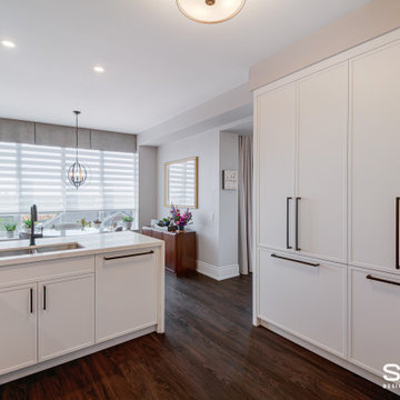
These are returning clients of Sosna, who purchased a condo built in 2009 to be their forever home to enjoy now that they are retired . Although the area and views are beautiful, the condo felt small, dark, and dated. The layout was also not functional, and had a lot of wasted space. They wanted the space to fit their lifestyle and feel like it was their own.
Having worked with Sosna previously, they knew they could put their full trust in Sosna. During the renovation, they were able to visit their cottage and relax, knowing their home was in good hands. Their only worry was that the condominium rules would restrict or delay the job. These worries were laid to rest, as Sosna developed a respectful and trusting relationship with the building management during construction.
In the Kitchen and eating area, we kept the existing footprint, but installed plenty of new cabinetry to provide much more functional storage, ensuring every square inch of the space was used to its full potential as a useful space. A white marble countertop and lower cabinetry made the space feel bright and open.
In the Master Bathroom, we re-worked the layout to allow for a larger, more functional and luxurious shower with a built in seat and nooks. During the design phase, we noticed that our clients had been hang drying clothing using a small rack in the bathtub. New hanging rods were installed above a new bathtub to provide a more functional solution for hang drying clothing that did not require having to move drying racks in and out of the space when needed. Beautiful patterned floor tiles were accented as well in the shower nooks to tie the bright new space together.
The Guest Bathroom was dark and dated. We were able to give it a welcoming facelift, giving it a more open and airy feel and a pop of colour in the shower.
Finally, we replaced the previously mismatched laminate flooring throughout the home with a darker vinyl flooring, all flowing in the same direction to provide a seamless and cohesive flow throughout the home, not to mention easy maintenance!
In the end, our clients were delighted with the care and quality of work put into their home, as well as the ease of the process from design to completion.
If you’re ready to make your forever home feel like it’s been made just for you, contact us to get started! We’re the Renovator You Can Count On!
Sosna Inc
7250 Keele Street, Unit 372
Vaughan, ON L4K 1Z8
416-888-7366 (RENO)
Website: sosna.ca
Email: contact@sosna.ca
Find the right local pro for your project
 7 Day Kitchens
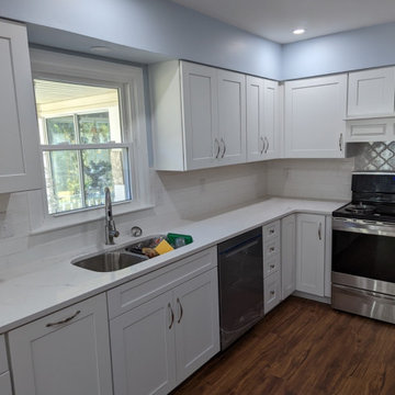
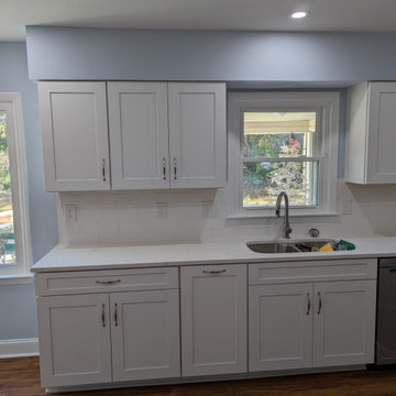
This charming south Charlotte home was in need of a little TLC. The original builder-grade cabinets and countertops were outdated and ready for a change to more modern materials.
The kitchen had a classic U-shaped layout that didn’t fit well with the space. The peninsula obstructed the work area and really restricted the movement around the kitchen. The work triangle was just right, but the honey toned wood cabinets and laminate countertops were definitely past their prime. So, we made some simple effective updates.
The biggest change was getting rid of the peninsula totally and adding a brand new spacious built-in buffet area. This gave her so much more storage space, and the roll-out trays made everyday items easily accessible. We added a built-in trash can pullout so she could hide her trash can. We also made the cabinets a little taller, going from 30 inches to 36 inches for even more storage space. The added benefit of taller cabinets gave the kitchen a fresh and modern look.
We also gave the laundry room a makeover and made it more functional with new cabinets over the washer and dryer for even more storage. We also replaced the flooring on the first floor with durable LVP flooring elevating the overall look and feel of the home. The whole project was completed in just 7 days, from start to finish.
 7 Day Kitchens
This charming south Charlotte home was in need of a little TLC. The original builder-grade cabinets and countertops were outdated and ready for a change to more modern materials.
The kitchen had a classic U-shaped layout that didn’t fit well with the space. The peninsula obstructed the work area and really restricted the movement around the kitchen. The work triangle was just right, but the honey toned wood cabinets and laminate countertops were definitely past their prime. So, we made some simple effective updates.
The biggest change was getting rid of the peninsula totally and adding a brand new spacious built-in buffet area. This gave her so much more storage space, and the roll-out trays made everyday items easily accessible. We added a built-in trash can pullout so she could hide her trash can. We also made the cabinets a little taller, going from 30 inches to 36 inches for even more storage space. The added benefit of taller cabinets gave the kitchen a fresh and modern look.
We also gave the laundry room a makeover and made it more functional with new cabinets over the washer and dryer for even more storage. We also replaced the flooring on the first floor with durable LVP flooring elevating the overall look and feel of the home. The whole project was completed in just 7 days, from start to finish.
 Wooldridge Interiors
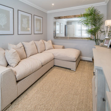
Earlier this year we completed a kitchen, lounge and bedroom refurbishment on behalf of our lovely client, and felt honoured to be called back to also refurbish their dining room into a cosy snug area recently.
When designing the space, we wanted to repeat similar materials, colours and themes that were in the other refurbished areas so that our client's property had flow and harmony.
We replaced the flooring throughout the house and incorporated a gorgeous sisal rug made from the same material as the main lounge and had the space painted in the same colour as the hallway and had a feature wall installed to provide tantalising texture.
Before doing this, we had the side window safely boarded up so that wall lights could be installed and so that the room regained it's symmetry.
Previously, the window provided only a restricted amount of day light due to the neighbouring property obstructing light, and hence, was redundant of it's primary function.
We decided to install wall lights each side of the television to provide additional lighting that did not obstruct the view of the TV.
Overall, the space was transformed into an indulgent yet gloriously cosy room, perfect for snuggling up, watching a film and welcoming those winter nights in.
 Pro-Land Landscape Construction Inc.
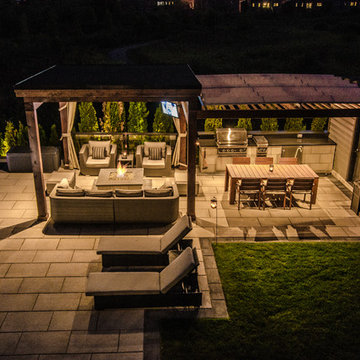
This full property landscape design and build presented Pro-Land with the opportunity to creatively work with existing grades, while considering the restrictions of an abutting conservation authority. Keeping this in mind we were able to optimize the views of the greenery around the property, while creating a functional outdoor entertainment area.
The client wanted a classic design for the front; flagstone walkways to tie in with the colors from the house and an entry wall frames the front door. The goal in the backyard was to create various areas for entertaining, without sacrificing play spaces for their children – the size of the property made accommodating their wishes fairly easy. A sports court, pool with water feature, cabana, and outdoor kitchen ensure these homeowners don’t have to go far for their next vacation.
 Optic Verve LLC
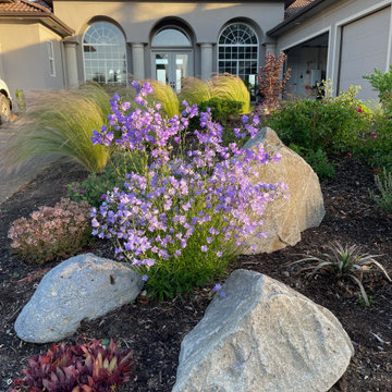
Carpet roses, native bluebells, succulents and low-growing ornamental grasses mix nicely, nestled in between occasional rocks.
Inspiration for a large contemporary landscaping in Portland.
Inspiration for a large contemporary landscaping in Portland.
 Metke Remodeling & Luxury Homes
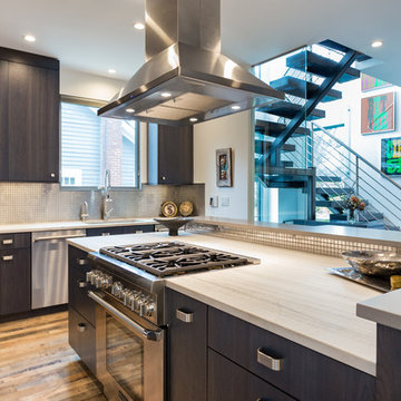
A traditional 1926 cottage was transformed into a stunning, contemporary home. The focal point from both inside and out is a 3-story floating wood and stainless staircase, showcased by oversized windows and dramatic lighting. Walnut cabinetry with a distinct stain and natural slab surfaces offset the metals used throughout – Including at the interior and exterior of the fireplace. Reclaimed wood floors pay homage to the industrial area the home is situated in.
In designing this home restrictions set forth by the building department were key. For instance, in order for the project to be considered a remodel the existing 8’ tall perimeter walls had to remain in place. The homeowners desperately wanted 9’ tall ceilings, so with crafty engineering and framing we were able to embellish the existing wall framing to achieve the added height.
Clearstory windows allow much needed light into the spaces and creates the illusion of spaciousness, while maintaining wall areas for key furnishings and artwork. Every inch of space maximizes storage throughout the 2,600 square foot home.
A cabinet for shoe storage immediately inside the front door also serves as a key component at the staircase and provides a platform to highlight sculptural artwork. Unique products and details, such as a metal link shower curtain and custom built-in guest beds with strategically placed outlets and horizontal surfaces to allow for electronics to be close at hand, elevate this home to the next level.
 Daniel Krienbuehl Contractors Inc.
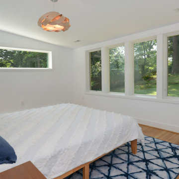
This project began with a sketch from our client that they'd received from a friend. It gave us a general idea of what they wanted but adjustments needed to be made for us to keep the renovation within budget. There were plenty of challenges in the designing and building stages. Early on, we learned the main structure of this 1940s house was encroaching the building restriction line. To remain within zoning limits, we needed to have two corners of the new addition slightly out of square. The new structure, cantilevered on both sides, required a heavy 45-degree angle beam to carry the load of the second floor and the roof. We equipped the house with central AC and expanded the existing hydronic heating system into the new space. The completed addition resulted in a shared music room and in-law suite with a bathroom on the first floor, and a master bedroom, bath, and hall bath on the second floor.

 SUPERIOR CHIMNEY SERVICES CORPORATION
As you may know, Superior Chimney writes a lot of articles to educate the Chicagoland area on chimneys and how to identify problems. Every once in a while, it is good to go back and review the basics. That’s what we’re going to do. We’re going to discuss what are the components of a chimney. Let’s get started.
What are the Components of a Fireplace?
We’re going to get started on the actual chimney itself. Most chimneys are built of brick and some are constructed of a wood framed chase with siding on it to match the rest of the home. The traditional masonry fireplace chimneys include (from the inside out) a firebox, where the firewood burns and gas starter are located. Going up is the throat, smoke chamber and then chimney flue. These are the components of a masonry chimney where the exhaust/air travels through - From the firebox and out through the top of the chimney. You can most often ‘see’ your chimney from the ground, you will notice the bricks and on top of that will be the chimney crown (cement slab) which keeps the elements away from the brick chimney. On top of the chimney crown is the chimney cap. This is what keeps animals & debris from entering the chimney flue… raccoons, squirrels, birds, bats, etc… down the flue, and into the firebox.
Now that we know what components that a chimney has, let’s focus on a couple of key areas.
Fireplace Dampers
All chimneys are fitted with a fireplace damper. A fireplace damper is a metal plate that opens and closes, allowing smoke from the fireplace to move up and out of the home. If you have a fire and the fireplace damper is closed, or restrictive, the smoke will back up into your home. The smoke needs a place to go. When the fireplace is not in use, the damper should remain closed in order to keep the cold air out of your home and warm air from escaping your home. Just because you have a fireplace does not mean that you have to deal with cold drafts in the room the fireplace is in.
Chimney Flues
As we all know, heat rises. The heat from the fireplace is going to rise taking with it the smoke, and other gases. This process is known as drafting. It is important to have good drafting as it prevents the smoke or gases from staying in your home and harming your family.
Chimney Flue Liners
Flue liners are important to the chimney; they are your firewall. It works to prevent overheating of any combustibles next to the chimney. And, it helps so the chimney construction doesn’t corrode from the byproducts of burning wood, or creosote. There are a few types of flue liners, such as fire clay tiles, heat resistant concrete, and stainless steel. Superior Chimney recommends the use of stainless steel in our geographic freeze and thaw climate. Our technicians can give you the details when we are at your home.
What is the Purpose of Taking Care of the Chimney?
Chimney Fires. This is where regular sweep & inspection is crucial to the health of your home. Without a chimney sweep or chimney cleaning each year, (whether you use the chimney or not, gas or wood burning) the chimney can cause a fire to transfer to your home. Only Nationally credentialed service technician professionals know and can inspect the key components of a fireplace for known condition and continued use. Be sure to contact us today!
 Maugel DeStefano Architects
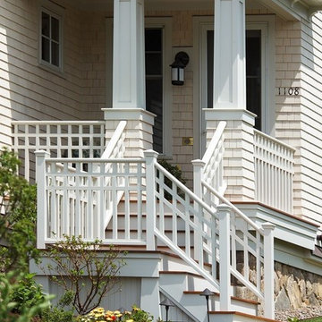
Designing a spectacular, spacious home that would take full advantage of ocean and salt marsh views on opposing sides of a long, thin slice of sloping land was a challenge embraced. To realize the full potential of the restrictive property, a multi-level structure was designed. Varied rooflines were created to give the home an appearance of being comfortably nestled in the landscape, while enabling the home to remain in proportion with the surrounding properties. Additional living space was gained by pulling the garage closer to the street and building a family room and an expansive deck above. Creative design options captured the scenic beauty of the narrow property and provided ocean views from primary living spaces throughout the day.
Photo: Dan Gair, Blind Dog Photo, Inc.

 KZ Architecture
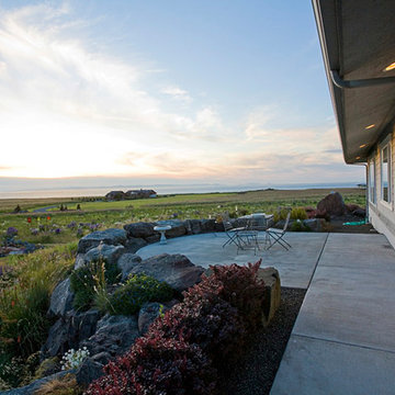
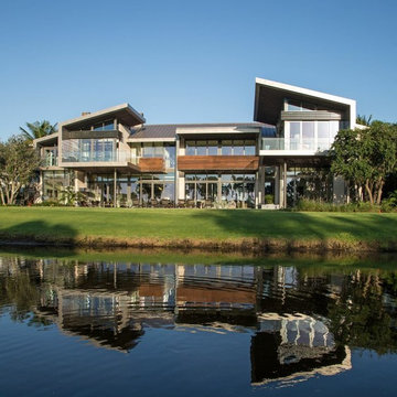
The project involved a large program that would yield a massive home on a limited and restricted site. The design strategy involved deconstructing the volume into pavilions that could generate a dialogue between built form and landscape and create intimate connections between the golf course and the living spaces.
Robin Hill
 CabinetGlass.com
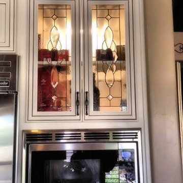
A beautiful pair of cabinet inserts featuring Beveled Glass Clusters, Beveled Glass Square accents, and 2 different textured glass types... one for the outside border glass and another for the center background glass.
This pair of Beveled Panels had each panel measuring 8-1/2" x 26-5/8".
They contain a beautiful Beveled Glass Cluster with the addition of Square 1" Bevels and an Outside Border in Spectrum Glass - 100HS - Small Hammered Glass, the Inside Surrounding Background Glass was Spectrum Glass - BR/CLEAR - Clear Baroque.
.The construction is Dark Antique Patina Tiffany Lead, the same technique as the beloved Tiffany Glass Lamps.
 Greensleeves Landscaping
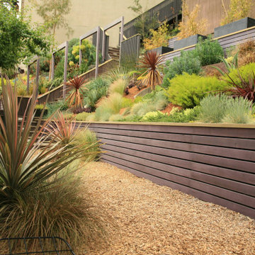
The garden beds are the icing on your cake. With such a huge variety of plant palettes available, consultation is vital. We specialise in drought tolerant plants and gardens which may range from thicker bushier species to more localised succulents and cactus based palettes. Allow our irrigation specialists to determine what, if any, systems may be required before we then design the planting and mulching accordingly. With increasing water costs and state water restrictions this final stage of the design / build is critical.
 Shelter Architecture
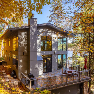
Tucked away from the hustle and bustle of the city along the beautiful St. Croix waterway, the site of this river residence is unparalleled. One challenge the design team faced were the restrictions put in place by the DNR's Wild and Scenic Rivers program, which monitored the height, materials, and setbacks of buildings along the river in order to maintain natural landscapes usable for all. Using these guidelines and regulations, Shelter sought to clad the building with natural-looking materials whenever possible. The finished home preserved the original stone basement and deck structure and on the upper floors neutral, reserved colors were chosen for the cladding.

 Otogawa-Anschel Design-Build
There is always an easy way out. A simple, uninteresting solution that neither challenges nor engages the mind or the soul. The 50s rambler is a simple structure that lacks character and charm. Its greatest contribution to architecture was the single floor living concept. We came to this project because the homeowners believed their home had the potential to be something more and had invested their time and creativity into developing ideas for what it could become. We embraced the opportunity to collaborate with the homeowner to create a home that was unique, thoughtful, customized for their use, and cared for.
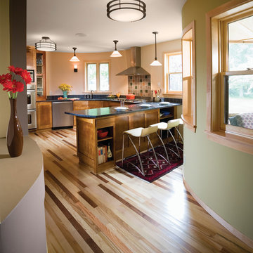
The curved exterior shell of this addition wraps around to accommodate a screen porch under a lifted peak. Inside, the new kitchen follows the curve with custom cabinets and honed granite creating a dynamite space for a chef. Shade tree, bamboo and honed slate flooring weave the living room, dining room, bathroom and kitchen together. Walls jog and jump with color and dimension.
One of the major challenges was to ensure that the space could accommodate large family gatherings of 12 – 16 people yet still feel intimate and comfortable for two people when guests were not present. As you move through the home you will notice that none of the spaces feel cavernous or restrictive. Careful attention was paid to mapping out the space to create areas that were cozy and appropriate while taking traffic patterns into consideration. The dining room entrances are staggered which creates the illusion of two separate spaces. The warm red halogen lights further encourage a sense of scale. One can easily extend the dining room table to accommodate a large crowd without causing guests to feel uncomfortable or confined.
The use of color is an often noted feature in our projects. Our philosophy is that the selection of color for the walls is as important as the selection of all the other materials. Color influences everything we do and gives us direction for how to feel, where to go, where to stop, and how to interact. It is the binding component between all the elements in a design. It bends, bounces, twists, manipulates light and the eye, and is required to fully develop and design a space.
This project was an exciting and rewarding challenge, and we are grateful to the homeowners for asking us to be a part of it and to opening up their home to the public. We hope that you will enjoy your time visiting this remarkably transformed home.
highlights
Re-use of existing housing stock
Icynene insulation
Super-insulated ceilings
Remnant granite countertops
Energy Star windows
Shade tree floors
Bamboo floors
Hardishingle siding
Halogen lights
Dimmers and separated task lighting
Energy efficient Panasonic fans
Locally manufactured cabinets
FSC certified millwork
Energy Star appliances
Dual flush toilet
 Stebnitz Builders, Inc.
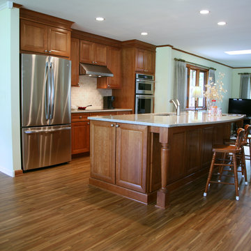
Our clients had a very comfortable getaway home in Williams Bay. But, like the wall of fame that displayed the memorable fish they’d landed over the years, their kitchen needed to be rearranged and refreshed to better serve the friends and family they looked to host.
The small gallery-style kitchen was small and blocked off to the rest of the home. It was very restrictive when friends and family gathered. It needed a new layout to accommodate more people, more comfortably. This required a change to the layout of the adjoining great room and entryway.
Walls were removed and modified to accept the larger kitchen layout and integrate seamlessly with the great room and entryway, creating a warm and comfortable area where our clients could now entertain and interact at the same time – no longer hidden away in the tight quarters of their old kitchen.
And of course … We made plenty of room to display their wall of fame with room to add even more memories.
122