
Search results for "Restriction" in Home Design Ideas
 Wooldridge Interiors
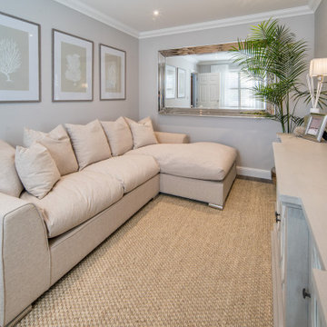
Earlier this year we completed a kitchen, lounge and bedroom refurbishment on behalf of our lovely client, and felt honoured to be called back to also refurbish their dining room into a cosy snug area recently.
When designing the space, we wanted to repeat similar materials, colours and themes that were in the other refurbished areas so that our client's property had flow and harmony.
We replaced the flooring throughout the house and incorporated a gorgeous sisal rug made from the same material as the main lounge and had the space painted in the same colour as the hallway and had a feature wall installed to provide tantalising texture.
Before doing this, we had the side window safely boarded up so that wall lights could be installed and so that the room regained it's symmetry.
Previously, the window provided only a restricted amount of day light due to the neighbouring property obstructing light, and hence, was redundant of it's primary function.
We decided to install wall lights each side of the television to provide additional lighting that did not obstruct the view of the TV.
Overall, the space was transformed into an indulgent yet gloriously cosy room, perfect for snuggling up, watching a film and welcoming those winter nights in.
 Pro-Land Landscape Construction Inc.
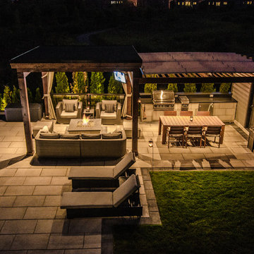
This full property landscape design and build presented Pro-Land with the opportunity to creatively work with existing grades, while considering the restrictions of an abutting conservation authority. Keeping this in mind we were able to optimize the views of the greenery around the property, while creating a functional outdoor entertainment area.
The client wanted a classic design for the front; flagstone walkways to tie in with the colors from the house and an entry wall frames the front door. The goal in the backyard was to create various areas for entertaining, without sacrificing play spaces for their children – the size of the property made accommodating their wishes fairly easy. A sports court, pool with water feature, cabana, and outdoor kitchen ensure these homeowners don’t have to go far for their next vacation.
 Optic Verve LLC
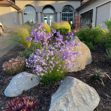
Carpet roses, native bluebells, succulents and low-growing ornamental grasses mix nicely, nestled in between occasional rocks.
Inspiration for a large contemporary landscaping in Portland.
Inspiration for a large contemporary landscaping in Portland.
Find the right local pro for your project
 Metke Remodeling & Luxury Homes
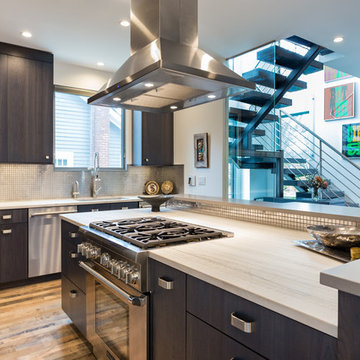
A traditional 1926 cottage was transformed into a stunning, contemporary home. The focal point from both inside and out is a 3-story floating wood and stainless staircase, showcased by oversized windows and dramatic lighting. Walnut cabinetry with a distinct stain and natural slab surfaces offset the metals used throughout – Including at the interior and exterior of the fireplace. Reclaimed wood floors pay homage to the industrial area the home is situated in.
In designing this home restrictions set forth by the building department were key. For instance, in order for the project to be considered a remodel the existing 8’ tall perimeter walls had to remain in place. The homeowners desperately wanted 9’ tall ceilings, so with crafty engineering and framing we were able to embellish the existing wall framing to achieve the added height.
Clearstory windows allow much needed light into the spaces and creates the illusion of spaciousness, while maintaining wall areas for key furnishings and artwork. Every inch of space maximizes storage throughout the 2,600 square foot home.
A cabinet for shoe storage immediately inside the front door also serves as a key component at the staircase and provides a platform to highlight sculptural artwork. Unique products and details, such as a metal link shower curtain and custom built-in guest beds with strategically placed outlets and horizontal surfaces to allow for electronics to be close at hand, elevate this home to the next level.
 Daniel Krienbuehl Contractors Inc.
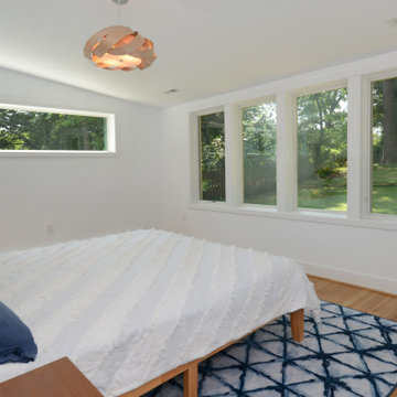
This project began with a sketch from our client that they'd received from a friend. It gave us a general idea of what they wanted but adjustments needed to be made for us to keep the renovation within budget. There were plenty of challenges in the designing and building stages. Early on, we learned the main structure of this 1940s house was encroaching the building restriction line. To remain within zoning limits, we needed to have two corners of the new addition slightly out of square. The new structure, cantilevered on both sides, required a heavy 45-degree angle beam to carry the load of the second floor and the roof. We equipped the house with central AC and expanded the existing hydronic heating system into the new space. The completed addition resulted in a shared music room and in-law suite with a bathroom on the first floor, and a master bedroom, bath, and hall bath on the second floor.
 TVL Creative Ltd.
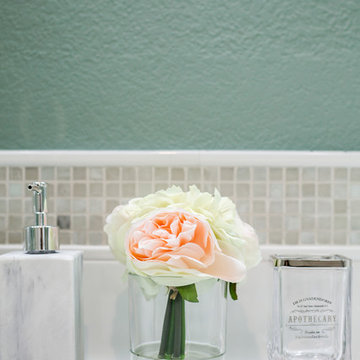
Words cannot describe the level of transformation this beautiful 60’s ranch has undergone. The home was blessed with a ton of natural light, however the sectioned rooms made for large awkward spaces without much functionality. By removing the dividing walls and reworking a few key functioning walls, this home is ready to entertain friends and family for all occasions. The large island has dual ovens for serious bake-off competitions accompanied with an inset induction cooktop equipped with a pop-up ventilation system. Plenty of storage surrounds the cooking stations providing large countertop space and seating nook for two. The beautiful natural quartzite is a show stopper throughout with it’s honed finish and serene blue/green hue providing a touch of color. Mother-of-Pearl backsplash tiles compliment the quartzite countertops and soft linen cabinets. The level of functionality has been elevated by moving the washer & dryer to a newly created closet situated behind the refrigerator and keeps hidden by a ceiling mounted barn-door. The new laundry room and storage closet opposite provide a functional solution for maintaining easy access to both areas without door swings restricting the path to the family room. Full height pantry cabinet make up the rest of the wall providing plenty of storage space and a natural division between casual dining to formal dining. Built-in cabinetry with glass doors provides the opportunity to showcase family dishes and heirlooms accented with in-cabinet lighting. With the wall partitions removed, the dining room easily flows into the rest of the home while maintaining its special moment. A large peninsula divides the kitchen space from the seating room providing plentiful storage including countertop cabinets for hidden storage, a charging nook, and a custom doggy station for the beloved dog with an elevated bowl deck and shallow drawer for leashes and treats! Beautiful large format tiles with a touch of modern flair bring all these spaces together providing a texture and color unlike any other with spots of iridescence, brushed concrete, and hues of blue and green. The original master bath and closet was divided into two parts separated by a hallway and door leading to the outside. This created an itty-bitty bathroom and plenty of untapped floor space with potential! By removing the interior walls and bringing the new bathroom space into the bedroom, we created a functional bathroom and walk-in closet space. By reconfiguration the bathroom layout to accommodate a walk-in shower and dual vanity, we took advantage of every square inch and made it functional and beautiful! A pocket door leads into the bathroom suite and a large full-length mirror on a mosaic accent wall greets you upon entering. To the left is a pocket door leading into the walk-in closet, and to the right is the new master bath. A natural marble floor mosaic in a basket weave pattern is warm to the touch thanks to the heating system underneath. Large format white wall tiles with glass mosaic accent in the shower and continues as a wainscot throughout the bathroom providing a modern touch and compliment the classic marble floor. A crisp white double vanity furniture piece completes the space. The journey of the Yosemite project is one we will never forget. Not only were we given the opportunity to transform this beautiful home into a more functional and beautiful space, we were blessed with such amazing clients who were endlessly appreciative of TVL – and for that we are grateful!
 TKS Design Group
Download our free ebook, Creating the Ideal Kitchen. DOWNLOAD NOW
Like many families with older children, this local Glen Ellyn couple wanted to expand the size of their kitchen while also creating a more open, airy feel for their main level. The home had plenty of space that included a formal living room, formal dining room, family room with eat-in area and kitchen with butler’s pantry. What it didn’t have, was an effortless flow between the areas used daily for cooking, eating and gathering.
Additionally, the kitchen had become outdated, feeling dark and dismal, despite the abundance of natural light. Our clients wanted a bright, cheerful interior that would inspire the family to congregate in this part of the house. No easy feat with teenagers.
An open floor plan design solved the issues with functionality and circulation, removing the walls that restricted flow and opening up the entry to the dining room. We also eliminated the rarely used butler’s pantry allowing us to expand the kitchen and add a large island for food prep and gathering. To create a sense of symmetry and consistency in the space, a clerestory window was added below the header and framed to match the existing adjacent entry from the living room.
Inspired by the owner’s Scottish ancestry, the island cabinetry boasts a beautiful blue hue, paired with stools upholstered in a sprightly plaid. The built-in buffet area provides additional storage, topped with a beautiful wooden top stained to coordinate with the stunning tones of the flooring.
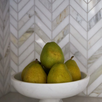
The owner’s opted for stainless steel appliances, inspiring the selection of brushed silver light fixtures and polished chrome hardware. Marble-look quartz offered a durable, lightly colored surface to reflect sunlight and enhance the cheer factor. According to this happy family, this uplifting space is now everyone’s favorite place to gather.
Designed by: Susan Klimala, CKBD
Photography by: Michael Kaskel
For more design inspiration go to: www.kitchenstudio-ge.com
 Mom's Design Build
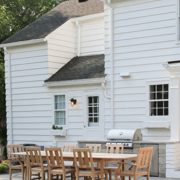
The clients purchased the home about 15 years ago and never knew what to do with the porch addition off the back of the home. In addition to being a general eye sore and cutting off a large portion of their small back yard, it was always a little damp, smelly, and not very well arranged. This also impeded access to the back yard by forcing passage through a secondary space. The size of the porch restricted light into the home which they did not like. The at-grade cedar deck was a maintenance nightmare and a terrible misuse of space.
 Vertical Construction Group LLC
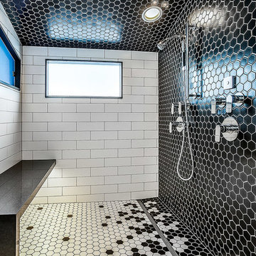
This master bathroom was one of the more challanging projects we have ever preformed. Creating the curbless shower/ trough drain application with the framing restrictions in this 100+ year old house took some creative thinking. The finished product turned out amazing, and includes: heated flooring, heated towell bar, shower steamer, three pre-programed shower valves, waterfall slab bench, soaking tub, LED back lights, floating duel vanities with under lighting and a super unique tile pattern designed by the homeowners. See for yourself!
 Michael Nash Design, Build & Homes
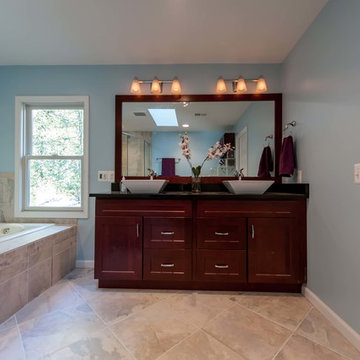
 This 1975 split-level home in a wooded area of Reston, Virginia, is home to a growing family of six. Needless to say, space was at a premium and they needed more of it. So they turned to Michael Nash Design, Build & Homes to create a second-story expansion.
With limited ability to expand the footprint of the home due to lot restrictions, the design team created a 25’ x 35’ master suite addition to be placed over the existing first floor. The space would be located above the living room, dining room and kitchen, creating a private and secluded oasis for mom and dad. The children would have the home’s three middle level bedrooms and a bath of their own.
A New Master Suite
A new custom wooden staircase leads the homeowner to the doorstep of what she now calls her “heavenly space.” It’s a large master bedroom complete with a seating area, vaulted ceiling and skylights, and a beautiful Bordeaux-finish maple wood floor. Bright color paint was selected for the walls to complement the wood flooring and bedroom furniture.
The new 11’x12’ master bathroom offers a spa-like experience. The new bath touts a large shower stall with a built-in bench and storage niches covered with flagstone tiles; a soaking whirlpool tub; and a long double vanity with granite top and fancy fixtures.
Exterior Ties It Together
Like any large addition, this one required exterior renovation to make the addition look like the rest of the home. New vinyl siding and architectural shingles replaced the old cedar siding and run down shingles on the original structure.
A new front porch with half-stone columns and pillars maintains the home’s cottage look. A new double car garage replaces the original carport. Both are a big part of the home’s new front elevation which greatly improves its curbside appeal.
The end result of this project offers everyone in the family a place of their own. The children have new bedrooms and the parents have their sanctuary in their new master suite.
 Stebnitz Builders, Inc.
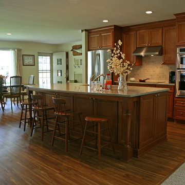
Our clients had a very comfortable getaway home in Williams Bay. But, like the wall of fame that displayed the memorable fish they’d landed over the years, their kitchen needed to be rearranged and refreshed to better serve the friends and family they looked to host.
The small gallery-style kitchen was small and blocked off to the rest of the home. It was very restrictive when friends and family gathered. It needed a new layout to accommodate more people, more comfortably. This required a change to the layout of the adjoining great room and entryway.
Walls were removed and modified to accept the larger kitchen layout and integrate seamlessly with the great room and entryway, creating a warm and comfortable area where our clients could now entertain and interact at the same time – no longer hidden away in the tight quarters of their old kitchen.
And of course … We made plenty of room to display their wall of fame with room to add even more memories.
 KZ Architecture
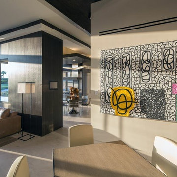
The project involved a large program that would yield a massive home on a limited and restricted site. The design strategy involved deconstructing the volume into pavilions that could generate a dialogue between built form and landscape and create intimate connections between the golf course and the living spaces.
Robin Hill
 Michael Eric Dale
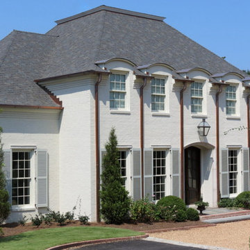
This home is located in the Montevallo Park planned community. There are two separate fronts, because the lot is served by two separate parallel streets. The owner wanted this ubiquitous Mountain Brook style, but the detailing and massing give the house a unique feel.
Notice the roof crown. The maximum height to the roof ridge was the standard 35 feet from ground level. A problem developed in that the other street was significantly lower than Montevallo Park Lane. We were forced to comply with the height restriction at both elevations. Because the approach to the home is from a higher elevation, a flat roof would be visible from the top of the street. So this roof crown at a lower pitch became a beautiful solution that is very interesting from afar.
 KC Interior Design Inc.
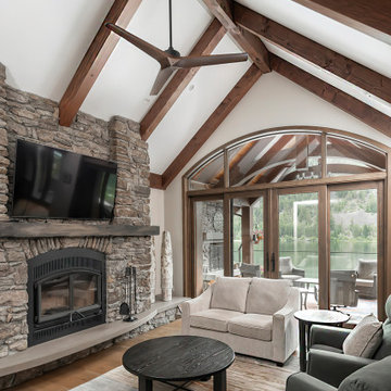
The great room, while relatively small compared to the scale of the rest of the house, feels more spacious thanks to its vaulted ceiling. Designing the fireplace was a meticulous process due to the strict fire codes surrounding wood-burning fireplaces. Although we aimed for a traditional wood mantle over the fireplace, we faced restrictions that led us to collaborate with Moda Concrete Studio, which crafted a poured concrete mantle that beautifully mimics the look and texture of wood.
 TRS Designs, Inc (Kitchens, Baths, & More)
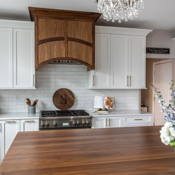
This beautiful house in an amazing neighborhood was originally built with an underwhelming kitchen. The remodel of this space involved changing a few things to allow the kitchen you see here.
We changed a sliding door to a smaller single swinging door, enlarged the window, removed a non-load bearing, decorative column and a flow restricting half wall. All off those changes as well as stealing 6.5' of the 3 car, garage allowed this kitchen to become this homes star of the show!!
 Jess Diab Studio
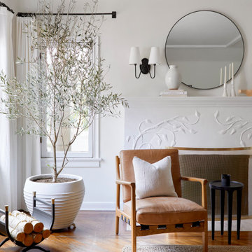
A 1930s Spanish Revival home with custom landscaping, hardscaping, exteriors color consultation. Natural materials like terracotta, breathable linens, and vintage rugs create a layered, lived-in family home. We designed landscaping that acted as an outdoor entertaining space for multiple families which was especially needed in light of the pandemic restrictions.
 Calgary Bath Renos
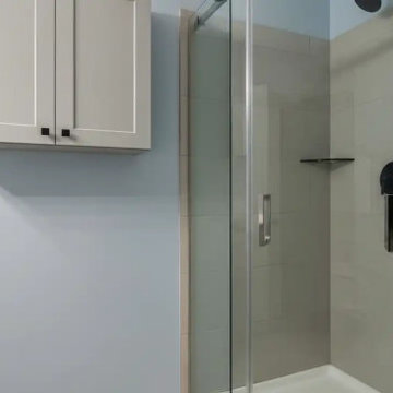
This project was completed in a high-rise condo in Beltline. The unit had shared plumbing stacks and strict work-hour restrictions.
The objective was improving ventilation and modernizing finishes without altering plumbing layout. Board approval documentation was submitted prior to construction.
 Revitalize Design by Val Valdez
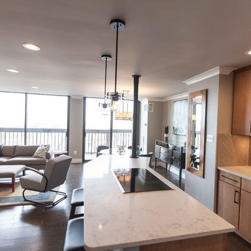
The view from the unit is spectacular, therefore, the furniture selected for this space was appropriately scaled to fit in the confined space and maintain the awesome view with low back seating. A mid-century modern swivel chair is positioned strategically near the TV and rotates towards the kitchen for easy conversation. The handsome gray arm chair has black metal arms and legs to tie in with the industrial accents in the kitchen. And the French gray TV console adds a touch of elegance and balances the far end of the living space.
The property is a 700 square foot condo. The homeowner's goal was to have his 40+ year old unit transformed into a brand new space. To accomplish this, we gutted the entire unit; we replaced the popcorn ceiling with new drywall, replaced the old flooring with maple engineered wood flooring, and removed the kitchen walls and bulkheads to create an open concept.
Additions include: Handsome crown moulding and custom baseboards, Sherwin Williams wall, ceiling and trim paint (the ceiling is NOT white), LED recessed light fixtures, custom island pendants, Quartz countertops, custom dining chandelier, custom shelving over the kitchen sink and custom "iron" pipe design to house existing telephone wires (building restricted the removal of existing phone line).
Photography by Michael Anthony Harrison, www.MikeAntPhotography.com
 Otogawa-Anschel Design-Build
The owners of this 1970s-era split-level on Lake Calhoun recently added a third story bringing the home up-to-date with attractive soffits, angles, and half-walls built to create depth and dimension. But in a house where every room registered a dull white, a healthy dose of color becomes the true force for modernizing this space. The homeowners asked Otogawa-Anschel to bring color into their lives.
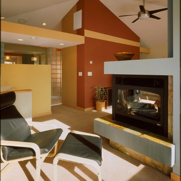
The standalone fireplace in the room’s center wears an entirely different chromatic palette on each side. From the sleeping area and looking out toward the lake, cool tones tease out the aqua and dark blue in the slate fireplace surround. From the opposite side, warm hues pick up the rose and violet of the same material. The wall separating the bedroom from the bathroom boasts a rich adobe red, set off by a gold soffit and a rich chocolate panel. The bold, earthy color triad serves as the eye-catching anchor point for the room.
Asymmetrical glass block flanking the bathroom vanity opens up an otherwise restrictive space, allowing it to communicate with the walk-in closet on one side and the natural light spill on the other. Because the green glass block diffuses the light, the room’s colors work to compensate for this softening. A mix of tangerine, pale green, and lemon yellow tile used in the shower find a place on the floor and walls as well for a burst of synthetic sunshine designed to shift and bend depending on vantage point. The gently morphing pattern eliminates the flat sterility of white tile and ordinary glass block.
The transition from the second floor to the third floor features a combination of yellow hues that also appear to shimmer and shift with the movement of natural light through the space. In the intense afternoon sun, the pigments lose their distinction and become a solid glowing wall. As the sun sets, they regain their individual character.
Like any healthy relationship, the living room and dining room work together while maintaining independence. In the living room, a soft suede wall gives way to the room’s large bank of windows and smartly complements the stone fireplace. Muted greens and golds segue effortlessly to the spectacular lake view. Meanwhile, the vibrant tones of the dining room tastefully contrast the cool calm of the living area.
highlights
Fifty-six colors in whole house
Forty-two colors in master suite
 A2Z Interiors, LLC
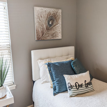
Client was using 4th bedroom as a catchall but with restrictions needed a place to work and accommodate guests, cleaned out the space, added a second bed and a desk to give a quiet work from home space when needed.
119