
Search results for "Right sized materials" in Home Design Ideas
 AV Architects + Builders
AV Architects + Builders
Forest Villa House - Mclean, VA
1528 Forrest Villa is situated in the heart of McLean, VA in a well-established neighborhood. This unique site is perfect for this modern house design because it sits at the top of a hill and has a grand view of the landscape.
We have designed a home that feels like a retreat but offers all the amenities a family needs to keep up with the fast pace of Northern VA. The house offers over 8,200 sqft of luxury living area on three finished levels.
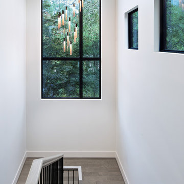
The main level is an open-concept floor plan designed to entertain. The central area is the great room and the kitchen separated by a two-sided fireplace, but it’s surrounded by a very generous dining room, a study with custom built-ins and an outdoor covered patio with another gas fireplace. We also have a functional mudroom with a powder room right-off the 3-car garage with plenty of storage. The open stair case anchors the front elevation of the home to the front porch and the site.
The second level offers a master suite with an expansive custom his/her walk-in closet, a master bath with a curb less shower area, a free-standing soaking tub and his/her vanities. Additionally, this level has 4 generously sized en-suite bedrooms with full baths and walk-in closets and a full size laundry room with lots of storage.
The lower level has a guest en-suite bedroom with a full bathroom and walk-in closet. It also has a rec room with a glass enclosed wine cellar to display your favorite wine collection. We have added a large exercise room, a media room fully wired, a full bath and lots of storage space.
The materials used for the home are of the highest quality. From the aluminum clad oversized windows, to the unique roofing structure, the Nichiha rectangular siding and stacked veneer stone, we have hand-picked materials that stand the test of time and complement the modern design of the home.
In total this 8200 sqft home has 6 bedrooms, 7 bathrooms, 2 half-baths and a 3-car garage.
Sean O'Rourke Photography. A one-of-a-kind modern home in the heart of McLean, Virginia.
 JRP Design & Remodel
Our clients wanted the ultimate modern farmhouse custom dream home. They found property in the Santa Rosa Valley with an existing house on 3 ½ acres. They could envision a new home with a pool, a barn, and a place to raise horses. JRP and the clients went all in, sparing no expense. Thus, the old house was demolished and the couple’s dream home began to come to fruition.
The result is a simple, contemporary layout with ample light thanks to the open floor plan. When it comes to a modern farmhouse aesthetic, it’s all about neutral hues, wood accents, and furniture with clean lines. Every room is thoughtfully crafted with its own personality. Yet still reflects a bit of that farmhouse charm.
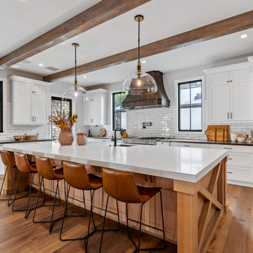
Their considerable-sized kitchen is a union of rustic warmth and industrial simplicity. The all-white shaker cabinetry and subway backsplash light up the room. All white everything complimented by warm wood flooring and matte black fixtures. The stunning custom Raw Urth reclaimed steel hood is also a star focal point in this gorgeous space. Not to mention the wet bar area with its unique open shelves above not one, but two integrated wine chillers. It’s also thoughtfully positioned next to the large pantry with a farmhouse style staple: a sliding barn door.
The master bathroom is relaxation at its finest. Monochromatic colors and a pop of pattern on the floor lend a fashionable look to this private retreat. Matte black finishes stand out against a stark white backsplash, complement charcoal veins in the marble looking countertop, and is cohesive with the entire look. The matte black shower units really add a dramatic finish to this luxurious large walk-in shower.
Photographer: Andrew - OpenHouse VC
 Valentini Kids Furniture Brooklyn NY
Huppe Connection Modern Glass Dining Table
Made in Canada
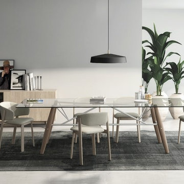
Connection by Huppe is a new luxury dining table from the Dining Furniture Up Line. The table is a real masterpiece created in Canada by real professionals from the hand-selected materials. Dining Table Connection features a real Scandinavian European design, that is remarkable by simple design, but astonishing uniqueness. The top of the dining table is made of 12mm (0.5") thick clear tempered glass. The legs are made of 100% solid White Oak or Walnut, that is stain finished up to your choice. The legs are supported with steel beams that carry not only a supporting function but also highlight the design, making the dining table a vivid spot in any interior. Connection glass top dining table is available in three sizes: 84", 98" and 108", so you could find the right size for your modern home.
Connection Dining Table by Huppe is also available with Wooden Top - Click here to View.
Features:
Designed by Up Huppe
Clear thick and durable tempered glass top
Solid oak or walnut legs available in a variety of finishes
Rectangular tabletop shape
Base feature steel beams available in different matt lacquered colors
Available in three different sizes
The starting price is for the Connection Glass Dining Table W84" with the base in Natural Oak Finish / Matt White Lacquer.
Dimensions:
Dining Table: W84" x D40" x H30"
Dining Table: W98" x D40" x H30"
Dining Table: W108" x D40" x H30"
Find the right local pro for your project
 Naikoon Contracting Ltd
Architect: M3 Architecture Inc.
Interior Design: Mocoro Studio
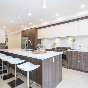
We recently completed a development project in the Pemberton Heights area of North Vancouver. These 2 houses were built to benefit the long-term durability through the selection of efficient materials and process which will give a longer lifespan with lower maintenance and energy costs. This project was a perfect fit for us to assist in the design and execute the construction while working with some outstanding clients and consultants. A win for all of us!
The original home was recycled hitting our target goals of 90%, leading way to a couple of stealth looking homes with performance levels right there with the best of them. Our mechanical engineer designed the mechanical systems to achieve maximum efficiency and hit our internal target goals that we have set for ourselves in accordance with our Vision here at Naikoon. These homes came in at EnerGuide score of 85% which can also be referenced in GJ with a score of 54GJ. To give you an idea of how this rating relates to an average home of this size, these 2 beauties on Mackay are about 80% more efficient. The main components in the design and equipment selection that leads to this are:
1) Space heating and Cooling
2) Water Heating
3) Lights and Appliances
4) Wall assemblies and insulation
Like all of our projects, we take pride in looking at the small details of the house. Things like, insulated water lines, domestic hot water heat recovery units, electric car plug-ins, solar power ready, extensive use of environmentally friendly materials, hot water heat pumps and stringent testing and inspection point along the way, led to a successful completion of 2 certified high-performance homes with Built Green Platinum and EnergyStar certifications.
Photo credits: vopenhouse.ca
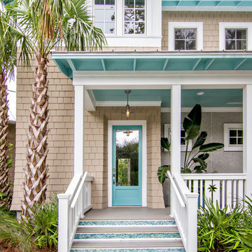
 Glenn Layton Homes
Glenn Layton Homes, LLC, "Building Your Coastal Lifestyle"
Example of a mid-sized beach style beige two-story wood house exterior design in Jacksonville with a hip roof
Example of a mid-sized beach style beige two-story wood house exterior design in Jacksonville with a hip roof
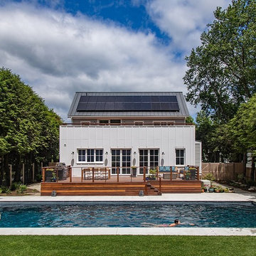
 ZeroEnergy Design
This LEED Platinum certified house reflects the homeowner's desire for an exceptionally healthy and comfortable living environment, within a traditional neighborhood.
INFILL SITE. The family, who moved from another area of Wellesley, sought out this property to be within walking distance of the high school and downtown area. An existing structure on the tight lot was removed to make way for the new home. 84% of the construction waste, from both the previous structure and the new home, was diverted from a landfill. ZED designed to preserve the existing mature trees on the perimeter of the property to minimize site impacts, and to maintain the character of the neighborhood as well as privacy on the site.
EXTERIOR EXPRESSION. The street facade of the home relates to the local New England vernacular. The rear uses contemporary language, a nod to the family’s Californian roots, to incorporate a roof deck, solar panels, outdoor living space, and the backyard swimming pool. ZED’s careful planning avoided to the need to face the garage doors towards the street, a common syndrome of a narrow lot.
THOUGHTFUL SPACE. Homes with dual entries can often result in duplicate and unused spaces. In this home, the everyday and formal entry areas are one and the same; the front and garage doors share the entry program of coat closets, mudroom storage with bench for removing your shoes, and a laundry room with generous closets for the children's sporting equipment. The entry area leads directly to the living space, encompassing the kitchen, dining and sitting area areas in an L-shaped open plan arrangement. The kitchen is placed at the south-west corner of the space to allow for a strong connection to the dining, sitting and outdoor living spaces. A fire pit on the deck satisfies the family’s desire for an open flame while a sealed gas fireplace is used indoors - ZED’s preference after omitting gas burning appliances completely from an airtight home. A small study, with a window seat, is conveniently located just off of the living space. A first floor guest bedroom includes an accessible bathroom for aging visitors and can be used as a master suite to accommodate aging in place.
HEALTHY LIVING. The client requested a home that was easy to clean and would provide a respite from seasonal allergies and common contaminants that are found in many indoor spaces. ZED selected easy to clean solid surface flooring throughout, provided ample space for cleaning supplies on each floor, and designed a mechanical system with ventilation that provides a constant supply of fresh outdoor air. ZED selected durable materials, finishes, cabinetry, and casework with low or no volatile organic compounds (VOCs) and no added urea formaldehyde.
YEAR-ROUND COMFORT. The home is super insulated and air-tight, paired with high performance triple-paned windows, to ensure it is draft-free throughout the winter (even when in front of the large windows and doors). ZED designed a right-sized heating and cooling system to pair with the thermally improved building enclosure to ensure year-round comfort. The glazing on the home maximizes passive solar gains, and facilitates cross ventilation and daylighting.
ENERGY EFFICIENT. As one of the most energy efficient houses built to date in Wellesley, the home highlights a practical solution for Massachusetts. First, the building enclosure reduces the largest energy requirement for typical houses (heating). Super-insulation, exceptional air sealing, a thermally broken wall assembly, triple pane windows, and passive solar gain combine for a sizable heating load reduction. Second, within the house only efficient systems consume energy. These include an air source heat pump for heating & cooling, a heat pump hot water heater, LED lighting, energy recovery ventilation, and high efficiency appliances. Lastly, photovoltaics provide renewable energy help offset energy consumption. The result is an 89% reduction in energy use compared to a similar brand new home built to code requirements.
RESILIENT. The home will fare well in extreme weather events. During a winter power outage, heat loss will be very slow due to the super-insulated and airtight envelope– taking multiple days to drop to 60 degrees even with no heat source. An engineered drainage system, paired with careful the detailing of the foundation, will help to keep the finished basement dry. A generator will provide full operation of the all-electric house during a power outage.
OVERALL. The home is a reflection of the family goals and an expression of their values, beautifully enabling health, comfort, safety, resilience, and utility, all while respecting the planet.
ZED - Architect & Mechanical Designer
Bevilacqua Builders Inc - Contractor
Creative Land & Water Engineering - Civil Engineering
Barbara Peterson Landscape - Landscape Design
Nest & Company - Interior Furnishings
Eric Roth Photography - Photography
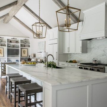
 BRADSHAW DESIGNS LLC
Beautiful white kitchen with vaulted ceiling and two of the best gold gilded lanterns above the large island. Love the Calacatta marble featured on the countertops and backsplash which keep this kitchen fresh, clean, and updated. Plenty of room to seat three or four at the island. Modern with traditional lines for a transitional look. Additional friends and family can sit at the banquette in the bay window.
Sponsored
Fredericksburg, OH

High Point Cabinets
Columbus' Experienced Custom Cabinet Builder | 4x Best of Houzz Winner
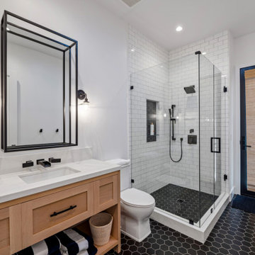 JRP Design & Remodel
Our clients wanted the ultimate modern farmhouse custom dream home. They found property in the Santa Rosa Valley with an existing house on 3 ½ acres. They could envision a new home with a pool, a barn, and a place to raise horses. JRP and the clients went all in, sparing no expense. Thus, the old house was demolished and the couple’s dream home began to come to fruition.
The result is a simple, contemporary layout with ample light thanks to the open floor plan. When it comes to a modern farmhouse aesthetic, it’s all about neutral hues, wood accents, and furniture with clean lines. Every room is thoughtfully crafted with its own personality. Yet still reflects a bit of that farmhouse charm.
Their considerable-sized kitchen is a union of rustic warmth and industrial simplicity. The all-white shaker cabinetry and subway backsplash light up the room. All white everything complimented by warm wood flooring and matte black fixtures. The stunning custom Raw Urth reclaimed steel hood is also a star focal point in this gorgeous space. Not to mention the wet bar area with its unique open shelves above not one, but two integrated wine chillers. It’s also thoughtfully positioned next to the large pantry with a farmhouse style staple: a sliding barn door.
The master bathroom is relaxation at its finest. Monochromatic colors and a pop of pattern on the floor lend a fashionable look to this private retreat. Matte black finishes stand out against a stark white backsplash, complement charcoal veins in the marble looking countertop, and is cohesive with the entire look. The matte black shower units really add a dramatic finish to this luxurious large walk-in shower.
Photographer: Andrew - OpenHouse VC
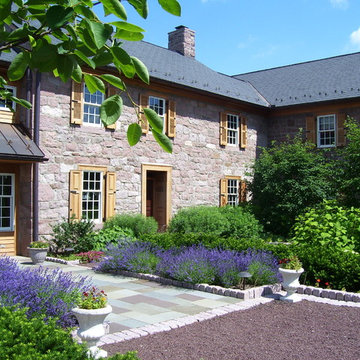
 River Valley Landscapes
This project presented unique opportunities that are not often found in residential landscaping. The homeowners were not only restoring their 1840's era farmhouse, a piece of their family’s history, but also enlarging and updating the home for modern living. The landscape designers continued this idea by creating a space that is a modern day interpretation of an 1840s era farm rather then a strict recreation. The resulting design combines elements of farm living from that time, as well as acknowledging the property’s history as a horse farm, with staples of 21st century landscapes such as space for outdoor living, lighting, and newer plant varieties.
Guests approach from the main driveway which winds through the property and ends at the main barn. There is secondary gated driveway just for the homeowners. Connected to this main driveway is a narrower gravel lane which leads directly to the residence. The lane passes near fruit trees planted in broken rows to give the illusion that they are the remains of an orchard that once existed on the site. The lane widens at the entrance to the gardens where there is a hitching post built into the fence that surrounds the gardens and a watering trough. The widened section is intended as a place to park a golf cart or, in a nod to the home’s past, tie up horses before entering. The gravel lane passes between two stone pillars and then ends at a square gravel court edged in cobblestones. The gravel court transitions into a wide flagstone walk bordered with yew hedges and lavender leading to the front door.
Directly to the right, upon entering the gravel court, is located a gravel and cobblestone edged walk leading to a secondary entrance into the residence. The walk is gated where it connects with the gravel court to close it off so as not to confuse visitors and guests to the main residence and to emphasize the primary entrance. An area for a bench is provided along this walk to encourage stopping to view and enjoy the gardens.
On either side of the front door, gravel and cobblestone walks branch off into the garden spaces. The one on the right leads to a flagstone with cobblestone border patio space. Since the home has no designated backyard like most modern suburban homes the outdoor living space had to be placed in what would traditionally be thought of as the front of the house. The patio is separated from the entrance walk by the yew hedge and further enclosed by three Amelanchiers and a variety of plantings including modern cultivars of old fashioned plants such as Itea and Hydrangea. A third entrance, the original front door to the 1840’s era section, connects to the patio from the home’s kitchen, making the space ideal for outdoor dining.
The gravel and cobblestone walk branching off to the left of the front door leads to the vegetable and perennial gardens. The idea for the vegetable garden was to recreate the tradition of a kitchen garden which would have been planted close to the residence for easy access. The vegetable garden is surrounded by mixed perennial beds along the inside of the wood picket fence which surrounds the entire garden space. Another area designated for a bench is provided here to encourage stopping and viewing. The home’s original smokehouse, completely restored and used as a garden shed, provides a strong architectural focal point to the vegetable garden. Behind the smokehouse is planted lilacs and other plants to give mass and balance to the corner and help screen the garden from the neighboring subdivision. At the rear corner of the garden a wood arbor was constructed to provide a structure on which to grow grapes or other vines should the homeowners choose to.
The landscape and gardens for this restored farmhouse and property are a thoughtfully designed and planned recreation of a historic landscape reinterpreted for modern living. The idea was to give a sense of timelessness when walking through the gardens as if they had been there for years but had possibly been updated and rejuvenated as lifestyles changed. The attention to materials and craftsmanship blend seamlessly with the residence and insure the gardens and landscape remain an integral part of the property. The farm has been in the homeowner’s family for many years and they are thrilled at the results and happy to see respect given to the home’s history and to its meticulous restoration.
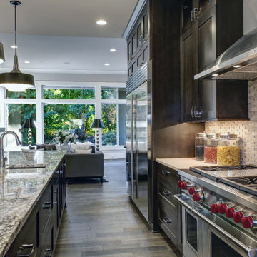
 Save home
For the best effect when looking for fabrics to furnish your house, it is best to use fabrics that have varying textures. This is the only way to avoid getting a flat and bland look. When furnishing, consider collecting different types of fabrics and then mixing them until you get a result you find appealing. Do not be afraid of trying out as many fabrics as possible. Remember it is only through carrying out trials that you will be able to identify the right color schemes as well as find what works best for your items or house. Voyage Maison share some tips to make the most of your soft furnishing.
When Choosing Fabrics, Consider Where You Want Them To Go
When selecting a fabric scheme, consider where you want the fabrics to go. If you look at the back of most fabrics, you will find that most manufacturers usually indicate the most suitable area where they should be placed such as on upholstery or for windows. You will also find that most fabrics usually come with labelled with their composition and rubs. Understanding the rubs on a fabric will help you know more about the durability of the material as well as the most suitable areas of use. The number of rubs on a fabric are typically found on little icons on the material or they can be indicated in the form of a number after a Martindale test has been carried out by the manufacturer. The number of rubs is the best way to know how to purpose a fabric. For example: • Fabrics with less than 10,000 rubs are most ideal for decorative uses • Fabrics with between 10,000-15,000 rubs are ideal for light domestic uses • Fabrics with between 15,000-25,000 rubs are ideal for general domestic uses • Fabrics with between 25,000-30,000 rubs are ideal for heavy duty uses When Choosing Fabrics For Furnishing, Consider Their Practicality and Maintenance Needs
It is best that you select your fabrics based on your existing needs while at the same time looking at the care that will be required to keep the material in prime condition. For example, if you have pets and kids, you should go for fabrics that can easily be wiped or cleaned. Most of the fabrics in the market today can be easily cleaned but you should ensure that you specify to your retailer that you need a material that is easy to clean when making a purchase. On finding your fabric of choice, you can also acquire Scotchgard – A strong fabric cover that repels most spills making cleaning of fabrics easier.
When selecting fabrics, you should also consider the orientation of the room where they will be used. This will help you pick the right material of fabric as well as select the right fabric color. For example, if your room has a southern orientation, light will be filtering into the room in such a way that it will not be prudent to use fabrics made of silk material for your cushions and windows.
Tips On How To Accentuate The Appeal Of a Room By Adding Throws & Cushions
In the market, you will find cushions and throws in all shapes, sizes and colors. These fittings can essentially be said to be the cherry on top of the cake when it comes to accentuating the décor in a room. After planning out the furnishings for the rest of the room, cushions and throws can help you brighten up a room and further, they can help you transform it entirely. For example, you can change the look of a room from formal to informal just by selecting the right cushions. You can also transform the look of a room to suit the season at hand, say from summer to winter by simply changing cushions and playing around with the fabric covers. You can also achieve different effects by changing the sizes of cushions and throws in a room. Changing cushions and fabrics to suit different occasions, moods or seasons is a great way to achieve your desired look without breaking the bank.
When selecting a fabric scheme, consider where you want the fabrics to go. If you look at the back of most fabrics, you will find that most manufacturers usually indicate the most suitable area where they should be placed such as on upholstery or for windows. You will also find that most fabrics usually come with labelled with their composition and rubs. Understanding the rubs on a fabric will help you know more about the durability of the material as well as the most suitable areas of use. The number of rubs on a fabric are typically found on little icons on the material or they can be indicated in the form of a number after a Martindale test has been carried out by the manufacturer. The number of rubs is the best way to know how to purpose a fabric. For example: • Fabrics with less than 10,000 rubs are most ideal for decorative uses • Fabrics with between 10,000-15,000 rubs are ideal for light domestic uses • Fabrics with between 15,000-25,000 rubs are ideal for general domestic uses • Fabrics with between 25,000-30,000 rubs are ideal for heavy duty uses When Choosing Fabrics For Furnishing, Consider Their Practicality and Maintenance Needs
It is best that you select your fabrics based on your existing needs while at the same time looking at the care that will be required to keep the material in prime condition. For example, if you have pets and kids, you should go for fabrics that can easily be wiped or cleaned. Most of the fabrics in the market today can be easily cleaned but you should ensure that you specify to your retailer that you need a material that is easy to clean when making a purchase. On finding your fabric of choice, you can also acquire Scotchgard – A strong fabric cover that repels most spills making cleaning of fabrics easier.
When selecting fabrics, you should also consider the orientation of the room where they will be used. This will help you pick the right material of fabric as well as select the right fabric color. For example, if your room has a southern orientation, light will be filtering into the room in such a way that it will not be prudent to use fabrics made of silk material for your cushions and windows.
Tips On How To Accentuate The Appeal Of a Room By Adding Throws & Cushions
In the market, you will find cushions and throws in all shapes, sizes and colors. These fittings can essentially be said to be the cherry on top of the cake when it comes to accentuating the décor in a room. After planning out the furnishings for the rest of the room, cushions and throws can help you brighten up a room and further, they can help you transform it entirely. For example, you can change the look of a room from formal to informal just by selecting the right cushions. You can also transform the look of a room to suit the season at hand, say from summer to winter by simply changing cushions and playing around with the fabric covers. You can also achieve different effects by changing the sizes of cushions and throws in a room. Changing cushions and fabrics to suit different occasions, moods or seasons is a great way to achieve your desired look without breaking the bank.
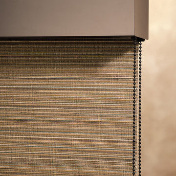
 Accent Window Fashions LLC
Hunter Douglas Casual Living Window Treatments
Alustra® Woven Textures® Roller Shades closed
Operating Systems: Continuous Cord Loop
Room Styles: Casual
Hunter Douglas Alustra® Woven Textures® Roman Shades
An innovative alternative to solar screens and woven wood shades, Alustra® Woven Textures® beautifully showcase natural textures and woven patterns, transforming a room by stylishly filtering natural light. Select a roller shade with the exclusive Chelsea™ roller system for a clean, simple appearance or the classic dimension of a Roman shade.
Material:
Fabric
Fold Size:
N/A
Sizes Available:
Width: 12" to 120"
Height: 12" to 120"
Material/Color Options:
47 Combinations
Available from Accent Window Fashions LLC (715) 355-0772
Hunter Douglas Showcase Priority Dealer
Hunter Douglas Certified Installer
Hunter Douglas Certified Professional Dealer
#Hunter_Douglas #Alustra #Woven_Textures #Roman_Shades #Roller_Shades #Continuous_Cord_Loop #Casual #Window_Treatments #HunterDouglas #Accent_Window_Fashions
Copyright 2001-2014 Hunter Douglas, Inc. All rights reserved.

 Breathe Design Studio
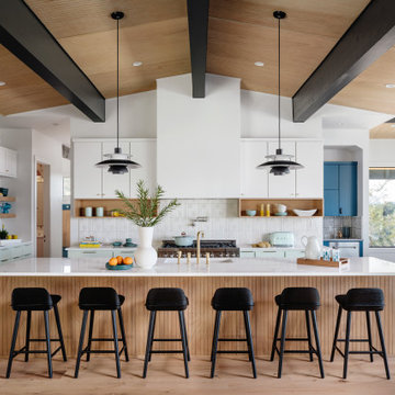
Our Austin studio decided to go bold with this project by ensuring that each space had a unique identity in the Mid-Century Modern style bathroom, butler's pantry, and mudroom. We covered the bathroom walls and flooring with stylish beige and yellow tile that was cleverly installed to look like two different patterns. The mint cabinet and pink vanity reflect the mid-century color palette. The stylish knobs and fittings add an extra splash of fun to the bathroom.
The butler's pantry is located right behind the kitchen and serves multiple functions like storage, a study area, and a bar. We went with a moody blue color for the cabinets and included a raw wood open shelf to give depth and warmth to the space. We went with some gorgeous artistic tiles that create a bold, intriguing look in the space.
In the mudroom, we used siding materials to create a shiplap effect to create warmth and texture – a homage to the classic Mid-Century Modern design. We used the same blue from the butler's pantry to create a cohesive effect. The large mint cabinets add a lighter touch to the space.


 River Valley Landscapes
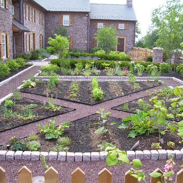
 This project presented unique opportunities that are not often found in residential landscaping. The homeowners were not only restoring their 1840's era farmhouse, a piece of their family’s history, but also enlarging and updating the home for modern living. The landscape designers continued this idea by creating a space that is a modern day interpretation of an 1840s era farm rather then a strict recreation. The resulting design combines elements of farm living from that time, as well as acknowledging the property’s history as a horse farm, with staples of 21st century landscapes such as space for outdoor living, lighting, and newer plant varieties.
Guests approach from the main driveway which winds through the property and ends at the main barn. There is secondary gated driveway just for the homeowners. Connected to this main driveway is a narrower gravel lane which leads directly to the residence. The lane passes near fruit trees planted in broken rows to give the illusion that they are the remains of an orchard that once existed on the site. The lane widens at the entrance to the gardens where there is a hitching post built into the fence that surrounds the gardens and a watering trough. The widened section is intended as a place to park a golf cart or, in a nod to the home’s past, tie up horses before entering. The gravel lane passes between two stone pillars and then ends at a square gravel court edged in cobblestones. The gravel court transitions into a wide flagstone walk bordered with yew hedges and lavender leading to the front door.
Directly to the right, upon entering the gravel court, is located a gravel and cobblestone edged walk leading to a secondary entrance into the residence. The walk is gated where it connects with the gravel court to close it off so as not to confuse visitors and guests to the main residence and to emphasize the primary entrance. An area for a bench is provided along this walk to encourage stopping to view and enjoy the gardens.
On either side of the front door, gravel and cobblestone walks branch off into the garden spaces. The one on the right leads to a flagstone with cobblestone border patio space. Since the home has no designated backyard like most modern suburban homes the outdoor living space had to be placed in what would traditionally be thought of as the front of the house. The patio is separated from the entrance walk by the yew hedge and further enclosed by three Amelanchiers and a variety of plantings including modern cultivars of old fashioned plants such as Itea and Hydrangea. A third entrance, the original front door to the 1840’s era section, connects to the patio from the home’s kitchen, making the space ideal for outdoor dining.
The gravel and cobblestone walk branching off to the left of the front door leads to the vegetable and perennial gardens. The idea for the vegetable garden was to recreate the tradition of a kitchen garden which would have been planted close to the residence for easy access. The vegetable garden is surrounded by mixed perennial beds along the inside of the wood picket fence which surrounds the entire garden space. Another area designated for a bench is provided here to encourage stopping and viewing. The home’s original smokehouse, completely restored and used as a garden shed, provides a strong architectural focal point to the vegetable garden. Behind the smokehouse is planted lilacs and other plants to give mass and balance to the corner and help screen the garden from the neighboring subdivision. At the rear corner of the garden a wood arbor was constructed to provide a structure on which to grow grapes or other vines should the homeowners choose to.
The landscape and gardens for this restored farmhouse and property are a thoughtfully designed and planned recreation of a historic landscape reinterpreted for modern living. The idea was to give a sense of timelessness when walking through the gardens as if they had been there for years but had possibly been updated and rejuvenated as lifestyles changed. The attention to materials and craftsmanship blend seamlessly with the residence and insure the gardens and landscape remain an integral part of the property. The farm has been in the homeowner’s family for many years and they are thrilled at the results and happy to see respect given to the home’s history and to its meticulous restoration.
 Isla Homes
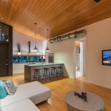
I built this on my property for my aging father who has some health issues. Handicap accessibility was a factor in design. His dream has always been to try retire to a cabin in the woods. This is what he got.
It is a 1 bedroom, 1 bath with a great room. It is 600 sqft of AC space. The footprint is 40' x 26' overall.
The site was the former home of our pig pen. I only had to take 1 tree to make this work and I planted 3 in its place. The axis is set from root ball to root ball. The rear center is aligned with mean sunset and is visible across a wetland.
The goal was to make the home feel like it was floating in the palms. The geometry had to simple and I didn't want it feeling heavy on the land so I cantilevered the structure beyond exposed foundation walls. My barn is nearby and it features old 1950's "S" corrugated metal panel walls. I used the same panel profile for my siding. I ran it vertical to match the barn, but also to balance the length of the structure and stretch the high point into the canopy, visually. The wood is all Southern Yellow Pine. This material came from clearing at the Babcock Ranch Development site. I ran it through the structure, end to end and horizontally, to create a seamless feel and to stretch the space. It worked. It feels MUCH bigger than it is.
I milled the material to specific sizes in specific areas to create precise alignments. Floor starters align with base. Wall tops adjoin ceiling starters to create the illusion of a seamless board. All light fixtures, HVAC supports, cabinets, switches, outlets, are set specifically to wood joints. The front and rear porch wood has three different milling profiles so the hypotenuse on the ceilings, align with the walls, and yield an aligned deck board below. Yes, I over did it. It is spectacular in its detailing. That's the benefit of small spaces.
Concrete counters and IKEA cabinets round out the conversation.
For those who cannot live tiny, I offer the Tiny-ish House.
Photos by Ryan Gamma
Staging by iStage Homes
Design Assistance Jimmy Thornton
 TKS Design Group
Free ebook, Creating the Ideal Kitchen. DOWNLOAD NOW
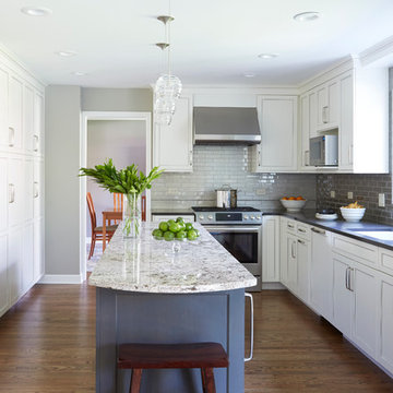
The homeowners of this mid-century Colonial and family of four were frustrated with the layout of their existing kitchen which was a small, narrow peninsula layout but that was adjoining a large space that they could not figure out how to use. Stealing part of the unused space seemed like an easy solution, except that there was an existing transition in floor height which made that a bit tricky. The solution of bringing the floor height up to meet the height of the existing kitchen allowed us to do just that.
This solution also offered some challenges. The exterior door had to be raised which resulted in some exterior rework, and the floor transition had to happen somewhere to get out to the garage, so we ended up “pushing” it towards what is now a new mudroom and powder room area. This solution allows for a small but functional and hidden mudroom area and more private powder room situation.
Another challenge of the design was the very narrow space. To minimize issues with this, we moved the location of the refrigerator into the newly found space which gave us an L-shaped layout allowing for an island and even some shallow pantry storage. The windows over the kitchen sink were expanded in size and relocated to allow more light into the room. A breakfast table fits perfectly in the area adjacent to the existing French doors and there was even room for a small bar area that helps transition from inside to outside for entertaining. The confusing unused space now makes sense and provides functionality on a daily basis.
To help bring some calm to this busy family, a pallet of soft neutrals was chosen -- gray glass tile with a simple metal accent strip, clear modern pendant lights and a neutral color scheme for cabinetry and countertops.
For more information on kitchen and bath design ideas go to: www.kitchenstudio-ge.com

 Liz Schupanitz Designs
Cooking for Two
Location: Plymouth, MN, United States
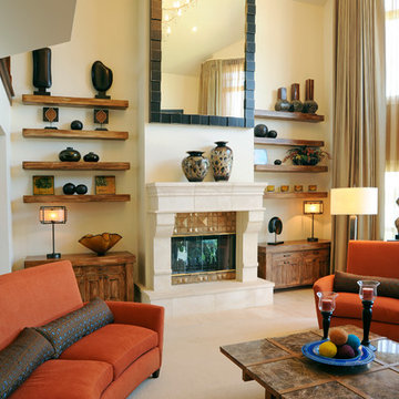
When this couple’s last child graduated from college they began the process of looking for a new home. After a lengthy search they decided to stay with the neighborhood they loved, saving money by remodeling rather than starting over.
The top priorities on their wish list were adding character to their 1990’s era home with a classic white kitchen and a larger island while keeping within the existing footprint. With the intention of honing their cooking skills, they were also considering better appliances and two ovens.
Challenges and Solutions
Design a larger island with seating for at least two. The existing island was small and the area behind the seating was less than recommended clearances.
To solve this challenge, the seating area of the island was extended out into the open area of the kitchen. This created a larger island with seating for three, extra storage and a bookshelf across from the range.
The original kitchen had a range with microwave above, so adding another oven was a challenge with limited wall space.
Because the adjoining dining room is used infrequently, the homeowner was open to placing the second oven and microwave in the walkway. This made room for the small buffet between the built in refrigerator and ovens, creating one of her favorite areas.
The client requested a white painted kitchen but wanted to make sure it had warmth and character. To achieve this the following elements were chosen:
1) Cabinets painted with Benjamin Moore Capitol White, a luminous and warm shade of white.
2) The Range hood was painted with warm metallic shades to reflect the bronze of the Ashley Norton hardware.
3) Black Aqua Grantique granite was chosen for countertops because it looks like soapstone and adds contrast.
4) Walker Zanger Café tile in Latte was chosen for it’s handmade look with uneven edges.
5) The to-the-counter-cabinet with glass door shows off serving dishes and lends sophisticated charm.
The result is a welcoming classic kitchen, where this couple enjoys cooking more often and sharpening their skills with gourmet appliances.
Liz Schupanitz Designs
Photographed by: Andrea Rugg Photography

 TKS Design Group
Download our free ebook, Creating the Ideal Kitchen. DOWNLOAD NOW
This client was referred to us from a past client. They are a busy 2-career household with young children and enjoy entertaining friends and family in their home. They have a beautiful open concept home but unfortunately the kitchen was not fitting for the rest of the home. They were not quite sure what to do with the space. We talked about trying to refresh it or do more of a minor remodel, but in the end they decided a full gut would get them to where they wanted to be.
One problem was there was no place for guests to hang out other than the large and awkward banquette area. The brick wall and tiled hood area were feeling a bit dated and tired. The space was just not functional for their lifestyle. There was no prep space near the cooktop and no landing area for items coming out of the ovens or refrigerator, plus a big dead zone in the center of the room.
Banquettes, like the one they previously had in the space, are great for small spaces, but when they get really large like this one, it makes getting in and out of the seating area awkward and uncomfortable. Plus, there was room for a large table, so we eliminated the awkward built in.
We started by removing the faux brick wall between the kitchen and back entry. We relocated the entry to the garage over a couple feet in order to get every last inch out of the new kitchen. We also made the decision to close up the primary window that faced the pretty ho hum brick wall of the neighbor’s house. There was plenty of light coming in from the seating area, so we just didn’t feel the window was adding much to the room.
Construction went smoothy. There was a bit of rework with electrical, flooring and HVAC, but in the end, we think it was well worth it.
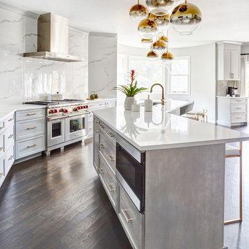
The clients really wanted a sleek contemporary look, and we originally had planned for a full height slab backsplash, but due to it’s size, it was a budget buster. Instead, we got creative and settled on large format porcelain tiles that have a similar feel but were a fraction of the cost. We made sure the wall was plumb and level so that the fit and finish would mimic that of slab material.
The final space was quite a change. A large prep sink sits directly across from the new pro-style range with plenty additional prep space on the large island. The refrigerator and ovens now have miles of landing space, and a nice tight work triangle makes cooking a breeze.
Since we wanted a more contemporary feel, not many wall cabinets were included. Instead, we outfitted some of the drawers for dish storage with a peg system. Two large pantries flanking the refrigerator hold baking supplies and small appliances. Large drawers by the cooktop hold pots and pans, and an appliance garage tucked away to the left of the range hides away miscellaneous items. The large island also houses a microwave drawer and tons of storage, most of which is drawers offering maximum convenience.
The island now seats 5-6 people comfortably along with the new table in the seating area which can seat up to 8. Entertaining will be a breeze in this space. With such a clean backdrop, we knew we would need some drama with the lighting, so we chose two sets of staggered pendants, which we adjusted for the right visual balance above the island.
We also included a small coffee station to the right of the main kitchen, which helps keep the coffee clutter out of the kitchen proper. Two tones of complimentary gray are featured in this kitchen. The perimeter is a light gray that reads almost white. The island is a gray stain that adds some depth and interest with the visible wood texture. The countertops are clean white quartz, and the hardware, barstools and light fixtures add warm brass tones. I see lots of cooking and entertaining with family and friends in the near future in this bright and airy new space.
Designed by: Susan Klimala, CKD, CBD
Photography by: Michael Kaskel
For more information on kitchen and bath design ideas go to: www.kitchenstudio-ge.com

 Calibre Enterprise
Caliber Enterprise is one of the leading Fasteners Manufacturers in India, offering strong and reliable Fasteners for different industries. We make sure our products are made with good quality materials that last long and work well in tough conditions. Our fasteners are used in areas like construction, machines, and vehicles. With modern technology and strict checks, we make sure every fastener gives the best performance.
As a trusted Fasteners Supplier in India, we supply fasteners in different sizes, materials, and finishes to suit a wide range of applications. We are a well-known Fasteners Manufacturer because of our focus on product accuracy, timely delivery, and customer satisfaction. Whether it’s for large infrastructure projects or small machinery repairs, we make sure our clients get the right fasteners every time. As a reliable Fasteners Supplier, we also provide expert guidance and technical support to help customers choose the best products for their needs.
We offer various fastening products like Nuts, bolts, screws, and washers that are essential in many construction and engineering projects. For better planning, we provide a nut bolt weight chart in kg pdf, which helps engineers and buyers easily calculate the right sizes and weights. As experienced Fasteners manufacturers in Chennai , we are proud to support clients with fasteners that meet both Indian and international quality standards. Our commitment to quality and service makes us a go-to partner in the fasteners industry.
To know more, visit Caliber Enterprise Other Product : screws supplier
To know more, visit Caliber Enterprise Other Product : screws supplier
 Wiedemann Architects LLC
This project is a new 5,900 sf. primary residence for a couple with three children. The site is slightly elevated above the residential street and enjoys winter views of the Potomac River.
The family’s requirements included five bedrooms, five full baths, a powder room, family room, dining room, eat-in kitchen, walk-in pantry, mudroom, lower level recreation room, exercise room, media room and numerous storage spaces. Also included was the request for an outdoor terrace and adequate outdoor storage, including provision for the storage of bikes and kayaks. The family needed a home that would have two entrances, the primary entrance, and a mudroom entry that would provide generous storage spaces for the family’s active lifestyle. Due to the small lot size, the challenge was to accommodate the family’s requirements, while remaining sympathetic to the scale of neighboring homes.
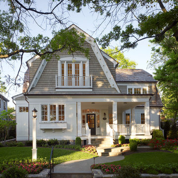
The residence employs a “T” shaped plan to aid in minimizing the massing visible from the street, while organizing interior spaces around a private outdoor terrace space accessible from the living and dining spaces. A generous front porch and a gambrel roof diminish the home’s scale, providing a welcoming view along the street front. A path along the right side of the residence leads to the family entrance and a small outbuilding that provides ready access to the bikes and kayaks while shielding the rear terrace from view of neighboring homes.
The two entrances join a central stair hall that leads to the eat-in kitchen overlooking the great room. Window seats and a custom built banquette provide gathering spaces, while the French doors connect the great room to the terrace where the arbor transitions to the garden. A first floor guest suite, separate from the family areas of the home, affords privacy for both guests and hosts alike. The second floor Master Suite enjoys views of the Potomac River through a second floor arched balcony visible from the front.
The exterior is composed of a board and batten first floor with a cedar shingled second floor and gambrel roof. These two contrasting materials and the inclusion of a partially recessed front porch contribute to the perceived diminution of the home’s scale relative to its smaller neighbors. The overall intention was to create a close fit between the residence and the neighboring context, both built and natural.
Builder: E.H. Johnstone Builders
Anice Hoachlander Photography
13