
Search results for "Rip off" in Home Design Ideas
 Way-Mar Inc.
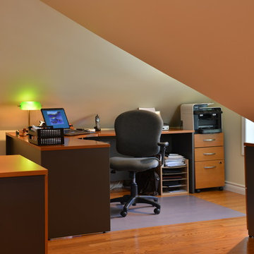
Based on her experience with several renovation projects, the owner reflects that “renovations always take longer and cost more than what you first think. That’s just the reality of renovations. You’re going to find stuff along the way. You learn to prepare for that. Having said that, there weren’t really any surprises with this project.”
She also appreciates the collaborative approach that Way-Mar brings to a project. “Way-Mar always gives options and explains the differences - taking into consideration your personal preferences and priorities.”
Early on with this home, the owners worked with different contractors and got several quotes to help choose the best company. She says they learned the “hard way” that not all contractors are the same.
A few times it looked like a good job was done on the surface but things were done poorly or incorrectly and had to be redone. The couple feels fortunate to have connected with Way-Mar early on.“Way-Mar stands out in their commitment to customer service and quality. That’s worth a lot.
We have built up a lot of trust over the years so we are never concerned that we are getting ripped off or if the work will be done right. I feel they always offer a fair price and we get excellent value for our money.”
“We’ve built a good long-term relationship so they know us pretty well. Way-Mar makes suggestions based on what they think is most suitable for us. We’re always happy with the results.”
photo: jeff brubacher
 Campion Walker Landscapes
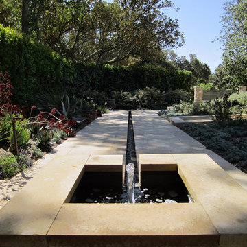
To anchor a modern house, designed by Frederick Fisher & Partners, Campion Walker brought in a mature oak grove that at first frames the home and then invites the visitor to explore the grounds including an intimate culinary garden and stone fruit orchard.
The neglected hillside on the back of the property once overgrown with ivy was transformed into a California native oak woodland, with under-planting of ceanothus and manzanitas.
We used recycled water to create a dramatic water feature cut directly into the limestone entranceway framed by a cacti and succulent garden.
 Gill Design Co.
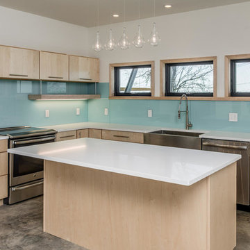
Backpainted glass in a soothing, robin's egg blue enlivens the kitchen.
Garrett Buell
Mid-sized minimalist l-shaped concrete floor open concept kitchen photo in Nashville with a farmhouse sink, flat-panel cabinets, light wood cabinets, quartz countertops, blue backsplash, glass sheet backsplash, stainless steel appliances and an island
Mid-sized minimalist l-shaped concrete floor open concept kitchen photo in Nashville with a farmhouse sink, flat-panel cabinets, light wood cabinets, quartz countertops, blue backsplash, glass sheet backsplash, stainless steel appliances and an island
Find the right local pro for your project
 Two Street Studio
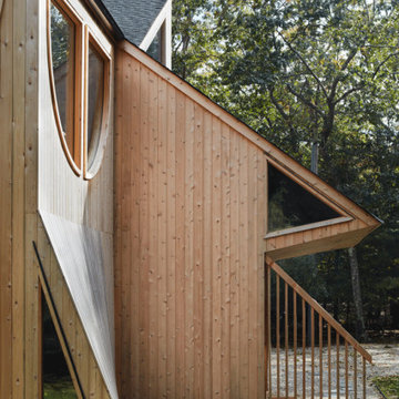
Small 1950s brown two-story wood house exterior photo in New York with a shingle roof and a black roof
 Jason Tanking Construction
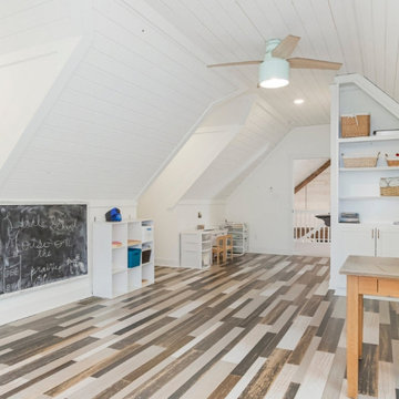
The inspiration was based on European country homes. The exterior stone and brick work, ironwork, slate-looking roof, shake shingle siding, and even the landscaping were intentionally tied together to resemble something you might find on the countryside in England or Italy. Inside we used age old design concept to tie in with newer farmhouse styles. We aimed to focus on family-friendly materials, making each space efficient for daily living, and maintaining aesthetically beautiful finishing touches. We call it the treehouse because we feel like we are living on top of the backyard trees waving right outside the main level windows.
An open concept paired with an abundance of windows create a light and airy feel in the main level of the home. Finishing off the vaulted ceilings with meaty exposed beams really made the main living space visually balanced and beautiful. Walking through the home you can find unique tile accents used on the walls and floors, natural wood flooring all throughout the main living space, and countertops of marble, granite, and stainless steel. With efficiency in mind, the two laundry rooms are coordinated in proximity to the closets. The office built-ins disguise a secret door to extra storage and the storm shelter.
The kitchen sink was refurbished after we ripped it from the basement of Jason’s grandparent’s home! We used faucets, handle pulls, and mirrors to accessorize and bring beauty to each space. The lighting we chose was also intentional to maintain the aesthetic appeal from floor to ceiling. Built-ins all throughout the home provide subtle pops of color and were used to maximize function in each space.
The exterior elements of the home were also important as our family loves being outdoors. We created multiple outdoor spaces including a large deck off of the dining area, a winding staircase to the covered brick patio surrounded by the fenced garden area, and an easily accessible pond, fire pit, and chicken coop in the back yard.
 Jason Tanking Construction
The inspiration was based on European country homes. The exterior stone and brick work, ironwork, slate-looking roof, shake shingle siding, and even the landscaping were intentionally tied together to resemble something you might find on the countryside in England or Italy. Inside we used age old design concept to tie in with newer farmhouse styles. We aimed to focus on family-friendly materials, making each space efficient for daily living, and maintaining aesthetically beautiful finishing touches. We call it the treehouse because we feel like we are living on top of the backyard trees waving right outside the main level windows.
An open concept paired with an abundance of windows create a light and airy feel in the main level of the home. Finishing off the vaulted ceilings with meaty exposed beams really made the main living space visually balanced and beautiful. Walking through the home you can find unique tile accents used on the walls and floors, natural wood flooring all throughout the main living space, and countertops of marble, granite, and stainless steel. With efficiency in mind, the two laundry rooms are coordinated in proximity to the closets. The office built-ins disguise a secret door to extra storage and the storm shelter.
The kitchen sink was refurbished after we ripped it from the basement of Jason’s grandparent’s home! We used faucets, handle pulls, and mirrors to accessorize and bring beauty to each space. The lighting we chose was also intentional to maintain the aesthetic appeal from floor to ceiling. Built-ins all throughout the home provide subtle pops of color and were used to maximize function in each space.
The exterior elements of the home were also important as our family loves being outdoors. We created multiple outdoor spaces including a large deck off of the dining area, a winding staircase to the covered brick patio surrounded by the fenced garden area, and an easily accessible pond, fire pit, and chicken coop in the back yard.
 TANGERINEdesign, Jill C. Finn Assoc. AIA
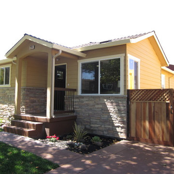
Design, Material choices and Photos by: TANGERINEdesign. By adding a stone base, new porch, extending the overhangs, re-sizing the windows, and a cheery color - this simple house has gone from bland to grand!
Sponsored
Columbus, OH

Wannemacher Interiors
Customized Award-Winning Interior Design Solutions in Franklin Cnty OH
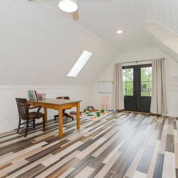 Jason Tanking Construction
The inspiration was based on European country homes. The exterior stone and brick work, ironwork, slate-looking roof, shake shingle siding, and even the landscaping were intentionally tied together to resemble something you might find on the countryside in England or Italy. Inside we used age old design concept to tie in with newer farmhouse styles. We aimed to focus on family-friendly materials, making each space efficient for daily living, and maintaining aesthetically beautiful finishing touches. We call it the treehouse because we feel like we are living on top of the backyard trees waving right outside the main level windows.
An open concept paired with an abundance of windows create a light and airy feel in the main level of the home. Finishing off the vaulted ceilings with meaty exposed beams really made the main living space visually balanced and beautiful. Walking through the home you can find unique tile accents used on the walls and floors, natural wood flooring all throughout the main living space, and countertops of marble, granite, and stainless steel. With efficiency in mind, the two laundry rooms are coordinated in proximity to the closets. The office built-ins disguise a secret door to extra storage and the storm shelter.
The kitchen sink was refurbished after we ripped it from the basement of Jason’s grandparent’s home! We used faucets, handle pulls, and mirrors to accessorize and bring beauty to each space. The lighting we chose was also intentional to maintain the aesthetic appeal from floor to ceiling. Built-ins all throughout the home provide subtle pops of color and were used to maximize function in each space.
The exterior elements of the home were also important as our family loves being outdoors. We created multiple outdoor spaces including a large deck off of the dining area, a winding staircase to the covered brick patio surrounded by the fenced garden area, and an easily accessible pond, fire pit, and chicken coop in the back yard.
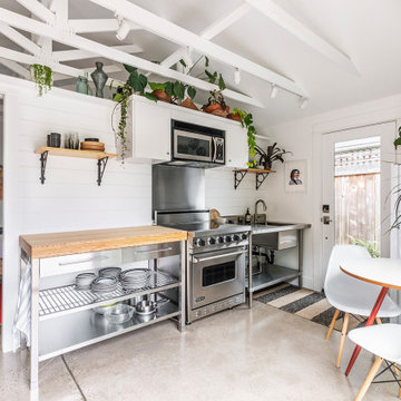
 Dyer Studio Inc.
Converted from an existing Tuff Shed garage, the Beech Haus ADU welcomes short stay guests in the heart of the bustling Williams Corridor neighborhood.
Natural light dominates this self-contained unit, with windows on all sides, yet maintains privacy from the primary unit. Double pocket doors between the Living and Bedroom areas offer spatial flexibility to accommodate a variety of guests and preferences. And the open vaulted ceiling makes the space feel airy and interconnected, with a playful nod to its origin as a truss-framed garage.
A play on the words Beach House, we approached this space as if it were a cottage on the coast. Durable and functional, with simplicity of form, this home away from home is cozied with curated treasures and accents. We like to personify it as a vacationer: breezy, lively, and carefree.
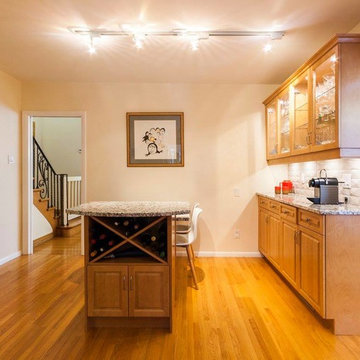
 TENTEN Kitchens
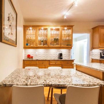
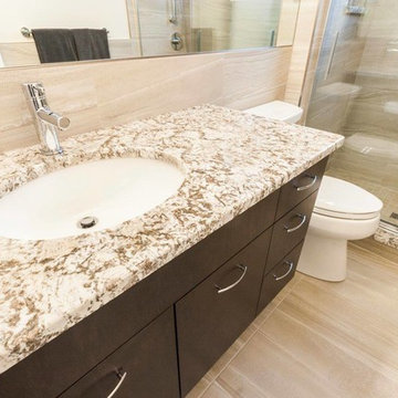
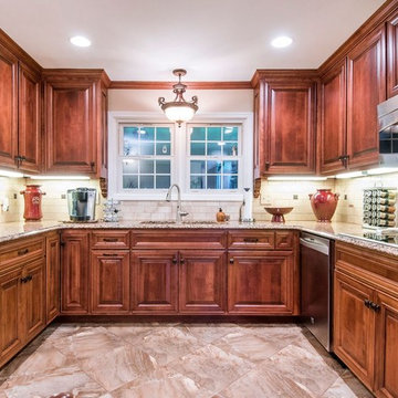
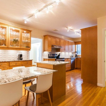
This young couple and their gorgeous daughter bought a fabulous home that needed some updating. The existing kitchen had good bones but they wanted additional cabinetry and built-in seating. Plus an update on the existing kitchen. New peaked subway tile backsplash, granite countertop, double sink & faucet were installed in the existing part of the kitchen along with soft close hinges, pull-outs in the pantry and lazy susans in the corners. We added a coffee bar area on the other side of the kitchen with glass front cabinets and glass shelves to show off their contents. We also added a table height granite table attached to another cabinet and wine rack. The result was a lot of new functional storage and a lovely look! Also in need of some change was the bathroom. The overwhelming green tile was dated and dark. We ripped it all out and started from scratch. The bathtub was removed and a large shower installed. The heated floor tile is wonderful and good for our cold winters! A new window, the tiled walls of the shower, granite threshold and shelf cut-out in the shower, gorgeous new shower faucet, floating vanity, comfort height toilet, updated lighting, matching sink faucet and towel bar accessories completed this upgrade! From a dark green cave to an updated, relaxing and luxurious bathroom.
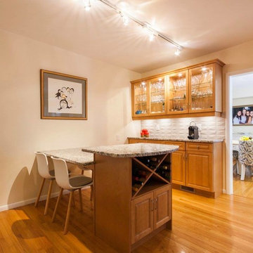 TENTEN Kitchens
This young couple and their gorgeous daughter bought a fabulous home that needed some updating. The existing kitchen had good bones but they wanted additional cabinetry and built-in seating. Plus an update on the existing kitchen. New peaked subway tile backsplash, granite countertop, double sink & faucet were installed in the existing part of the kitchen along with soft close hinges, pull-outs in the pantry and lazy susans in the corners. We added a coffee bar area on the other side of the kitchen with glass front cabinets and glass shelves to show off their contents. We also added a table height granite table attached to another cabinet and wine rack. The result was a lot of new functional storage and a lovely look! Also in need of some change was the bathroom. The overwhelming green tile was dated and dark. We ripped it all out and started from scratch. The bathtub was removed and a large shower installed. The heated floor tile is wonderful and good for our cold winters! A new window, the tiled walls of the shower, granite threshold and shelf cut-out in the shower, gorgeous new shower faucet, floating vanity, comfort height toilet, updated lighting, matching sink faucet and towel bar accessories completed this upgrade! From a dark green cave to an updated, relaxing and luxurious bathroom.
 TENTEN Kitchens
This young couple and their gorgeous daughter bought a fabulous home that needed some updating. The existing kitchen had good bones but they wanted additional cabinetry and built-in seating. Plus an update on the existing kitchen. New peaked subway tile backsplash, granite countertop, double sink & faucet were installed in the existing part of the kitchen along with soft close hinges, pull-outs in the pantry and lazy susans in the corners. We added a coffee bar area on the other side of the kitchen with glass front cabinets and glass shelves to show off their contents. We also added a table height granite table attached to another cabinet and wine rack. The result was a lot of new functional storage and a lovely look! Also in need of some change was the bathroom. The overwhelming green tile was dated and dark. We ripped it all out and started from scratch. The bathtub was removed and a large shower installed. The heated floor tile is wonderful and good for our cold winters! A new window, the tiled walls of the shower, granite threshold and shelf cut-out in the shower, gorgeous new shower faucet, floating vanity, comfort height toilet, updated lighting, matching sink faucet and towel bar accessories completed this upgrade! From a dark green cave to an updated, relaxing and luxurious bathroom.
 TENTEN Kitchens
This young couple and their gorgeous daughter bought a fabulous home that needed some updating. The existing kitchen had good bones but they wanted additional cabinetry and built-in seating. Plus an update on the existing kitchen. New peaked subway tile backsplash, granite countertop, double sink & faucet were installed in the existing part of the kitchen along with soft close hinges, pull-outs in the pantry and lazy susans in the corners. We added a coffee bar area on the other side of the kitchen with glass front cabinets and glass shelves to show off their contents. We also added a table height granite table attached to another cabinet and wine rack. The result was a lot of new functional storage and a lovely look! Also in need of some change was the bathroom. The overwhelming green tile was dated and dark. We ripped it all out and started from scratch. The bathtub was removed and a large shower installed. The heated floor tile is wonderful and good for our cold winters! A new window, the tiled walls of the shower, granite threshold and shelf cut-out in the shower, gorgeous new shower faucet, floating vanity, comfort height toilet, updated lighting, matching sink faucet and towel bar accessories completed this upgrade! From a dark green cave to an updated, relaxing and luxurious bathroom.

 TENTEN Kitchens
This young couple and their gorgeous daughter bought a fabulous home that needed some updating. The existing kitchen had good bones but they wanted additional cabinetry and built-in seating. Plus an update on the existing kitchen. New peaked subway tile backsplash, granite countertop, double sink & faucet were installed in the existing part of the kitchen along with soft close hinges, pull-outs in the pantry and lazy susans in the corners. We added a coffee bar area on the other side of the kitchen with glass front cabinets and glass shelves to show off their contents. We also added a table height granite table attached to another cabinet and wine rack. The result was a lot of new functional storage and a lovely look! Also in need of some change was the bathroom. The overwhelming green tile was dated and dark. We ripped it all out and started from scratch. The bathtub was removed and a large shower installed. The heated floor tile is wonderful and good for our cold winters! A new window, the tiled walls of the shower, granite threshold and shelf cut-out in the shower, gorgeous new shower faucet, floating vanity, comfort height toilet, updated lighting, matching sink faucet and towel bar accessories completed this upgrade! From a dark green cave to an updated, relaxing and luxurious bathroom.
 TENTEN Kitchens
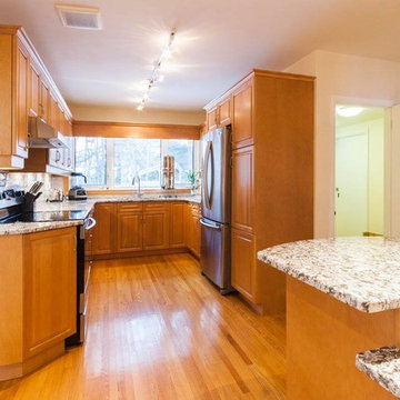
This young couple and their gorgeous daughter bought a fabulous home that needed some updating. The existing kitchen had good bones but they wanted additional cabinetry and built-in seating. Plus an update on the existing kitchen. New peaked subway tile backsplash, granite countertop, double sink & faucet were installed in the existing part of the kitchen along with soft close hinges, pull-outs in the pantry and lazy susans in the corners. We added a coffee bar area on the other side of the kitchen with glass front cabinets and glass shelves to show off their contents. We also added a table height granite table attached to another cabinet and wine rack. The result was a lot of new functional storage and a lovely look! Also in need of some change was the bathroom. The overwhelming green tile was dated and dark. We ripped it all out and started from scratch. The bathtub was removed and a large shower installed. The heated floor tile is wonderful and good for our cold winters! A new window, the tiled walls of the shower, granite threshold and shelf cut-out in the shower, gorgeous new shower faucet, floating vanity, comfort height toilet, updated lighting, matching sink faucet and towel bar accessories completed this upgrade! From a dark green cave to an updated, relaxing and luxurious bathroom.
 KCS Design Inc.
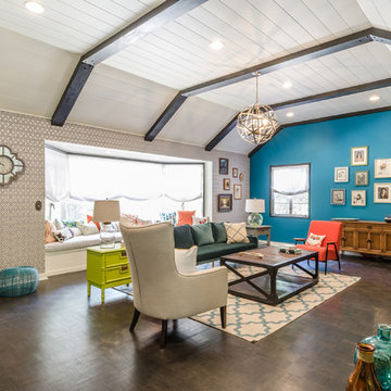
I was hired as the interior designer for HGTV's House Hunters: Renovation to help a young couple remodel their living/dining room in their new home that needed major work. Their style, as they describe it was vintage meets old lady chic with pops of modern industrial. They LOVE color and wanted it everywhere. We ripped off all the old wood paneling on the walls, painted the ceiling white and stained the beams dark, added a wall of vintage wallpaper, painted bright and bold accent walls in every room and found a mixture of pieces from flea markets, vintage stores and main stream stores to create their perfect space.
Photography by Joshua Targownik
www.targophoto.com
 Safferstone Interiors
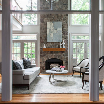
Dennis and Joe have a large, light-filled house. New construction meant lofted space and open floor plans with traditional styling. Running a busy dental practice by day and engaged in a rich social life by night, this couple needed a professional to take the lead on making their house a home.
That’s my cue!
They wanted to take risks, and stay away from “matchy-matchy”. We gussied up a plain ol’ TV room and gave it a healthy dose of luxury.
Our plan was initially inspired by an abstract painting hanging over their stone fireplace. We brought in their love of the outdoors to make things cozy and used family furniture whenever possible for nostalgia and comfort.
I took their love for one-of-a-kind objects and started making a design plan, aiming to solve their biggest frustration: the family room. They had a tortured relationship with a “forgotten family room,” a great space that was spacious and bright, but not at all cozy or joyful, and certainly not “them.”
I wanted to create a cozy space functional for everyday curling up with puppies and watching TV after dinner, yet chic enough for hosting the pre-dinner kitchen overflow and cocktails during parties.
I went looking for contrasting textures and materials. I wanted to balance patterns and scale, and use non-traditional colors as neutrals to create an overall sense of “BAM!”
Dennis and Joe loved the nod to the classics juxtaposed with new and different globally-inspired pieces. For this project our design aesthetic can be described as Middle Eastern/tribal meets mid-century modern. We played to their sensible side with proportion and balance, and stayed as far away from boring/bleh as we could.
From there we moved on to other spaces.. We added colorful pillows and sheer drapery to finish off their formal living room. We kept an inherited bedroom set from Dennis’ Mom and added color, draperies, and pillows to overhaul the guest bedroom.
Their project was not a rip-and-replace, we weren’t starting from scratch with a blank piece of paper.
Rather, our goal was to take what was already there and make it better, more like them. Using functionality first, we focused on giving the house a soothing, joyful aesthetic. We upped the chic factor by a gajillion and helped them find their ‘happy’ at home. See more Safferstone stuff at www.safferstone.com. Connect with us on Facebook, get inspired on Pinterest, and share modern musings on life & design on Instagram. Or, send us a love note at hello@safferstone.com.
Photo: Angie Seckinger
Sponsored
Delaware, OH

Buckeye Basements, Inc.
Central Ohio's Basement Finishing ExpertsBest Of Houzz '13-'21
 KCS Design Inc.
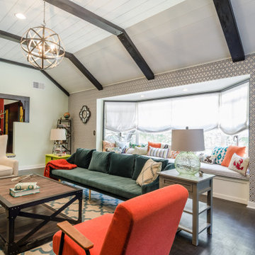
I was hired as the interior designer for HGTV's House Hunters: Renovation to help a young couple remodel their living/dining room in their new home that needed major work. Their style, as they describe it was vintage meets old lady chic with pops of modern industrial. They LOVE color and wanted it everywhere. We ripped off all the old wood paneling on the walls, painted the ceiling white and stained the beams dark, added a wall of vintage wallpaper, painted bright and bold accent walls in every room and found a mixture of pieces from flea markets, vintage stores and main stream stores to create their perfect space.
Photography by Joshua Targownik
www.targophoto.com
 CairnsCraft Design & Remodel
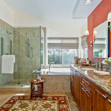
Great spacious bathroom with lot of amenities.
Photographer: Jon Upson
Large elegant master beige tile and porcelain tile drop-in bathtub photo in San Diego with an undermount sink, raised-panel cabinets, medium tone wood cabinets, granite countertops, beige walls and a two-piece toilet
Large elegant master beige tile and porcelain tile drop-in bathtub photo in San Diego with an undermount sink, raised-panel cabinets, medium tone wood cabinets, granite countertops, beige walls and a two-piece toilet
 ALL Renovation & Design LLC
Could a dreadful dishwasher leak be a blessing in disguise?
The Redding kitchen was very odd. The house was a beautiful brick house from the early 1900’s, but the kitchen had been renovated since then with an impractical layout. It worked, but, for as much time as Mr. and Mrs. spend in the kitchen, it left much to be desired. Because they enjoy cooking so much, they dreamed of having a functional kitchen that added to the character of the home and respected the history of it.
So that’s why Mr. and Mrs. went to a Lancaster Home Show where they meet ALL Renovation & Design. They were impressed with our process which guides clients through the design phase in a unique way that guarantees a customized remodel, tailored to their dreams. We really hit it off, but, since they were still in the idea stage, the years passed quickly.
Then one morning they discovered a puddle under the dishwasher. And, as is often the case, the damage had already spread to the surrounding cabinets and a large area of the floor. And upon further inspection, it was discovered that part of the floor was made with asbestos – which would require expert remediation. This was turning into a major rehab project.
That’s when they were faced with a tough call: do they patch it up now and rip it out in a few years when they remodel the entire kitchen, or, do they remodel now? They called ALL Renovation & Design.
First we worked with the insurance company to raise the damage claim to what it would have actually cost to repair the damage done by the leak… several thousand dollars higher than what they had initially appraised it.
Then we guided Mr. and Mrs. through the design process that carefully articulated the goals and vision for the new kitchen. Functionality and complementing the home’s character were top priority. They were extremely pleased with the help we provided in guiding them through the cabinet choices, layout, and color selections.
Communication was key. Especially when we got into the demolition and construction work. One thing you can be sure of when working with older homes is that there are almost always surprises between the walls. For the Redding kitchen it took the form of a steel support beam that we discovered on the second day of demolition. Because it prevented us from opening up the doorway, we had to pivot and adjust the cabinet spacing. Electrical access was also a serious problem that required added creativity to be sure the new space would include all the functionality of a modern kitchen. But all the challenges were overcome through creativity and almost constant communication.
At last, it was complete. Together we transformed the space into a beautiful transitional kitchen that is a joy to work in.
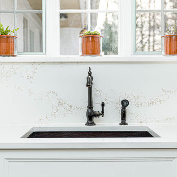
The maple cabinets with full-overlay doors were painted in matte white with copper hardware. The countertop and backsplash were Hanstone Quartz in the Strato color. It included a 30” single-basin sink in 14-gauge hammered copper. For the floor they chose Lauzan Maple Hardwood in the Sahara finish, installed in the herringbone pattern. And to really set off the kitchen, the old appliances were replaced with new GE Café appliances in their classy matte white with brushed copper accents.
10