
Search results for "Santa fe style kitchen ideas" in Home Design Ideas
 Shaw Architecture LLC.
wendy mceahern
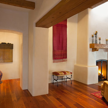
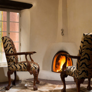
Inspiration for a large southwestern open concept and formal medium tone wood floor, brown floor and exposed beam living room remodel in Albuquerque with beige walls, a standard fireplace, a plaster fireplace and no tv
Inspiration for a large southwestern open concept and formal medium tone wood floor, brown floor and exposed beam living room remodel in Albuquerque with beige walls, a standard fireplace, a plaster fireplace and no tv
 TKS Design Group
Download our free ebook, Creating the Ideal Kitchen. DOWNLOAD NOW
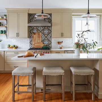
The homeowners came to us looking to update the kitchen in their historic 1897 home. The home had gone through an extensive renovation several years earlier that added a master bedroom suite and updates to the front façade. The kitchen however was not part of that update and a prior 1990’s update had left much to be desired. The client is an avid cook, and it was just not very functional for the family.
The original kitchen was very choppy and included a large eat in area that took up more than its fair share of the space. On the wish list was a place where the family could comfortably congregate, that was easy and to cook in, that feels lived in and in check with the rest of the home’s décor. They also wanted a space that was not cluttered and dark – a happy, light and airy room. A small powder room off the space also needed some attention so we set out to include that in the remodel as well.
See that arch in the neighboring dining room? The homeowner really wanted to make the opening to the dining room an arch to match, so we incorporated that into the design.
Another unfortunate eyesore was the state of the ceiling and soffits. Turns out it was just a series of shortcuts from the prior renovation, and we were surprised and delighted that we were easily able to flatten out almost the entire ceiling with a couple of little reworks.
Other changes we made were to add new windows that were appropriate to the new design, which included moving the sink window over slightly to give the work zone more breathing room. We also adjusted the height of the windows in what was previously the eat-in area that were too low for a countertop to work. We tried to keep an old island in the plan since it was a well-loved vintage find, but the tradeoff for the function of the new island was not worth it in the end. We hope the old found a new home, perhaps as a potting table.
Designed by: Susan Klimala, CKD, CBD
Photography by: Michael Kaskel
For more information on kitchen and bath design ideas go to: www.kitchenstudio-ge.com
 Drury Design
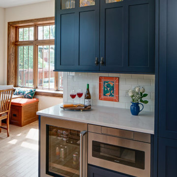
The 100-year old home’s kitchen was old and just didn’t function well. A peninsula in the middle of the main part of the kitchen blocked the path from the back door. This forced the homeowners to mostly use an odd, U-shaped corner of the kitchen.
Design objectives:
-Add an island
-Wow-factor design
-Incorporate arts and crafts with a touch of Mid-century modern style
-Allow for a better work triangle when cooking
-Create a seamless path coming into the home from the backdoor
-Make all the countertops in the space 36” high (the old kitchen had different base cabinet heights)
Design challenges to be solved:
-Island design
-Where to place the sink and dishwasher
-The family’s main entrance into the home is a back door located within the kitchen space. Samantha needed to find a way to make an unobstructed path through the kitchen to the outside
-A large eating area connected to the kitchen felt slightly misplaced – Samantha wanted to bring the kitchen and materials more into this area
-The client does not like appliance garages/cabinets to the counter. The more countertop space, the better!
Design solutions:
-Adding the right island made all the difference! Now the family has a couple of seats within the kitchen space. -Multiple walkways facilitate traffic flow.
-Multiple pantry cabinets (both shallow and deep) are placed throughout the space. A couple of pantry cabinets were even added to the back door wall and wrap around into the breakfast nook to give the kitchen a feel of extending into the adjoining eating area.
-Upper wall cabinets with clear glass offer extra lighting and the opportunity for the client to display her beautiful vases and plates. They add and an airy feel to the space.
-The kitchen had two large existing windows that were ideal for a sink placement. The window closest to the back door made the most sense due to the fact that the other window was in the corner. Now that the sink had a place, we needed to worry about the dishwasher. Samantha didn’t want the dishwasher to be in the way of people coming in the back door – it’s now in the island right across from the sink.
-The homeowners love Motawi Tile. Some fantastic pieces are placed within the backsplash throughout the kitchen. -Larger tiles with borders make for nice accent pieces over the rangetop and by the bar/beverage area.
-The adjacent area for eating is a gorgeous nook with massive windows. We added a built-in furniture-style banquette with additional lower storage cabinets in the same finish. It’s a great way to connect and blend the two areas into what now feels like one big space!
Find the right local pro for your project
 Creative Kitchens & Baths Seattle LLC
Jeff Hawe - Photo
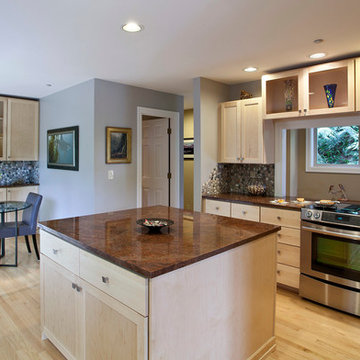
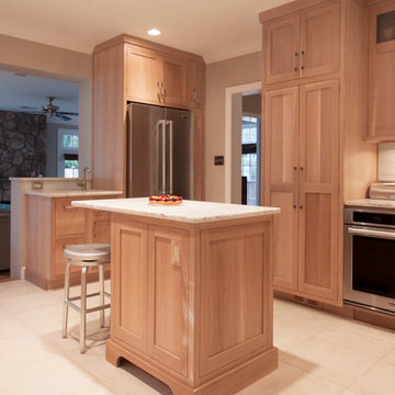
Inspiration for a transitional eat-in kitchen remodel in Seattle with shaker cabinets, light wood cabinets, stone tile backsplash and stainless steel appliances
Inspiration for a transitional eat-in kitchen remodel in Seattle with shaker cabinets, light wood cabinets, stone tile backsplash and stainless steel appliances

 Revival House
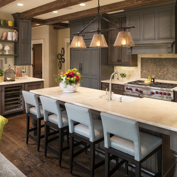
European charm meets a fully modern and super functional kitchen. This beautiful light and airy setting is perfect for cooking and entertaining. Wood beams and dark floors compliment the oversized island with farmhouse sink. Custom cabinetry is designed specifically with the cook in mind, featuring great storage and amazing extras.
James Kruger, Landmark Photography & Design, LLP.
Learn more about our showroom and kitchen and bath design: http://www.mingleteam.com
 PB Kitchen Design
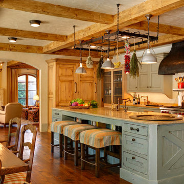
Reminiscent of a villa in south of France, this Old World yet still sophisticated home are what the client had dreamed of. The home was newly built to the client’s specifications. The wood tone kitchen cabinets are made of butternut wood, instantly warming the atmosphere. The perimeter and island cabinets are painted and captivating against the limestone counter tops. A custom steel hammered hood and Apex wood flooring (Downers Grove, IL) bring this room to an artful balance.
Project specs: Sub Zero integrated refrigerator and Wolf 36” range
Interior Design by Tony Stavish, A.W. Stavish Designs
Craig Dugan - Photographer

 Leah Ward Interiors
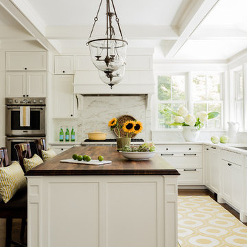
Traditional white marble New England kitchen with walnut wood island and bronze fixtures for added warmth. Photo: Michael J Lee Photography
Kitchen - traditional dark wood floor and brown floor kitchen idea in Boston with an undermount sink, shaker cabinets, white cabinets, white backsplash, marble backsplash, paneled appliances, an island and wood countertops
Kitchen - traditional dark wood floor and brown floor kitchen idea in Boston with an undermount sink, shaker cabinets, white cabinets, white backsplash, marble backsplash, paneled appliances, an island and wood countertops
 Remodel Works Bath & Kitchen
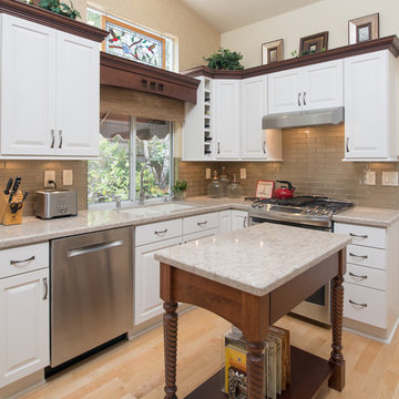
This craftsman style kitchen remodel is surrounded by white Starmark cabinets with Richelieu pulls, accented with Starmark cabinets with a nutmeg stain. The BD Manhattan grey subway tiles fill the backsplash against the light granite countertop. The stainless steel appliances complete this clean, craftsman style kitchen.
 Hallmark Floors
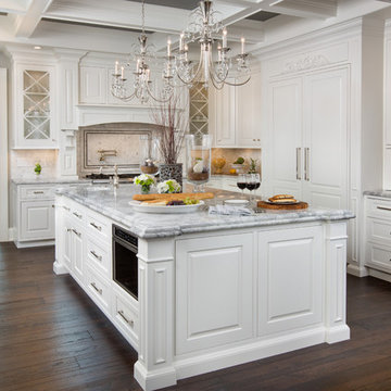
Traditional White Kitchen with Hallmark Floors Alta Vista Collection by Kichen Kraft Inc. Engineered hardwood flooring from Hallmark Floors.
A Gorgeous Traditional White Kitchen with Hallmark Floors, Historic Oak Floors by Kitchen Kraft Inc. This traditional Kitchen remodel was completed with Hallmark Floors Alta Vista Historic Oak Collection by Kitchen Kraft, Inc or Columbus OH. They did a fantastic job combining the updated fashions of white counter tops to the rustic colored accent of the island. Amazing work.
The Alta Vista Historic Oak floors offer a gorgeous contrast to the bright white of all of the other accents within the kitchen. Truly inspiring.
 TKS Design Group
Free ebook, Creating the Ideal Kitchen. DOWNLOAD NOW
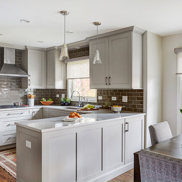
Our clients had been in their home since the early 1980’s and decided it was time for some updates. We took on the kitchen, two bathrooms and a powder room.
The layout in the kitchen was functional for them, so we kept that pretty much as is. Our client wanted a contemporary-leaning transitional look — nice clean lines with a gray and white palette. Light gray cabinets with a slightly darker gray subway tile keep the northern exposure light and airy. They also purchased some new furniture for their breakfast room and adjoining family room, so the whole space looks completely styled and new. The light fixtures are staggered and give a nice rhythm to the otherwise serene feel.
The homeowners were not 100% sold on the flooring choice for little powder room off the kitchen when I first showed it, but now they think it is one of the most interesting features of the design. I always try to “push” my clients a little bit because that’s when things can get really fun and this is what you are paying for after all, ideas that you may not come up with on your own.
We also worked on the two upstairs bathrooms. We started first on the hall bath which was basically just in need of a face lift. The floor is porcelain tile made to look like carrera marble. The vanity is white Shaker doors fitted with a white quartz top. We re-glazed the cast iron tub.
The master bath was a tub to shower conversion. We used a wood look porcelain plank on the main floor along with a Kohler Tailored vanity. The custom shower has a barn door shower door, and vinyl wallpaper in the sink area gives a rich textured look to the space. Overall, it’s a pretty sophisticated look for its smaller fooprint.
Designed by: Susan Klimala, CKD, CBD
Photography by: Michael Alan Kaskel
For more information on kitchen and bath design ideas go to: www.kitchenstudio-ge.com
 TKS Design Group
Free ebook, Creating the Ideal Kitchen. DOWNLOAD NOW
One of my favorite things to work on is older homes with a bit of history because I find it an interesting challenge to marry the historical architectural features of a home with modern design elements that work well for my client’s current lifestyle.
This home was particularly fun because it was the second kitchen we had done for this family and was quite a departure from the style of the first kitchen.
The before shot of the kitchen shows a view from the family room. See the dropped ceiling? We were curious, was this just part of the design or was the dropped ceiling there to hide mechanicals? Well we soon found out that it was mostly decorative (yay!), and with the exception of a little bit of work to some plumbing from an upstairs bathroom and rerouting of the ventilation system within the original floor joists, we were in the clear, phew! The shot of the completed kitchen from roughly the same vantage point shows how much taller the ceilings are. It makes a huge difference in the feel of the space. Dark and gloomy turned fresh and light!
Another serious consideration was what do we do with the skinny transom window above the refrigerator. After much back and forth, we decided to eliminate it and do some open shelving instead. This ended up being one of the nicest areas in the room. I am calling it the “fun zone” because it houses all the barware, wine cubbies and a bar fridge — the perfect little buffet spot for entertaining. It is flanked on either side by pull out pantries that I’m sure will get a ton of use. Since the neighboring room has literally three walls of almost full height windows, the kitchen gets plenty of light.
The gold shelving brackets, large pendant fixtures over the island and the tile mural behind the range all pay subtle homage to the home’s prairie style architecture and bring a bit of sparkle to the room.
Even though the room is quite large, the work triangle is very tight with the large Subzero fridge, sink and range all nearby for easy maneuvering during meal prep. There is seating for four at the island, and work aisles are generous.
Designed by: Susan Klimala, CKD, CBD
Photography by: LOMA Studios
For more information on kitchen and bath design ideas go to: www.kitchenstudio-ge.com
 Cameo Kitchens, Inc.
Kelly Keul Duer and Merima Hopkins
Inspiration for a transitional eat-in kitchen remodel in DC Metro with shaker cabinets, light wood cabinets, quartzite countertops, white backsplash, glass tile backsplash and stainless steel appliances
Inspiration for a transitional eat-in kitchen remodel in DC Metro with shaker cabinets, light wood cabinets, quartzite countertops, white backsplash, glass tile backsplash and stainless steel appliances
Sponsored
Fredericksburg, OH

High Point Cabinets
Columbus' Experienced Custom Cabinet Builder | 4x Best of Houzz Winner
 Tierra Concepts
HOME FEATURES
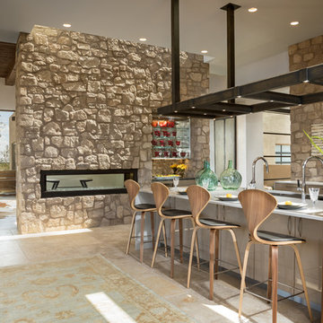
Contexual modern design with contemporary Santa Fe–style elements
Luxuriously open floor plan
Stunning chef’s kitchen perfect for entertaining
Gracious indoor/outdoor living with views of the Sangres
 TKS Design Group
Download our free ebook, Creating the Ideal Kitchen. DOWNLOAD NOW
This client was referred to us from a past client. They are a busy 2-career household with young children and enjoy entertaining friends and family in their home. They have a beautiful open concept home but unfortunately the kitchen was not fitting for the rest of the home. They were not quite sure what to do with the space. We talked about trying to refresh it or do more of a minor remodel, but in the end they decided a full gut would get them to where they wanted to be.
One problem was there was no place for guests to hang out other than the large and awkward banquette area. The brick wall and tiled hood area were feeling a bit dated and tired. The space was just not functional for their lifestyle. There was no prep space near the cooktop and no landing area for items coming out of the ovens or refrigerator, plus a big dead zone in the center of the room.
Banquettes, like the one they previously had in the space, are great for small spaces, but when they get really large like this one, it makes getting in and out of the seating area awkward and uncomfortable. Plus, there was room for a large table, so we eliminated the awkward built in.
We started by removing the faux brick wall between the kitchen and back entry. We relocated the entry to the garage over a couple feet in order to get every last inch out of the new kitchen. We also made the decision to close up the primary window that faced the pretty ho hum brick wall of the neighbor’s house. There was plenty of light coming in from the seating area, so we just didn’t feel the window was adding much to the room.
Construction went smoothy. There was a bit of rework with electrical, flooring and HVAC, but in the end, we think it was well worth it.
The clients really wanted a sleek contemporary look, and we originally had planned for a full height slab backsplash, but due to it’s size, it was a budget buster. Instead, we got creative and settled on large format porcelain tiles that have a similar feel but were a fraction of the cost. We made sure the wall was plumb and level so that the fit and finish would mimic that of slab material.
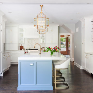
The final space was quite a change. A large prep sink sits directly across from the new pro-style range with plenty additional prep space on the large island. The refrigerator and ovens now have miles of landing space, and a nice tight work triangle makes cooking a breeze.
Since we wanted a more contemporary feel, not many wall cabinets were included. Instead, we outfitted some of the drawers for dish storage with a peg system. Two large pantries flanking the refrigerator hold baking supplies and small appliances. Large drawers by the cooktop hold pots and pans, and an appliance garage tucked away to the left of the range hides away miscellaneous items. The large island also houses a microwave drawer and tons of storage, most of which is drawers offering maximum convenience.
The island now seats 5-6 people comfortably along with the new table in the seating area which can seat up to 8. Entertaining will be a breeze in this space. With such a clean backdrop, we knew we would need some drama with the lighting, so we chose two sets of staggered pendants, which we adjusted for the right visual balance above the island.
We also included a small coffee station to the right of the main kitchen, which helps keep the coffee clutter out of the kitchen proper. Two tones of complimentary gray are featured in this kitchen. The perimeter is a light gray that reads almost white. The island is a gray stain that adds some depth and interest with the visible wood texture. The countertops are clean white quartz, and the hardware, barstools and light fixtures add warm brass tones. I see lots of cooking and entertaining with family and friends in the near future in this bright and airy new space.
Designed by: Susan Klimala, CKD, CBD
Photography by: Michael Kaskel
For more information on kitchen and bath design ideas go to: www.kitchenstudio-ge.com
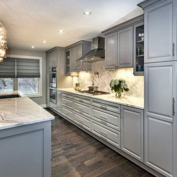
 Reico Kitchen & Bath
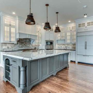
This traditional inspired kitchen design features Merillat Masterpiece cabinets in the Verona raised panel door style in the Pebble Grey Paint finish. Kitchen countertops are Cambria Brittanica.
Photos courtesy of Felicia Evans Photography.
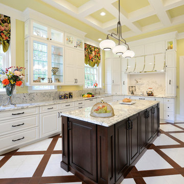
 Marcia Moore Design
Best of Houzz Kitchen Design 2016 winner. A custom kitchen remodel was one of the final projects for this beautiful Georgian Century Home. All the details were part of the effort to maintain the feel of an old kitchen but with all the most current conveniences. Notice the glass cabinet hung in front of a window, granite counter top repeated as the back splash, porcelain tiles that mimic wood and marble on the floor, a stunning island light and the coffered ceiling.
Michael Jacob Photography
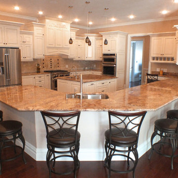
Sponsored
Fredericksburg, OH
High Point Cabinets
Columbus' Experienced Custom Cabinet Builder | 4x Best of Houzz Winner
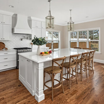
 Ng Living- Custom Cabinetry
This is a classic style Hamptons style kitchen, with shaker style cabinet doors. The kitchen incorporates both traditional and modern fixtures making it a transitional style. The traditional elements include all hardware and plumbing fixtures, whilst the modern white bevelled backsplash tile and Misterio countertops balance out it out to create a transitional sleek kitchen.
 Signature Designs Kitchen | Bath | Interiors
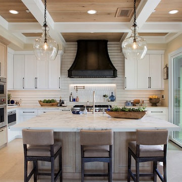
Our client desired a bespoke farmhouse kitchen and sought unique items to create this one of a kind farmhouse kitchen their family. We transformed this kitchen by changing the orientation, removed walls and opened up the exterior with a 3 panel stacking door.
The oversized pendants are the subtle frame work for an artfully made metal hood cover. The statement hood which I discovered on one of my trips inspired the design and added flare and style to this home.
Nothing is as it seems, the white cabinetry looks like shaker until you look closer it is beveled for a sophisticated finish upscale finish.
The backsplash looks like subway until you look closer it is actually 3d concave tile that simply looks like it was formed around a wine bottle.
We added the coffered ceiling and wood flooring to create this warm enhanced featured of the space. The custom cabinetry then was made to match the oak wood on the ceiling. The pedestal legs on the island enhance the characterizes for the cerused oak cabinetry.
Fabulous clients make fabulous projects.
 Period Architecture Ltd.
Angle Eye Photography
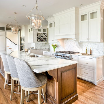
Eat-in kitchen - large traditional l-shaped medium tone wood floor and brown floor eat-in kitchen idea in Philadelphia with an undermount sink, raised-panel cabinets, white cabinets, marble countertops, white backsplash, stone tile backsplash, stainless steel appliances, an island and white countertops
Eat-in kitchen - large traditional l-shaped medium tone wood floor and brown floor eat-in kitchen idea in Philadelphia with an undermount sink, raised-panel cabinets, white cabinets, marble countertops, white backsplash, stone tile backsplash, stainless steel appliances, an island and white countertops
3