
Search results for "Scatter" in Home Design Ideas

 Reyes Creative Concepts LLC.
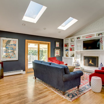
Living Room:
Our customer wanted to update the family room and the kitchen of this 1970's splanch. By painting the brick wall white and adding custom built-ins we brightened up the space. The decor reflects our client's love for color and a bit of asian style elements. We also made sure that the sitting was not only beautiful, but very comfortable and durable. The sofa and the accent chairs sit very comfortably and we used the performance fabrics to make sure they last through the years. We also wanted to highlight the art collection which the owner curated through the years.
Kithen:
We enlarged the kitchen by removing a partition wall that divided it from the dining room and relocated the entrance. Our goal was to create a warm and inviting kitchen, therefore we selected a mellow, neutral palette. The cabinets are soft Irish Cream as opposed to a bright white. The mosaic backsplash makes a statement, but remains subtle through its beige tones. We selected polished brass for the hardware, as well as brass and warm metals for the light fixtures which emit a warm and cozy glow.
For beauty and practicality, we used quartz for the working surface countertops and for the island we chose a sophisticated leather finish marble with strong movement and gold inflections. Because of our client’s love for Asian influences, we selected upholstery fabric with an image of a dragon, chrysanthemums to mimic Japanese textiles, and red accents scattered throughout.
Functionality, aesthetics, and expressing our clients vision was our main goal.
Photography: Jeanne Calarco, Context Media Development

 Indian River Furniture
Coastal Living by Stanley Hooker
Mid-sized beach style formal and open concept light wood floor living room photo in Orlando with white walls, no fireplace and no tv
Mid-sized beach style formal and open concept light wood floor living room photo in Orlando with white walls, no fireplace and no tv
Find the right local pro for your project


 Winder Gibson Architects
Working from the existing home’s deficits, we designed a bright and classic home well-suited to today’s living. Instead of a dark tunnel-like entry, we have a skylight custom curving stair that no one can believe is not original. Instead of a maze of rooms to reach the gorgeous park-like backyard, we have a clear central axis, allowing a sightline right through from the top of the stairs. Instead of three bedrooms scattered all over the house, we have zoned them to the second floor, each well-proportioned with a true master suite. Painted wood paneling, face-frame cabinets, box-beam beilings and Calacatta counters express the classic grandeur of the home.
 Winder Gibson Architects
Working from the existing home’s deficits, we designed a bright and classic home well-suited to today’s living. Instead of a dark tunnel-like entry, we have a skylight custom curving stair that no one can believe is not original. Instead of a maze of rooms to reach the gorgeous park-like backyard, we have a clear central axis, allowing a sightline right through from the top of the stairs. Instead of three bedrooms scattered all over the house, we have zoned them to the second floor, each well-proportioned with a true master suite. Painted wood paneling, face-frame cabinets, box-beam beilings and Calacatta counters express the classic grandeur of the home.
 lavish
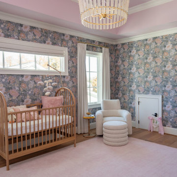
These two adjoining girls' rooms — a show-stopping nursery and a dreamy toddler bedroom — are among the most enchanting children's spaces imaginable. Each room has its own distinct personality while sharing a thread of botanical wonder, soft femininity, and elevated design that refuses to talk down to its young inhabitants. These are spaces designed not just for children, but with genuine artistry — rooms that will inspire wonder for years to come.
The Nursery
Step into this nursery and feel immediately transported into a secret garden at dusk. The design decision that sets the entire room apart is breathtakingly bold: a large-scale dark floral wallpaper — blooming with oversized peonies, roses, and wildflowers in dusty pink, peach, sage, and cream against a deep slate blue ground — wraps every wall from chair rail to ceiling, creating an immersive, almost painterly environment that feels simultaneously dramatic and deeply soft.
The ceiling is painted a warm, powdery pink that picks up the blush tones within the wallpaper perfectly — a "fifth wall" design moment that makes the room feel like a complete, considered installation rather than a decorated room. The transition from wallpapered walls to pink ceiling at the crown molding line is seamless and intentional, wrapping the baby in a floral garden overhead and all around.
Anchoring the room with genuine design authority is a spectacular gold and crystal chandelier — its circular brass frame hung with vertical crystal rods that catch and scatter light like a garden in rain — elevating the nursery from charming to genuinely luxurious. Beneath it, a natural oak arched spindle crib sits against the wallpapered feature wall, its warm honey wood grain providing organic contrast to the moody floral backdrop. Pink velvet pillows and a soft crib mobile of plush clouds and moons complete the crib vignette with gentle whimsy.
A boucle glider chair and matching stacked ottoman in cream provide the nursing corner, paired with a small brass side table for midnight essentials. A soft blush pink area rug anchors the seating area and echoes the ceiling color. Linen drapery panels in soft ivory frame the windows without competing with the wallpaper, their pinch-pleat heading adding a refined tailoring detail.
The Toddler Bedroom
The connecting bedroom takes the botanical theme in a softer, sunnier direction — all blush pink walls (matching ceiling and walls in the same warm rose tone for a cocooning effect), botanical print drapery in cream with red and green wildflowers, and brass curtain hardware that ties to the nursery's gold palette. A gold spindle crib — the metallic version of the nursery's wooden one — grounds the room with warmth, while a sage green upholstered glider provides a reading corner. A white dresser with brass hardware doubles as a changing table, topped with art prints and a Matisse-inspired framed poster in a gold frame that adds a touch of grown-up gallery sensibility.
Floating acrylic shelves hold a curated collection of board books at child-height — a detail that communicates that this room was designed for a child who will love and use it, not just admire it. A whimsical wicker llama toy basket, an indoor olive tree, and a fluffy white boucle child's armchair complete a room that balances magic with livability.
 Truss Interiors & Renovations
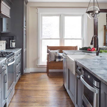
Spacious city kitchen with a country feel. Hardwood floors with grey painted Shaker style kitchen cabinets. Plenty of storage. Generous island with marble counter tops and farmhouse sink. Stainless steel appliances.
 STONEYARD®
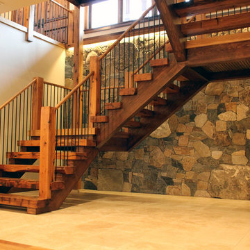
A perfect blend of old world charm and modern luxury, this home is sure to be a neighborhood favorite. An open layout with inviting fireplaces make this the perfect place for entertaining and relaxing. Around the home you will find unique stone accents, wood and metal staircases, custom kitchen and bathrooms, and a rec room complete with bar and pool table.
This craftsman style residence uses a mix of the Boston Blend Mosaic and Square & Rectangular thin stone veneer. It was used as a kitchen backsplash, interior wall accent, on multiple fireplaces, and stone archways. Great care was taken so the stones could be installed without a mortared joint. Corners were used along archways to create the illusion of full thickness stones and to allow for a more consistent and complete look. Scattered throughout, the mason cut custom large pieces of stone and wood to use as focal points.
New England’s finest real stone veneer was the perfect choice to pair with the rustic décor. The variety of colors offered in our popular Boston Blend complement any design setting with an elegant touch.
For more photos and video, please visit www.stoneyard.com/973
 Russell Landscape Construction
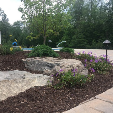
Walkway connecting the large paver patio with the driveway. The patio was constructed using Techo-Bloc Blu 60mm slabs in the Sandlewood blend. Kichler path lights are used to illuminate the patio/walkway and the boulders and flowering perennials within the landscape beds, while Kichler accent lights were placed beneath the larger accent plants of the landscape, including a Japanese White Pine and scattered Kousa Dogwood trees.
 Reyes Creative Concepts LLC.
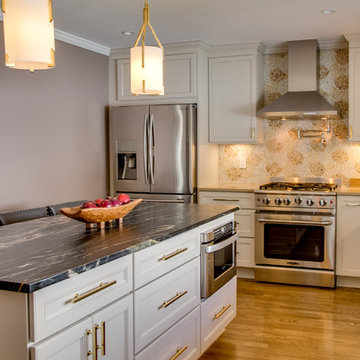
The owner wanted to update the family room and the kitchen of this 1970's splanch. By painting the brick wall white and adding custom built-ins we brightened up the space. The decor reflects our client's love for color and a bit of asian style elements. We also made sure that the sitting was not only beautiful, but very comfortable and durable. The sofa and the accent chairs sit very comfortably and we used the performance fabrics to make sure they last through the years. We also wanted to highlight the art collection which the owner curated through the years.
We enlarged the kitchen by removing a partition wall that divided it from the dining room and relocated the entrance. Our goal was to create a warm and inviting kitchen, therefore we selected a mellow, neutral palette. The cabinets are soft Irish Cream as opposed to a bright white. The mosaic backsplash makes a statement, but remains subtle through its beige tones. We selected polished brass for the hardware, as well as brass and warm metals for the light fixtures which emit a warm and cozy glow.
For beauty and practicality, we used quartz for the working surface countertops and for the island we chose a sophisticated leather finish marble with strong movement and gold inflections. Because of our client’s love for Asian influences, we selected upholstery fabric with an image of a dragon, chrysanthemums to mimic Japanese textiles, and red accents scattered throughout.
Functionality, aesthetics, and expressing our clients vision was our main goal.
Photography: Jeanne Calarco, Context Media Development
 Grunberger Interiors
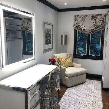
My client requested a cosy dressing room area with a black and white Chanel inspired theme. The closet compartments and storage are comprised of a linen white with edging details in a high gloss black. I created a center dresser in black lacquer to match, with unique polished nickel pulls. For make up there is a dressing table in white glass with nickel accents, an electrified mirror and custom upholstered vanity chair. Relaxed roman shades in a large floral print coordinate with leopard accents and geometric fabrics.
 Rocky Tops Granite & Marble LLC
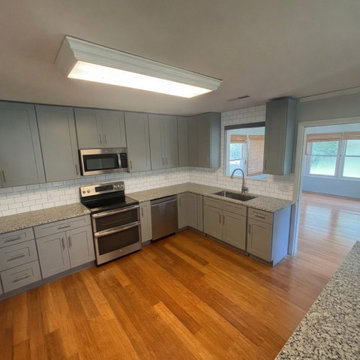
This West Columbia kitchen got new countertops in White Alpes granite, a stone with a light background scattered through with dark speckling and mineral flecks that catch the light differently depending on where you stand. It's the kind of pattern that reads calm from across the room and gets more interesting up close, which is exactly what you want on a surface you're going to be looking at every day.
Granite like this is quarried and cut into slabs, then polished to bring out that natural fleck and depth. It's dense, heat resistant, and about as tough a countertop material as you can put in a kitchen. You can set a hot pan on it without worrying, and it shrugs off the daily knife-and-cutting-board traffic that wears down softer stones. With a good sealer applied at install, it resists staining from wine, oil, and the usual kitchen spills for years before it needs to be redone.
We templated the space to fit around the existing gray shaker cabinets and stainless appliances, cutting the sink opening for the stainless steel sink and squaring up the seams so the pattern in the granite carries through cleanly from one run to the next. That's the part of the job that doesn't show up in a photo: getting the slab cut so the speckling doesn't look choppy at the seam, and getting the sink cutout dialed in so the reveal is even all the way around.
With the backsplash area still open, the countertop is doing a lot of the visual work right now, and it's holding its own. The light background of the White Alpes plays well against the gray cabinetry, and it'll give whatever backsplash goes in next a neutral, textured surface to build off of.
We do a lot of this kind of granite work around West Columbia and the rest of the Midlands. Kitchens like this one are a good reminder of why granite has stayed a go-to choice for so long: it looks good, it holds up, and it doesn't ask much of the homeowner once it's in.


 Bentoreno
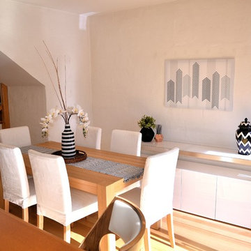
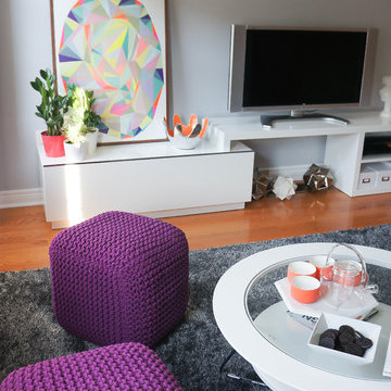
Beautiful pop colours are scattered throughout the living space!
Large trendy open concept medium tone wood floor living room photo in Toronto with gray walls, a standard fireplace, a stone fireplace and a tv stand
Large trendy open concept medium tone wood floor living room photo in Toronto with gray walls, a standard fireplace, a stone fireplace and a tv stand
 Decorating Den Interiors-Barbara Tabak
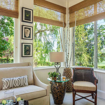
The inspiration for this room’s design was inspired by the beautiful view found outside the windows. Not wanting to compete with Mother Nature I selected neutral color pallet to blend with the idyllic surroundings. The clean sleek lines of the upholstered furnishings sit in juxtaposition to the natural elements—the woven wood blinds, the driftwood coffee table, the slate and copper wall fountain and other accessories— that are scattered throughout the room. Altogether, the room’s design creates a wonderful area to relax, entertain or simply enjoy the scenery.

 Mogul Interior
 https://www.mogulinterior.com/collections/rustic-furniture
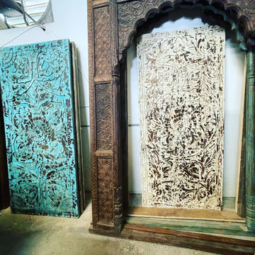
Indian decor is rich in color, pattern and texture, an authentic antique damchiya fills the room with exotic flair. An antique Indian bench made from oxcarts and layered with colorful pillows, transforms this urban New York apartment into a vibrant, energetic space. Block printed cotton throws are scattered on the sofas and an antique triple arch graces the main wall of the living room. Unique architectural remnants and paintings are the focus and give a pop of color against the white wall. A huge brass cladded hope chest sits in the foyer and is useful to store extra blankets.
 b Studio Architecture
The site was abandoned and in disrepair, and on it a classic Charleston Freeman Cottage, along with a few shacks and what might have originally been a garage sat scattered on this long narrow site.
The new owners saw the potential to bring this small home back to life while maintaining the existing street presences and expanding the cottage to better fit a modern life.
We were able to arrange additions in a way that created a village massing where one larger home felt like many and saved a shared courtyard with the small commercial structure. The space is inmate and urban, while allowing for a 4 Bedroom home to snuggle into the streetscape. The ramshackle garage space was brought back to life as micro-commercial space, activating the sidewalk.
52