Search results for "Segment" in Home Design Ideas

This "Palatial Villa" is an architectural statement, amidst a sprawling country setting. An elegant, modern revival of the Spanish Tudor style, the high-contrast white stucco and black details pop against the natural backdrop.
Round and segmental arches lend an air of European antiquity, and fenestrations are placed providently, to capture picturesque views for the occupants. Massive glass sliding doors and modern high-performance, low-e windows, bathe the interior with natural light and at the same time increase efficiency, with the highest-rated air-leakage and water-penetration resistance.
Inside, the lofty ceilings, rustic beam detailing, and wide-open floor-plan inspire a vast feel. Patterned repetition of dark wood and iron elements unify the interior design, creating a dynamic contrast with the white, plaster faux-finish walls.
A high-efficiency furnace, heat pump, heated floors, and Control 4 automated environmental controls ensure occupant comfort and safety. The kitchen, wine cellar, and adjoining great room flow naturally into an outdoor entertainment area. A private gym and his-and-hers offices round out a long list of luxury amenities.
With thoughtful design and the highest quality craftsmanship in every detail, Palatial Villa stands out as a gleaming jewel, set amongst charming countryside environs.

The owners of this cheery and bright kitchen and dining room are a young family with a busy and active life. They approached KMI because they needed an updated kitchen that functionally served their needs better and allowed for more connection to the dining room for entertaining. Where the peninsula stands currently, there once stood a wall completely segmenting the two spaces. We worked with a structural engineer to help our clients eliminate that wall so we could create the open floor plan they were dreaming of.
We also helped our clients think creatively about maximizing storage in their small but mighty kitchen. In smaller spaces, good organization is all the more important. We added a pantry cabinet, utilized dead space by the fridge for open shelves, and added storage drawers to the built-in bench seat in the breakfast nook – not for storing serveware, but for their two boys' Lego collection that once lived on the table.
When it came to the finishes and the design, we knew this kitchen needed to fit into the historic craftsman home. We chose colors and fixtures that honored the age and style of the home while allowing the kitchen to also fit the aesthetic of a modern family. Wood accents, brass hardware, and the pop of deep blue in the peninsula were chosen to add warmth and character to the space, while the creamy off-white cabinets add an air of lightness and brightness to the kitchen, ultimately creating an effortlessly balanced design.

25' of Marvin Lift & Slide doors (5 panels)
Family room - modern concrete floor family room idea in Salt Lake City with white walls
Find the right local pro for your project
The owners of this cheery and bright kitchen and dining room are a young family with a busy and active life. They approached KMI because they needed an updated kitchen that functionally served their needs better and allowed for more connection to the dining room for entertaining. Where the peninsula stands currently, there once stood a wall completely segmenting the two spaces. We worked with a structural engineer to help our clients eliminate that wall so we could create the open floor plan they were dreaming of.
We also helped our clients think creatively about maximizing storage in their small but mighty kitchen. In smaller spaces, good organization is all the more important. We added a pantry cabinet, utilized dead space by the fridge for open shelves, and added storage drawers to the built-in bench seat in the breakfast nook – not for storing serveware, but for their two boys' Lego collection that once lived on the table.
When it came to the finishes and the design, we knew this kitchen needed to fit into the historic craftsman home. We chose colors and fixtures that honored the age and style of the home while allowing the kitchen to also fit the aesthetic of a modern family. Wood accents, brass hardware, and the pop of deep blue in the peninsula were chosen to add warmth and character to the space, while the creamy off-white cabinets add an air of lightness and brightness to the kitchen, ultimately creating an effortlessly balanced design.

photos by Everett Fenton Gidley
Modern exterior home idea in Los Angeles

The owners of this cheery and bright kitchen and dining room are a young family with a busy and active life. They approached KMI because they needed an updated kitchen that functionally served their needs better and allowed for more connection to the dining room for entertaining. Where the peninsula stands currently, there once stood a wall completely segmenting the two spaces. We worked with a structural engineer to help our clients eliminate that wall so we could create the open floor plan they were dreaming of.
We also helped our clients think creatively about maximizing storage in their small but mighty kitchen. In smaller spaces, good organization is all the more important. We added a pantry cabinet, utilized dead space by the fridge for open shelves, and added storage drawers to the built-in bench seat in the breakfast nook – not for storing serveware, but for their two boys' Lego collection that once lived on the table.
When it came to the finishes and the design, we knew this kitchen needed to fit into the historic craftsman home. We chose colors and fixtures that honored the age and style of the home while allowing the kitchen to also fit the aesthetic of a modern family. Wood accents, brass hardware, and the pop of deep blue in the peninsula were chosen to add warmth and character to the space, while the creamy off-white cabinets add an air of lightness and brightness to the kitchen, ultimately creating an effortlessly balanced design.

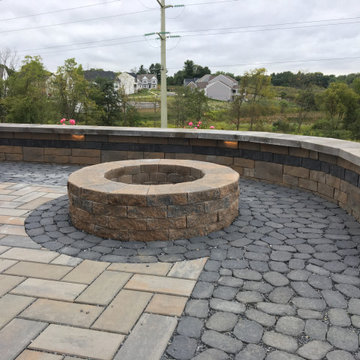
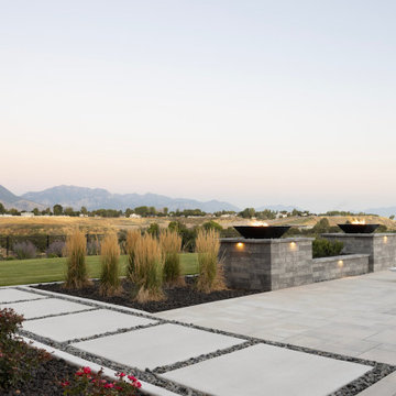
The segmented concrete pavers, exposed aggregate concrete patio, river rock bed, and manicured lawn show a great variety and contrast of textures that can be created on ground planes at this coastal cottage landscape on the Puget Sound in Washington State.

This Northwest version of an Italian villa is 4,300 square foot home was designed based on a sketch from the homeowner. BC&J Architecture brought to life the home owners vision of how an Italian countryside family home might grow through the generations.
The main body of the house is separated from the garage and 650 square foot studio by the stone base of an upper terrace space with a with gorgeous water views. Breaking the structure into segments reinforces the idea the home could have expanded over time and generations.

The gray-taupe paint color perfectly compliments the fabric of the seating and shows off the architectural details of the stunning built in cabinets. By painting the back wall of the open bookshelves, these are given depth and interest.

Inspiration for a mid-sized traditional shade backyard stone garden path in New York.

This large, apron front, single bowl Crosstown by Elkay sink brings together urban design with universal appeal.
Sink: ECTRUF30179R Faucet: LKHA2031NK Soap Dispenser: LKGT1054NK

The need to have the rear garden enclosed provided an opportunity to combine a Shinto Torii gateway with a stylized Chinese moon gate - Jeff Stapleton

When an international client moved from Brazil to Stamford, Connecticut, they reached out to Decor Aid, and asked for our help in modernizing a recently purchased suburban home. The client felt that the house was too “cookie-cutter,” and wanted to transform their space into a highly individualized home for their energetic family of four.
In addition to giving the house a more updated and modern feel, the client wanted to use the interior design as an opportunity to segment and demarcate each area of the home. They requested that the downstairs area be transformed into a media room, where the whole family could hang out together. Both of the parents work from home, and so their office spaces had to be sequestered from the rest of the house, but conceived without any disruptive design elements. And as the husband is a photographer, he wanted to put his own artwork on display. So the furniture that we sourced had to balance the more traditional elements of the house, while also feeling cohesive with the husband’s bold, graphic, contemporary style of photography.
The first step in transforming this house was repainting the interior and exterior, which were originally done in outdated beige and taupe colors. To set the tone for a classically modern design scheme, we painted the exterior a charcoal grey, with a white trim, and repainted the door a crimson red. The home offices were placed in a quiet corner of the house, and outfitted with a similar color palette: grey walls, a white trim, and red accents, for a seamless transition between work space and home life.
The house is situated on the edge of a Connecticut forest, with clusters of maple, birch, and hemlock trees lining the property. So we installed white window treatments, to accentuate the natural surroundings, and to highlight the angular architecture of the home.
In the entryway, a bold, graphic print, and a thick-pile sheepskin rug set the tone for this modern, yet comfortable home. While the formal room was conceived with a high-contrast neutral palette and angular, contemporary furniture, the downstairs media area includes a spiral staircase, comfortable furniture, and patterned accent pillows, which creates a more relaxed atmosphere. Equipped with a television, a fully-stocked bar, and a variety of table games, the downstairs media area has something for everyone in this energetic young family.

These West Chester, PA, homeowners were looking something new in their master bathroom and his and her's walk in closets. The original space was too segmented and enclosed. So we re-configured and renovated the two water closets, main bathroom area, and two walk in closets. The new spaces are bright, open, and contemporary, featuring Calcutta marble, a soaking tub alcove with built-in shelves and custom millwork,a large marble shower with body jets and multiple shower heads, and custom cabinetry and shelving, and a make up desk in the walk in closets.
RUDLOFF Custom Builders has won Best of Houzz for Customer Service in 2014, 2015 2016 and 2017. We also were voted Best of Design in 2016, 2017 and 2018, which only 2% of professionals receive. Rudloff Custom Builders has been featured on Houzz in their Kitchen of the Week, What to Know About Using Reclaimed Wood in the Kitchen as well as included in their Bathroom WorkBook article. We are a full service, certified remodeling company that covers all of the Philadelphia suburban area. This business, like most others, developed from a friendship of young entrepreneurs who wanted to make a difference in their clients’ lives, one household at a time. This relationship between partners is much more than a friendship. Edward and Stephen Rudloff are brothers who have renovated and built custom homes together paying close attention to detail. They are carpenters by trade and understand concept and execution. RUDLOFF CUSTOM BUILDERS will provide services for you with the highest level of professionalism, quality, detail, punctuality and craftsmanship, every step of the way along our journey together.
Specializing in residential construction allows us to connect with our clients early on in the design phase to ensure that every detail is captured as you imagined. One stop shopping is essentially what you will receive with RUDLOFF CUSTOM BUILDERS from design of your project to the construction of your dreams, executed by on-site project managers and skilled craftsmen. Our concept, envision our client’s ideas and make them a reality. Our mission; CREATING LIFETIME RELATIONSHIPS BUILT ON TRUST AND INTEGRITY.
Photo Credit: JMB Photoworks

Daylight was maximized in a previously segmented and enclosed space by removing a load-bearing wall to the living room. The kitchen design incorporates a new island for added countertop space and entertaining. 10K worked closely with our clients to ensure the existing mid-century integrity of the home was maintained.

The owners of this cheery and bright kitchen and dining room are a young family with a busy and active life. They approached KMI because they needed an updated kitchen that functionally served their needs better and allowed for more connection to the dining room for entertaining. Where the peninsula stands currently, there once stood a wall completely segmenting the two spaces. We worked with a structural engineer to help our clients eliminate that wall so we could create the open floor plan they were dreaming of.
We also helped our clients think creatively about maximizing storage in their small but mighty kitchen. In smaller spaces, good organization is all the more important. We added a pantry cabinet, utilized dead space by the fridge for open shelves, and added storage drawers to the built-in bench seat in the breakfast nook – not for storing serveware, but for their two boys' Lego collection that once lived on the table.
When it came to the finishes and the design, we knew this kitchen needed to fit into the historic craftsman home. We chose colors and fixtures that honored the age and style of the home while allowing the kitchen to also fit the aesthetic of a modern family. Wood accents, brass hardware, and the pop of deep blue in the peninsula were chosen to add warmth and character to the space, while the creamy off-white cabinets add an air of lightness and brightness to the kitchen, ultimately creating an effortlessly balanced design.

 
Download our free ebook, Creating the Ideal Kitchen. DOWNLOAD NOW
 
Lakefront property in the northwest suburbs of Chicago is hard to come by, so when we were hired by this young family with exactly that, we were immediately inspired by not just the unusually large footprint of this 1950’s colonial revival but also the lovely views of the manmade lake it was sited on. The large 5-bedroom home was solidly stuck in the 1980’s, but we saw tons of potential. We started out by updating the existing staircase with a fresh coat of paint and adding new herringbone slate to the entry hall.
The powder room off the entryway also got a refresh - new flooring, new cabinets and fixtures. We ran the new slate right through into this space for some consistency. A fun wallpaper and shiplap trim add a welcoming feel and set the tone for the home.
Next, we tackled the kitchen. Located away from the rest of the first floor, the kitchen felt a little isolated, so we immediately began planning for how to better connect it to the rest of the first floor. We landed on removing the wall between the kitchen and dining room and designed a modified galley style space with separate cooking and clean up zones. The cooking zone consists of the refrigerator, prep sink and cooktop, along with a nice long run of prep space at the island. The cleanup side of the kitchen consists of the main sink and dishwasher. Both areas are situated so that the user can view the lake during prep work and cleanup!
One of the home’s main puzzles was how to incorporate the mudroom and area in front of the patio doors at the back of the house. We already had a breakfast table area, so the space by the patio doors was a bit of a no man’s land. We decided to separate the kitchen proper from what became the new mudroom with a large set of barn doors. That way you can quickly hide any mudroom messes but have easy access to the light coming in through the patio doors as well as the outdoor grilling station. We also love the impact the barn doors add to the overall space.
The homeowners’ first words to us were “it’s time to ditch the brown,” so we did! We chose a lovely blue pallet that reflects the home’s location on the lake which is also vibrant yet easy on the eye. Countertops are white quartz, and the natural oak floor works well with the other honey accents. The breakfast table was given a refresh with new chairs, chandelier and window treatments that frame the gorgeous views of the lake out the back.
We coordinated the slate mudroom flooring with that used in the home’s main entrance for a consistent feel. The storage area consists of open and closed storage to allow for some clutter control as needed.
Next on our “to do” list was revamping the dated brown bar area in the neighboring dining room. We eliminated the clutter by adding some closed cabinets and did some easy updates to help the space feel more current. One snag we ran into here was the discovery of a beam above the existing open shelving that had to be modified with a smaller structural beam to allow for our new design to work. This was an unexpected surprise, but in the end we think it was well worth it!
We kept the colors here a bit more muted to blend with the homeowner’s existing furnishings. Open shelving and polished nickel hardware add some simple detail to the new entertainment zone which also looks out onto the lake!
Next we tackled the upstairs starting with the homeowner’s son’s bath. The bath originally had both a tub shower and a separate shower, so we decided to swap out the shower for a new laundry area. This freed up some space downstairs in what used to be the mudroom/laundry room and is much more convenient for daily laundry needs.
We continued the blue palette here with navy cabinetry and the navy tile in the shower. Porcelain floor tile and chrome fixtures keep maintenance to a minimum while matte black mirrors and lighting add some depth the design. A low maintenance runner adds some warmth underfoot and ties the whole space together.
We added a pocket door to the bathroom to minimize interference with the door swings. The left door of the laundry closet is on a 180 degree hinge to allow for easy full access to the machines. Next we tackled the master bath which is an en suite arrangement. The original was typical of the 1980’s with the vanity outside of the bathroom, situated near the master closet. And the brown theme continued here with multiple shades of brown.
Our first move was to segment off the bath and the closet from the master bedroom. We created a short hall from the bedroom to the bathroom with his and hers walk-in closets on the left and right as well as a separate toilet closet outside of the main bathroom for privacy and flexibility.
The original bathroom had a giant soaking tub with steps (dangerous!) as well as a small shower that did not work well for our homeowner who is 6’3”. With other bathtubs in the home, they decided to eliminate the tub and create an oversized shower which takes up the space where the old tub was located. The double vanity is on the opposite wall and a bench is located under the window for morning conversations and a place to set a couple of towels.
The pallet in here is light and airy with a mix of blond wood, creamy porcelain and marble tile, and brass accents. A simple roman shade adds some texture and it’s top-down mechanism allows for light and privacy.
This large whole house remodel gave our homeowners not only the ability to maximize the potential of their home but also created a lovely new frame from which to view their fabulous lake views.
Designed by: Susan Klimala, CKD, CBD
Photography by: Michael Kaskel
For more information on kitchen and bath design ideas go to: www.kitchenstudio-ge.com

This kitchen was once segmented off, by opening up the space and creating an island for seating, storage and prep space, this North Dallas kitchen was transformed into a unique and open space. Gorgeous quartzite countertop creates a visual statement while uniquely patterned back splash displays the homeowners distinctive taste! Floorplan design by Chad Hatfield, CR, CKBR. Photography by Lauren Brown of Versatile Imaging.

This "Palatial Villa" is an architectural statement, amidst a sprawling country setting. An elegant, modern revival of the Spanish Tudor style, the high-contrast white stucco and black details pop against the natural backdrop.
Round and segmental arches lend an air of European antiquity, and fenestrations are placed providently, to capture picturesque views for the occupants. Massive glass sliding doors and modern high-performance, low-e windows, bathe the interior with natural light and at the same time increase efficiency, with the highest-rated air-leakage and water-penetration resistance.
Inside, the lofty ceilings, rustic beam detailing, and wide-open floor-plan inspire a vast feel. Patterned repetition of dark wood and iron elements unify the interior design, creating a dynamic contrast with the white, plaster faux-finish walls.
A high-efficiency furnace, heat pump, heated floors, and Control 4 automated environmental controls ensure occupant comfort and safety. The kitchen, wine cellar, and adjoining great room flow naturally into an outdoor entertainment area. A private gym and his-and-hers offices round out a long list of luxury amenities.
With thoughtful design and the highest quality craftsmanship in every detail, Palatial Villa stands out as a gleaming jewel, set amongst charming countryside environs.
32