Search results for "Segment" in Home Design Ideas

Comfort conditioning for the addition is provided by a split system VRV heat pump that is segmented from the rest of the home and delivered through a discreetly placed cassette.

Attached to the main floor master suite is a private bath with large vanity and walk-in tiled shower.
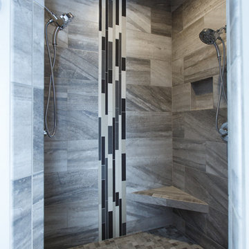
Inspiration for a mid-sized contemporary master gray tile and glass tile porcelain tile alcove shower remodel in Seattle with flat-panel cabinets, dark wood cabinets, a two-piece toilet, gray walls, an undermount sink and quartz countertops

This 1950's home was chopped up with the segmented rooms of the period. The front of the house had two living spaces, separated by a wall with a door opening, and the long-skinny hearth area was difficult to arrange. The kitchen had been remodeled at some point, but was still dated. The homeowners wanted more space, more light, and more MODERN. So we delivered.
We knocked out the walls and added a beam to open up the three spaces. Luxury vinyl tile in a warm, matte black set the base for the space, with light grey walls and a mid-grey ceiling. The fireplace was totally revamped and clad in cut-face black stone.
Cabinetry and built-ins in clear-coated maple add the mid-century vibe, as does the furnishings. And the geometric backsplash was the starting inspiration for everything.
We'll let you just peruse the photos, with before photos at the end, to see just how dramatic the results were!
Find the right local pro for your project

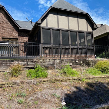
walk down segmented stair at rear of deck from deck level two.
Designed by Michael Raso, AIA
Inspiration for a timeless deck remodel in New York

This 1950's home was chopped up with the segmented rooms of the period. The front of the house had two living spaces, separated by a wall with a door opening, and the long-skinny hearth area was difficult to arrange. The kitchen had been remodeled at some point, but was still dated. The homeowners wanted more space, more light, and more MODERN. So we delivered.
We knocked out the walls and added a beam to open up the three spaces. Luxury vinyl tile in a warm, matte black set the base for the space, with light grey walls and a mid-grey ceiling. The fireplace was totally revamped and clad in cut-face black stone.
Cabinetry and built-ins in clear-coated maple add the mid-century vibe, as does the furnishings. And the geometric backsplash was the starting inspiration for everything.
We'll let you just peruse the photos, with before photos at the end, to see just how dramatic the results were!

1- story Mid-Century Brick Ranch undergoes a magnificent transformation | by opening up the segmented first floor into an open-concept layout on the first floor. Master Suite - wing is added on the rear of the house and a 2nd Floor is added for bedrooms, Study, Exercise Room, and Screened-in Porch. A 360 degree negative edge pool in the rear caps off this exciting renovation.

BOSSA – the successful real wood surface programme for elegant cosiness
In its 2021 collection, LEICHT entered completely new territory and laid the foundation for a new type
of room concept and furnishing aesthetic in the high-end kitchen segment with the BOSSA programme.
Their courage was rewarded: since its market launch, BOSSA has proven to be extremely successful and
style-defining for diverse planning in the cross-kitchen living area. The characteristic design element is
the vertically lined surface structure of the real wood fronts, which makes a powerful statement. Protruding,
linear ridges, 7.5 millimetres wide with a gap of 5 millimetres between each ridge, give BOSSA
a delicate, extremely vital, three-dimensional look. The overall grid of the ridges of 12.5 millimetres corresponds
exactly to the vertical joint pattern of LEICHT – a graphic effect the new pullout system M8
also uses for orientation. The result is a stringent, visual fusion of kitchen, wall and unit fronts to create
a furnishing soloist. BOSSA comes in two veneers: the version in light oak has a Scandinavian look characterised
by tranquillity, while the version in dark walnut is sublime and elegantly reminiscent of Italian
‘grandezza’. BOSSA is architectural, modern, bold – and will retain these characteristics in the living space
of the future, too.

This Northwest version of an Italian villa is 4,300 square foot home was designed based on a sketch from the homeowner. BC&J Architecture brought to life the home owners vision of how an Italian countryside family home might grow through the generations.
The main body of the house is separated from the garage and 650 square foot studio by the stone base of an upper terrace space with a with gorgeous water views. Breaking the structure into segments reinforces the idea the home could have expanded over time and generations.

This home features a master bed on the main floor. The owners suite is large and includes a bay sitting space. It is equipped with a two sided fireplace. The master bath is spacious with separate vanities. Equally important is the fact that there are large walk-in his and hers closets. The sunken living room is two stories tall and has a fireplace as well as built-in cabinets. The dining room has enough space to entertain a large dinner party and is ideally located near the kitchen for easy access.
The family area is very inviting with its open design. The room abuts to a gourmet kitchen that overlook a segmented radius breakfast area. Together with the family room, they all merge into one seamless yet distinctive space.

This beautiful Aspinwall home had a very small and segmented first floor. The design flipped the kitchen and dining room so that the rooms were more proportional to their needs and functions. An opening was created on each side of the wall between the two rooms, and the brick chimney between that could not be removed acted as the division of space without the two rooms being closed off to one another.
The house shared one main bathroom on the second floor, so a master bathroom was added to the master bedroom upstairs in what was originally a closet space. This created a fully functional suite.

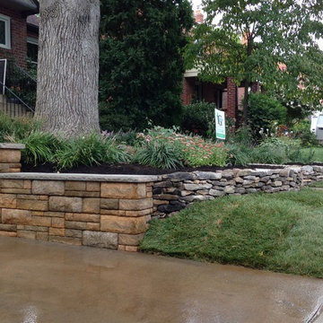
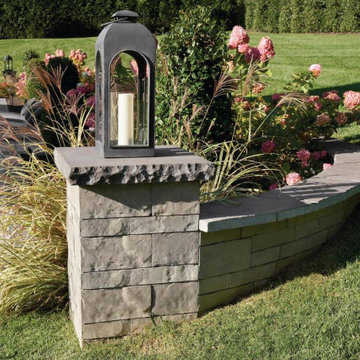
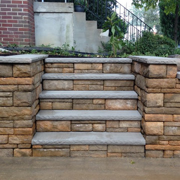
An area for planting serves as a visual border on this raised patio created with the VERSA-LOK segmental retaining wall system and Willow Creek paving stones.

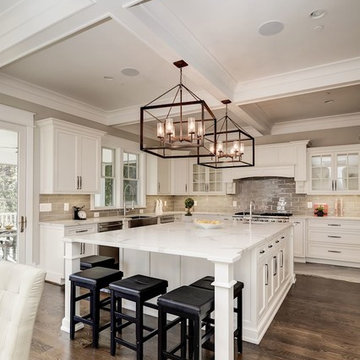
This Kitchen and Mudroom renovation in Chantilly, VA featured plenty of kitchen counter space with a unique kitchen island, beautiful white cabinetry and kitchen backsplash and modern appliances that turned this dark and segmented kitchen into a bright open space.

This Industrial Loft Sofa collection consists of armchair, foot rest, rocking armchair, 2 or 3 seats sofa and chaise lounge.
Main characteristic of this collection lies in its emphasized spherical side of each piece in the collection, which is made from solid wood, additional graced with widened parts in the back or seat. These parts are made from knotted segments of tree trunk, where rings have spiral form and resemble human eye, hence the name of the whole collection.
Also, ‘eye’ gives exceptional ergonomics to each piece, as the upholstered part follows their shape. Additional aesthetics and 3 D effect can be seen in slightly conical legs which form a conical shape. Asymmetrical, hand-made wooden buttons with emphasized thread in different color, make a tasteful detail on the buttons.
Dimensions: width 75cm, length 96cm, height 97 cm, weight 23.5 kg

Raising a previously sunken living room floor and removing interior walls, the floorplan became an open living concept in lieu of the original segmented rooms. Neutral walls and bold fabric patterns mix for a casual, comfortable home laced with the Homeowner's antique collection.

Michael Wilkinson
The existing home has stucco siding. Matching the exterior of the addition to the Tudor home's stucco was outside the client's budget. Instead, we used Hardiepanel that has a stucco pattern. Wide Tru Exterior trim matches the width of the trim on the existing house. We mimicked the trim pattern of the existing house.
We removed the existing rear deck as well as a 4-foot wide segment along the side of the house that led to a sliding door to a small office. The clients didn’t need outdoor access from the office, so we replaced the sliding door with a casement window.
The foundation of the addition is piers. The pizza oven base acts as one of the piers.

This main floor renovation was completed over the course of a year and focused on creating a more open, connected layout for a busy Kleinburg family of four and their two dogs, who love to entertain. The previous floor plan made gatherings feel segmented, so improving flow and functionality was key.
The renovation included a new staircase, reconfigured walls, a custom kitchen, and a striking new fireplace feature wall. The clients wanted to transition from their traditional aesthetic to a timeless, transitional design that feels fresh yet classic.
Natural materials and soft, earthy tones were incorporated throughout, including in the redesigned bathrooms, to maintain a cohesive and inviting atmosphere. The result is a warm, functional home that brings everyone together—just as our clients envisioned.

Enjoy our Summer Great Deals!
Combi blinds/shades, also known as zebra shades, uses dual layers of horizontal fabric segments alternating between sheer and semi-opaque or opaque fabrics. Shade can be set to open where vanes between the two layers are aligned or closed to cover the sheer portion. Or they can be complete rolled up into the headrail. Provide view-through and visual privacy. Shades block up to 99% of UV rays when closed.

THE SETUP
Sam’s client had lived in her downtown townhome home for less than a year when she decided to remodel the spacious second level. This open area consisted of three sections: a TV and fireplace zone, a sparsely furnished dining area, and a dominant central kitchen. The kitchen featured a long back wall with three segmented sections and a massive island housing the cooktop. She found the kitchen’s functionality lacking and its presence overwhelming – it dominated the entire floor, regardless of where you stood.
Design objectives:
- Reconfigure key kitchen elements (sink, cooktop, oven) while minimizing the kitchen’s visual impact
- Optimize the kitchen’s back wall, eliminating existing dead space
- Create a purposeful, well-defined dining area
- Establish a distinct, comfortable living area
- Reuse existing appliances and flooring
- Maintain an overall modern design aesthetic
THE REMODEL
Design challenges to be solved:
- Redesign the island to reduce its overwhelming presence
- Create a comfortable, dedicated living room within the available space
- Establish a distinct, inviting dining area within spatial constraints
- Enhance kitchen functionality and style without dominating the entire floor
THE RENEWED SPACE
Design solutions:
- Sam created raised end caps for the island. This separated the kitchen from adjacent living and dining areas while focusing the kitchen’s functionality. The new sink location offers ample workspace, allowing the cook to interact with guests seated at the island. The redesigned island also provides additional storage.
- For the living area, Sam opted for a functional-yet-minimalist approach. Large-format tile creates a natural stone look for the fireplace and TV wall. The recessed TV and extended fireplace shelf maintain a sleek profile. - Artistic wallpaper adds depth and texture, while the intentional lack of extensive shelving keeps the space open and distinct.
- Sam transformed the dining area’s blank wall into a feature, adding a unique dry bar with counter space, open shelves, cabinet storage and a beverage fridge. - - - Wallpaper behind and above the bar contributes to the area’s personality. A mirror adds depth while pendant lights add style and visual interest.
Relocating the cooktop to the back wall facilitates hidden ventilation, reducing visual clutter. Sam balanced transitional and modern elements for a contemporary yet comfortable feel. The digital control panel on the convection cooktop maintains a sleek look, while the wall oven is now at an easy-to-use height. ----- Mirrored base cabinet fronts and a paneled fridge prevent cabinetry monotony.
The redesign has delighted Sam’s client, achieving her main goal of creating a more inviting and visually appealing space. Each section now has its own visual personality and functionality while harmonizing within a monochromatic palette. The entire floor offers wow-factor pop upon first glance, with each area maintaining its distinct character while contributing to a cohesive, modern aesthetic.
35