
Search results for "Select 'adding'" in Home Design Ideas
 RAJ Kitchen and Bath, LLC
**Check out the video of this transformation on our website**
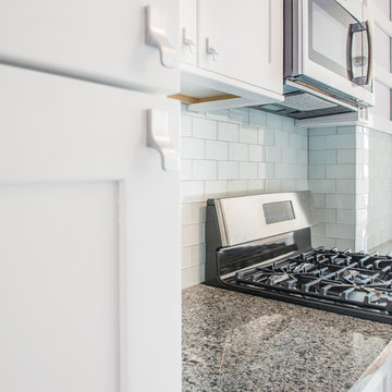
This small kitchen was way too small for this 2 bedrooms, 2 bathrooms apartment. Not only was it a very small kitchen, but the physical location of it made it very difficult to make it any bigger. There wasn't much that could have been done without incurring astronomical cost, which would get little or no return on the investment. The client wanted a kitchen that can be optimized in its current location to add a ton of value for resale.
This was difficult to do, because there was no moving of any mechanical around in the kitchen and even if we wanted to, the management of the building would not allow. For those of you who live in condos, co-ops or apartment building, you know how difficult it is to rework these foot prints. When we showed up, we saw the problems, but we also saw a huge opportunity where we can achieve those goals in the small space. This was accomplished by making some key changes and to incorporate some new things that was not possible when this kitchen was built years ago.
The crucial part of the design that would drive the entire new layout, was selecting the only appliance; that was the Refrigerator. Once we nailed down that refrigerator, we then proceeded to design the kitchen around it. We moved it to the other side of the wall where the sink was so that we can tap into the water line from the sink plumbing. It was crucial that it stays exactly 24" deep, not an inch more because we had to keep the entry as open as possible. Also, it was going to be directly in front of another big storage unit - The pantry. It is not ideal in most cases, but we needed the rest of the space to ramp up the design and open feel towards the side where all of the activities would take place, which happend to be the dining room and the view.
Once all that was figured out, we re-positioned the sink, dishwasher and the range and proceeded to wrap the cabinets around the columns to integrate them into the space. Thirty- six inches cabinets height was used so that they can be installed higher towards the ceiling height to give more room rather than the standard 18" required height between the counter tops. This was done to make the room feel a lot bigger than it really was. Not to mention, we also didn't want the faucet to be buried under the cabinets so that was also a necessary design detail for the space.
We then lowered both knee walls so that the counter top can sit on top of them, by removing that stop point that would have otherwise defined the kitchen area. This allowed us to pick up that extra footprint into the room for added prep space and enabled us to create the illusion of a kitchen that is looking longer than it really is. Every inch mattered when designing this kitchen and we made a conscious decision to use every one of that inch.
White cabinets were selected to do just what white cabinets are design to do; make a small or dark room appear bigger, brighter and more open. In this kitchen, this was amplified the more because of the kitchen location. It was perfect! We knew we did justice to the space because while we were there taking some photos, a few potential buyers walked in and went straight for the kitchen! They said its design just to fit the apartment.
Pantry roll out shelving, Double recycle bin, fancy handles, LED lighting, Quartz counter top, beautiful backslash tiles and grey linen floors finished off the kitchen which looked over a beautiful view of the George Washington Bridge from the top of this lovely 4th floor apartment.
Credit to Masterpiece Tile and Marble (Annmarie on the selection of Tiles and countertop and Val on the Construction to complete this project).
Davor Kokic Photography
 HIGOLD Outdoor Furniture
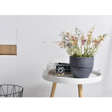
Introducing a gray flower pot can be a great way to add some stylish and modern flair to your home decor. Here are a few tips on how to do it:
Choose the right location: Before placing the gray flower pot, you should think about the best location for it. Consider the lighting in the room and how the pot will look with the other decor.
Select the right plant: Choosing the right plant for your gray flower pot is key. Consider the lighting and humidity levels in the room, as well as your own personal style preferences.
Pick complementary decor: Once you have chosen the right spot for your gray flower pot and the perfect plant, it's time to add some complementary decor. You can place the pot on a decorative tray or stand, or add some decorative stones or moss to the top of the soil.
Experiment with placement: Don't be afraid to experiment with different placements of your gray flower pot. You can try placing it on a bookshelf, a side table, or even on a windowsill to see where it looks best.
Overall, introducing a gray flower pot is a great way to add some modern style and natural beauty to your home decor. With a little bit of creativity and some careful thought, you can create a beautiful and stylish display that you will love.
 Bridges Const.
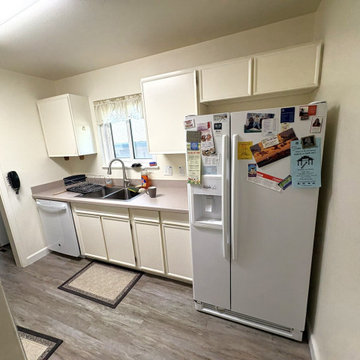
This project is a perfect example of how thoughtful design can completely transform the heart of a home.
We started by lowering the raised peninsula bar, creating one continuous countertop that’s perfect for entertaining, meal prep, and everyday living. To brighten the space, we added recessed lighting, giving the kitchen a clean, modern feel.
The biggest transformation came with beautiful new white shaker-style cabinets by KCD, paired with sparkling white quartz countertops that bring elegance and durability to the space. To tie everything together, the homeowners selected a full-height Crystal Ocean mosaic tile backsplash, adding just the right amount of texture and shine.
But we didn’t stop with the kitchen!
✔️ Added a custom built-in linen cabinet in the hallway for extra storage.
✔️ Refreshed the laundry room with fresh paint and bypass pantry closet doors for a clean, updated look.
We’re proud to help homeowners create spaces that are not only beautiful but also more functional for everyday life.
Find the right local pro for your project
 Emily Roose Interiors
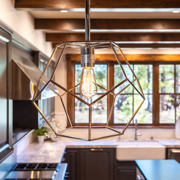
This kitchen was 20 years old with stained cabinets and felt dark and heavy. We painted all of the perimeter cabinets a beautiful blue grey and the island is a custom white with black glazing. For the countertops the perimeter is a grey and white quartzite and the island is a leathered black honed granite. The old sink was replaced with a Farmhouse styled white porcelain apron, a new faucet and added a hot/cold water dispenser. The old trash compactor was removed and replaced with a double trash pull-out drawer, a two drawer beverage fridge and ice maker were added as well. For the backspalsh we selected white marble tiles in a hexagon shape and added new geometric pendant lights over the peninsula. All the recessed can lights were updated to LED units for energy efficiency and to provide better lighting.
Photos by Patrick Sheehan of Sheehan Creative
 User
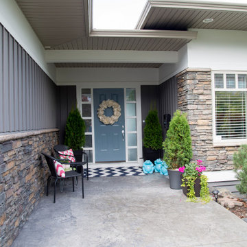
UserWe were thrilled to partner with Sherwin-Williams to have this homes tired brown exterior painted a fresh warm gray (Gauntlet Gray SW 7019), for the body and a beautiful creamy white for the trim (Greek villa SW 7551). We love it and hope that you do as well!
@sherwinwilliams #swcolorlove, #sponsorship #ad
 French Creek Designs Kitchen & Bath Design Center
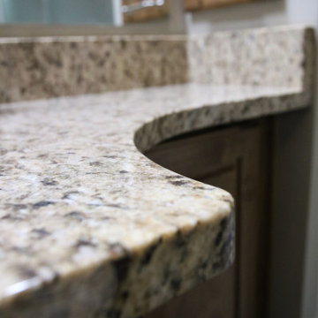
New Master Bath Remodel includes Ditra-Heat flooring for that extra warmth all year round. The door opening to the Master Bath was widened and a farm door added for easier access; aging in place. The ‘notch’ in the Master Countertop was added for ease of shower access. A hidden pull-out drawer was added in Master Bath for extra storage.
Large 12×24 Anthracite Black Porcelain Tile was used for the floor. Use of Stained Alder Knotty Cabinets with Giallo Ornamental Granite Countertops and offset with a White Undermount Sink.
French Creek Designs Kitchen & Bath Design Studio – where selections begin. Let us design and dream with you. Overwhelmed on where to start that Home Improvement, Kitchen or Bath Project? Let our Designers video conference or sit down with you, take the overwhelming out of the picture and assist in choosing your materials. Whether new construction, full remodel or just a partial remodel, we can help you to make it an enjoyable experience to design your dream space.
“Making Your Home Beautiful One Room at a Time with your local Kitchen & Bath Experts at French Creek Designs Center.”
#openforbusiness #casper #wyoming #casperbusiness #frenchcreekdesigns #shoplocal #casperwyoming #bathremodeling #bathdesigners #pebbles #niche #showersurround #showertiles #showerdrains #showerbench #cabinets #countertops #knobsandpulls #sinksandfaucets #flooring #tileandmosiacs #laundryremodel #homeimprovement


Sponsored
Columbus, OH

Structural Remodeling
Franklin County's Heavy Timber Specialists | Best of Houzz 2020!
 Kaleidoscope Design Studio
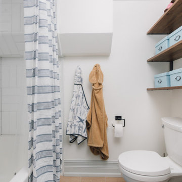
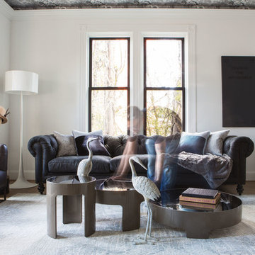
Simple doesn’t have to be boring, especially when your backyard is a lush ravine. This was the name of the game when it came to this traditional cottage-style house, with a contemporary flare. Emphasizing the great bones of the house with a simple pallet and contrasting trim helps to accentuate the high ceilings and classic mouldings, While adding saturated colours, and bold graphic wall murals brings lots of character to the house. This growing family now has the perfectly layered home, with plenty of their personality shining through.
 SKP Design
Located in a wooded setting which backs up to a golf course, The Woods is a vacation condo community in Canadian Lakes, Michigan. The owners asked us to create a comfortable modern design that would appeal to golfers and also families visiting relatives in the area. This complete renovation brought the design from 80's basic to rustic transitional. Colors and design elements echo the natural area surrounding the property.
SKP Design was involved in multiple aspects of this project. Our services included:
space planning for kitchen and both bathrooms
selecting finishes for walls, floors, trim, cabinets and countertops
reviewing construction details and electrical plans
specification of plumbing fixtures, appliances and accent lighting
furniture layout, specification and purchasing
fireplace design and stone selection
reviewing branding and signage ideas
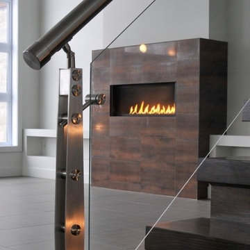
In the great room, wrought iron accents are featured in a new staircase handrail system. Other metal accents are found in the new chandelier, barstools and the legs of the live edge coffee table. An open area under the staircase was enclosed with recessed shelving which gives a focal point to the dinette area. Recessed built-in cabinets near the fireplace store TV technology and accessories. The original tiled hearth was replaced by poured concrete with stone accents.
A queen sleeper sofa from Edgecomb provides additional sleeping. Fabrics and upholstery throughout the condo were selected for durability and cleanability.
Basic white laminate kitchen cabinets were replaced with beautiful dark stained wood. Floor tile is a wood-look porcelain from Daltile called Saddle Brook. Countertops in the kitchen and bathrooms are solid surface Corian Quartz (formerly called DuPont Zodiaq). Broadloom carpet is from Durkan. The first floor bedroom is Mona Vista pattern from Modesto Collection; all other carpet is Inviting Spaces pattern from Timeless Compositions. Walls are painted with Sherwin Williams 7647 Crushed Ice.
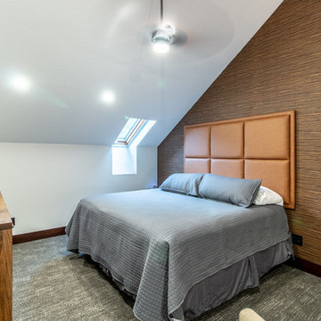
The main floor bedroom has a custom headboard mounted on a feature wall with plaid wallcovering. A freestanding vanity with undermount sink was added to the alcove area, creating space for a larger walk-in tiled shower with custom bench. On both levels, backlit mirrors highlight the sink areas. The upstairs bath has a blue tile feature wall and vessel sink.
A fiberglass bathtub surround was removed and replaced by a custom tiled shower. Vinyl wallcovering from D.L. Couch provides a focal point behind the king headboard in the loft bedroom. A twin sleeper chair adds an extra bed.
 RAJ Kitchen and Bath, LLC
**Check out the video of this transformation on our website**
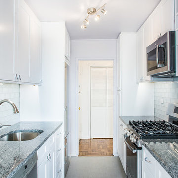
This small kitchen was way too small for this 2 bedrooms, 2 bathrooms apartment. Not only was it a very small kitchen, but the physical location of it made it very difficult to make it any bigger. There wasn't much that could have been done without incurring astronomical cost, which would get little or no return on the investment. The client wanted a kitchen that can be optimized in its current location to add a ton of value for resale.
This was difficult to do, because there was no moving of any mechanical around in the kitchen and even if we wanted to, the management of the building would not allow. For those of you who live in condos, co-ops or apartment building, you know how difficult it is to rework these foot prints. When we showed up, we saw the problems, but we also saw a huge opportunity where we can achieve those goals in the small space. This was accomplished by making some key changes and to incorporate some new things that was not possible when this kitchen was built years ago.
The crucial part of the design that would drive the entire new layout, was selecting the only appliance; that was the Refrigerator. Once we nailed down that refrigerator, we then proceeded to design the kitchen around it. We moved it to the other side of the wall where the sink was so that we can tap into the water line from the sink plumbing. It was crucial that it stays exactly 24" deep, not an inch more because we had to keep the entry as open as possible. Also, it was going to be directly in front of another big storage unit - The pantry. It is not ideal in most cases, but we needed the rest of the space to ramp up the design and open feel towards the side where all of the activities would take place, which happend to be the dining room and the view.
Once all that was figured out, we re-positioned the sink, dishwasher and the range and proceeded to wrap the cabinets around the columns to integrate them into the space. Thirty- six inches cabinets height was used so that they can be installed higher towards the ceiling height to give more room rather than the standard 18" required height between the counter tops. This was done to make the room feel a lot bigger than it really was. Not to mention, we also didn't want the faucet to be buried under the cabinets so that was also a necessary design detail for the space.
We then lowered both knee walls so that the counter top can sit on top of them, by removing that stop point that would have otherwise defined the kitchen area. This allowed us to pick up that extra footprint into the room for added prep space and enabled us to create the illusion of a kitchen that is looking longer than it really is. Every inch mattered when designing this kitchen and we made a conscious decision to use every one of that inch.
White cabinets were selected to do just what white cabinets are design to do; make a small or dark room appear bigger, brighter and more open. In this kitchen, this was amplified the more because of the kitchen location. It was perfect! We knew we did justice to the space because while we were there taking some photos, a few potential buyers walked in and went straight for the kitchen! They said its design just to fit the apartment.
Pantry roll out shelving, Double recycle bin, fancy handles, LED lighting, Quartz counter top, beautiful backslash tiles and grey linen floors finished off the kitchen which looked over a beautiful view of the George Washington Bridge from the top of this lovely 4th floor apartment.
Credit to Masterpiece Tile and Marble (Annmarie on the selection of Tiles and countertop and Val on the Construction to complete this project).
Davor Kokic Photography
 Rockledge Design + Architecture
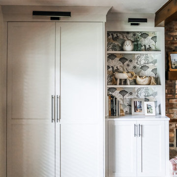
To help make this family room in Wexford more functional and cohesive, we added new custom built-in storage around the brick fireplace. On the left side, an existing built-in was situated in between the fireplace and a small closet, which also contained a sink. We started by peeling away these elements to create a larger space.
Adding symmetry to the room, we designed new cabinetry which included a mix of hidden and open shelf storage. Behind full-height pocketing doors on the left, a new wet bar with a tiled backsplash and quartz countertop. On the right, another set of pocketing doors conceals three large drawers, plus overflow toy storage for the adjacent playroom. Immediately flanking the fireplace, bookshelves provide a space to display favorite items with even more storage beneath.
To balance the room’s rich wood tones and multi-tonal red brick, we helped the clients select a neutral color palette to make the space feel more relaxed. Complimentary colors and textures are added through the playful wallpaper lining the back of the shelves, and hexagon backsplash tile. A stylish new fireplace faceplate, gallery lighting, and cabinet hardware — each in a dark metal finish — help to tie everything together.
 Get My Rugs LLC
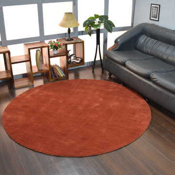
Improve your living room or bedroom begins with the perfect area rug—an essential element that enhances both style and functionality. A well-chosen rug not only anchors the room but also adds warmth, texture, and a touch of personality to your space. Whether you’re decorating a cozy bedroom or a spacious living room, selecting the right rug is crucial to achieving a harmonious and inviting atmosphere.
Design and Style: The design of your area rug can dramatically influence the overall look of your space. For a luxurious touch, consider hand-tufted or hand-knotted rugs, which offer intricate patterns and rich textures. These rugs are often crafted with attention to detail, making them ideal for adding an elegant statement to any room. If you prefer a more modern approach, machine-woven rugs are a great choice. They come in a variety of vibrant patterns and colors and are built to withstand heavy foot traffic thanks to their heat-set fibers. For a versatile option, flat-woven rugs, such as kilims, provide a reversible design that fits seamlessly into both contemporary and traditional decor.
Materials and Comfort: When selecting a rug, the material plays a significant role in both its appearance and comfort. Shag and flokati rugs are perfect for creating a plush, cozy environment. Their long, soft fibers add a layer of comfort underfoot, making your living room or bedroom feel more inviting. Hand-loomed rugs offer unique textures and artisanal quality, while braided and hand-hooked rugs add a charming, handcrafted touch. For practical maintenance, machine washable rugs are a smart choice. They allow for easy cleaning and help maintain a fresh look with minimal effort.
Functionality and Practical Features: Beyond aesthetics, consider the functionality of your rug. Stain-resistant and water-resistant rugs are ideal for managing spills and stains, ensuring that your rug remains in good condition over time. Non-slip and adhesive backings are essential for safety, particularly on hardwood floors. These features prevent the rug from shifting and reduce the risk of slips and falls. Additionally, cushioned rugs enhance comfort, making your space not only stylish but also more enjoyable to relax in.
Customization and Personalization: Add a unique touch to your space with custom or personalized rug options. An 8x10 area rug is a popular choice for covering large areas and can be tailored to fit specific dimensions or design preferences. Personalized features, such as fringe details or organic textures, allow you to create a rug that reflects your individual style and complements your existing decor.
Versatility and Maintenance: The top 15 area rugs available today offer a diverse range of styles and features to suit various needs. From distressed designs that add character to contemporary patterns that offer a modern edge, there is a rug to match every aesthetic. Large rugs for living rooms and bedrooms can help define the space and create a cohesive look, while huge carpets can make a bold statement. Consider the practicality of each rug, ensuring that it not only enhances your decor but also withstands everyday use.
In Summary: Selecting the ideal area rug involves finding a balance between style and practicality. Whether you opt for a luxurious hand-tufted design, a durable machine-woven option, or a versatile flat-woven style, the right rug will elevate your living room, bedroom, or any other space. By exploring various options and considering both design and functionality, you can find the perfect rug that transforms your space into a stylish, comfortable haven.
 Penny Black Interiors LLC.
This 1896 Italianate Victorian home in Portland Heights was all but derelict in 2017.
We partnered with Look Construction LLC. to save this iconic home that sits atop a steep embankment—a huge challenge for the necessary new foundation. The house was lifted and new foundation poured adding 4 feet and a whole new floor to boot.
It had been stripped of all its original interior character over the years, so the design replaced and added to what was there originally. We re-designed the home’s layout, reconfiguring the kitchen, moving the lower staircase, adding a staircase to the loft room and rebuilding the widows walk roof deck. All doorways were raised to 9 feet to add to the sense of space.
Finally, we splurged on a selection of incredible wallpapers to add drama and romance to this stunning show piece of a home.
The Penny Black House is featured in Gray Magazine #39, April 2018.

Sponsored
Columbus, OH

Hope Restoration & General Contracting
Columbus Design-Build, Kitchen & Bath Remodeling, Historic Renovations
 SKP Design
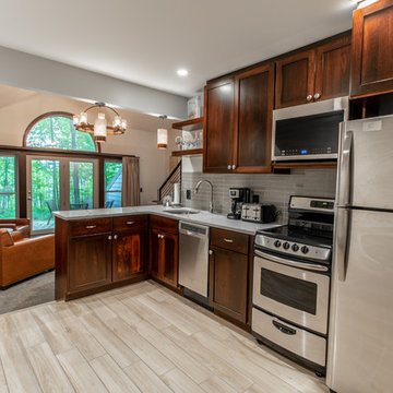
Located in a wooded setting which backs up to a golf course, The Woods is a vacation condo community in Canadian Lakes, Michigan. The owners asked us to create a comfortable modern design that would appeal to golfers and also families visiting relatives in the area. This complete renovation brought the design from 80's basic to rustic transitional. Colors and design elements echo the natural area surrounding the property.
SKP Design was involved in multiple aspects of this project. Our services included:
space planning for kitchen and both bathrooms
selecting finishes for walls, floors, trim, cabinets and countertops
reviewing construction details and electrical plans
specification of plumbing fixtures, appliances and accent lighting
furniture layout, specification and purchasing
fireplace design and stone selection
reviewing branding and signage ideas
In the great room, wrought iron accents are featured in a new staircase handrail system. Other metal accents are found in the new chandelier, barstools and the legs of the live edge coffee table. An open area under the staircase was enclosed with recessed shelving which gives a focal point to the dinette area. Recessed built-in cabinets near the fireplace store TV technology and accessories. The original tiled hearth was replaced by poured concrete with stone accents.
A queen sleeper sofa from Edgecomb provides additional sleeping. Fabrics and upholstery throughout the condo were selected for durability and cleanability.
Basic white laminate kitchen cabinets were replaced with beautiful dark stained wood. Floor tile is a wood-look porcelain from Daltile called Saddle Brook. Countertops in the kitchen and bathrooms are solid surface Corian Quartz (formerly called DuPont Zodiaq). Broadloom carpet is from Durkan. The first floor bedroom is Mona Vista pattern from Modesto Collection; all other carpet is Inviting Spaces pattern from Timeless Compositions. Walls are painted with Sherwin Williams 7647 Crushed Ice.
The main floor bedroom has a custom headboard mounted on a feature wall with plaid wallcovering. A freestanding vanity with undermount sink was added to the alcove area, creating space for a larger walk-in tiled shower with custom bench. On both levels, backlit mirrors highlight the sink areas. The upstairs bath has a blue tile feature wall and vessel sink.
A fiberglass bathtub surround was removed and replaced by a custom tiled shower. Vinyl wallcovering from D.L. Couch provides a focal point behind the king headboard in the loft bedroom. A twin sleeper chair adds an extra bed.
 Thomas J. Pearson, Inc.
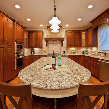
The owners of this traditional home sought to update and expand their somewhat dated and crowded kitchen. The former kitchen had a corner sink and a modified U-shape, but with the only entry intersecting the refrigerator and bar passage, it did not allow for multiple cooks in the kitchen. The existing kitchen was separated from the family room by a wall which included a see-through fireplace, but in reality the two areas were distinctly separate. As this family enjoys cooking and entertaining, they sought to open the space to accommodate a large island in the kitchen and opening the space to the adjoining family room. Additionally, they wanted the cooking surfaces and appliances to be state of the art, but with a style reminiscent of Tuscany.
To achieve the effect, color groups and materials were selected to create the Tuscan region’s theme. Round shapes were included throughout the space including the island top and the custom archway opening to the family room. The owners selected cherry cabinetry with a dark brown stain, granite counters with some hues of blue-green, and a natural stone tumbled subway tile backsplash. The island color is fossil beige, and the owners re-purposed their existing bar stools using the same color. With the serious emphasis on cooking, the range selected is a 36” gas Thermador® with custom exhaust hood. A separate Thermador® baking oven and microwave are built-in on the adjoining wall. Bela Cera® hand-scraped hardwood flooring ties together the kitchen, eating area, and family room.
The existing stone fireplace was taken down and set aside for re-installation at project completion. As the wall separating the kitchen and family room was eliminated, the stone fireplace has been reinstalled at its new location on the home’s east-wall. Windows and built-in cabinetry flank the fireplace, with the flat screen mounted above it. With added windows, additional can lighting, and antique white trim, the rooms are bright and airy.
 Roeser Home Remodeling
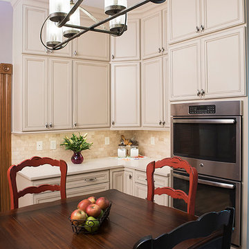
Older homes are filled with charm, but often the kitchen has been overlooked. Originally, it was a work area– not made for public view. Today it truly is the center of all that goes on in the family. Today’s active homeowners are no different. Although their children may be grown, cooking and baking are still considered top priorities. Storage and counter space were issues that needed to be addressed and being aware of the aging process of the kitchen, lighting also needed to be considered. Although the kitchen is only a 13’ X 13’ space, it had other challenges. A back staircase, three doorways, and a large window took away from the wall space, however the 9’ ceilings were an unused potential for storage. Choosing Wellborn’s Select Series Cabinets in a Maple with a sandstone slate finish brightened the space immediately. Stacking the cabinets and taking them all the way to the ceiling gave this homeowner more storage than ever imagined for items of occasional use. Under counter LED Tape lighting brightened the task areas of the kitchen without causing additional heat from too many lights. A new table light on a dimmer sets the right mood for dining and provides just enough additional lighting. Installing a Sharp, stainless steel, 24” microwave drawer freed up some counter space for prep work near the cooktop (a GE, stainless steel 30” gas cooktop with four burners) and next to the sink (a new Elkay Gourmet Double Bowl with aqua DVD). Also, adding a new Kohler Sensate kitchen faucet which is hands free, a Kohler contemporary soap/lotion dispenser and a new ISE 3/4 horsepower disposal– helps to make clean-up a breeze. A new GE dishwasher, a new Broan stainless steel 30” hood, and a new GE 30” double oven both standard oven sizes, not only allows our homeowner to cook dinner and dessert, but the stainless steel reflects light while adding a design element tying the cabinet hardware and light fixture into the overall look. The countertop is Caesarstone’s Dreamy Marfil and is always a bold statement for any size Kitchen. Mixing the backsplash tile up without appearing busy came together with the beautiful combination of Sandlewood polished Amafi 30cm from countertops to base cabinets and Jinsen Coffee Bone in a diamond pattern framed in the Sandlewood polish and a Amafi Pencil liner above the cooktop. The soft addition of a new six panel Pine door stained and finished to match the other doors within the home added to the overall beauty of this stunning kitchen.
 Connecticut Roofcrafters Llc
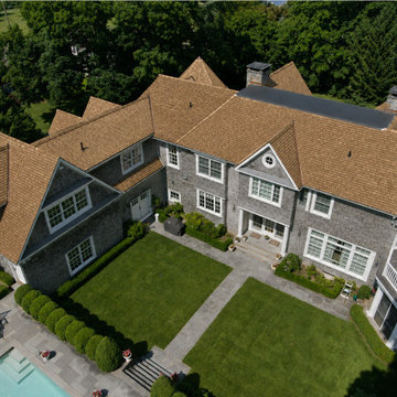
This intricate Western Red Cedar installation combines traditional craftsmanship with high-performance materials suited to its wooded Connecticut River setting. CCA-treated tapersawn cedar from Waska Mills was selected for enhanced resistance to fungal growth—an important advantage in a shaded, moisture-prone environment near the brackish river. Beneath the cedar, Grace Select underlayment provides an added moisture barrier, topped with Cedar Breather matting to promote airflow and help the roof dry properly. Complex rooflines and transitions showcase the cedar’s natural character, while a Firestone .090 EPDM membrane provides durable protection across the expansive low-slope section, creating a carefully integrated hybrid roofing system.

Sponsored
Columbus, OH
Hope Restoration & General Contracting
Columbus Design-Build, Kitchen & Bath Remodeling, Historic Renovations
 RAJ Kitchen and Bath, LLC
**Check out the video of this transformation on our website**
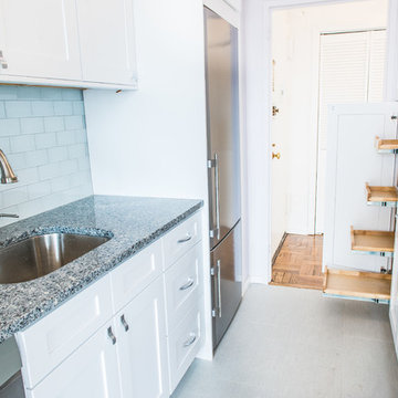
This small kitchen was way too small for this 2 bedrooms, 2 bathrooms apartment. Not only was it a very small kitchen, but the physical location of it made it very difficult to make it any bigger. There wasn't much that could have been done without incurring astronomical cost, which would get little or no return on the investment. The client wanted a kitchen that can be optimized in its current location to add a ton of value for resale.
This was difficult to do, because there was no moving of any mechanical around in the kitchen and even if we wanted to, the management of the building would not allow. For those of you who live in condos, co-ops or apartment building, you know how difficult it is to rework these foot prints. When we showed up, we saw the problems, but we also saw a huge opportunity where we can achieve those goals in the small space. This was accomplished by making some key changes and to incorporate some new things that was not possible when this kitchen was built years ago.
The crucial part of the design that would drive the entire new layout, was selecting the only appliance; that was the Refrigerator. Once we nailed down that refrigerator, we then proceeded to design the kitchen around it. We moved it to the other side of the wall where the sink was so that we can tap into the water line from the sink plumbing. It was crucial that it stays exactly 24" deep, not an inch more because we had to keep the entry as open as possible. Also, it was going to be directly in front of another big storage unit - The pantry. It is not ideal in most cases, but we needed the rest of the space to ramp up the design and open feel towards the side where all of the activities would take place, which happend to be the dining room and the view.
Once all that was figured out, we re-positioned the sink, dishwasher and the range and proceeded to wrap the cabinets around the columns to integrate them into the space. Thirty- six inches cabinets height was used so that they can be installed higher towards the ceiling height to give more room rather than the standard 18" required height between the counter tops. This was done to make the room feel a lot bigger than it really was. Not to mention, we also didn't want the faucet to be buried under the cabinets so that was also a necessary design detail for the space.
We then lowered both knee walls so that the counter top can sit on top of them, by removing that stop point that would have otherwise defined the kitchen area. This allowed us to pick up that extra footprint into the room for added prep space and enabled us to create the illusion of a kitchen that is looking longer than it really is. Every inch mattered when designing this kitchen and we made a conscious decision to use every one of that inch.
White cabinets were selected to do just what white cabinets are design to do; make a small or dark room appear bigger, brighter and more open. In this kitchen, this was amplified the more because of the kitchen location. It was perfect! We knew we did justice to the space because while we were there taking some photos, a few potential buyers walked in and went straight for the kitchen! They said its design just to fit the apartment.
Pantry roll out shelving, Double recycle bin, fancy handles, LED lighting, Quartz counter top, beautiful backslash tiles and grey linen floors finished off the kitchen which looked over a beautiful view of the George Washington Bridge from the top of this lovely 4th floor apartment.
Credit to Masterpiece Tile and Marble (Annmarie on the selection of Tiles and countertop and Val on the Construction to complete this project).
Davor Kokic Photography
 LEDVANS
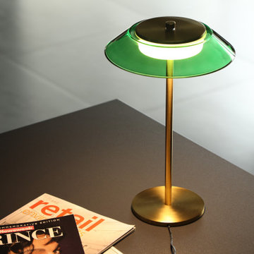
The banker's lamp is the highlight on the desktop, providing not only localized lighting but also adding decorative flair to the entire work area. When choosing a style, one can consider a simple and modern design to ensure it matches various decorative styles.
 Kaleidoscope Design Studio
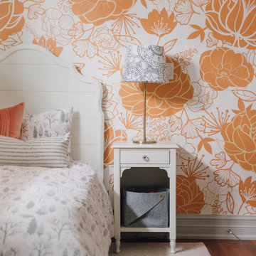
Simple doesn’t have to be boring, especially when your backyard is a lush ravine. This was the name of the game when it came to this traditional cottage-style house, with a contemporary flare. Emphasizing the great bones of the house with a simple pallet and contrasting trim helps to accentuate the high ceilings and classic mouldings, While adding saturated colours, and bold graphic wall murals brings lots of character to the house. This growing family now has the perfectly layered home, with plenty of their personality shining through.
112