
Search results for "Select 'adding'" in Home Design Ideas
 Next Level Austin
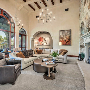
We started with a blank slate for furnishings and worked with Objets Ltd. on our selections. Our clients have a large family, therefor we created multiple seating areas along with a custom sectional. We designed an ottoman that was surrounded by small movable tables, a leather recliner and two CR Laine chairs for a private seating area. A Bernhardt console was added with an oversized lamp and mirror behind it to provide a focal point.
 KURV Architecture DPC (Alex Hughes Architects)
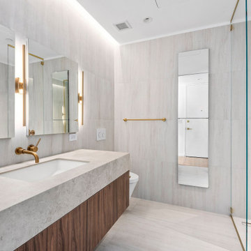
Located in the heart of Manhattan’s Lower East Side, the building was erected on a shallow commercial lot between two 120 year old masonry buildings and a new residential rental building. 330 Grand Street is a mix of 725 SF 1BRs and 1050 SF 2BR apartments. It also contains a 1100 SF two story duplex as well as private and public rooftop space, large private balconies for most units and two large private terraces for the ground floor units.
330 Grand Street was originally designed and approved at the NYC DOB as a prefabricated modular building. During the pandemic, as shipping costs skyrocketed putting the project at risk, we suggested redesigning the building as a reinforced cast-in-place concrete structure. Concrete was readily available and prices had not been affected by the demand increase that many other materials suffered in the pandemic. We took this opportunity to raise floor to ceiling heights, enlarge high performance windows and redistribute the buildings MEPFS and Structural Systems to create very open floor plans.
The challenge was to create a luxurious sensorial living experience with very limited means. In a city with very high construction costs, low cost residential buildings in the area are usually devoid of good quality, design and character. Our approach was to aim high for the end user, prioritizing natural light, open space with long visual perspectives, high ceilings and as always, rejecting the use of predefined building templates.
Our biggest challenge was to ensure that the small spaces feel as clean cut, large and bright as possible. Several unique design decisions were made to ensure low cost and high quality;
Floor plans were laid out so that spaces were wide open and free of clutter from mechanical or structural interruptions. Therefore all infrastructure was placed in lateral demising walls, which in turn act as the unit’s storage and kitchen. The apartments feel wide open, are super quiet and have more storage space than any other comparable apartment in the city.
To solve the problem of the site’s shallow commercial lot which is typically prone to dark interior spaces we focused our attention on the building’s envelope. Instead of the usual small punched window openings, oversized high performance windows were designed to ensure that light penetrated as far as possible into the units. In the smaller 1BR units, the full 50’ depth of the lot is perceived by partitioning spaces with sliding pocket doors that can be retracted to allow deep visual perspectives, making the sight lines in the space feel longer, larger, more ample than normal. In addition to the full height glazing, each unit above the 2nd floor receives a 7 foot covered balcony, adding 120 to 240 sf to each apartment, something unusual in New York City buildings. The space is large enough for a full size dining table, when the weather permits being outside.
We also worked hard to ensure modularity. For example, all kitchen units are all identical throughout the building. The idea of modularity and the economy of the repetitive unit is exercised to the maximum through the building.
Hardware, appliances, flooring, wall coverings and material finishes are all carefully selected to feel bespoke, high quality and unique.
It was important to KURV that the result of this work manifest into something that would deeply connect with the end user and sustain relationships with the consumers of this space.
All images by KURV Architecture ©
 Unpatterned
Sometimes we start with a few foundational items and a blank slate. We’ve worked with these Clients on their previous home, and they were ready to make their bedroom suite all their own. Keeping the built-ins was a requirement as was wallpaper, some new window treatments, a closet overhaul, and all the decor and details. We kept the bed and drapes and swapped the rest to create a luxe sleeping retreat.
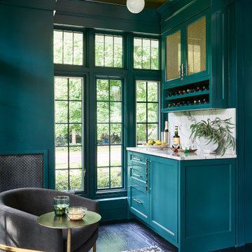
Phase 2 of this project was to tackle the dining room and adjacent powder room. The dining room had a small sun room attached to it that was not being utilized. We turned it into a luxe home bar with custom cabinetry and a stunning quartz countertop / backsplash. Gold wallpaper on the ceiling completed the room and highlighted all of the fun metal details throughout the space. We ran the color from the bar through the dining room and accented it with bold wallpaper. We added some contrasting colors with the rug selection and brought in wood tones with the furniture to ground the space.
FUN FACT : The art over the fireplace is a vintage photo from District’s Vintage Chicago Project, featuring photos found in vintage furniture over the lifetime of the store.
Bedroom Photography: Dustin Halleck / Dining Room & Bar Photography: Ryan McDonald
Find the right local pro for your project
 User
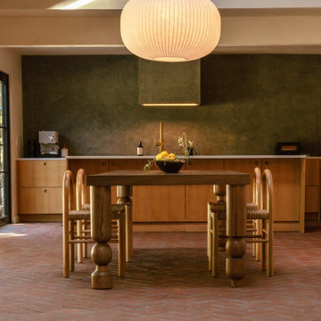
UserFeatured in Dwell, Hacienda Granada is an eclectic modern residence designed by Working Holiday Studio that subtly combines the Spanish influences of a Mexican hacienda with Scandinavian minimalism and features All Weather Architectual Aluminun custom windows and doors.
Carlos Nuade and Whitney Brown run Working Holiday, a multi disciplinary creative studio based in Los Angeles that boasts a portfolio of several renovation projects across Southern California.
Originally built in 1962, the 2,762-square-foot residence with 4 bedrooms and 2.5 baths was not the couple’s dream home but they saw potential in its vaulted ceilings, ample-sized kitchen, backyard pool and large garage and more importantly, they found a space where they could infuse with their own personal history and distinct taste. "Our style is very modern and minimalist," Carlos explains. "But we still wanted to include some of the warmth, accents, and tones from traditional Spanish architecture."
Carlos and Whitney chose All Weather Series 5000 casement and fixed windows with SDL's to infuse the home with the Hacienda vibe. They replaced the existing patio entry door with expansive Series 8100 Multi Slide Doors that connect to the living and dining room. The couple opened up the kitchen by adding an All Weather Series 7000 French Doors and repositioned the island so you can see into the house when they are cooking. They also reshaped most of the interior doorways, creating arches to enhance the Spanish-Mexican vibe.
All Weather was honored to be selected for Hacienda Granada because Carlos and Whitney treat their projects like showrooms and they only bring on brands they like and curate the space accordingly.
 Simply Home Decorating
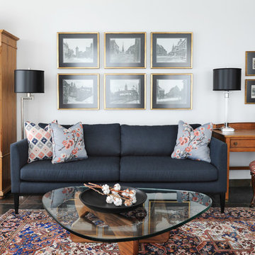
The homeowners of this condo sought our assistance when downsizing from a large family home on Howe Sound to a small urban condo in Lower Lonsdale, North Vancouver. They asked us to incorporate many of their precious antiques and art pieces into the new design. Our challenges here were twofold; first, how to deal with the unconventional curved floor plan with vast South facing windows that provide a 180 degree view of downtown Vancouver, and second, how to successfully merge an eclectic collection of antique pieces into a modern setting. We began by updating most of their artwork with new matting and framing. We created a gallery effect by grouping like artwork together and displaying larger pieces on the sections of wall between the windows, lighting them with black wall sconces for a graphic effect. We re-upholstered their antique seating with more contemporary fabrics choices - a gray flannel on their Victorian fainting couch and a fun orange chenille animal print on their Louis style chairs. We selected black as an accent colour for many of the accessories as well as the dining room wall to give the space a sophisticated modern edge. The new pieces that we added, including the sofa, coffee table and dining light fixture are mid century inspired, bridging the gap between old and new. White walls and understated wallpaper provide the perfect backdrop for the colourful mix of antique pieces. Interior Design by Lori Steeves, Simply Home Decorating. Photos by Tracey Ayton Photography
 Lauren Levant
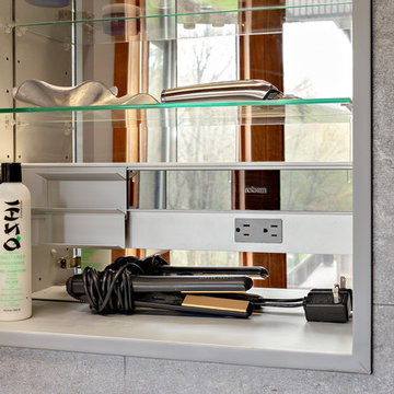
Double shower - large modern master gray tile gray floor and concrete floor double shower idea in Other with flat-panel cabinets, medium tone wood cabinets, a one-piece toilet, gray walls, a vessel sink, a hinged shower door, black countertops and concrete countertops
 Ginkgo Leaf Studio
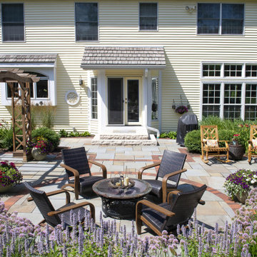
View of the home from the patio. New lannon stone steps connect the patio to the home.
Renn Kuhnen Photography
Patio - large traditional backyard stone patio idea in Chicago
Patio - large traditional backyard stone patio idea in Chicago

Sponsored
Columbus, OH

Hope Restoration & General Contracting
Columbus Design-Build, Kitchen & Bath Remodeling, Historic Renovations
 Urban Oasis Landscape Design
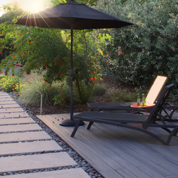
The uneven back yard was graded into ¬upper and lower levels with an industrial style, concrete wall. Linear pavers lead the garden stroller from place to place alongside a rain garden filled with swaying grasses that spans the side yard and culminates at a gracefully arching pomegranate tree, A bubbling boulder water feature murmurs soothing sounds. A large steel and willow-roof pergola creates a shady space to dine in and chaise lounges and chairs bask in the surrounding shade. The transformation was completed with a bold and biodiverse selection of low water, climate appropriate plants that make the space come alive. branches laden with impossibly red blossoms and fruit. The elements of a sustainable habitat garden have been designed into the ¬lush landscape. One hundred percent of rainwater runoff is diverted into the two large raingardens which infiltrate stormwater runoff into the soil. After building up the soil with tons of organic amendments, we added permeable hardscape elements, a water feature, native and climate appropriate plants - including an exceedingly low-water Kurapia lawn - and drip irrigation with a smart timer. With these practices we’ve created a sumptuous wildlife habitat that has become a haven for migratory birds & butterflies.
 Finesse, Inc.
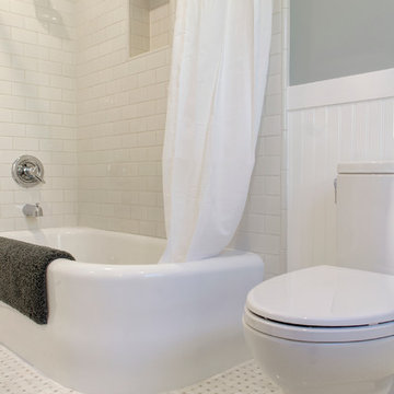
This 1927 Spanish Colonial home was in dire need of an upgraded Master bathroom. We completely gut the bathroom and re-framed the floor because the house had settled over time. The client selected hand crafted 3x6 white tile and we installed them over a full mortar bed in a Subway pattern. We reused the original pedestal sink and tub, but had the tub re-glazed. The shower rod is also original, but we had it dipped in Polish Chrome. We added two wall sconces and a store bought medicine cabinet.
Photos by Jessica Abler, Los Angeles, CA
 Donald Lococo Architects
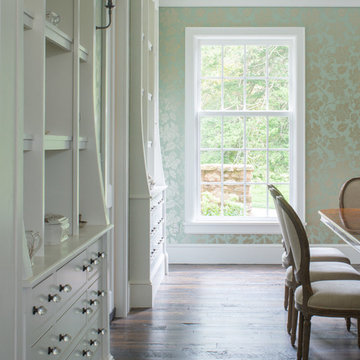
Located on farmland in McLean, Virginia, the American Farmhouse balances the expected comforts of a new home with the bucolic beauty of an old farmhouse. The final site plan still has evidence showing parallel courses of the barn’s destiny. The house mass is broken and lowered so that the home can remain secondary to the monolithic barn structure. Earthy and elemental materials are selected for the home that reference the barn without directly mimicking it. Wooden members found inside the barn and from other barns bridge ceilings and are used in floors along with rustic slate adding to a sense of simplicity to the farmhouse design.
The age and patina of the barn is reflected in the house’s textural use of board and batten and field stone layered similar to stone foundations. The original development plan was to demolish the existing barn and construct three suburban homes. Part of an endangered breed, as one of the few remaining barns in the area, it was originally viewed as a challenge in a luxury home construction with several difficulties posed to the impending project: it would be expensive to renovate, vulnerable to demolition, and threatened by urban sprawl. However, instead of trying to alter or destroy the barn, the structure was fully embraced into the traditional architecture project as a centerpiece and was used as the inspiration for the home. The new house was sited parallel to the barn so that views to the barn gable were accessible.
 Denise Quade Design
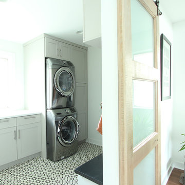
The washer and dryer were stacked and placed next to a tall pantry cabinet. Medium grey painted cabinets were selected and paired with black and white cement tile. Base cabinets were added under the window for additional overflow storage. A custom made barn door conceals the laundry room when the family entertains. Frosted glass panels allows the light from the window to filter into the hallway when the door is closed.
 Floor & Decor
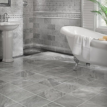
Carrara White Honed Marble Tile | This 12in. x 12in. Carrara White Honed Marble Tile is white.
With a consistent, satin-smooth finish, honed finish tiles give your room a natural look.
Create an elegant yet simple floor layout with this square tile.
Carrara is a classic white marble with a mixed fleuri and vein cut that blend to create subtle yet distinctive patterns. The veining is mainly gray with a light to white background, but Carrara can also have a slight gold tint to its veining that provides added dimension. Artists and architects use marble to make a statement that will last an eternity. Give your home a timeless and elegant appeal with marble.
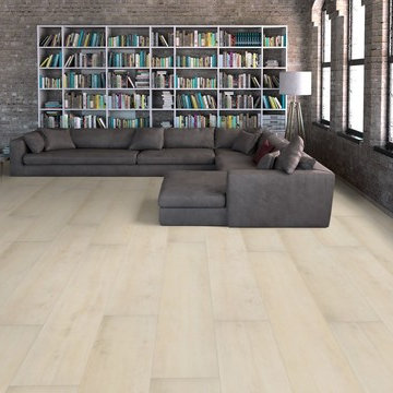
 Flooret
Part of the Modin Vinyl Plank Collection, Available Exclusively From www.Flooret.com
$3.49 / sq ft, 22.08 sq ft per box
50% WIDER. 25% LONGER. TWICE AS DURABLE
Luxury Vinyl Plank, 5 mm x 9" x 60" (1.0 mm / 40 mil wear-layer)
Lifetime Residential Warranty, 20 year Commercial Warranty
Nordic simplicity. White floors can be challenging to use, but when pulled off correctly are extremely rewarding. An instant statement-maker, they often present the challenge of maintenance. For Nordland, we specifically created a slightly weathered pattern with darker knots, so that they do not reveal dirt as quickly.
REDEFINING DURABILITY
The most important specification for determining the durability of vinyl flooring is the thickness of the wear-layer. The best wear-layers are made of thick, clear virgin PVC, which covers the paper print-film that gives the floor its unique appearance. Once the wear-layer wears through, the paper is damaged and the floor will need replacement.
Most vinyl floors come with a 8-12 mil wear-layer (0.2-3 mm). The top commercial specs in the industry are higher, at 20-22 mil (0.5 mm). A select few manufacturers offer a "super" commercial spec of 28 mil (0.7 mm).
For Modin, we decided to set a new standard: 40 mil (1.0 mm) of premium virgin PVC. This allows us to offer an industry-leading 20 year Commercial Warranty (Lifetime Residential), compared to nearly all other commercial vinyl floors' 10 year Commercial Warranty.
Beyond our superior wear-layer, we also use a patented click mechanism for superior hold, and a ceramic-bead coating.
SIZE MATTERS
Wider and longer planks create a sense of space and luxury. Most vinyl floors come in 6" or 7" widths, and 36" or 48" lengths.
For Modin, we designed our planks to be 9" wide, and 60" long. This extra large size allows our gorgeous designs to be fully expressed.
DETAILS THAT COUNT
We made sure to get all the details right. Real texture, to create the feel of wire-brushed wood. Low sheen level, to ensure a natural look that wears well over time. 4-sided bevels, to more accurately emulate the look of real planks. When added together they help create the unique look that is Modin.
DESIGNS THAT INSPIRE
We spent nearly a year just focusing on our designs, to ensure they provide the right mix of color and depth. Focusing on timeless wire-brush and European Oak styles, as well as more contemporary modern washes, our collection offers truly beautiful design that is both functional and inspiring.

Sponsored
Columbus, OH
Hope Restoration & General Contracting
Columbus Design-Build, Kitchen & Bath Remodeling, Historic Renovations
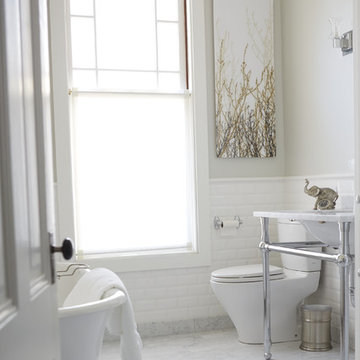
 Maquette Interior Design
Liz Daly
Inspiration for a mid-sized transitional gray tile and ceramic tile marble floor bathroom remodel in San Francisco with recessed-panel cabinets, white cabinets, marble countertops, a one-piece toilet, gray walls and a console sink
Inspiration for a mid-sized transitional gray tile and ceramic tile marble floor bathroom remodel in San Francisco with recessed-panel cabinets, white cabinets, marble countertops, a one-piece toilet, gray walls and a console sink
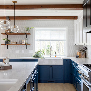
 Jamie Banfield Interior Designs
The true farmhouse kitchen. Mixing bold traditional colours, natural elements, shiplap and wooden beamed ceiling details, all make for the perfectly crafted farmhouse. Layering in a traditional farm house sink, and an industrial inspired metal hood fan adds charm and a curated feel to this traditional space. No compromise spared with storage, function or innovation.
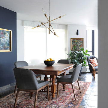 Simply Home Decorating
The homeowners of this condo sought our assistance when downsizing from a large family home on Howe Sound to a small urban condo in Lower Lonsdale, North Vancouver. They asked us to incorporate many of their precious antiques and art pieces into the new design. Our challenges here were twofold; first, how to deal with the unconventional curved floor plan with vast South facing windows that provide a 180 degree view of downtown Vancouver, and second, how to successfully merge an eclectic collection of antique pieces into a modern setting. We began by updating most of their artwork with new matting and framing. We created a gallery effect by grouping like artwork together and displaying larger pieces on the sections of wall between the windows, lighting them with black wall sconces for a graphic effect. We re-upholstered their antique seating with more contemporary fabrics choices - a gray flannel on their Victorian fainting couch and a fun orange chenille animal print on their Louis style chairs. We selected black as an accent colour for many of the accessories as well as the dining room wall to give the space a sophisticated modern edge. The new pieces that we added, including the sofa, coffee table and dining light fixture are mid century inspired, bridging the gap between old and new. White walls and understated wallpaper provide the perfect backdrop for the colourful mix of antique pieces. Interior Design by Lori Steeves, Simply Home Decorating. Photos by Tracey Ayton Photography
 Robin Amorello, CKD CAPS - Atmoscaper Design
Photos by Robin Amorello, CKD CAPS
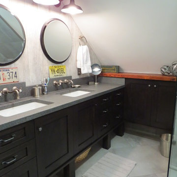
Example of a small urban master gray tile and porcelain tile porcelain tile walk-in shower design in Portland Maine with an undermount sink, shaker cabinets, dark wood cabinets, granite countertops, a wall-mount toilet and white walls
Example of a small urban master gray tile and porcelain tile porcelain tile walk-in shower design in Portland Maine with an undermount sink, shaker cabinets, dark wood cabinets, granite countertops, a wall-mount toilet and white walls
Sponsored
Columbus, OH
Hope Restoration & General Contracting
Columbus Design-Build, Kitchen & Bath Remodeling, Historic Renovations
 Regan Baker Design Inc.
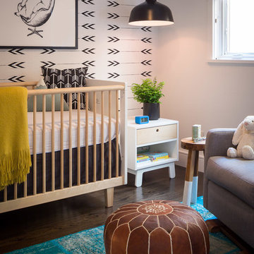
First home, savvy art owners, decided to hire RBD to design their recently purchased two story, four bedroom, midcentury Diamond Heights home to merge their new parenthood and love for entertaining lifestyles. Hired two months prior to the arrival of their baby boy, RBD was successful in installing the nursery just in time. The home required little architectural spatial reconfiguration given the previous owner was an architect, allowing RBD to focus mainly on furniture, fixtures and accessories while updating only a few finishes. New paint grade paneling added a needed midcentury texture to the entry, while an existing site for sore eyes radiator, received a new walnut cover creating a built-in mid-century custom headboard for the guest room, perfect for large art and plant decoration. RBD successfully paired furniture and art selections to connect the existing material finishes by keeping fabrics neutral and complimentary to the existing finishes. The backyard, an SF rare oasis, showcases a hanging chair and custom outdoor floor cushions for easy lounging, while a stylish midcentury heated bench allows easy outdoor entertaining in the SF climate.
Photography Credit: Scott Hargis Photography
 Revival House
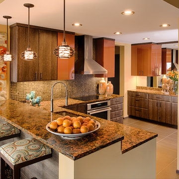
A fun yet sophisticated kitchen mimics the homeowner’s personality to a “T”. Located in uptown, this condos modern design really flourishes. Mirrors across the back wall give the small space some added dimension and appeal. This gentleman now has the perfect place to entertain his guests.
Scott Amundson Photography, LLC
Learn more about our showroom and kitchen and bath design: www.mingleteam.com
 Home Expressions Interiors by Laura Bloom Inc.
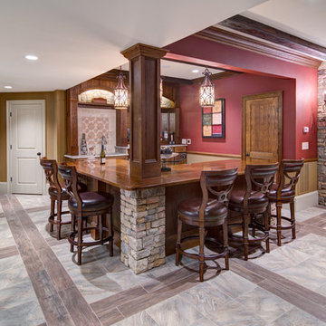
This client wanted their Terrace Level to be comprised of the warm finishes and colors found in a true Tuscan home. Basement was completely unfinished so once we space planned for all necessary areas including pre-teen media area and game room, adult media area, home bar and wine cellar guest suite and bathroom; we started selecting materials that were authentic and yet low maintenance since the entire space opens to an outdoor living area with pool. The wood like porcelain tile used to create interest on floors was complimented by custom distressed beams on the ceilings. Real stucco walls and brick floors lit by a wrought iron lantern create a true wine cellar mood. A sloped fireplace designed with brick, stone and stucco was enhanced with the rustic wood beam mantle to resemble a fireplace seen in Italy while adding a perfect and unexpected rustic charm and coziness to the bar area. Finally decorative finishes were applied to columns for a layered and worn appearance. Tumbled stone backsplash behind the bar was hand painted for another one of a kind focal point. Some other important features are the double sided iron railed staircase designed to make the space feel more unified and open and the barrel ceiling in the wine cellar. Carefully selected furniture and accessories complete the look.
136