
Search results for "Sense running" in Home Design Ideas

 G.B. Construction and Development, Inc.
Joan Wozniak
This completely remodeled kitchen was taken from outdated and blah to fabulous. Light colored raised panel wood cabinets complete with panels at each end were installed. Glass doors strategically located giving a more open feel and sense of depth. crown molding finish the cabinets beautifully where the upper cabinets meet the ceiling. Brushed chrome pulls were added to coordinate with the stainless steel appliances and sink. A dark Silestone countertop was added to contrast the light colored cabinets. The ceramic tile floor was lain on a diagonal to run perpendicular to the wood floor installed in the adjoining room and the deck off the breakfast area.

 Driwood Moulding Co
Running the wainscot throughout the basement ties in the family movie screening space. The same columns used on the base of the bar and the built in seating is seen once more on the mantel columns. The consistency of wood details brings a warmth and sense of comfort throughout the entire basement.
 Mission Home Remodeling
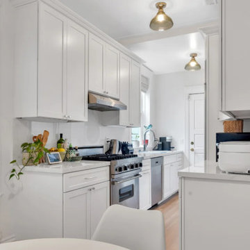
This Nob Hill kitchen showcases a clean, classic remodel with a distinctly San Francisco sensibility. Shaker-style white cabinetry rises to the ceiling for maximum storage, paired with quartz countertops and brushed brass semi-flush lighting that adds warmth against the crisp white palette. A professional-grade gas range with stainless steel finish anchors the run, flanked by a built-in dishwasher and a window over the sink that fills the galley layout with natural light. Warm oak flooring and soft woven window shades bring texture and a sense of ease to the space, striking that balance MHR clients look for: sophisticated, functional, and quietly livable.
Find the right local pro for your project
 Mission Home Remodeling
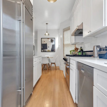
This Nob Hill kitchen makes the most of a classic galley layout, pairing crisp white shaker cabinetry with professional-grade stainless steel appliances for a look that feels both timeless and effortlessly functional. Wide-plank white oak flooring runs the length of the room, warming the space and leading the eye toward a sunlit breakfast nook framed by a paned window. Quartz countertops and a brass flush-mount fixture add quiet luxury, while the open sightline through to the dining area gives this efficient San Francisco kitchen a sense of flow and ease rarely found in the city's classic railroad-style homes.
 Hamish Murray Construction, Inc.
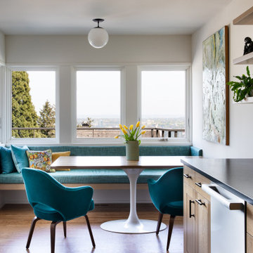
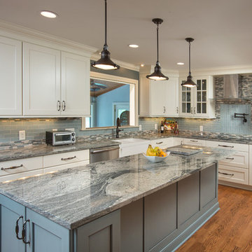
In the kitchen, strong attention to detail was vital to achieve precise sight lines that run the length of the home, linking the cabinetry and tile. Hardwood flooring sits below quarter-sawn white oak cabinetry, enveloped by dual leathered granite waterfall countertops, which impart a matte, textured appearance. The soft neutral tones bring a sense of warmth and unity, while thoughtfully placed dark accents and subtle hints of color beautifully complement the space.
The homeowners are avid wine connoisseurs, so two specialty wine refrigerators were also installed, providing the temperature-control needed to preserve the highest quality and taste.
 Turner Hastings
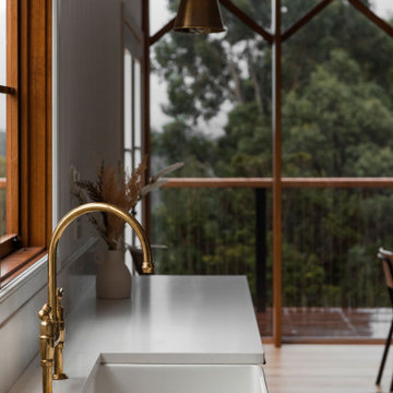
Interior Designer Savannah Denny has created a beautiful luxury woodland cabin nestled in the treetops of rural Tasmania.
With soaring detailed windows and the most breathtaking view, all it needed was some modern updates to bring it into the 21st century.
We re-planned the kitchen to include all the modern conveniences with the inclusion of a butler's pantry, walk-in food storage, french door fridge, freestanding cooktop, and a huge farmhouse sink. With American Farmhouse style in mind, we gave this treetop cabin a sense of luxury with the warm timber veneer cabinetry, brass accents and farmhouse sink.
The client wanted a retreat away from the hustle and bustle of corporate life and with a hobby farm to run this was the kitchen of their dreams. Perfect space to come and enjoy a coffee at the end of a long morning tending to the animals.
CREDITS
Savannah Denny Interior Design
Instagram: https://www.instagram.com/savannah_denny_interiors/
 EnergyPal Solar
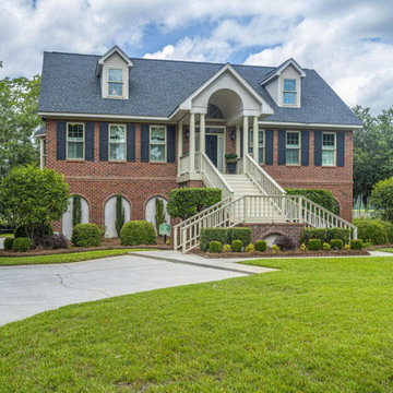
This one-of-a-kind lot and home provides the best sunset views in this riverfront community. You'll enjoy the sense of place this home's front elevation presents as you approach, lawn and home framed by the front crepe myrtles and oaks, nestled on well over a half-acre of impeccably manicured yard and grounds. Plus, with solar panels covering the roof, this home will run fully on clean solar energy!


 Harper Design Build
Example of a small trendy ceramic tile and gray floor mudroom design in New York with gray walls

 Klopf Architecture
 and Outer space Landscape Architects designed a new warm, modern, open, indoor-outdoor home in Los Altos, California. Inspired by mid-century modern homes but looking for something completely new and custom, the owners, a couple with two children, bought an older ranch style home with the intention of replacing it.
Created on a grid, the house is designed to be at rest with differentiated spaces for activities; living, playing, cooking, dining and a piano space. The low-sloping gable roof over the great room brings a grand feeling to the space. The clerestory windows at the high sloping roof make the grand space light and airy.
Upon entering the house, an open atrium entry in the middle of the house provides light and nature to the great room. The Heath tile wall at the back of the atrium blocks direct view of the rear yard from the entry door for privacy.
The bedrooms, bathrooms, play room and the sitting room are under flat wing-like roofs that balance on either side of the low sloping gable roof of the main space. Large sliding glass panels and pocketing glass doors foster openness to the front and back yards. In the front there is a fenced-in play space connected to the play room, creating an indoor-outdoor play space that could change in use over the years. The play room can also be closed off from the great room with a large pocketing door. In the rear, everything opens up to a deck overlooking a pool where the family can come together outdoors.
Wood siding travels from exterior to interior, accentuating the indoor-outdoor nature of the house. Where the exterior siding doesn’t come inside, a palette of white oak floors, white walls, walnut cabinetry, and dark window frames ties all the spaces together to create a uniform feeling and flow throughout the house. The custom cabinetry matches the minimal joinery of the rest of the house, a trim-less, minimal appearance. Wood siding was mitered in the corners, including where siding meets the interior drywall. Wall materials were held up off the floor with a minimal reveal. This tight detailing gives a sense of cleanliness to the house.
The garage door of the house is completely flush and of the same material as the garage wall, de-emphasizing the garage door and making the street presentation of the house kinder to the neighborhood.
The house is akin to a custom, modern-day Eichler home in many ways. Inspired by mid-century modern homes with today’s materials, approaches, standards, and technologies. The goals were to create an indoor-outdoor home that was energy-efficient, light and flexible for young children to grow. This 3,000 square foot, 3 bedroom, 2.5 bathroom new house is located in Los Altos in the heart of the Silicon Valley.
Klopf Architecture Project Team: John Klopf, AIA, and Chuang-Ming Liu
Landscape Architect: Outer space Landscape Architects
Structural Engineer: ZFA Structural Engineers
Staging: Da Lusso Design
Photography ©2018 Mariko Reed
Location: Los Altos, CA
Year completed: 2017
 Twelve Stones Designs, LLC
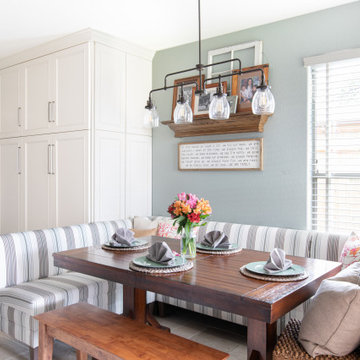
The owners of this kitchen had spent the money to upgrade the finishes in their kitchen upon building the home 12 years ago, but after living in the space for several years they realized how nonfunctional the layout really was. The (then) two preschool aged children had grown into busy, hungry teenagers with many friends who also liked to hang out at the house. So the family needed a more functional kitchen with better traffic flow, space for daily activities revolving around the kitchen at different times of day, and a kitchen that could accommodate cooking for and serving large groups. Furthermore, the dark, traditional finishes no longer reflected the homeowners’ style. They requested a brighter, more relaxed, coastal style that reflected their love of the seaside cities they like to visit.
Originally, the kitchen was U-shaped with a narrow island in the middle. The island created narrow aisles that bottle-necked at the dishwasher, refrigerator, and cooktop areas. There was a pass-through from the foyer into the kitchen, but the owners never liked that the pass-through was also located so close to the powder room. The awkward proximity was unappealing and made guests feel uncomfortable.
The kitchen’s storage was made up of lots of narrow cabinets, apothecary drawers, clipped corner units, and very few drawers. It lacked useful storage for the larger items the family used on a daily basis. And the kitchen’s only pantry was small closet that had only builder-grade, narrow shelving with no illumination to be able to see the contents inside.
Overall, the kitchen’s lighting plan was poorly executed. Only six recessed cans illuminated the entire kitchen and nook areas. The under cabinet lighting was not evenly distributed either. In fact, the builder had mis-placed the under cabinet lighting around the decorative pilasters which made for choppy, dark cubbies. Further, the builder didn’t include any lighting over the sink or the bar area, which meant whoever was doing the dishes was always in their own shadow. That, coupled with the steep overhang of the game room above made the bar area feel like a dim, cavernous space that wasn’t inviting or task oriented. The kitchen looked out into the main living space, but the raised bar and a narrow wall (which held the only large cabinet in the kitchen) created more of a barrier than a relationship to the living room or breakfast nook. In fact, one couldn’t even see the breakfast nook from the cooktop or sink areas due to its orientation. The raised bar top was too narrow to comfortably sit to either dine at or chat from due to the lack of knee space. The the homeowners confided that the kitchen felt more like a dark, dirty prison than place where the family, or their guests, wanted to gather and commune.
The clients' needs and desires were:
➢ to create a kitchen that would be a space the family loved to be in; to relate to the adjacent spaces all around, and to have better flow for entertaining large groups
➢ to remove the walls between the breakfast nook and living area and to be able to utilize the natural light from the windows in both those areas
➢ to incorporate a functional chopping block for prepping fresh food for home cooked meals, an island with a large sink and drain board, 2 pull out trash cans, and seating for at least the 2 teens to eat or do homework
➢ to design a kitchen and breakfast nook with an airy, coastal, relaxed vibe that blended with the rest of the house's coastal theme
➢ to integrate a layered lighting plan which would include ample general illumination, specific task lighting, decorative lighting, and lots of illuminated storage
➢ to design a kitchen with not only more storage for all the husband’s kitchen gadgets and collection of oils and spices, but smart storage, including a coffee/breakfast bar and a place to store and conceal the toaster oven and microwave
➢ to find a way to utilize the large open space between the kitchen, pantry area, and breakfast nook
Twelve Stones Designs achieved the owner's goals by:
➢ removing the walls between the kitchen and living room to allow the natural light to filter in from the adjacent rooms and to create a connection between the kitchen, nook, and living spaces for a sense of unity and communion
➢ removing the existing pantry and designing 3 large pantry style cabinets with LED tape lights and rollout drawers to house lots of kitchen appliances, gadgets, and tons of groceries. We also took the cabinets all the way up to the 9’ ceiling for additional storage for seasonal items and bulk storage.
➢ designing 2 islands - 1 with a gorgeous black walnut chopping block that houses a drawer for chopping and carving knives and a custom double pull out trash unit for point of use utilization - and 1 that houses the dishwasher, a large Blanco Gourmet sink with integrated drain board, woven baskets for fresh root vegetables and kitchen towels, plenty of drawer storage for kitchen items, and bar seating for up to 4 diners.
➢ closing off the space between the kitchen and the powder room to create a beautiful new private alcove for the powder room as well as adding some decorative storage. This also gave us space to include more tall storage near the new range for precision placement of the husband’s extensive oil and spice collection as well as a location for a combo-steam oven the wife wanted for baking and cooking healthy meals.
The project is enhanced functionally by:
➢ incorporated USB and standard receptacles for the kids’ laptops and phone charging in the large island
➢ designing the small island to include additional open shelving for items used on a daily basis such as a variety of bowls, plates, and colanders. This set up also works well for the husband who prefers to “plate” his dinners in restaurant-style fashion before presenting them to the table.
➢ the integration of specific storage units, such as double stacked cutlery drawers, a custom spice pull-out, a Kuerig coffee and tea pod drawer, and custom double stacked utensil drawers
➢ moving the refrigerator to the old oven location - this eliminated the bottle neck as well as created a better relationship to the eating table. It also utilizes the floor space between the pantry, nook, and kitchen
➢ creating a banquet style breakfast nook - this banquette seating not only doubles the amount of seating for large gatherings but it better utilizes the odd space between the kitchen and the previous nook area. It also helps to create a distinct pathway from the mudroom room through the pantry area, kitchen, nook, and living room.
➢ the coffee/breakfast bar area which includes the perfect location for the concealed microwave and toaster oven, convenient storage for the coffee pods and tea accoutrements. Roll-out drawers below also house the smoothie maker, hot water kettle, and a plethora of smoothie-making ingredients such as protein powders, smoothie additives, etc. Furthermore, the drawers below the Keurig house measuring utensil, cutlery, baking supplies and tupperware storage.
➢ incorporating lots of wide drawers and pullouts to accommodate large cookware.
➢ utilizing as much vertical space as possible by building storage to the ceiling which accommodates the family’s abundant amount of serving platters, baking sheets, bakeware, casserole dishes, and additional cutting boards.
The project is enhanced aesthetically by:
➢ new 5-piece Versailles pattern porcelain tile that now seamlessly joins the entire down stairs area together creating a bright, cohesiveness feeling instead of choppy separated spaces - it also adds a coastal feeling
➢ designing a cabinet to conceal the microwave and toaster oven
➢ the coastal influenced light fixtures over the nook table and island
➢ the sandy colors of the Langdon Cambria countertops. The swirling pattern and sparkling quartz pieces remind the homeowner of black-and-tan sandy beaches
➢ the striped banquet seating whose creamy white background and blue-green stripes were the inspiration for the cabinet and wall colors.
➢ All the interior doors were painted black to coordinate with the blacks and grays in the backsplash tile and countertop. This also adds a hint of tailored formality to an otherwise casual space.
➢ the use of WAC's Oculux small aperture LED units for the overhead lighting complimented with Diode LED strips for task lighting under the cabinets and inside the pantry and glass wall cabinets. All of the lighting applications are on separate dimmer switches.
Innovative uses of materials or construction methods by Realty Restoration LLC:
➢ Each 1-1/2” x 3” block of reclaimed end-grain black walnut that makes up the center island chopping block was hand milled and built in the shop. It was designed to look substantial and proportional to the surrounding elements, executed by creating the 4 inch tall top with a solid wood chamfered edge band.
➢ The metal doors on either side of the vent hood were also custom designed for this project and built in the Realty Restoration LLC shop. They are made 1x2, 11-gauge mild steel with ribbed glass. Weighing 60 lbs a piece, heavy duty cabinet hinges were added to support the weight of the door and keep them from sagging.
➢ Under-cabinet receptacles were added along the range wall in order to have a clean, uninterrupted backsplash.
Design obstacles to overcome:
➢ Because we were removing the demising walls between the kitchen and living room, we had to find a way to plumb and vent the new island. We did this by tunneling through the slab (the slab had post tension cables which prevented us from just trenching) to run a new wet vent through a nearby structural wall. We pulled the existing hot and cold lines between upper floor joists and ran them down the structural wall as well and up through a conduit in the tunnel.
➢ Since we were converting from wall overs to a gas range it allowed us to utilize the 220 feed for the wall ovens to provide a new sub panel for all the new kitchen circuits
➢ Due to framing deficiencies inherited from the original build there was a 1-1/2” differential in the floor-to-ceiling height over a 20 foot span; by utilizing the process of cutting and furring coupled with the crown moulding details on the cabinet elevations we were able to mask the problem and provide seamless transitions between the cabinet components.
Evidence of superior craftsmanship:
➢ uniquely designed, one-of-a-kind metal “X” end panels on the large island. The end panels were custom made in the Realty Restoration LLC shop and fitted to the exact dimensions of the island. The welding seams are completely indistinguishable - the posts look like they are cut from a single sheet of metal
➢ square metal posts on the small island were also custom made and designed to compliment and carry through the metal element s throughout the kitchen
➢ the beautiful, oversized end panels on the pantry cabinets which give the breakfast nook a tailored look
➢ integrating a large format 5 piece Versailles tile pattern to seamlessly flow from the existing spaces into the new kitchen space
➢ By constructing a custom cabinet that jogged around a corner we could not remodel (housing the entry way coat closet) we were able to camouflage the adjacent wall offset within the upper and lower cabinets. By designing around the existing jog in the structural walls we accomplished a few things: we were able to find the space to house, and hide, the microwave and toaster oven yet still have a clean cohesive appearance from the kitchen side. Additionally, the owners were able to keep their much needed coat closet and we didn’t have to increase the budget with unnecessary structural work.

 LeichtUSA
The kitchen as the centre of the home – that was something
the whole family wanted. So there is no living space
in the traditional sense in the Madrona house, simply causally
positioned seating in a range of niches. The openplan
kitchen is at the top of the stairs on the first floor and
opens up to the outside with floor-to-ceiling windows. The
limitation to the bare essentials in terms of furniture and
fixtures is characteristic of the interior – the kitchen area
looks correspondingly spacious with units right down to
the floor, one streamlined unit run and a dining table.
Kitchen By: Leicht USA
Builder: YS Built
photographer: Lara Swimmer (Seattle)

 Cummings Architecture + Interiors
Situated in a neighborhood of grand Victorians, this shingled Foursquare home seemed like a bit of a wallflower with its plain façade. The homeowner came to Cummings Architects hoping for a design that would add some character and make the house feel more a part of the neighborhood.
The answer was an expansive porch that runs along the front façade and down the length of one side, providing a beautiful new entrance, lots of outdoor living space, and more than enough charm to transform the home’s entire personality. Designed to coordinate seamlessly with the streetscape, the porch includes many custom details including perfectly proportioned double columns positioned on handmade piers of tiered shingles, mahogany decking, and a fir beaded ceiling laid in a pattern designed specifically to complement the covered porch layout. Custom designed and built handrails bridge the gap between the supporting piers, adding a subtle sense of shape and movement to the wrap around style.
Other details like the crown molding integrate beautifully with the architectural style of the home, making the porch look like it’s always been there. No longer the wallflower, this house is now a lovely beauty that looks right at home among its majestic neighbors.
Photo by Eric Roth
 Flavin Architects
Devereux Beach House
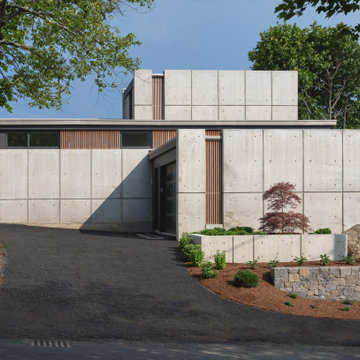
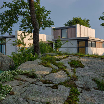
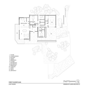
Our client presented Flavin Architects with a unique challenge. On a site that previously hosted two houses, our client asked us to design a modestly sized house and separate art studio. Both structures reduce the height and bulk of the original buildings. The modern concrete house we designed is situated on the brow of a steep cliff overlooking Marblehead harbor. The concrete visually anchors the house to stone outcroppings on the property, and the low profile ensures the structure doesn’t conflict with the surround of traditional, gabled homes.
Three primary concrete walls run north to south in parallel, forming the structural walls of the home. The entry sequence is carefully considered. The front door is hidden from view from the street. An entry path leads to an intimate courtyard, from which the front door is first visible. Upon entering, the visitor gets the first glimpse of the sea, framed by a portal of cast-in-place concrete. The kitchen, living, and dining space have a soaring 10-foot ceiling creating an especially spacious sense of interiority. A cantilevered deck runs the length of the living room, with a solid railing providing privacy from beach below. Where the house grows from a single to a two-story structure, the concrete walls rise magisterially to the full height of the building. The exterior concrete walls are accented with zinc gutters and downspouts, and wooden Ipe slats which softly filter light through the windows.
Sponsored
Columbus, OH

Trish Takacs Design
Award Winning & Highly Skilled Kitchen & Bath Designer in Columbus

 Maraya Interior Design
Old World European, Country Cottage. Three separate cottages make up this secluded village over looking a private lake in an old German, English, and French stone villa style. Hand scraped arched trusses, wide width random walnut plank flooring, distressed dark stained raised panel cabinetry, and hand carved moldings make these traditional buildings look like they have been here for 100s of years. Newly built of old materials, and old traditional building methods, including arched planked doors, leathered stone counter tops, stone entry, wrought iron straps, and metal beam straps. The Lake House is the first, a Tudor style cottage with a slate roof, 2 bedrooms, view filled living room open to the dining area, all overlooking the lake. European fantasy cottage with hand hewn beams, exposed curved trusses and scraped walnut floors, carved moldings, steel straps, wrought iron lighting and real stone arched fireplace. The Carriage Home fills in when the kids come home to visit, and holds the garage for the whole idyllic village. This cottage features 2 bedrooms with on suite baths, a large open kitchen, and an warm, comfortable and inviting great room. All overlooking the lake. The third structure is the Wheel House, running a real wonderful old water wheel, and features a private suite upstairs, and a work space downstairs. All homes are slightly different in materials and color, including a few with old terra cotta roofing. Project Location: Ojai, California. Project designed by Maraya Interior Design. From their beautiful resort town of Ojai, they serve clients in Montecito, Hope Ranch, Malibu and Calabasas, across the tri-county area of Santa Barbara, Ventura and Los Angeles, south to Hidden Hills.
Christopher Painter, contractor
 LeichtUSA
The kitchen as the centre of the home – that was something the whole family wanted. So there is no living space in the traditional sense in the Madrona house, simply causally positioned seating in a range of niches. The open plan kitchen is at the top of the stairs on the first floor and opens up to the outside with floor-to-ceiling windows. The
limitation to the bare essentials in terms of furniture and
fixtures is characteristic of the interior – the kitchen area
looks correspondingly spacious with units right down to
the floor, one streamlined unit run and a dining table.
Kitchen By: Leicht USA
Builder: YS Built
photographer: Lara Swimmer (Seattle)

 Flavin Architects
Devereux Beach House
Our client presented Flavin Architects with a unique challenge. On a site that previously hosted two houses, our client asked us to design a modestly sized house and separate art studio. Both structures reduce the height and bulk of the original buildings. The modern concrete house we designed is situated on the brow of a steep cliff overlooking Marblehead harbor. The concrete visually anchors the house to stone outcroppings on the property, and the low profile ensures the structure doesn’t conflict with the surround of traditional, gabled homes.
Three primary concrete walls run north to south in parallel, forming the structural walls of the home. The entry sequence is carefully considered. The front door is hidden from view from the street. An entry path leads to an intimate courtyard, from which the front door is first visible. Upon entering, the visitor gets the first glimpse of the sea, framed by a portal of cast-in-place concrete. The kitchen, living, and dining space have a soaring 10-foot ceiling creating an especially spacious sense of interiority. A cantilevered deck runs the length of the living room, with a solid railing providing privacy from beach below. Where the house grows from a single to a two-story structure, the concrete walls rise magisterially to the full height of the building. The exterior concrete walls are accented with zinc gutters and downspouts, and wooden Ipe slats which softly filter light through the windows.
 Flavin Architects
Devereux Beach House
Our client presented Flavin Architects with a unique challenge. On a site that previously hosted two houses, our client asked us to design a modestly sized house and separate art studio. Both structures reduce the height and bulk of the original buildings. The modern concrete house we designed is situated on the brow of a steep cliff overlooking Marblehead harbor. The concrete visually anchors the house to stone outcroppings on the property, and the low profile ensures the structure doesn’t conflict with the surround of traditional, gabled homes.
Three primary concrete walls run north to south in parallel, forming the structural walls of the home. The entry sequence is carefully considered. The front door is hidden from view from the street. An entry path leads to an intimate courtyard, from which the front door is first visible. Upon entering, the visitor gets the first glimpse of the sea, framed by a portal of cast-in-place concrete. The kitchen, living, and dining space have a soaring 10-foot ceiling creating an especially spacious sense of interiority. A cantilevered deck runs the length of the living room, with a solid railing providing privacy from beach below. Where the house grows from a single to a two-story structure, the concrete walls rise magisterially to the full height of the building. The exterior concrete walls are accented with zinc gutters and downspouts, and wooden Ipe slats which softly filter light through the windows.

 Saikley Architects
This beautiful 1881 Alameda Victorian cottage, wonderfully embodying the Transitional Gothic-Eastlake era, had most of its original features intact. Our clients, one of whom is a painter, wanted to preserve the beauty of the historic home while modernizing its flow and function.
From several small rooms, we created a bright, open artist’s studio. We dug out the basement for a large workshop, extending a new run of stair in keeping with the existing original staircase. While keeping the bones of the house intact, we combined small spaces into large rooms, closed off doorways that were in awkward places, removed unused chimneys, changed the circulation through the house for ease and good sightlines, and made new high doorways that work gracefully with the eleven foot high ceilings. We removed inconsistent picture railings to give wall space for the clients’ art collection and to enhance the height of the rooms. From a poorly laid out kitchen and adjunct utility rooms, we made a large kitchen and family room with nine-foot-high glass doors to a new large deck. A tall wood screen at one end of the deck, fire pit, and seating give the sense of an outdoor room, overlooking the owners’ intensively planted garden. A previous mismatched addition at the side of the house was removed and a cozy outdoor living space made where morning light is received. The original house was segmented into small spaces; the new open design lends itself to the clients’ lifestyle of entertaining groups of people, working from home, and enjoying indoor-outdoor living.
Photography by Kurt Manley.
https://saikleyarchitects.com/portfolio/artists-victorian/
25