
Search results for "Sense running" in Home Design Ideas

 Tom Ralston Concrete
Nooks and Crannies at the DeBernardo pool and back yard that offer a handsome wooden shade structure outside of the piano room; Stone Columns surrounded with Mexican La Paz pebbles, Japanese Maple and Fern that take advantage of the shady areas as well as the planter line up with a 3" precast concrete cap in the foreground and thicker 6" concrete cast in place planter caps heading toward the vineyards.
John Luhn

 Century Stair Company
This industrial staircase rises through the heart of the home, taking center stage as an anchoring sculptural piece. The light gray treads pair flawlessly with the dark metal railings to create a refined contrast while complementing the exposed structural steel beams throughout the home. The open risers amplify the sense of volume, allowing the staircase to feel integrated rather than intrusive. The result is functional art that elevates everyday movement into an architectural experience.
1976-2025 © Century Stair Company

 Saikley Architects
This beautiful 1881 Alameda Victorian cottage, wonderfully embodying the Transitional Gothic-Eastlake era, had most of its original features intact. Our clients, one of whom is a painter, wanted to preserve the beauty of the historic home while modernizing its flow and function.
From several small rooms, we created a bright, open artist’s studio. We dug out the basement for a large workshop, extending a new run of stair in keeping with the existing original staircase. While keeping the bones of the house intact, we combined small spaces into large rooms, closed off doorways that were in awkward places, removed unused chimneys, changed the circulation through the house for ease and good sightlines, and made new high doorways that work gracefully with the eleven foot high ceilings. We removed inconsistent picture railings to give wall space for the clients’ art collection and to enhance the height of the rooms. From a poorly laid out kitchen and adjunct utility rooms, we made a large kitchen and family room with nine-foot-high glass doors to a new large deck. A tall wood screen at one end of the deck, fire pit, and seating give the sense of an outdoor room, overlooking the owners’ intensively planted garden. A previous mismatched addition at the side of the house was removed and a cozy outdoor living space made where morning light is received. The original house was segmented into small spaces; the new open design lends itself to the clients’ lifestyle of entertaining groups of people, working from home, and enjoying indoor-outdoor living.
Photography by Kurt Manley.
https://saikleyarchitects.com/portfolio/artists-victorian/
Find the right local pro for your project
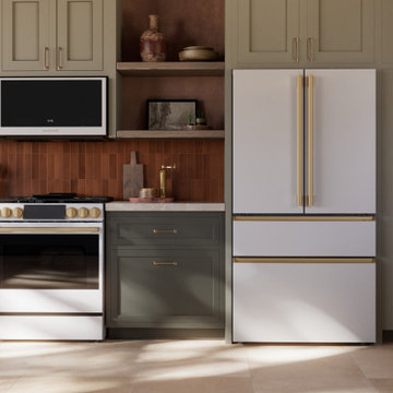


 Maria Aureli
The challenge was to create a modern, minimalist structure that did not interfere with the natural setting but rather seemed nestled in and part of the landscape while blurring the lines between interior and exterior spaces.
Special Features and Details:
• wood floor, ceiling and exterior deck all run in the same direction drawing the eye toward the water view below
• valence encompassing the living space aligns with the face of the loft floor and conceals window shades and uplighting.
• pocket doors are flush with the ceiling adding to the feeling of one room flowing into the other when the doors are open
• ample storage tucks into the walls unobtrusively
• baseboards are set in, flush with the walls separated by a channel detail.
• deck appears to float, creating a sense of weightlessness. This detail repeats at the bedside tables and bathroom vanity
• obscured glass window in shower provides light and privacy
 Maria Aureli
The challenge was to create a modern, minimalist structure that did not interfere with the natural setting but rather seemed nestled in and part of the landscape while blurring the lines between interior and exterior spaces.
Special Features and Details:
• wood floor, ceiling and exterior deck all run in the same direction drawing the eye toward the water view below
• valence encompassing the living space aligns with the face of the loft floor and conceals window shades and uplighting.
• pocket doors are flush with the ceiling adding to the feeling of one room flowing into the other when the doors are open
• ample storage tucks into the walls unobtrusively
• baseboards are set in, flush with the walls separated by a channel detail.
• deck appears to float, creating a sense of weightlessness. This detail repeats at the bedside tables and bathroom vanity
• obscured glass window in shower provides light and privacy

 TKS Design Group
This project is a good example of what can be done with a little refresh. Sometimes parts of your space work well and parts don’t, so a full gut and replace might not make sense. That was the case here.
After living with it for a decade or so realized they would really prefer two sinks in the vanity. Since there were two windows in the bathroom, we decided to eliminate the window to the left of the current vanity and replace with it with a longer run of cabinets.
The other window is to the right of the vanity let’s in beautiful morning light. The window we removed was a northern exposure and its location under an eave didn’t allow for much light, so it was the perfect solution!
In addition to the new vanity, we also changed out the countertop, added new mirrors and lighting, and changed out the tile floor to a larger hex with fewer grout lines. This adds a brighter more modern look while still maintaining the vintage feel of the room.
The shower was in great shape, so we left that as is except for swapping out the shower floor tile to match the main floor and adding a more updated decorative mosaic tile. We added a new toilet and for a bit of luxury a heated towel bar.
Designed by: Susan Klimala, CKD, CBD
Photography by: LOMA Studios
For more information on kitchen and bath design ideas go to: www.kitchenstudio-ge.com
Project Year: 2020

 Sixth Sense Studio
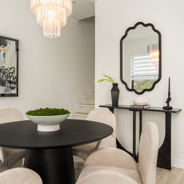
The centerpiece of the scene is a rectangular dining table crafted from light brown wood. It boasts a smooth finish and a clean design, featuring four straight legs connected by a stretcher base - a horizontal bar that runs between the legs on each long side for added stability. The light brown color of the table creates a warm and inviting feel in the room.
In the center of the table sits a simple yet elegant centerpiece. A white ceramic vase holds several green plant stems, adding a touch of nature and life to the space.
Surrounding the table are four chairs, each with a brown wooden frame that complements the table. The chairs are upholstered in a light brown fabric, creating a cohesive look with the table. The upholstery appears light-colored enough to add contrast and prevent the room from looking too dark or monotonous.
A decorative mirror hangs on the wall directly behind the table. The mirror's frame has a light brown finish that echoes the color of the table and chair frames, tying the design elements together. This placement of the mirror helps create a sense of spaciousness in the dining room by reflecting the light and the table setting.
A chandelier hangs from the ceiling, positioned directly above the center of the table. The chandelier has a metal frame with a classic design, featuring multiple arms that each hold a clear glass bulb. The chandelier provides ample task lighting for the dining area, and its style complements the traditional feel of the furniture.
Overall, the scene depicts a well-coordinated dining room that is both warm and inviting. The use of light brown tones throughout the space creates a sense of harmony, while the simple elegance of the furniture and centerpiece suggests a focus on functionality and clean lines.
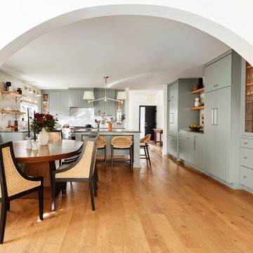

 Maria Aureli
The challenge was to create a modern, minimalist structure that did not interfere with the natural setting but rather seemed nestled in and part of the landscape while blurring the lines between interior and exterior spaces.
Special Features and Details:
• wood floor, ceiling and exterior deck all run in the same direction drawing the eye toward the water view below
• valence encompassing the living space aligns with the face of the loft floor and conceals window shades and uplighting.
• pocket doors are flush with the ceiling adding to the feeling of one room flowing into the other when the doors are open
• ample storage tucks into the walls unobtrusively
• baseboards are set in, flush with the walls separated by a channel detail.
• deck appears to float, creating a sense of weightlessness. This detail repeats at the bedside tables and bathroom vanity
• obscured glass window in shower provides light and privacy
 Verce Design
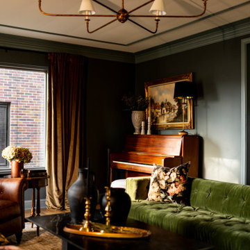
A century-old colonial estate in one of Detroit’s most prestigious neighborhoods is given new life. Nationally award winning and one-of-a-kind, the space highlights new furnishings, custom millwork, European textiles and wallpaper, blended with family heirlooms and antique artifacts that have been collected and curated over decades. Reflecting the family’s unique personality and functional needs were a driving component in the design. From Indian and Irish descent, the beautiful, multi-cultural family was highlighted throughout the home. Living busy lives including running multiple businesses, coaching sports teams, and global travels - our goal was to create a home that gave the family a sense of peace and awe.
 Sixth Sense Studio
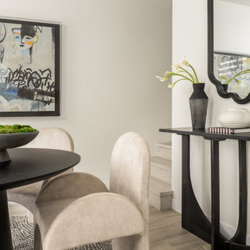
The centerpiece of the scene is a rectangular dining table crafted from light brown wood. It boasts a smooth finish and a clean design, featuring four straight legs connected by a stretcher base - a horizontal bar that runs between the legs on each long side for added stability. The light brown color of the table creates a warm and inviting feel in the room.
In the center of the table sits a simple yet elegant centerpiece. A white ceramic vase holds several green plant stems, adding a touch of nature and life to the space.
Surrounding the table are four chairs, each with a brown wooden frame that complements the table. The chairs are upholstered in a light brown fabric, creating a cohesive look with the table. The upholstery appears light-colored enough to add contrast and prevent the room from looking too dark or monotonous.
A decorative mirror hangs on the wall directly behind the table. The mirror's frame has a light brown finish that echoes the color of the table and chair frames, tying the design elements together. This placement of the mirror helps create a sense of spaciousness in the dining room by reflecting the light and the table setting.
A chandelier hangs from the ceiling, positioned directly above the center of the table. The chandelier has a metal frame with a classic design, featuring multiple arms that each hold a clear glass bulb. The chandelier provides ample task lighting for the dining area, and its style complements the traditional feel of the furniture.
Overall, the scene depicts a well-coordinated dining room that is both warm and inviting. The use of light brown tones throughout the space creates a sense of harmony, while the simple elegance of the furniture and centerpiece suggests a focus on functionality and clean lines.
 Verce Design
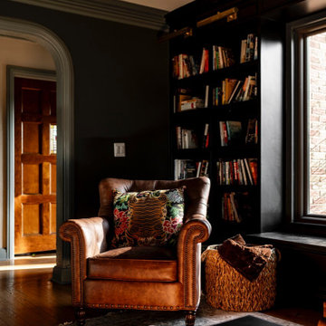
A century-old colonial estate in one of Detroit’s most prestigious neighborhoods is given new life. Nationally award winning and one-of-a-kind, the space highlights new furnishings, custom millwork, European textiles and wallpaper, blended with family heirlooms and antique artifacts that have been collected and curated over decades. Reflecting the family’s unique personality and functional needs were a driving component in the design. From Indian and Irish descent, the beautiful, multi-cultural family was highlighted throughout the home. Living busy lives including running multiple businesses, coaching sports teams, and global travels - our goal was to create a home that gave the family a sense of peace and awe.
Sponsored
Columbus, OH

Trish Takacs Design
Award Winning & Highly Skilled Kitchen & Bath Designer in Columbus

 Meyer Design
The hallway features warm, inviting wood flooring that runs seamlessly from one end to the other, adding natural texture and elegance to the space. The rich, honey-toned hardwood planks are arranged in a classic pattern, enhancing the sense of continuity and flow. Soft, ambient lighting is provided by strategically placed wall sconces or recessed ceiling lights, creating a cozy and well-lit passageway. The walls are painted in neutral tones, perhaps with subtle decorative molding or artwork to add visual interest. A runner rug, in a complementary color or pattern, adds comfort underfoot and guides visitors through the corridor. Simple, stylish hardware and minimalistic accents keep the focus on the natural beauty of the wood flooring and the warm lighting, making the hallway a welcoming transition between rooms.

 Joy Street Design
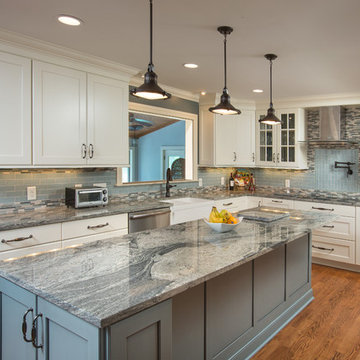
A gorgeous kitchen showcasing a brand new color palette of gray and bold blue! As this was the client’s childhood home, we wanted to preserve her memories while still refreshing the interior and bringing it up-to-date. We started with a new spatial layout and increased the size of wall openings to create the sense of an open plan without removing all the walls. By adding a more functional layout and pops of color throughout the space, we were able to achieve a youthful update to a cherished space without losing all the character and memories that the homeowner loved.
Designed by Joy Street Design serving Oakland, Berkeley, San Francisco, and the whole of the East Bay.
For more about Joy Street Design, click here: https://www.joystreetdesign.com/
To learn more about this project, click here: https://www.joystreetdesign.com/portfolio/randolph-street

 Albert, Righter & Tittmann Architects, Inc.
Modern Farmhouse is a contemporary take on a tradition building type, the Connecticut farmhouse. Our clients were interested in a house that fit in with the landscape while providing plenty of daylight with views to the surrounding property. The design uses simple gables arranged in a picturesque manner. It balances clean modern lines, traditional forms, and rustic textures. The new house is bright and light while also feeling personal and unique.
There was interest early on to compress the construction time and to design a building that would not take a lot of energy to run. To achieve these goals, the design of the main house used modular construction and a high performance envelope. To articulate the surfaces of the spaces, the owner assembled a group of designers and artisans. Natural textures and tones were layered over the volumes to give a sense of place and time. The modular units of the house are produced by Huntington Homes in East Montpelier, Vermont.
In addition to the main house, there is a pool house that sits symmetrically on the main axis of a long swimming pool. A glass enclosed living room fits between two concrete volumes that house a bathroom and storage spaces. An outdoor shower faces south, with an oculus that lets light in when the door is closed. The simple forms of the pool house sit below a green roof, which protects the glassy room from the summer sun and integrates the building into the hilly landscape.

 Cummings Architecture + Interiors
Situated along Eagle River, looking across to the mouth of the Ipswich Harbor, this was clearly a little cape house that was married to the sea. The owners were inquiring about adding a simple shed dormer to provide additional exposure to the stunning water view, but they were also interested in what Mathew would design if this beach cottage were his.
Inspired by the waves that came ashore mere feet from the little house, Mathew took up a fat marker and sketched a sweeping, S-shape dormer on the waterside of the building. He then described how the dormer would be designed in the shape of an ocean wave. “This way,” he explained, “you will not only be able to see the ocean from your new master bedroom, you’ll also be able to experience that view from a space that actually reflects the spirit of the waves.”
Mathew and his team designed the master suite and study using a subtle combination of contemporary and traditional, beach-house elements. The result was a completely unique and one-of-a-kind space inside and out. Transparencies are built into the design via features like gently curved glass that reflects the water and the arched interior window separating the bedroom and bath. On the exterior, the curved dormer on the street side echoes these rounded shapes and lines to create continuity throughout. The sense of movement is accentuated by the continuous, V-groove boarded ceiling that runs from one ocean-shaped dormer through to the opposite side of the house.
The bedroom features a cozy sitting area with built in storage and a porthole window to look out onto the rowboats in the harbor. A bathroom and closet were combined into a single room in a modern design that doesn't sacrifice any style or space and provides highly efficient functionality. A striking barn door made of glass with industrial hardware divides the two zones of the master suite. The custom, built-in maple cabinetry of the closets provides a textural counterpoint to the unique glass shower that incorporates sea stones and an ocean wave motif accent tile.
With this spectacular design vision, the owners are now able to enjoy their stunning view from a bright and spacious interior that brings the natural elements of the beach into the home.
Photo by Eric Roth

 Rodwin Architecture & Skycastle Construction
Rodwin Architecture & Skycastle Homes
Location: Boulder, CO USA
Our clients asked us to breathe new life into a dark and chopped up 1990’s home, that had a solid shell but a dysfunctional floor plan and dated finishes. We took down all the walls and created an open concept, sunny plan where all the public social spaces connected. We added a Dutch front door and created both a foyer and proper mud-room for the first time, so guests now had a sense of arrival and a place to hang their jackets. The odd dated kitchen that was the heart of the home was rebuilt from scratch with a simple white and blue palette. We opened up the south wall of the main floor with large windows and doors to help BBQ’s and parties flow from inside to the patio. The sagging and faded wrap-around porch was rebuilt from scratch. We re-arranged the interior spaces to create a dream kid’s playroom packed with organized storage and just far enough away from the grown-ups so that everyone can co-exist peacefully. We redid the finishes & fixtures throughout, and opened up the staircase to be an elegant path through this 4 storey house.
Built by Skycastle Construction.
 Cummings Architecture + Interiors
Situated in a neighborhood of grand Victorians, this shingled Foursquare home seemed like a bit of a wallflower with its plain façade. The homeowner came to Cummings Architects hoping for a design that would add some character and make the house feel more a part of the neighborhood.
The answer was an expansive porch that runs along the front façade and down the length of one side, providing a beautiful new entrance, lots of outdoor living space, and more than enough charm to transform the home’s entire personality. Designed to coordinate seamlessly with the streetscape, the porch includes many custom details including perfectly proportioned double columns positioned on handmade piers of tiered shingles, mahogany decking, and a fir beaded ceiling laid in a pattern designed specifically to complement the covered porch layout. Custom designed and built handrails bridge the gap between the supporting piers, adding a subtle sense of shape and movement to the wrap around style.
Other details like the crown molding integrate beautifully with the architectural style of the home, making the porch look like it’s always been there. No longer the wallflower, this house is now a lovely beauty that looks right at home among its majestic neighbors.
Photo by Eric Roth
 YW CONSTRUCTION SERVICES
This complete home remodel transformed an outdated space into a bright, open-concept living area with a clean and modern aesthetic. The kitchen features white shaker cabinets, quartz countertops, and stainless steel appliances that blend functionality with timeless design. Light wood flooring runs seamlessly throughout the main level, enhancing the sense of continuity and warmth.
The open floor plan connects the kitchen, dining, and living areas, creating a spacious and inviting environment perfect for modern living. Neutral tones, recessed lighting, and sleek fixtures highlight the home’s contemporary feel, while the bold black front door adds a touch of contrast and sophistication.
This renovation focused on maximizing natural light, optimizing flow, and combining simplicity with elegance — the perfect balance of comfort and style for everyday living.
29