
Search results for "Sense running" in Home Design Ideas
 French Creek Designs Kitchen & Bath Design Center
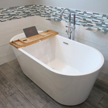
Acrylic freestanding tub added in this light, bright, and refreshing bathroom remodel. From drab colors to light and bright was the transformation of this bathroom remodel. First and trending, garden tub is removed and replaced with a white acrylic freestanding tub. In addition, to a beautifully wrapped subway tile wall eloquently displayed with a glass mixed mosaic tile. Along with adding a Schluter metal shelf just above the tub to hold those necessities with a matching schluter metal trim along the top of the mosaic.
Next, shower modified and enlarged to accommodate a marble bench, threshold, and beautiful shelves to hold those necessities. Included just above the bench is a niche neatly hidden to accommodate additional storage. Coupled with a waterfall tile running down the center of the back wall is stunning. Shower floor and interior of niche completed in a honed lava grey tile.
Furthermore, cabinets refreshed and refurbished with a blue grey paint topped with elegant marble countertops. Together with the glass mixed mosaic and subway tile was used throughout the bathroom adding the finishing touches and creating a sense of luxury. Finally, warm wood-look grey tile flowing throughout the floor is inviting. The before and after photos of this bathroom remodel is stunning. When refreshing, light, and bright are in order. This bathroom renovation is perfectly displayed.

 Paul Lopa Designs
See what our client say about Paul Lopa Designs:
It went as smooth as it possibly could go. The only bumps in the road was with what we found during demolition, you never know what your gonna run into when all the walls, floors and fixtures come out. Paul had explained to us that depending on what we found under all the out dated stuff it might take a little longer. Paul was there doing the work with his workers he showed up on time and finished on schedule. It was no problem being in touch with Paul because he answered his phone or got back to us in a timely fashion. He has an excellent sense of design he knows what goes well together and makes the house flow with comfort and usability.
Paul Lopa designs,inc

 Zola European Windows
Essential, contemporary, and inviting defines this extremely energy efficient, Energy Star certified, Passive House design-inspired home in the Pacific Northwest. Designed for an active family of four, the one-story 3 bedroom, 2 bath floor plan offers tasteful aging in place features, a strong sense of privacy, and a low profile that doesn’t impinge on the natural landscape. This house will heat itself in the dead of winter with less energy than it takes to run a hair dryer, and be sensual to live in while it does it. The forms throughout the home are simple and neutral, allowing for ample natural light, rich warm materials, and of course, room for the Guinea pigs makes this a great example of artful architecture applied to a genuine family lifestyle.
This ultra energy efficient home relies on extremely high levels of insulation, air-tight detailing and construction, and the implementation of high performance, custom made European windows and doors by Zola Windows. Zola’s ThermoPlus Clad line, which boasts R-11 triple glazing and is thermally broken with a layer of patented German Purenit®, was selected for the project. Natural daylight enters both from the tilt & turn and fixed windows in the living and dining areas, and through the terrace door that leads seamlessly outside to the natural landscape.
Project Designed & Built by: artisansgroup
Certifications: Energy Star & Built Green Lvl 4
Photography: Art Gray of Art Gray Photography
Find the right local pro for your project

 Saikley Architects
This beautiful 1881 Alameda Victorian cottage, wonderfully embodying the Transitional Gothic-Eastlake era, had most of its original features intact. Our clients, one of whom is a painter, wanted to preserve the beauty of the historic home while modernizing its flow and function.
From several small rooms, we created a bright, open artist’s studio. We dug out the basement for a large workshop, extending a new run of stair in keeping with the existing original staircase. While keeping the bones of the house intact, we combined small spaces into large rooms, closed off doorways that were in awkward places, removed unused chimneys, changed the circulation through the house for ease and good sightlines, and made new high doorways that work gracefully with the eleven foot high ceilings. We removed inconsistent picture railings to give wall space for the clients’ art collection and to enhance the height of the rooms. From a poorly laid out kitchen and adjunct utility rooms, we made a large kitchen and family room with nine-foot-high glass doors to a new large deck. A tall wood screen at one end of the deck, fire pit, and seating give the sense of an outdoor room, overlooking the owners’ intensively planted garden. A previous mismatched addition at the side of the house was removed and a cozy outdoor living space made where morning light is received. The original house was segmented into small spaces; the new open design lends itself to the clients’ lifestyle of entertaining groups of people, working from home, and enjoying indoor-outdoor living.
Photography by Kurt Manley.
https://saikleyarchitects.com/portfolio/artists-victorian/

 Brooks + Scarpa Architects
Description: In early 1994, the architects began work on the project and while in construction (demolition, grading and foundations) the owner, due to circumstances beyond his control, halted all construction of the project. Seven years later the owner returned to the architects and asked them to complete the partially constructed house. Due to code changes, city ordinances and a wide variety of obstacles it was determined that the house was unable to be completed as originally designed.
After much consideration the client asked the architect if it were possible to alter/remodel the partially constructed house, which was a remodel/addition to a 1970’s ranch style house, into a project that fit into current zoning and structural codes. The owner also requested that the house’s footprint and partially constructed foundations remain to avoid the need for further entitlements and delays on an already long overdue and difficult hillside site.
The architects’ main challenge was how to alter the design that reflected an outdated philosophical approach to architecture that was nearly a decade old. How could the house be re-conceived reflecting the architect and client’s maturity on a ten-year-old footprint?
The answer was to remove almost all of the previously proposed existing interior walls and transform the existing footprint into a pavilion-like structure that allows the site to in a sense “pass through the house”. This allowed the client to take better advantage of a limited and restricted building area while capturing extraordinary panoramic views of the San Fernando Valley and Hollywood Hills. Large 22-foot high custom sliding glass doors allow the interior and exterior to become one. Even the studio is separated from the house and connected only by an exterior bridge. Private spaces are treated as loft-like spaces capturing volume and views while maintaining privacy.
Limestone floors extend from inside to outside and into the lap pool that runs the entire length of the house creating a horizon line at the edge of the view. Other natural materials such as board formed concrete, copper, steel and cherry provides softness to the objects that seem to float within the interior volume. By placing objects and materials "outside the frame," a new frame of reference deepens our sense of perception. Art does not reproduce what we see; rather it makes us see.

 Manomin Resawn Timbers
Reclaimed wood box beams run the full length of this contemporary kitchen and open concept living space, their warm reddish-brown tones and aged patina creating a striking contrast against a crisp white ceiling, black cabinetry, white marble island, and gold hardware. In a space this refined and modern, the beams do something no other element can: they bring warmth, depth, and a sense of history that keeps the interior from feeling sterile. They connect the kitchen to the living room beyond in a single unbroken line, giving the entire open floor plan a cohesive architectural backbone. Every piece is sourced from 19th and early 20th century structures and prepared through our process of denailing, kiln drying, and precision milling.
Whether you are a homebuilder, a home remodeling contractor, or a homeowner looking to add reclaimed wood box beams to a contemporary kitchen or open concept living space, Manomin Resawn Timbers has been helping people discover the antique charm of reclaimed wood since 2002. We ship nationwide and are happy to help you find the right pieces from anywhere in the country. Visit our showroom in Hugo, MN or reach out to us with a call or a message to get started.

 HQ Architects
Inspired by the iconic American farmhouse, this transitional home blends a modern sense of space and living with traditional form and materials. Details are streamlined and modernized, while the overall form echoes American nastolgia. Past the expansive and welcoming front patio, one enters through the element of glass tying together the two main brick masses.
The airiness of the entry glass wall is carried throughout the home with vaulted ceilings, generous views to the outside and an open tread stair with a metal rail system. The modern openness is balanced by the traditional warmth of interior details, including fireplaces, wood ceiling beams and transitional light fixtures, and the restrained proportion of windows.
The home takes advantage of the Colorado sun by maximizing the southern light into the family spaces and Master Bedroom, orienting the Kitchen, Great Room and informal dining around the outdoor living space through views and multi-slide doors, the formal Dining Room spills out to the front patio through a wall of French doors, and the 2nd floor is dominated by a glass wall to the front and a balcony to the rear.
As a home for the modern family, it seeks to balance expansive gathering spaces throughout all three levels, both indoors and out, while also providing quiet respites such as the 5-piece Master Suite flooded with southern light, the 2nd floor Reading Nook overlooking the street, nestled between the Master and secondary bedrooms, and the Home Office projecting out into the private rear yard. This home promises to flex with the family looking to entertain or stay in for a quiet evening.


 TKS Design Group
This project is a good example of what can be done with a little refresh. Sometimes parts of your space work well and parts don’t, so a full gut and replace might not make sense. That was the case here.
After living with it for a decade or so realized they would really prefer two sinks in the vanity. Since there were two windows in the bathroom, we decided to eliminate the window to the left of the current vanity and replace with it with a longer run of cabinets.
The other window is to the right of the vanity let’s in beautiful morning light. The window we removed was a northern exposure and its location under an eave didn’t allow for much light, so it was the perfect solution!
In addition to the new vanity, we also changed out the countertop, added new mirrors and lighting, and changed out the tile floor to a larger hex with fewer grout lines. This adds a brighter more modern look while still maintaining the vintage feel of the room.
The shower was in great shape, so we left that as is except for swapping out the shower floor tile to match the main floor and adding a more updated decorative mosaic tile. We added a new toilet and for a bit of luxury a heated towel bar.
Designed by: Susan Klimala, CKD, CBD
Photography by: LOMA Studios
For more information on kitchen and bath design ideas go to: www.kitchenstudio-ge.com
Project Year: 2020

 Neil Kelly Company
Her contemporary Seattle features a limitless sky and water view. The view inside Leslie’s kitchen was a little different. “Our kitchen was very dated and in need of renovation,” she says. Her 1974 contemporary home is perched on a bluff overlooking Puget Sound, but her dark, cramped kitchen didn’t take advantage of the stellar views. For Leslie and her husband, Peter, the kitchen only allowed one person at a time to cook.
This was not like Leslie’s charming cottage. She longed for the welcoming, light filled, open space of her cottage kitchen. But how to bring that feel to a mid-70’s contemporary, especially one that allowed no room for expansion?
For Seattle Neil Kelly Design Consultant, Diane Forman, the goal was simple. “How do I translate the crisp, clean, cheering feeling of a Victorian cottage kitchen to a contemporary space?”
Diane needed some extra space, and what she found wasn’t much. She found 12 inches of space that was available without infringing on the dining room window nearest the existing kitchen. “The impact of that additional 12 inches was immense in that it opened up storage solutions not previously conceivable,” Diane says. “It made it possible for two people to comfortably occupy and move within that space. Just one foot, that’s all it took,” she says.
As their current locations and sizes took full advantage of the view, it made no sense to move the windows, but she still needed to “lighten up” the dark kitchen. “I needed to create a joyously simple, very traditional color palette for a sophisticated contemporary setting,” Diane says. “And I replaced the ubiquitous 1970’s fluorescent light boxes with recessed can lighting, under cabinet task lighting, and some beautiful hand-blown pendant lights placed above the peninsula.”
But there was one more hurdle to overcome: Storage. Diane needed to create storage for dishes, pans, spices, wine, trays, cookbooks, small appliances and recycling. And she also had to make space for her client’s crystal collection. “Relocated the display cabinet and adding a new gently curved eating bar accommodates seating for four without intruding on the existing window nearest the kitchen”, Diane says.
There are multiple details that add up to a distinctly modern feeling and optimism to the space. And in the long run Leslie and Peter have a kitchen that matches their view. “Diane and I were trying to find a transitional style that would be cottage-like, and also urban modern,” says Leslie. “I think she did a very good job.”
 Brooks + Scarpa Architects
Description: In early 1994, the architects began work on the project and while in construction (demolition, grading and foundations) the owner, due to circumstances beyond his control, halted all construction of the project. Seven years later the owner returned to the architects and asked them to complete the partially constructed house. Due to code changes, city ordinances and a wide variety of obstacles it was determined that the house was unable to be completed as originally designed.
After much consideration the client asked the architect if it were possible to alter/remodel the partially constructed house, which was a remodel/addition to a 1970’s ranch style house, into a project that fit into current zoning and structural codes. The owner also requested that the house’s footprint and partially constructed foundations remain to avoid the need for further entitlements and delays on an already long overdue and difficult hillside site.
The architects’ main challenge was how to alter the design that reflected an outdated philosophical approach to architecture that was nearly a decade old. How could the house be re-conceived reflecting the architect and client’s maturity on a ten-year-old footprint?
The answer was to remove almost all of the previously proposed existing interior walls and transform the existing footprint into a pavilion-like structure that allows the site to in a sense “pass through the house”. This allowed the client to take better advantage of a limited and restricted building area while capturing extraordinary panoramic views of the San Fernando Valley and Hollywood Hills. Large 22-foot high custom sliding glass doors allow the interior and exterior to become one. Even the studio is separated from the house and connected only by an exterior bridge. Private spaces are treated as loft-like spaces capturing volume and views while maintaining privacy.
Limestone floors extend from inside to outside and into the lap pool that runs the entire length of the house creating a horizon line at the edge of the view. Other natural materials such as board formed concrete, copper, steel and cherry provides softness to the objects that seem to float within the interior volume. By placing objects and materials "outside the frame," a new frame of reference deepens our sense of perception. Art does not reproduce what we see; rather it makes us see.

 Lynch Landscape and Tree Service, Inc.
The context of this home is set atop a hillside, making for a tricky entry sequence. The driveway meanders up and around the house to the rear of the property. Though this is the back of the property, it is indeed the main entry as well. Given that the other side of the home sits 15' above ground elevation, our client's desire was to design a space off the backside of the home that doesn't inhibit the entry for new visitors, but allows for a seamless outdoor living space off their kitchen/ living room. We achieved this balance by retaining a front walkway to the main entry using large 24" x 36" bluestone slabs in a running band through the new patio space. Visually the clean lines of this walkway lead visitors to the front entrance while also subtly defining the two seating areas of the new patio terrace. The reclaimed granite piers, Saratoga Granite Seating walls, and plantings provide further definition which truly enhance the sense of space! Needless to say, our clients were thrilled with the finished product!
 Paul Lopa Designs
See what our client say about Paul Lopa Designs:
It went as smooth as it possibly could go. The only bumps in the road was with what we found during demolition, you never know what your gonna run into when all the walls, floors and fixtures come out. Paul had explained to us that depending on what we found under all the out dated stuff it might take a little longer. Paul was there doing the work with his workers he showed up on time and finished on schedule. It was no problem being in touch with Paul because he answered his phone or got back to us in a timely fashion. He has an excellent sense of design he knows what goes well together and makes the house flow with comfort and usability.
Paul Lopa designs,inc
 Lynch Landscape and Tree Service, Inc.
The context of this home is set atop a hillside, making for a tricky entry sequence. The driveway meanders up and around the house to the rear of the property. Though this is the back of the property, it is indeed the main entry as well. Given that the other side of the home sits 15' above ground elevation, our client's desire was to design a space off the backside of the home that doesn't inhibit the entry for new visitors, but allows for a seamless outdoor living space off their kitchen/ living room. We achieved this balance by retaining a front walkway to the main entry using large 24" x 36" bluestone slabs in a running band through the new patio space. Visually the clean lines of this walkway lead visitors to the front entrance while also subtly defining the two seating areas of the new patio terrace. The reclaimed granite piers, Saratoga Granite Seating walls, and plantings provide further definition which truly enhance the sense of space! Needless to say, our clients were thrilled with the finished product!
Sponsored
Columbus, OH

Trish Takacs Design
Award Winning & Highly Skilled Kitchen & Bath Designer in Columbus
 Lynch Landscape and Tree Service, Inc.
The context of this home is set atop a hillside, making for a tricky entry sequence. The driveway meanders up and around the house to the rear of the property. Though this is the back of the property, it is indeed the main entry as well. Given that the other side of the home sits 15' above ground elevation, our client's desire was to design a space off the backside of the home that doesn't inhibit the entry for new visitors, but allows for a seamless outdoor living space off their kitchen/ living room. We achieved this balance by retaining a front walkwkay to the main entry using large 24" x 36" bluestone slabs in a running band through the new patio space. Visually the clean lines of this walkway lead visitors to the front entrance while also subtly defining the two seating areas of the new patio terrace. The reclaimed granite piers, Saratoga Granite Seating walls, and plantings provide further definition which truly enhance the sense of space! Needless to say, our clients were thrilled with the finished product!

 INSPIRED KITCHEN DESIGN
To that end, maximizing storage space was a critical part of her IKEA kitchen.
“Our old cabinets stopped well short of the ceiling, which meant there was a lot of dead space on top that wasn’t being used,” she explains.
As mentioned, she selected Semihandmade’s Super Matte White Slab upper cabinet fronts which run along the upper perimeter of the space, from above the Whirlpool refrigerator, above the open shelving and over the stove and dishwasher, creating a bank of storage along the entire adjacent wall. The white cabinetry is given an understated pop of color with the Natural Brass cabinet pulls and a sense of warmth is created (as are more storage options!) with the Super Matte Clay Slab lower cabinet fronts, drawer fronts and toe kicks from Semihandmade.
“Now that we’ve extended the cabinetry to the ceiling and gotten rid of a wall-mounted microwave we have more storage space than we need – a true luxury in New York!” she says.

 chas architects
Mark Knight Photography
Example of a mid-sized trendy beige one-story stucco exterior home design in Austin with a hip roof
Example of a mid-sized trendy beige one-story stucco exterior home design in Austin with a hip roof
 Amy Martin Landscape Design
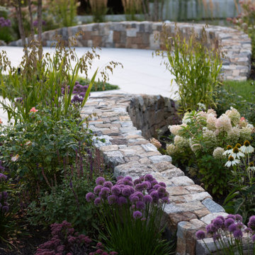
Waves of stone walls create a unique environment for guests to linger at parties
Design ideas for a farmhouse landscaping in Boston.
Design ideas for a farmhouse landscaping in Boston.

 Klopf Architecture
, Outer Space Landscape Architects, Sezen & Moon Structural Engineer and Flegels Construction updated a classic Eichler open, indoor-outdoor home.
Everyone loved the classic, original bones of this house, but it was in need of a major facelift both inside and out. The owners also wanted to remove the barriers between the kitchen and great room, and increase the size of the master bathroom as well as make other layout changes. No addition to the house was contemplated.
The owners worked with Klopf Architecture in part because of Klopf’s extensive mid-century modern / Eichler design portfolio, and in part because one of their neighbors who had worked with Klopf on their Eichler home remodel referred them. The Klopf team knew how to update the worn finishes to make a more sophisticated, higher quality home that both looks better and functions better.
In conjunction with the atrium and the landscaped rear yard / patio, the glassy living room feels open on both sides and allows an indoor / outdoor flow throughout. The new, natural wood exterior siding runs through the house from inside to outside to inside again, updating one of the classic design features of the Eichler homes.
Picking up on the wood siding, walnut vanities and cabinets offset the white walls. Gray porcelain tiles evoke the concrete slab floors and flow from interior to exterior to make the spaces appear to flow together. Similarly the ceiling decking has the same white-washed finish from inside to out. The continuity of materials and space enhances the sense of flow.
The large kitchen, perfect for entertaining, has a wall of built-ins and an oversized island. There’s plenty of storage and space for the whole group to prep and cook together.
One unique approach to the master bedroom is the bed wall. The head of the bed is tucked within a line of built-in wardrobes with a high window above. Replacing the master closet with this wall of wardrobes allowed for both a larger bathroom and a larger bedroom.
This 1,953 square foot, 4 bedroom, 2 bathroom Double Gable Eichler remodeled single-family house is located in Mountain View in the heart of the Silicon Valley.
Klopf Architecture Project Team: John Klopf, AIA, Klara Kevane, and Yegvenia Torres-Zavala
Landscape Architect: Outer Space Landscape Architects
Structural Engineer: Sezen & Moon
Contractor: Flegels Construction
Landscape Contractor: Roco's Gardening & Arroyo Vista Landscaping, Inc.
Photography ©2016 Mariko Reed
Location: Mountain View, CA
Year completed: 2015
 Lynch Landscape and Tree Service, Inc.
The context of this home is set atop a hillside, making for a tricky entry sequence. The driveway meanders up and around the house to the rear of the property. Though this is the back of the property, it is indeed the main entry as well. Given that the other side of the home sits 15' above ground elevation, our client's desire was to design a space off the backside of the home that doesn't inhibit the entry for new visitors, but allows for a seamless outdoor living space off their kitchen/ living room. We achieved this balance by retaining a front walkway to the main entry using large 24" x 36" bluestone slabs in a running band through the new patio space. Visually the clean lines of this walkway lead visitors to the front entrance while also subtly defining the two seating areas of the new patio terrace. The reclaimed granite piers, Saratoga Granite Seating walls, and plantings provide further definition which truly enhance the sense of space! Needless to say, our clients were thrilled with the finished product!

 Zelaya Properties LLC
We used: Custom cherry cabinetry in Arts & Crafts Shaker style by Kabinart in Boulder and Espresso stains. Liberty Hardware Venetian bronze 1-1/2" cabinet knobs. KitchenAid Architect II Series 22 CF counter-depth French door refrigerator. KitchenAid Architect Series II 27" convection single wall oven. KitchenAid 36" 6-burner dual fuel freestanding commercial-style range. KitchenAid Architect II Series 24" dishwasher. Sharp Insight Pro Series 24" built-in microwave drawer (Model #KB6524PS). Crystorama Solaris 12" wide pendant lights in English bronze. Granite countertops in Brown Fantasy. 3"x6" polished marble backsplash.
Paint colors:
Walls: Glidden Silver Cloud 30YY 63/024
Ceilings/Trims/Doors: Glidden Swan White GLC23
Robert B. Narod Photography
43