
Search results for "Sets creative" in Home Design Ideas
 CAST architecture
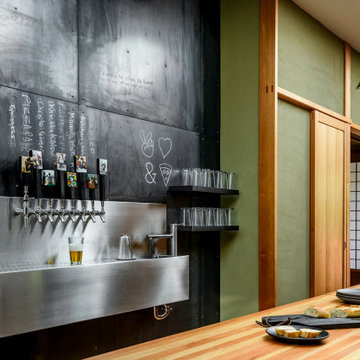
The renovation of this Wallingford craftsman-style bungalow is a thoughtful mix of contemporary ideals within the traditional language of the existing home. Overall, the house was in good shape, but there were unique changes the owner wanted to promote socializing and cooking, relatable to the craftsman style, setting an eclectic balance.
Natural light transforms the space. The vaulted ceiling and five over-sized skylights, plus glass doors allow sunlight to pour through and fill the kitchen and social space with tons of daylight.
To extend the kitchen, the busiest room in the home, a NanaWall opens to a tiered deck with a connection to the backyard and intimate garden views. There is an in-kitchen Wood Stone pizza oven. An 18-foot long island runs the length of the kitchen where homemade pizzas are made, plus it conceals a shuffleboard table. A black metal wall holds eight beer taps and a surface for creativity.
The tatami room serves as an adaptive space – for eating, sleeping, playing games, and socializing.

 MA Peterson Design Build, Inc.
MA Peterson
www.mapeterson.com
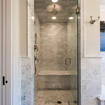
We reconfigured this bathroom and the closet leading to it to create more space, by combining two baths into one. The windows were existing and to prevent exterior work, we creatively worked around them. Our design allowed them to stay in place where they were originally, but afforded great light into the reconfigured bathroom space.
Masculine slate stone floors, classic ceramic wainscot and marble counter-tops surround a spacious his and her vanity, with sconces to illuminate each. The formal white cabinetry provided the perfect contrast to the plank-like rustic slate floor.
Find the right local pro for your project
 Trevor Fulmer Design
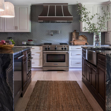
Contemporary. Expansive. Multi-functional. An extensive kitchen renovation was needed to modernize an original design from 1993. Our gut remodel established a seamless new floor plan with two large islands. We lined the perimeter with ample storage and carefully layered creative lighting throughout the space. Contrasting white and walnut cabinets and an oversized copper hood, paired beautifully with a herringbone backsplash and custom live-edge table.
 Garden Gate Landscaping
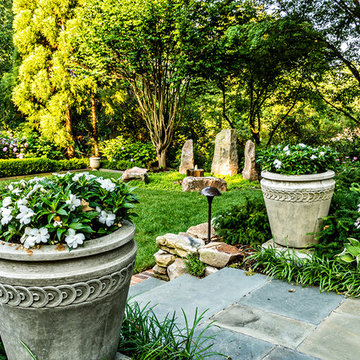
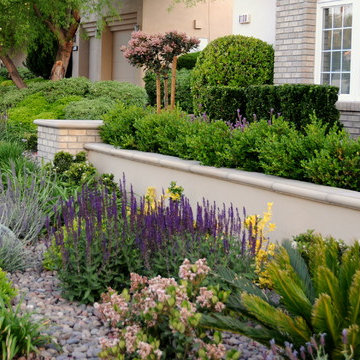
A complete and eclectic rear garden renovation with a creative blend of formal and natural elements. Formal lawn panel and rose garden, craftsman style wood deck and trellis, homages to Goldsworthy and Stonehenge with large boulders and a large stone cairn, several water features, a Japanese Torii gate, rock walls and steps, vegetables and herbs in containers and a new parking area paved with permeable pavers that feed an underground storage area that in turns irrigates the garden. All this blends into a diverse but cohesive garden.
Designed by Charles W Bowers, Built by Garden Gate Landscaping, Inc. © Garden Gate Landscaping, Inc./Charles W. Bowers

 Fluidesign Studio
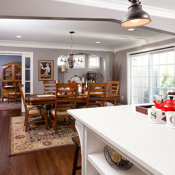
Building Design, Plans (in collaboration with Orfield Drafting), and Interior Finishes by: Fluidesign Studio I Builder & Creative Collaborator : Anchor Builders I Photographer: sethbennphoto.com

Sponsored
Columbus, OH

Hope Restoration & General Contracting
Columbus Design-Build, Kitchen & Bath Remodeling, Historic Renovations
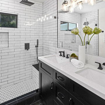
 Regal Construction & Remodeling Inc.
be creative, play with the tile
Example of a mid-sized transitional master porcelain tile, black floor and double-sink bathroom design in Los Angeles with black cabinets, recessed-panel cabinets, white walls, an undermount sink, quartz countertops, a hinged shower door, white countertops, a niche and a built-in vanity
Example of a mid-sized transitional master porcelain tile, black floor and double-sink bathroom design in Los Angeles with black cabinets, recessed-panel cabinets, white walls, an undermount sink, quartz countertops, a hinged shower door, white countertops, a niche and a built-in vanity
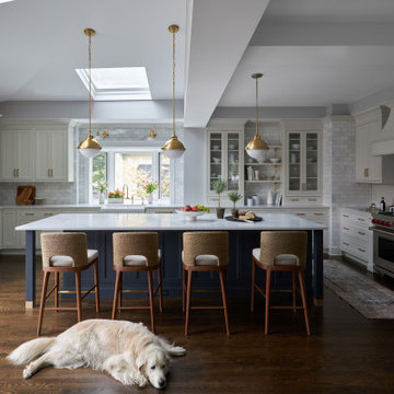
 TKS Design Group
Download our free ebook, Creating the Ideal Kitchen. DOWNLOAD NOW
For many, extra time at home during COVID left them wanting more from their homes. Whether you realized the shortcomings of your space or simply wanted to combat boredom, a well-designed and functional home was no longer a want, it became a need. Tina found herself wanting more from her Old Irving Park home and reached out to The Kitchen Studio about adding function to her kitchen to make the most of the available real estate.
At the end of the day, there is nothing better than returning home to a bright and happy space you love. And this kitchen wasn’t that for Tina. Dark and dated, with a palette from the past and features that didn’t make the most of the available square footage, this remodel required vision and a fresh approach to the space. Lead designer, Stephanie Cole’s main design goal was better flow, while adding greater functionality with organized storage, accessible open shelving, and an overall sense of cohesion with the adjoining family room.
The original kitchen featured a large pizza oven, which was rarely used, yet its footprint limited storage space. The nearby pantry had become a catch-all, lacking the organization needed in the home. The initial plan was to keep the pizza oven, but eventually Tina realized she preferred the design possibilities that came from removing this cumbersome feature, with the goal of adding function throughout the upgraded and elevated space. Eliminating the pantry added square footage and length to the kitchen for greater function and more storage. This redesigned space reflects how she lives and uses her home, as well as her love for entertaining.
The kitchen features a classic, clean, and timeless palette. White cabinetry, with brass and bronze finishes, contrasts with rich wood flooring, and lets the large, deep blue island in Woodland’s custom color Harbor – a neutral, yet statement color – draw your eye.
The kitchen was the main priority. In addition to updating and elevating this space, Tina wanted to maximize what her home had to offer. From moving the location of the patio door and eliminating a window to removing an existing closet in the mudroom and the cluttered pantry, the kitchen footprint grew. Once the floorplan was set, it was time to bring cohesion to her home, creating connection between the kitchen and surrounding spaces.
The color palette carries into the mudroom, where we added beautiful new cabinetry, practical bench seating, and accessible hooks, perfect for guests and everyday living. The nearby bar continues the aesthetic, with stunning Carrara marble subway tile, hints of brass and bronze, and a design that further captures the vibe of the kitchen.
Every home has its unique design challenges. But with a fresh perspective and a bit of creativity, there is always a way to give the client exactly what they want [and need]. In this particular kitchen, the existing soffits and high slanted ceilings added a layer of complexity to the lighting layout and upper perimeter cabinets.
While a space needs to look good, it also needs to function well. This meant making the most of the height of the room and accounting for the varied ceiling features, while also giving Tina everything she wanted and more. Pendants and task lighting paired with an abundance of natural light amplify the bright aesthetic. The cabinetry layout and design compliments the soffits with subtle profile details that bring everything together. The tile selections add visual interest, drawing the eye to the focal area above the range. Glass-doored cabinets further customize the space and give the illusion of even more height within the room.
While her family may be grown and out of the house, Tina was focused on adding function without sacrificing a stunning aesthetic and dreamy finishes that make the kitchen the gathering place of any home. It was time to love her kitchen again, and if you’re wondering what she loves most, it’s the niche with glass door cabinetry and open shelving for display paired with the marble mosaic backsplash over the range and complimenting hood. Each of these features is a stunning point of interest within the kitchen – both brag-worthy additions to a perimeter layout that previously felt limited and lacking.
Whether your remodel is the result of special needs in your home or simply the excitement of focusing your energy on creating a fun new aesthetic, we are here for it. We love a good challenge because there is always a way to make a space better – adding function and beauty simultaneously.
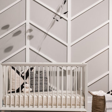
 Lauren King Interior Design
This project was a part of the 2017 Decorators' Showhouse in Columbus, Ohio. Twelve designers each created a room within the Columbus Museum of Art, making this the first showhouse to take place within a museum. Each designer was allowed to use a piece of artwork from the museum's collection in their space.
The intent of this design was to create a contemporary, gender-neutral nursery with touches of mid-century modern style. Mid-century modern design is sleek, simple, functional and bright. Here, the combination of vintage and contemporary furnishings and accessories all come together to create a space that is calm, yet inspires creative play.
The artwork, California Landscape by Stanton Macdonald-Wright, sets this tone. His modern abstract, devoid of illustration uses blocks of color to create space and form. This idea of geometric abstracts is repeated throughout the design of the room. Interesting shapes that can be manipulated with eye or hand are very fitting for a nursery. This is a space where a child can dream and play, grow and learn, and also rest. It is a room that could evolve over time while continuing to inspire a child for many years.
“I strive to divest my work of all anecdote and illustration and to purify it to the point where the emotions of the spectator will be wholly aesthetic, as when listening to good music…”
- Stanton Macdonald-Wright, circa 1915
Photo Credit: Marshall Evan Photography
Construction: Jameson Building Co.
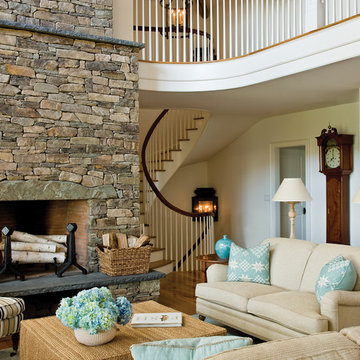
 Carter & Company
The Escape embraces one of the best aspects of life in New England – the amazing range of natural settings within a relatively short distance from home that allows us an entirely different living experience. Here we get to rejuvenate and recreate with friends and family at our home away from home. From the mountains and lakes of New Hampshire, to the Island of Nantucket and the coast of Maine, Carter & Company has had the great fortune to help design, build and decorate some amazing vacation homes. These are special places with unique points of view that creatively reflect the natural environment, all with an emphasis on ease, comfort and relaxation.
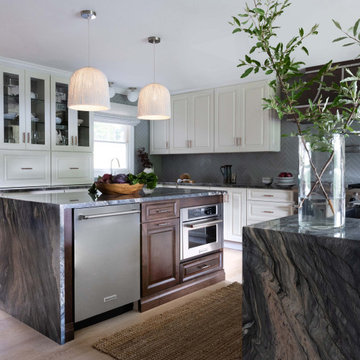 Trevor Fulmer Design
Contemporary. Expansive. Multi-functional. An extensive kitchen renovation was needed to modernize an original design from 1993. Our gut remodel established a seamless new floor plan with two large islands. We lined the perimeter with ample storage and carefully layered creative lighting throughout the space. Contrasting white and walnut cabinets and an oversized copper hood, paired beautifully with a herringbone backsplash and custom live-edge table.


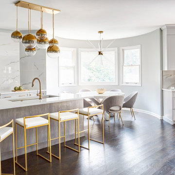 TKS Design Group
Download our free ebook, Creating the Ideal Kitchen. DOWNLOAD NOW
This client was referred to us from a past client. They are a busy 2-career household with young children and enjoy entertaining friends and family in their home. They have a beautiful open concept home but unfortunately the kitchen was not fitting for the rest of the home. They were not quite sure what to do with the space. We talked about trying to refresh it or do more of a minor remodel, but in the end they decided a full gut would get them to where they wanted to be.
One problem was there was no place for guests to hang out other than the large and awkward banquette area. The brick wall and tiled hood area were feeling a bit dated and tired. The space was just not functional for their lifestyle. There was no prep space near the cooktop and no landing area for items coming out of the ovens or refrigerator, plus a big dead zone in the center of the room.
Banquettes, like the one they previously had in the space, are great for small spaces, but when they get really large like this one, it makes getting in and out of the seating area awkward and uncomfortable. Plus, there was room for a large table, so we eliminated the awkward built in.
We started by removing the faux brick wall between the kitchen and back entry. We relocated the entry to the garage over a couple feet in order to get every last inch out of the new kitchen. We also made the decision to close up the primary window that faced the pretty ho hum brick wall of the neighbor’s house. There was plenty of light coming in from the seating area, so we just didn’t feel the window was adding much to the room.
Construction went smoothy. There was a bit of rework with electrical, flooring and HVAC, but in the end, we think it was well worth it.
The clients really wanted a sleek contemporary look, and we originally had planned for a full height slab backsplash, but due to it’s size, it was a budget buster. Instead, we got creative and settled on large format porcelain tiles that have a similar feel but were a fraction of the cost. We made sure the wall was plumb and level so that the fit and finish would mimic that of slab material.
The final space was quite a change. A large prep sink sits directly across from the new pro-style range with plenty additional prep space on the large island. The refrigerator and ovens now have miles of landing space, and a nice tight work triangle makes cooking a breeze.
Since we wanted a more contemporary feel, not many wall cabinets were included. Instead, we outfitted some of the drawers for dish storage with a peg system. Two large pantries flanking the refrigerator hold baking supplies and small appliances. Large drawers by the cooktop hold pots and pans, and an appliance garage tucked away to the left of the range hides away miscellaneous items. The large island also houses a microwave drawer and tons of storage, most of which is drawers offering maximum convenience.
The island now seats 5-6 people comfortably along with the new table in the seating area which can seat up to 8. Entertaining will be a breeze in this space. With such a clean backdrop, we knew we would need some drama with the lighting, so we chose two sets of staggered pendants, which we adjusted for the right visual balance above the island.
We also included a small coffee station to the right of the main kitchen, which helps keep the coffee clutter out of the kitchen proper. Two tones of complimentary gray are featured in this kitchen. The perimeter is a light gray that reads almost white. The island is a gray stain that adds some depth and interest with the visible wood texture. The countertops are clean white quartz, and the hardware, barstools and light fixtures add warm brass tones. I see lots of cooking and entertaining with family and friends in the near future in this bright and airy new space.
Designed by: Susan Klimala, CKD, CBD
Photography by: Michael Kaskel
For more information on kitchen and bath design ideas go to: www.kitchenstudio-ge.com
 Rachel Loewen Photography
Rachel Loewen Photography © 2017 Houzz
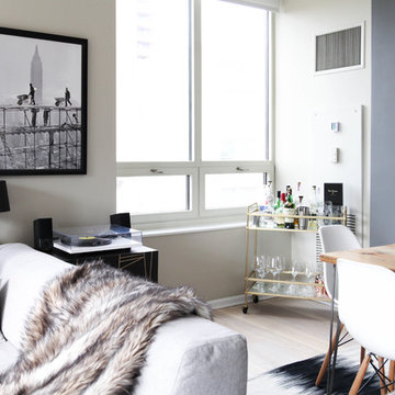
Living room - scandinavian living room idea in Chicago
Living room - scandinavian living room idea in Chicago
 Rumor Design + reDesign
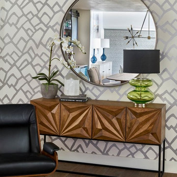
The entryway to this space is fun and fresh. Set your keys down, take your shoes off and escape into this slope side ski condo with enough personality to keep the whole family entertained.
 Fluidesign Studio
Building Design, Plans (in collaboration with Orfield Drafting), and Interior Finishes by: Fluidesign Studio I Builder & Creative Collaborator : Anchor Builders I Photographer: sethbennphoto.com

Sponsored
Delaware, OH

Buckeye Basements, Inc.
Central Ohio's Basement Finishing ExpertsBest Of Houzz '13-'21
 Lauren King Interior Design
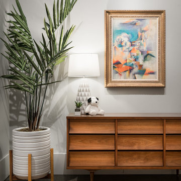
This project was a part of the 2017 Decorators' Showhouse in Columbus, Ohio. Twelve designers each created a room within the Columbus Museum of Art, making this the first showhouse to take place within a museum. Each designer was allowed to use a piece of artwork from the museum's collection in their space.
The intent of this design was to create a contemporary, gender-neutral nursery with touches of mid-century modern style. Mid-century modern design is sleek, simple, functional and bright. Here, the combination of vintage and contemporary furnishings and accessories all come together to create a space that is calm, yet inspires creative play.
The artwork, California Landscape by Stanton Macdonald-Wright, sets this tone. His modern abstract, devoid of illustration uses blocks of color to create space and form. This idea of geometric abstracts is repeated throughout the design of the room. Interesting shapes that can be manipulated with eye or hand are very fitting for a nursery. This is a space where a child can dream and play, grow and learn, and also rest. It is a room that could evolve over time while continuing to inspire a child for many years.
“I strive to divest my work of all anecdote and illustration and to purify it to the point where the emotions of the spectator will be wholly aesthetic, as when listening to good music…”
- Stanton Macdonald-Wright, circa 1915
Photo Credit: Marshall Evan Photography
Construction: Jameson Building Co.
 Ambiance
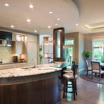
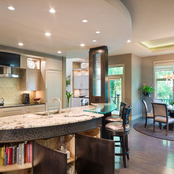
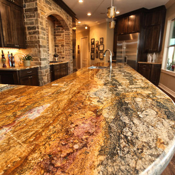
A unique granite with movement and multiple colors complement the other natural materials and setting of this family kitchen. The amber glass pendants over the bar complement the granite.
Clay Bostian, Creative Photography

159