
Search results for "Sharp decision making" in Home Design Ideas
 Mary Cook
Taylor Photo
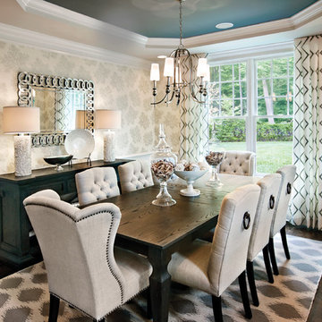
Inspiration for a transitional dark wood floor and brown floor dining room remodel in Chicago with beige walls
Inspiration for a transitional dark wood floor and brown floor dining room remodel in Chicago with beige walls
 DesignbyRuchi
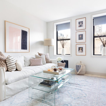
I designed an apartment for a young couple who moved to Manhattan from Chicago. They needed to downsize and struggled with the size of their new abode. The apartment had great bones and I wanted to highlight those features. I designed their living room and was able to fit more than they thought they had room for. Designwise, this was a very neutral design with shades of whites, greys, blush supported with tons of layers, scale, textures and art to bring the overall pop. I created a California comfortable design with linens, washed woods, brass, cane and a lot of tone on tone. Neutral mood with layers of whites, grey, and natural woods. As always, I started with the layout and managed to fit a larger sofa than the clients thought we could fit. Every cushion, the play with the sizes and material, the color and pattern, the throw is a well thought out design decision. The art installed vertically between the two windows and the vases with the cherry blossoms are unique design features that play up the exsiting bones of the apartment. A diverse material mix with linen, cane, natural wood, glass, shagreen and brass make this living room design.
 ODS Architecture
In the hills of San Anselmo in Marin County, this 5,000 square foot existing multi-story home was enlarged to 6,000 square feet with a new dance studio addition with new master bedroom suite and sitting room for evening entertainment and morning coffee. Sited on a steep hillside one acre lot, the back yard was unusable. New concrete retaining walls and planters were designed to create outdoor play and lounging areas with stairs that cascade down the hill forming a wrap-around walkway. The goal was to make the new addition integrate the disparate design elements of the house and calm it down visually. The scope was not to change everything, just the rear façade and some of the side facades.
The new addition is a long rectangular space inserted into the rear of the building with new up-swooping roof that ties everything together. Clad in red cedar, the exterior reflects the relaxed nature of the one acre wooded hillside site. Fleetwood windows and wood patterned tile complete the exterior color material palate.
The sitting room overlooks a new patio area off of the children’s playroom and features a butt glazed corner window providing views filtered through a grove of bay laurel trees. Inside is a television viewing area with wetbar off to the side that can be closed off with a concealed pocket door to the master bedroom. The bedroom was situated to take advantage of these views of the rear yard and the bed faces a stone tile wall with recessed skylight above. The master bath, a driving force for the project, is large enough to allow both of them to occupy and use at the same time.
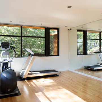
The new dance studio and gym was inspired for their two daughters and has become a facility for the whole family. All glass, mirrors and space with cushioned wood sports flooring, views to the new level outdoor area and tree covered side yard make for a dramatic turnaround for a home with little play or usable outdoor space previously.
Photo Credit: Paul Dyer Photography.
Find the right local pro for your project
 Spruce Homes
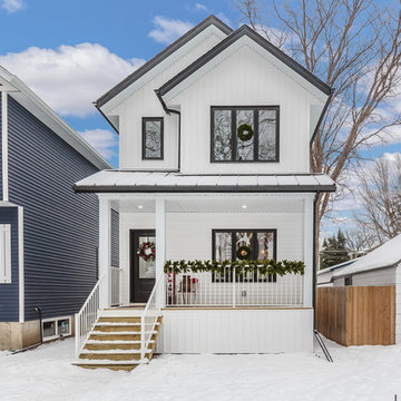
We loved bringing this urban farmhouse design together, but we cannot wait for a family to move into it & make it a home! Black and white design details make this home a definite show-stopper. With a unique Jack and Jill bathroom (a southern tradition), this floor plan is sure to impress. Named after our second niece, Reagan Everlee, this home offers a lot of opportunity for sibling togetherness - one of Reagan's favorite activities.
Features of this home include:
3 bedrooms / 2.5 bathrooms
1460 square feet
Legal suite potential
Double detached garage
Front landscaping
Master en-suite
Jack and Jill bathroom
Custom kitchen w/ eat up breakfast nook
Quartz countertops
Large pantry complete with sliding barn doors
Garden doors leading to backyard
 Adrienne DeRosa
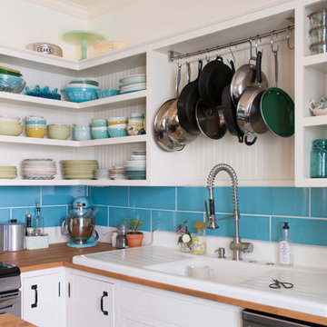
Kiel's woodworking talents are in full effect in the kitchen. Rather than incorporate pre-fabricated cabinets into the newly rebuilt space, he decided to build them himself, affording the home the custom work that it so deserves. "It didn't make sense to put in the same fiberboard cabinetry that was there before", he confesses. Part of the plan called for open shelving up top to show off Chelsea's colorful plate collection. "One of the perks of being married to a wood worker", Chelsea jokes, "is having an entire kitchen worth of cabinets for the cost of wood and paint!"
The couple outfitted the antique sink with a modern spray fixture from IKEA. The enameled cast iron sink was not only a steal at $25, but it is certainly made to last. "Often we buy older pieces which have been around for 50+ years because we know that if they have survived this long they will likely survive another 50", she says.
Backsplash Tile, Hamilton Parker
Photo: Adrienne DeRosa Photography © 2014 Houzz
 ZeroEnergy Design
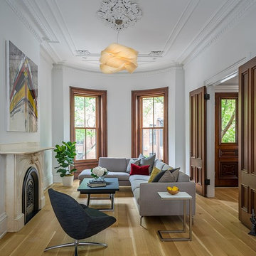
This renovated brick rowhome in Boston’s South End offers a modern aesthetic within a historic structure, creative use of space, exceptional thermal comfort, a reduced carbon footprint, and a passive stream of income.
DESIGN PRIORITIES. The goals for the project were clear - design the primary unit to accommodate the family’s modern lifestyle, rework the layout to create a desirable rental unit, improve thermal comfort and introduce a modern aesthetic. We designed the street-level entry as a shared entrance for both the primary and rental unit. The family uses it as their everyday entrance - we planned for bike storage and an open mudroom with bench and shoe storage to facilitate the change from shoes to slippers or bare feet as they enter their home. On the main level, we expanded the kitchen into the dining room to create an eat-in space with generous counter space and storage, as well as a comfortable connection to the living space. The second floor serves as master suite for the couple - a bedroom with a walk-in-closet and ensuite bathroom, and an adjacent study, with refinished original pumpkin pine floors. The upper floor, aside from a guest bedroom, is the child's domain with interconnected spaces for sleeping, work and play. In the play space, which can be separated from the work space with new translucent sliding doors, we incorporated recreational features inspired by adventurous and competitive television shows, at their son’s request.
MODERN MEETS TRADITIONAL. We left the historic front facade of the building largely unchanged - the security bars were removed from the windows and the single pane windows were replaced with higher performing historic replicas. We designed the interior and rear facade with a vision of warm modernism, weaving in the notable period features. Each element was either restored or reinterpreted to blend with the modern aesthetic. The detailed ceiling in the living space, for example, has a new matte monochromatic finish, and the wood stairs are covered in a dark grey floor paint, whereas the mahogany doors were simply refinished. New wide plank wood flooring with a neutral finish, floor-to-ceiling casework, and bold splashes of color in wall paint and tile, and oversized high-performance windows (on the rear facade) round out the modern aesthetic.
RENTAL INCOME. The existing rowhome was zoned for a 2-family dwelling but included an undesirable, single-floor studio apartment at the garden level with low ceiling heights and questionable emergency egress. In order to increase the quality and quantity of space in the rental unit, we reimagined it as a two-floor, 1 or 2 bedroom, 2 bathroom apartment with a modern aesthetic, increased ceiling height on the lowest level and provided an in-unit washer/dryer. The apartment was listed with Jackie O'Connor Real Estate and rented immediately, providing the owners with a source of passive income.
ENCLOSURE WITH BENEFITS. The homeowners sought a minimal carbon footprint, enabled by their urban location and lifestyle decisions, paired with the benefits of a high-performance home. The extent of the renovation allowed us to implement a deep energy retrofit (DER) to address air tightness, insulation, and high-performance windows. The historic front facade is insulated from the interior, while the rear facade is insulated on the exterior. Together with these building enclosure improvements, we designed an HVAC system comprised of continuous fresh air ventilation, and an efficient, all-electric heating and cooling system to decouple the house from natural gas. This strategy provides optimal thermal comfort and indoor air quality, improved acoustic isolation from street noise and neighbors, as well as a further reduced carbon footprint. We also took measures to prepare the roof for future solar panels, for when the South End neighborhood’s aging electrical infrastructure is upgraded to allow them.
URBAN LIVING. The desirable neighborhood location allows the both the homeowners and tenant to walk, bike, and use public transportation to access the city, while each charging their respective plug-in electric cars behind the building to travel greater distances.
OVERALL. The understated rowhouse is now ready for another century of urban living, offering the owners comfort and convenience as they live life as an expression of their values.
Eric Roth Photo
 Toronto Interior Design Group
Gillian Jackson
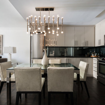
Inspiration for a small contemporary l-shaped dark wood floor and brown floor open concept kitchen remodel in Toronto with an undermount sink, flat-panel cabinets, gray cabinets, quartz countertops, stainless steel appliances, no island and black backsplash
Inspiration for a small contemporary l-shaped dark wood floor and brown floor open concept kitchen remodel in Toronto with an undermount sink, flat-panel cabinets, gray cabinets, quartz countertops, stainless steel appliances, no island and black backsplash


 Kathleen Jennison
An Arts & Crafts Bungalow is one of my favorite styles of homes. We have quite a few of them in our Stockton Mid-Town area. And when C&L called us to help them remodel their 1923 American Bungalow, I was beyond thrilled.
As per usual, when we get a new inquiry, we quickly Google the project location while we are talking to you on the phone. My excitement escalated when I saw the Google Earth Image of the sweet Sage Green bungalow in Mid-Town Stockton. "Yes, we would be interested in working with you," I said trying to keep my cool.
But what made it even better was meeting C&L and touring their home, because they are the nicest young couple, eager to make their home period perfect. Unfortunately, it had been slightly molested by some bad house-flippers, and we needed to bring the bathroom back to it "roots."
We knew we had to banish the hideous brown tile and cheap vanity quickly. But C&L complained about the condensation problems and the constant fight with mold. This immediately told me that improper remodeling had occurred and we needed to remedy that right away.
The Before: Frustrations with a Botched Remodel
The bathroom needed to be brought back to period appropriate design with all the functionality of a modern bathroom. We thought of things like marble countertop, white mosaic floor tiles, white subway tile, board and batten molding, and of course a fabulous wallpaper.
This small (and only) bathroom on a tight budget required a little bit of design sleuthing to figure out how we could get the proper look and feel. Our goal was to determine where to splurge and where to economize and how to complete the remodel as quickly as possible because C&L would have to move out while construction was going on.
The Process: Hard Work to Remedy Design and Function
During our initial design study, (which included 2 hours in the owners’ home), we noticed framed images of William Morris Arts and Crafts textile patterns and knew this would be our design inspiration. We presented C&L with three options and they quickly selected the Pimpernel Design Concept.
We had originally selected the Black and Olive colors with a black vanity, mirror, and black and white floor tile. C&L liked it but weren’t quite sure about the black, We went back to the drawing board and decided the William & Co Pimpernel Wallpaper in Bayleaf and Manilla color with a softer gray painted vanity and mirror and white floor tile was more to their liking.
After the Design Concept was approved, we went to work securing the building permit, procuring all the elements, and scheduling our trusted tradesmen to perform the work.
We did uncover some shoddy work by the flippers such as live electrical wires hidden behind the wall, plumbing venting cut-off and buried in the walls (hence the constant dampness), the tub barely balancing on two fence boards across the floor joist, and no insulation on the exterior wall.
All of the previous blunders were fixed and the bathroom put back to its previous glory. We could feel the house thanking us for making it pretty again.
The After Reveal: Cohesive Design Decisions
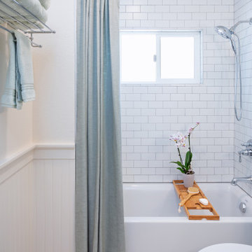
We selected a simple white subway tile for the tub/shower. This is always classic and in keeping with the style of the house.
We selected a pre-fab vanity and mirror, but they look rich with the quartz countertop. There is much more storage in this small vanity than you would think.
The Transformation: A Period Perfect Refresh
We began the remodel just as the pandemic reared and stay-in-place orders went into effect. As C&L were already moved out and living with relatives, we got the go-ahead from city officials to get the work done (after all, how can you shelter in place without a bathroom?).
All our tradesmen were scheduled to work so that only one crew was on the job site at a time. We stayed on the original schedule with only a one week delay.
The end result is the sweetest little bathroom I've ever seen (and I can't wait to start work on C&L's kitchen next).
Thank you for joining me in this project transformation. I hope this inspired you to think about being creative with your design projects, determining what works best in keeping with the architecture of your space, and carefully assessing how you can have the best life in your home.
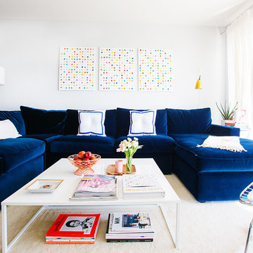
 Nanette Wong
Photo: Nanette Wong © 2014 Houzz
Example of a transitional living room design in San Francisco with white walls
Example of a transitional living room design in San Francisco with white walls
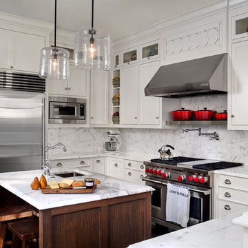
 SV Design
Located on the flat of Beacon Hill, this iconic building is rich in history and in detail. Constructed in 1828 as one of the first buildings in a series of row houses, it was in need of a major renovation to improve functionality and to restore as well as re-introduce charm.Originally designed by noted architect Asher Benjamin, the renovation was respectful of his early work. “What would Asher have done?” was a common refrain during design decision making, given today’s technology and tools.
Photographer: Bruce Buck
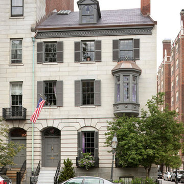 SV Design
Located on the flat of Beacon Hill, this iconic building is rich in history and in detail. Constructed in 1828 as one of the first buildings in a series of row houses, it was in need of a major renovation to improve functionality and to restore as well as re-introduce charm.Originally designed by noted architect Asher Benjamin, the renovation was respectful of his early work. “What would Asher have done?” was a common refrain during design decision making, given today’s technology and tools.
Photographer: Bruce Buck
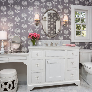
 Robert Frank Interiors
Clark Dugger Photography
Example of a small classic kids' gray tile and mosaic tile mosaic tile floor bathroom design in Los Angeles with an undermount sink, recessed-panel cabinets, white cabinets, marble countertops, a two-piece toilet and gray walls
Example of a small classic kids' gray tile and mosaic tile mosaic tile floor bathroom design in Los Angeles with an undermount sink, recessed-panel cabinets, white cabinets, marble countertops, a two-piece toilet and gray walls
 Renovations Group Inc
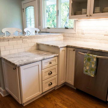
Our homeowner had dreamt about one day redoing her beyond outdated kitchen since they day her husband carried her over the threshold. Vinyl flooring used for a backsplash, dingy carpeting, laminate with no sheen left to speak of and mismatched cabinetry…. it was time to make it happen. A year’s worth of planning later, her time capsule became one dreamy kitchen.
Functionality reigns supreme in this small, but efficient kitchen where every cabinet has a story to tell and a place to store it. Countertop space to the right of the stove was an added necessity for function and safety. The raised snack bar is perfect for day to day meals and the lowered countertop was a must for this petite baker. A new lighting plan includes recessed lights, under-cabinet and accent lights, while new lighting fixtures reflect the client’s sense of style. Dingy brick patterned carpet was removed making way for new hardwood floors toothed in from the dining room.
An airy palette gained some weight with the use of larger details; the oversized hood, beefy turned posts, prominent apron front sink and a grouping of tall cabinets on the refrigerator wall. Glass cabinet fronts, shiny beveled subway tile, and granite countertops allow light to dance around the space.
Zachary Seib Photography
 InHance
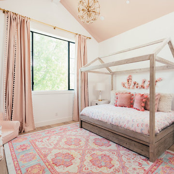
Our clients purchased a new house, but wanted to add their own personal style and touches to make it really feel like home. We added a few updated to the exterior, plus paneling in the entryway and formal sitting room, customized the master closet, and cosmetic updates to the kitchen, formal dining room, great room, formal sitting room, laundry room, children’s spaces, nursery, and master suite. All new furniture, accessories, and home-staging was done by InHance. Window treatments, wall paper, and paint was updated, plus we re-did the tile in the downstairs powder room to glam it up. The children’s bedrooms and playroom have custom furnishings and décor pieces that make the rooms feel super sweet and personal. All the details in the furnishing and décor really brought this home together and our clients couldn’t be happier!
 SV Design
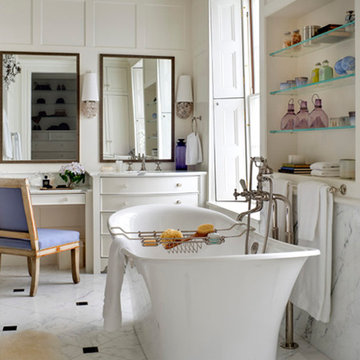
Located on the flat of Beacon Hill, this iconic building is rich in history and in detail. Constructed in 1828 as one of the first buildings in a series of row houses, it was in need of a major renovation to improve functionality and to restore as well as re-introduce charm.Originally designed by noted architect Asher Benjamin, the renovation was respectful of his early work. “What would Asher have done?” was a common refrain during design decision making, given today’s technology and tools.
Photographer: Bruce Buck
 Woolights
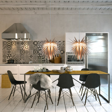
Modern pendant lamp made of fine sanded ultra thin translucent birch plywood.
The shape of this modern wooden pendant light was inspired by the blooming teasel flower. Lamp's surface, densely packed with thin and sharp needle-like birch petals, hides the bulb deep inside allowing the light to sink through gently, making it soft and mellow. This modern pendant lamp is an autonomous object that defines the space around.
Modern pendant lamp Teazzle | Hyper dynamic organic explosion
Our modern lamps are designed for easy and fast self assembly. Arrives flat packed. Graphical instruction included.
Technical specification diameter | 59cm height | 47cm cord length | 100cm recommended bulb | LED only, max 20W (not included) E27 bulb socket
Materials petals | birch plywood frame | birch plywood colour | natural birch cord | E27, transparent canopy | powder coated steel, space gray colour
All our wood pendant lights are designed and produced locally in Wrocław, Poland and are made of FSC and PEFC certified Scandinavian plywood.
 Wilkinson Brochier Interior Design
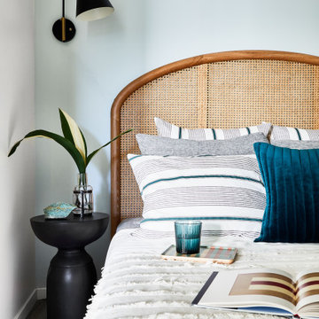
Small apartments often mean sleeping alcoves instead of full size bedrooms. Make the most of it with a Rattan bed that makes a stylish statement in white and gray linen with stripe accents and mid century sconce and sculptured table as a night stand. Use a rattan screen to divide the bedroom from the rest of the apartment.

Sponsored
Columbus, OH

Wannemacher Interiors
Customized Award-Winning Interior Design Solutions in Franklin Cnty OH
 Advance Design Studio, Ltd.
The major kitchen renovation of this old country farmhouse was a task of love, one that had been planned for many years by these Barrington seasoned homeowners. After interviewing no less than five companies, the homeowners chose the design team at Advance Design Studio to make the transformation they had long planned for.
“They had an understanding of the right design for the space almost from the instant they walked in the room”, says Sharon Scott of the design team of Nicole Ryan at Todd Jurs at Advance Design Studio. “They were the only designers who laid out ideas in the first meeting at the house that we really loved”, she says. “It was obvious that they understood the house, and understood us - and from then on the decision to hire them literally made itself”.
The original kitchen had a dividing “wall” of cabinetry…that made the rather large space seem very small, and cut off the kitchen from the eating area that has a beautiful garden view completely hidden from the main kitchen. Circulation was poor, leaving family members on top of one another when entertaining family and friends.
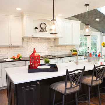
The new kitchen design nearly doubles the kitchen size within the original space; opening it up completely and enjoying an expansive island containing a new Kohler Whitehaven Smart Divide farm sink, a dishwasher, and pull out double trash receptacle. The great new gathering space accommodates four pull out stools beckoning grandchildren and friends alike. Removing the range from the island and relocating it to create a dramatic “feature” wall, completely out of the way of guests; it is now crowned with a beautiful completely customized wood hood designed to ventilate much more efficiently than the original island range containing a limited downdraft system.
The much more efficient use of the space after removing a pantry closet made way for a fully functional “tall wall” housing a double oven and refrigerator, out of the way of guests. Removing the restrictive cabinetry wall now allowed for an expansive floor to ceiling pantry cabinet with full extension pull out shelving, and an elegant display area complete with a beautiful furniture detailed buffet.
Fitting perfectly into the farmhouse charm of the old estate, Medallion Silver Lancaster cabinetry was chosen in a soft white Maple Divinity paint finish lining the perimeter. The stunning island hints to this old home’s past with Medallion Gold’s Maple Devonshire style graced with a Carriage Black Heirloom painted finish. The rubbed off black paint finish reveals the soft wood tones beneath, mimicking furniture you’d see in your grandmother’s home that has lovingly been polished for years to reveal a soft, subtly rubbed-off sheen.
Counter tops reverse contrast with perimeter tops of black “Raven” granite possessing a subtle honed finish, and a shift to Quartz Difinity Viareggio - resembling white Carrera marble on the island. A simple herringbone detail completes the decorative range wall, and subtle porcelain subway tiles grace the backsplash throughout.
The design is finished off with crisp Thermador and Bosch stainless steel appliances, and bright brushed cup pull and handle combination hardware. A pull down Kohler Bellaria faucet makes cleanup a breeze, and soft under-cabinet LED lighting throughout makes every work surface shine softly, and highlights the cabinetry display area with grace.
One special detail was created to make the dramatic ceiling transition to a vaulted area above the breakfast nook extra special. A tongue and groove solid wood ceiling was hung above, and a subtle greenish-grey distressed paint finish was hand developed on site by the talented crew, complementing the new kitchen with a completely unique surface that appears as if it’s been there for many, many years. It’s just one standout feature in the amazing new space that is sure to be in every conversation as newcomers enjoy the newest best hangout in this old home renewed!
After 30 years of renovating homes, this now content homeowner sips a cup of tea enjoying her new garden view, and reminisces projects of past – and lastly reports their experience with Advance Design Studio culminating with their amazing new kitchen to be the most enjoyable and satisfying home experience yet.
Designer: Nicole Ryan
Photographer: Joe Nowak

 Elizabeth Lawson Design
Photography by Jennifer Hughes
Transitional medium tone wood floor kitchen photo in Baltimore with a farmhouse sink, shaker cabinets, black cabinets, marble countertops, stainless steel appliances, marble backsplash and white countertops
Transitional medium tone wood floor kitchen photo in Baltimore with a farmhouse sink, shaker cabinets, black cabinets, marble countertops, stainless steel appliances, marble backsplash and white countertops
 Nar Design Group
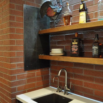
Our carpenters labored every detail from chainsaws to the finest of chisels and brad nails to achieve this eclectic industrial design. This project was not about just putting two things together, it was about coming up with the best solutions to accomplish the overall vision. A true meeting of the minds was required around every turn to achieve "rough" in its most luxurious state.
Featuring multiple Columbia Cabinet finishes; contrasting backsplashes, wall textures and flooring are all part of what makes this project so unique! Features include: Sharp microwave drawer, glass front wine fridge, fully integrated dishwasher, Blanco compost bin recessed into the counter, Walnut floating shelves, and barn house lighting.
PhotographerLink
24