
Search results for "Simple process" in Home Design Ideas
 G Squared Design
Photo Credits: Pixil Studios
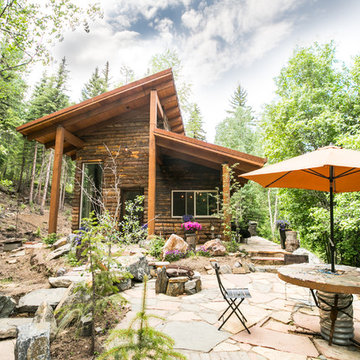
Example of a small mountain style home design design in Denver
Example of a small mountain style home design design in Denver


Find the right local pro for your project
 TELFORD+BROWN STUDIO ARCHITECTURE
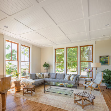
The Shadowood House is part of a farm that has been in the client's family for generations. At the beginning of the process, the clients were living in a house (where this one now sits) that had been through addition after addition, making the spaces feel cramped and non-cohesive. They wanted a space for family gatherings, that was a modern take on a simple farmhouse. The clients wanted a house that feels comfortable for their children and grandchildren, but also enables them to age-in-place. In short, they wanted a house that would offer generations to come a place to feel at home.
Josh Partee AIAP, ASMP, LEED AP / Architectural Photographer
 Cosentino North America
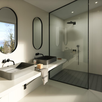
Presenting the first Carbon Neutral collection by Silestone®. A commitment to sustainability in which we reduce and offset the emissions of the manufacturing process with reforestation projects. Sunlit Days is inspired by the evocative Mediterranean shades of a unique lifestyle.
 River Valley Landscapes
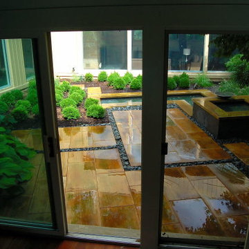
Blending contemporary forms and lush plantings, this Garden maximizes the sensory experience of the materials and planting from inside and outside the home. The garden occupies an interior courtyard framed by four interior walls. The home, designed by Architect Cliff May was built in 1948 and the following year was featured in House Beautiful Magazine. The clients list of needs and desires was brief. They wanted a space that would complement the mid century modern home and provide visual interest from inside the home. Some form of water was also requested. They had a budget of $30,000. In order to stay within their budget the clients performed the demolition of the old garden. The designer’s intent was to create a garden that would possess a clear sculptural quality and would be as visually striking from inside the home as it would be from inside the courtyard. The strategy behind the design was to use hardscape materials characterized by simple geometric forms and a planting palette that would emphasize form over color, and then to arrange the materials to achieve an interpretation of modern aesthetic.
The views from inside the homes three main living rooms present the garden as a graphic composition of space, hardscape materials and planting. Inside the courtyard the edges are defined by stone and planting. The floor is composed of rectangular slabs of Teakwood flagstone with a counterpoint of Mexican beach pebbles set within the joints and around the edges. Concrete along the edges of the Teakwood pads reduces migration of the modified stone and sand base. The contrast of the Mexican beach pebbles accentuates the pattern of the flagstone. The outside perimeter of the pebbles is contained with low profile edging. An existing catch drain was utilized for storm water runoff. A concrete block pier set on a concrete footing is covered with black stucco and provides a perch for a custom made copper bowl that circulates water into the L shaped water feature. The water features subterranean basin is constructed of pressure treated wood with a custom box liner insert. Since the Teakwood flagstone was unavailable as coping for the water feature, the designer chose Shawnee Buff stone to complement the Teakwood flagstone. The subtle sound of water spilling from the copper bowl and the reflective qualities of the water help to create an atmosphere of relaxation. The planting is composed of shades of green with white flowers in order to accentuate the graphic design. ‘Justin Brouwer’ Boxwood, ‘Sum and Substance’ Hosta, white Anemones, black bamboo and ornamental grasses contrast dramatically with the clean lines of the hardscape elements. The black bamboo is set in 30” diameter concrete containers to control the vigorous plant from spreading.
The construction of the interior courtyard space challenged the building team. They set up baffles between the front door and the door to the courtyard as well as temporary protection over the floor to allow the process to move forward without too much disturbance to the client’s lives. All of the materials were shuffled through the temporary portal.
The clients love the space and recently said that “the design is so well thought out and simple that they would never get tired of it.” The designs sculptural quality compliments the modern feel of the home and creates a sublime yet dramatic view from within the house or within the courtyard. The clients plan to purchase two black Bertoia Diamond chairs with red cushions which should perfectly integrate with the space.
 TVL Creative Ltd.
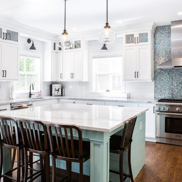
This project has been a labor of love for quite some time! The design ideas started flowing for this space back in 2016, and we are so excited to have recently completed the build-out process after our lengthy planning time frame. These wonderful clients completed a bathroom renovation with us last year, and we absolutely loved the charming, clean-lined farmhouse aesthetic we produced there. Wanting to carry that similar aesthetic into the kitchen, our clients hired us to transform their dated 90's builder-grade kitchen into a stunning showpiece for their home. While no major fixtures or appliances were relocated, nor were there major architectural changes, this space's transformation is a jaw-dropper. We began by removing the existing yellowed oak wood cabinets and replaced them with gorgeous custom cabinets from Tharp Cabinet Company. These cabinets are a very simple shaker style in a bright white paint color. We paired these fresh and bright cabinet with black hardware for a dramatic pop. We utilized the Blackrock pulls from Amerock and adore the playful contrast these pieces provide. On the backsplash, we used a very simple and understated white subway tile for a classic and timeless look that doesn't draw the eye away from the focal island or surrounding features. Over the range, we used a stunning mini-glass mosaic tile from TileBar that shimmers and showcases a variety of colors based on the time of day and light entry. The island is our favorite piece in this kitchen: a custom-built focal point from Tharp, painted in a gorgeous custom blue from Benjamin Moore. The island is topped with a dramatic slab of Arabescato from Pental Surfaces. On the perimeter cabinets, we've utilized the stunning White Fusion quartz, also from Pental. For final touches, we've utilized matte black wall sconces over the windows from Rejuvenation, and have a gorgeous sink faucet from Delta Faucet. Throughout the main level, we refinished the hardwood floors to bring them to a more soft, neutral brown color. New paint is carried throughout the house as well. We adore the bright simplicity of this space, and are so excited that our clients can enjoy this family friendly stunner for years to come!
Sponsored
Columbus, OH

Hope Restoration & General Contracting
Columbus Design-Build, Kitchen & Bath Remodeling, Historic Renovations
 Dura Supreme Cabinetry
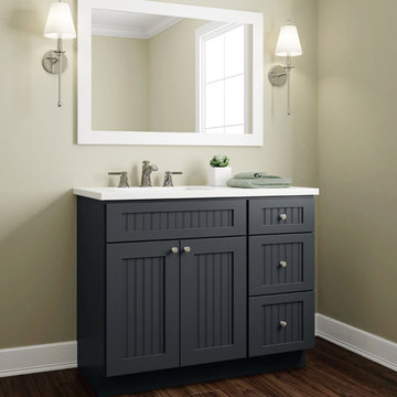
This nautical styled bathroom features Sherwin-Williams “Cyberspace” SW 7076 on Dura Supreme’s Craftsman Beaded Panel cabinet door style. This dark navy blue is subtle, neutral, and dramatic all at the same time. This color was selected for Dura Supreme’s 2017-2018 Curated Color Collection. Dura Supreme’s Curated Color Collection is a collection of cabinet paint colors that are always fresh, current and reflective of popular color trends for home interiors and cabinetry. This offering of colors is continuously updated as color trends shift.
Painted cabinetry is more popular than ever before and the color you select for your home should be a reflection of your personal taste and style. Our Personal Paint Match Program offers the entire Sherwin-William’s paint palette and Benjamin Moore’s paint palette, over 5,000 colors, for your new kitchen or bath cabinetry.
Color is a highly personal preference for most people and although there are specific colors that are considered “on trend” or fashionable, color choices should ultimately be based on what appeals to you personally. Homeowners often ask about color trends and how to incorporate them into newly designed or renovated interiors. And although trends and fashion should be taken into consideration, that should not be the only deciding factor. If you love a specific shade of green, select complementing neutrals and coordinating colors to create an entire palette that will remain an everlasting classic. It could be something as simple as being able to select the perfect shade of white that complements the countertop and tile and works well in a specific lighting situation. Our new Personal Paint Match system makes that process so much easier.
Request a FREE Dura Supreme Brochure Packet:
http://www.durasupreme.com/request-brochure
 Native Edge Landscape
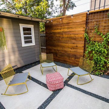
Another fun Crestview project! This young couple wanted a back yard that reflected their bohemian-eclectic style and could add additional privacy from the ever climbing construction around them. A place for “hanging out and drinking coffee or beer in the backyard.” But what was most exciting, was the air stream they had just purchased and were in the process of restoring. With the end goal of using it as a guest home for family and friends, we were challenged with creating a space that was cohesive and connected this new living space with the rest of the yard.
In the front we had another quark to fix. The sidewalk from their front door to the street suddenly stopped 5 feet from the curb, making a less than inviting entry for guests. So, creating a new usable entryway with additional curb appeal was a top priority.
We managed the entertainment space by using modern poured concrete pad’s as a focal. A poured concrete wall serves as a bench as well as creates a visual anchor for the patio area. To soften the hard materials, small plantings of succulents and ground cover were planted in the spaces between the pads. For a backdrop, a custom Cedar Plank wall and trellis combined to soften the vertical space and add plenty of privacy. The trellis is anchored by a Coral Vine to add interest. Cafe style lighting was strung across the area create a sense of intimacy.
We also completed the fence transition, and eliminated the grass areas that were not being utilized to reduce the amount of water waste in the landscape, and replaced these areas with beneficial plantings for the wildlife.
Overall, this landscape was completed with a cohesive Austin-friendly design in mind for these busy young professionals!
Caleb Kerr - http://www.calebkerr.com
 Klopf Architecture
Klopf Architecture and Jesse Ososki Art remodeled an existing Eichler atrium home into a brighter, more open, and more functional version of its original self.
The goals were to preserve the Eichler look and feel without the need to strictly adhere to it. The scope of work included re-configuring the master bedroom/bath, the kitchen, and the hall bath/laundry area, as well as updating interior finishes throughout to be more sophisticated.
The owners are detail-oriented and were very involved in the design process, down to the selection of lighting controls and stainless steel faceplates.Their design aesthetic leans toward the Scandinavian — light and bright, with simple straight lines and pure geometric shapes.
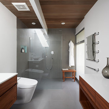
The finish flooring is large porcelain tile (24” x 24”) in a neutral grey tone, providing a uniform backdrop against which other materials can stand out. The same tile continues into the shower floor (with a different finish texture for slip-resistance) and up the shower/tub walls (in a smaller size). Heath Classic Field ceramic tile in Modern Blue was used sparingly, to add color at the hall bath vanity backsplash and at the shampoo niches in both bathrooms. Back-painted soda glass in pale blue to match the Heath tile was used at the kitchen backsplash. This same accent color was also used at the front entry atrium door. Kitchen cabinetry, countertops, appliances, and light fixtures are all white, making the kitchen feel more airy and light. Countertops are Caesarstone Blizzard.
The owners chose to keep some of the original Eichler elements: the concrete masonry fireplace; the stained tongue-and-groove redwood ceiling decking; and the luan wall paneling. The luan paneling was lightly sanded, cleaned, and re-stained. The owners also kept an added element that was installed by a previous owner: sliding shoji panels at all bedroom windows and sliding glass doors, for both privacy and sun control. Grooves were cut into the new tile flooring for the shoji panels to slide in, creating a more integrated look. Walnut was used to add warmth and contrast at the kitchen bar top and niche, the bathroom vanities, and the window sill/ledge under the kitchen window.
This Burlingame Eichler Remodel is a 2,121 sf, 4 bedroom/2 bath home located in the heart of Silicon Valley.
Klopf Architecture Project Team: John Klopf, Klara Kevane and Yegvenia Torres Zavala
Contractor: Jesse Ososki Art
Structural Engineer: Emmanuel Pun
Photography ©2018 Mariko Reed
Location: Burlingame, CA
Year completed: 2017
 Creative Furniture Galleries
Features:
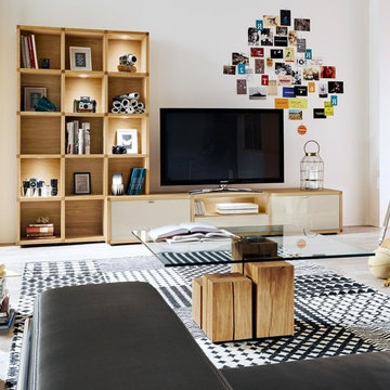
Wood Veneer Frame
2 Frame Finishes
9 Front finishes
The rear panels are in the chosen frame finish
The lacquer lamination surfaces in high gloss and matt are very scratch-resistant because of the UV-lacquer
The single pane safety, clear glass doors are glue-processed with high quality fittings
All doors and drawers have a soft close mechanism, drawers are full pull-outs
LED lighting optional, regulate your lighting atmosphere with a transmit dimmer and infrared repeater
Dimensions:
W 117.70" x D 20"/12.20" x H 74.80"
 Main Line Kitchen Design
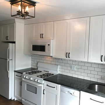
Unlike full showrooms open to the general public, Main Line Kitchen Design works only by appointment. Appointments can be scheduled days, nights, and weekends either in your home or in our office and selection center. During office appointments we display clients kitchens on a flat screen TV and help them look through 100’s of sample doorstyles, almost a thousand sample finish blocks and sample kitchen cabinets. During home visits we can bring samples, take measurements, and make design changes on laptops showing you what your kitchen can look like in the very room being renovated. This is more convenient for our customers and it eliminates the expense of staffing and maintaining a larger space that is open to walk in traffic. We pass the significant savings on to our customers and so we sell cabinetry for less than other dealers, even home centers like Lowes and The Home Depot.
We believe that since a web site like Houzz.com has over half a million kitchen photos, any advantage to going to a full kitchen showroom with full kitchen displays has been lost. Almost no customer today will ever get to see a display kitchen in their door style and finish because there are just too many possibilities. And the design of each kitchen is unique anyway. Our design process allows us to spend more time working on our customer’s designs. This is what we enjoy most about our business and it is what makes the difference between an average and a great kitchen design. Among the kitchen cabinet lines we design with and sell are Jim Bishop, 6 Square, Fabuwood, Brighton, and Wellsford Fine Custom Cabinetry.
 Eagle Pond Studio
Jessica Cook and Scott McCullough
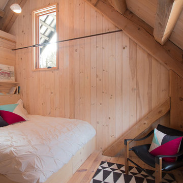
Inspiration for a rustic home design remodel in Boston
Inspiration for a rustic home design remodel in Boston
Sponsored
Columbus, OH

Structural Remodeling
Franklin County's Heavy Timber Specialists | Best of Houzz 2020!
 The Turett Collaborative
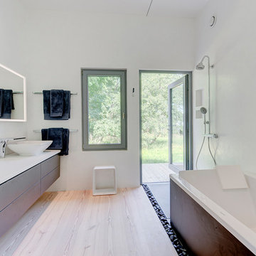
Master bath suite by Duravit. Greenport Passive House. Photos by Liz Glasgow.
Bathroom - large modern master bathroom idea in New York with flat-panel cabinets
Bathroom - large modern master bathroom idea in New York with flat-panel cabinets
 MIG Furniture Design, Inc.
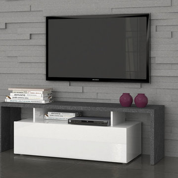
Modern Italian TV Stand Trevor A. Trevor A tv stand would be a great functional decoration of any contemporary living room. Slim and elegant design is perfectly combined with functionality, providing lots of storage space for all your need. Large drawer in the middle gives lots of hidden storage, while spacious open area provides sufficient room for your cable box and other media devices. Trevor A tv stand is available in two color combinations: gloss white / matt graphite or gloss black / matt graphite.
MATERIAL/CONSTRUCTION:
E1-Class ecological panels, which are produced exclusively trough a wood recycling production process
All panels are FSC certified
100% Made in Italy
Assembly:
Unassembled, Ready-To-Assemble
The starting price is for the TV Stand Trevor A.
Dimensions:
TV Stand: W55" x D17.7" x H17"
 Dura Supreme Cabinetry
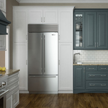
This fun and stylish bathroom features Sherwin-Williams “Slate Tile" SW 7624 on Dura Supreme’s Hawthorne door style. This elegant blue/gray paint color is subtle, calm, and inspiring. This color was selected for Dura Supreme’s 2017-2018 Curated Color Collection. Dura Supreme’s Curated Color Collection is a collection of cabinet paint colors that are always fresh, current and reflective of popular color trends for home interiors and cabinetry. This offering of colors is continuously updated as color trends shift.
Painted cabinetry is more popular than ever before and the color you select for your home should be a reflection of your personal taste and style. Our Personal Paint Match Program offers the entire Sherwin-William’s paint palette and Benjamin Moore’s paint palette, over 5,000 colors, for your new kitchen or bath cabinetry.
Color is a highly personal preference for most people and although there are specific colors that are considered “on trend” or fashionable, color choices should ultimately be based on what appeals to you personally. Homeowners often ask about color trends and how to incorporate them into newly designed or renovated interiors. And although trends and fashion should be taken into consideration, that should not be the only deciding factor. If you love a specific shade of green, select complementing neutrals and coordinating colors to create an entire palette that will remain an everlasting classic. It could be something as simple as being able to select the perfect shade of white that complements the countertop and tile and works well in a specific lighting situation. Our new Personal Paint Match system makes that process so much easier.
Request a FREE Dura Supreme Brochure Packet:
http://www.durasupreme.com/request-brochure
 Kathleen Jennison
An Arts & Crafts Bungalow is one of my favorite styles of homes. We have quite a few of them in our Stockton Mid-Town area. And when C&L called us to help them remodel their 1923 American Bungalow, I was beyond thrilled.
As per usual, when we get a new inquiry, we quickly Google the project location while we are talking to you on the phone. My excitement escalated when I saw the Google Earth Image of the sweet Sage Green bungalow in Mid-Town Stockton. "Yes, we would be interested in working with you," I said trying to keep my cool.
But what made it even better was meeting C&L and touring their home, because they are the nicest young couple, eager to make their home period perfect. Unfortunately, it had been slightly molested by some bad house-flippers, and we needed to bring the bathroom back to it "roots."
We knew we had to banish the hideous brown tile and cheap vanity quickly. But C&L complained about the condensation problems and the constant fight with mold. This immediately told me that improper remodeling had occurred and we needed to remedy that right away.
The Before: Frustrations with a Botched Remodel
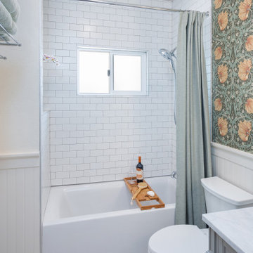
The bathroom needed to be brought back to period appropriate design with all the functionality of a modern bathroom. We thought of things like marble countertop, white mosaic floor tiles, white subway tile, board and batten molding, and of course a fabulous wallpaper.
This small (and only) bathroom on a tight budget required a little bit of design sleuthing to figure out how we could get the proper look and feel. Our goal was to determine where to splurge and where to economize and how to complete the remodel as quickly as possible because C&L would have to move out while construction was going on.
The Process: Hard Work to Remedy Design and Function
During our initial design study, (which included 2 hours in the owners’ home), we noticed framed images of William Morris Arts and Crafts textile patterns and knew this would be our design inspiration. We presented C&L with three options and they quickly selected the Pimpernel Design Concept.
We had originally selected the Black and Olive colors with a black vanity, mirror, and black and white floor tile. C&L liked it but weren’t quite sure about the black, We went back to the drawing board and decided the William & Co Pimpernel Wallpaper in Bayleaf and Manilla color with a softer gray painted vanity and mirror and white floor tile was more to their liking.
After the Design Concept was approved, we went to work securing the building permit, procuring all the elements, and scheduling our trusted tradesmen to perform the work.
We did uncover some shoddy work by the flippers such as live electrical wires hidden behind the wall, plumbing venting cut-off and buried in the walls (hence the constant dampness), the tub barely balancing on two fence boards across the floor joist, and no insulation on the exterior wall.
All of the previous blunders were fixed and the bathroom put back to its previous glory. We could feel the house thanking us for making it pretty again.
The After Reveal: Cohesive Design Decisions
We selected a simple white subway tile for the tub/shower. This is always classic and in keeping with the style of the house.
We selected a pre-fab vanity and mirror, but they look rich with the quartz countertop. There is much more storage in this small vanity than you would think.
The Transformation: A Period Perfect Refresh
We began the remodel just as the pandemic reared and stay-in-place orders went into effect. As C&L were already moved out and living with relatives, we got the go-ahead from city officials to get the work done (after all, how can you shelter in place without a bathroom?).
All our tradesmen were scheduled to work so that only one crew was on the job site at a time. We stayed on the original schedule with only a one week delay.
The end result is the sweetest little bathroom I've ever seen (and I can't wait to start work on C&L's kitchen next).
Thank you for joining me in this project transformation. I hope this inspired you to think about being creative with your design projects, determining what works best in keeping with the architecture of your space, and carefully assessing how you can have the best life in your home.

 User
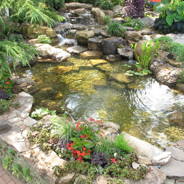
UserHow To Build A Fish Pond, seems to be a frequently asked question in today's day and age, what with Extreme Home Make Over, HGTV, P. Allen Smith and all of the other "Do-It-Yourself" television programs that are flooding our airways.
Once you finally decide that you want a beautiful ecosystem pond to come home to, the next step is to come up with an ecosystem pond design that works for you. This pond design can be a front yard waterscape with curb appeal or a Backyard Waterfall creating your own private get away. If your having trouble designing it yourself you could always have BJL Aquascapes Colts Neck, Monmouth County, NJ help design and build it for you !
Click Here To See Our Website Page Links
Visit our website links to more information on Backyard Garden Ponds, CLICK ON THE LINKS BELOW TO LEARN MORE !!!
Pond Filtration
Ecosystem Pond
Small Pond Filter Urn
UV Pond Sterilization
Bog Filtration
Our Display Ponds
Semi-Formal Ponds
Our Display At Brock's
Large Pond Management
Pond Portfolio
Construction Process
 AoDK Inc.
A couple wanted a weekend retreat without spending a majority of their getaway in an automobile. Therefore, a lot was purchased along the Rocky River with the vision of creating a nearby escape less than five miles away from their home. This 1,300 sf 24’ x 24’ dwelling is divided into a four square quadrant with the goal to create a variety of interior and exterior experiences while maintaining a rather small footprint.
Typically, when going on a weekend retreat one has the drive time to decompress. However, without this, the goal was to create a procession from the car to the house to signify such change of context. This concept was achieved through the use of a wood slatted screen wall which must be passed through. After winding around a collection of poured concrete steps and walls one comes to a wood plank bridge and crosses over a Japanese garden leaving all the stresses of the daily world behind.
The house is structured around a nine column steel frame grid, which reinforces the impression one gets of the four quadrants. The two rear quadrants intentionally house enclosed program space but once passed through, the floor plan completely opens to long views down to the mouth of the river into Lake Erie.
On the second floor the four square grid is stacked with one quadrant removed for the two story living area on the first floor to capture heightened views down the river. In a move to create complete separation there is a one quadrant roof top office with surrounding roof top garden space. The rooftop office is accessed through a unique approach by exiting onto a steel grated staircase which wraps up the exterior facade of the house. This experience provides an additional retreat within their weekend getaway, and serves as the apex of the house where one can completely enjoy the views of Lake Erie disappearing over the horizon.
Visually the house extends into the riverside site, but the four quadrant axis also physically extends creating a series of experiences out on the property. The Northeast kitchen quadrant extends out to become an exterior kitchen & dining space. The two-story Northwest living room quadrant extends out to a series of wrap around steps and lounge seating. A fire pit sits in this quadrant as well farther out in the lawn. A fruit and vegetable garden sits out in the Southwest quadrant in near proximity to the shed, and the entry sequence is contained within the Southeast quadrant extension. Internally and externally the whole house is organized in a simple and concise way and achieves the ultimate goal of creating many different experiences within a rationally sized footprint.
 TOC design & construction inc.
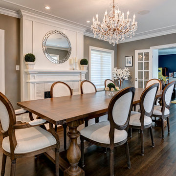
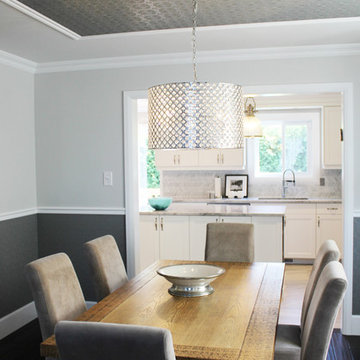
Formal Dining in a relax setting by Tania Scardellato – TOC design
Remodeling your home can be a lengthy and time consuming process, especially if you opt to renovate the entire house rather than just one room. However, even just by updating the decor in your home you can create a beautiful and fresh looking space. One space that is particularly easy to overhaul is the dining room. This is one of the smaller rooms in the home and contains a minimal amount of furniture, making the remodeling process quick and simple.
An essential factor of dining room design is the color scheme of this space. When searching for the best paint colors for a dining room you should keep a few things in mind, including your design, the size of the room, and the décor of the rest of your house. Because it tends to be smaller than most rooms in the home you do not want to choose a really dark or overwhelming color like black or bright fuchsia. Rather save these hues as accents in dark wood furniture, curtains, pictures, and other wall art. In this dining room we kept the colors neutral and added more accents to hi-gloss moldings, highlighting the architecture of the space and creating space definition with a TOUCH OF CLASS - TOC
When it comes to lighting for the dining room you have a lot of options such as chandeliers or wall sconces, however natural light is always best. If you already have windows in this space try to keep them uncovered or use sheer fabric curtains to allow optimum illumination in throughout the day. If your dining room does not have windows there are other options available that can help to brighten and open up this area
Accessorizing your dining room with the right accents is very important to tie in all aspects of the design. For example, an elegant table centerpiece can make the dining space feel more homey and relaxed. You can accent a kitchen island or dining table with a stunning vase of festive flowers, ornamental fruits and vegetables, or a basket of decorative glass ornaments. However, try to keep the ornamentation to a minimum to prevent cluttering the countertops. Sometimes the table itself can be an accent piece. The dining room creates an elegant focal point that contains different colors, textures, and patterns. Similarly, leather chairs surrounding solid oak dining room furniture add the element of texture and color while creating a rustic, old world atmosphere. Regardless of the look you are trying to obtain, or the room in which you are redecorating, we can help create the style custom to suit your needs
35