
Search results for "Simply remove" in Home Design Ideas
 Corinthian Fine Homes
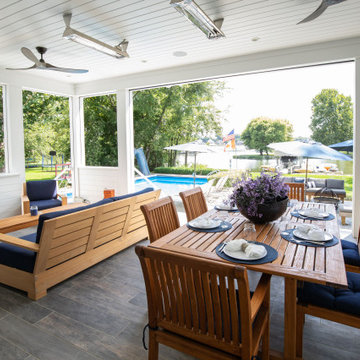
These homeowners are well known to our team as repeat clients and asked us to convert a dated deck overlooking their pool and the lake into an indoor/outdoor living space. A new footer foundation with tile floor was added to withstand the Indiana climate and to create an elegant aesthetic. The existing transom windows were raised and a collapsible glass wall with retractable screens was added to truly bring the outdoor space inside. Overhead heaters and ceiling fans now assist with climate control and a custom TV cabinet was built and installed utilizing motorized retractable hardware to hide the TV when not in use.
As the exterior project was concluding we additionally removed 2 interior walls and french doors to a room to be converted to a game room. We removed a storage space under the stairs leading to the upper floor and installed contemporary stair tread and cable handrail for an updated modern look. The first floor living space is now open and entertainer friendly with uninterrupted flow from inside to outside and is simply stunning.
 TKS Design Group
Download our free ebook, Creating the Ideal Kitchen. DOWNLOAD NOW
For many, extra time at home during COVID left them wanting more from their homes. Whether you realized the shortcomings of your space or simply wanted to combat boredom, a well-designed and functional home was no longer a want, it became a need. Tina found herself wanting more from her Old Irving Park home and reached out to The Kitchen Studio about adding function to her kitchen to make the most of the available real estate.
At the end of the day, there is nothing better than returning home to a bright and happy space you love. And this kitchen wasn’t that for Tina. Dark and dated, with a palette from the past and features that didn’t make the most of the available square footage, this remodel required vision and a fresh approach to the space. Lead designer, Stephanie Cole’s main design goal was better flow, while adding greater functionality with organized storage, accessible open shelving, and an overall sense of cohesion with the adjoining family room.
The original kitchen featured a large pizza oven, which was rarely used, yet its footprint limited storage space. The nearby pantry had become a catch-all, lacking the organization needed in the home. The initial plan was to keep the pizza oven, but eventually Tina realized she preferred the design possibilities that came from removing this cumbersome feature, with the goal of adding function throughout the upgraded and elevated space. Eliminating the pantry added square footage and length to the kitchen for greater function and more storage. This redesigned space reflects how she lives and uses her home, as well as her love for entertaining.
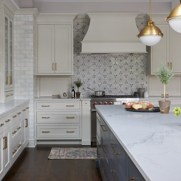
The kitchen features a classic, clean, and timeless palette. White cabinetry, with brass and bronze finishes, contrasts with rich wood flooring, and lets the large, deep blue island in Woodland’s custom color Harbor – a neutral, yet statement color – draw your eye.
The kitchen was the main priority. In addition to updating and elevating this space, Tina wanted to maximize what her home had to offer. From moving the location of the patio door and eliminating a window to removing an existing closet in the mudroom and the cluttered pantry, the kitchen footprint grew. Once the floorplan was set, it was time to bring cohesion to her home, creating connection between the kitchen and surrounding spaces.
The color palette carries into the mudroom, where we added beautiful new cabinetry, practical bench seating, and accessible hooks, perfect for guests and everyday living. The nearby bar continues the aesthetic, with stunning Carrara marble subway tile, hints of brass and bronze, and a design that further captures the vibe of the kitchen.
Every home has its unique design challenges. But with a fresh perspective and a bit of creativity, there is always a way to give the client exactly what they want [and need]. In this particular kitchen, the existing soffits and high slanted ceilings added a layer of complexity to the lighting layout and upper perimeter cabinets.
While a space needs to look good, it also needs to function well. This meant making the most of the height of the room and accounting for the varied ceiling features, while also giving Tina everything she wanted and more. Pendants and task lighting paired with an abundance of natural light amplify the bright aesthetic. The cabinetry layout and design compliments the soffits with subtle profile details that bring everything together. The tile selections add visual interest, drawing the eye to the focal area above the range. Glass-doored cabinets further customize the space and give the illusion of even more height within the room.
While her family may be grown and out of the house, Tina was focused on adding function without sacrificing a stunning aesthetic and dreamy finishes that make the kitchen the gathering place of any home. It was time to love her kitchen again, and if you’re wondering what she loves most, it’s the niche with glass door cabinetry and open shelving for display paired with the marble mosaic backsplash over the range and complimenting hood. Each of these features is a stunning point of interest within the kitchen – both brag-worthy additions to a perimeter layout that previously felt limited and lacking.
Whether your remodel is the result of special needs in your home or simply the excitement of focusing your energy on creating a fun new aesthetic, we are here for it. We love a good challenge because there is always a way to make a space better – adding function and beauty simultaneously.

Find the right local pro for your project
 Mosaik Design & Remodeling
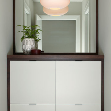
This linen cabinet with his and hers hampers boasts white doors inset into walnut frames which adds interest and a modern quality to the design. This combination ties both color schemes together for added cohesion on the design. The mirror and Mid Century oval pendant make this a focal point rather than just another linen cabinet.
Wendi Nordeck Photography
By removing the existing his and her closets from the master bathroom and annexing space from the laundry room, we were able to design in separate tub and showers to fit into the space. White tile with a distinct midcentury pattern on it clads (2) full walls and lightens up the space. The sleek undermount tub with white quartz top is beautiful in its simplicity and is balanced out by the walnut skirt panels that are easily removed by touch latches. The bathroom cabinet and linen cabinet (end of the hall) both have white doors inset in walnut frames for added interest. This combination ties both color schemes together for added cohesion on the design. The vanity tower cabinet is a multi-purpose storage cabinet accessed on all (3) sides. The face is a medicine cabinet and the sides are his and her storage with outlets. This allows for easy use of electric toothbrushes, razors and hairdryers. Below, there are also his and her pull-outs with adjustable shelving to keep the taller toiletries organized and at hand.
The large format porcelain tile has a natural feel to it which ties in to the mixed grey toned rocks on the shower floor for consistency. Can lighting combined with stunning bottle shaped pendants that mimic the tile pattern offer controlled light on dimmers to suit every need in the space.
Wendi Nordeck Photography
 Cadence Design + Architecture Studio
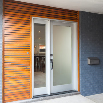
We removed the old door and used the clear cedar slats to compliment the space around the new anodized aluminum door with a side light. Photo by Michael de Leon Photography.
 Tile Doctor Ltd
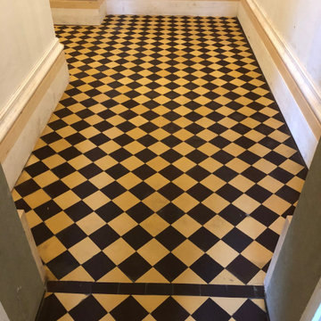
I thought I would share this case history of a Yellow and Black Victorian Tiled floor that we worked on at a large house in Lancaster last year. It’s a great example of the typical problems we face with old Victorian floors, especially around door thresholds where the transition between the different foundation invariable cause problems.
I didn’t know the full history of the floor, but it was now in quite a state and recent renovation work had left the floor unstable with loose and cracked tiles. The tiles needed to be removed and then the damaged subfloor carefully scraped out and replaced. Once that was done the floor would need relaying and then cleaned and sealed so everything would blend in.
After visiting the property and providing a quotation we were given the go ahead and agreed a date to do the work.
We returned on the agreed date and set about carefully removing the loose and cracked Victorian tiles and put them aside for later use. Some would need replacing however this would not present a problem and they are still widely available, and I have several contacts I can turn to for this.
Once this was done and the subfloor exposed and cleaned up, I used self-levelling cement to bring the floor level up and in-line with the existing. This now needed to set hard, so the rest of the day was spent cleaning up the tiles we removed earlier with Tile Doctor Grout Clean-up and Pro-clean. Our goal is to reuse as many of the original tiles as possible to preserve the heritage of the floor.
The next day with the new subfloor set it was ready for tiling. This involves laying out the tiles first without adhesive carefully cutting and fitting new tiles as needed to maintain the overall pattern of the floor. Once I was happy the tiles were moved to a board and then fitted with fresh adhesive.
I came back on day three with the aim of cleaning the floor so it could be sealed however whilst inspecting my new tiling I was disappointed to discover some were not as level as I had hoped. I had noticed the replacement tiles were not the same thickness as the originals the previous day but I had worked around this by using different levels of adhesive, clearly this plan was not as effective as I had hoped for.
To counter this problem, I used a set of 50-Grit, 100-grit and then 200-grit diamond pads in sequence to mill the floor flat and remove the lippage between them. This is done with water to lubricate the process and a weighted floor buffer. The pads generate a lot of slurry and so you need to rinse this off with more water and extract all the soil after each pad.
I followed this up with various Diamond burnishing pads of increasingly finer grits across the whole floor until we achieved a consistent finish and had the added benefit of getting the whole floor clean. More water is used to rinse the tiles after burnishing and the soil extracted with a wet vacuum as before. Once done and inspected the floor was left to dry off overnight.
Tile Doctor Colour Grow was applied to enhance the appearance of the tiles and protect them going forward. This product copes well with damp which can always be a problem with old floors like this one with no damp proof membrane present.
The floor looked amazing when finished and our attention to detail had really paid off, in fact you simply could not tell we had done any tiling work or replaced any tiles. For aftercare I recommend the use of Tile Doctor Neutral Cleaner which is designed for the regular cleaning of sealed tiles.
Russell Taylor
Lancashire Tile Doctor
 Tile Doctor Ltd
If you have a tiled shower area in your home, it’s very likely you’ve experienced problems with the grout becoming excessively dirty and ridden with displeasing black spots of mould. The underlying issue is due to inadequate ventilation which can be a real problem in modern insulated houses and occasionally the grout can get so imbued with contamination that the problem needs to be resolved professionally.
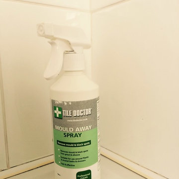
In the case of this Ceramic tiled shower area, located at a property in Galgate, Lancashire, mould had turned the grout black and had got into the sealant strip around the base. The property owner had tried using the run-of-the-mill cleaning products you can buy in superstores, but they simply couldn’t get the job done. So, she contacted me to see what could be done.
At Tile Doctor, we come across the problem of mouldy shower tiles very often. Excess soaps and shampoos – many of which contain chemicals that harmful to the grout – can quickly build-up if not removed, causing mould and soap scum to emerge quickly, and before you know it, you have a problem like this one.
Thankfully, with the right strength product and cleaning methods, mould can be removed quite easily. The cleaning product used here was Tile Doctor Mould Away, which does what it says on the bottle and can quickly remove mould and black spots from grout and silicone. I applied Mould Away to the grout and surrounding Ceramic tiles and left it to dwell for a short period, before starting to clean the affected areas carefully using soft nail brushes and a small amount of water.
Sometimes it is necessary to repeat this process several times to achieve the best possible results, but in this case two attempts was all it took to get the grout looking like new once again.
Following the cleaning, the area was rinsed thoroughly with water, before bring dried off quickly with a heat gun on a low setting. I then sealed the grout with a single coat of Tile Doctor Wall Grout Sealer, which is a water-based sealer designed to protect against water, oil and acid-based contaminants, and stop them from spoiling the appearance of the grout. It also provides a transparent finish that does not diminish the original colouring of the grout. To add the finishing touches, I polished off the Ceramic tiles as these were already fully glazed and did not require any extra sealer.
The before and after photos are a testament to how significantly the condition and appearance of the grout was quickly improved and needless to say, the customer was very satisfied with the result.
Russell Taylor
Lancashire Tile Doctor


 Tile Doctor Ltd
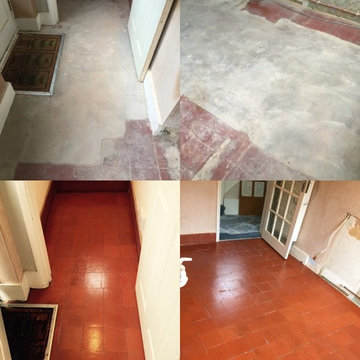
This customer from Woking had a Quarry tiled kitchen floor that she simply didn’t think could be restored. The floor had been unearthed after many years of being covered by a layer of levelling compound cement and then linoleum. Indeed, the situation certainly looked dire, but I carried out a successful test clean on a patch of the floor where the cement was at its thickest to show that it would be possible to conduct a full restoration. Having seen the results, the customer was more than happy for me to get the work underway.
To begin the restoration, I soaked small sections with water and Tile Doctor Remove and Go our heavy duty coatings remover. The solution was left to dwell for a short period to soften the cement, before I used the heat from a steamer in combination with a hand scraper to begin lifting away the muck. As you can probably imagine, this was an arduous and intensive process which took a full four days to fully complete.
Next, I cleaned the cement-free tiles using our high alkaline tile cleaning product Tile Doctor Pro Clean diluted 1 part cleaner with 3 parts water. This helped to eradicate the leftover muck once I had removed the bulk of the cement. I then sprayed Tile Doctor Grout Clean Up onto the grout lines and tiles to fully neutralise them and also remove any cement residue. Finally, I steamed the floor and left it for a week to dry out completely.
Upon my return to the property I sealed the floor with two coats of Tile Doctor Colour Grow, an impregnating sealer which really enhances the natural colours stone, and four coats of Tile Doctor Seal and Go, a topical sealer which provides a high quality sheen finish and durable protection against stains.
The customer was over the moon with the results and left some great feedback:
“Wayne did a really superb job. It was a very tough task, hot and exhausting, but he was fantastically good-humoured throughout, and kept me really well-informed. He was 100% reliable and very good at communicating between visits. I’m absolutely thrilled with the results! Thank you Wayne and thank you Tile Doctor! Would definitely recommend, and use your services again.”


 Tile Doctor Ltd
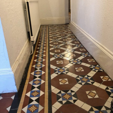
We received a request to renovate Victorian tiled hallway floor at a house in the London borough of Harlesden NW10. My client had modernised the heating system and this unfortunately required a section of the tiled flooring to be dug up so new pipework could be laid.
After speaking on the phone, I arranged an initial visit to the property so I could properly assess the work required and provide a price for restoring the floor. During my visit I could see there was another section of missing tiles at one of the door thresholds which would need attention. Except for the missing sections of floor I could see that the tiles themselves were in good condition for their age and would respond well to a deep clean and fresh seal.
I was confident on being able to source matching replacements for the missing tiles and reassured my client that we would be able not only repair the floor but also renovate it to a good standard. I gave them a price to do the restoration which they were happy to accept, and the work was booked.
After some research I managed to source replacement tiles from the Vintage Floor Tile Company in Kent; Victorian tiles are still popular so there a few companies that keep stock so we can usually find a match.
With the replacements in hand, work started by removing the cement and loose material from the missing sections of flooring and backfilling with self-levelling compound to bring the exposed base up to the right level for tiling.
The tiles were then cut to shape as required to match the existing patten and fixed into place with a quick setting adhesive and then grouted.
The floor was left to overnight to allow the adhesive to harden fully, and I returned the next day to deep clean the whole floor. To give the tiles are deep clean a strong dilution of Tile Doctor Remove and Go was sprayed onto the floor and left to soak in for ten minutes. It was then scrubbed into the floor using a rotary machine fitted with a with a black pad. This action lifted the dirt out of the tiles and the resulting slurry was removed with the wet vacuum.
It turned out that the pores of the tiles were holding a lot of dirt, so the process was repeated until I was satisfied. Due to the age of the property, there was no damp-proof membrane installed so I do try to minimise the amount of water I use in this process as there is always a chance of exacerbating any latent efflorescence issues.
Efflorescence occurs where moisture rises through the tile bringing with it salts from underneath the floor as it evaporates on the surface. This can lead to unsightly white marks appearing on the tile. To counteract this potential problem the cleaning was followed by an acid wash using Tile Doctor Acid Gel applied with a 100 then 200-grit pad, before finishing on a 400-grit burnishing pad. The floor was again rinsed with water after the application of each pad to remove the slurry and extracted with a wet vacuum.
Once I was satisfied the floor was as clean as possible, we left site and the area was left to dry over the weekend ready for application of a new sealer.
I returned on the Monday and started by taking a few moisture readings to check the floor was dry. The floor was in an acceptable range, so I applied the first of 4 coats of sealer. For this floor I chose Tile Doctor Seal and Go Extra which is specially formulated product that provides stain resistance with a hard wearing low-sheen finish.
This product is also breathable which is an important feature for old floors, anything that blocks moisture from rising through the tile will cause it to become trapped underneath where it will pool and eventually reach out to the walls and result in rising damp.
Once complete the floor looked brand new and I’m pleased to say with the deep clean and a fresh sealer applied it was impossible to tell the difference between the original and repaired sections of flooring.
For the aftercare of sealed Victorian tiled floors, I recommend Tile Doctor Neutral Cleaner, it’s a mild day to day cleaner with a neutral pH that won’t damage the sealer. Many of the tile cleaning products you find in supermarkets are simply too strong.
Andrew Newstead
North London Tile Doctor
 William Hoffman Architect
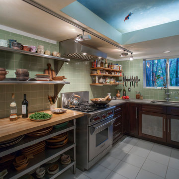
What simply started out as the purchase of a 30” Wolf gas stove to replace the old, turned into a complete kitchen renovation. The original intent was to replace the existing stove with the new. The new Wolf came other issues one being installing an adequate exhaust system to meet the needs of the stove. One thing led to the next and with that a new kitchen. The renovation included removing all existing fixtures, cabinetry and lighting. The existing tile floor remained the same but with some added area that was previously under existing base cabinets.
The goal of the project, once the decision was made to do a complete renovation, was to update the kitchen creating an eclectic aesthetic with all new fixtures of the best quality that could be afforded. Listed below are the changes that were made. All fixtures remained in their existing locations other than removing small piece of wall that allowed an extended length of the new bakers table to extend 24” into the existing dining and living room space to pull the spaces together and provide a small eating bar with adjoining bar stools. One stool was a custom design and fabrication (Marlin Stool)
Fixtures
1. Existing gas stove replaced with new 30” gas Wolf stove.
2. Existing Refrigerator replace with new 36” stainless steel Jen-Air refrigerator with bottom freezer.
3. Existing Dishwasher replace with new Jen-Air stainless steel interior and exterior dishwasher.
4. Existing base cabinets replaced with a combination of open and closed tables and cabinets. Two stainless steel commercial kitchen tables with an open bases and shelving. One with a stainless steel top the other a bakers table with a wood butcher block top. The cabinets were Kraft Made traditional wood base cabinets with a Kaffe finish and Fireslate counter surface. These cabinets were customized with stainless steel perforated door inserts and Mockett stainless steel drawer and door pulls.
5. Surface counter and table material included wood butcher block, stainless steel and Fireslate.
6. Overhead shelving included open commercial kitchen stainless steel shelves and open Appleply wood shelves with Rakks aluminum shelf brackets.
7. Existing lighting was replaced with Zumtobel track lighting with Ushio lamps, Lutron dimmers and an up lighted coffered ceiling (see Superman).
8. Existing kitchen sink was replaced with a large single compartment sink from Kindred with an In-Sinkerator Evolution garbage disposal. Filter water tap was added that connects to an Everprue water filter system.
9. Walls were tiled with Bottle Green 4 1/4” x 4 1/4” Daltile to staying consistent with existing original house tile.
10. The ceiling was reworked as required with a plaster finish
11. Marine grade caulk was used as required.
12. A soffit with up lighting was added to the periphery of kitchen facing the adjoining living and dining rooms.
13. Silver Masonite peg board storage wall adjacent to refrigerator.
Credits:
• Little Pete the Parakeet.....for being there
• Catalina Aguirre.....pots
• Many Friends....pots
• David D’Imperio.....Sputnik lamp
• Jose Maria Concha Sali.....painting
• Ron Meyers.....Plates on wall
• Bill Sanders.....Bunny screen painting
• William Hoffman....Beverly lamp
• William Hoffman.....marlin stool
• William Hoffman.....Gulfstream side chair
• William Hoffman.....Gulfstream dining table
• William Hoffman.....5 from 1 plywood chair
Problems
• A custom fabricated exhaust duct was required due to existing soffit framing conditions.
• The ceiling was not parallel to the floor so the intended full wall tile installation was held short of the ceiling.
• Return Air duct to A/C air handler required relocation
Project cost
• +/- $22,000
Fixtures, materials and appliances
Selection of fixtures, materials and fixtures were made based on quality, aesthetic and cost. Extensive research was done to find the best quality at a price point that was affordable. Items that were splurged on were the Wolf stove and Jen-Air refrigerator and dishwasher and the Zumtobel lighting
Bill Sanders Photography
 Simply Home Decorating
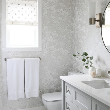
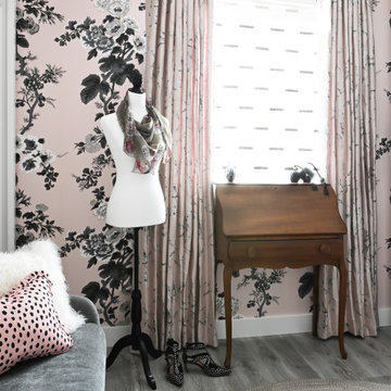
This 1990's home, located in North Vancouver's Lynn Valley neighbourhood, had high ceilings and a great open plan layout but the decor was straight out of the 90's complete with sponge painted walls in dark earth tones. The owners, a young professional couple, enlisted our help to take it from dated and dreary to modern and bright. We started by removing details like chair rails and crown mouldings, that did not suit the modern architectural lines of the home. We replaced the heavily worn wood floors with a new high end, light coloured, wood-look laminate that will withstand the wear and tear from their two energetic golden retrievers. Since the main living space is completely open plan it was important that we work with simple consistent finishes for a clean modern look. The all white kitchen features flat doors with minimal hardware and a solid surface marble-look countertop and backsplash. We modernized all of the lighting and updated the bathrooms and master bedroom as well. The only departure from our clean modern scheme is found in the dressing room where the client was looking for a more dressed up feminine feel but we kept a thread of grey consistent even in this more vivid colour scheme. This transformation, featuring the clients' gorgeous original artwork and new custom designed furnishings is admittedly one of our favourite projects to date!


 Simply Elegant Interiors
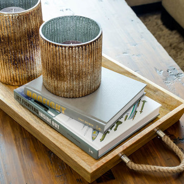
The client wanted a masculine and rustic family room.
We chose this coffee table for the simple lines and rustic appeal. There is storage underneath that comes in handy for small spaces. The decorative tray makes it easy to remove items if more space is needed.
Simply Elegant Interiors, Tampa.
 Simply Home Decorating
This 1990's home, located in North Vancouver's Lynn Valley neighbourhood, had high ceilings and a great open plan layout but the decor was straight out of the 90's complete with sponge painted walls in dark earth tones. The owners, a young professional couple, enlisted our help to take it from dated and dreary to modern and bright. We started by removing details like chair rails and crown mouldings, that did not suit the modern architectural lines of the home. We replaced the heavily worn wood floors with a new high end, light coloured, wood-look laminate that will withstand the wear and tear from their two energetic golden retrievers. Since the main living space is completely open plan it was important that we work with simple consistent finishes for a clean modern look. The all white kitchen features flat doors with minimal hardware and a solid surface marble-look countertop and backsplash. We modernized all of the lighting and updated the bathrooms and master bedroom as well. The only departure from our clean modern scheme is found in the dressing room where the client was looking for a more dressed up feminine feel but we kept a thread of grey consistent even in this more vivid colour scheme. This transformation, featuring the clients' gorgeous original artwork and new custom designed furnishings is admittedly one of our favourite projects to date!
 Simply Stunning Spaces
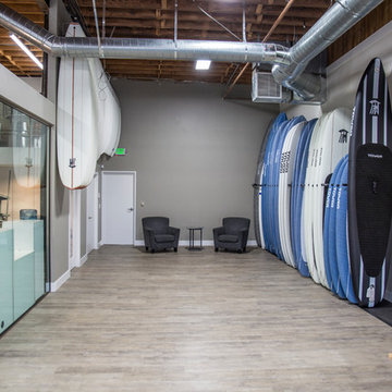
Tower Paddle Boards, or Tower (as in a lifeguard tower), is a dedicated stand up paddle boarding brand started by Stephan Aarstol and later funded by Shark Tank icon Mark Cuban on ABC's hit show.
Simply Stunning Spaces has had the absolute pleasure of watching this company grow from their small office space in Pacific Beach to expanding their warehouse space and most recently gaining a prominent location on one of San Diego's most recognizable streets, Garnet Ave.
This space had a long ways to go to becoming something simply stunning but the end result was just that. By removing the ceiling tiles and opening up to the 15 foot ceilings hidden away we were able to maximize the square footage of the office, gain a second floor of office space and dedicate the bottom floor to retail and event space for the SUP community to enjoy.
Some of our favorite features: the 31 foot Tower mural inside the glass enclosed private work space, the outdoor painted signage, the sand blasted ceilings which were definitely worth it! The exposed duct work add to its industrial feel and the glass enclosed shaping room in the window is an absolute show stopper!
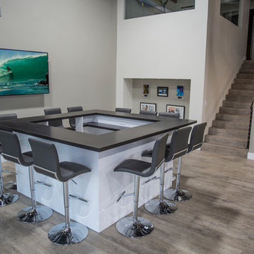
The bar we built for the previous office space fit just perfectly in the new space. We love repurposing whenever we can and the dedicated niche we built to house all the really cool awards and recognitions the owner and company have received were well deserving of being highlighted. It's not too often you can say you've been in Inc magazine, Forbes, 20/20... just to name a few!
 Simply Stunning Spaces
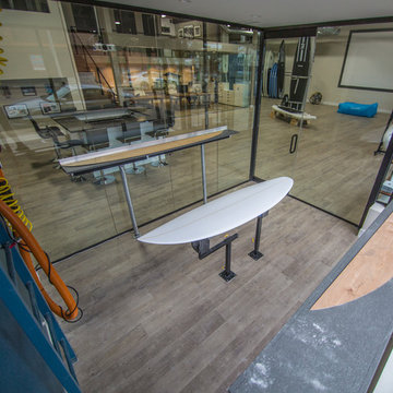
Tower Paddle Boards, or Tower (as in a lifeguard tower), is a dedicated stand up paddle boarding brand started by Stephan Aarstol and later funded by Shark Tank icon Mark Cuban on ABC's hit show.
Simply Stunning Spaces has had the absolute pleasure of watching this company grow from their small office space in Pacific Beach to expanding their warehouse space and most recently gaining a prominent location on one of San Diego's most recognizable streets, Garnet Ave.
This space had a long ways to go to becoming something simply stunning but the end result was just that. By removing the ceiling tiles and opening up to the 15 foot ceilings hidden away we were able to maximize the square footage of the office, gain a second floor of office space and dedicate the bottom floor to retail and event space for the SUP community to enjoy.
Some of our favorite features: the 31 foot Tower mural inside the glass enclosed private work space, the outdoor painted signage, the sand blasted ceilings which were definitely worth it! The exposed duct work add to its industrial feel and the glass enclosed shaping room in the window is an absolute show stopper!
The bar we built for the previous office space fit just perfectly in the new space. We love repurposing whenever we can and the dedicated niche we built to house all the really cool awards and recognitions the owner and company have received were well deserving of being highlighted. It's not too often you can say you've been in Inc magazine, Forbes, 20/20... just to name a few!
 Simply Stunning Spaces
Tower Paddle Boards, or Tower (as in a lifeguard tower), is a dedicated stand up paddle boarding brand started by Stephan Aarstol and later funded by Shark Tank icon Mark Cuban on ABC's hit show.
Simply Stunning Spaces has had the absolute pleasure of watching this company grow from their small office space in Pacific Beach to expanding their warehouse space and most recently gaining a prominent location on one of San Diego's most recognizable streets, Garnet Ave.
This space had a long ways to go to becoming something simply stunning but the end result was just that. By removing the ceiling tiles and opening up to the 15 foot ceilings hidden away we were able to maximize the square footage of the office, gain a second floor of office space and dedicate the bottom floor to retail and event space for the SUP community to enjoy.
Some of our favorite features: the 31 foot Tower mural inside the glass enclosed private work space, the outdoor painted signage, the sand blasted ceilings which were definitely worth it! The exposed duct work add to its industrial feel and the glass enclosed shaping room in the window is an absolute show stopper!
The bar we built for the previous office space fit just perfectly in the new space. We love repurposing whenever we can and the dedicated niche we built to house all the really cool awards and recognitions the owner and company have received were well deserving of being highlighted. It's not too often you can say you've been in Inc magazine, Forbes, 20/20... just to name a few!
 Simply Stunning Spaces
Tower Paddle Boards, or Tower (as in a lifeguard tower), is a dedicated stand up paddle boarding brand started by Stephan Aarstol and later funded by Shark Tank icon Mark Cuban on ABC's hit show.
Simply Stunning Spaces has had the absolute pleasure of watching this company grow from their small office space in Pacific Beach to expanding their warehouse space and most recently gaining a prominent location on one of San Diego's most recognizable streets, Garnet Ave.
This space had a long ways to go to becoming something simply stunning but the end result was just that. By removing the ceiling tiles and opening up to the 15 foot ceilings hidden away we were able to maximize the square footage of the office, gain a second floor of office space and dedicate the bottom floor to retail and event space for the SUP community to enjoy.
Some of our favorite features: the 31 foot Tower mural inside the glass enclosed private work space, the outdoor painted signage, the sand blasted ceilings which were definitely worth it! The exposed duct work add to its industrial feel and the glass enclosed shaping room in the window is an absolute show stopper!
The bar we built for the previous office space fit just perfectly in the new space. We love repurposing whenever we can and the dedicated niche we built to house all the really cool awards and recognitions the owner and company have received were well deserving of being highlighted. It's not too often you can say you've been in Inc magazine, Forbes, 20/20... just to name a few!

21