
Search results for "Sinking realization" in Home Design Ideas
 Kraft Custom Construction
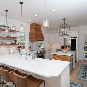
This 1914 family farmhouse was passed down from the original owners to their grandson and his young family. The original goal was to restore the old home to its former glory. However, when we started planning the remodel, we discovered the foundation needed to be replaced, the roof framing didn’t meet code, all the electrical, plumbing and mechanical would have to be removed, siding replaced, and much more. We quickly realized that instead of restoring the home, it would be more cost effective to deconstruct the home, recycle the materials, and build a replica of the old house using as much of the salvaged materials as we could.
The design of the new construction is greatly influenced by the old home with traditional craftsman design interiors. We worked with a deconstruction specialist to salvage the old-growth timber and reused or re-purposed many of the original materials. We moved the house back on the property, connecting it to the existing garage, and lowered the elevation of the home which made it more accessible to the existing grades. The new home includes 5-panel doors, columned archways, tall baseboards, reused wood for architectural highlights in the kitchen, a food-preservation room, exercise room, playful wallpaper in the guest bath and fun era-specific fixtures throughout.
 Kraft Custom Construction
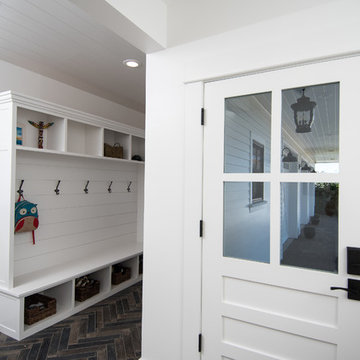
This 1914 family farmhouse was passed down from the original owners to their grandson and his young family. The original goal was to restore the old home to its former glory. However, when we started planning the remodel, we discovered the foundation needed to be replaced, the roof framing didn’t meet code, all the electrical, plumbing and mechanical would have to be removed, siding replaced, and much more. We quickly realized that instead of restoring the home, it would be more cost effective to deconstruct the home, recycle the materials, and build a replica of the old house using as much of the salvaged materials as we could.
The design of the new construction is greatly influenced by the old home with traditional craftsman design interiors. We worked with a deconstruction specialist to salvage the old-growth timber and reused or re-purposed many of the original materials. We moved the house back on the property, connecting it to the existing garage, and lowered the elevation of the home which made it more accessible to the existing grades. The new home includes 5-panel doors, columned archways, tall baseboards, reused wood for architectural highlights in the kitchen, a food-preservation room, exercise room, playful wallpaper in the guest bath and fun era-specific fixtures throughout.
 Traci Connell Interiors
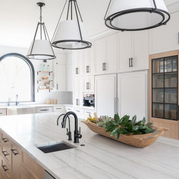
Perfectly embedded on an acre of land overlooking a pond, in the heart of Willow Bend of Plano, this dated, traditional home got more than a complete facelift. The wife is a “farmer’s daughter” and could have never imagined having a home like this to call her own one day. Finding a 15’ dining table was a tall task… especially for a family of four. Using a local craftsman, the most gorgeous white oak table was created to host everyone in the neighborhood! The clients told a lot of stories about their past and children. The designer realized that the stories were actually treasures as she incorporated their memories and symbols in every room. She brought these memories to life in a custom artwork collage above the family room mantel. From a tractor representing the grandfather, to the Russian alphabet portraying the roots of their adopted sons and some Cambodian script, there were meanings behind each piece. In order to bring nature indoors, the designer decided to demo the exterior wall to the patio to add a large folding door and blew out the wall dividing the formal dining room and breakfast room so there would be a clear sight through to the outdoors. Throughout the home, each family member was thought of. The fabrics and finishes had to withstand small boys, who were extremely active. The use of outdoor fabrics and beautiful scratch proof finishes were incorporated in every space – bring on the hotwheels.
Find the right local pro for your project
 Powell Construction
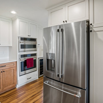
When we first began the design of this project, the clients’ main priority was to get more room in their kitchen. The wall that separated the kitchen and dining space was load bearing and spanned the living room space as well, so rather than removing it the way we might in some floorplans, we left a header and created a large opening to help the flow between the spaces. When it came to the style of the kitchen, the ranch-style home was well suited for a classic, transitional style with farmhouse details such as a white apron-front sink.
We decided on the two-toned cabinetry after originally discussing the idea of white, but realizing that with grandkids and dogs, having white cabinetry so near exterior doors might not be the best option. The lower cabinets are maple stained with a color called “Coffee” and the white upper cabinets feature a similar colored glaze in the detailing to help tie them together. The floor is a popular CoreTEC product called “Red River Hickory”. The overall tone matches that of the lower cabinets for a seamless look. The white backsplash tile and countertop with simple veining continue the two-toned look.
The range hood is a new Zephyr fixture originally designed for commercial kitchens, but became a good choice for homes with low ceilings, as the high suction power allows us to meet building codes without obstructing any views. The other appliances are from the GE Café line – these pieces feature copper accents on the handles, which gave us a great place to start when choosing the showstopping copper pendant over the sink.
The redesigned space gives more room for multiple cooks and the removal of the wall allows in tons of extra light from the dining room – without moving or replacing a single window or exterior door. There is ample prep room, storage space, and seating for visitors to the kitchen. The homeowners love their new space, and we are sure they will continue to love it for years to come.
 TVL Creative Ltd.
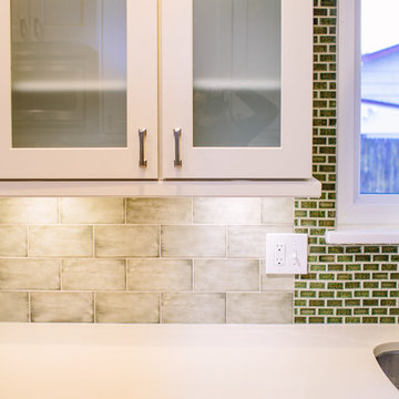
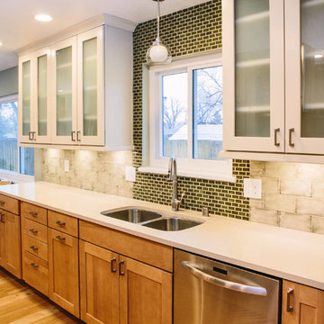
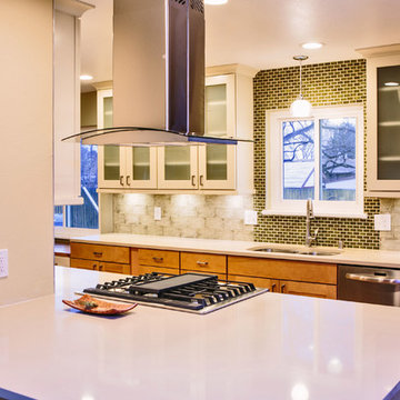
This remodel took an extremely dark & dated kitchen and transformed it into a bright and airy happy place for our client. The existing conditions created a dark, hall-like kitchen that greatly lacked in function and did little to optimize storage. Realizing the potential of this truly massive space, we created a design that utilizes every inch of the kitchen and creates functional cooking and prep space as well as pantry storage and work nooks. Our first order of business was to demo out the blocky corner that separated the kitchen from the living room. This involved removing an existing fireplace, re-structuring a wall, and having an entirely new furnace installed in the basement to eliminate a duct running right through the corner we hoped to eliminate. After opening up the space, we focused on highlighting and brightening the room. New NuCore flooring was installed to give the kitchen a fresh look while offering optimal function and cleanability. Two-toned cabinets in a honey maple and painted silk were used to create a warm and comfortable balance throughout the space. New quartz countertops in MSI's canvas were installed, and butcher block was installed on the two desk areas to offer a warm visual relief and casual work surface. The color palette for the kitchen is reminiscent of a cozy apothecary; we utilized fresh greens with Sherwin Williams paint on the walls and Treviso Gray Sage glazed subway tiles on the backsplash. Over the sink, we designed a playful highlight with counter-to-ceiling mini brick mosaic in a dark crackle green. We introduced additional lighting throughout including new recessed lights, over-sink light, and under-cabinet lights. New appliances were introduced to the space as well, and we complimented the stainless steel of these fixtures to the transitional nickel hardware on the cabinets. This space now feels open and inviting, and is visible from the second you enter the front door! We are so proud of this result and so happy that our clients can enjoy this gorgeous kitchen for years to come.
 Powell Construction
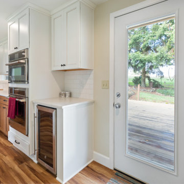
When we first began the design of this project, the clients’ main priority was to get more room in their kitchen. The wall that separated the kitchen and dining space was load bearing and spanned the living room space as well, so rather than removing it the way we might in some floorplans, we left a header and created a large opening to help the flow between the spaces. When it came to the style of the kitchen, the ranch-style home was well suited for a classic, transitional style with farmhouse details such as a white apron-front sink.
We decided on the two-toned cabinetry after originally discussing the idea of white, but realizing that with grandkids and dogs, having white cabinetry so near exterior doors might not be the best option. The lower cabinets are maple stained with a color called “Coffee” and the white upper cabinets feature a similar colored glaze in the detailing to help tie them together. The floor is a popular CoreTEC product called “Red River Hickory”. The overall tone matches that of the lower cabinets for a seamless look. The white backsplash tile and countertop with simple veining continue the two-toned look.
The range hood is a new Zephyr fixture originally designed for commercial kitchens, but became a good choice for homes with low ceilings, as the high suction power allows us to meet building codes without obstructing any views. The other appliances are from the GE Café line – these pieces feature copper accents on the handles, which gave us a great place to start when choosing the showstopping copper pendant over the sink.
The redesigned space gives more room for multiple cooks and the removal of the wall allows in tons of extra light from the dining room – without moving or replacing a single window or exterior door. There is ample prep room, storage space, and seating for visitors to the kitchen. The homeowners love their new space, and we are sure they will continue to love it for years to come.
 TVL Creative Ltd.
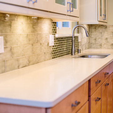
This remodel took an extremely dark & dated kitchen and transformed it into a bright and airy happy place for our client. The existing conditions created a dark, hall-like kitchen that greatly lacked in function and did little to optimize storage. Realizing the potential of this truly massive space, we created a design that utilizes every inch of the kitchen and creates functional cooking and prep space as well as pantry storage and work nooks. Our first order of business was to demo out the blocky corner that separated the kitchen from the living room. This involved removing an existing fireplace, re-structuring a wall, and having an entirely new furnace installed in the basement to eliminate a duct running right through the corner we hoped to eliminate. After opening up the space, we focused on highlighting and brightening the room. New NuCore flooring was installed to give the kitchen a fresh look while offering optimal function and cleanability. Two-toned cabinets in a honey maple and painted silk were used to create a warm and comfortable balance throughout the space. New quartz countertops in MSI's canvas were installed, and butcher block was installed on the two desk areas to offer a warm visual relief and casual work surface. The color palette for the kitchen is reminiscent of a cozy apothecary; we utilized fresh greens with Sherwin Williams paint on the walls and Treviso Gray Sage glazed subway tiles on the backsplash. Over the sink, we designed a playful highlight with counter-to-ceiling mini brick mosaic in a dark crackle green. We introduced additional lighting throughout including new recessed lights, over-sink light, and under-cabinet lights. New appliances were introduced to the space as well, and we complimented the stainless steel of these fixtures to the transitional nickel hardware on the cabinets. This space now feels open and inviting, and is visible from the second you enter the front door! We are so proud of this result and so happy that our clients can enjoy this gorgeous kitchen for years to come.

 Powell Construction
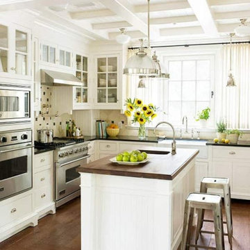
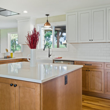
When we first began the design of this project, the clients’ main priority was to get more room in their kitchen. The wall that separated the kitchen and dining space was load bearing and spanned the living room space as well, so rather than removing it the way we might in some floorplans, we left a header and created a large opening to help the flow between the spaces. When it came to the style of the kitchen, the ranch-style home was well suited for a classic, transitional style with farmhouse details such as a white apron-front sink.
We decided on the two-toned cabinetry after originally discussing the idea of white, but realizing that with grandkids and dogs, having white cabinetry so near exterior doors might not be the best option. The lower cabinets are maple stained with a color called “Coffee” and the white upper cabinets feature a similar colored glaze in the detailing to help tie them together. The floor is a popular CoreTEC product called “Red River Hickory”. The overall tone matches that of the lower cabinets for a seamless look. The white backsplash tile and countertop with simple veining continue the two-toned look.
The range hood is a new Zephyr fixture originally designed for commercial kitchens, but became a good choice for homes with low ceilings, as the high suction power allows us to meet building codes without obstructing any views. The other appliances are from the GE Café line – these pieces feature copper accents on the handles, which gave us a great place to start when choosing the showstopping copper pendant over the sink.
The redesigned space gives more room for multiple cooks and the removal of the wall allows in tons of extra light from the dining room – without moving or replacing a single window or exterior door. There is ample prep room, storage space, and seating for visitors to the kitchen. The homeowners love their new space, and we are sure they will continue to love it for years to come.
 Powell Construction
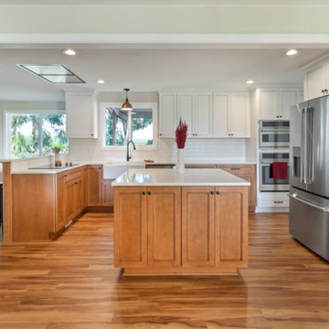
When we first began the design of this project, the clients’ main priority was to get more room in their kitchen. The wall that separated the kitchen and dining space was load bearing and spanned the living room space as well, so rather than removing it the way we might in some floorplans, we left a header and created a large opening to help the flow between the spaces. When it came to the style of the kitchen, the ranch-style home was well suited for a classic, transitional style with farmhouse details such as a white apron-front sink.
We decided on the two-toned cabinetry after originally discussing the idea of white, but realizing that with grandkids and dogs, having white cabinetry so near exterior doors might not be the best option. The lower cabinets are maple stained with a color called “Coffee” and the white upper cabinets feature a similar colored glaze in the detailing to help tie them together. The floor is a popular CoreTEC product called “Red River Hickory”. The overall tone matches that of the lower cabinets for a seamless look. The white backsplash tile and countertop with simple veining continue the two-toned look.
The range hood is a new Zephyr fixture originally designed for commercial kitchens, but became a good choice for homes with low ceilings, as the high suction power allows us to meet building codes without obstructing any views. The other appliances are from the GE Café line – these pieces feature copper accents on the handles, which gave us a great place to start when choosing the showstopping copper pendant over the sink.
The redesigned space gives more room for multiple cooks and the removal of the wall allows in tons of extra light from the dining room – without moving or replacing a single window or exterior door. There is ample prep room, storage space, and seating for visitors to the kitchen. The homeowners love their new space, and we are sure they will continue to love it for years to come.
 Powell Construction
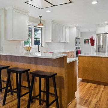
When we first began the design of this project, the clients’ main priority was to get more room in their kitchen. The wall that separated the kitchen and dining space was load bearing and spanned the living room space as well, so rather than removing it the way we might in some floorplans, we left a header and created a large opening to help the flow between the spaces. When it came to the style of the kitchen, the ranch-style home was well suited for a classic, transitional style with farmhouse details such as a white apron-front sink.
We decided on the two-toned cabinetry after originally discussing the idea of white, but realizing that with grandkids and dogs, having white cabinetry so near exterior doors might not be the best option. The lower cabinets are maple stained with a color called “Coffee” and the white upper cabinets feature a similar colored glaze in the detailing to help tie them together. The floor is a popular CoreTEC product called “Red River Hickory”. The overall tone matches that of the lower cabinets for a seamless look. The white backsplash tile and countertop with simple veining continue the two-toned look.
The range hood is a new Zephyr fixture originally designed for commercial kitchens, but became a good choice for homes with low ceilings, as the high suction power allows us to meet building codes without obstructing any views. The other appliances are from the GE Café line – these pieces feature copper accents on the handles, which gave us a great place to start when choosing the showstopping copper pendant over the sink.
The redesigned space gives more room for multiple cooks and the removal of the wall allows in tons of extra light from the dining room – without moving or replacing a single window or exterior door. There is ample prep room, storage space, and seating for visitors to the kitchen. The homeowners love their new space, and we are sure they will continue to love it for years to come.
 TVL Creative Ltd.
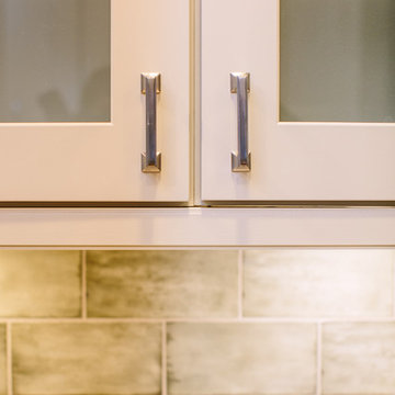
This remodel took an extremely dark & dated kitchen and transformed it into a bright and airy happy place for our client. The existing conditions created a dark, hall-like kitchen that greatly lacked in function and did little to optimize storage. Realizing the potential of this truly massive space, we created a design that utilizes every inch of the kitchen and creates functional cooking and prep space as well as pantry storage and work nooks. Our first order of business was to demo out the blocky corner that separated the kitchen from the living room. This involved removing an existing fireplace, re-structuring a wall, and having an entirely new furnace installed in the basement to eliminate a duct running right through the corner we hoped to eliminate. After opening up the space, we focused on highlighting and brightening the room. New NuCore flooring was installed to give the kitchen a fresh look while offering optimal function and cleanability. Two-toned cabinets in a honey maple and painted silk were used to create a warm and comfortable balance throughout the space. New quartz countertops in MSI's canvas were installed, and butcher block was installed on the two desk areas to offer a warm visual relief and casual work surface. The color palette for the kitchen is reminiscent of a cozy apothecary; we utilized fresh greens with Sherwin Williams paint on the walls and Treviso Gray Sage glazed subway tiles on the backsplash. Over the sink, we designed a playful highlight with counter-to-ceiling mini brick mosaic in a dark crackle green. We introduced additional lighting throughout including new recessed lights, over-sink light, and under-cabinet lights. New appliances were introduced to the space as well, and we complimented the stainless steel of these fixtures to the transitional nickel hardware on the cabinets. This space now feels open and inviting, and is visible from the second you enter the front door! We are so proud of this result and so happy that our clients can enjoy this gorgeous kitchen for years to come.
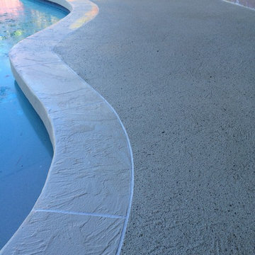
 CTi South Florida
Old stamped concrete has been resurfaced with soft beige color using Hallmark System. With additional 2 color highlights the look is beautiful and maintenance is no cost. No slippery, long duration, 10 YRS warranty
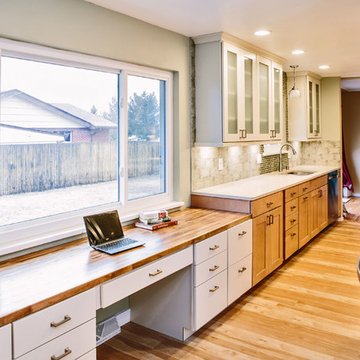 TVL Creative Ltd.
This remodel took an extremely dark & dated kitchen and transformed it into a bright and airy happy place for our client. The existing conditions created a dark, hall-like kitchen that greatly lacked in function and did little to optimize storage. Realizing the potential of this truly massive space, we created a design that utilizes every inch of the kitchen and creates functional cooking and prep space as well as pantry storage and work nooks. Our first order of business was to demo out the blocky corner that separated the kitchen from the living room. This involved removing an existing fireplace, re-structuring a wall, and having an entirely new furnace installed in the basement to eliminate a duct running right through the corner we hoped to eliminate. After opening up the space, we focused on highlighting and brightening the room. New NuCore flooring was installed to give the kitchen a fresh look while offering optimal function and cleanability. Two-toned cabinets in a honey maple and painted silk were used to create a warm and comfortable balance throughout the space. New quartz countertops in MSI's canvas were installed, and butcher block was installed on the two desk areas to offer a warm visual relief and casual work surface. The color palette for the kitchen is reminiscent of a cozy apothecary; we utilized fresh greens with Sherwin Williams paint on the walls and Treviso Gray Sage glazed subway tiles on the backsplash. Over the sink, we designed a playful highlight with counter-to-ceiling mini brick mosaic in a dark crackle green. We introduced additional lighting throughout including new recessed lights, over-sink light, and under-cabinet lights. New appliances were introduced to the space as well, and we complimented the stainless steel of these fixtures to the transitional nickel hardware on the cabinets. This space now feels open and inviting, and is visible from the second you enter the front door! We are so proud of this result and so happy that our clients can enjoy this gorgeous kitchen for years to come.
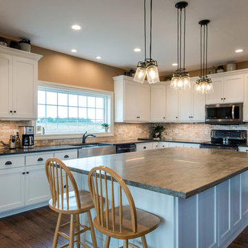

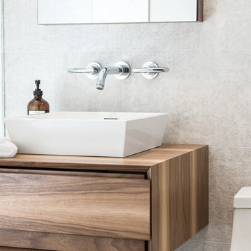
 Paul Lopa Designs
See what our client say about Paul Lopa Designs.
I started my search for a contractor about a year before I hired Paul to do a kitchen and bathroom renovation. This was my first time at the bat, and I really had no idea what to expect. I had many contractor proposals that swung wildly in price but for some reason I never felt inclined to hire any of the guys I met with. I happened to be looking at Houzz one day and came across Paul’s company and he had very good reviews. I gave him a call and he came to my apartment quickly. I liked him immediately when we met. I thought it was strange that he asked me for my budget and how much I wanted to spend but in hindsight, providing that information allowed Paul to come back to me with a very detailed proposal based on my budget. I soon realized that the lower proposals I had did not include many of the budget items that would be necessary to complete the job. Paul laid out the pricing and provided a very reasonable “allowance” based on your measurements for tile, toilet, sinks, etc. It is up to you to stay within that allowance.
 TVL Creative Ltd.
This remodel took an extremely dark & dated kitchen and transformed it into a bright and airy happy place for our client. The existing conditions created a dark, hall-like kitchen that greatly lacked in function and did little to optimize storage. Realizing the potential of this truly massive space, we created a design that utilizes every inch of the kitchen and creates functional cooking and prep space as well as pantry storage and work nooks. Our first order of business was to demo out the blocky corner that separated the kitchen from the living room. This involved removing an existing fireplace, re-structuring a wall, and having an entirely new furnace installed in the basement to eliminate a duct running right through the corner we hoped to eliminate. After opening up the space, we focused on highlighting and brightening the room. New NuCore flooring was installed to give the kitchen a fresh look while offering optimal function and cleanability. Two-toned cabinets in a honey maple and painted silk were used to create a warm and comfortable balance throughout the space. New quartz countertops in MSI's canvas were installed, and butcher block was installed on the two desk areas to offer a warm visual relief and casual work surface. The color palette for the kitchen is reminiscent of a cozy apothecary; we utilized fresh greens with Sherwin Williams paint on the walls and Treviso Gray Sage glazed subway tiles on the backsplash. Over the sink, we designed a playful highlight with counter-to-ceiling mini brick mosaic in a dark crackle green. We introduced additional lighting throughout including new recessed lights, over-sink light, and under-cabinet lights. New appliances were introduced to the space as well, and we complimented the stainless steel of these fixtures to the transitional nickel hardware on the cabinets. This space now feels open and inviting, and is visible from the second you enter the front door! We are so proud of this result and so happy that our clients can enjoy this gorgeous kitchen for years to come.
 TVL Creative Ltd.
This remodel took an extremely dark & dated kitchen and transformed it into a bright and airy happy place for our client. The existing conditions created a dark, hall-like kitchen that greatly lacked in function and did little to optimize storage. Realizing the potential of this truly massive space, we created a design that utilizes every inch of the kitchen and creates functional cooking and prep space as well as pantry storage and work nooks. Our first order of business was to demo out the blocky corner that separated the kitchen from the living room. This involved removing an existing fireplace, re-structuring a wall, and having an entirely new furnace installed in the basement to eliminate a duct running right through the corner we hoped to eliminate. After opening up the space, we focused on highlighting and brightening the room. New NuCore flooring was installed to give the kitchen a fresh look while offering optimal function and cleanability. Two-toned cabinets in a honey maple and painted silk were used to create a warm and comfortable balance throughout the space. New quartz countertops in MSI's canvas were installed, and butcher block was installed on the two desk areas to offer a warm visual relief and casual work surface. The color palette for the kitchen is reminiscent of a cozy apothecary; we utilized fresh greens with Sherwin Williams paint on the walls and Treviso Gray Sage glazed subway tiles on the backsplash. Over the sink, we designed a playful highlight with counter-to-ceiling mini brick mosaic in a dark crackle green. We introduced additional lighting throughout including new recessed lights, over-sink light, and under-cabinet lights. New appliances were introduced to the space as well, and we complimented the stainless steel of these fixtures to the transitional nickel hardware on the cabinets. This space now feels open and inviting, and is visible from the second you enter the front door! We are so proud of this result and so happy that our clients can enjoy this gorgeous kitchen for years to come.
 Kraft Custom Construction
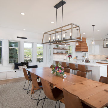
This 1914 family farmhouse was passed down from the original owners to their grandson and his young family. The original goal was to restore the old home to its former glory. However, when we started planning the remodel, we discovered the foundation needed to be replaced, the roof framing didn’t meet code, all the electrical, plumbing and mechanical would have to be removed, siding replaced, and much more. We quickly realized that instead of restoring the home, it would be more cost effective to deconstruct the home, recycle the materials, and build a replica of the old house using as much of the salvaged materials as we could.
The design of the new construction is greatly influenced by the old home with traditional craftsman design interiors. We worked with a deconstruction specialist to salvage the old-growth timber and reused or re-purposed many of the original materials. We moved the house back on the property, connecting it to the existing garage, and lowered the elevation of the home which made it more accessible to the existing grades. The new home includes 5-panel doors, columned archways, tall baseboards, reused wood for architectural highlights in the kitchen, a food-preservation room, exercise room, playful wallpaper in the guest bath and fun era-specific fixtures throughout.
Sponsored
Fredericksburg, OH

High Point Cabinets
Columbus' Experienced Custom Cabinet Builder | 4x Best of Houzz Winner
 TVL Creative Ltd.
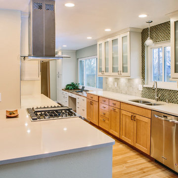
This remodel took an extremely dark & dated kitchen and transformed it into a bright and airy happy place for our client. The existing conditions created a dark, hall-like kitchen that greatly lacked in function and did little to optimize storage. Realizing the potential of this truly massive space, we created a design that utilizes every inch of the kitchen and creates functional cooking and prep space as well as pantry storage and work nooks. Our first order of business was to demo out the blocky corner that separated the kitchen from the living room. This involved removing an existing fireplace, re-structuring a wall, and having an entirely new furnace installed in the basement to eliminate a duct running right through the corner we hoped to eliminate. After opening up the space, we focused on highlighting and brightening the room. New NuCore flooring was installed to give the kitchen a fresh look while offering optimal function and cleanability. Two-toned cabinets in a honey maple and painted silk were used to create a warm and comfortable balance throughout the space. New quartz countertops in MSI's canvas were installed, and butcher block was installed on the two desk areas to offer a warm visual relief and casual work surface. The color palette for the kitchen is reminiscent of a cozy apothecary; we utilized fresh greens with Sherwin Williams paint on the walls and Treviso Gray Sage glazed subway tiles on the backsplash. Over the sink, we designed a playful highlight with counter-to-ceiling mini brick mosaic in a dark crackle green. We introduced additional lighting throughout including new recessed lights, over-sink light, and under-cabinet lights. New appliances were introduced to the space as well, and we complimented the stainless steel of these fixtures to the transitional nickel hardware on the cabinets. This space now feels open and inviting, and is visible from the second you enter the front door! We are so proud of this result and so happy that our clients can enjoy this gorgeous kitchen for years to come.
 Kraft Custom Construction
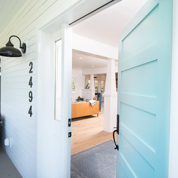
This 1914 family farmhouse was passed down from the original owners to their grandson and his young family. The original goal was to restore the old home to its former glory. However, when we started planning the remodel, we discovered the foundation needed to be replaced, the roof framing didn’t meet code, all the electrical, plumbing and mechanical would have to be removed, siding replaced, and much more. We quickly realized that instead of restoring the home, it would be more cost effective to deconstruct the home, recycle the materials, and build a replica of the old house using as much of the salvaged materials as we could.
The design of the new construction is greatly influenced by the old home with traditional craftsman design interiors. We worked with a deconstruction specialist to salvage the old-growth timber and reused or re-purposed many of the original materials. We moved the house back on the property, connecting it to the existing garage, and lowered the elevation of the home which made it more accessible to the existing grades. The new home includes 5-panel doors, columned archways, tall baseboards, reused wood for architectural highlights in the kitchen, a food-preservation room, exercise room, playful wallpaper in the guest bath and fun era-specific fixtures throughout.
 Rockwood Cabinetry
Remodel by Ostmo Construction
Interior Design by Lord Design
Photos by Blackstone Edge Studios
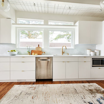
Example of a large trendy u-shaped medium tone wood floor and brown floor kitchen pantry design in Portland with an undermount sink, flat-panel cabinets, white cabinets, quartz countertops, white backsplash, stone slab backsplash, stainless steel appliances, no island and white countertops
Example of a large trendy u-shaped medium tone wood floor and brown floor kitchen pantry design in Portland with an undermount sink, flat-panel cabinets, white cabinets, quartz countertops, white backsplash, stone slab backsplash, stainless steel appliances, no island and white countertops
42