
Search results for "Sinking realization" in Home Design Ideas
 TKS Design Group
Download our free ebook, Creating the Ideal Kitchen. DOWNLOAD NOW
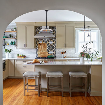
The homeowners came to us looking to update the kitchen in their historic 1897 home. The home had gone through an extensive renovation several years earlier that added a master bedroom suite and updates to the front façade. The kitchen however was not part of that update and a prior 1990’s update had left much to be desired. The client is an avid cook, and it was just not very functional for the family.
The original kitchen was very choppy and included a large eat in area that took up more than its fair share of the space. On the wish list was a place where the family could comfortably congregate, that was easy and to cook in, that feels lived in and in check with the rest of the home’s décor. They also wanted a space that was not cluttered and dark – a happy, light and airy room. A small powder room off the space also needed some attention so we set out to include that in the remodel as well.
See that arch in the neighboring dining room? The homeowner really wanted to make the opening to the dining room an arch to match, so we incorporated that into the design.
Another unfortunate eyesore was the state of the ceiling and soffits. Turns out it was just a series of shortcuts from the prior renovation, and we were surprised and delighted that we were easily able to flatten out almost the entire ceiling with a couple of little reworks.
Other changes we made were to add new windows that were appropriate to the new design, which included moving the sink window over slightly to give the work zone more breathing room. We also adjusted the height of the windows in what was previously the eat-in area that were too low for a countertop to work. We tried to keep an old island in the plan since it was a well-loved vintage find, but the tradeoff for the function of the new island was not worth it in the end. We hope the old found a new home, perhaps as a potting table.
Designed by: Susan Klimala, CKD, CBD
Photography by: Michael Kaskel
For more information on kitchen and bath design ideas go to: www.kitchenstudio-ge.com
 Kitchen Design Concepts
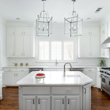
With a little bit of love, you can transform your kitchen into a space you love to spend time in! Many people are so used to their surroundings that we don’t realize what a little bit of paint and new finishes can do to change a room. That’s exactly the case of this kitchen. Actually, the cabinetry was already refinished prior to us coming into the picture, our clients couldn’t wait! So, we had the opportunity to incorporate those finishing touches to really seal the deal of this space. Today, this kitchen is up-to-date and classic. It really will stand the test of time! To learn more about this space, continue reading below:
Cabinets
The cabinetry was already refinished prior to us doing our magic. But we love how the crisp and clean finishes of the cabinetry pairs so well with the new finishes and materials we incorporated. To elevate the cabinetry, we embellished the doors and drawers with 5 inch “Emerald” hardware from Top Knobs (TK288BSN).
Countertops
At first glance, you may have noticed we incorporated beautiful marble countertops to this space. So, what if we told you those countertops are not made of marble? Actually, not even close! These countertops are a beautiful 3cm Cambria quartz in the finish “Ironsbridge”. The specs of grey and veining in the countertops might have fooled you! We love the way it looks in this space.
Backsplash
Subway tiles have been around a long time. Still, we love the classic look of subway tile and our clients are always requesting it! A simple way to add interested to subway tile is to utilize tile with beveling, create a contrasting pattern, and add contrasting grout color, as we have done here. Here we have utilized a 3×6 Daltile Rittenhouse Square with beveled edges as the main tile. Then, over the range, we have framed the tile and changed the pattern to herringbone to add some pop!
Fixtures
The fixtures of this space are classically styled as well. From Blanco, we have the main sink in a Precis Super Single Bowl in White paired with an Atura kitchen faucet with pull-down spray in stainless steel. Then on the island, we have a Precis Medium Bowl in White and an Atura Pulldown bar faucet in stainless steel, also from Blanco.

Find the right local pro for your project
 Laura Casale Architect
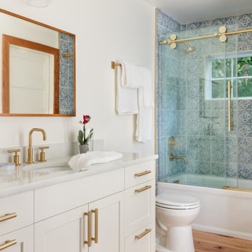
Example of a transitional 3/4 white floor alcove shower design in New York with shaker cabinets, white cabinets, white walls, an undermount sink, a hinged shower door and white countertops
 Bedrosians Tile and Stone
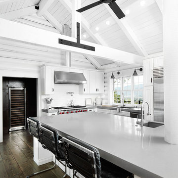
Example of a transitional l-shaped dark wood floor kitchen design in Orange County with an undermount sink, shaker cabinets, white backsplash, subway tile backsplash, stainless steel appliances and an island
 CG Allan Interior Architecture + Design LLC
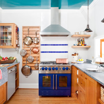
Inspiration for a transitional medium tone wood floor and orange floor kitchen remodel in DC Metro with a farmhouse sink, medium tone wood cabinets, concrete countertops, multicolored backsplash, colored appliances and no island
 Pinnacle Design & Remodeling
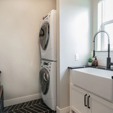
Alongside Tschida Construction and Pro Design Custom Cabinetry, we upgraded a new build to maximum function and magazine worthy style. Changing swinging doors to pocket, stacking laundry units, and doing closed cabinetry options really made the space seem as though it doubled.



 Charlie Allen Renovations, Inc.
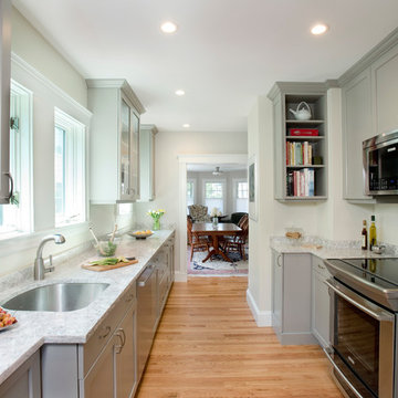
Renovation is stressful. Wouldn’t it be nice to let someone else oversee product selections, manage day-to-day issues, and bring your project to a successful completion? The owners of a two-family in Arlington recently did just that, flying off to Florida just as we began renovating their first floor unit.
Of course, before they left we thoroughly discussed all aspects of the work order, which included renovating the kitchen and bathroom, painting the bedroom, and adding a laundry closet. We reviewed color and material selections, and set up a schedule for regular briefings.
A handful of issues did come up. But because we had planned ahead, we were able to resolve them with very little stress for our clients. For instance, the client had chosen a bright yellow paint color for the kitchen walls, but once the new cabinets, countertop, and flooring had been installed, it was clear that yellow would clash. We suggested a more complementary Benjamin Moore Lancaster Whitewash shade instead.
In the bathroom, the clients had selected a deep inset mirrored medicine cabinet. But when the wall behind the vanity was opened, it revealed a pipe running up the wall, too close for the inset model. In this small space, a bump-out medicine cabinet would be awkward, so instead we placed a mirror over the sink and two smaller inset cabinets on either side – a solution that pleased the homeowners, who now have his-and-hers storage spaces.
Finally, the homeowners had resigned themselves to the fact that the laundry closet would be too small for storing detergent and other needs. However once the units were in place, we realized that a small custom shelf could be built and had it installed to the delight of the homeowners.
Photo by Shelly Harrison
 Linette Dai Design
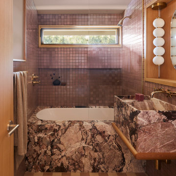
Example of a 1950s pink tile multicolored floor and single-sink tub/shower combo design in Los Angeles with an undermount tub, a vessel sink and a floating vanity
 Osada Construction
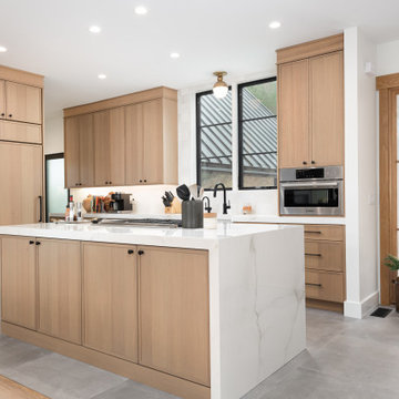
Inspiration for a mid-sized transitional l-shaped cement tile floor and gray floor kitchen remodel with a farmhouse sink, shaker cabinets, light wood cabinets, white backsplash, ceramic backsplash, paneled appliances, an island and white countertops
 Alex Nerland
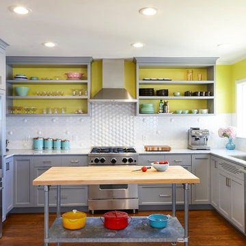
www.davidkingsburyphoto.com
For more information on this project please see: http://www.nerland.net/
 Susan Yeley Homes
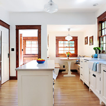
Like most of our projects, we can't gush about this reno—a new kitchen and mudroom, ensuite closet and pantry—without gushing about the people who live there. The best projects, we always say, are the ones in which client, contractor and design team are all present throughout, conception to completion, each bringing their particular expertise to the table and forming a cohesive, trustworthy team that is mutually invested in a smooth and successful process. They listen to each other, give the benefit of the doubt to each other, do what they say they'll do. This project exemplified that kind of team, and it shows in the results.
Most obvious is the opening up of the kitchen to the dining room, decompartmentalizing somewhat a century-old bungalow that was originally quite purposefully compartmentalized. As a result, the kitchen had to become a place one wanted to see clear through from the front door. Inset cabinets and carefully selected details make the functional heart of the house equal in elegance to the more "public" gathering spaces, with their craftsman depth and detail. An old back porch was converted to interior space, creating a mudroom and a much-needed ensuite walk-in closet. A new, larger deck went on: Phase One of an extensive design for outdoor living, that we all hope will be realized over the next few years. Finally, a duplicative back stairwell was repurposed into a walk-in pantry.
Modernizing often means opening spaces up for more casual living and entertaining, and/or making better use of dead space. In this re-conceptualized old house, we did all of that, creating a back-of-the-house that is now bright and cheerful and new, while carefully incorporating meaningful vintage and personal elements.
The best result of all: the clients are thrilled. And everyone who went in to the project came out of it friends.
Contractor: Stumpner Building Services
Cabinetry: Stoll’s Woodworking
Photographer: Gina Rogers


 Chuck Morris Coastal Homes
Photos by Bruce Glass
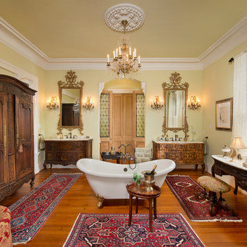
Freestanding bathtub - victorian master medium tone wood floor freestanding bathtub idea in Houston with medium tone wood cabinets, yellow walls and recessed-panel cabinets
Freestanding bathtub - victorian master medium tone wood floor freestanding bathtub idea in Houston with medium tone wood cabinets, yellow walls and recessed-panel cabinets
 Adrienne DeRosa
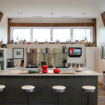
With respect to the notion of old-meets-new, the kitchen strikes a comfortable balance between materials. For the center island, Franklin repurposed original barn siding into cladding for the unit, painting it grey. The Corian counter top and stainless steel backsplash provide a cool contrast.
A set of antique barstools was a fortunate find for the homeowner. Sourced from a local bar that had closed, all they needed was a little elbow grease to realize their full potential. It took days to remove years worth of nicotine stains from them, but as Franklin exclaims, "It was worth it because the old stools found a new home in an old barn!"
The partial wall was designed to address a number of functional and aesthetic concerns. Dividing the workspace from the storage space, it keeps the pantry area out of view, and allows light to carry through this area of the home. Franklin also uses the wall as a means to display his growing teapot collection. "It’s funny," he confesses, "but I think they can entice people to sit down, have a cup of tea and converse (Imagine that in this world of technology!)"
Adrienne DeRosa Photography
 Benson Homes LLC
Many families ponder the idea of adding extra living space for a few years before they are actually ready to remodel. Then, all-of-the sudden, something will happen that makes them realize that they can’t wait any longer. In the case of this remodeling story, it was the snowstorm of 2016 that spurred the homeowners into action. As the family was stuck in the house with nowhere to go, they longed for more space. The parents longed for a getaway spot for themselves that could also double as a hangout area for the kids and their friends. As they considered their options, there was one clear choice…to renovate the detached garage.
The detached garage previously functioned as a workshop and storage room and offered plenty of square footage to create a family room, kitchenette, and full bath. It’s location right beside the outdoor kitchen made it an ideal spot for entertaining and provided an easily accessible bathroom during the summertime. Even the canine family members get to enjoy it as they have their own personal entrance, through a bathroom doggie door.
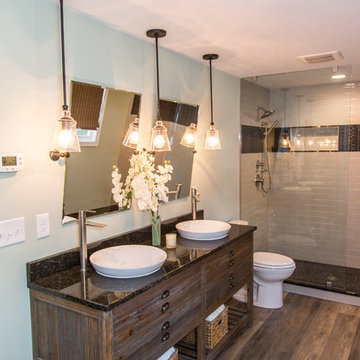
Our design team listened carefully to our client’s wishes to create a space that had a modern rustic feel and found selections that fit their aesthetic perfectly. To set the tone, Blackstone Oak luxury vinyl plank flooring was installed throughout. The kitchenette area features Maple Shaker style cabinets in a pecan shell stain, Uba Tuba granite countertops, and an eye-catching amber glass and antique bronze pulley sconce. Rather than use just an ordinary door for the bathroom entry, a gorgeous Knotty Alder barn door creates a stunning focal point of the room.
The fantastic selections continue in the full bath. A reclaimed wood double vanity with a gray washed pine finish anchors the room. White, semi-recessed sinks with chrome faucets add some contemporary accents, while the glass and oil-rubbed bronze mini pendant lights are a balance between both rustic and modern. The design called for taking the shower tile to the ceiling and it really paid off. A sliced pebble tile floor in the shower is curbed with Uba Tuba granite, creating a clean line and another accent detail.
The new multi-functional space looks like a natural extension of their home, with its matching exterior lights, new windows, doors, and sliders. And with winter approaching and snow on the way, this family is ready to hunker down and ride out the storm in comfort and warmth. When summer arrives, they have a designated bathroom for outdoor entertaining and a wonderful area for guests to hang out.
It was a pleasure to create this beautiful remodel for our clients and we hope that they continue to enjoy it for many years to come.
 Greenbuilders, Inc.
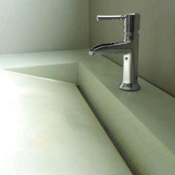
This is a one-piece, cast concrete sink, using green and environmentally sound sustainable methods, with a custom created color throughout the mix. The sink and counter top are seamlessly connected. This piece was cast by Lukeworks, one of the many highly talented local resources we love to utilize. The clients value its clean, simple, upscale appearance, and perfectly realized functionality.
Sponsored
Plain City, OH

Kuhns Contracting, Inc.
Central Ohio's Trusted Home Remodeler Specializing in Kitchens & Baths
 LeichtUSA
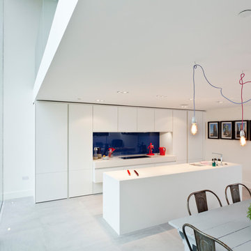
Attractive living as an architectural experiment: a 136-year-old water tower, a listed building with a spectacular 360-degree panorama view over the City of London. The task, to transform it into a superior residence, initially seemed an absolute impossibility. But when the owners came across architect Mike Collier, they had found a partner who was to make the impossible possible. The tower, which had been empty for decades, underwent radical renovation work and was extended by a four-storey cube containing kitchen, dining and living room - connected by glazed tunnels and a lift shaft. The kitchen, realised by Enclosure Interiors in Tunbridge Wells, Kent, with furniture from LEICHT is the very heart of living in this new building.
Shiny white matt-lacquered kitchen fronts (AVANCE-LR), tone-on-tone with the worktops, reflect the light in the room and thus create expanse and openness. The surface of the handle-less kitchen fronts has a horizontal relief embossing; depending on the light incidence, this results in a vitally structured surface. The free-standing preparation isle with its vertical side panels with a seamlessly integrated sink represents the transition between kitchen and living room. The fronts of the floor units facing the dining table were extended to the floor to do away with the plinth typical of most kitchens. Ceiling-high tall units on the wall provide plenty of storage space; the electrical appliances are integrated here invisible to the eye. Floor units on a high plinth which thus appear to be floating form the actual cooking centre within the kitchen, attached to the wall. A range of handle-less wall units concludes the glazed niche at the top.
LEICHT international: “Architecture and kitchen” in the centre of London. www.LeichtUSA.com
 LeichtUSA
Attractive living as an architectural experiment: a 136-year-old water tower, a listed building with a spectacular 360-degree panorama view over the City of London. The task, to transform it into a superior residence, initially seemed an absolute impossibility. But when the owners came across architect Mike Collier, they had found a partner who was to make the impossible possible. The tower, which had been empty for decades, underwent radical renovation work and was extended by a four-storey cube containing kitchen, dining and living room - connected by glazed tunnels and a lift shaft. The kitchen, realised by Enclosure Interiors in Tunbridge Wells, Kent, with furniture from LEICHT is the very heart of living in this new building.
Shiny white matt-lacquered kitchen fronts (AVANCE-LR), tone-on-tone with the worktops, reflect the light in the room and thus create expanse and openness. The surface of the handle-less kitchen fronts has a horizontal relief embossing; depending on the light incidence, this results in a vitally structured surface. The free-standing preparation isle with its vertical side panels with a seamlessly integrated sink represents the transition between kitchen and living room. The fronts of the floor units facing the dining table were extended to the floor to do away with the plinth typical of most kitchens. Ceiling-high tall units on the wall provide plenty of storage space; the electrical appliances are integrated here invisible to the eye. Floor units on a high plinth which thus appear to be floating form the actual cooking centre within the kitchen, attached to the wall. A range of handle-less wall units concludes the glazed niche at the top.
LEICHT international: “Architecture and kitchen” in the centre of London. www.LeichtUSA.com
 LeichtUSA
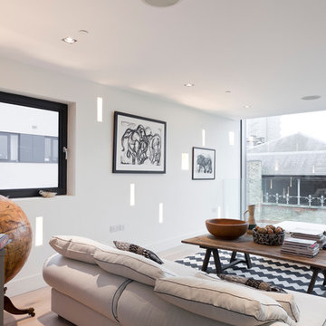
Attractive living as an architectural experiment: a 136-year-old water tower, a listed building with a spectacular 360-degree panorama view over the City of London. The task, to transform it into a superior residence, initially seemed an absolute impossibility. But when the owners came across architect Mike Collier, they had found a partner who was to make the impossible possible. The tower, which had been empty for decades, underwent radical renovation work and was extended by a four-storey cube containing kitchen, dining and living room - connected by glazed tunnels and a lift shaft. The kitchen, realised by Enclosure Interiors in Tunbridge Wells, Kent, with furniture from LEICHT is the very heart of living in this new building.
Shiny white matt-lacquered kitchen fronts (AVANCE-LR), tone-on-tone with the worktops, reflect the light in the room and thus create expanse and openness. The surface of the handle-less kitchen fronts has a horizontal relief embossing; depending on the light incidence, this results in a vitally structured surface. The free-standing preparation isle with its vertical side panels with a seamlessly integrated sink represents the transition between kitchen and living room. The fronts of the floor units facing the dining table were extended to the floor to do away with the plinth typical of most kitchens. Ceiling-high tall units on the wall provide plenty of storage space; the electrical appliances are integrated here invisible to the eye. Floor units on a high plinth which thus appear to be floating form the actual cooking centre within the kitchen, attached to the wall. A range of handle-less wall units concludes the glazed niche at the top.
LEICHT international: “Architecture and kitchen” in the centre of London. www.LeichtUSA.com
5