
Search results for "Size tire" in Home Design Ideas
 Airy Kitchens
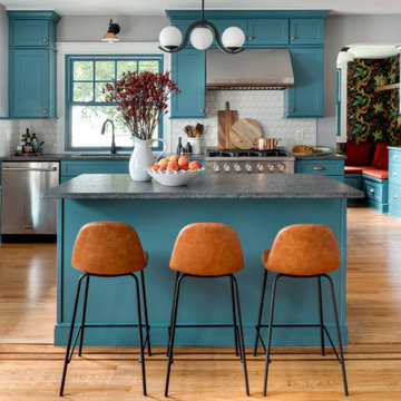
Eat-in kitchen - mid-sized eclectic single-wall light wood floor and orange floor eat-in kitchen idea in Philadelphia with an undermount sink, shaker cabinets, blue cabinets, granite countertops, white backsplash, ceramic backsplash, stainless steel appliances, an island and gray countertops

 ZeroEnergy Design
 (ZED) created this modern home for a progressive family in the desirable community of Lexington.
Thoughtful Land Connection. The residence is carefully sited on the infill lot so as to create privacy from the road and neighbors, while cultivating a side yard that captures the southern sun. The terraced grade rises to meet the house, allowing for it to maintain a structured connection with the ground while also sitting above the high water table. The elevated outdoor living space maintains a strong connection with the indoor living space, while the stepped edge ties it back to the true ground plane. Siting and outdoor connections were completed by ZED in collaboration with landscape designer Soren Deniord Design Studio.
Exterior Finishes and Solar. The exterior finish materials include a palette of shiplapped wood siding, through-colored fiber cement panels and stucco. A rooftop parapet hides the solar panels above, while a gutter and site drainage system directs rainwater into an irrigation cistern and dry wells that recharge the groundwater.
Cooking, Dining, Living. Inside, the kitchen, fabricated by Henrybuilt, is located between the indoor and outdoor dining areas. The expansive south-facing sliding door opens to seamlessly connect the spaces, using a retractable awning to provide shade during the summer while still admitting the warming winter sun. The indoor living space continues from the dining areas across to the sunken living area, with a view that returns again to the outside through the corner wall of glass.
Accessible Guest Suite. The design of the first level guest suite provides for both aging in place and guests who regularly visit for extended stays. The patio off the north side of the house affords guests their own private outdoor space, and privacy from the neighbor. Similarly, the second level master suite opens to an outdoor private roof deck.
Light and Access. The wide open interior stair with a glass panel rail leads from the top level down to the well insulated basement. The design of the basement, used as an away/play space, addresses the need for both natural light and easy access. In addition to the open stairwell, light is admitted to the north side of the area with a high performance, Passive House (PHI) certified skylight, covering a six by sixteen foot area. On the south side, a unique roof hatch set flush with the deck opens to reveal a glass door at the base of the stairwell which provides additional light and access from the deck above down to the play space.
Energy. Energy consumption is reduced by the high performance building envelope, high efficiency mechanical systems, and then offset with renewable energy. All windows and doors are made of high performance triple paned glass with thermally broken aluminum frames. The exterior wall assembly employs dense pack cellulose in the stud cavity, a continuous air barrier, and four inches exterior rigid foam insulation. The 10kW rooftop solar electric system provides clean energy production. The final air leakage testing yielded 0.6 ACH 50 - an extremely air tight house, a testament to the well-designed details, progress testing and quality construction. When compared to a new house built to code requirements, this home consumes only 19% of the energy.
Architecture & Energy Consulting: ZeroEnergy Design
Landscape Design: Soren Deniord Design
Paintings: Bernd Haussmann Studio
Photos: Eric Roth Photography

 SLR Architecture Inc.
This tired ranch was in dire need of an update. Formerly the kitchen was separate from the living room and the dining area was severely undersized.
SLR Architecture opened up the kitchen to the great room and defined the living and dining areas so that each space stands on it's own. With help from interior designer Justine Sterling the finishes, furniture, ad accessories were carefully considered so that the whole room works as an overall composition.
A compact mud room was carved out of the back hall from a formally over sized laundry room so the family had a convenient drop zone, also the front entry was upgraded and a new rear deck was added for easier exterior access. Lighting was carefully considered so that different zones were well lit.
photo: Jessica Delaney
Find the right local pro for your project

 Bremner Pool & Spa
Bremner Pool And Spa renovated this 1970‘s pool. We took a tired vinyl liner pool with old plastic coping, 6’straight fibreglass steps and a very uneven brushed concrete deck and modernized it to current standards. We installed 8’ roman end acrylic steps with spa jets for hydrotherapy making the step more visually pleasing and more functional as a seat. To add a dimension to the deep end, we eliminated the diving board and added a natural stone bench, thus removing the starkness of a rectangle pool. We changed the plain looks of a brushed concrete to the more modern method of stamping the concrete and added a cantilever coping to the pool edge in a different colour to highlight. At the shallow end, we increased the size and added a decorative concrete wall to border the seating area. A new vinyl liner completed the job.

 Green Acres Landscaping & Aquascapes
Design ideas for a large contemporary full sun backyard gravel landscaping for summer.
 Bremner Pool & Spa
Bremner Pool And Spa renovated this 1970‘s pool. We took a tired vinyl liner pool with old plastic coping, 6’straight fibreglass steps and a very uneven brushed concrete deck and modernized it to current standards. We installed 8’ roman end acrylic steps with spa jets for hydrotherapy making the step more visually pleasing and more functional as a seat. To add a dimension to the deep end, we eliminated the diving board and added a natural stone bench, thus removing the starkness of a rectangle pool. We changed the plain looks of a brushed concrete to the more modern method of stamping the concrete and added a cantilever coping to the pool edge in a different colour to highlight. At the shallow end, we increased the size and added a decorative concrete wall to border the seating area. A new vinyl liner completed the job.
 Bremner Pool & Spa
Bremner Pool And Spa renovated this 1970‘s pool. We took a tired vinyl liner pool with old plastic coping, 6’straight fibreglass steps and a very uneven brushed concrete deck and modernized it to current standards. We installed 8’ roman end acrylic steps with spa jets for hydrotherapy making the step more visually pleasing and more functional as a seat. To add a dimension to the deep end, we eliminated the diving board and added a natural stone bench, thus removing the starkness of a rectangle pool. We changed the plain looks of a brushed concrete to the more modern method of stamping the concrete and added a cantilever coping to the pool edge in a different colour to highlight. At the shallow end, we increased the size and added a decorative concrete wall to border the seating area. A new vinyl liner completed the job.


 Simply Baths & Kitchens
Tired of their cramped master bath, this CT couple wanted more room, an enlarged shower, a bathtub, and a natural aesthetic. With 40 square feet added from the adjacent closet, the stage was set for Rachel Peterson, of Simply Baths, Inc., to transform the space. Outfitted with nature-inspired beauty and luxury comforts, this bathroom is now a relaxing retreat.
 Voar Construction
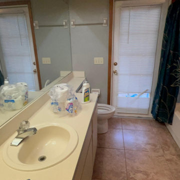
Before - Guest / Pool Bathroom
This bathroom had a generous size, but its design made it feel much smaller than it really was. The dark tile made the space look even more dated. The fixtures were all old, and the dark cabinetry only added to the closed-in feel. Despite its potential, the bathroom looked tired, outdated, and far from welcoming.uncomfortably small and unpractical. The dark tile and color choices made the entire space feel heavy and closed-in, taking away any sense of comfort or luxury. Overall, it was an old-fashioned, poorly planned bathroom in need of a complete reimagining.

 Sheila Rich Interiors, LLC
The ceiling of this charming beach house porch was vaulted. Wainscot was added to the walls to give this small mid-century screened-in porch a vertical lift. It offers family and friends a comfortable place to gather while being cooled and illuminated by ceiling fans.
Photography Peter Rymwid
 Karen Mills Interior Design, Inc
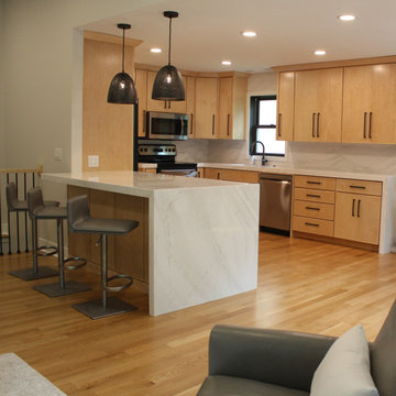
Cozy Luxe is my new word for a beautiful comfortable space that may be more modest in size, but not in luxury, a place I think most of us would like to have eventually when we tire of the more voluminous home that takes way too much work.
In this space, we remodeled the great room, kitchen, bathroom and laundry.
Starting with a bold neutral color scheme, we were able to create a dramatic look. that was stunning from the floor to ceiling stacked stone fireplace, new windows outlined in a dark bronze, and custom designed paneled wall to the waterfall countertops that also run up the backsplash, beautiful custom furnishings and bold light fixtures.

 Rolf Schroeder General Contractors, Inc.
The layout of this early 90’s home was adequate for the husband when he was just living there. However, now the family of three and their loving cat live there together; the space quickly became confined and inadequate. The Clients contacted us to discuss what their options may be to help the home feel more spacious. After a few weeks of design and engineering, we went to work on opening up the first floor to increase the size of the rooms while creating continuity with the adjoining rooms. A once tired and confined layout became a spacious, comfortable, & aesthetically pleasing space to live and entertain.

 Granger Remodel & Design
This beautiful farmhouse style master bathroom was renovated in Stonebridge Ranch McKinney. The client was tired of their 90's era fixtures and finishes and wanted a trendier update.
Sponsored
Sunbury, OH

J.Holderby - Renovations
Franklin County's Leading General Contractors - 2X Best of Houzz!
 Voar Construction
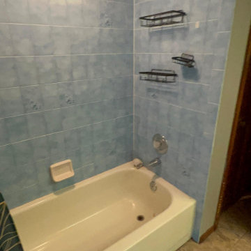
Before - Guest / Pool Bathroom
This bathroom had a generous size, but its design made it feel much smaller than it really was. The dark tile made the space look even more dated. The fixtures were all old, and the dark cabinetry only added to the closed-in feel. Despite its potential, the bathroom looked tired, outdated, and far from welcoming.uncomfortably small and unpractical. The dark tile and color choices made the entire space feel heavy and closed-in, taking away any sense of comfort or luxury. Overall, it was an old-fashioned, poorly planned bathroom in need of a complete reimagining.

 TVL Creative Ltd.
This kitchen took a tired, 80’s builder kitchen and revamped it into a personalized gathering space for our wonderful client. The existing space was split up by the dated configuration of eat-in kitchen table area to one side and cramped workspace on the other. It didn’t just under-serve our client’s needs; it flat out discouraged them from using the space. Our client desired an open kitchen with a central gathering space where family and friends could connect. To open things up, we removed the half wall separating the kitchen from the dining room and the wall that blocked sight lines to the family room and created a narrow hallway to the kitchen. The old oak cabinets weren't maximizing storage and were dated and dark. We used Waypoint Living Spaces cabinets in linen white to brighten up the room. On the east wall, we created a hutch-like stack that features an appliance garage that keeps often used countertop appliance on hand but out of sight. The hutch also acts as a transition from the cooking zone to the coffee and wine area. We eliminated the north window that looked onto the entry walkway and activated this wall as storage with refrigerator enclosure and pantry. We opted to leave the east window as-is and incorporated it into the new kitchen layout by creating a window well for growing plants and herbs. The countertops are Pental Quartz in Carrara. The sleek cabinet hardware is from our friends at Amerock in a gorgeous satin champagne bronze. One of the most striking features in the space is the pattern encaustic tile from Tile Shop. The pop of blue in the backsplash adds personality and contrast to the champagne accents. The reclaimed wood cladding surrounding the large east-facing window introduces a quintessential Colorado vibe, and the natural texture balances the crisp white cabinetry and geometric patterned tile. Minimalist modern lighting fixtures from Mitzi by Hudson Valley Lighting provide task lighting over the sink and at the wine/ coffee station. The visual lightness of the sink pendants maintains the openness and visual connection between the kitchen and dining room. Together the elements make for a sophisticated yet casual vibe-- a comfortable chic kitchen. We love the way this space turned out and are so happy that our clients now have such a bright and welcoming gathering space as the heart of their home!

 User
Bugle (Ajuga reptans) and Japanese Painted Fern (Athyrium niponicum) complement each other in cool hues.
Design ideas for a traditional landscaping in New York.
Design ideas for a traditional landscaping in New York.
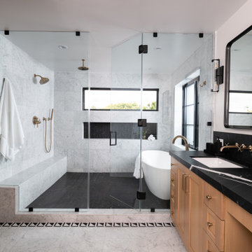


 Rolf Schroeder General Contractors, Inc.
The layout of this early 90’s home was adequate for the husband when he was just living there. However, now the family of three and their loving cat live there together; the space quickly became confined and inadequate. The Clients contacted us to discuss what their options may be to help the home feel more spacious. After a few weeks of design and engineering, we went to work on opening up the first floor to increase the size of the rooms while creating continuity with the adjoining rooms. A once tired and confined layout became a spacious, comfortable, & aesthetically pleasing space to live and entertain.

 Advance Design Studio, Ltd.
Karen and Chad of Tower Lakes, IL were tired of their unfinished basement functioning as nothing more than a storage area and depressing gym. They wanted to increase the livable square footage of their home with a cohesive finished basement design, while incorporating space for the kids and adults to hang out.
“We wanted to make sure that upon renovating the basement, that we can have a place where we can spend time and watch movies, but also entertain and showcase the wine collection that we have,” Karen said.
After a long search comparing many different remodeling companies, Karen and Chad found Advance Design Studio. They were drawn towards the unique “Common Sense Remodeling” process that simplifies the renovation experience into predictable steps focused on customer satisfaction.
“There are so many other design/build companies, who may not have transparency, or a focused process in mind and I think that is what separated Advance Design Studio from the rest,” Karen said.
Karen loved how designer Claudia Pop was able to take very high-level concepts, “non-negotiable items” and implement them in the initial 3D drawings. Claudia and Project Manager DJ Yurik kept the couple in constant communication through the project. “Claudia was very receptive to the ideas we had, but she was also very good at infusing her own points and thoughts, she was very responsive, and we had an open line of communication,” Karen said.
A very important part of the basement renovation for the couple was the home gym and sauna. The “high-end hotel” look and feel of the openly blended work out area is both highly functional and beautiful to look at. The home sauna gives them a place to relax after a long day of work or a tough workout. “The gym was a very important feature for us,” Karen said. “And I think (Advance Design) did a very great job in not only making the gym a functional area, but also an aesthetic point in our basement”.
An extremely unique wow-factor in this basement is the walk in glass wine cellar that elegantly displays Karen and Chad’s extensive wine collection. Immediate access to the stunning wet bar accompanies the wine cellar to make this basement a popular spot for friends and family.
The custom-built wine bar brings together two natural elements; Calacatta Vicenza Quartz and thick distressed Black Walnut. Sophisticated yet warm Graphite Dura Supreme cabinetry provides contrast to the soft beige walls and the Calacatta Gold backsplash. An undermount sink across from the bar in a matching Calacatta Vicenza Quartz countertop adds functionality and convenience to the bar, while identical distressed walnut floating shelves add an interesting design element and increased storage. Rich true brown Rustic Oak hardwood floors soften and warm the space drawing all the areas together.
Across from the bar is a comfortable living area perfect for the family to sit down at a watch a movie. A full bath completes this finished basement with a spacious walk-in shower, Cocoa Brown Dura Supreme vanity with Calacatta Vicenza Quartz countertop, a crisp white sink and a stainless-steel Voss faucet.
Advance Design’s Common Sense process gives clients the opportunity to walk through the basement renovation process one step at a time, in a completely predictable and controlled environment. “Everything was designed and built exactly how we envisioned it, and we are really enjoying it to it’s full potential,” Karen said.
Constantly striving for customer satisfaction, Advance Design’s success is heavily reliant upon happy clients referring their friends and family. “We definitely will and have recommended Advance Design Studio to friends who are looking to embark on a remodeling project small or large,” Karen exclaimed at the completion of her project.

 McGrath II
Living room - large transitional open concept living room idea in New York with white walls and a media wall
33