
Search results for "Size tire" in Home Design Ideas

 Revealing Redesign
Life changes. Kids move out.
And they leave us with spaces that look a little tired...
One of the most fun things that can happen (so I hear--I haven't experienced it yet), is to have your children want to come home and visit again WITH GRANDCHILDREN. Yay!
This is exactly where my client had found herself…and she wanted to make the rooms that were now mostly empty and seldom-used, a warm, cozy & stylish guest suite to welcome her adult children home when they came to visit.
We used an eclectic mix of furnishings and fabrics to outfit both of the old bedrooms, creating a lovely guest suite, complete with a sitting/tv room that my clients use for cozy movie watching nights even when they don't have guests. :)
Photography by Laura Kicey

 Exterior Worlds Landscaping & Design
Our Japanese-inspired garden design features intricate details such as this elegant rain chain, perfectly complemented by smooth river rocks and meticulously arranged pebbles. This landscape brings a touch of serenity and sophistication to your outdoor space.
 Design Set Match
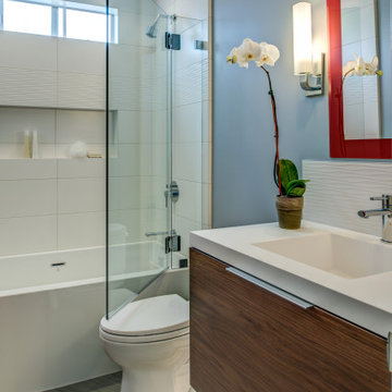
Mid-sized white tile and ceramic tile porcelain tile, gray floor and single-sink alcove bathtub photo in San Francisco with flat-panel cabinets, brown cabinets, a two-piece toilet, blue walls, an integrated sink, solid surface countertops, white countertops, a niche and a floating vanity
Find the right local pro for your project

 Castle Building & Remodeling
Tired of doing laundry in an unfinished rugged basement? The owners of this 1922 Seward Minneapolis home were as well! They contacted Castle to help them with their basement planning and build for a finished laundry space and new bathroom with shower.
Changes were first made to improve the health of the home. Asbestos tile flooring/glue was abated and the following items were added: a sump pump and drain tile, spray foam insulation, a glass block window, and a Panasonic bathroom fan.
After the designer and client walked through ideas to improve flow of the space, we decided to eliminate the existing 1/2 bath in the family room and build the new 3/4 bathroom within the existing laundry room. This allowed the family room to be enlarged.
Plumbing fixtures in the bathroom include a Kohler, Memoirs® Stately 24″ pedestal bathroom sink, Kohler, Archer® sink faucet and showerhead in polished chrome, and a Kohler, Highline® Comfort Height® toilet with Class Five® flush technology.
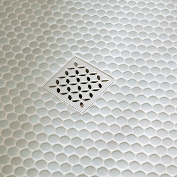
American Olean 1″ hex tile was installed in the shower’s floor, and subway tile on shower walls all the way up to the ceiling. A custom frameless glass shower enclosure finishes the sleek, open design.
Highly wear-resistant Adura luxury vinyl tile flooring runs throughout the entire bathroom and laundry room areas.
The full laundry room was finished to include new walls and ceilings. Beautiful shaker-style cabinetry with beadboard panels in white linen was chosen, along with glossy white cultured marble countertops from Central Marble, a Blanco, Precis 27″ single bowl granite composite sink in cafe brown, and a Kohler, Bellera® sink faucet.
We also decided to save and restore some original pieces in the home, like their existing 5-panel doors; one of which was repurposed into a pocket door for the new bathroom.
The homeowners completed the basement finish with new carpeting in the family room. The whole basement feels fresh, new, and has a great flow. They will enjoy their healthy, happy home for years to come.
Designed by: Emily Blonigen
See full details, including before photos at https://www.castlebri.com/basements/project-3378-1/
 ReVision Design + Build
© Ascendant Imaging
Inspiration for a large transitional master white tile and porcelain tile porcelain tile, beige floor, double-sink and wallpaper freestanding bathtub remodel in Charlotte with furniture-like cabinets, green cabinets, a two-piece toilet, white walls, an undermount sink, quartz countertops, a hinged shower door, white countertops, a niche and a built-in vanity
Inspiration for a large transitional master white tile and porcelain tile porcelain tile, beige floor, double-sink and wallpaper freestanding bathtub remodel in Charlotte with furniture-like cabinets, green cabinets, a two-piece toilet, white walls, an undermount sink, quartz countertops, a hinged shower door, white countertops, a niche and a built-in vanity

 Horizon Interior Design
A family of four with two young girls and cats needed a brand new master bath to accommodate a family member with MS. They tasked us with creating a luxurious master bath in a modern rustic style that was ADA-accessible and could accommodate the client's walker and wheelchair in the future.
Their key issues were that the shower was relatively small, with a curb the client had to step over. They also had a large jacuzzi tub with a tub deck built around it, but the couple never used it. The main bathroom only had one vanity with minimal counter space available, and the dated finishes and materials looked tired - so they were more than ready for a beautiful transformation.
To create an ADA-accessible main bath, we relocated the shower to an interior corner, allowing for the addition of a larger ADA-accessible shower with zero entry and a bench the client could easily transfer onto for bathing. The arrangement of this space would also allow for a walker and wheelchair to easily move through the walkways for access to the shower.
We moved the toilet to where the shower had been located originally with ADA accessibility features and installed luxurious double vanities along the entire vanity wall, with a modern linen tower cabinet for added storage. Since the client loved the modern rustic aesthetic, we incorporated their chosen style with elements like the Calacatta porcelain tile, cabinet hardware, mason jar lights, and wood-framed mirrors.

 Thinkterior LLC
For a family who believes fitness is not only an essential part of life but also a fun opportunity for the whole family to connect, build and achieve greatness together there is nothing better than a custom designed obstacle course right in your back yard.
THEME
The theme of this half mile trail through the woods is evident in the fun, creative and all-inclusive obstacles hidden in the natural flow of the land around this amazing family home. The course was created with adults and children, advanced and beginner athletes, competitive and entertaining events all accounted for. Each of the 13 obstacles was designed to be challenging no matter the size, skill or ability of the athlete lucky enough to run the course.
FOCUS
The focus for this family was to create an outdoor adventure that could be an athletic, social and personal outlet for their entire family while maintaining the natural beauty of the landscape and without altering the sweeping views from the home. The large scale of the challenging obstacles is camouflaged within the landscape using the rolling hills and mature trees as a natural curtain in every season. The beauty of the course does not diminish the functional and demanding nature of the obstacles which are designed to focus on multiple strength, agility, and cardio fitness abilities and intensities.
STORAGE
The start of the trail includes a raised training area offering a dedicated space clear from the ground to place bags, mats and other equipment used during the run. A small all-terrain storage cart was provided for use with 6 yoga mats, 3 medicine balls of various weights, rings, sprinting cones, and a large digital timer to record laps.
GROWTH
The course was designed to provide an athletic and fun challenge for children, teens and adults no matter their experience or athletic prowess. This course offers competitive athletes a challenge and budding athletes an opportunity to experience and ignite their passion for physical activity. Initially the concept for the course was focused on the youngest of the family however as the design grew so did the obstacles and now it is a true family experience that will meet their adapting needs for years. Each obstacle is paired with an instructional sign directing the runners in proper use of the obstacle, adaptations for skill levels and tips on form. These signs are all customized for this course and are printed on metal to ensure they last for many years.
SAFETY
Safety is crucial for all physical activity and an obstacle course of this scale presents unique safety concerns. Children should always be supervised when participating in an adventure on the course however additional care was paid to details on the course to ensure everyone has a great time. All of the course obstacles have been created with pressure treated lumber that will withstand the seasonal poundings. All footer pilings that support obstacles have been placed into the ground between 3 to 4 feet (.9 to 1.2 meters) and each piling has 2 to 3 bags of concrete (totaling over 90 bags used throughout the course) ensuring stability of the structure and safety of the participants. Additionally, all obstacle lumber has been given rounded corners and sanded down offering less splintering and more time for everyone to enjoy the course.
This athletic and charismatic family strives to incorporate a healthy active lifestyle into their daily life and this obstacle course offers their family an opportunity to strengthen themselves and host some memorable and active events at their amazing home.
Sponsored
Sunbury, OH

J.Holderby - Renovations
Franklin County's Leading General Contractors - 2X Best of Houzz!

 User
Amy Bartlam
Kitchen - medium tone wood floor and brown floor kitchen idea in Los Angeles with a farmhouse sink, shaker cabinets, white cabinets, quartz countertops, stainless steel appliances and an island
Kitchen - medium tone wood floor and brown floor kitchen idea in Los Angeles with a farmhouse sink, shaker cabinets, white cabinets, quartz countertops, stainless steel appliances and an island

 TVL Creative Ltd.
This kitchen took a tired, 80’s builder kitchen and revamped it into a personalized gathering space for our wonderful client. The existing space was split up by the dated configuration of eat-in kitchen table area to one side and cramped workspace on the other. It didn’t just under-serve our client’s needs; it flat out discouraged them from using the space. Our client desired an open kitchen with a central gathering space where family and friends could connect. To open things up, we removed the half wall separating the kitchen from the dining room and the wall that blocked sight lines to the family room and created a narrow hallway to the kitchen. The old oak cabinets weren't maximizing storage and were dated and dark. We used Waypoint Living Spaces cabinets in linen white to brighten up the room. On the east wall, we created a hutch-like stack that features an appliance garage that keeps often used countertop appliance on hand but out of sight. The hutch also acts as a transition from the cooking zone to the coffee and wine area. We eliminated the north window that looked onto the entry walkway and activated this wall as storage with refrigerator enclosure and pantry. We opted to leave the east window as-is and incorporated it into the new kitchen layout by creating a window well for growing plants and herbs. The countertops are Pental Quartz in Carrara. The sleek cabinet hardware is from our friends at Amerock in a gorgeous satin champagne bronze. One of the most striking features in the space is the pattern encaustic tile from Tile Shop. The pop of blue in the backsplash adds personality and contrast to the champagne accents. The reclaimed wood cladding surrounding the large east-facing window introduces a quintessential Colorado vibe, and the natural texture balances the crisp white cabinetry and geometric patterned tile. Minimalist modern lighting fixtures from Mitzi by Hudson Valley Lighting provide task lighting over the sink and at the wine/ coffee station. The visual lightness of the sink pendants maintains the openness and visual connection between the kitchen and dining room. Together the elements make for a sophisticated yet casual vibe-- a comfortable chic kitchen. We love the way this space turned out and are so happy that our clients now have such a bright and welcoming gathering space as the heart of their home!
 TKS Design Group
Download our free ebook, Creating the Ideal Kitchen. DOWNLOAD NOW
This client was referred to us from a past client. They are a busy 2-career household with young children and enjoy entertaining friends and family in their home. They have a beautiful open concept home but unfortunately the kitchen was not fitting for the rest of the home. They were not quite sure what to do with the space. We talked about trying to refresh it or do more of a minor remodel, but in the end they decided a full gut would get them to where they wanted to be.
One problem was there was no place for guests to hang out other than the large and awkward banquette area. The brick wall and tiled hood area were feeling a bit dated and tired. The space was just not functional for their lifestyle. There was no prep space near the cooktop and no landing area for items coming out of the ovens or refrigerator, plus a big dead zone in the center of the room.
Banquettes, like the one they previously had in the space, are great for small spaces, but when they get really large like this one, it makes getting in and out of the seating area awkward and uncomfortable. Plus, there was room for a large table, so we eliminated the awkward built in.
We started by removing the faux brick wall between the kitchen and back entry. We relocated the entry to the garage over a couple feet in order to get every last inch out of the new kitchen. We also made the decision to close up the primary window that faced the pretty ho hum brick wall of the neighbor’s house. There was plenty of light coming in from the seating area, so we just didn’t feel the window was adding much to the room.
Construction went smoothy. There was a bit of rework with electrical, flooring and HVAC, but in the end, we think it was well worth it.
The clients really wanted a sleek contemporary look, and we originally had planned for a full height slab backsplash, but due to it’s size, it was a budget buster. Instead, we got creative and settled on large format porcelain tiles that have a similar feel but were a fraction of the cost. We made sure the wall was plumb and level so that the fit and finish would mimic that of slab material.
The final space was quite a change. A large prep sink sits directly across from the new pro-style range with plenty additional prep space on the large island. The refrigerator and ovens now have miles of landing space, and a nice tight work triangle makes cooking a breeze.
Since we wanted a more contemporary feel, not many wall cabinets were included. Instead, we outfitted some of the drawers for dish storage with a peg system. Two large pantries flanking the refrigerator hold baking supplies and small appliances. Large drawers by the cooktop hold pots and pans, and an appliance garage tucked away to the left of the range hides away miscellaneous items. The large island also houses a microwave drawer and tons of storage, most of which is drawers offering maximum convenience.
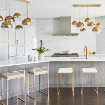
The island now seats 5-6 people comfortably along with the new table in the seating area which can seat up to 8. Entertaining will be a breeze in this space. With such a clean backdrop, we knew we would need some drama with the lighting, so we chose two sets of staggered pendants, which we adjusted for the right visual balance above the island.
We also included a small coffee station to the right of the main kitchen, which helps keep the coffee clutter out of the kitchen proper. Two tones of complimentary gray are featured in this kitchen. The perimeter is a light gray that reads almost white. The island is a gray stain that adds some depth and interest with the visible wood texture. The countertops are clean white quartz, and the hardware, barstools and light fixtures add warm brass tones. I see lots of cooking and entertaining with family and friends in the near future in this bright and airy new space.
Designed by: Susan Klimala, CKD, CBD
Photography by: Michael Kaskel
For more information on kitchen and bath design ideas go to: www.kitchenstudio-ge.com

 June Scott Design
Located in a historic neighborhood, this property features an Italian Revival home on a compact lot. The owners have lovingly restored the exterior, and we created a garden that feels both fresh and timeless. The design maximizes the site with a sparkling pool and a series of spaces for entertaining, relaxing and play. Generous custom tile work, a new pergola and gates, and iron lights and railings all elevate the design and extend the graciousness of the home’s interior into the new outdoor spaces.
Photo by Martin Cox

 Advance Design Studio, Ltd.
After six years of living in their Huntley IL home, Chris and Meghan were tired of their dark, dingy, outdated kitchen and it was finally time for a long-anticipated change. “The kitchen is the place where we live, it’s where we do everything,” Meghan said. “It was important that it be a space where we wanted to be.” Meghan loves cooking and enjoys including their girls in healthy meal prepping, this led them to want a brighter, more enjoyable kitchen with increased functionality and improved storage.
For Chris especially, the laundry room was an entirely dysfunctional eyesore. “We had a washer and a dryer, but it was all kind-of cobbled together!” Chris said. “There were always laundry piles everywhere, we weren’t really sure what we wanted to do in there, but it was time for us to make a change.” The mess of the space was stressful every time they walked in the door from the garage each day. Kids’ backpacks and shoes piled up haphazardly in the makeshift boot-bench closet left the family feeling disorganized and stressed. They needed space for folding clothes and locker cubbies to help keep the family organized.
Having known Christine and Todd in the Huntley community for years, Chris and Meghan were familiar with their work. “We already trusted them personally and having seen their projects for years we knew they did top notch work. After we reviewed the initial round of designs, we knew that hiring them was definitely the right choice,” Meghan and Chris said. Although Chris had done a lot of work in their home himself, the kitchen and laundry room renovation was such a large undertaking that he didn’t want to steal time away from his family to spend what would surely be many long weekends doing the job himself. “That would not have been a wise choice for us,” Chris laughed.
“Our designer, Michelle was very, very, easy to work with; anything we wanted to see or weren’t sure about, she went above and beyond to make this easy for us. She was easy to get hold of and always quick to respond,” the couple said. Michelle pulled ideas that mirrored the couple’s taste and style and was adept at directing the couple to limited choices that didn’t overwhelm them and kept the process moving. “I have a hard time making decisions. Michelle made the decision-making process so easy. I loved how she listened to what I liked and then presented three great options for me to choose from,” Meghan said.
The main objectives for the kitchen were better storage solutions, they wanted the space to reflect their lifestyle and taste, and they wanted it to last for years with low maintenance. One of the first steps in creating a more functional kitchen was relocating the refrigerator, creating an improved workflow for the busy family.
“We didn’t know that we could even move the refrigerator to a new location where it is now, that was something that we never would have thought of,” Chris said. “The new refrigerator location makes the kitchen feel so much bigger. We didn’t add any space, but our whole kitchen with the new design just seems like it’s so much larger than before!” Meghan said.
The perimeter mist colored cabinets helped warm and brighten the entire room, while the graphite colored cabinets on the island added contrast. Using this fresh, clean color palette satisfied the couple’s desire for a bright space that was the exact opposite of what they had before. Organization accessories were also added to the cabinets such as a spice drawer tray and roll outs to create hidden convenience.
“I absolutely love the hidden spices – it makes cooking so much more enjoyable!” Chris said. “And all the pull outs, and the double trash bin, who would think you could get so excited about organization!” the couple said in unison.
One thing they hated in their original kitchen was how dark the space felt. Added lighting on the ceiling with the new light fixtures combined with the lighter cabinetry colors throughout solved this problem. “Our new kitchen has this warm, almost cozy feeling that our old kitchen never had, it’s just a space that I love spending my time in now,” Meghan said. The light airy feeling was accentuated with the use of floating white shelves on either side of the decorative range hood. “We have so much cabinetry space, the new design is amazing we actually have more storage space than we will ever need,” Meghan said.
The island was extended to create more work surface and added space for stool seating. “The new island changes how we live. Now the kids can be in the kitchen with us, doing homework, eating breakfast, and the three of us have special dinners there when Chris is working late,” Meghan said.
The Carrara Marmi Quartz countertops were chosen because they are, not only beautiful, but are made from hard-working material that doesn’t require maintenance. The white subway tile backsplash that wraps to the ceiling behind the focal point cooktop range/hood compliments the crisp white countertops perfectly, while brushed brass hardware and light fixtures keep the design fresh and new.
The couple had a few fears at the beginning of the project, as most homeowners do. Their biggest fear was being out of their kitchen and laundry room for an extended time. The crew made it very easy for the family to work in a limited space keeping the washer and dryer hooked up the majority of the time, and also getting appliances working with minimal downtime.
“They above and beyond accommodated us to get us through the process,” Meghan said. “They did a great job making sure we were as comfortable as possible throughout the process,” Chris added.
“Our project manager DJ did a great job. He was very good at updating us on schedule changes, getting guys in as quickly as possible. Everyone that stepped in the house was nice and did great work,” said Chris. They thought Advance’s carpenter was phenomenal and were impressed when he took a conceptual idea from a photograph and worked with designer Michelle to create a one of a kind range/hood that has become the topic of conversation with friends and family who visit the new kitchen. “He was in our house literally every day for several weeks. He was easy to work with and good at what he did,” Meghan and Chris said.
The focal point of the kitchen; a hand-crafted, custom-built ventilation hood was clad with handpicked reclaimed barnwood. Advance Design’s carpenter built the framework and the cladding to create a one-of-a-kind design element that the couple loves.
“I think it was especially fun for him to create something unique from scratch, showcasing his talent in this area,” Meghan said. “I love that my kitchen is not like everyone else’s. I got to pick out the wood on my hood and watch it being built and was able to choose what pieces of wood went where on it. It’s totally unique.”
Red Oak flooring was toothed-in throughout the kitchen and the rest of the first floor anywhere changes were made. Then the whole floor was refinished to tone down the orange undertones in the existing floor stain, ultimately changing the color complexion of the entire first floor. The result is a completely new feeling to the entire home.
Renovating the laundry room was extremely important to Meghan and Chris, but they had trouble visualizing what the possibilities were for the seemingly small space. Michelle produced beautiful 3D illustrations that helped them envision the space in a whole new way.
“I must have told Michelle 100 times that I am a visual person, seeing the designs in 3D made it so easy to make decisions and see what we could really do with our space,” Meghan said.
A dividing wall and doorway were removed between the existing laundry room and hallway formerly containing a coat closet, providing space to design specialized graphite colored cabinetry matching the kitchen island to house custom storage cubbies for each family member. Adding the tall utility cabinetry in the new laundry area helped solve the storage issue, tucking away cleaning supplies, household items, and even the cat got its own cubby.
“I love how everything is now hidden in its own space. I can’t tell you how much I hated coming home and seeing everything sitting around on counters,” Chris said.
Electrical outlets were planned for the inside of utility cabinets, so devices could charge in hidden locations. Stacking the washer and dryer allowed for wider countertop space to provide a folding area and a special space for clothes to hang. “The way I do laundry has been completely transformed! I can actually fold clothes and hang them now right out of the washer and dryer,” Meghan said.
“The end result in the kitchen and the laundry/mud room was an updated light and bright space, with a smarter work flow that better meets the needs of this family,” Michelle said.
“I would totally recommend Advance Design,” Meghan said. “Sometimes I sit and just look at my kitchen and laundry room and think ‘Wow, I can’t believe I get to live here!’ It’s an understatement to say we love our new space.”
 Everything Home
The utility room was in between the LR and the kitchen, so we moved it in order to connect the two spaces. We put the utility room where the laundry room used to be and created a new laundry room off a new hallway that leads to the master bedroom. The space for this was created by borrowing space from the XL dining area. We carved out space for the formal living room to accommodate a larger kitchen. The rest of the space became modest-sized offices with French doors to allow light from the house's front into the kitchen. The living room now transitioned into the kitchen with a new bar and sitting area.
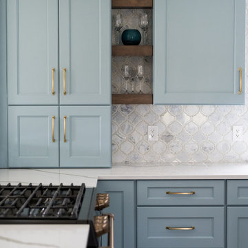
We also transformed the full bath and hallway, which became a half-bath and mudroom for this single couple. The master bathroom was redesigned to receive a private toilet room and tiled shower. The stairs were reoriented to highlight an open railing and small foyer with a pretty armchair. The client’s existing stylish furnishings were incorporated into the colorful, bold design. Each space had personality and unique charm. The aqua kitchen’s focal point is the Kohler cast-iron vintage-inspired sink. The enlarged windows in the living room and sink allow the homeowners to enjoy the natural surroundings.
Builder Partner – Parsetich Custom Homes
Photographer - Sarah Shields
---
Project completed by Wendy Langston's Everything Home interior design firm, which serves Carmel, Zionsville, Fishers, Westfield, Noblesville, and Indianapolis.
For more about Everything Home, click here: https://everythinghomedesigns.com/
To learn more about this project, click here:
https://everythinghomedesigns.com/portfolio/this-is-my-happy-place/

 TKS Design Group
Download our free ebook, Creating the Ideal Kitchen. DOWNLOAD NOW
A tired primary bathroom, with varying ceiling heights and a beige-on-beige color scheme, was screaming for love. Squaring the room and adding natural materials erased the memory of the lack luster space and converted it to a bright and welcoming spa oasis. The home was a new build in 2005 and it looked like all the builder’s material choices remained. The client was clear on their design direction but were challenged by the differing ceiling heights and were looking to hire a design-build firm that could resolve that issue.
This local Glen Ellyn couple found us on Instagram (@kitchenstudioge, follow us ?). They loved our designs and felt like we fit their style. They requested a full primary bath renovation to include a large shower, soaking tub, double vanity with storage options, and heated floors. The wife also really wanted a separate make-up vanity. The biggest challenge presented to us was to architecturally marry the various ceiling heights and deliver a streamlined design.
The existing layout worked well for the couple, so we kept everything in place, except we enlarged the shower and replaced the built-in tub with a lovely free-standing model. We also added a sitting make-up vanity. We were able to eliminate the awkward ceiling lines by extending all the walls to the highest level. Then, to accommodate the sprinklers and HVAC, lowered the ceiling height over the entrance and shower area which then opens to the 2-story vanity and tub area. Very dramatic!
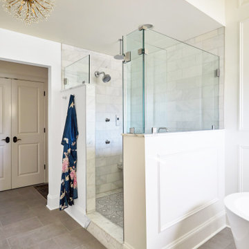
This high-end home deserved high-end fixtures. The homeowners also quickly realized they loved the look of natural marble and wanted to use as much of it as possible in their new bath. They chose a marble slab from the stone yard for the countertops and back splash, and we found complimentary marble tile for the shower. The homeowners also liked the idea of mixing metals in their new posh bathroom and loved the look of black, gold, and chrome.
Although our clients were very clear on their style, they were having a difficult time pulling it all together and envisioning the final product. As interior designers it is our job to translate and elevate our clients’ ideas into a deliverable design. We presented the homeowners with mood boards and 3D renderings of our modern, clean, white marble design. Since the color scheme was relatively neutral, at the homeowner’s request, we decided to add of interest with the patterns and shapes in the room.
We were first inspired by the shower floor tile with its circular/linear motif. We designed the cabinetry, floor and wall tiles, mirrors, cabinet pulls, and wainscoting to have a square or rectangular shape, and then to create interest we added perfectly placed circles to contrast with the rectangular shapes. The globe shaped chandelier against the square wall trim is a delightful yet subtle juxtaposition.
The clients were overjoyed with our interpretation of their vision and impressed with the level of detail we brought to the project. It’s one thing to know how you want a space to look, but it takes a special set of skills to create the design and see it thorough to implementation. Could hiring The Kitchen Studio be the first step to making your home dreams come to life?

 Cloud Hunter
Have you been searching for your ‘Happily Ever After’? Look no more! This dreamy duvet cover topped with pure white textured floral and leaves trimmed with clear beading IS your happy end to a tiring day. It’s whimsical design is storybook friendly! Classically white but modernly individualistic with it’s unique feminine detail. Inspirations of french, vintage and natural elements come together to create this clean crisp bed set.
Freshly cut flower and leaves adorn the top of the duvet with a soft-to-the-touch but sturdy-through-the-wear chiffon overlay. Tear drop and leaf translucent beads trim the sides and foot. Top off the look with coordinating shams that are sold separately. Trimmed with beautiful high quality feathers to complete your new incredible nest look!
Support USA made products with Cloud Hunter, handmade in California with high end materials and a passion for quality. We’re a fashion minded home decor company who believes your bed should be as well dressed as you! Please view our unique bedding collections at www.cloudhunterco.com or contact us for our custom decor needs- we work with every style.
-Dry cleaning recommended
-Zipper closure
-Twin and queen ready to ship
-King and custom sizes available
-Coordinating shams and decor pillows sold separately
-Made in the USA
MADE WITH LOVE IN C A L I F O R N I A

 Michael Nash Design, Build & Homes
A family of five, who live in a prestigious McLean neighborhood, was looking to renovate and upgrade their 20 year old kitchen.
She was tired of the bleached look on her kitchen, and now was looking for light but updated look at her kitchen. She also did not want to deal with having a cook top in her Island and wanted professional appliances and better traffic pattern.
Challenges:
The bulkheads were stuffed with lots of duct work and plumbing. All need to be relocated in order to take advantage of the height.
The kitchen was over a very tight crawl space area that made access to run gas line, and plumbing line much more challenging.
Adjacent family room needed to become part of this grand plan and as part of the oval scheme of work tie into kitchen cabinetry.
Design Solutions:
The plan was to give a French country look to this kitchen, by carrying the overall soft and creamy color scheme of main floor furniture in the new kitchen.
The back wall of the kitchen now occupied by 48” professional range under a custom wood hood.
New tower style refrigerator covered in matching wood panels is placed at the end of the run, just create more work space on both sides of the stove.
New plumbing was run for prep. Sink in the new island in order to have a second cook can work in the kitchen.
The large contrasting Island in a Dark chocolate finish now offers a second dishwasher, a beverage center and built in microwave. Also serves as a large buffet style counter space and accommodate up to five seats around it.
Smart use of detailed crown and trim molding are highlights of this kitchen.
Just to the west of this kitchen, we used to have a bare was with a 36” fireplace in it.
Our goal was to get all surrounding walls involved with this renovation. Now the entirety of this wall in filled with lower cabinetry and upper display cabinetry and a working station at the end of the run.
The fireplace was wrapped with matching color mantel and got equipped for a new large TV above it
New cabinetry was added to butler area to harmonize with new kitchen.
We have introduced a large size porcelain tile floor for entire family room and kitchen just to give it bigger space look and easy upon the traffic pattern.
Outcome:
The rare exotic counter top stone was the most favorite item in this kitchen for the homeowner. The way it connects with a brown glazing of the cabinetry and compliments the stone backsplash tile with an interesting picture frame inset niche above stove area is breathtaking.
She is thrilled with the end result and cannot wait to celebrate her son’s engagement party in her new and exciting kitchen.

 All Marble Tiles
Carrara Marble Tiles and Bathroom Tiles
We all love a bathroom backdrop that creates the most serene ambience in which we can soak ourselves after a long day of work. Nothing gives your bathroom that posh look like snow white Carrara marble tiles. It is sold in different textures and density in the market; you have the option of making the selection that suits your style.
There are so many ways to carpet your bathroom with Carrara marble tile. Since the bathroom tiles are non-porous in nature, they cannot soak in water. This makes them perfect to cover your walls with them and provide that warm ambience as you take a shower. Carrara stone does not retain odors as well thus you are perfectly safe using your shampoo or liquid body wash however you want without worrying.
Carrara marble tile bathroom walls offer a perfect white backdrop in which you can add details like silvery faucets, flower vases or candelabras when having romantic moments with your spouse. Because stone can be polished to a glimmer, using Carrara bathroom tiles on the walls reflects light off making the entire room look illuminated and fresh. And the plush white look doesn’t have to end with the walls; your own drop-in tab can also be decorated with Carrara marble tiles to complete the sophisticated hotel-style look.
Marble is also perfect on floors especially when you want to do away with the rugs. Bathroom rugs tend to soak and look ugly on the floor or get dump and give off nauseating odors. Polished Carrara marble is all you do to make the floor neat and shiny. And because they don’t get dump, they maintain their temperatures and feel warm whenever you walk on them.
Installing these tiles is a smooth job and stone can easily be cut using hand-held tile cutters. Laying the tiles yourself also gives you the freedom to try different patterns on the walls and floor. Moreover, you can also try out mosaic formats to achieve a different look but you have to consult someone if you are not sure about mosaics. Make sure you use non-slippery grout sealers so your Carrara bathroom design remains safe even when walking bare foot.
Investing in Carrara marble tiles is a one-time opportunity that will last for as long as possible. There is little maintenance on the stone marble and it cleans up easily and doesn’t corrode either. If you are tired of your current bathroom look, invest in this option for a change.
http://AllMarbleTiles.com

 Granit Architects + Interiors
We are delighted to have completed the radical transformation of a tired detached property in South Croydon.
When they appointed Granit, our clients were living in the property which had previously been divided into a number of flats.
The historic sub-division had resulted in an extremely poor use of space with redundant staircases, kitchens and bathrooms throughout.
Our clients sought to reconfigure the property back into a single dwelling for his growing family.
Our client had an eye for design and was keen to balance contemporary design whilst maintaining as much of the character of the original house.
Maximising natural light, space and establishing a visual and physical connection were also key drivers for the design. Owing to the size of the property, it became apparent that reconfiguration rather than extension provided the solution to meet the brief.
A metal clad ‘intervention’ was introduced to the rear facade. This created a strong horizontal element creating a visual balance with the vertical nature of the three storey gable.
The metal cladding specified echoed the colour of the red brick string courses tying old with new. Slender frame sliding doors provide access and views of the large garden.
The central circulation space was transformed by the introduction of a double height glazed slot wrapping up the rear facade and onto the roof. This allows daylight to permeate into the heart of the otherwise dark deep floor plan. The staircase was reconfigured into a series of landings looking down over the main void space below and out towards the tree canopies at the rear of the garden.
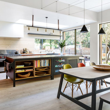
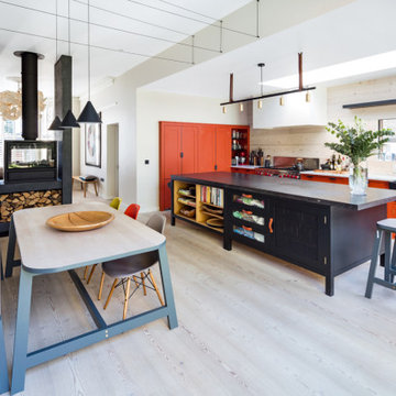
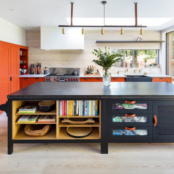
The introduction of double pocket doors throughout the ground floor creates a series of interconnected spaces and the whitewashed Larch flooring flows seamlessly from room to room. A bold palette of colours and materials lends character and texture throughout the property.
The end result is a spacious yet cosy environment for the family to inhabit for years to come.
 Granit Architects + Interiors
We are delighted to have completed the radical transformation of a tired detached property in South Croydon.
When they appointed Granit, our clients were living in the property which had previously been divided into a number of flats.
The historic sub-division had resulted in an extremely poor use of space with redundant staircases, kitchens and bathrooms throughout.
Our clients sought to reconfigure the property back into a single dwelling for his growing family.
Our client had an eye for design and was keen to balance contemporary design whilst maintaining as much of the character of the original house.
Maximising natural light, space and establishing a visual and physical connection were also key drivers for the design. Owing to the size of the property, it became apparent that reconfiguration rather than extension provided the solution to meet the brief.
A metal clad ‘intervention’ was introduced to the rear facade. This created a strong horizontal element creating a visual balance with the vertical nature of the three storey gable.
The metal cladding specified echoed the colour of the red brick string courses tying old with new. Slender frame sliding doors provide access and views of the large garden.
The central circulation space was transformed by the introduction of a double height glazed slot wrapping up the rear facade and onto the roof. This allows daylight to permeate into the heart of the otherwise dark deep floor plan. The staircase was reconfigured into a series of landings looking down over the main void space below and out towards the tree canopies at the rear of the garden.
The introduction of double pocket doors throughout the ground floor creates a series of interconnected spaces and the whitewashed Larch flooring flows seamlessly from room to room. A bold palette of colours and materials lends character and texture throughout the property.
The end result is a spacious yet cosy environment for the family to inhabit for years to come.
 Granit Architects + Interiors
We are delighted to have completed the radical transformation of a tired detached property in South Croydon.
When they appointed Granit, our clients were living in the property which had previously been divided into a number of flats.
The historic sub-division had resulted in an extremely poor use of space with redundant staircases, kitchens and bathrooms throughout.
Our clients sought to reconfigure the property back into a single dwelling for his growing family.
Our client had an eye for design and was keen to balance contemporary design whilst maintaining as much of the character of the original house.
Maximising natural light, space and establishing a visual and physical connection were also key drivers for the design. Owing to the size of the property, it became apparent that reconfiguration rather than extension provided the solution to meet the brief.
A metal clad ‘intervention’ was introduced to the rear facade. This created a strong horizontal element creating a visual balance with the vertical nature of the three storey gable.
The metal cladding specified echoed the colour of the red brick string courses tying old with new. Slender frame sliding doors provide access and views of the large garden.
The central circulation space was transformed by the introduction of a double height glazed slot wrapping up the rear facade and onto the roof. This allows daylight to permeate into the heart of the otherwise dark deep floor plan. The staircase was reconfigured into a series of landings looking down over the main void space below and out towards the tree canopies at the rear of the garden.
The introduction of double pocket doors throughout the ground floor creates a series of interconnected spaces and the whitewashed Larch flooring flows seamlessly from room to room. A bold palette of colours and materials lends character and texture throughout the property.
The end result is a spacious yet cosy environment for the family to inhabit for years to come.
41