
Search results for "So called confidence" in Home Design Ideas
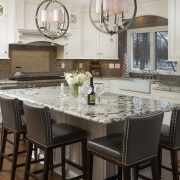
Kitchen - traditional l-shaped dark wood floor kitchen idea in Columbus with a farmhouse sink, shaker cabinets, white cabinets, gray backsplash, subway tile backsplash and an island
 Whitten Architects
photography by Rob Karosis
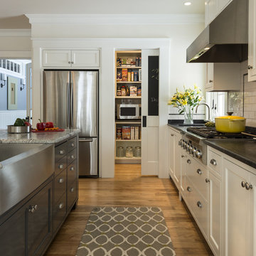
Example of a large classic l-shaped medium tone wood floor kitchen design in Portland Maine with a farmhouse sink, shaker cabinets, white cabinets, granite countertops, white backsplash, ceramic backsplash and stainless steel appliances
Example of a large classic l-shaped medium tone wood floor kitchen design in Portland Maine with a farmhouse sink, shaker cabinets, white cabinets, granite countertops, white backsplash, ceramic backsplash and stainless steel appliances
 TKS Design Group
Download our free ebook, Creating the Ideal Kitchen. DOWNLOAD NOW
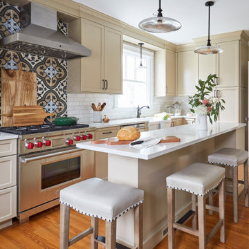
The homeowners came to us looking to update the kitchen in their historic 1897 home. The home had gone through an extensive renovation several years earlier that added a master bedroom suite and updates to the front façade. The kitchen however was not part of that update and a prior 1990’s update had left much to be desired. The client is an avid cook, and it was just not very functional for the family.
The original kitchen was very choppy and included a large eat in area that took up more than its fair share of the space. On the wish list was a place where the family could comfortably congregate, that was easy and to cook in, that feels lived in and in check with the rest of the home’s décor. They also wanted a space that was not cluttered and dark – a happy, light and airy room. A small powder room off the space also needed some attention so we set out to include that in the remodel as well.
See that arch in the neighboring dining room? The homeowner really wanted to make the opening to the dining room an arch to match, so we incorporated that into the design.
Another unfortunate eyesore was the state of the ceiling and soffits. Turns out it was just a series of shortcuts from the prior renovation, and we were surprised and delighted that we were easily able to flatten out almost the entire ceiling with a couple of little reworks.
Other changes we made were to add new windows that were appropriate to the new design, which included moving the sink window over slightly to give the work zone more breathing room. We also adjusted the height of the windows in what was previously the eat-in area that were too low for a countertop to work. We tried to keep an old island in the plan since it was a well-loved vintage find, but the tradeoff for the function of the new island was not worth it in the end. We hope the old found a new home, perhaps as a potting table.
Designed by: Susan Klimala, CKD, CBD
Photography by: Michael Kaskel
For more information on kitchen and bath design ideas go to: www.kitchenstudio-ge.com
Find the right local pro for your project

 Carpet Cleaning Pros
Carpet Cleaning Pros
Obtain your totally free Carpet Cleaning Quote Today! Serving all locations in Johannesburg City
Your carpetings experience a lot of damage and need to be skillfully cleansed at least yearly.
We clean much more than simply rugs! We can aid with furniture, mattresses, workplace chairs, deodorising and also a lot more!
Carpet Cleaning Pros is Johannesburg City leading carpet cleaning company. We head out of our means to provide superb customer care and also professional carpet and furniture cleaning services.
We run throughout Johannesburg City so give us a call currently!
Carpet Cleaning Pros
Address: Shop 8, 406 Southern Klipriviersberg Rd, Steeledale, Johannesburg City, 2197
087 250 0268
Website: https://www.carpetcleaningpros.co.za/
Social Media: https://www.facebook.com/Carpet-Cleaning-Pros-105599832051569 https://www.youtube.com/channel/UCb0lO04xmlg0s8X0bWSIAqQ/ https://za.pinterest.com/parpetcleaningpros/
Carpet Cleaning Pros - Carpet Cleaning in Johannesburg City. Carpet Cleaning Pros South Africa - Fast, Affordable, Free Quotes. Quick results, remove stains, restore to new. Serving all areas in South Africa, Durban, Cape Town, Joburg, Pretoria.
The Carpet Cleaning Pros Special Technique
Carpet Cleaning Pros uses our own unique technique for specialist carpet cleaning:
Pre-clean examination. Prior to cleaning your carpets or upholstery, our experts inspect the location for discolorations, tracked-in dust and also locations of problem.
Pre-clean treatment. Based on the pre-clean assessment, your carpet cleaning pro will certainly treat any kind of spots to eliminate stubborn dirt. We likewise deal with woollen carpets with a brownout solution.
Specialist cleaning. This is where the magic takes place. Using our specialized equipment as well as high-tech solutions, we expertly deep clean your carpets or furniture.
Rinsing. Our rinsing stage gets rid of the cleaning service and any kind of continuing to be accumulation.
Deodorizing. We will deal with the location with our special ventilating option if you require your rugs or upholstery deodorised.
Quick-dry. With our special method, your rugs as well as upholstery will be completely dry prior to you understand it!
Carpet Cleaning Johannesburg City
Did you recognize that you should have your carpetings professionally cleansed a minimum of once a year?
Your rugs hold any kind of dust, dirt, germs as well as allergens that people track in, as well as specialist cleaning can remove all this.
Over time, carpets can create an undesirable smell.
We will skillfully clean your carpets promptly and also efficiently, and also they'll be completely dry within a couple of hours!
It's less expensive than you believe so call currently for a totally free quote!
Office Chair and Furniture Cleaning Johannesburg City
Workplace chairs, couches and also other soft furniture can obtain very unclean.
Don't enable your consumers to obtain the incorrect impact of your workplace, as well as get your carpetings and furnishings cleansed on a regular basis.
Our expert cleaning will get rid of dirt, stains as well as irritants for a healthy workplace.
Call us right here for a free quote!
Upholstery Cleaning Johannesburg City
Sofas, curtains, drapes, area rugs, and also furniture with upholstery all require normal, specialist cleaning.
This not just keeps them clean and hygienic, but additionally extends their life-span.
Visit this site for a totally free quote for upholstery cleaning.
Bed as well as Mattress Cleaning Johannesburg City
Your bed and cushion has a great deal of hidden dust that is unclean and can also make you ill.
After a short while, a brand-new mattress will contain dead skin cells, sweat, dander, dirt, dirt and also various other toxic irritants. This can make your allergic reactions flare as well as supply an unclean sleeping place.
The good news is that regular mattress cleaning can prevent this.
Call right here to reserve a specialist mattress cleaning.
Office, Church, Synagogue as well as Mosque Cleaning
Carpet Cleaning Pros uses professional office, mosque, synagogue and also church cleaning.
These buildings all see a lot of traffic through their doors. Rugs can soon get upholstered and unclean chairs as well as benches can become discolored and unhygienic.
We provide economical prices for cleaning workplaces, mosques, churches and also synagogues. We run throughout Johannesburg City and will involve you!
To reserve your professional cleaning, go here.
Ventilating
Carpet Cleaning Pros additionally uses specialist ventilating services.
Deodorising can be very effective in a variety of circumstances:
Pet dog messes. Cat pee is specifically potent-smelling as well as can be tough to get out on your own. Our expert deodorising can remove offensive family pet mess smells.
Water damage. If your carpets have been water damaged, the trapped water in the carpets can end up being moudly and also smelly. Specialist deodorising can clean and then remove the scent.
Old carpets. Rather of ripping them up you may desire to maintain them if your carpets are old however still in excellent adequate condition to continue making use of. A professional clean and deodorising can eliminate moldy smells from old rugs.
Food splashes. Mistakenly spilt food on your carpets? Obtain them deodorised and smelling like new!
Sick spaces. It will be almost difficult to remove the scent on your very own if someone has actually thrown up on your carpets. We will professionally deep clean and afterwards deodorise the location, making it as if it never happened!
Obtain your totally free Carpet Cleaning Quote Today! Based on the pre-clean examination, your carpet cleaning pro will treat any kind of discolorations to remove persistent dust. Utilizing our specialist devices as well as high-tech options, we professionally deep clean your carpetings or furniture.
If your carpets have actually been water harmed, the trapped water in the carpets can end up being moudly and also stinky. A professional clean as well as deodorising can get rid of mildewy smells from old rugs.
 Deniece Duscheone Design
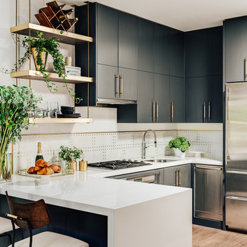
Nestled in the former antiques & design district, this loft unites a charismatic history with lively modern vibes. If these walls could talk. We gave this industrial time capsule an urban facelift by enhancing the 19-century architecture with a mix of metals, textures and sleek surfaces to appeal to a sassy & youthful lifestyle. Transcending time and place, we designed this loft to be clearly confident, uniquely refined while maintaining its authentic bones.
 Divine Custom Homes
Photos by Spacecrafting
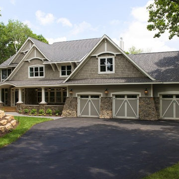
Inspiration for a large timeless gray two-story wood gable roof remodel in Minneapolis
Inspiration for a large timeless gray two-story wood gable roof remodel in Minneapolis
 TKS Design Group
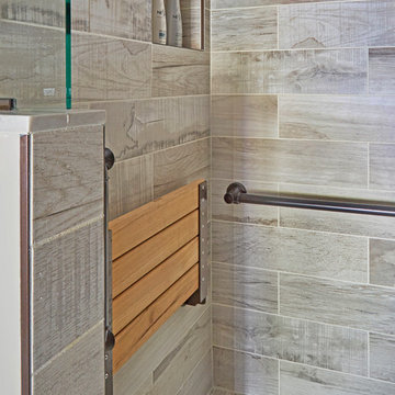
This project was completed for clients who wanted a comfortable, accessible 1ST floor bathroom for their grown daughter to use during visits to their home as well as a nicely-appointed space for any guest. Their daughter has some accessibility challenges so the bathroom was also designed with that in mind.
The original space worked fairly well in some ways, but we were able to tweak a few features to make the space even easier to maneuver through. We started by making the entry to the shower flush so that there is no curb to step over. In addition, although there was an existing oversized seat in the shower, it was way too deep and not comfortable to sit on and just wasted space. We made the shower a little smaller and then provided a fold down teak seat that is slip resistant, warm and comfortable to sit on and can flip down only when needed. Thus we were able to create some additional storage by way of open shelving to the left of the shower area. The open shelving matches the wood vanity and allows a spot for the homeowners to display heirlooms as well as practical storage for things like towels and other bath necessities.
We carefully measured all the existing heights and locations of countertops, toilet seat, and grab bars to make sure that we did not undo the things that were already working well. We added some additional hidden grab bars or “grabcessories” at the toilet paper holder and shower shelf for an extra layer of assurance. Large format, slip-resistant floor tile was added eliminating as many grout lines as possible making the surface less prone to tripping. We used a wood look tile as an accent on the walls, and open storage in the vanity allowing for easy access for clean towels. Bronze fixtures and frameless glass shower doors add an elegant yet homey feel that was important for the homeowner. A pivot mirror allows adjustability for different users.
If you are interested in designing a bathroom featuring “Living In Place” or accessibility features, give us a call to find out more. Susan Klimala, CKBD, is a Certified Aging In Place Specialist (CAPS) and particularly enjoys helping her clients with unique needs in the context of beautifully designed spaces.
Designed by: Susan Klimala, CKD, CBD
Photography by: Michael Alan Kaskel

 GOODFELLAS CONSTRUCTION
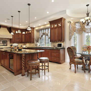
Classic vintage inspired design with marble counter tops. Dark tone cabinets and glass top dining table.
Inspiration for a large timeless l-shaped ceramic tile and beige floor eat-in kitchen remodel in Los Angeles with raised-panel cabinets, dark wood cabinets, beige backsplash, an island, marble countertops, a double-bowl sink, porcelain backsplash and stainless steel appliances
Inspiration for a large timeless l-shaped ceramic tile and beige floor eat-in kitchen remodel in Los Angeles with raised-panel cabinets, dark wood cabinets, beige backsplash, an island, marble countertops, a double-bowl sink, porcelain backsplash and stainless steel appliances
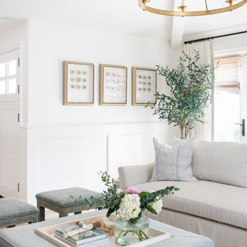
 White Sands Coastal Development
In Southern California there are pockets of darling cottages built in the early 20th century that we like to call jewelry boxes. They are quaint, full of charm and usually a bit cramped. Our clients have a growing family and needed a modern, functional home. They opted for a renovation that directly addressed their concerns.
When we first saw this 2,170 square-foot 3-bedroom beach cottage, the front door opened directly into a staircase and a dead-end hallway. The kitchen was cramped, the living room was claustrophobic and everything felt dark and dated.
The big picture items included pitching the living room ceiling to create space and taking down a kitchen wall. We added a French oven and luxury range that the wife had always dreamed about, a custom vent hood, and custom-paneled appliances.
We added a downstairs half-bath for guests (entirely designed around its whimsical wallpaper) and converted one of the existing bathrooms into a Jack-and-Jill, connecting the kids’ bedrooms, with double sinks and a closed-off toilet and shower for privacy.
In the bathrooms, we added white marble floors and wainscoting. We created storage throughout the home with custom-cabinets, new closets and built-ins, such as bookcases, desks and shelving.
White Sands Design/Build furnished the entire cottage mostly with commissioned pieces, including a custom dining table and upholstered chairs. We updated light fixtures and added brass hardware throughout, to create a vintage, bo-ho vibe.
The best thing about this cottage is the charming backyard accessory dwelling unit (ADU), designed in the same style as the larger structure. In order to keep the ADU it was necessary to renovate less than 50% of the main home, which took some serious strategy, otherwise the non-conforming ADU would need to be torn out. We renovated the bathroom with white walls and pine flooring, transforming it into a get-away that will grow with the girls.

 Twelve Stones Designs, LLC
The owners of this kitchen had spent the money to upgrade the finishes in their kitchen upon building the home 12 years ago, but after living in the space for several years they realized how nonfunctional the layout really was. The (then) two preschool aged children had grown into busy, hungry teenagers with many friends who also liked to hang out at the house. So the family needed a more functional kitchen with better traffic flow, space for daily activities revolving around the kitchen at different times of day, and a kitchen that could accommodate cooking for and serving large groups. Furthermore, the dark, traditional finishes no longer reflected the homeowners’ style. They requested a brighter, more relaxed, coastal style that reflected their love of the seaside cities they like to visit.
Originally, the kitchen was U-shaped with a narrow island in the middle. The island created narrow aisles that bottle-necked at the dishwasher, refrigerator, and cooktop areas. There was a pass-through from the foyer into the kitchen, but the owners never liked that the pass-through was also located so close to the powder room. The awkward proximity was unappealing and made guests feel uncomfortable.
The kitchen’s storage was made up of lots of narrow cabinets, apothecary drawers, clipped corner units, and very few drawers. It lacked useful storage for the larger items the family used on a daily basis. And the kitchen’s only pantry was small closet that had only builder-grade, narrow shelving with no illumination to be able to see the contents inside.
Overall, the kitchen’s lighting plan was poorly executed. Only six recessed cans illuminated the entire kitchen and nook areas. The under cabinet lighting was not evenly distributed either. In fact, the builder had mis-placed the under cabinet lighting around the decorative pilasters which made for choppy, dark cubbies. Further, the builder didn’t include any lighting over the sink or the bar area, which meant whoever was doing the dishes was always in their own shadow. That, coupled with the steep overhang of the game room above made the bar area feel like a dim, cavernous space that wasn’t inviting or task oriented. The kitchen looked out into the main living space, but the raised bar and a narrow wall (which held the only large cabinet in the kitchen) created more of a barrier than a relationship to the living room or breakfast nook. In fact, one couldn’t even see the breakfast nook from the cooktop or sink areas due to its orientation. The raised bar top was too narrow to comfortably sit to either dine at or chat from due to the lack of knee space. The the homeowners confided that the kitchen felt more like a dark, dirty prison than place where the family, or their guests, wanted to gather and commune.
The clients' needs and desires were:
➢ to create a kitchen that would be a space the family loved to be in; to relate to the adjacent spaces all around, and to have better flow for entertaining large groups
➢ to remove the walls between the breakfast nook and living area and to be able to utilize the natural light from the windows in both those areas
➢ to incorporate a functional chopping block for prepping fresh food for home cooked meals, an island with a large sink and drain board, 2 pull out trash cans, and seating for at least the 2 teens to eat or do homework
➢ to design a kitchen and breakfast nook with an airy, coastal, relaxed vibe that blended with the rest of the house's coastal theme
➢ to integrate a layered lighting plan which would include ample general illumination, specific task lighting, decorative lighting, and lots of illuminated storage
➢ to design a kitchen with not only more storage for all the husband’s kitchen gadgets and collection of oils and spices, but smart storage, including a coffee/breakfast bar and a place to store and conceal the toaster oven and microwave
➢ to find a way to utilize the large open space between the kitchen, pantry area, and breakfast nook
Twelve Stones Designs achieved the owner's goals by:
➢ removing the walls between the kitchen and living room to allow the natural light to filter in from the adjacent rooms and to create a connection between the kitchen, nook, and living spaces for a sense of unity and communion
➢ removing the existing pantry and designing 3 large pantry style cabinets with LED tape lights and rollout drawers to house lots of kitchen appliances, gadgets, and tons of groceries. We also took the cabinets all the way up to the 9’ ceiling for additional storage for seasonal items and bulk storage.
➢ designing 2 islands - 1 with a gorgeous black walnut chopping block that houses a drawer for chopping and carving knives and a custom double pull out trash unit for point of use utilization - and 1 that houses the dishwasher, a large Blanco Gourmet sink with integrated drain board, woven baskets for fresh root vegetables and kitchen towels, plenty of drawer storage for kitchen items, and bar seating for up to 4 diners.
➢ closing off the space between the kitchen and the powder room to create a beautiful new private alcove for the powder room as well as adding some decorative storage. This also gave us space to include more tall storage near the new range for precision placement of the husband’s extensive oil and spice collection as well as a location for a combo-steam oven the wife wanted for baking and cooking healthy meals.
The project is enhanced functionally by:
➢ incorporated USB and standard receptacles for the kids’ laptops and phone charging in the large island
➢ designing the small island to include additional open shelving for items used on a daily basis such as a variety of bowls, plates, and colanders. This set up also works well for the husband who prefers to “plate” his dinners in restaurant-style fashion before presenting them to the table.
➢ the integration of specific storage units, such as double stacked cutlery drawers, a custom spice pull-out, a Kuerig coffee and tea pod drawer, and custom double stacked utensil drawers
➢ moving the refrigerator to the old oven location - this eliminated the bottle neck as well as created a better relationship to the eating table. It also utilizes the floor space between the pantry, nook, and kitchen
➢ creating a banquet style breakfast nook - this banquette seating not only doubles the amount of seating for large gatherings but it better utilizes the odd space between the kitchen and the previous nook area. It also helps to create a distinct pathway from the mudroom room through the pantry area, kitchen, nook, and living room.
➢ the coffee/breakfast bar area which includes the perfect location for the concealed microwave and toaster oven, convenient storage for the coffee pods and tea accoutrements. Roll-out drawers below also house the smoothie maker, hot water kettle, and a plethora of smoothie-making ingredients such as protein powders, smoothie additives, etc. Furthermore, the drawers below the Keurig house measuring utensil, cutlery, baking supplies and tupperware storage.
➢ incorporating lots of wide drawers and pullouts to accommodate large cookware.
➢ utilizing as much vertical space as possible by building storage to the ceiling which accommodates the family’s abundant amount of serving platters, baking sheets, bakeware, casserole dishes, and additional cutting boards.
The project is enhanced aesthetically by:
➢ new 5-piece Versailles pattern porcelain tile that now seamlessly joins the entire down stairs area together creating a bright, cohesiveness feeling instead of choppy separated spaces - it also adds a coastal feeling
➢ designing a cabinet to conceal the microwave and toaster oven
➢ the coastal influenced light fixtures over the nook table and island
➢ the sandy colors of the Langdon Cambria countertops. The swirling pattern and sparkling quartz pieces remind the homeowner of black-and-tan sandy beaches
➢ the striped banquet seating whose creamy white background and blue-green stripes were the inspiration for the cabinet and wall colors.
➢ All the interior doors were painted black to coordinate with the blacks and grays in the backsplash tile and countertop. This also adds a hint of tailored formality to an otherwise casual space.
➢ the use of WAC's Oculux small aperture LED units for the overhead lighting complimented with Diode LED strips for task lighting under the cabinets and inside the pantry and glass wall cabinets. All of the lighting applications are on separate dimmer switches.
Innovative uses of materials or construction methods by Realty Restoration LLC:
➢ Each 1-1/2” x 3” block of reclaimed end-grain black walnut that makes up the center island chopping block was hand milled and built in the shop. It was designed to look substantial and proportional to the surrounding elements, executed by creating the 4 inch tall top with a solid wood chamfered edge band.
➢ The metal doors on either side of the vent hood were also custom designed for this project and built in the Realty Restoration LLC shop. They are made 1x2, 11-gauge mild steel with ribbed glass. Weighing 60 lbs a piece, heavy duty cabinet hinges were added to support the weight of the door and keep them from sagging.
➢ Under-cabinet receptacles were added along the range wall in order to have a clean, uninterrupted backsplash.
Design obstacles to overcome:
➢ Because we were removing the demising walls between the kitchen and living room, we had to find a way to plumb and vent the new island. We did this by tunneling through the slab (the slab had post tension cables which prevented us from just trenching) to run a new wet vent through a nearby structural wall. We pulled the existing hot and cold lines between upper floor joists and ran them down the structural wall as well and up through a conduit in the tunnel.
➢ Since we were converting from wall overs to a gas range it allowed us to utilize the 220 feed for the wall ovens to provide a new sub panel for all the new kitchen circuits
➢ Due to framing deficiencies inherited from the original build there was a 1-1/2” differential in the floor-to-ceiling height over a 20 foot span; by utilizing the process of cutting and furring coupled with the crown moulding details on the cabinet elevations we were able to mask the problem and provide seamless transitions between the cabinet components.
Evidence of superior craftsmanship:
➢ uniquely designed, one-of-a-kind metal “X” end panels on the large island. The end panels were custom made in the Realty Restoration LLC shop and fitted to the exact dimensions of the island. The welding seams are completely indistinguishable - the posts look like they are cut from a single sheet of metal
➢ square metal posts on the small island were also custom made and designed to compliment and carry through the metal element s throughout the kitchen
➢ the beautiful, oversized end panels on the pantry cabinets which give the breakfast nook a tailored look
➢ integrating a large format 5 piece Versailles tile pattern to seamlessly flow from the existing spaces into the new kitchen space
➢ By constructing a custom cabinet that jogged around a corner we could not remodel (housing the entry way coat closet) we were able to camouflage the adjacent wall offset within the upper and lower cabinets. By designing around the existing jog in the structural walls we accomplished a few things: we were able to find the space to house, and hide, the microwave and toaster oven yet still have a clean cohesive appearance from the kitchen side. Additionally, the owners were able to keep their much needed coat closet and we didn’t have to increase the budget with unnecessary structural work.
 Klopf Architecture
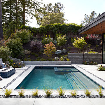
Klopf Architecture, Arterra Landscape Architects and Henry Calvert of Calvert Ventures Designed and built a new warm, modern, Eichler-inspired, open, indoor-outdoor home on a deeper-than-usual San Mateo Highlands property where an original Eichler house had burned to the ground.
The owners wanted multi-generational living and larger spaces than the original home offered, but all parties agreed that the house should respect the neighborhood and blend in stylistically with the other Eichlers. At first the Klopf team considered re-using what little was left of the original home and expanding on it. But after discussions with the owner and builder, all parties agreed that the last few remaining elements of the house were not practical to re-use, so Klopf Architecture designed a new home that pushes the Eichler approach in new directions.
One disadvantage of Eichler production homes is that the house designs were not optimized for each specific lot. A new custom home offered the team a chance to start over. In this case, a longer house that opens up sideways to the south fit the lot better than the original square-ish house that used to open to the rear (west). Accordingly, the Klopf team designed an L-shaped “bar” house with a large glass wall with large sliding glass doors that faces sideways instead of to the rear like a typical Eichler. This glass wall opens to a pool and landscaped yard designed by Arterra Landscape Architects.
Driving by the house, one might assume at first glance it is an Eichler because of the horizontality, the overhanging flat roof eaves, the dark gray vertical siding, and orange solid panel front door, but the house is designed for the 21st Century and is not meant to be a “Likeler.” You won't see any posts and beams in this home. Instead, the ceiling decking is a western red cedar that covers over all the beams. Like Eichlers, this cedar runs continuously from inside to out, enhancing the indoor / outdoor feeling of the house, but unlike Eichlers it conceals a cavity for lighting, wiring, and insulation. Ceilings are higher, rooms are larger and more open, the master bathroom is light-filled and more generous, with a separate tub and shower and a separate toilet compartment, and there is plenty of storage. The garage even easily fits two of today's vehicles with room to spare.
A massive 49-foot by 12-foot wall of glass and the continuity of materials from inside to outside enhance the inside-outside living concept, so the owners and their guests can flow freely from house to pool deck to BBQ to pool and back.
During construction in the rough framing stage, Klopf thought the front of the house appeared too tall even though the house had looked right in the design renderings (probably because the house is uphill from the street). So Klopf Architecture paid the framer to change the roofline from how we had designed it to be lower along the front, allowing the home to blend in better with the neighborhood. One project goal was for people driving up the street to pass the home without immediately noticing there is an "imposter" on this lot, and making that change was essential to achieve that goal.
This 2,606 square foot, 3 bedroom, 3 bathroom Eichler-inspired new house is located in San Mateo in the heart of the Silicon Valley.
Klopf Architecture Project Team: John Klopf, AIA, Klara Kevane
Landscape Architect: Arterra Landscape Architects
Contractor: Henry Calvert of Calvert Ventures
Photography ©2016 Mariko Reed
Location: San Mateo, CA
Year completed: 2016
 Isla Homes
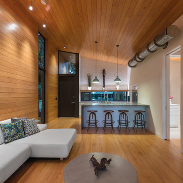
I built this on my property for my aging father who has some health issues. Handicap accessibility was a factor in design. His dream has always been to try retire to a cabin in the woods. This is what he got.
It is a 1 bedroom, 1 bath with a great room. It is 600 sqft of AC space. The footprint is 40' x 26' overall.
The site was the former home of our pig pen. I only had to take 1 tree to make this work and I planted 3 in its place. The axis is set from root ball to root ball. The rear center is aligned with mean sunset and is visible across a wetland.
The goal was to make the home feel like it was floating in the palms. The geometry had to simple and I didn't want it feeling heavy on the land so I cantilevered the structure beyond exposed foundation walls. My barn is nearby and it features old 1950's "S" corrugated metal panel walls. I used the same panel profile for my siding. I ran it vertical to match the barn, but also to balance the length of the structure and stretch the high point into the canopy, visually. The wood is all Southern Yellow Pine. This material came from clearing at the Babcock Ranch Development site. I ran it through the structure, end to end and horizontally, to create a seamless feel and to stretch the space. It worked. It feels MUCH bigger than it is.
I milled the material to specific sizes in specific areas to create precise alignments. Floor starters align with base. Wall tops adjoin ceiling starters to create the illusion of a seamless board. All light fixtures, HVAC supports, cabinets, switches, outlets, are set specifically to wood joints. The front and rear porch wood has three different milling profiles so the hypotenuse on the ceilings, align with the walls, and yield an aligned deck board below. Yes, I over did it. It is spectacular in its detailing. That's the benefit of small spaces.
Concrete counters and IKEA cabinets round out the conversation.
For those who cannot live tiny, I offer the Tiny-ish House.
Photos by Ryan Gamma
Staging by iStage Homes
Design Assistance Jimmy Thornton
 Alair Homes Plano
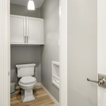
Our clients called us wanting to not only update their master bathroom but to specifically make it more functional. She had just had knee surgery, so taking a shower wasn’t easy. They wanted to remove the tub and enlarge the shower, as much as possible, and add a bench. She really wanted a seated makeup vanity area, too. They wanted to replace all vanity cabinets making them one height, and possibly add tower storage. With the current layout, they felt that there were too many doors, so we discussed possibly using a barn door to the bedroom.
We removed the large oval bathtub and expanded the shower, with an added bench. She got her seated makeup vanity and it’s placed between the shower and the window, right where she wanted it by the natural light. A tilting oval mirror sits above the makeup vanity flanked with Pottery Barn “Hayden” brushed nickel vanity lights. A lit swing arm makeup mirror was installed, making for a perfect makeup vanity! New taller Shiloh “Eclipse” bathroom cabinets painted in Polar with Slate highlights were installed (all at one height), with Kohler “Caxton” square double sinks. Two large beautiful mirrors are hung above each sink, again, flanked with Pottery Barn “Hayden” brushed nickel vanity lights on either side. Beautiful Quartzmasters Polished Calacutta Borghini countertops were installed on both vanities, as well as the shower bench top and shower wall cap.
Carrara Valentino basketweave mosaic marble tiles was installed on the shower floor and the back of the niches, while Heirloom Clay 3x9 tile was installed on the shower walls. A Delta Shower System was installed with both a hand held shower and a rainshower. The linen closet that used to have a standard door opening into the middle of the bathroom is now storage cabinets, with the classic Restoration Hardware “Campaign” pulls on the drawers and doors. A beautiful Birch forest gray 6”x 36” floor tile, laid in a random offset pattern was installed for an updated look on the floor. New glass paneled doors were installed to the closet and the water closet, matching the barn door. A gorgeous Shades of Light 20” “Pyramid Crystals” chandelier was hung in the center of the bathroom to top it all off!
The bedroom was painted a soothing Magnetic Gray and a classic updated Capital Lighting “Harlow” Chandelier was hung for an updated look.
We were able to meet all of our clients needs by removing the tub, enlarging the shower, installing the seated makeup vanity, by the natural light, right were she wanted it and by installing a beautiful barn door between the bathroom from the bedroom! Not only is it beautiful, but it’s more functional for them now and they love it!
Design/Remodel by Hatfield Builders & Remodelers | Photography by Versatile Imaging

Sponsored
Sunbury, OH

J.Holderby - Renovations
Franklin County's Leading General Contractors - 2X Best of Houzz!

 Elizabeth Lawson Design
Photography by Jennifer Hughes
Transitional medium tone wood floor kitchen photo in Baltimore with a farmhouse sink, shaker cabinets, black cabinets, marble countertops, stainless steel appliances, marble backsplash and white countertops
Transitional medium tone wood floor kitchen photo in Baltimore with a farmhouse sink, shaker cabinets, black cabinets, marble countertops, stainless steel appliances, marble backsplash and white countertops
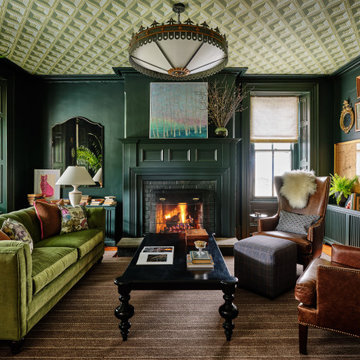
 Camden Grace LLC
If a Hot Toddy could be a room, this would be it. Warm, cozy, and inviting with a dash of cinnamon to spice it up. The living room before was a blank (think greige) slate. The mantle had lost its grandeur so we rebuilt it with more generous proportions. The ceiling wallpaper really inspired our design and is made by Adelph, a boutique artisanal company that specializes in historically accurate block-printed wallpapers. The pattern is circa 1807 and called “Philadelphia” – such a coincidence given this home is located just 20 miles from the city.
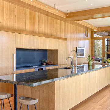
 Bushman Dreyfus Architects
Virginia AIA Honor Award for Excellence in Residential Design | This house is designed around the simple concept of placing main living spaces and private bedrooms in separate volumes, and linking the two wings with a well-organized kitchen. In doing so, the southern living space becomes a pavilion that enjoys expansive glass openings and a generous porch. Maintaining a geometric self-confidence, this front pavilion possesses the simplicity of a barn, while its large, shadowy openings suggest shelter from the elements and refuge within.
The interior is fitted with reclaimed elm flooring and vertical grain white oak for windows, bookcases, cabinets, and trim. The same cypress used on the exterior comes inside on the back wall and ceiling. Belgian linen drapes pocket behind the bookcases, and windows are glazed with energy-efficient, triple-pane, R-11 Low-E glass.
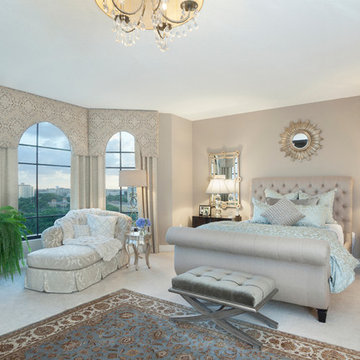
 Catherine Caporaso, ASID
Ben Moore #HC-86 Wall Color
Bedroom - transitional carpeted bedroom idea in Miami with gray walls and no fireplace
Bedroom - transitional carpeted bedroom idea in Miami with gray walls and no fireplace

Sponsored
Columbus, OH

Wannemacher Interiors
Customized Award-Winning Interior Design Solutions in Franklin Cnty OH
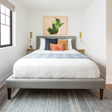
 Kimberlee Marie Interiors
This one is near and dear to my heart. Not only is it in my own backyard, it is also the first remodel project I've gotten to do for myself! This space was previously a detached two car garage in our backyard. Seeing it transform from such a utilitarian, dingy garage to a bright and cheery little retreat was so much fun and so rewarding! This space was slated to be an AirBNB from the start and I knew I wanted to design it for the adventure seeker, the savvy traveler, and those who appreciate all the little design details . My goal was to make a warm and inviting space that our guests would look forward to coming back to after a full day of exploring the city or gorgeous mountains and trails that define the Pacific Northwest. I also wanted to make a few bold choices, like the hunter green kitchen cabinets or patterned tile, because while a lot of people might be too timid to make those choice for their own home, who doesn't love trying it on for a few days?At the end of the day I am so happy with how it all turned out!
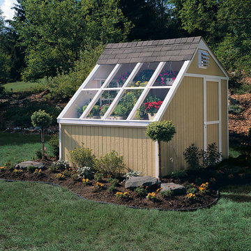
 Backyard Buildings
Is it a shed or greenhouse? We like to call it a Greenhouse shed due to it's storage capacity and four windows that let in plenty of light. This shed can certainly store stuff, but the true assets of this building is the amount of control you have to grow plants. You have complete control of how much light comes in. You can even add a power ventilating fan so you can control the temperature inside. You will love the Aurora, but so will your plants.
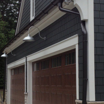
 Great Lakes Gutter Inc
This particular homeowner was so happy that the gutters looked so good it's all anyone who came over talked about. He called our project manager, and said 'I spent 10 times more for my siding, paint, and wood embellishments, and the only thing people comment on when they come over is how awesome my gutters are. Great Customer with impeccable taste.
26