
Search results for "Space saving ideas" in Home Design Ideas

 Waypoint Living Spaces
Inspiration for a huge country beige floor and travertine floor eat-in kitchen remodel in DC Metro with recessed-panel cabinets, white cabinets, stainless steel appliances, no island, an undermount sink, concrete countertops and gray backsplash
 Boyce Design + Build
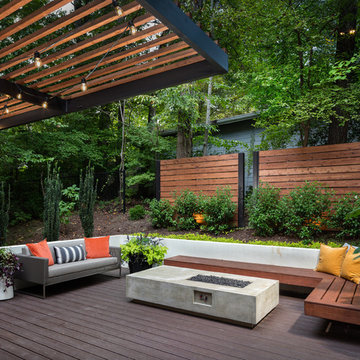
The upper level of this gorgeous Trex deck is the central entertaining and dining space and includes a beautiful concrete fire table and a custom cedar bench that floats over the deck. Light brown custom cedar screen walls provide privacy along the landscaped terrace and compliment the warm hues of the decking. Clean, modern light fixtures are also present in the deck steps, along the deck perimeter, and throughout the landscape making the space well-defined in the evening as well as the daytime.
 Idea Space Architecture + Design
Photography by Anna Herbst
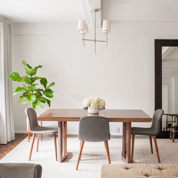
Mid-sized 1950s dark wood floor and brown floor great room photo in New York with gray walls and no fireplace
Mid-sized 1950s dark wood floor and brown floor great room photo in New York with gray walls and no fireplace
Find the right local pro for your project
 Simply Home Decorating
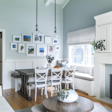
This tiny home is located on a treelined street in the Kitsilano neighborhood of Vancouver. We helped our client create a living and dining space with a beach vibe in this small front room that comfortably accommodates their growing family of four. The starting point for the decor was the client's treasured antique chaise (positioned under the large window) and the scheme grew from there. We employed a few important space saving techniques in this room... One is building seating into a corner that doubles as storage, the other is tucking a footstool, which can double as an extra seat, under the custom wood coffee table. The TV is carefully concealed in the custom millwork above the fireplace. Finally, we personalized this space by designing a family gallery wall that combines family photos and shadow boxes of treasured keepsakes. Interior Decorating by Lori Steeves of Simply Home Decorating. Photos by Tracey Ayton Photography
 Keitaro Yoshioka Photography
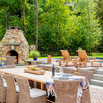
Backyard living space photography project in Norwell, MA
Brickstone Masonry Inc
Boston Design Guide
Keitaro Yoshioka Photography
Inspiration for a timeless backyard brick patio remodel in Boston with a fireplace and no cover
Inspiration for a timeless backyard brick patio remodel in Boston with a fireplace and no cover
![[Bracketed Space] House](https://st.hzcdn.com/fimgs/7f110a4c07d2cecd_5921-w360-h360-b0-p0--.jpg)
 Matt Fajkus Architecture
The site descends from the street and is privileged with dynamic natural views toward a creek below and beyond. To incorporate the existing landscape into the daily life of the residents, the house steps down to the natural topography. A continuous and jogging retaining wall from outside to inside embeds the structure below natural grade at the front with flush transitions at its rear facade. All indoor spaces open up to a central courtyard which terraces down to the tree canopy, creating a readily visible and occupiable transitional space between man-made and nature.
The courtyard scheme is simplified by two wings representing common and private zones - connected by a glass dining “bridge." This transparent volume also visually connects the front yard to the courtyard, clearing for the prospect view, while maintaining a subdued street presence. The staircase acts as a vertical “knuckle,” mediating shifting wing angles while contrasting the predominant horizontality of the house.
Crips materiality and detailing, deep roof overhangs, and the one-and-half story wall at the rear further enhance the connection between outdoors and indoors, providing nuanced natural lighting throughout and a meaningful framed procession through the property.
Photography
Spaces and Faces Photography
 TKS Design Group
WATCH the time lapse video of this kitchen remodel: https://youtu.be/caemXXlauLU
Free ebook, Creating the Ideal Kitchen. DOWNLOAD NOW
This Glen Ellyn homeowner came to us, frustrated with the layout and size of their current kitchen, looking for help generating ideas for how to maximize functionality within the constraints of the space. After visiting with them and seeing the home’s layout, I realized that looking at the bigger picture of how they used the entire first floor might bring us some dramatic solutions. We ended up flipping the kitchen and family room and taking down the wall separating the two creating one big open floor plan for the family to enjoy. There is still a visual separation between the rooms because of their different lengths and the overall space now relates nicely to the dining room which was also opened up to both rooms.
The new kitchen is an L-shaped space that is no longer cramped and small and is truly a cook’s dream. The fridge is on one end, a large cooktop and sink are located along the main perimeter and double ovens located at the end of the “L” complete the layout. Ample work surface along the perimeter and on the large island makes entertaining a breeze. An existing door to the patio remains, floods the room with light and provides easy access to the existing outdoor deck for entertaining and grilling.
White cabinetry with quartz countertops, Carrera marble backsplash tile and a contrasting gray island give the space a clean and modern feel. The gray pendant lights and stainless appliances bring a slight industrial feel to the space letting you know that some serious cooking will take place here.
Once we had their Dream Kitchen design completed, the homeowners decided to tackle another project at the same time. We made plans to create a master suite upstairs by combining two existing bedrooms into a larger bedroom, bathroom and walk-in closet. The existing spaces were not overly large so getting everything on the wish list into the design was a challenge. In the end, we came up with a design that works. The two bedrooms were adjoined, one wall moved back slightly to make for a slightly larger bedroom, and the remaining space was allotted to the new bathroom and a walk in closet.
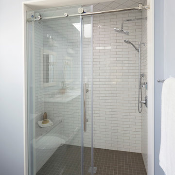
The bathroom consists of a double vanity and a large shower with a barn door shower door. A skylight brings light into the space and helps make it feel larger and more open. The new walk-in closet is accessible through the bathroom, and we even managed to fit in a small entry vestibule that houses some additional storage and makes a nice transition from the hallway. A white vanity, Carrera tops and gray floor tile make for a serene space that feels just right for this home.
Designed by: Susan Klimala, CKD, CBD
Photography by: Mike Kaskel
For more information on kitchen and bath design ideas go to: www.kitchenstudio-ge.com

 Renovisions
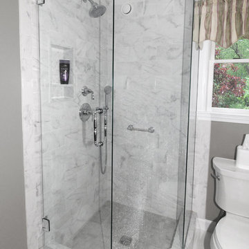
Renovisions recently remodeled a first-floor bath for this South Shore couple. They needed a better solution to their existing, outdated fiberglass shower stall and had difficulty squatting to enter the shower. As bathroom designers, we realize that a neo-angle shower is a simple and minimalistic design option where space is a premium. The clipped corner creates an angled opening that allows easy access to the shower between other fixtures in the bathroom.
This new shower has a curb using a combination of glass and tile for the walls. Taking advantage of every possible inch for the shower made an enormous difference in comfort while showering. A traditional shower head along with a multi-function hand-held shower head and a shampoo niche both save space and provide a relaxing showering experience. The custom 3/8″ thick glass shower enclosure with mitered corners provides a clean and seamless appearance. The vanity’s bead-board design in sage green compliments the unique veining and hues in the quartz countertop.
Overall, the clients were ecstatic with their newly transformed bathroom and are eager to share it with friends and family. One friend in fact, exclaimed that the bathroom resembled one she had seen in a five star resort!
 Jason Todd Home Design
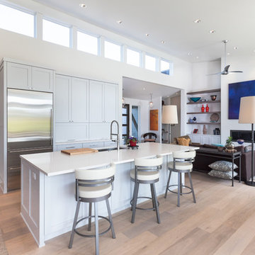
Clerestory windows to bring in added light and save on wall space.
Overall - single level modern home on golf course with peak-aboo mtn views. The design was an open concept with multiple sitting options.
Kitchen is the hub of activity so adding an extra sitting area allows the chef to move freely while still engaging with guests in an open environment.
The direction from the owner was to have lots of light and clear views of the mountains and golf course. She also wanted lots of wall space for art which was important to her.
It's easy to put lots of windows in, but how do you decide which walls get windows and which get art?
Regarding the lot: There’s a golf bunker near the lot so the challenge was to get up high enough, still be a single level home. We designed the home to step up from the garage to achieve views.
Greg Welch Construction: http://gregwelchconstruction.com/
Interiors finishes: Legum Design: https://www.legumdesign.com/
Photo credit: Cheryl McIntosh of www.greatthingsaredone.com
 InnovationLand
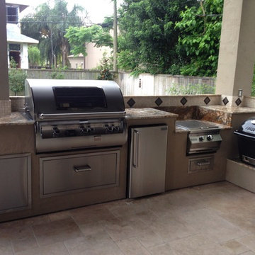
This Houston outdoor kitchen and entertaining area offers a modern take on Mediterranean style.
Designed and built by Outdoor Homescapes of Houston, this fully loaded family and entertaining space echoes the stucco, travertine tile patio and Mediterranean style of the existing home while exuding a more modern, transitional style.
“This was a high-profile client – both VPs of different oil and gas companies who entertain affluent guests on a regular basis – so they wanted to make sure they had high-end appliances and all the latest amenities they could order,” says Lisha Maxey, senior designer for Outdoor Homescapes and owner of LGH Design Services in Houston. “They also have two kids, ages 7 and 10, and wanted a family gathering space that better accompanied their new, luxurious pool.”
What really sets apart this outside kitchen design idea, however, is the way the elements are used throughout the space.
“Usually, outdoor kitchen designs for a backyard are grouped into one island or cabinet,” explains Outdoor Homescapes of Houston owner Wayne Franks. “But here, the patio, roof and fireplace were all in place, separated by stucco columns, and the outdoor kitchen elements had to work around them.”
A 14-foot-long cooking island houses a built-in Fire Magic grill with a Magic View Window (allows the chef to check on food without lifting the lid and losing valuable heat). The island, the countertop of which is "Carnaval" granite from Lackstone, also features a Fire Magic power burner, warming drawer and trash drawer. On one side of the fireplace, forming an “L” with the cooking island, sits a built-in Primo ceramic grill.
On the other side of the fireplace is a 3-foot-long cabinet housing a bar with a wine cooler, ice maker and upper cabinet. And finally, just outside the patio door is a 7-foot-long cabinet with a modern Kohler sink with a high-arc Moen faucet (sink and faucet from Faucets Direct), a trash drawer and another upper cabinet.
Outdoor Homescapes of Houston, by the way, outfitted both cabinets with glass inserts, custom pulls and three-way sensor lighting.
“At the beginning, this was basically a blank space with a fireplace in the middle,” says Maxey. So Outdoor Homescapes upgraded the fireplace with Austin Stack Stone in white (No. 401) from Colorstonescreenshot vickers mosaic tile rectangle. "The stone added that pop,” notes Maxey.
The fireplace’s espresso-colored, distressed wood mantel (from Mantels.com) and upper wood cabinets were both stained with the Minwax color Jacobean. The ceiling fans were also updated with ones featuring similarly espresso-colored, wooden fan blades, to match.
The table in the middle - a cast-iron, Mediterranean style gem with hand-forged scrollwork designs from Patio 1 in Houston – seats 10.
“We wanted this kind of Mediterranean feel,” says Maxey. “We wanted rustic, but the appliance package was so new, with all its stainless steel, so we kept a the cabinets and the columns stucco instead of stone for a more clean, modern look and then did the custom tile backsplash and mosaic in more of a rustic, Mediterranean look."
The backsplash is a 1-inch travertine tile background with 4-inch square metallic insets, both from Floor & Decor. The tile for the 18-by-24-inch rectangle mosaic came from Great Britain Tile Co. and included a Dianno Reale tumbled border and background. The bronze, diamond-shaped insets are tumbled Dark Emperdor tile and the scrolls are tumbled Noce tile.
The client, who admits they have high standards, was more than pleased with the project – especially browsing through Outdoor Homescapes’ vast library of patio kitchen design ideas, the 3D virtual video tour that let them preview the project from every angle before construction. They also liked the personalized design consultation.
"OH provides a very neat service where one of their designers will either shop/buy for you or shop with you for the more detailed pieces that will finish your home," reads the client's review on Houzz. "This was a very positive, personalized feature ... Lisha helped narrow down an enormous marketplace of materials and finishes to a few we could choose from."
 Advance Design Studio, Ltd.
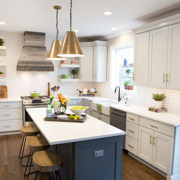
After six years of living in their Huntley IL home, Chris and Meghan were tired of their dark, dingy, outdated kitchen and it was finally time for a long-anticipated change. “The kitchen is the place where we live, it’s where we do everything,” Meghan said. “It was important that it be a space where we wanted to be.” Meghan loves cooking and enjoys including their girls in healthy meal prepping, this led them to want a brighter, more enjoyable kitchen with increased functionality and improved storage.
For Chris especially, the laundry room was an entirely dysfunctional eyesore. “We had a washer and a dryer, but it was all kind-of cobbled together!” Chris said. “There were always laundry piles everywhere, we weren’t really sure what we wanted to do in there, but it was time for us to make a change.” The mess of the space was stressful every time they walked in the door from the garage each day. Kids’ backpacks and shoes piled up haphazardly in the makeshift boot-bench closet left the family feeling disorganized and stressed. They needed space for folding clothes and locker cubbies to help keep the family organized.
Having known Christine and Todd in the Huntley community for years, Chris and Meghan were familiar with their work. “We already trusted them personally and having seen their projects for years we knew they did top notch work. After we reviewed the initial round of designs, we knew that hiring them was definitely the right choice,” Meghan and Chris said. Although Chris had done a lot of work in their home himself, the kitchen and laundry room renovation was such a large undertaking that he didn’t want to steal time away from his family to spend what would surely be many long weekends doing the job himself. “That would not have been a wise choice for us,” Chris laughed.
“Our designer, Michelle was very, very, easy to work with; anything we wanted to see or weren’t sure about, she went above and beyond to make this easy for us. She was easy to get hold of and always quick to respond,” the couple said. Michelle pulled ideas that mirrored the couple’s taste and style and was adept at directing the couple to limited choices that didn’t overwhelm them and kept the process moving. “I have a hard time making decisions. Michelle made the decision-making process so easy. I loved how she listened to what I liked and then presented three great options for me to choose from,” Meghan said.
The main objectives for the kitchen were better storage solutions, they wanted the space to reflect their lifestyle and taste, and they wanted it to last for years with low maintenance. One of the first steps in creating a more functional kitchen was relocating the refrigerator, creating an improved workflow for the busy family.
“We didn’t know that we could even move the refrigerator to a new location where it is now, that was something that we never would have thought of,” Chris said. “The new refrigerator location makes the kitchen feel so much bigger. We didn’t add any space, but our whole kitchen with the new design just seems like it’s so much larger than before!” Meghan said.
The perimeter mist colored cabinets helped warm and brighten the entire room, while the graphite colored cabinets on the island added contrast. Using this fresh, clean color palette satisfied the couple’s desire for a bright space that was the exact opposite of what they had before. Organization accessories were also added to the cabinets such as a spice drawer tray and roll outs to create hidden convenience.
“I absolutely love the hidden spices – it makes cooking so much more enjoyable!” Chris said. “And all the pull outs, and the double trash bin, who would think you could get so excited about organization!” the couple said in unison.
One thing they hated in their original kitchen was how dark the space felt. Added lighting on the ceiling with the new light fixtures combined with the lighter cabinetry colors throughout solved this problem. “Our new kitchen has this warm, almost cozy feeling that our old kitchen never had, it’s just a space that I love spending my time in now,” Meghan said. The light airy feeling was accentuated with the use of floating white shelves on either side of the decorative range hood. “We have so much cabinetry space, the new design is amazing we actually have more storage space than we will ever need,” Meghan said.
The island was extended to create more work surface and added space for stool seating. “The new island changes how we live. Now the kids can be in the kitchen with us, doing homework, eating breakfast, and the three of us have special dinners there when Chris is working late,” Meghan said.
The Carrara Marmi Quartz countertops were chosen because they are, not only beautiful, but are made from hard-working material that doesn’t require maintenance. The white subway tile backsplash that wraps to the ceiling behind the focal point cooktop range/hood compliments the crisp white countertops perfectly, while brushed brass hardware and light fixtures keep the design fresh and new.
The couple had a few fears at the beginning of the project, as most homeowners do. Their biggest fear was being out of their kitchen and laundry room for an extended time. The crew made it very easy for the family to work in a limited space keeping the washer and dryer hooked up the majority of the time, and also getting appliances working with minimal downtime.
“They above and beyond accommodated us to get us through the process,” Meghan said. “They did a great job making sure we were as comfortable as possible throughout the process,” Chris added.
“Our project manager DJ did a great job. He was very good at updating us on schedule changes, getting guys in as quickly as possible. Everyone that stepped in the house was nice and did great work,” said Chris. They thought Advance’s carpenter was phenomenal and were impressed when he took a conceptual idea from a photograph and worked with designer Michelle to create a one of a kind range/hood that has become the topic of conversation with friends and family who visit the new kitchen. “He was in our house literally every day for several weeks. He was easy to work with and good at what he did,” Meghan and Chris said.
The focal point of the kitchen; a hand-crafted, custom-built ventilation hood was clad with handpicked reclaimed barnwood. Advance Design’s carpenter built the framework and the cladding to create a one-of-a-kind design element that the couple loves.
“I think it was especially fun for him to create something unique from scratch, showcasing his talent in this area,” Meghan said. “I love that my kitchen is not like everyone else’s. I got to pick out the wood on my hood and watch it being built and was able to choose what pieces of wood went where on it. It’s totally unique.”
Red Oak flooring was toothed-in throughout the kitchen and the rest of the first floor anywhere changes were made. Then the whole floor was refinished to tone down the orange undertones in the existing floor stain, ultimately changing the color complexion of the entire first floor. The result is a completely new feeling to the entire home.
Renovating the laundry room was extremely important to Meghan and Chris, but they had trouble visualizing what the possibilities were for the seemingly small space. Michelle produced beautiful 3D illustrations that helped them envision the space in a whole new way.
“I must have told Michelle 100 times that I am a visual person, seeing the designs in 3D made it so easy to make decisions and see what we could really do with our space,” Meghan said.
A dividing wall and doorway were removed between the existing laundry room and hallway formerly containing a coat closet, providing space to design specialized graphite colored cabinetry matching the kitchen island to house custom storage cubbies for each family member. Adding the tall utility cabinetry in the new laundry area helped solve the storage issue, tucking away cleaning supplies, household items, and even the cat got its own cubby.
“I love how everything is now hidden in its own space. I can’t tell you how much I hated coming home and seeing everything sitting around on counters,” Chris said.
Electrical outlets were planned for the inside of utility cabinets, so devices could charge in hidden locations. Stacking the washer and dryer allowed for wider countertop space to provide a folding area and a special space for clothes to hang. “The way I do laundry has been completely transformed! I can actually fold clothes and hang them now right out of the washer and dryer,” Meghan said.
“The end result in the kitchen and the laundry/mud room was an updated light and bright space, with a smarter work flow that better meets the needs of this family,” Michelle said.
“I would totally recommend Advance Design,” Meghan said. “Sometimes I sit and just look at my kitchen and laundry room and think ‘Wow, I can’t believe I get to live here!’ It’s an understatement to say we love our new space.”
 J Lewis Building Ltd
Oliver Weber Photography
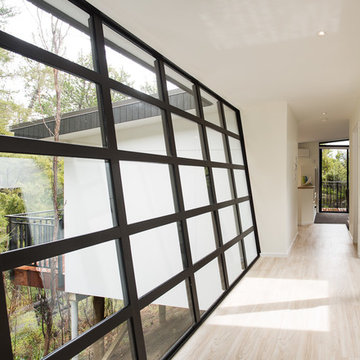
Inspiration for a small contemporary light wood floor hallway remodel with white walls
Inspiration for a small contemporary light wood floor hallway remodel with white walls
 Forward Design Build Remodel
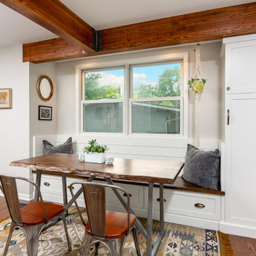
Honestly we're not sure what's better than a window seat.
Kitchen/dining room combo - small transitional brown floor and medium tone wood floor kitchen/dining room combo idea in Detroit with gray walls and no fireplace
Kitchen/dining room combo - small transitional brown floor and medium tone wood floor kitchen/dining room combo idea in Detroit with gray walls and no fireplace


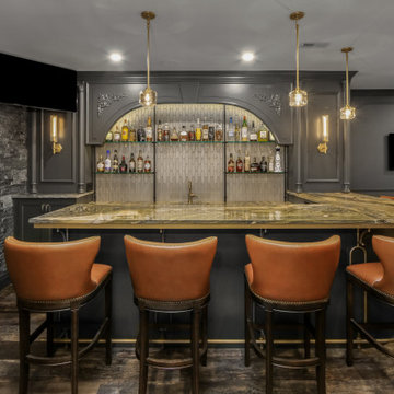
 Architectural Justice
This lower level remodel transforms the basement into a sophisticated entertaining space, centered around a custom-designed home bar. Rich custom millwork and thoughtfully integrated metal accents add depth, texture, and a refined architectural feel throughout the space.
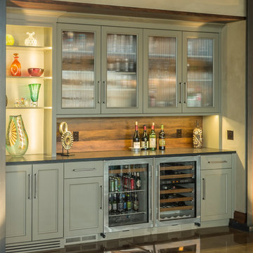
 PB Kitchen Design
The key to this project was to create a kitchen fitting of a residence with strong Industrial aesthetics. The PB Kitchen Design team managed to preserve the warmth and organic feel of the home’s architecture. The sturdy materials used to enrich the integrity of the design, never take away from the fact that this space is meant for hospitality. Functionally, the kitchen works equally well for quick family meals or large gatherings. But take a closer look at the use of texture and height. The vaulted ceiling and exposed trusses bring an additional element of awe to this already stunning kitchen.
Project specs: Cabinets by Quality Custom Cabinetry. 48" Wolf range. Sub Zero integrated refrigerator in stainless steel.
Project Accolades: First Place honors in the National Kitchen and Bath Association’s 2014 Design Competition
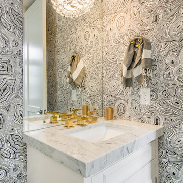
 Lane Myers Construction
Located in the Avenues of the heart of Salt Lake City, this craftsman style home leaves us astounded. Upon demolition of the existing home, this custom home was built to showcase what exactly Lane Myers Construction could deliver on when we are given numerous constraints. With a floor plan designed to open up what would have been considered a confined space, attention to tiny details and the custom finishes were just the cusp of what we took the time to create
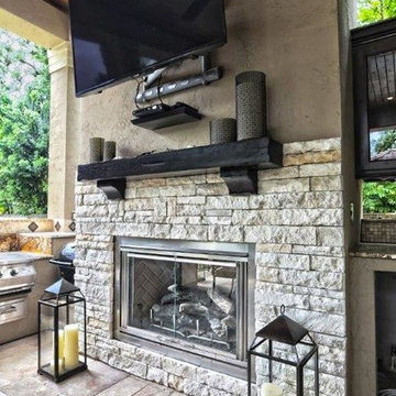 InnovationLand
This Houston outdoor kitchen and entertaining area offers a modern take on Mediterranean style.
Designed and built by Outdoor Homescapes of Houston, this fully loaded family and entertaining space echoes the stucco, travertine tile patio and Mediterranean style of the existing home while exuding a more modern, transitional style.
“This was a high-profile client – both VPs of different oil and gas companies who entertain affluent guests on a regular basis – so they wanted to make sure they had high-end appliances and all the latest amenities they could order,” says Lisha Maxey, senior designer for Outdoor Homescapes and owner of LGH Design Services in Houston. “They also have two kids, ages 7 and 10, and wanted a family gathering space that better accompanied their new, luxurious pool.”
What really sets apart this outside kitchen design idea, however, is the way the elements are used throughout the space.
“Usually, outdoor kitchen designs for a backyard are grouped into one island or cabinet,” explains Outdoor Homescapes of Houston owner Wayne Franks. “But here, the patio, roof and fireplace were all in place, separated by stucco columns, and the outdoor kitchen elements had to work around them.”
A 14-foot-long cooking island houses a built-in Fire Magic grill with a Magic View Window (allows the chef to check on food without lifting the lid and losing valuable heat). The island, the countertop of which is "Carnaval" granite from Lackstone, also features a Fire Magic power burner, warming drawer and trash drawer. On one side of the fireplace, forming an “L” with the cooking island, sits a built-in Primo ceramic grill.
On the other side of the fireplace is a 3-foot-long cabinet housing a bar with a wine cooler, ice maker and upper cabinet. And finally, just outside the patio door is a 7-foot-long cabinet with a modern Kohler sink with a high-arc Moen faucet (sink and faucet from Faucets Direct), a trash drawer and another upper cabinet.
Outdoor Homescapes of Houston, by the way, outfitted both cabinets with glass inserts, custom pulls and three-way sensor lighting.
“At the beginning, this was basically a blank space with a fireplace in the middle,” says Maxey. So Outdoor Homescapes upgraded the fireplace with Austin Stack Stone in white (No. 401) from Colorstonescreenshot vickers mosaic tile rectangle. "The stone added that pop,” notes Maxey.
The fireplace’s espresso-colored, distressed wood mantel (from Mantels.com) and upper wood cabinets were both stained with the Minwax color Jacobean. The ceiling fans were also updated with ones featuring similarly espresso-colored, wooden fan blades, to match.
The table in the middle - a cast-iron, Mediterranean style gem with hand-forged scrollwork designs from Patio 1 in Houston – seats 10.
“We wanted this kind of Mediterranean feel,” says Maxey. “We wanted rustic, but the appliance package was so new, with all its stainless steel, so we kept a the cabinets and the columns stucco instead of stone for a more clean, modern look and then did the custom tile backsplash and mosaic in more of a rustic, Mediterranean look."
The backsplash is a 1-inch travertine tile background with 4-inch square metallic insets, both from Floor & Decor. The tile for the 18-by-24-inch rectangle mosaic came from Great Britain Tile Co. and included a Dianno Reale tumbled border and background. The bronze, diamond-shaped insets are tumbled Dark Emperdor tile and the scrolls are tumbled Noce tile.
The client, who admits they have high standards, was more than pleased with the project – especially browsing through Outdoor Homescapes’ vast library of patio kitchen design ideas, the 3D virtual video tour that let them preview the project from every angle before construction. They also liked the personalized design consultation.
"OH provides a very neat service where one of their designers will either shop/buy for you or shop with you for the more detailed pieces that will finish your home," reads the client's review on Houzz. "This was a very positive, personalized feature ... Lisha helped narrow down an enormous marketplace of materials and finishes to a few we could choose from."
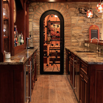
Sponsored
Delaware, OH

Buckeye Basements, Inc.
Central Ohio's Basement Finishing ExpertsBest Of Houzz '13-'21
 Alair Homes Plano
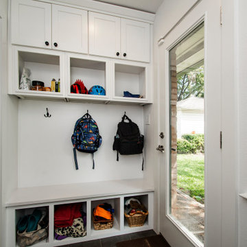
Our clients purchased this 1950 ranch style cottage knowing it needed to be updated. They fell in love with the location, being within walking distance to White Rock Lake. They wanted to redesign the layout of the house to improve the flow and function of the spaces while maintaining a cozy feel. They wanted to explore the idea of opening up the kitchen and possibly even relocating it. A laundry room and mudroom space needed to be added to that space, as well. Both bathrooms needed a complete update and they wanted to enlarge the master bath if possible, to have a double vanity and more efficient storage. With two small boys and one on the way, they ideally wanted to add a 3rd bedroom to the house within the existing footprint but were open to possibly designing an addition, if that wasn’t possible.
In the end, we gave them everything they wanted, without having to put an addition on to the home. They absolutely love the openness of their new kitchen and living spaces and we even added a small bar! They have their much-needed laundry room and mudroom off the back patio, so their “drop zone” is out of the way. We were able to add storage and double vanity to the master bathroom by enclosing what used to be a coat closet near the entryway and using that sq. ft. in the bathroom. The functionality of this house has completely changed and has definitely changed the lives of our clients for the better!
 TKS Design Group
Download our free ebook, Creating the Ideal Kitchen. DOWNLOAD NOW
For many, extra time at home during COVID left them wanting more from their homes. Whether you realized the shortcomings of your space or simply wanted to combat boredom, a well-designed and functional home was no longer a want, it became a need. Tina found herself wanting more from her Old Irving Park home and reached out to The Kitchen Studio about adding function to her kitchen to make the most of the available real estate.
At the end of the day, there is nothing better than returning home to a bright and happy space you love. And this kitchen wasn’t that for Tina. Dark and dated, with a palette from the past and features that didn’t make the most of the available square footage, this remodel required vision and a fresh approach to the space. Lead designer, Stephanie Cole’s main design goal was better flow, while adding greater functionality with organized storage, accessible open shelving, and an overall sense of cohesion with the adjoining family room.
The original kitchen featured a large pizza oven, which was rarely used, yet its footprint limited storage space. The nearby pantry had become a catch-all, lacking the organization needed in the home. The initial plan was to keep the pizza oven, but eventually Tina realized she preferred the design possibilities that came from removing this cumbersome feature, with the goal of adding function throughout the upgraded and elevated space. Eliminating the pantry added square footage and length to the kitchen for greater function and more storage. This redesigned space reflects how she lives and uses her home, as well as her love for entertaining.
The kitchen features a classic, clean, and timeless palette. White cabinetry, with brass and bronze finishes, contrasts with rich wood flooring, and lets the large, deep blue island in Woodland’s custom color Harbor – a neutral, yet statement color – draw your eye.
The kitchen was the main priority. In addition to updating and elevating this space, Tina wanted to maximize what her home had to offer. From moving the location of the patio door and eliminating a window to removing an existing closet in the mudroom and the cluttered pantry, the kitchen footprint grew. Once the floorplan was set, it was time to bring cohesion to her home, creating connection between the kitchen and surrounding spaces.
The color palette carries into the mudroom, where we added beautiful new cabinetry, practical bench seating, and accessible hooks, perfect for guests and everyday living. The nearby bar continues the aesthetic, with stunning Carrara marble subway tile, hints of brass and bronze, and a design that further captures the vibe of the kitchen.
Every home has its unique design challenges. But with a fresh perspective and a bit of creativity, there is always a way to give the client exactly what they want [and need]. In this particular kitchen, the existing soffits and high slanted ceilings added a layer of complexity to the lighting layout and upper perimeter cabinets.
While a space needs to look good, it also needs to function well. This meant making the most of the height of the room and accounting for the varied ceiling features, while also giving Tina everything she wanted and more. Pendants and task lighting paired with an abundance of natural light amplify the bright aesthetic. The cabinetry layout and design compliments the soffits with subtle profile details that bring everything together. The tile selections add visual interest, drawing the eye to the focal area above the range. Glass-doored cabinets further customize the space and give the illusion of even more height within the room.
While her family may be grown and out of the house, Tina was focused on adding function without sacrificing a stunning aesthetic and dreamy finishes that make the kitchen the gathering place of any home. It was time to love her kitchen again, and if you’re wondering what she loves most, it’s the niche with glass door cabinetry and open shelving for display paired with the marble mosaic backsplash over the range and complimenting hood. Each of these features is a stunning point of interest within the kitchen – both brag-worthy additions to a perimeter layout that previously felt limited and lacking.
Whether your remodel is the result of special needs in your home or simply the excitement of focusing your energy on creating a fun new aesthetic, we are here for it. We love a good challenge because there is always a way to make a space better – adding function and beauty simultaneously.
 Kaplan Thompson Architects
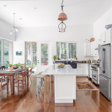
A young family with a wooded, triangular lot in Ipswich, Massachusetts wanted to take on a highly creative, organic, and unrushed process in designing their new home. The parents of three boys had contemporary ideas for living, including phasing the construction of different structures over time as the kids grew so they could maximize the options for use on their land.
They hoped to build a net zero energy home that would be cozy on the very coldest days of winter, using cost-efficient methods of home building. The house needed to be sited to minimize impact on the land and trees, and it was critical to respect a conservation easement on the south border of the lot.
Finally, the design would be contemporary in form and feel, but it would also need to fit into a classic New England context, both in terms of materials used and durability. We were asked to honor the notions of “surprise and delight,” and that inspired everything we designed for the family.
The highly unique home consists of a three-story form, composed mostly of bedrooms and baths on the top two floors and a cross axis of shared living spaces on the first level. This axis extends out to an oversized covered porch, open to the south and west. The porch connects to a two-story garage with flex space above, used as a guest house, play room, and yoga studio depending on the day.
A floor-to-ceiling ribbon of glass wraps the south and west walls of the lower level, bringing in an abundance of natural light and linking the entire open plan to the yard beyond. The master suite takes up the entire top floor, and includes an outdoor deck with a shower. The middle floor has extra height to accommodate a variety of multi-level play scenarios in the kids’ rooms.
Many of the materials used in this house are made from recycled or environmentally friendly content, or they come from local sources. The high performance home has triple glazed windows and all materials, adhesives, and sealants are low toxicity and safe for growing kids.
Photographer credit: Irvin Serrano
53