
Search results for "Space transforms" in Home Design Ideas

 Change Your Bathroom©
The goal of this project was to upgrade the builder grade finishes and create an ergonomic space that had a contemporary feel. This bathroom transformed from a standard, builder grade bathroom to a contemporary urban oasis. This was one of my favorite projects, I know I say that about most of my projects but this one really took an amazing transformation. By removing the walls surrounding the shower and relocating the toilet it visually opened up the space. Creating a deeper shower allowed for the tub to be incorporated into the wet area. Adding a LED panel in the back of the shower gave the illusion of a depth and created a unique storage ledge. A custom vanity keeps a clean front with different storage options and linear limestone draws the eye towards the stacked stone accent wall.
Houzz Write Up: https://www.houzz.com/magazine/inside-houzz-a-chopped-up-bathroom-goes-streamlined-and-swank-stsetivw-vs~27263720
The layout of this bathroom was opened up to get rid of the hallway effect, being only 7 foot wide, this bathroom needed all the width it could muster. Using light flooring in the form of natural lime stone 12x24 tiles with a linear pattern, it really draws the eye down the length of the room which is what we needed. Then, breaking up the space a little with the stone pebble flooring in the shower, this client enjoyed his time living in Japan and wanted to incorporate some of the elements that he appreciated while living there. The dark stacked stone feature wall behind the tub is the perfect backdrop for the LED panel, giving the illusion of a window and also creates a cool storage shelf for the tub. A narrow, but tasteful, oval freestanding tub fit effortlessly in the back of the shower. With a sloped floor, ensuring no standing water either in the shower floor or behind the tub, every thought went into engineering this Atlanta bathroom to last the test of time. With now adequate space in the shower, there was space for adjacent shower heads controlled by Kohler digital valves. A hand wand was added for use and convenience of cleaning as well. On the vanity are semi-vessel sinks which give the appearance of vessel sinks, but with the added benefit of a deeper, rounded basin to avoid splashing. Wall mounted faucets add sophistication as well as less cleaning maintenance over time. The custom vanity is streamlined with drawers, doors and a pull out for a can or hamper.
A wonderful project and equally wonderful client. I really enjoyed working with this client and the creative direction of this project.
Brushed nickel shower head with digital shower valve, freestanding bathtub, curbless shower with hidden shower drain, flat pebble shower floor, shelf over tub with LED lighting, gray vanity with drawer fronts, white square ceramic sinks, wall mount faucets and lighting under vanity. Hidden Drain shower system. Atlanta Bathroom.

 Dig Your Garden Landscape Design
With a limited budget, we were able to transform and update this front garden with a new modern pathway and small patio using full range Connecticut bluestone. Bulbine frutescens 'Hallmark' was planted along the pathway in mass. A variety of other low-water and low-maintenance plants. The black mulch completes this modern landscape design transformation. I included a selection of plants that provide a variety of heights, colors and textures. A great alternative to water- thirsty lawns, especially important for Northern California gardens. Photos taken 1 year after installation. Design and photo © Eileen Kelly, Dig Your Garden Landscape Design http://www.digyourgarden.com/portfolio/midcenturymodern.html

 Misiaszek Turpin pllc
The 800 square-foot guest cottage is located on the footprint of a slightly smaller original cottage that was built three generations ago. With a failing structural system, the existing cottage had a very low sloping roof, did not provide for a lot of natural light and was not energy efficient. Utilizing high performing windows, doors and insulation, a total transformation of the structure occurred. A combination of clapboard and shingle siding, with standout touches of modern elegance, welcomes guests to their cozy retreat.
The cottage consists of the main living area, a small galley style kitchen, master bedroom, bathroom and sleeping loft above. The loft construction was a timber frame system utilizing recycled timbers from the Balsams Resort in northern New Hampshire. The stones for the front steps and hearth of the fireplace came from the existing cottage’s granite chimney. Stylistically, the design is a mix of both a “Cottage” style of architecture with some clean and simple “Tech” style features, such as the air-craft cable and metal railing system. The color red was used as a highlight feature, accentuated on the shed dormer window exterior frames, the vintage looking range, the sliding doors and other interior elements.
Photographer: John Hession
Find the right local pro for your project

 L Marie Interior Design
Clients' first home and there forever home with a family of four and in laws close, this home needed to be able to grow with the family. This most recent growth included a few home additions including the kids bathrooms (on suite) added on to the East end, the two original bathrooms were converted into one larger hall bath, the kitchen wall was blown out, entrying into a complete 22'x22' great room addition with a mudroom and half bath leading to the garage and the final addition a third car garage. This space is transitional and classic to last the test of time.
 Furniture Row
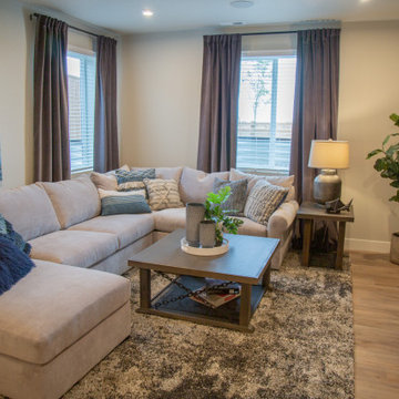
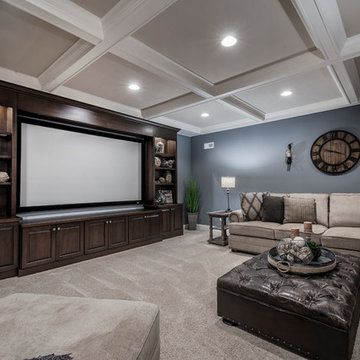
We transformed the Denver St. Jude Dream Home basement into a stylish and functional living space and home office. The centerpiece of this transformation is the Jennifer 3 Pc. Sectional, a contemporary piece that perfectly fits the space and provides ample seating for family and guests.
To complement the sectional, we incorporated a series of pieces from the Whiskey River collection. The Whiskey River Sofa Table, Whiskey River Credenza, Whiskey River Hutch, and Whiskey River End Table seamlessly tie the living area into the home office, creating a cohesive and stylish look.
To add character and depth, we introduced a variety of accents and decor that blend different styles. In the office space, the Bealle Table Lamp brings a touch of eclectic and contemporary flair. Meanwhile, the living area features an Industrial Desk Lamp, adding an industrial edge to the overall design.

 MILIEU
A tub shower transformed into a standing open shower. A concrete composite vanity top incorporates the sink and counter making it low maintenance.
Photography by
Jacob Hand

 Studio Dearborn
INTERNATIONAL AWARD WINNER. 2018 NKBA Design Competition Best Overall Kitchen. 2018 TIDA International USA Kitchen of the Year. 2018 Best Traditional Kitchen - Westchester Home Magazine design awards.
The designer's own kitchen was gutted and renovated in 2017, with a focus on classic materials and thoughtful storage. The 1920s craftsman home has been in the family since 1940, and every effort was made to keep finishes and details true to the original construction. For sources, please see the website at www.studiodearborn.com. Photography, Adam Kane Macchia and Timothy Lenz
Sponsored
Fredericksburg, OH

High Point Cabinets
Columbus' Experienced Custom Cabinet Builder | 4x Best of Houzz Winner
 FineLine Kitchens, Inc.
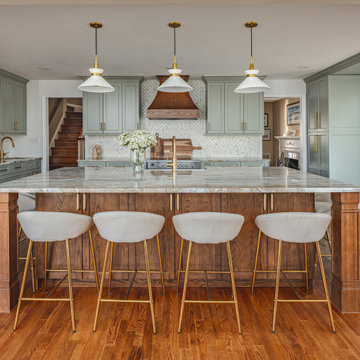
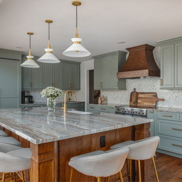
Hi everyone, I'm Sarah and Ogun we are here with fine line kitchens. So we are a couple working together. I do the interior design and remodeling of the space material selection meeting with the clients. And I handled operations outside, you know meaning all the construction work that is taking place the inside. The houses that we work in. I handle all the aspects of the construction, so today's project is very special. We're in Vienna and the client had a very big family. It's a family of seven that lives here. So we had a few aspects that we needed to keep in mind while designing this one. Having everybody be able to sit on the island. So we wanted plenty of seating all the way around. We didn't want anybody standing or anything like that. So what we did is we maximize the space. The center island is the biggest part of the kitchen. We use a natural stone to kind of give it a beautiful texture versus quartz. It's kind of standard white or kind of fabricated, so I wanted something very natural. We did this because I took my inspiration from the outside, so the inspiration if you look at the view right in front of me is there are so many greens there's a lot of brass accents and I wanted to bring this. Into this kitchen while designing it for my clients. She is very warm very. She wanted a very homey, comfy kind of look for the kitchen. So that's what we did today. As you can see, the cabinets are sage green, very light, so I still think it's a neutral, but it's a lighter color that again brings the outside in and we combine that with the oak right behind me so it's a slightly warm oak. It's not very dark. It's not very light. It's a medium brown and the same color went on the island. To kind of tie these two in and the backsplash, my favorite part is where you can see a little bit of design. It is, in my opinion still classic, but includes a pattern so the outside part is as we said in the beginning, is handled by my husband. I'd like him to speak a little bit about that. Thanks, Sarah, I want to talk to you guys a little bit about the construction part of this project. Originally this kitchen was located mostly in this area. They had their stove there sing. It was more of a peninsula layout in Sarah's and the customer vision they wanted. They wanted to get rid of the peninsula and they want to be able to have a huge island that can at least sit seven people because they're familiar with seven. So we wanted to make sure that we can achieve this design and bring it to life so that they can be happy with this layout. Some of the challenges we had, the house, the home being, you know, old home. There were a lot of you know the older electrical and plumbing that had to be replaced. We had to relocate the stove from here to this area. Over here we had put a nice foot fan that we had to relocate all the ductwork and the plumbing. Was being on the peninsula area. We had to relocate it to the center islands. So we achieved all this and kind of like bring it to bring in this kitchen up to date it looks beautiful. That's true, so yes, the old layout did not function for my clients because everything was kind of gathered on one side of the kitchen. So there was like a peninsula right there. So the end of this island kind of continued straight. And that was just the L shape. Kind of where everything was and there used to be another big table here, so they were using only kind of half of the space. So like I said at the beginning, our vision was to kind of feed everybody at the island, create some symmetry. 'cause I love that. So as you can see behind me, this is kind of the focal point symmetrical. Everything is kind of even we wanted to also panel the fridge here so it mimics the pantry and another size. So when you're looking at it, it is bringing again that symmetry back again. I hope you enjoyed this kitchen and this video and I'll see you soon. So how do you think this project turned out? It's nice. I like the color. I think it turned out nice. It's kind of like a little bit different color than what we always do. So I realize. Are you giving me a little bit of credit here that I did something different? Are you proud? I'm so proud of you. Other than that I like it. That they have kind of like a two sink. So if this was our kitchen, if we ever like you can have your own. I can have mine if we ever get into a fight then this can be like my own kitchen. Why are we gonna bring in a fight right now? So I'm cooking anyway. You're grilling most of the time, So what are you even talking about? My kitchen? That's my kitchen. You can just take the small sink. That's fine. It's always good to have your own space right there, so anyways. Thank you guys for watching. We hope to see you soon and if you have any questions please click the link below. It'll lead you to our website, house, YouTube and all of the social media is so nice to have you guys. We'll see you soon. Thanks bye bye-bye.

 Michael K Chen Architecture
Photos by Alan Tansey Photographer
Bedroom - small modern medium tone wood floor bedroom idea in New York with white walls
Bedroom - small modern medium tone wood floor bedroom idea in New York with white walls

 Design Harmony
Design Dilemma: Our clients needed a place to store their beautiful bass and their extensive collection of books and records. Solution - We transformed this unused corner in the great room into a beautiful and functional storage space.
Using a subtle instrument rack so the client could easily remove the bass to play, we were able to showcase the bass as a work of art and make it a focal point in the space. We also added a rolling ladder to access the top of the bookshelf and to make the space more interesting.
Photo Credit: Holland Photography - Cory Holland - Hollandphotography.biz

 New England Design & Construction
This Brookline remodel took a very compartmentalized floor plan with hallway, separate living room, dining room, kitchen, and 3-season porch, and transformed it into one open living space with cathedral ceilings and lots of light.
photos: Abby Woodman

 FineLine Kitchens, Inc.
Hi everyone, I'm Sarah and Ogun we are here with fine line kitchens. So we are a couple working together. I do the interior design and remodeling of the space material selection meeting with the clients. And I handled operations outside, you know meaning all the construction work that is taking place the inside. The houses that we work in. I handle all the aspects of the construction, so today's project is very special. We're in Vienna and the client had a very big family. It's a family of seven that lives here. So we had a few aspects that we needed to keep in mind while designing this one. Having everybody be able to sit on the island. So we wanted plenty of seating all the way around. We didn't want anybody standing or anything like that. So what we did is we maximize the space. The center island is the biggest part of the kitchen. We use a natural stone to kind of give it a beautiful texture versus quartz. It's kind of standard white or kind of fabricated, so I wanted something very natural. We did this because I took my inspiration from the outside, so the inspiration if you look at the view right in front of me is there are so many greens there's a lot of brass accents and I wanted to bring this. Into this kitchen while designing it for my clients. She is very warm very. She wanted a very homey, comfy kind of look for the kitchen. So that's what we did today. As you can see, the cabinets are sage green, very light, so I still think it's a neutral, but it's a lighter color that again brings the outside in and we combine that with the oak right behind me so it's a slightly warm oak. It's not very dark. It's not very light. It's a medium brown and the same color went on the island. To kind of tie these two in and the backsplash, my favorite part is where you can see a little bit of design. It is, in my opinion still classic, but includes a pattern so the outside part is as we said in the beginning, is handled by my husband. I'd like him to speak a little bit about that. Thanks, Sarah, I want to talk to you guys a little bit about the construction part of this project. Originally this kitchen was located mostly in this area. They had their stove there sing. It was more of a peninsula layout in Sarah's and the customer vision they wanted. They wanted to get rid of the peninsula and they want to be able to have a huge island that can at least sit seven people because they're familiar with seven. So we wanted to make sure that we can achieve this design and bring it to life so that they can be happy with this layout. Some of the challenges we had, the house, the home being, you know, old home. There were a lot of you know the older electrical and plumbing that had to be replaced. We had to relocate the stove from here to this area. Over here we had put a nice foot fan that we had to relocate all the ductwork and the plumbing. Was being on the peninsula area. We had to relocate it to the center islands. So we achieved all this and kind of like bring it to bring in this kitchen up to date it looks beautiful. That's true, so yes, the old layout did not function for my clients because everything was kind of gathered on one side of the kitchen. So there was like a peninsula right there. So the end of this island kind of continued straight. And that was just the L shape. Kind of where everything was and there used to be another big table here, so they were using only kind of half of the space. So like I said at the beginning, our vision was to kind of feed everybody at the island, create some symmetry. 'cause I love that. So as you can see behind me, this is kind of the focal point symmetrical. Everything is kind of even we wanted to also panel the fridge here so it mimics the pantry and another size. So when you're looking at it, it is bringing again that symmetry back again. I hope you enjoyed this kitchen and this video and I'll see you soon. So how do you think this project turned out? It's nice. I like the color. I think it turned out nice. It's kind of like a little bit different color than what we always do. So I realize. Are you giving me a little bit of credit here that I did something different? Are you proud? I'm so proud of you. Other than that I like it. That they have kind of like a two sink. So if this was our kitchen, if we ever like you can have your own. I can have mine if we ever get into a fight then this can be like my own kitchen. Why are we gonna bring in a fight right now? So I'm cooking anyway. You're grilling most of the time, So what are you even talking about? My kitchen? That's my kitchen. You can just take the small sink. That's fine. It's always good to have your own space right there, so anyways. Thank you guys for watching. We hope to see you soon and if you have any questions please click the link below. It'll lead you to our website, house, YouTube and all of the social media is so nice to have you guys. We'll see you soon. Thanks bye bye-bye.
Sponsored
Delaware, OH

Buckeye Basements, Inc.
Central Ohio's Basement Finishing ExpertsBest Of Houzz '13-'21

 RW Anderson Homes
Interior Design by ecd Design LLC
This newly remodeled home was transformed top to bottom. It is, as all good art should be “A little something of the past and a little something of the future.” We kept the old world charm of the Tudor style, (a popular American theme harkening back to Great Britain in the 1500’s) and combined it with the modern amenities and design that many of us have come to love and appreciate. In the process, we created something truly unique and inspiring.
RW Anderson Homes is the premier home builder and remodeler in the Seattle and Bellevue area. Distinguished by their excellent team, and attention to detail, RW Anderson delivers a custom tailored experience for every customer. Their service to clients has earned them a great reputation in the industry for taking care of their customers.
Working with RW Anderson Homes is very easy. Their office and design team work tirelessly to maximize your goals and dreams in order to create finished spaces that aren’t only beautiful, but highly functional for every customer. In an industry known for false promises and the unexpected, the team at RW Anderson is professional and works to present a clear and concise strategy for every project. They take pride in their references and the amount of direct referrals they receive from past clients.
RW Anderson Homes would love the opportunity to talk with you about your home or remodel project today. Estimates and consultations are always free. Call us now at 206-383-8084 or email Ryan@rwandersonhomes.com.

 Anderson & Rodgers Construction
Example of a mid-sized country open concept medium tone wood floor and brown floor family room design with white walls and no fireplace


 Antonio Martins Interior Design
Country house pantry and bar. Walls covered with burlap are a perfect background for vintage working table that is transformed into counter. Floating shelves are made out of antique oak barn wood. antique portrait looks over the space.
photo by Drew Kellly
Sponsored
Columbus, OH

Hope Restoration & General Contracting
Columbus Design-Build, Kitchen & Bath Remodeling, Historic Renovations
 Asha Maía Design
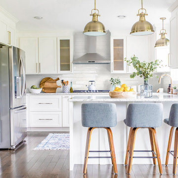
Transforming key spaces in a home can really change the overall look and feel, especially in main living areas such as a kitchen or primary bathroom! Our goal was to create a bright, fresh, and timeless design in each space. We accomplished this by incorporating white cabinetry and by swapping out the small, seemingly useless island for a large and much more functional peninsula. And to transform the primary bathroom into a serene sanctuary, we incorporated a new open and spacious glass shower enclosure as well as a luxurious free-standing soaking tub, perfect for ultimate relaxation.

 Hammer & Hand
Referred to inside H&H as “the basement of dreams,” this project transformed a raw, dark, unfinished basement into a bright living space flooded with daylight. Working with architect Sean Barnett of Polymath Studio, Hammer & Hand added several 4’ windows to the perimeter of the basement, a new entrance, and wired the unit for future ADU conversion.
This basement is filled with custom touches reflecting the young family’s project goals. H&H milled custom trim to match the existing home’s trim, making the basement feel original to the historic house. The H&H shop crafted a barn door with an inlaid chalkboard for their toddler to draw on, while the rest of the H&H team designed a custom closet with movable hanging racks to store and dry their camping gear.
Photography by Jeff Amram.


8