
Search results for "Specific items" in Home Design Ideas
 Combine 9 Design, LLC
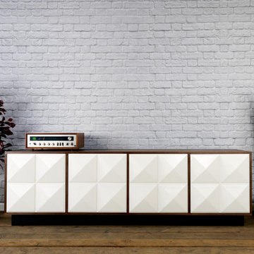
This modern credenza would make the perfect storage cabinet in nearly any environment. It is handcrafted by us here in the USA utilizing only the highest quality materials and it’s made to last a lifetime. It sits atop a black platform base (wrapped in vinyl to give a little texture). The raised geometric pattern of the doors add a touch of modernism. It is a very versatile piece and would be well-suited as a modern TV stand/console, credenza, buffet, or stylish sideboard.
Behind each door you’ll find an adjustable inner shelf for maximum flexibility. Push-to-open doors eliminate the need for handles or knobs on the front so as to not distract from the stylish, modern look of the doors.
In addition to making these in many different widths and heights, we can also build yours in nearly any configuration. Want a more “open”, “airy” look? We can make yours with an open middle section (meaning doors only on the outsides). Or, need drawers? We can do that as well!
It is shown here in rich brown walnut, but yours can be made in any of the woods shown on our wood options page.
Other door colors are available as well. For a more vintage look, consider our vintage orange doors. Or, for a more Hollywood glam look, go bold with our gold! See our other items for examples in different color and configurations.
Looking for a more mid-century look? Take a look at this unit with our tapered, gold spindle legs as opposed to the platform base.
For many years of trouble-free use, we use only top-of-the-line hardware (hinges, push to open mechanisms) from Blum and Salice. Only the highest quality furniture-grade veneers are used as well. Like any natural material, expect some slight variations in grain and coloration.
Using this to store electronic devices that need power? Let us know and we’re happy to add holes in the back for cables to exit for no additional charge.
Need a different width? Yours can be made with any number of doors.
Dimensions: approximately 82.75" wide x 19" deep x 25.25" high . (The dimensions are the exterior dimensions of the cabinet. The patterns on the doors will extend slightly past the cabinet)
Model: Regency (shown in walnut with white doors and platform base).
Please inquire for information and pricing on any changes you would like.
We also create many other custom pieces in this and other styles, so, please contact us if you are looking for conference tables, credenzas, industrial office shelving, or any other furniture. We would love to discuss how we can work together to design a unique piece to fit your needs!
To see more options and to learn more about us, visit us at: www.combine9.com
In addition to countless wonderful homeowners and small businesses around the country, some of our past clients include companies such as Google, Disney, Hilton Hotels, YouTube, Linked In, Living Social, Wyndham Hotels, Trip Advisor, Hard Rock Hotel & Casino, Vans Shoes, Vibram Shoes, Mishimoto, Starwood Hotels, and Bose retail stores. We’ve also been in numerous national publications and TV shows including HGTV’s “House Hunters”, a nation-wide Verizon TV commercial, a nation-wide Microsoft TV commercial, NBC’s “About a Boy” TV show, Dwell (for their Dwell Labs exhibit), Sound & Vision magazine, Living Spaces magazine, etc. We’ve even had several A-list celebrities (that we’ve been asked to not mention by name)!
ABOUT US: We create custom, unique furniture, unlike anything you will find. Our intention is to give you a piece of furniture that you will admire and enjoy for years to come and that will leave your house-guests envious. Our work is handcrafted in the United States and made to last a lifetime. These unique pieces fit perfectly with any urban/modern, mid-century, or rustic décor. All of our pieces can be made in many configurations and sizes to suit your specific style and needs. There are many options available as each piece is designed just for you, so, if you have any thoughts, please contact us and we would be happy to let you know what your options are.
* All rights reserved; Combine 9 Design, LLC
 C.E. Pontz Sons
Dream backyard
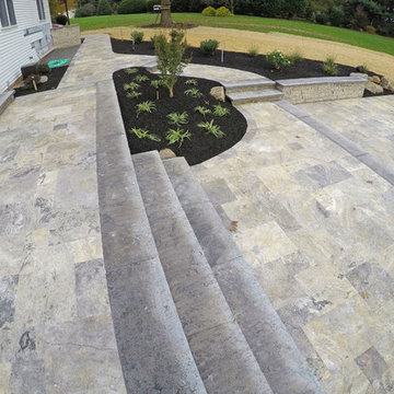
This Amazing Dream Backyard Project features just about all the options you have ever dreamed about having in your very own backyard. We just recently completed this project and as you can tell from the video and photos below it’s quite the dream backyard. But dreams can came true, and for these homeowners they certainly have. So proud of our team for coming together and installing another amazing backyard paradise. The outdoor living area features everything from fire to water and includes multiple travertine patio areas, flagstone and travertine walkways, stone steps, pondless waterfall, landscape lighting, outdoor audio, fire pit, and landscaping. To think were the project came from a decrepit old deck to this beautiful work of art is almost unreal!
Travertine Patio and Fire Pit
The dream backyard project included the installation of various hardscape items including travertine patio, Seating walls, Steps, and walkways. The patio material is silver travertine laid in French pattern. The patio area is approximately 1,012 sq ft with antiqued finish and natural edge. All walls and steps are constructed using natural stone Semco ‘Cedar Ridge’ sawn wall stone. Caps and stair treads are constructed of natural stone ‘Chateau Limestone’ 2″ thick and 14″ deep, thermal top and rock faced edges. Cap stone for grill wall is 18″ wide polished and sealed top. Under grill area the patio is outdoor ‘wood look’ porcelain tile. A Semco ‘Cedar Ridge’ 57″ Fire Pit with Large Zentro ‘Smokeless’ insert is installed on the lower patio area. As of these pictures and this video the fire pit insert has yet to be installed. Sealing of Travertine surfaces using GST stain blocking sealer will be completed once the project is entirely finished. Stepping stone pathway to the side of the home is full color Pa Flagstone irregular steppers.
Landscaping
Landscape beds, plants, trees, edging and mulching was done around the entire back and side yards of the home using triple cut bark mulch. Plant variety and size specifications were all chosen by our amazing designer Wes. The landscaping portion of this project also included the grading, lawn repair, and seeding of all the areas damaged and disturbed during construction.
Pondless Waterfall
A 15′ pondless waterfall was installed into the new landscape to the side of the lower patio for maximum viewing. The waterfall features approximately 15 foot of stream with multiple waterfalls. Two side by side spillways merge into a wide stream with a small waterfall before turning and going into the final falls at the basin area. The Waterfall is outfitted with low voltage LED underwater landscape lighting throughout.
Outdoor Sound
The Outdoor Sound System installed was a TRU Audio 4 speaker system and 12″ outdoor hardscape subwoofer. This system also includes the amplifier which is located in the home owners basement as well as Apple Airport Express and Blue Tooth Connection.
Siding
Siding work to be completed is still unfinished as of the time this video and pictures were shot. Siding was removed and salvaged in areas need for the patio and electrical work. Siding in areas of new outdoor living space to include: new vinyl siding on entire rear kitchen/bathroom wall from top to bottom as well as Piecing in around lights and sliding door on adjacent wall and in back of garage.

Find the right local pro for your project

 Thompson Remodeling
The owners of this beautiful historic farmhouse had been painstakingly restoring it bit by bit. One of the last items on their list was to create a wrap-around front porch to create a more distinct and obvious entrance to the front of their home.
Aside from the functional reasons for the new porch, our client also had very specific ideas for its design. She wanted to recreate her grandmother’s porch so that she could carry on the same wonderful traditions with her own grandchildren someday.
Key requirements for this front porch remodel included:
- Creating a seamless connection to the main house.
- A floorplan with areas for dining, reading, having coffee and playing games.
- Respecting and maintaining the historic details of the home and making sure the addition felt authentic.
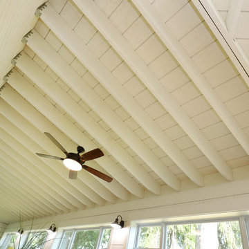
Upon entering, you will notice the authentic real pine porch decking.
Real windows were used instead of three season porch windows which also have molding around them to match the existing home’s windows.
The left wing of the porch includes a dining area and a game and craft space.
Ceiling fans provide light and additional comfort in the summer months. Iron wall sconces supply additional lighting throughout.
Exposed rafters with hidden fasteners were used in the ceiling.
Handmade shiplap graces the walls.
On the left side of the front porch, a reading area enjoys plenty of natural light from the windows.
The new porch blends perfectly with the existing home much nicer front facade. There is a clear front entrance to the home, where previously guests weren’t sure where to enter.
We successfully created a place for the client to enjoy with her future grandchildren that’s filled with nostalgic nods to the memories she made with her own grandmother.
"We have had many people who asked us what changed on the house but did not know what we did. When we told them we put the porch on, all of them made the statement that they did not notice it was a new addition and fit into the house perfectly.”
– Homeowner
 Advance Design Studio, Ltd.
After six years of living in their Huntley IL home, Chris and Meghan were tired of their dark, dingy, outdated kitchen and it was finally time for a long-anticipated change. “The kitchen is the place where we live, it’s where we do everything,” Meghan said. “It was important that it be a space where we wanted to be.” Meghan loves cooking and enjoys including their girls in healthy meal prepping, this led them to want a brighter, more enjoyable kitchen with increased functionality and improved storage.
For Chris especially, the laundry room was an entirely dysfunctional eyesore. “We had a washer and a dryer, but it was all kind-of cobbled together!” Chris said. “There were always laundry piles everywhere, we weren’t really sure what we wanted to do in there, but it was time for us to make a change.” The mess of the space was stressful every time they walked in the door from the garage each day. Kids’ backpacks and shoes piled up haphazardly in the makeshift boot-bench closet left the family feeling disorganized and stressed. They needed space for folding clothes and locker cubbies to help keep the family organized.
Having known Christine and Todd in the Huntley community for years, Chris and Meghan were familiar with their work. “We already trusted them personally and having seen their projects for years we knew they did top notch work. After we reviewed the initial round of designs, we knew that hiring them was definitely the right choice,” Meghan and Chris said. Although Chris had done a lot of work in their home himself, the kitchen and laundry room renovation was such a large undertaking that he didn’t want to steal time away from his family to spend what would surely be many long weekends doing the job himself. “That would not have been a wise choice for us,” Chris laughed.
“Our designer, Michelle was very, very, easy to work with; anything we wanted to see or weren’t sure about, she went above and beyond to make this easy for us. She was easy to get hold of and always quick to respond,” the couple said. Michelle pulled ideas that mirrored the couple’s taste and style and was adept at directing the couple to limited choices that didn’t overwhelm them and kept the process moving. “I have a hard time making decisions. Michelle made the decision-making process so easy. I loved how she listened to what I liked and then presented three great options for me to choose from,” Meghan said.
The main objectives for the kitchen were better storage solutions, they wanted the space to reflect their lifestyle and taste, and they wanted it to last for years with low maintenance. One of the first steps in creating a more functional kitchen was relocating the refrigerator, creating an improved workflow for the busy family.
“We didn’t know that we could even move the refrigerator to a new location where it is now, that was something that we never would have thought of,” Chris said. “The new refrigerator location makes the kitchen feel so much bigger. We didn’t add any space, but our whole kitchen with the new design just seems like it’s so much larger than before!” Meghan said.
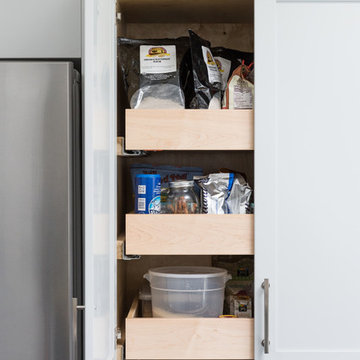
The perimeter mist colored cabinets helped warm and brighten the entire room, while the graphite colored cabinets on the island added contrast. Using this fresh, clean color palette satisfied the couple’s desire for a bright space that was the exact opposite of what they had before. Organization accessories were also added to the cabinets such as a spice drawer tray and roll outs to create hidden convenience.
“I absolutely love the hidden spices – it makes cooking so much more enjoyable!” Chris said. “And all the pull outs, and the double trash bin, who would think you could get so excited about organization!” the couple said in unison.
One thing they hated in their original kitchen was how dark the space felt. Added lighting on the ceiling with the new light fixtures combined with the lighter cabinetry colors throughout solved this problem. “Our new kitchen has this warm, almost cozy feeling that our old kitchen never had, it’s just a space that I love spending my time in now,” Meghan said. The light airy feeling was accentuated with the use of floating white shelves on either side of the decorative range hood. “We have so much cabinetry space, the new design is amazing we actually have more storage space than we will ever need,” Meghan said.
The island was extended to create more work surface and added space for stool seating. “The new island changes how we live. Now the kids can be in the kitchen with us, doing homework, eating breakfast, and the three of us have special dinners there when Chris is working late,” Meghan said.
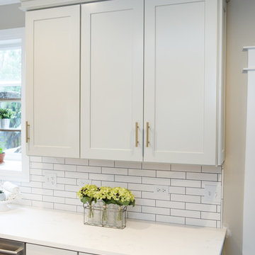
The Carrara Marmi Quartz countertops were chosen because they are, not only beautiful, but are made from hard-working material that doesn’t require maintenance. The white subway tile backsplash that wraps to the ceiling behind the focal point cooktop range/hood compliments the crisp white countertops perfectly, while brushed brass hardware and light fixtures keep the design fresh and new.
The couple had a few fears at the beginning of the project, as most homeowners do. Their biggest fear was being out of their kitchen and laundry room for an extended time. The crew made it very easy for the family to work in a limited space keeping the washer and dryer hooked up the majority of the time, and also getting appliances working with minimal downtime.
“They above and beyond accommodated us to get us through the process,” Meghan said. “They did a great job making sure we were as comfortable as possible throughout the process,” Chris added.
“Our project manager DJ did a great job. He was very good at updating us on schedule changes, getting guys in as quickly as possible. Everyone that stepped in the house was nice and did great work,” said Chris. They thought Advance’s carpenter was phenomenal and were impressed when he took a conceptual idea from a photograph and worked with designer Michelle to create a one of a kind range/hood that has become the topic of conversation with friends and family who visit the new kitchen. “He was in our house literally every day for several weeks. He was easy to work with and good at what he did,” Meghan and Chris said.
The focal point of the kitchen; a hand-crafted, custom-built ventilation hood was clad with handpicked reclaimed barnwood. Advance Design’s carpenter built the framework and the cladding to create a one-of-a-kind design element that the couple loves.
“I think it was especially fun for him to create something unique from scratch, showcasing his talent in this area,” Meghan said. “I love that my kitchen is not like everyone else’s. I got to pick out the wood on my hood and watch it being built and was able to choose what pieces of wood went where on it. It’s totally unique.”
Red Oak flooring was toothed-in throughout the kitchen and the rest of the first floor anywhere changes were made. Then the whole floor was refinished to tone down the orange undertones in the existing floor stain, ultimately changing the color complexion of the entire first floor. The result is a completely new feeling to the entire home.
Renovating the laundry room was extremely important to Meghan and Chris, but they had trouble visualizing what the possibilities were for the seemingly small space. Michelle produced beautiful 3D illustrations that helped them envision the space in a whole new way.
“I must have told Michelle 100 times that I am a visual person, seeing the designs in 3D made it so easy to make decisions and see what we could really do with our space,” Meghan said.
A dividing wall and doorway were removed between the existing laundry room and hallway formerly containing a coat closet, providing space to design specialized graphite colored cabinetry matching the kitchen island to house custom storage cubbies for each family member. Adding the tall utility cabinetry in the new laundry area helped solve the storage issue, tucking away cleaning supplies, household items, and even the cat got its own cubby.
“I love how everything is now hidden in its own space. I can’t tell you how much I hated coming home and seeing everything sitting around on counters,” Chris said.
Electrical outlets were planned for the inside of utility cabinets, so devices could charge in hidden locations. Stacking the washer and dryer allowed for wider countertop space to provide a folding area and a special space for clothes to hang. “The way I do laundry has been completely transformed! I can actually fold clothes and hang them now right out of the washer and dryer,” Meghan said.
“The end result in the kitchen and the laundry/mud room was an updated light and bright space, with a smarter work flow that better meets the needs of this family,” Michelle said.
“I would totally recommend Advance Design,” Meghan said. “Sometimes I sit and just look at my kitchen and laundry room and think ‘Wow, I can’t believe I get to live here!’ It’s an understatement to say we love our new space.”
 Terri Sears, Kitchen and Bath Designer
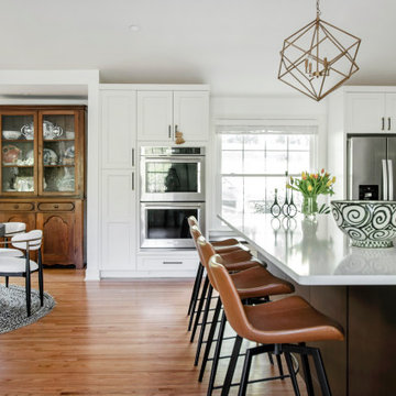
Example of a huge transitional u-shaped medium tone wood floor, brown floor and vaulted ceiling open concept kitchen design in Nashville with an undermount sink, recessed-panel cabinets, white cabinets, quartz countertops, white backsplash, porcelain backsplash, stainless steel appliances, an island and white countertops

Sponsored
Delaware, OH

Buckeye Basements, Inc.
Central Ohio's Basement Finishing ExpertsBest Of Houzz '13-'21
 TKS Design Group
Download our free ebook, Creating the Ideal Kitchen. DOWNLOAD NOW
This unit, located in a 4-flat owned by TKS Owners Jeff and Susan Klimala, was remodeled as their personal pied-à-terre, and doubles as an Airbnb property when they are not using it. Jeff and Susan were drawn to the location of the building, a vibrant Chicago neighborhood, 4 blocks from Wrigley Field, as well as to the vintage charm of the 1890’s building. The entire 2 bed, 2 bath unit was renovated and furnished, including the kitchen, with a specific Parisian vibe in mind.
Although the location and vintage charm were all there, the building was not in ideal shape -- the mechanicals -- from HVAC, to electrical, plumbing, to needed structural updates, peeling plaster, out of level floors, the list was long. Susan and Jeff drew on their expertise to update the issues behind the walls while also preserving much of the original charm that attracted them to the building in the first place -- heart pine floors, vintage mouldings, pocket doors and transoms.
Because this unit was going to be primarily used as an Airbnb, the Klimalas wanted to make it beautiful, maintain the character of the building, while also specifying materials that would last and wouldn’t break the budget. Susan enjoyed the hunt of specifying these items and still coming up with a cohesive creative space that feels a bit French in flavor.
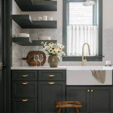
Parisian style décor is all about casual elegance and an eclectic mix of old and new. Susan had fun sourcing some more personal pieces of artwork for the space, creating a dramatic black, white and moody green color scheme for the kitchen and highlighting the living room with pieces to showcase the vintage fireplace and pocket doors.
Photographer: @MargaretRajic
Photo stylist: @Brandidevers
Do you have a new home that has great bones but just doesn’t feel comfortable and you can’t quite figure out why? Contact us here to see how we can help!
 LandArt
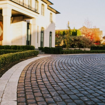
A magnificent cobblestone driveway horseshoes around to a modern French Chateau estate.
These homeowners were looking for a comprehensive landscape plan for their newly completed custom home. They wanted an extensive driveway, a planting plan that would provide privacy in some key areas while accentuating the style of the home, as well as a pool, fire feature, hot tub, new stone entrances, and a play center on artificial turf. We provided a design that brought together all these items with a very specific colour palette which we repeated throughout different elements.
 Amazing Spaces
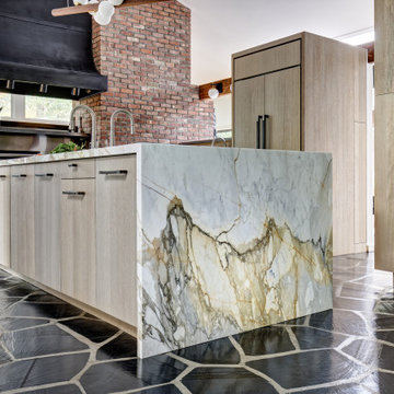
This is a great house. Perched high on a private, heavily wooded site, it has a rustic contemporary aesthetic. Vaulted ceilings, sky lights, large windows and natural materials punctuate the main spaces. The existing large format mosaic slate floor grabs your attention upon entering the home extending throughout the foyer, kitchen, and family room.
Specific requirements included a larger island with workspace for each of the homeowners featuring a homemade pasta station which requires small appliances on lift-up mechanisms as well as a custom-designed pasta drying rack. Both chefs wanted their own prep sink on the island complete with a garbage “shoot” which we concealed below sliding cutting boards. A second and overwhelming requirement was storage for a large collection of dishes, serving platters, specialty utensils, cooking equipment and such. To meet those needs we took the opportunity to get creative with storage: sliding doors were designed for a coffee station adjacent to the main sink; hid the steam oven, microwave and toaster oven within a stainless steel niche hidden behind pantry doors; added a narrow base cabinet adjacent to the range for their large spice collection; concealed a small broom closet behind the refrigerator; and filled the only available wall with full-height storage complete with a small niche for charging phones and organizing mail. We added 48” high base cabinets behind the main sink to function as a bar/buffet counter as well as overflow for kitchen items.
The client’s existing vintage commercial grade Wolf stove and hood commands attention with a tall backdrop of exposed brick from the fireplace in the adjacent living room. We loved the rustic appeal of the brick along with the existing wood beams, and complimented those elements with wired brushed white oak cabinets. The grayish stain ties in the floor color while the slab door style brings a modern element to the space. We lightened the color scheme with a mix of white marble and quartz countertops. The waterfall countertop adjacent to the dining table shows off the amazing veining of the marble while adding contrast to the floor. Special materials are used throughout, featured on the textured leather-wrapped pantry doors, patina zinc bar countertop, and hand-stitched leather cabinet hardware. We took advantage of the tall ceilings by adding two walnut linear pendants over the island that create a sculptural effect and coordinated them with the new dining pendant and three wall sconces on the beam over the main sink.
 Elite Kitchen Cabinetry
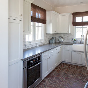
Example of a large transitional u-shaped brick floor kitchen design in Phoenix with a farmhouse sink, white cabinets, stainless steel countertops and shaker cabinets
 McKinney Homes LLC
David White Photography
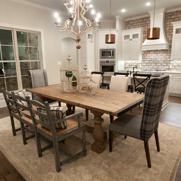
Example of a large farmhouse light wood floor and brown floor kitchen/dining room combo design in Dallas with gray walls and no fireplace
Example of a large farmhouse light wood floor and brown floor kitchen/dining room combo design in Dallas with gray walls and no fireplace
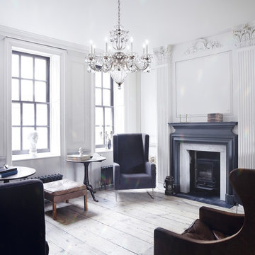
 Commonwealth Lighting of Virginia
Featuring a highly refined display of crystal, Bagatelle is a fanciful version of a traditional lantern motif.
Technical Specifications
MANUFACTURER Schonbek
COUNTRY OF MANUFACTURE United States
ITEM # 1238-___
HEIGHT 24.5
LENGTH 26.5
WIRE LENGTH 124
PRODUCT FAMILY Bagatelle
BULBS INCLUDED no;no
BULB TYPE Incandescent Bulb
VOLTAGE 110
DIAMETER 26.5
SOCKET TYPE E12;E12
LIGHTING INFORMATION B10-8, 60 Max. - Not Included;G12-3, 40 Max. - Not Included

Sponsored
Columbus, OH

Hope Restoration & General Contracting
Columbus Design-Build, Kitchen & Bath Remodeling, Historic Renovations
 TKS Design Group
Download our free ebook, Creating the Ideal Kitchen. DOWNLOAD NOW
This family from Wheaton was ready to remodel their kitchen, dining room and powder room. The project didn’t call for any structural or space planning changes but the makeover still had a massive impact on their home. The homeowners wanted to change their dated 1990’s brown speckled granite and light maple kitchen. They liked the welcoming feeling they got from the wood and warm tones in their current kitchen, but this style clashed with their vision of a deVOL type kitchen, a London-based furniture company. Their inspiration came from the country homes of the UK that mix the warmth of traditional detail with clean lines and modern updates.
To create their vision, we started with all new framed cabinets with a modified overlay painted in beautiful, understated colors. Our clients were adamant about “no white cabinets.” Instead we used an oyster color for the perimeter and a custom color match to a specific shade of green chosen by the homeowner. The use of a simple color pallet reduces the visual noise and allows the space to feel open and welcoming. We also painted the trim above the cabinets the same color to make the cabinets look taller. The room trim was painted a bright clean white to match the ceiling.
In true English fashion our clients are not coffee drinkers, but they LOVE tea. We created a tea station for them where they can prepare and serve tea. We added plenty of glass to showcase their tea mugs and adapted the cabinetry below to accommodate storage for their tea items. Function is also key for the English kitchen and the homeowners. They requested a deep farmhouse sink and a cabinet devoted to their heavy mixer because they bake a lot. We then got rid of the stovetop on the island and wall oven and replaced both of them with a range located against the far wall. This gives them plenty of space on the island to roll out dough and prepare any number of baked goods. We then removed the bifold pantry doors and created custom built-ins with plenty of usable storage for all their cooking and baking needs.
The client wanted a big change to the dining room but still wanted to use their own furniture and rug. We installed a toile-like wallpaper on the top half of the room and supported it with white wainscot paneling. We also changed out the light fixture, showing us once again that small changes can have a big impact.
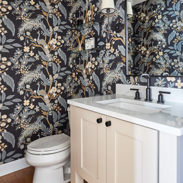
As the final touch, we also re-did the powder room to be in line with the rest of the first floor. We had the new vanity painted in the same oyster color as the kitchen cabinets and then covered the walls in a whimsical patterned wallpaper. Although the homeowners like subtle neutral colors they were willing to go a bit bold in the powder room for something unexpected. For more design inspiration go to: www.kitchenstudio-ge.com

 Amy Pearson Design
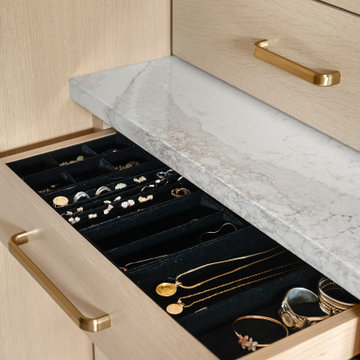
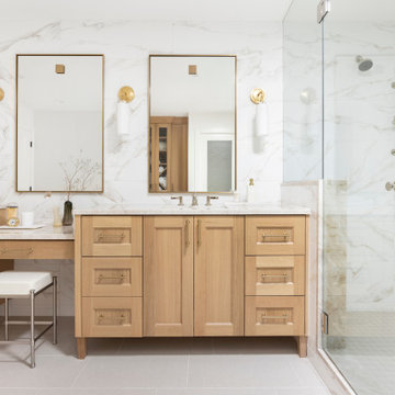
APD was hired to update the kitchen, living room, primary bathroom and bedroom, and laundry room in this suburban townhome. The design brought an aesthetic that incorporated a fresh updated and current take on traditional while remaining timeless and classic. The kitchen layout moved cooking to the exterior wall providing a beautiful range and hood moment. Removing an existing peninsula and re-orienting the island orientation provided a functional floorplan while adding extra storage in the same square footage. A specific design request from the client was bar cabinetry integrated into the stair railing, and we could not be more thrilled with how it came together!
The primary bathroom experienced a major overhaul by relocating both the shower and double vanities and removing an un-used soaker tub. The design added linen storage and seated beauty vanity while expanding the shower to a luxurious size. Dimensional tile at the shower accent wall relates to the dimensional tile at the kitchen backsplash without matching the two spaces to each other while tones of cream, taupe, and warm woods with touches of gray are a cohesive thread throughout.
 Aquatica Plumbing Group
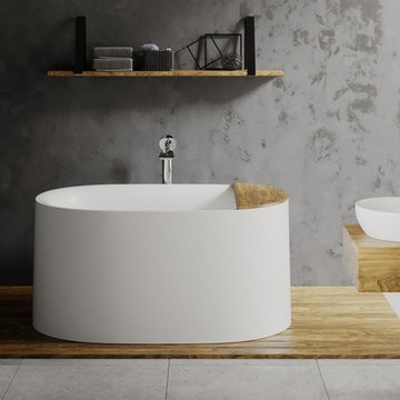
This stunning new release from Aquatica has been specifically designed to blend the influences of traditional soaking tub bathing such as that perfected by the Japanese, with very modern, minimal style and elegant, understated good looks.
Sophia is all urban chic in its appeal. Its freestanding form exudes a purity of line that will sit happily in even the most designer bathroom. The deep interior – up to 23”, allows full body soaking made even more enjoyable by the gently curved end wall, made to conform to and support the bather’s back and spine in absolute comfort. The softly rounded rim provides a comfortable neck rest.
The finishing touch is the smart yet understated solid wood bath tray, crafted to fit seamlessly in the end of the tub, for those important bathing items.
Made from Aquatica’s innovative AquateX™ composite, Sophia provides heat retention and durability, is easy to clean and scratch resistant. Can be made in high gloss/matte finish.
Sponsored
Columbus, OH
Hope Restoration & General Contracting
Columbus Design-Build, Kitchen & Bath Remodeling, Historic Renovations
 Housetrends Magazine
Since moving into her Dublin home two and a half years ago, Nancy Sanford has been peeling off the decades—quite literally. Built in the 1980s, the home was “very well-maintained, but very little had been done to it” in terms of updating the finishes or style, Sanford says. Plush white carpet ran from wall-to-wall-to-wall, almond-colored laminate coated the kitchen cabinets and wallpaper ran rampant—even covering some ceilings.
Despite her efforts, Sanford knew it was going to take more than cosmetic editing to shake the ‘80s and make the home her own. Although she lives in the traditional-leaning Muirfield community, Sanford adores a minimalist, contemporary style—and admits to devouring design magazines “ad nauseam.”
To implement her thoroughly modern vision, Sanford turned to Brigid Norton, an interior designer and family friend, and Kristi Youles, a kitchen designer with The JAE Company. Working together, the trio created a carefully considered contemporary design that’s easy on the eyes, and the body.
In addition to improving the flow of the kitchen—by removing a V-shaped peninsula that angled out into the room—and adding appliances like a stainless steel refrigerator, Sanford’s short list of must-haves included clean, uncluttered lines and no wall cabinets over the countertops. “I’ve found as I’ve aged, I’ve gotten shorter and just don’t use the upper cabinets,” Sanford explains.
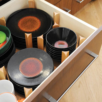
Easy-access, smooth-slide drawers with clean slab fronts were the answer—resulting in strong visual lines, an open, airy feel and enhanced ergonomics. Starting with a “needs assessment,” Youles and Norton designed the space quite literally around Nancy. By looking at factors such as her height and which items she uses most frequently, they were able to determine the optimum placement for everything from canned goods in the pantry to cutlery, pans and plates in the customized drawers, all of which helped to achieve the ultimate kitchen organization.
But there’s more to the kitchen cabinets smooth façade than clean-lined storage. Walnut drawer fronts—found on the oven and the base of the island—are book-matched, allowing the grain to continue from drawer to drawer. And even in spaces where drawers weren’t feasible, beneath the sink and in a desk area, the designers continued the look with cabinet doors crafted to resemble drawers.
The visual continuity of these lines might not be as impactful if it weren’t for the careful selection of contrasting finishes. The designers filled the space with pure, glossy white—using a specific type of quartz, White Cliff by Cambria, to accent the bold rectangular design of the island. Then, to break up the expanse of accompanying white painted drawers, walnut was selected to bring the contrasting warmth and grain of wood without red undertones. It is commonly found in modern furniture design, as well as current productions of mid-century designs like the iconic Eames Lounge Chair from Herman Miller, Youles says.
 Beatty Lumber Company
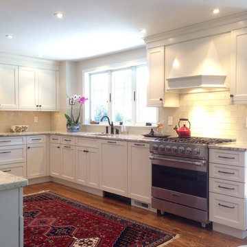
Opening up the kitchen to the previous dining room allows for an entertaining-friendly space.
Inspiration for a mid-sized timeless l-shaped medium tone wood floor open concept kitchen remodel in Philadelphia with an undermount sink, recessed-panel cabinets, white cabinets, granite countertops, beige backsplash, glass tile backsplash, stainless steel appliances and no island
Inspiration for a mid-sized timeless l-shaped medium tone wood floor open concept kitchen remodel in Philadelphia with an undermount sink, recessed-panel cabinets, white cabinets, granite countertops, beige backsplash, glass tile backsplash, stainless steel appliances and no island

51