
Search results for "Square shaped earrings" in Home Design Ideas
 Klopf Architecture
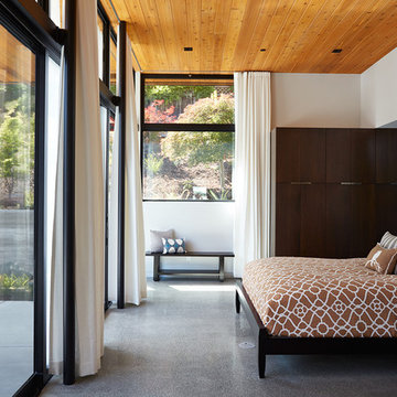
Klopf Architecture, Arterra Landscape Architects and Henry Calvert of Calvert Ventures Designed and built a new warm, modern, Eichler-inspired, open, indoor-outdoor home on a deeper-than-usual San Mateo Highlands property where an original Eichler house had burned to the ground.
The owners wanted multi-generational living and larger spaces than the original home offered, but all parties agreed that the house should respect the neighborhood and blend in stylistically with the other Eichlers. At first the Klopf team considered re-using what little was left of the original home and expanding on it. But after discussions with the owner and builder, all parties agreed that the last few remaining elements of the house were not practical to re-use, so Klopf Architecture designed a new home that pushes the Eichler approach in new directions.
One disadvantage of Eichler production homes is that the house designs were not optimized for each specific lot. A new custom home offered the team a chance to start over. In this case, a longer house that opens up sideways to the south fit the lot better than the original square-ish house that used to open to the rear (west). Accordingly, the Klopf team designed an L-shaped “bar” house with a large glass wall with large sliding glass doors that faces sideways instead of to the rear like a typical Eichler. This glass wall opens to a pool and landscaped yard designed by Arterra Landscape Architects.
Driving by the house, one might assume at first glance it is an Eichler because of the horizontality, the overhanging flat roof eaves, the dark gray vertical siding, and orange solid panel front door, but the house is designed for the 21st Century and is not meant to be a “Likeler.” You won't see any posts and beams in this home. Instead, the ceiling decking is a western red cedar that covers over all the beams. Like Eichlers, this cedar runs continuously from inside to out, enhancing the indoor / outdoor feeling of the house, but unlike Eichlers it conceals a cavity for lighting, wiring, and insulation. Ceilings are higher, rooms are larger and more open, the master bathroom is light-filled and more generous, with a separate tub and shower and a separate toilet compartment, and there is plenty of storage. The garage even easily fits two of today's vehicles with room to spare.
A massive 49-foot by 12-foot wall of glass and the continuity of materials from inside to outside enhance the inside-outside living concept, so the owners and their guests can flow freely from house to pool deck to BBQ to pool and back.
During construction in the rough framing stage, Klopf thought the front of the house appeared too tall even though the house had looked right in the design renderings (probably because the house is uphill from the street). So Klopf Architecture paid the framer to change the roofline from how we had designed it to be lower along the front, allowing the home to blend in better with the neighborhood. One project goal was for people driving up the street to pass the home without immediately noticing there is an "imposter" on this lot, and making that change was essential to achieve that goal.
This 2,606 square foot, 3 bedroom, 3 bathroom Eichler-inspired new house is located in San Mateo in the heart of the Silicon Valley.
Klopf Architecture Project Team: John Klopf, AIA, Klara Kevane
Landscape Architect: Arterra Landscape Architects
Contractor: Henry Calvert of Calvert Ventures
Photography ©2016 Mariko Reed
Location: San Mateo, CA
Year completed: 2016
 Searl Lamaster Howe Architects
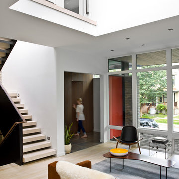
A view of the living room and foyer beyond. The bold orange entry door is a pleasant surprise one only sees after winding around a tall brick wall. Within the entry is a wall of walnut paneling with a hidden door leading to a large closet. The stairs lead up to a second floor landing with a glass railing that opens onto a double height space capped with a series of five over-scaled skylights.
 Kimberly Demmy Design
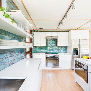
Mid Century Modern Renovation - nestled in the heart of Arapahoe Acres. This home was purchased as a foreclosure and needed a complete renovation. To complete the renovation - new floors, walls, ceiling, windows, doors, electrical, plumbing and heating system were redone or replaced. The kitchen and bathroom also underwent a complete renovation - as well as the home exterior and landscaping. Many of the original details of the home had not been preserved so Kimberly Demmy Design worked to restore what was intact and carefully selected other details that would honor the mid century roots of the home. Published in Atomic Ranch - Fall 2015 - Keeping It Small.
Daniel O'Connor Photography
Find the right local pro for your project
 Randy Angell Designs
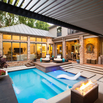
The client purchased this property with grand plans of renovating the entire place; from top to bottom, and from inside to outside. And while the inside canvas was very generous and even somewhat forgiving, the outside space would be anything but.
We wanted to squeeze in as much seating space as possible in their limited courtyard area, without encroaching on the already compact-sized pool. The first and most obvious solution was to get rid of the trees and shrubs that separated this house from its zero-lot-line neighbor. With the addition of Lueder limestone pavers, this new area alone would free up nearly 120 additional square feet, which happened to be the perfect amount of space for a mobile gas fire pit and sectional sofa. And this would make for the perfect place to enjoy the afternoon sunset with the implementation of a custom-built metal pergola standing above it all.
The next problem to overcome was the disconnected feel of the existing patio; there were too many levels of steps and stairs, which meant that it would have been difficult to have any sort of traditional furniture arrangement in their outdoor space. Randy knew that it only made sense to bring in a wood deck that could be mated to the highest level of the patio, thus creating and gaining the greatest amount of continuous, flat space that the client needed. But even so, that flat space would be limited to a very tight "L-shape" around the pool. And knowing this, the client decided that the larger space would be more valuable to them than the spa, so they opted to have a portion of the deck built over it in order to allow for a more generous amount of patio space.
And with the edge of the patio/deck dropping off almost 2 feet to the waterline, it now created the perfect opportunity to have a visually compelling raised wall that could be adorned with different hues of plank-shaped tiles. From inside the pool, the varying shades of brown were a great accent to the wood deck that sat just above.
However, the true visual crowning jewel of this project would end up being the raised back wall along the fence, fully encased in a large format, 24x24 slate grey tile, complete with a custom stainless steel, square-tube scupper bank, installed at just the right height to create the perfect amount of water noise.
But Randy wasn't done just yet. With two entirely new entertaining areas opened up at opposite ends of the pool, the only thing left to do now was to connect them. Knowing that he nor the client wanted to eliminate any more water space, he decided to bring a new traffic pattern right into the pool by way of two "floating", Lueder limestone stepper pads. It would be a visually perfect union of both pool and walking spaces.
The existing steps and walkways were then cut away and replaced with matching Lueder limestone caps and steppers. All remaining hardscape gaps were later filled with Mexican beach pebble, which helped to promote a very "zen-like" feel in this outdoor space.
The interior of the pool was coated with Wet Edge Primerastone "Blue Pacific Coast" plaster, and then lit up with the incredibly versatile Pentair GloBrite LED pool lights.
In the end, the client ended up gaining the additional entertaining and seating space that they needed, and the updated, modern feel that they loved.
 Centre Sky Architecture Ltd
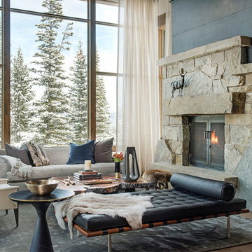
The design of this home drew upon historical styles, preserving the essentials of the original movement while updating these elements with clean lines and modern materials. Peers Homestead drew upon the American Farmhouse. The architectural design was based on several factors: orientation with views and connection to seasonal water elements, glass cubes, simplistic form and material palette, and steel accents with structure and cladding. To capture views, the floor to ceiling windows in the great room bring in the natural environment into the home and were oriented to face the Spanish Peaks. The great room’s simple gable roof and square room shape, accompanied by the large glass walls and a high ceiling, create an impressive glass cube effect. Following a contemporary trend for windows, thin-frame, aluminum clad windows were utilized for the high performance qualities as well as the aesthetic appeal.
(Photos by Whitney Kamman)
 KE Interior Solutions
VIRTUANCE
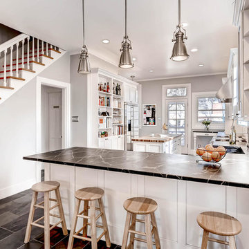
Inspiration for a large transitional l-shaped ceramic tile open concept kitchen remodel in Denver with a farmhouse sink, recessed-panel cabinets, white cabinets, soapstone countertops, gray backsplash, subway tile backsplash, stainless steel appliances and an island
Inspiration for a large transitional l-shaped ceramic tile open concept kitchen remodel in Denver with a farmhouse sink, recessed-panel cabinets, white cabinets, soapstone countertops, gray backsplash, subway tile backsplash, stainless steel appliances and an island
 B Moore Design, Inc.
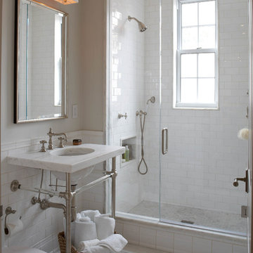
This was a gut renovation, full architectural details, space layout and design, including construction management and furniture/finish selections in Union Square NYC.
Sponsored
Fredericksburg, OH

High Point Cabinets
Columbus' Experienced Custom Cabinet Builder | 4x Best of Houzz Winner
 Jameson Design Group
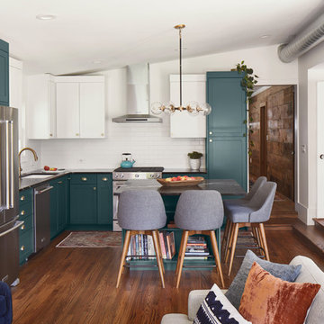
The kitchen is in the portion of the home that was part of an addition by the previous homeowners, which was enclosed and had a very low ceiling. We removed and reframed the roof of the addition portion to vault the ceiling.
The new kitchen layout is open to the family room, and has a large square shaped island. Other improvements include natural soapstone countertops, built-in stainless steel appliances and two tone cabinets with brass hardware.
 BC&J Architecture
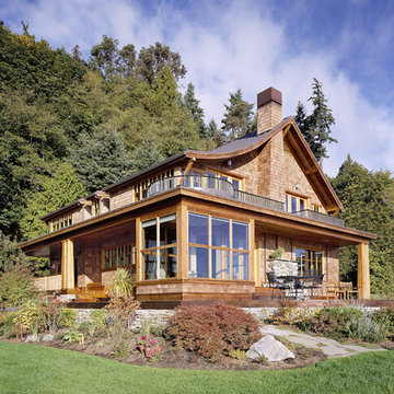
The 2,800 square foot Rockaway Beach Residence is a significant remodel and addition to a small beach cottage built in the 1920’s. The owner’s desire for the building was to maintain a visual connection to the water and Seattle beyond and expand upon the nature of the shingled cottages found along the water’s edge in Puget Sound in the early part of the 20th century.
The two bedroom house includes daytime living spaces on the ground level including a sunroom where one can view both Mt. Baker and Mt. Rainier on a clear day. The second floor includes bedrooms with views, a gallery space over the dining room below, owner’s office and grandchildren’s loft.
Fine attention to craft was taken in preparing the unusual roof shapes and gracious trim assemblies.
Designed by BC&J Architecture.
 Martha's Vineyard Interior Design
Eric Roth Photography
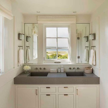
Example of a beach style master bathroom design in Boston with an integrated sink, beaded inset cabinets, white cabinets, concrete countertops and white walls
Example of a beach style master bathroom design in Boston with an integrated sink, beaded inset cabinets, white cabinets, concrete countertops and white walls

 VIRTUOSO INTERIOR DESIGN STUDIO
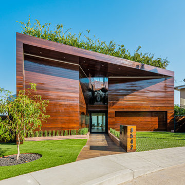
The Hollywood Hills Dollhouse - architectural gem and engineering masterpiece! Named to evoke a childhood memory of a dollhouse, this imposing architectural structure has a luxurious front facade and behind a remaining structure that is comprised of almost all glass giving the appearance and feeling of a dollhouse. This stunning gem is incomparable as there is no other house in the Los Angeles area that shares this unique architectural design. This unrivaled property is not the standard rectangular cube seen throughout the Hollywood Hills but an elegant, design-centric structure consisting of wood, glass and steel overlooking the city of Los Angeles and beyond.The rich, glossy Brazilian IPE hardwood that envelops the structure gives the this trophy house its recognizability from miles away, during both daytime and at night. It is brilliantly designed with an entrance that gives way to a sprawling open space with endless possibilities and approximately 13,000 sq feet for living, working and playing. This state-of-the art property was developed and built around three core principles: an unique and recognizable architectural design, endless views and a hotel-like experience. The property stands on a peerless promontory above the heart of the Sunset Strip offering 300+ degrees views. On every level there is a superb wrap-around experience where one can walk from one end of the property to the other while enjoying uninterrupted views. The structure comprises of 4 levels named for their functionality and versatility. First area, also known as the Play, Work & Be Well level is a 4000SF basement level comprised of terrace, orchard and indoor and outdoor space. In this level, there is also a Wellness Center with a twenty-three jet spa, a dry and infrared heat sauna, an aromatherapy Roman bath and a steam room. Also, on this level is what is dubbed the Play room with a red draped theater, game room, and a wine bar and cellar. An indoor-outdoor creative office space with a full-wall whiteboard, desks and conference table called the Work room is next door. Because this house is built with luxury amenities bearing in mind its future residents lifestyle it has an exterior basement stairwell allowing staff, associates, personal trainers, masseuse or stylists to arrive without entering via main entrance. This feature provides an additional level of privacy and decadence. Every detail of this house has been flawlessly curated to provide the utmost quality of luxe living. The Hollywood Hills Dollhouse has an entrance level with almost 2000 square foot ground floor that expands into an opulent 1800 square foot pool deck and catwalk. This area is referred to as Entertain level because it was designed to be the quintessential California experience. It has a spacious living area, full amenities kitchen and a phenomenal pool deck overlooking unique geometrically shaped pool and spa. The exquisite Masterpiece bedroom and three regal, en-suite bedrooms are situated on a sprawling 2,300 square foot floor designed around the breathtaking views. The Masterpiece bedroom, which is the name of master suite, embraces all the concepts that predominate in the creation of this house- modern architecture, energy, breathtaking views, functionality, recognizability, and luxury. The rooftop is named the Take your Breath Away level is an 2,800 square foot open deck with 360-degree views that provides a spectacular visual experience. It was designed to evoke a wondrous reaction in whomever walks towards this space.Each level is named after a verb mainly to illustrate what this monumental 13,000 square foot of meticulously developed space can provide which is a sanctuary to play, work, be well, entertain, rest and enjoy the breathtaking views in a tranquil setting. Simply put, the Hollywood Hills Dollhouse is unmatched in everything it has to offer. It is one of a kind and you will get a sense of awe the minute you set foot in this house beyond comparison.
 Gilmans Kitchens and Baths
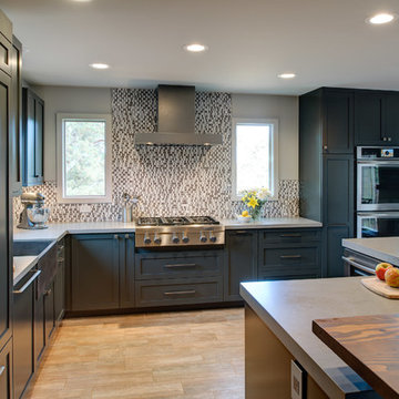
The clients desired an Industrial and Contemporary look for their new kitchen. The original town home kitchen was smaller in size with a larger dining and family room area.
Heavily influenced by the feel of New York lofts, the project started with strong and sturdy combination of metals, dark blues, woods, and greys. A softer, matching backsplash was added to balance and create a second focal point in the room. Expansive storage was achieved through multiple ceiling-height cabinets, double-sided island storage, and a sink facing open shelf cabinet.
Treve Johnson Photography
Sponsored
Sunbury, OH

J.Holderby - Renovations
Franklin County's Leading General Contractors - 2X Best of Houzz!
 Stebnitz Builders, Inc.
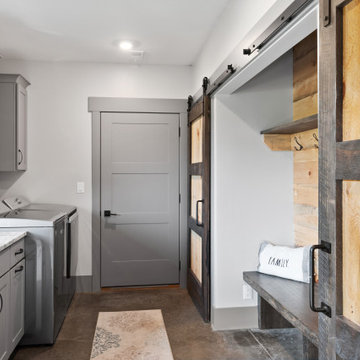
This 2,500 square-foot home, combines the an industrial-meets-contemporary gives its owners the perfect place to enjoy their rustic 30- acre property. Its multi-level rectangular shape is covered with corrugated red, black, and gray metal, which is low-maintenance and adds to the industrial feel.
Encased in the metal exterior, are three bedrooms, two bathrooms, a state-of-the-art kitchen, and an aging-in-place suite that is made for the in-laws. This home also boasts two garage doors that open up to a sunroom that brings our clients close nature in the comfort of their own home.
The flooring is polished concrete and the fireplaces are metal. Still, a warm aesthetic abounds with mixed textures of hand-scraped woodwork and quartz and spectacular granite counters. Clean, straight lines, rows of windows, soaring ceilings, and sleek design elements form a one-of-a-kind, 2,500 square-foot home
 DHD Architecture and Interior Design
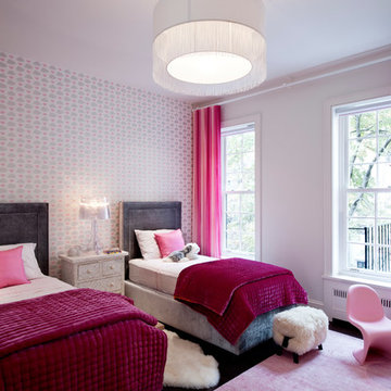
This stately townhouse underwent a full renovation from both the DHD Architecture and Interiors team to provide a young family with rooms to grow into. Spaces were updated with contemporary furnishings and refined architectural details, while still honoring the classic, formal elements of the historic home. The expansive outdoor space is framed by the dining area’s floor to ceiling windows and bold window treatment. DHD’s interiors team aimed to transform the room into an inviting and livable space for the family, designing a custom kitchen banquette and using playfully bright, warm color tones. While the master bedroom keeps to a soft, muted palette incorporating deep shades of purples, the children’s rooms are extravagantly fun, complete with fuchsia bedding and oversized Lucite table lamps.
Photography: Emily Andrews
3 Bedrooms / 6,000 Square Feet
 Smiley Renovations, LLC
Greg Hadley
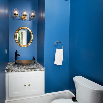
powder blue bathroom with copper sink
Transitional multicolored tile and mosaic tile dark wood floor powder room photo in DC Metro with a vessel sink, shaker cabinets, white cabinets, tile countertops, a two-piece toilet, blue walls and multicolored countertops
Transitional multicolored tile and mosaic tile dark wood floor powder room photo in DC Metro with a vessel sink, shaker cabinets, white cabinets, tile countertops, a two-piece toilet, blue walls and multicolored countertops
 Bilotta Kitchen & Home
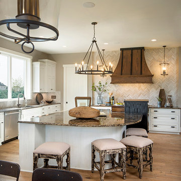
Despite its diamond-mullioned exterior, this stately home’s interior takes a more light-hearted approach to design. The Dove White inset cabinetry is classic, with recessed panel doors, a deep bevel inside profile and a matching hood. Streamlined brass cup pulls and knobs are timeless. Departing from the ubiquitous crown molding is a square top trim.
The layout supplies plenty of function: a paneled refrigerator; prep sink on the island; built-in microwave and second oven; built-in coffee maker; and a paneled wine refrigerator. Contrast is provided by the countertops and backsplash: honed black Jet Mist granite on the perimeter and a statement-making island top of exuberantly-patterned Arabescato Corchia Italian marble.
Flooring pays homage to terrazzo floors popular in the 70’s: “Geotzzo” tiles of inlaid gray and Bianco Dolomite marble. Field tiles in the breakfast area and cooking zone perimeter are a mix of small chips; feature tiles under the island have modern rectangular Bianco Dolomite shapes. Enameled metal pendants and maple stools and dining chairs add a mid-century Scandinavian touch. The turquoise on the table base is a delightful surprise.
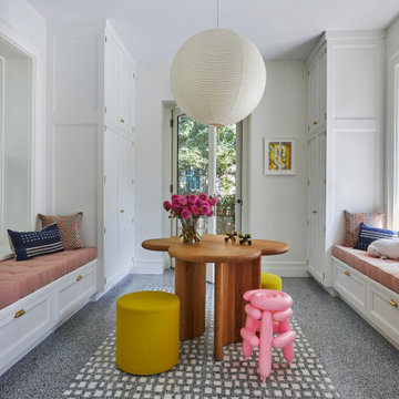
An adjacent pantry has tall storage, cozy window seats, a playful petal table, colorful upholstered ottomans and a whimsical “balloon animal” stool.
This kitchen was done in collaboration with Daniel Heighes Wismer and Greg Dufner of Dufner Heighes and Sarah Witkin of Bilotta Architecture. It is the personal kitchen of the CEO of Sandow Media, Erica Holborn. Click here to read the article on her home featured in Interior Designer Magazine.
Photographer: John Ellis
Description written by Paulette Gambacorta adapted for Houzz.

 InnovationLand
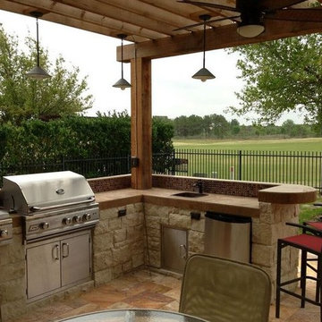
We love this rustic-modern Houston patio addition with an outdoor kitchen and double pergola!
It not only made the most of a long, narrow space while satisfying strict homeowners association rules, but did so affordably in a warm, timeless style.
“The client really enjoys outdoor living, but had a specific budget they wanted to meet,” explains Outdoor Homescapes owner Wayne Franks. “They also live on a golf course and had to meet particular HOA requirements.”
The HOA requirements restricted how far back the new 450-square-foot patio and pergola could extend back into the yard. The HOA also wanted to make sure the patio’s colors and materials matched the existing home and others around it.
“We chose colors and materials that offered texture and character, but that would go with just about anything around it,” says Wayne. “We found what we were looking for in the Fantastico travertine and Austin limestone – two materials clients love and just can’t go wrong with.”
The Austin limestone facing the 8-foot-square, L-shaped kitchen island is dry-stacked in a castle pattern for a naturalistic, rustic look. Yet its light, neutral color keeps the style fresh and modern.
Adding to the modern look are the stainless steel appliances: an RCS 30-inch stainless steel grill, double burner and outdoor fridge. Even though the finishes on the sink and light fixtures (Hunter pendant lamps and Hampton Bay light/fan combos) have a different finish – oil-rubbed-bronze – this actually follows the recent trend of mixing different metals, materials and finishes.
“The look’s not so matchy-matchy anymore,” explains Wayne. “Mixing it up makes it look more authentic and personalized.”
That’s why backsplashes like the one in this project – done in glass and metal mosaic – are also becoming more popular than traditional ceramic tile.
Another recent trend can be seen here, too – an amping up of color variation and texture.
“In addition to the split-face texture of the rock, you can definitely see the bold color variation in the travertine,” says Wayne.
The flooring is a Fantastico travertine, laid out in a Versailles pattern. “The Fantastico tile is killer,” says Wayne. “The warm reds go great with red brick, which we have a lot of around here.”
The countertop with the rounded, raised bar at the end is English walnut travertine.
The red bar stools also add a pop of exciting color that contrasts nicely with the greenery around the patio.
The double pergola, continues Wayne, is No. 2 pine stained a Minwax honey-gold. One side of the pergola – the side over the seating area – is covered with Lexan, a clear material that keeps out rain, heat and UV rays.
The pergola also juts further into the yard on that side. “It’s called a scallop, and it just lends some visual interest,” explains Wayne. “It prevents the pergola from just looking like one big rectangular hunk of wood.”
Wayne particularly likes how everything blended so well with the brick – which was a big concern – yet didn’t come off as too neutral or boring.
“The Fantastico travertine and red chairs do an excellent job of pulling the red from the brick and working with the warmth of that color to make a super-inviting space,” says Wayne. “We’re really pleased with how it all ties together so well.”
 Century Stair Company
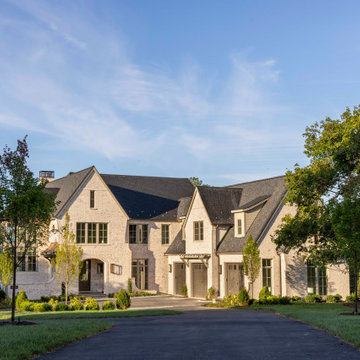
Light cascades through the windows, highlighting the white oak of this contemporary staircase. The white oak risers and treads stand out against the crisp white stringers as the U-shaped staircase turns up the three levels of this Virginia home. The white oak is echoed in the railing as square chamfer-top newels support a post-to-post handrail system that forgoes traditional goosenecks for a cleaner architectural line. The satin black balusters add a custom, chic feel with their geometric pattern. The result is a stair system in balance, easy on the eye at every turn. It is a centerpiece worth taking in, not just traveling through.
1976-2026 © Century Stair Company
Photos courtesy of Classic Cottages
 DesignARC
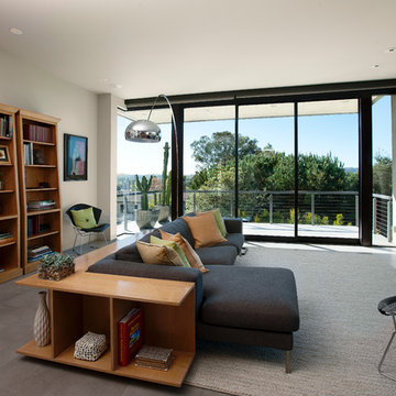
The Tice Residences replace a run-down and aging duplex with two separate, modern, Santa Barbara homes. Although the unique creek-side site (which the client’s original home looked toward across a small ravine) proposed significant challenges, the clients were certain they wanted to live on the lush “Riviera” hillside.
The challenges presented were ultimately overcome through a thorough and careful study of site conditions. With an extremely efficient use of space and strategic placement of windows and decks, privacy is maintained while affording expansive views from each home to the creek, downtown Santa Barbara and Pacific Ocean beyond. Both homes appear to have far more openness than their compact lots afford.
The solution strikes a balance between enclosure and openness. Walls and landscape elements divide and protect two private domains, and are in turn, carefully penetrated to reveal views.
Both homes are variations on one consistent theme: elegant composition of contemporary, “warm” materials; strong roof planes punctuated by vertical masses; and floating decks. The project forms an intimate connection with its setting by using site-excavated stone, terracing landscape planters with native plantings, and utilizing the shade provided by its ancient Riviera Oak trees.
2012 AIA Santa Barbara Chapter Merit Award
Jim Bartsch Photography
4