
Search results for "Start realizing" in Home Design Ideas
 Deskins Group LLC
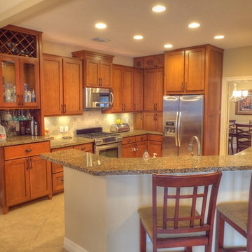
This project started when the client moved in to their new home and realized that the builder grade cabinets would not close with their plates inside., and it developed from there. We installed new custom cherry cabinets, granite countertops, appliances, can lights, and more. We removed the built-in oven and installed a beverage center, and we used 28" lower cabinets and 20" deep upper cabinets along the wall with the refrigerator to make the full size refrigerator look counter depth.
 Stanislav Boff Design Bureau
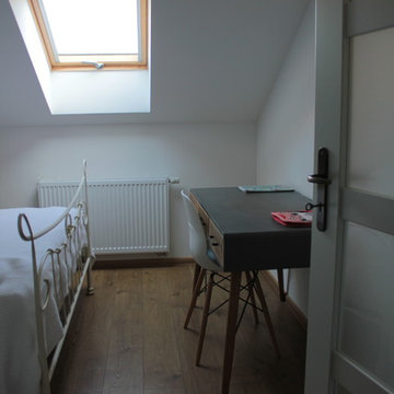
Sleeping room in 82 m2 apartment in albertov Area in Prague.
The whole project took 2,5 moths to realise, starting from sketches to the final interior decoration. Table is from Kare Shop.
 Real Big Art
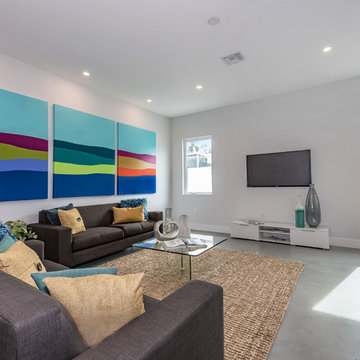
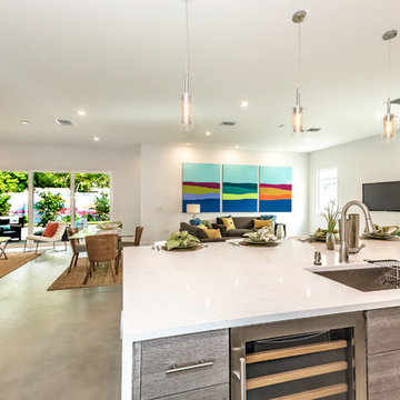
"Water, Earth, and Sky" - (Written by the Artist, Christina Cook Lee) "Growing up in the sixties, I observed Andy Warhol doing his famous graphic treatments of one image in variations. As I studied TV and Film in the 80's, I was taught that the industry developed and succeeded by offering classic plots in what became known as--"the same thing, only different". In other words, when a TV show or movie was successful, the producers would say, "Make another one...the same thing, only different". I painted these three pieces specifically for the wall they are shown on. There was a need for something large with impact. As I did the measurements of the wall and realized three 48"x60" canvases would work nicely, I started thinking about Warhol. Of course, the result I came up with is not a copy of his images at all...it's the same thing, only different." Acrylic on Canvas.
Find the right local pro for your project
 Laidlaw Schultz architects
The project’s starting point was to understand the building’s original post and beam structure and to use that internal logic to formulate a sympathetic remodel. With an emphasis on the upper back unit, the owner’s private residence within this recently purchased Edward Killingsworth triplex, the first order of business was to strip the excess out and to return the complex to something that resembled the original. With a limited budget, the tact was to restore where possible, and to insert where needed, but always with a sympathetic eye. The kitchen quickly became the primary focus and it was soon realized that by removing the division between the existing galley and family room that the essence of the structural system could be revealed. Once opened the datum of the layered beams was adhered to with the kitchen reinforcing this overhead water line. The primary internal wall was then highlighted with a new wood veneer with the refrigerator recessed (borrowing a bit of space from the master closet) and the existing heater chromed.
 User
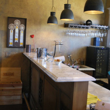
UserThe client purchased a mature, small, NAPA Valley vineyard to be their home and for personal enjoyment.
Once they began converting their new "hobby" grapes into wine, they soon realized they needed a place to "age" their labors and a place to then enjoy them. They decided to design such a place within the confines of their home where they could entertain family and friends.
The structure was modified to allow storage of more than 200 individual bottles, cases, and magnum size bottles. A cask room was added as was a well-appointed tasting room. The storage area is separated from the tasting and social area by a tempered glass doors and windows. The space to be converted was a challenge. No surface was plumb or level, therefore, the remodel involved interior walls, new floors and ceilings.
Until these issues were addressed, the beautiful cabinet work, and a complete temperature and humidity control system to store, maintain, and enjoy the wine could not be started. The floors had to be floated out and chases with faux finishes provided for HVAC and electrical. Lighting in the tasting room is provided by a series of recessed and puck lights.
The bar/counter area is highlighted by a custom, Tiffany style chandelier. Enough space was left in front of the bar to accommodate two serving tables for food and snacks, with plenty of room to move about the space. Discreetly hidden behind the bar is a large capacity cooler that can chill several bottles at once.
The bar is capped with eight lineal feet of Calcutta Gold Marble and sports a brass foot rail. The bar has grape panels between Acanthus Corbels and the bottle storage cabinet areas are a unique blend of Acanthus overlays under precisely cut and mitered grape design crown molding over and around a cleverly designed bottle storage system.
Traffic flow is achieved through the multiple points of entry through any of three pairs of 6' custom double doors which, when weather permitting, can remain open while entertaining. The host and hostess can attend food and beverage service from behind and around the bar through a separate doorway.
The temperature controlled cask storage area is large enough for the clients' current needs, and can accommodate a larger number of casks should the need arise.
The floor and walls of the cask room are designed for easy maintenance.. Both rooms are delightfully decorated with earthen tone faux finishes on walls, ceilings and floors reminiscent of a nonspecific European wine making region.
This effect is extended to the soffits in the tasting room. A unique wine racking system is easily stored, providing even greater ability to maintain and move about the storage area.
 Laidlaw Schultz architects
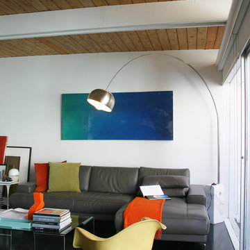
The project’s starting point was to understand the building’s original post and beam structure and to use that internal logic to formulate a sympathetic remodel. With an emphasis on the upper back unit, the owner’s private residence within this recently purchased Edward Killingsworth triplex, the first order of business was to strip the excess out and to return the complex to something that resembled the original. With a limited budget, the tact was to restore where possible, and to insert where needed, but always with a sympathetic eye. The kitchen quickly became the primary focus and it was soon realized that by removing the division between the existing galley and family room that the essence of the structural system could be revealed. Once opened the datum of the layered beams was adhered to with the kitchen reinforcing this overhead water line. The primary internal wall was then highlighted with a new wood veneer with the refrigerator recessed (borrowing a bit of space from the master closet) and the existing heater chromed.

 Fiorito Interior Design
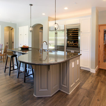
Like many projects, this one started with a simple wish from a client: turn an unused butler’s pantry between the dining room and kitchen into a fully functioning, climate-controlled wine room for his extensive collection of valuable vintages. But like many projects, the wine room is connected to the dining room which is connected to the sitting room which is connected to the entry. When you touch one room, it only makes sense to reinvigorate them all. We overhauled the entire ground floor of this lovely home.
For the wine room, I worked with Vintage Cellars in Southern California to create custom wine storage embedded with LED lighting to spotlight very special bottles. The walls are in a burgundy tone and the floors are porcelain tiles that look as if they came from an old wine cave in Tuscany. A bubble light chandelier alludes to sparkling varietals.
But as mentioned, the rest of the house came along for the ride. Since we were adding a climate-controlled wine room, the brief was to turn the rest of the house into a space that would rival any hot-spot winery in Napa.
After choosing new flooring and a new hue for the walls, the entry became a destination in itself with a huge concave metal mirror and custom bench. We knocked out a half wall that awkwardly separated the sitting room from the dining room so that after-dinner drinks could flow to the fireplace surrounded by stainless steel pebbles; and we outfitted the dining room with a new chandelier. We chose all new furniture for all spaces.
The kitchen received the least amount of work but ended up being completely transformed anyhow. At first our plan was to tear everything out, but we soon realized that the cabinetry was in good shape and only needed the dated honey pine color painted over with a cream white. We also played with the idea of changing the counter tops, but once the cabinetry changed color, the granite stood out beautifully. The final change was the removal of a pot rack over the island in favor of design-forward iron pendants.
Photo by: Genia Barnes
 Real Big Art
"Water, Earth, and Sky" - (Written by the Artist, Christina Cook Lee) "Growing up in the sixties, I observed Andy Warhol doing his famous graphic treatments of one image in variations. As I studied TV and Film in the 80's, I was taught that the industry developed and succeeded by offering classic plots in what became known as--"the same thing, only different". In other words, when a TV show or movie was successful, the producers would say, "Make another one...the same thing, only different". I painted these three pieces specifically for the wall they are shown on. There was a need for something large with impact. As I did the measurements of the wall and realized three 48"x60" canvases would work nicely, I started thinking about Warhol. Of course, the result I came up with is not a copy of his images at all...it's the same thing, only different." Acrylic on Canvas.
 Progressive Design Build
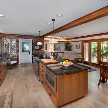
When a Historic District home was renovated in Fort Myers, a dream kitchen was created: open plan enough for gathering, with clearly delineated areas for cooking, reading and entertaining.
Challenge
Bill and Alison’s existing kitchen was small and dysfunctional. Each room seemed independent, and there was no flow through the house. The house felt small, with one entry and exit point.
As a planning consultant, Bill was no stranger to construction. He was a general contractor himself and had built several custom homes in years past. As a gardening enthusiast and professional educator, Alison also had an eye for design. They started with design, layout and planning on their own, but soon realized they needed help. After interviewing several contractors who seemed overwhelmed and unenthused by their project, they reached out to Progressive Design Build.
Solution
Mike was not only enthused about the project, but he established trust with Bill and Alison. Within a few short weeks he was hired to begin the planning phase, conducting thorough research on the project, meeting key subcontractors and establishing a realistic budget.
When the project began, internal walls were removed to open up the kitchen/dining areas and an island was built, giving the space an open and modern functionality. The eating area was enlarged, and a visual connection to the outside was established using Marvin insulated glass windows with Low E coatings—which rejects solar heat gain without reducing visible light passing through the glass.
In order to allow for the open concept layout that Bill and Alison desired, we built new structural beams to transfer the live load. The sliding patio doors opened onto a small terrace with a wrought iron handrail creating access to the private courtyard and garden area.
Finishing details included custom cherry cabinets and wood trimming, 16” x 32” natural stone flooring, granite countertops and historically correct plaster finishes.
Result
The project was completed within budget and two weeks ahead of schedule.
“That planning phase was the best money we spent on the project,” exclaimed Bill. “It was incredibly gratifying being able to watch the subcontractors and suppliers come and go with shared leadership and attention to details.”
 Pinnacle Design & Remodeling
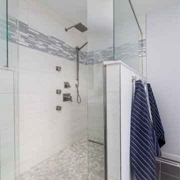
These clients had the project underway when they realized they needed some additional help. They had a great start on demo and selections but were at a standstill on what direction they wanted to go and were questioning if what they were gravitating towards really looked good.
They had their own contractor, so we skipped the contractor bid phase and went straight into design development.
We came in and confirmed some choices and proposed some new ones.
Even though it was at a smaller capacity than most clients, we helped their lake home en suite come to life and saved the a lot of money at the same time!
Photographer- Chris Holden Photos
 Little Wooden Penguin
Once we started making farmhouse tables, we realized there wasn't a high-end play table out there for kids that you would want to feature in your home, not hide away when company arrived.
Our goal: Make something beautiful, unique and durable to spark creativity without worrying about spills and scratches, that fits in with the decor of your home.
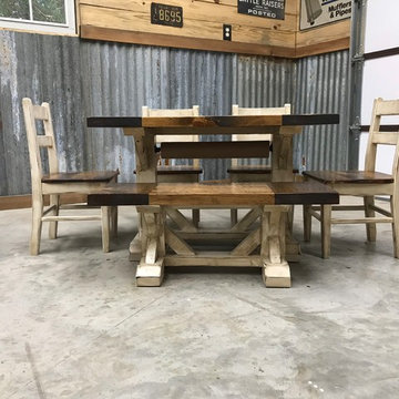
To do that, we felt having a craft paper roll installed is a must, but we didn't want it to take up an entire side of the table where another child could sit, so what did we do? We nested it between the trestle legs, so when you put the paper away it disappears, and seating is available on all sides of the table.
Set it up in your kitchen and use the paper for quick clean up after dinner, or make it a craft table in the playroom. No one will ever laugh at the kids Thanksgiving table with this piece!
The seven coats of polyurethane will repel water, markers, playdough and anything else your kiddos can come up with! This kids trestle table is built with the same (if not more) love and care as our other farmhouse tables, so you know you are getting a high-quality product your kids will want to use every day.
COOL FEATURES:
Each table is handmade, so you can customize the color to match the decor in your room.
Sizing is flexible depending on your space.
No particle board - this table is solid wood with a 1.5" thick top.
Roller holds an 18" Craft Roll
Lightly hand-scraped top - allows for color and drawing, but additional scratches only add character, they don't destroy the table top.
SET INCLUDES:
TABLE: 36"L x 24"W x 22"H
BENCH: 32"L x 12"W x 12"H
BASE: TRESTLE
BASE COLOR: WHITE SHABBY
TOP: EASTERN KNOTTY PINE / HAND SCRAPED
TOP STAIN: PROVINCIAL
(4) KIDS CHAIRS: PAINT MATCHED
 Jarrett Design
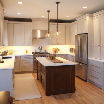
Upon meeting the homeowners of this Nazareth remodel, we quickly realized this was not their first rodeo when it came to kitchen renovations. The project started with a very orange oak kitchen with an awkward layout that did not work for their family. The new u-shaped layout keeps everything needed for preparing daily meals within arms reach, while a central island serves as a landing space and buffet for family gatherings. Undercabinet lighting highlights the gorgeous Fireclay Tile backsplash and Bianco Rafaele marble, while Kichler pendants illuminate the island. The wall was extended at the end of the sink run to allow us to create a small office nook, perfect for typing a quick email or looking up a recipe, and an adjacent bar area allows guests to concoct their own drinks, away from the food prep. Matt Villano Photography
 Powell Construction
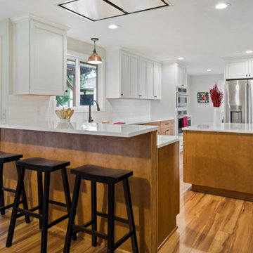
When we first began the design of this project, the clients’ main priority was to get more room in their kitchen. The wall that separated the kitchen and dining space was load bearing and spanned the living room space as well, so rather than removing it the way we might in some floorplans, we left a header and created a large opening to help the flow between the spaces. When it came to the style of the kitchen, the ranch-style home was well suited for a classic, transitional style with farmhouse details such as a white apron-front sink.
We decided on the two-toned cabinetry after originally discussing the idea of white, but realizing that with grandkids and dogs, having white cabinetry so near exterior doors might not be the best option. The lower cabinets are maple stained with a color called “Coffee” and the white upper cabinets feature a similar colored glaze in the detailing to help tie them together. The floor is a popular CoreTEC product called “Red River Hickory”. The overall tone matches that of the lower cabinets for a seamless look. The white backsplash tile and countertop with simple veining continue the two-toned look.
The range hood is a new Zephyr fixture originally designed for commercial kitchens, but became a good choice for homes with low ceilings, as the high suction power allows us to meet building codes without obstructing any views. The other appliances are from the GE Café line – these pieces feature copper accents on the handles, which gave us a great place to start when choosing the showstopping copper pendant over the sink.
The redesigned space gives more room for multiple cooks and the removal of the wall allows in tons of extra light from the dining room – without moving or replacing a single window or exterior door. There is ample prep room, storage space, and seating for visitors to the kitchen. The homeowners love their new space, and we are sure they will continue to love it for years to come.
 Glenview Haus – Custom Doors & Wine Cellars
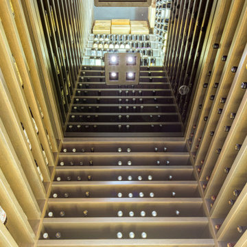
Beautiful wine collections need an equally beautiful display. Our customers located in the Streeterville area had an enormous collection, and we provided them with the added illusion of an enormous wine cellar! One of our favorite elements of this modern wine cellar is the mirrored ceiling. This is a creative trick to provide an infinite appearance that will elude to the idea of having hundreds of shelves! Each corner of this modern wine cellar is complemented by our different racking techniques. Our display shelves allow each bottle to have its own moment of appreciation, to create an artful look that is sure to impress.
When our client approached us with an idea of housing their extensive wine collection in their modern high rise residence, we were thrilled! After viewing their incredibly modern home, we realized that we could not provide them with a traditional wine cellar. We were presented with an exciting task of reimagining our traditional displays, to a clean and sleek modern design. As designers, maintaining the flow of a home is very important to us and our mission is to enhance the home’s existing features. From the wine cellar door to the ceiling, we were able to bring our A-game and create a complementary extension to our customer’s home. Our custom wine cellar door is equipped with a matching threshold, that holds all of the cold air in place. When you take a step inside, you are greeted from floor to ceiling with exquisite design. From our customer’s collectible storage boxes to 4 upward facing display shelves, you are immediately aware that this is a work of art. Each display shelf is adorned with its own light strip that further draws attention to the collectible wine bottles. As you glance up further, you see our storage shelves in full force. Playing off of the vast collection, we decided to install a mirrored ceiling. This design element allowed us to have some fun, and to further accentuate the large collection. This modern wine cellar is complete with a clear glass insulated Modern door that creates a temperature-controlled environment, conducive for preserving wine for decades. As designers, we were presented with a wonderful opportunity to showcase several of our strong suits. We were able to provide our client with a modern wine cellar, as well as an engineered, temperature-controlled environment.
From traditional to modern, we are able to provide your project with the upmost quality wine expertise and guidance. Unsure of where to start, but you just know that you want to? Give us a call or stop into our showroom and we can help provide you with all the necessary details that you will need to get inspired!
 Design Builders & Remodeling Inc.
Design Builders & Remodeling is a one stop shop operation. From the start, design solutions are strongly rooted in practical applications and experience. Project planning takes into account the realities of the construction process and mindful of your established budget. All the work is centralized in one firm reducing the chances of costly or time consuming surprises. A solid partnership with solid professionals to help you realize your dreams for a new or improved home.
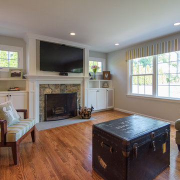
This classic Connecticut home was bought by a growing family. The house was in an ideal location but needed to be expanded. Design Builders & Remodeling almost doubled the square footage of the home. Creating a new sunny and spacious master bedroom, new guestroom, laundry room, garage, kids bathroom, expanded and renovated the kitchen, family room, and playroom. The upgrades and addition is seamlessly and thoughtfully integrated to the original footprint.
 Green Oxen Design
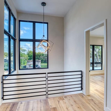
Green Oxen was started with the mission to help developers of modern residences and commercial projects realize their vision through artfully designed products. We have quickly become the go-to solution for those who aim to increase their property value through high-end, modern, and sustainable products. As a leader in manufacturing high-quality aluminum railings, baseboards, doors and lighting in South Florida, all of our products meet LEED requirements and can be finished with different colors and applications.
 APlus Interior Design & Remodeling
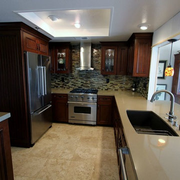
Peg and Randy had a wonderful experience working with APlus and were impressed with the incredible workmanship that went into the remodel. They started their journey looking at their options with stock cabinets and came to realize it wasn’t the best choice for them. A friend that was very happy with the remodel being completed at her home by APlus recommended they call to set up an appointment to meet with a designer. They met with Alex and loved his design ideas so they decided to hire APlus to remodel their kitchen. Peg and Randy were very pleased with the cost and were very surprised to find that a custom kitchen was well within their budget. When guest ask them how they came up with the design concept of the kitchen they praise Alex for coming up with such a gorgeous design. Many changes were made in the kitchen such as adding wonderful high end appliances and hiding the microwave from view. Prior to remodeling their kitchen they had such limited storage space in the kitchen that they resorted to using their garage to store items. This Lake Forest couple now has an amazing amount of hidden storage space with plenty of new space to spare. Now when they step into their kitchen they are in awe and disbelief that they finally have the kitchen of their dreams. http://www.apluskitchen.com/Orange-County-Lake-Forest-Complete-Kitchen-Remodel-Project76.html


 In Detail Interiors
Colorful and rich style
When a repeat client shows up on your doorstep with his third home to furnish and wants to start from scratch and go really bold, you just embrace him, scoot him right up to the resource room, and don’t ask questions! I mean, who does not love a client that embraces velvet, leather, silk and wallcoverings?
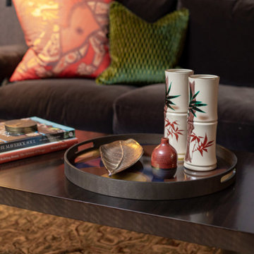
This lush, vibrant lounge space was all created from the want to really deep dive into something different, eclectic and more traveled. The original small, narrow, dimly lit room totally delivered on helping accomplish that mood. Mixing a little of that Ming dynasty-inspired strawberry red with a deep chocolate mohair on the sectional and cladding the room in a soft, amethyst woven wallcovering. We loved the interplay and “non-matchiness” that this space embraced.
Lighting and art were both about telling a story in this room – accenting conversational opportunities and an almost gallery-esque feel. Designating a more dynamic and unusual, sculptural feel – from the harder lines of the statement floor lamp in the living room across to the sprawling, slightly modern bloom of the dining area fixture.
Jewel of a space
The area rug had to ground the already bold furniture and lend itself to the darker wood floors, and a dusky green wool proved the ticket. We loved the almost pixelated pattern the hand-knotted wool lent to the overall design. A little hint of oxblood, chocolate and blue picked up in accents elsewhere, but the tone of almost jade really caught us about this piece.
Not enough can be said about the accent of a dining space either (which in terms of space planning was the only way to balance this long, narrow “hallway” of a room off the kitchen). Citron velvet on the low-profile chairs left the space feeling open, but fun for games and cocktail parties. Plus, the cerused wood dining table was a great complement – offering depth without a conflict to the existing flooring or nearby sectional.
Being able to view this space as a whole was very important to us! From the selection of sconces carried throughout (that wonky placement was existing and with so little opportunity to add cans we had to play up the new fixtures in a way that make them feel purposeful and desirable.), to the balance of color and temperature in each furniture grouping. Sometimes working floor to ceiling in an existing space can pose a lot of unique challenges when it comes to furnishing projects. However, we loved that the client embraced our drive to really punch up the visual feel of this living/dining combo. Also, we know the enjoyment he gets from the finished product is a testament to hunting for the right pieces, designing with unusual and luxe fabric combinations, and managing the inclusion of budget-friendly surprises that always balance a job well done.
What the client says
“From the moment that Cheryl arrived, I felt that she was definitely the designer that I needed to help facilitate & execute my vision for the space. I’m not the “cookie cutter” type, and I immediately realized that Cheryl had a knack for envisioning ideas that were unique, yet tasteful, timeless, and sophisticated.”
From its beginnings as a plain Jane envelope, this combination living/dining space becomes a study in texture and color!
34