
Search results for "Start thinking" in Home Design Ideas
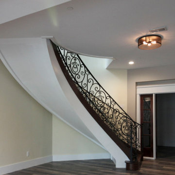
 Century Stair Company
This graceful curved staircase follows the elegant arc of the entry foyer wall, creating a seamless and sophisticated transition from the lower to upper levels. Rich dark-stained treads and risers provide a warm, luxurious foundation beneath an intricately patterned wrought iron railing, full of ornate swirls and curls that define the French Provincial aesthetic. Balcony railing continues the intricate ironwork pattern across the second level, maintaining visual continuity throughout the home's grand entrance. Every refined detail, from the metal handrail's graceful final curve to the flared starting step, speaks to the craftsmanship woven throughout this design.
1976-2026 © Century Stair Company

 Six Walls Interior Design
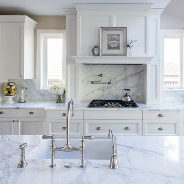
Starting out with a small request to add a pot filler, this kitchen renovation grew into a full makeover which gave the family the functional, bright and sophisticated kitchen they’ve always dreamed of.
Find the right local pro for your project
 Jarrett Design
These clients win the award for ‘Most Jarrett Design Projects in One Home’! We consider ourselves extremely fortunate to have been able to work with these kind folks so consistently over the years.
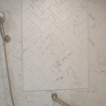
The most recent project features their master bath, a room they have been wanting to tackle for many years. We think it was well worth the wait! It started off as an outdated space with an enormous platform tub open to the bedroom featuring a large round column. The open concept was inspired by island homes long ago, but it was time for some privacy. The water closet, shower and linen closet served the clients well, but the tub and vanities had to be updated with storage improvements desired. The clients also wanted to add organized spaces for clothing, shoes and handbags. Swapping the large tub for a dainty freestanding tub centered on the new window, cleared space for gorgeous his and hers vanities and armoires flanking the tub. The area where the old double vanity existed was transformed into personalized storage closets boasting beautiful custom mirrored doors. The bathroom floors and shower surround were replaced with classic white and grey materials. Handmade vessel sinks and faucets add a rich touch. Soft brass wire doors are the highlight of a freestanding custom armoire created to house handbags adding more convenient storage and beauty to the bedroom. Star sconces, bell jar fixture, wallpaper and window treatments selected by the homeowner with the help of the talented Lisa Abdalla Interiors provide the finishing traditional touches for this sanctuary.
Jacqueline Powell Photography
 Weiland by Andersen
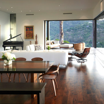
Weiland corner Liftslide door with flush track.
Photo: Tim Street-Porter
Inspiration for a modern living room remodel in San Diego
Inspiration for a modern living room remodel in San Diego
 Legendary Escapes Pools
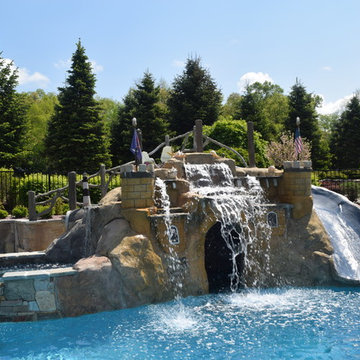
This project began as a wilderness retreat for the homeowners at their rural estate. They already had a large outdoor area complete with a pond, and detached garage in the perfect location to tie into an outdoor entertaining area/kitchen for the swimming pool. The homeowners were hoping that the design team at Legendary Escapes could create something magical for their small grandchildren, and for the grownups to enjoy for summertime relaxation.
When the discussion turned to themes, the cartoon SpongeBob came up, and our team found a direction to go, either to the homeowners delight, possibly mixed with a bit of apprehension at the thought of a cartoony theme as a result. We promised subtle surprise and delight - and the homeowner decided to let the team go with their vision. The pool is a very abundant sized swimming pool, much larger than the average residential swimming pool. The sunledge was also made larger after the pool layout, providing even more space for chairs and play area for small children. One of the special surprises the owners didn't even know about until after they were in were the secret port holes that were re-seated with magnifying glass - and showcased miniature characters behind them, that when viewed through the glass looked giant in size.
The waterfall/slide combination also features a large grotto - themed and decorated with elements that remind visitors to the space of the lessons and themes of the cartoon. The castle is solid, carved concrete - mixed and sculpted on site and hand placed. As the waterfall began to take shape, the outside was created as a sand castle, providing the perfect whimsical backdrop for the slide, and accents including a pair of flipper outfitted legs of what we can only think is mermaid man.
One of the biggest surprises on this project came when Al found an old wooden boat at an auction, which he bought, took back to the job and cut it in half - creating the tail end of a boating incident, much like SpongeBob would have had when he missed the direction of the curve sign while out boating. (The joke in the show is that he can't ever get his drivers license because he doesn't know how to steer.) The other end of the boat became a vertical storage space for firewood or other pool side needs. The two parts of the boat became anchor pieces for what became the "wharf wall" which is the perfect area to lead people into the swimming pool retreat.
The pool has three different entertaining patio levels, including the lower wharf level, swim up bar and raised concrete counter at the deep end of the pool. The middle section of patio is perfect for relaxing and watching kids play in the pool with the deck jets and sun ledge, and the upper area is adjacent to the outdoor kitchen area, also designed and created out of concrete (carved timbers) as the cabinetry and under bar areas.
The pool was completed with ecoFinish on the sun ledge, interior of the spa, grotto and the slide. The main swimming area of the pool was vinyl liner, constructed in the special hybrid way of the team.
With the project complete, the homeowners and family thoroughly enjoyed their backyard retreat. Any hesitation at the initial theme ideas were fully appreciated as they developed along the way, with the final project a subtle blend of function and whimsy, meeting everything that they could have asked for in a backyard entertaining retreat. Their advice is to just trust Al and the team through the process, because the results will be more than you would ever hope for. If our team can help you create a backyard or custom retreat, which includes a pool and plenty of outdoor entertaining options to surprise and delight you and your family, please reach out to start your design discussions.
 OakWood Designers & Builders
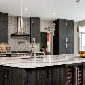
Cabinets that were starting to peel. Finishes that looked tired and dated. An overall style that wasn’t working anymore. This and more got our client thinking it was finally time to give their kitchen a contemporary makeover.
We love the use of darker cabinets for this design as they stand out beautifully when contrasted with the lighter countertop and backsplash. The combination also helps create a cozy and inviting atmosphere and helps pull the room together by giving a strong presence with their bold tones. The overall result is a bold and contemporary design that creates a modern and sophisticated atmosphere.


 Living with Lolo
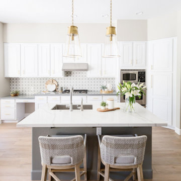
Kitchen in 45th Place | Budget-Friendly Kitchen Remodel in Phoenix, AZ |
Room Type: Kitchen Remodel |
Project Name: 45th Place |
Key Feature: A transitional kitchen remodel that proves smart material selections and a clear design vision can deliver a high-impact result without a luxury budget.
Challenge: The kitchen needed a full refresh but the project had real budget constraints. The challenge was making intentional material choices that looked elevated and cohesive without overspending, while still delivering the clean, transitional aesthetic the clients wanted.
Solution: Living with Lolo approached this as a design problem first, identifying where to invest and where to pull back without sacrificing the overall look. Budget-friendly materials were selected strategically so the finished kitchen felt intentional and designed rather than value-engineered. The result is a space that punches above its price point because the design thinking behind it was sound from the start.
Materials: Budget-conscious cabinetry, transitional hardware and fixtures, and durable countertop surfaces selected for both value and visual impact.
Budget: $30,000 to $75,000 |
Timeline: Completed approximately 2019, roughly 2 to 4 months from design through completion.
 Laure Nell Interiors
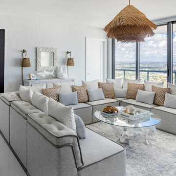
Every inch of this 4,200-square-foot condo on Las Olas—two units combined into one inside the tallest building in Fort Lauderdale—is dripping with glamour, starting right away in the entrance with Phillip Jeffries’ Cloud wallpaper and crushed velvet gold chairs by Koket. Along with tearing out some of the bathrooms and installing sleek and chic new vanities, Laure Nell Interiors outfitted the residence with all the accoutrements that make it perfect for the owners—two doctors without children—to enjoy an evening at home alone or entertaining friends and family. On one side of the condo, we turned the previous kitchen into a wet bar off the family room. Inspired by One Hotel, the aesthetic here gives off permanent vacation vibes. A large rattan light fixture sets a beachy tone above a custom-designed oversized sofa. Also on this side of the unit, a light and bright guest bedroom, affectionately named the Bali Room, features Phillip Jeffries’ silver leaf wallpaper and heirloom artifacts that pay homage to the Indian heritage of one of the owners. In another more-moody guest room, a Currey and Co. Grand Lotus light fixture gives off a golden glow against Phillip Jeffries’ dip wallcovering behind an emerald green bed, while an artist hand painted the look on each wall. The other side of the condo took on an aesthetic that reads: The more bling, the better. Think crystals and chrome and a 78-inch circular diamond chandelier. The main kitchen, living room (where we custom-surged together Surya rugs), dining room (embellished with jewelry-like chain-link Yale sconces by Arteriors), office, and master bedroom (overlooking downtown and the ocean) all reside on this side of the residence. And then there’s perhaps the jewel of the home: the powder room, illuminated by Tom Dixon pendants. The homeowners hiked Machu Picchu together and fell in love with a piece of art on their trip that we designed the entire bathroom around. It’s one of many personal objets found throughout the condo, making this project a true labor of love.
 Gallery KBNY
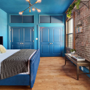
For this Brooklyn condo renovation, Gallery Kitchen and Bath updated the entire kitchen and both bathrooms, as well as painted and laid out new flooring throughout the entire apartment. The owners wanted to unite the seeming medley of the existing space into a cohesive design more representative of their own style. With its ultra-high ceilings and exposed joints and beams, the space already lent itself to the farmhouse look. The end result is a modernized, eclectic farmhouse style that we keenly carried throughout the home.
MORE DETAILS
Compelling textures and color combos reign supreme. The kitchen features semi-custom Shaker-style stone gray cabinets, a white subway tile backsplash running all the way up the wall, and white quartz countertops. We built the island in part to create a pleasing yet efficient flow from the kitchen into the living and dining areas as the space was opened up. We also painted the plumbing stack white to not make it stand out.
We also redesigned the bathrooms, giving each a unique treatment. In the master bath, we took a Victorian-goes-modern approach with coral walls, champagne fixtures, and a clawfoot tub. In the guest bathroom, we stuck to a transitional style that approaches modern without becoming contemporary, pairing herringbone marble floor tiles with a mix of subway and penny tiles on the walls and in the shower. Both maintain elements, such as tiles, fixtures, and colors, that coordinate with the overall eclectic farmhouse look.
HOW WE COLLABORATE
Collaboration with our clients to their desired degree is one of our core pillars. In this condo renovation, the clients wanted central air and were initially considering a true central air system. We advised against it, as not only would it take away from the unique beauty of unusually tall ceilings by adding unsightly ductwork, but it would also significantly detract from the farmhouse look. Instead, we suggested a mini-split system. Our recommended units were both cost-effective and much more complementary to the comprehensive theme. Of course, we ultimately always honor the clients’ choices but it’s just as important to us that we make sure to provide all the necessary information so our clients can make educated decisions that are best for their needs.
SPACE PLANNING
Another key element of the renovation process is space planning. From this perspective, we consider the placement and positioning of objects with regard to the overall flow of space. The building where this renovation took place is U-shaped at one end, which happens to be where this particular apartment is located. Uniquely-shaped spaces naturally require more concentration than those built in the standard rectangular shape. Questions we consider include: Where will people really spend time in this space? What will the flow of foot traffic be? Is there easy access to the kitchen island? Does it flow well into the hallways? Does the island protrude into anything? Working in New York, with its variety of homes and architectural styles, has greatly developed our experience with standard spaces and unconventional ones alike.
SOME HIGHLIGHTS
- Ultra-tall ceilings, allowing for stacked cabinets in the kitchen, as well as long pendant light fixtures and more chandeliers than usual throughout the home
- Completely refurbished cast iron clawfoot tub in one bathroom, with a 270-degree shower curtain around the tub
- Vibrant color choices, including an all-blue bedroom in various shades
- Treated exposed brick walls
Fun Fact: A client once showed us inspiration photos that they sourced online of this exact project, having no idea it was one of ours.
Thinking about renovating your condo? Contact us today to find out how you can benefit from our expertise in remodeling New York City condos. We are a design-and-build firm with a full-scale approach that handles every single aspect of your condo renovation from start to finish.
 User
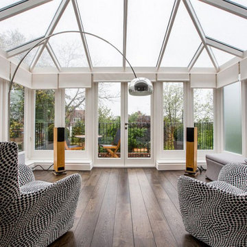
UserWe are a reliable and professional patio and decks contractor, offering the much needed sunroom design and construction services in Santee and neighboring cities. If you are thinking about the next patio project, let Able Patios offer the excellent construction services that you need. We start by creating a custom plan for your dream residential patio and work with you to the very end!
Sunroom Design & Construction Santee, CA - https://www.ablepatios.com/
 Complete Coatings
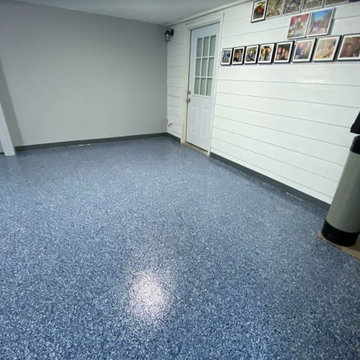
A family owned and operated concrete coatings company based in Portland, OR. We specialize in garage floor coatings.
The garage typically makes up a quarter or more of a home's square footage and is often treated like a large, dirty storage unit. Our mission is to change the way people think about, and use, their garage. This starts from the ground up!
Using the highest quality polymers and epoxy resins, we will install a floor that is durable and dazzling. Best of all, your new garage floor will be EASY TO CLEAN! This is how you transform the garage into truly livable space, making it an extension of your home.
If your looking at other areas of your home for coatings. We also do basements, patio, pool decks and more. We even do commercial work.
 S.Flynn Design + Build
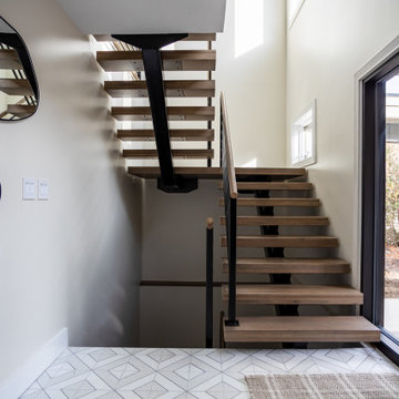
Before we came in, the foyer had no wow factor and didn’t say much about the home. So to fix that, we started by adding a hefty white oak pivot door with large sidelights to let in lots of light. This custom door is a deep, dark chocolate brown stain that complements the custom distressed and stained oak hardwood flooring we installed. In sum, the whole front door unit, including the glass sidelights, is 10 feet long! Typically, I prefer to install the same flooring throughout a house for continuity. But here, our clients wanted to pack a punch with a statement tile. Plus, being on a lake, they have lots of messy foot traffic passing through, so they wanted a more durable material. They chose to splurge on this tile, a thassos marble with stainless steel grout inlays, but I think it was worth it.
As per the Scandi style, the husband really pushed for a floating staircase, so we designed a 3-floor floating tread staircase connecting the main floor, upstairs, and basement. Truthfully, this was an intense, dangerous install, but we got it done for our clients!


 Cure Design Group
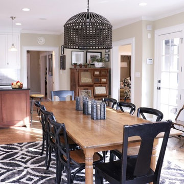
This designer client relationship is one based on friendship. Senior Designer Cori Dyer and client have an indescribable partnership and unmentioned understanding when it comes to decorating this home. A vintage charmer with a modern flair, filled with collectables and uncommon goods that make this space a unique and spectacular.
Cori Dyer:
I first met Sally when our boys became friends at Chaminade in 2007.
Since then, we have stayed close and become great friends.
Several years back she asked for my help giving her ideas on ways to spruce things up a bit and work with her on a major remodel.
A little intimidating as Sally has a beautiful home and is an avid collector of vintage finds.... way before the trend of blending old and new was popular.
She has an eye for unique ways to use vintage pieces and incorporating those into some of the most interesting and compelling displays. What has made this design relationship work is simply one of respect. I know when to give her that push outside of her comfort zone and incorporate her collections with selections that work with what she has, but that offer a new spin on putting it all together.
From that initial "spruce up" has come a makeover in her Living Room and currently one completed in her Family Room.
Although there are signs of my design throughout her home, the detail and selection of the collections and vintage finds are all Sally!!
I truly think that is how Design should be. Blending old and new, and a Designer listening to what makes the client happy.
Client: It was fun to be in style for a year or two, but it’s back to being the quirky lady. I started collecting in my teens and enjoy the hunt for new finds of all types. Cori helped me to enjoy my collections in a new and modern way! As always I had too many things. With her designer eye she taught me to blend the old and the new and to use different materials. The best part was going shopping with one of my best friends, who just happens to be a designer!! She is definitely the ying to my much needed yang.
 Ginger Rabe Designs, LLC
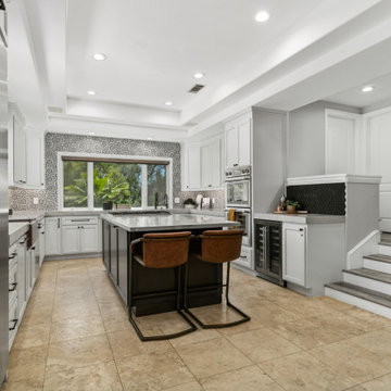
The new design of the kitchen went from dark and dreary to bright and inviting. With new custom designed tiles, a beverage serving areas, custom island and surrounding cabinets. Every detail in this kitchen was thought of. Ginger Rabe Designs, LLC also did a refresh on the bathroom as well as the adjoining dining room. The house is ready for entertaining to all ages. And to think this all started with a simple color consultation for the home.
*Our Firm draws, designs, and construct full working construction documents for all our projects.
 Bennett Design Co.
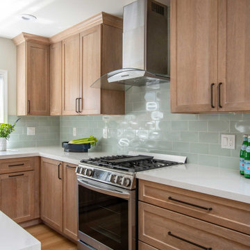
This kitchen remodel is all about understated neutrals and subtle textures, creating a warm, calming, comfortable space. The light oak cabinets paired with the white quartz countertops and complimented by the soft aqua gloss backsplash tile create the perfect environment to start and end one's day. Soft neutral colors help the space feel comfortable without being boring. We like to think of this space as reminiscent of walking on the beach, with natural woods and soft blues accented with white, similar to whitecaps on a wave. This space is the true definition of a timeless kitchen.
 Village Home Stores
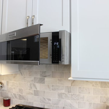
White cabinetry and marble look quartz counters in the Britannica Cambria quartz design paired with a KitchenAid appliance suit and a marble subway tile backsplash. Kitchen in Moline, IL Quad Cities remodeled from start to finish by Village Home Stores.

 Thompson Remodeling
When dreaming about the perfect master suite remodel, there are two important ingredients that are always in the mix– the closet space and the master bath. Too often, existing homes will have small closets and baths in the master suite leaving homeowners frustrated and ultimately unsatisfied. At Thompson Remodeling, we have seen our share of strange configurations, but that’s part of the fun. We enjoy the challenge of reconfiguring space to make it work better for our clients.
In this recent master suite remodel, the existing floor plan had a small bath with vanities located in the bedroom not the bath, two reach-in closets, and a massive closet with a vaulted ceiling and skylight. Now, who doesn’t love a great big closet? But this one was roughly 11’x 14’ – big enough to be a bedroom!
To start, we decided to get rid of the two reach-in closets to make the main section of the bedroom larger, a gain of 66 square feet. In the massive closet space we designed a spacious bathroom and dressing area. With a window and skylight already in place, there is a ton of natural light. Next, we swapped the original bath space out for a closet.
The flow of this master bedroom is so much better now! Before, you would walk in to the room and be facing a double vanity sink. Now, there’s a small entryway that leads to a much more open and inviting space. The homeowners wanted an organic feel to the space and we used an existing corner fireplace to set the tone. Cream, muted grays and taupes are mixed with natural and weathered woods throughout.
We replaced glass block with a barn door made of reclaimed wood. This creates a beautiful focal point in the room.
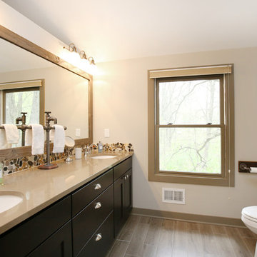
In the bathroom, quartz countertops are accented with a stone mosaic backsplash. Maple cabinets with a java finish are a rich offset to the lighter wood vanity mirror and heated ceramic floor.
We think this new master suite remodel is stunning! What a major improvement in the functionality of the entire space.
 BANDD DESIGN
This was a big girl room makeover I did for my daughter. She has been always been a party animal at bedtime and that includes her climbing out of her crib around 13 months! She’s almost 5 now and once she started showing that she was a bit more responsible at bedtime, we upgraded her space. I opted for a queen size bed with a bed frame that doesn't require a box spring, which opens up for storage underneath. I also wanted the space to speak to her, so I left a small area that was for playing and reading. This space will be good as she gets older and wants to spend time in her room more often. Thinking about how she would use the space for years to come was a big deal. I made sure the larger pieces were transitional and only small items like bedding or lighting would need to be swapped out in the future.
Designed by Sara Barney’s BANDD DESIGN, who are based in Austin, Texas and serving throughout Round Rock, Lake Travis, West Lake Hills, and Tarrytown.
For more about BANDD DESIGN, click here: https://bandddesign.com/
To learn more about this project, click here: https://bandddesign.com/big-girl-room-makeover/
 Robin's Nest Interiors
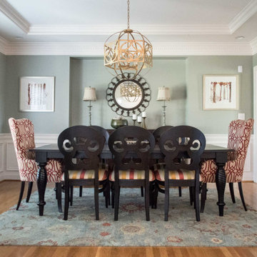
This long time client of ours recently moved to a new home and wanted to incorporate some of her favorite furnishings into a fresher look. She had this lovely dining table and upholstered chairs; however, the fabrics were red, golds and greens. The key to making these colors work with a more updated color palette is to find a fabric, rug and artwork that have those colors as well as other colors in them. We were able to find all three things, and now the reds and golds are an accent in the space. The walls above the wainscoting are painted Sherwin Williams’ Escape Gray (SW6185) which is a lovely gray/green color. We added a sleek sideboard in the recessed area that coordinated perfectly with the table and chairs. We reused the homeowner’s mirror and lamps and added accessories to complete the vignette. We flanked the recessed area with artwork in reds and the green/gray colors as well as a large landscape on the adjacent wall. We dressed the window with drapery panels in a vibrant floral fabric which incorporated all of our colors. Our muted rug also supports our updated color palette. And last but not least, the gold chandelier is truly a focal point in the room.
This is one gorgeous Dining Room, and I do not think we could have done any better if we had started from scratch. Red and golds have been overdone in the past, but I love red and I love incorporating it as an accent in a space. This is definitely “red done right!” Enjoy!
114