
Search results for "Starter" in Home Design Ideas
 Peltier Interiors
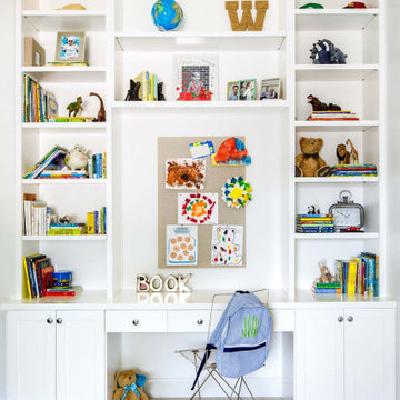
This lovely family turned their small starter home into their perfect forever home. Space was added, ceilings were raised and we filled it with color to create this refreshingly cheerful home.
---
Project designed by Vienna interior design studio Amy Peltier Interior Design & Home. They serve Mclean, Vienna, Bethesda, DC, Potomac, Great Falls, Chevy Chase, Rockville, Oakton, Alexandria, and the surrounding area.
For more about Amy Peltier Interior Design & Home, click here: https://peltierinteriors.com/
To learn more about this project, click here:
https://peltierinteriors.com/portfolio/charming-pasadena-cottage/
 Buckminster Green LLC
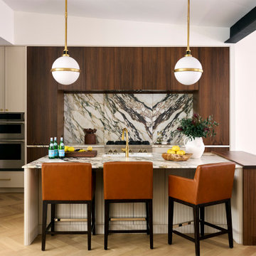
Large transitional l-shaped light wood floor, beige floor, exposed beam and vaulted ceiling open concept kitchen photo in Philadelphia with flat-panel cabinets, marble countertops, multicolored backsplash, marble backsplash, paneled appliances, an island, multicolored countertops, an undermount sink and brown cabinets
Find the right local pro for your project
 weetu
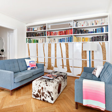
weetuExample of a small trendy medium tone wood floor and brown floor family room library design in New York with white walls
 This Yuppie Life
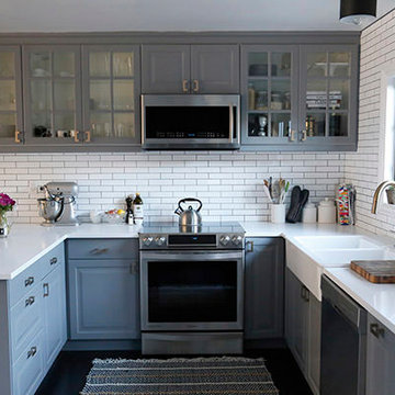
Los Angeles, California, United States Remodeled kitchen in starter home. Photo: Ragan Brooks
Small cottage chic u-shaped eat-in kitchen photo in Los Angeles with a farmhouse sink, glass-front cabinets, gray cabinets, white backsplash and stainless steel appliances
Small cottage chic u-shaped eat-in kitchen photo in Los Angeles with a farmhouse sink, glass-front cabinets, gray cabinets, white backsplash and stainless steel appliances
 Ray C. Moore, LLC
Bill Speer
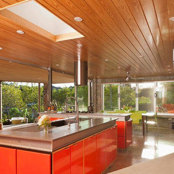
1960s eat-in kitchen photo in Tampa with an undermount sink, concrete countertops, stainless steel appliances, flat-panel cabinets and red cabinets
1960s eat-in kitchen photo in Tampa with an undermount sink, concrete countertops, stainless steel appliances, flat-panel cabinets and red cabinets


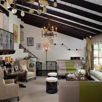
 Lori Dennis, Inc.
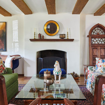
Living room - mediterranean formal and enclosed dark wood floor and brown floor living room idea in San Diego with white walls and no tv
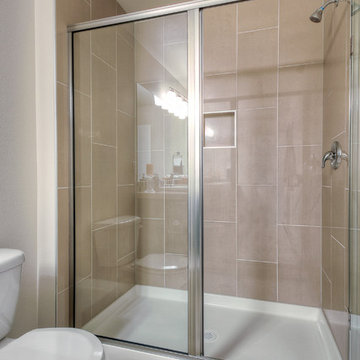
 Powell Homes & Renovations
Brand new master bathroom in SeaTac starter home.
Bathroom - mid-sized craftsman master beige tile and ceramic tile ceramic tile bathroom idea in Seattle with recessed-panel cabinets, dark wood cabinets, white walls, an undermount sink and tile countertops
Bathroom - mid-sized craftsman master beige tile and ceramic tile ceramic tile bathroom idea in Seattle with recessed-panel cabinets, dark wood cabinets, white walls, an undermount sink and tile countertops
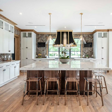
 I & I Homes, Home Staging and Redesign
Example of a transitional medium tone wood floor kitchen design in Orlando with shaker cabinets, white cabinets, brown backsplash, paneled appliances, an island, white countertops and marble countertops
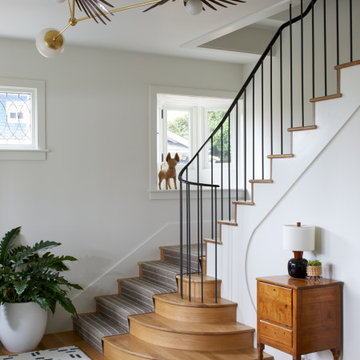
 Olson & Jones Construction, Inc
Example of an ornate wooden l-shaped metal railing staircase design in Portland with wooden risers
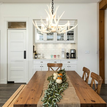
Kitchen - mid-sized rustic single-wall kitchen idea in Vancouver with an undermount sink, recessed-panel cabinets, white cabinets, white backsplash and subway tile backsplash
 Décor Aid
To create a soothing oasis for our busy bicoastal client, like we did for her Bay Area residence, we took cues from her petite NYC apartment’s architectural features and floor to ceiling windows as a foundational starting point for a luxurious interior design upgrade boasting brilliant décor and personality.
And to make the space have a similar feel to her San Francisco home, Décor Aid’s interior designer Victoria C. set about to create the same sense of comfort and consistency that we did for her first project with us.
Centered around her modern art collection, our client wanted a modern, fun, comfortable, and casual interior design upgrade for her apartment that boasted a light and airy feel along with a pulled-together sense of everyday urban glamor.
From room to room, Victoria’s main objective was to create a quick budget-friendly turnaround with furnishings that were neither too precious or required custom construction – everything needed to be ready on the go as you can imagine for a client with such a heavy, frequent commute.
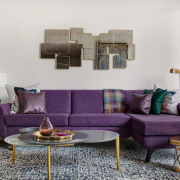
For the living room, a transitional sectional in a rich purple hue was brought in for an easy sense of relaxed drama, was finished with pillows in complimentary jewel tones, and punctuated with a graphic cubist wall hanging featuring tonal shades of matte and muted gold.
In order to break away from the rooms angular lined furnishings, a rounded glass-topped coffee table was sourced to also make the living room appear larger than it is. And a white sculptural Eames chaise was introduced as a conversation starter and juxtaposition to the indulgent color scheme of the other furnishings.
For the den, Victoria placed a playful boldly hued collaged wall hanging above a somewhat traditional gray couch to emphasize a non-fussy approach to the room’s décor. While a modern rustic shelving unit was introduced to do triple duty as an entertainment center, a mini-library, and a spot to highlight decorative objects and collectibles.
 Isla Homes
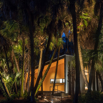
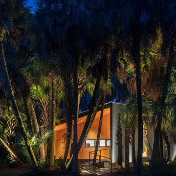
I built this on my property for my aging father who has some health issues. Handicap accessibility was a factor in design. His dream has always been to try retire to a cabin in the woods. This is what he got.
It is a 1 bedroom, 1 bath with a great room. It is 600 sqft of AC space. The footprint is 40' x 26' overall.
The site was the former home of our pig pen. I only had to take 1 tree to make this work and I planted 3 in its place. The axis is set from root ball to root ball. The rear center is aligned with mean sunset and is visible across a wetland.
The goal was to make the home feel like it was floating in the palms. The geometry had to simple and I didn't want it feeling heavy on the land so I cantilevered the structure beyond exposed foundation walls. My barn is nearby and it features old 1950's "S" corrugated metal panel walls. I used the same panel profile for my siding. I ran it vertical to math the barn, but also to balance the length of the structure and stretch the high point into the canopy, visually. The wood is all Southern Yellow Pine. This material came from clearing at the Babcock Ranch Development site. I ran it through the structure, end to end and horizontally, to create a seamless feel and to stretch the space. It worked. It feels MUCH bigger than it is.
I milled the material to specific sizes in specific areas to create precise alignments. Floor starters align with base. Wall tops adjoin ceiling starters to create the illusion of a seamless board. All light fixtures, HVAC supports, cabinets, switches, outlets, are set specifically to wood joints. The front and rear porch wood has three different milling profiles so the hypotenuse on the ceilings, align with the walls, and yield an aligned deck board below. Yes, I over did it. It is spectacular in its detailing. That's the benefit of small spaces.
Concrete counters and IKEA cabinets round out the conversation.
For those who could not live in a tiny house, I offer the Tiny-ish House.
Photos by Ryan Gamma
Staging by iStage Homes
Design assistance by Jimmy Thornton

 Isla Homes
I built this on my property for my aging father who has some health issues. Handicap accessibility was a factor in design. His dream has always been to try retire to a cabin in the woods. This is what he got.
It is a 1 bedroom, 1 bath with a great room. It is 600 sqft of AC space. The footprint is 40' x 26' overall.
The site was the former home of our pig pen. I only had to take 1 tree to make this work and I planted 3 in its place. The axis is set from root ball to root ball. The rear center is aligned with mean sunset and is visible across a wetland.
The goal was to make the home feel like it was floating in the palms. The geometry had to simple and I didn't want it feeling heavy on the land so I cantilevered the structure beyond exposed foundation walls. My barn is nearby and it features old 1950's "S" corrugated metal panel walls. I used the same panel profile for my siding. I ran it vertical to match the barn, but also to balance the length of the structure and stretch the high point into the canopy, visually. The wood is all Southern Yellow Pine. This material came from clearing at the Babcock Ranch Development site. I ran it through the structure, end to end and horizontally, to create a seamless feel and to stretch the space. It worked. It feels MUCH bigger than it is.
I milled the material to specific sizes in specific areas to create precise alignments. Floor starters align with base. Wall tops adjoin ceiling starters to create the illusion of a seamless board. All light fixtures, HVAC supports, cabinets, switches, outlets, are set specifically to wood joints. The front and rear porch wood has three different milling profiles so the hypotenuse on the ceilings, align with the walls, and yield an aligned deck board below. Yes, I over did it. It is spectacular in its detailing. That's the benefit of small spaces.
Concrete counters and IKEA cabinets round out the conversation.
For those who cannot live tiny, I offer the Tiny-ish House.
Photos by Ryan Gamma
Staging by iStage Homes
Design Assistance Jimmy Thornton
 George Gekas Design
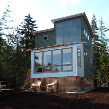
George Gekas Design
Example of a trendy gray two-story exterior home design in Portland Maine
Example of a trendy gray two-story exterior home design in Portland Maine
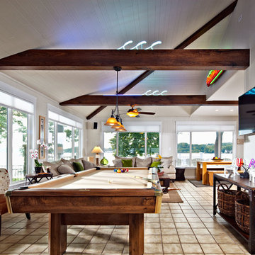
 Sexton Development
Example of a large transitional open concept ceramic tile family room design in Chicago with white walls
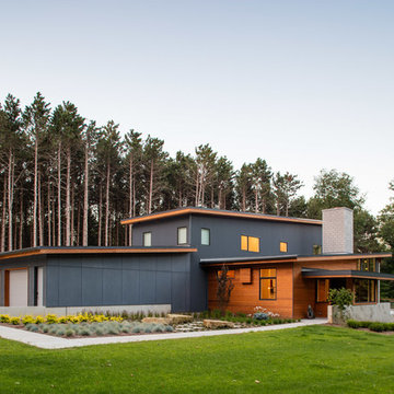
 Lucid Architecture
Example of a trendy gray two-story mixed siding house exterior design in Grand Rapids with a shed roof
33