
Search results for "Starting watering" in Home Design Ideas

 Shade And Shutter Systems, Inc
A home on Nantucket, Massachusetts equipped with built-in roll shutters.
Rolling Shutters are the ultimate solution when you want to protect what’s behind your windows and doors. With Rolling Shutters, enjoy peace of mind knowing that your home has a sturdy layer of hurricane protection and storm protection. Rolling shutters shield against wind-blown debris, sand blasting and water penetration. Strong, secure, and durable, our Rolling Hurricane Shutters are proven to reduce energy and maintenance costs while making your home more comfortable to live in.
Hurricane Shutters
Hurricane Shutters are the premier protection against snow and ice storms, driving rain, high winds, and flying debris. We have huge selection of Hurricane Protection products for all types of applications. We specialize in new construction, retrofit projects and custom applications designed around more complex installations.
Hurricane Shutters protect your windows and doors from water penetration and breakage during hurricanes and Nor’easters bringing you comfort and protection. Even when you are not physically at the location of the storm, rolling shutters can offer you peace of mind. Homes and businesses not equipped with rolling shutters may experience glass breakage and door failures during high winds. Ultimately, those openings in the structure’s envelope can cause complete devastation to the home or business. Once the air pressure enters a building, no matter the type of construction, the likelihood of other windows and doors failing rises. If the pressure grows beyond a certain point, walls and and roof components begin to fail.
Security Shutters
Security Shutters are one of the best ways to discourage intruders from attempting to enter your home or business. This deterrent measure is just where rolling shutters start. While in the down position, rolling shutters can be locked in place by a motor, a gear, a keyed switch or by a separate locking device.
Rolling Shutters have been used as security shutters all over the world for decades with incredible success. Sometimes labeled as metal shutters and metal security shutters, they all have subtle differences, and the differences can’t be seen with the rolling shutter in the down position.
Security Shutters typically have end-retention pins that lock into the guide rails from the top. These pins are located throughout the entire curtain and are protected from manipulation while the curtain is in the close position.
Storm Shutters
Storm Shutters are the broad category of Storm Protection products. Of course, they come in all types of sizes, features and functionality. We have a full line of rolling shutters, hinged storm shutters and storm panels for you to to explore on our website or we would love for you to swing by one of our showrooms to see live demo models.
Storm Shutters are specifically engineered and designed for high hinds, flying debris protection and ultimately given a rating for Hurricane Protection. A little known fact: The most damaging type of wind value is not the force of the wind blowing directly on your home. This force is called positive pressure, and typically, many believe this is the strongest force against their home or business. Believe it or not, the negative pressure, or, the air passing by your windows and doors, has far greater power. Many low-grade storm shutters and hurricane protection products fail under this pressure.
Solar Shutters
Solar Shutters have a double wall construction and filled with a specialized polyurethane foam designed to increase R-factor and deflect solar penetration. Many rolling shutters can perform this function, but not all are created equal. The energy efficiency of exterior rolling shutters is up to 95% more effective than interior solar shades.
Solar Shutters have many unique and positive “side effects” from their dense foam-filled curtain profile. Many homeowners have taken advantage of energy savings by using these types of rolling shutters in both the summer and winter seasons. Reducing heating and air conditioning expenses throughout the entire year is not always our first thought, but many home and business owners have expressed massive savings. Not only do they block up to 90% of heat gain and loss, they also provide incredible noise control opportunities.
Privacy Shutters
Privacy Shutters are a great way to close of areas of your home or business from others. Some rolling shutters are equipped with perforations allowing ambient light to pass through when needed.
Privacy Shutters have many uses and are creatively used throughout the world in homes and businesses for all kinds of reasons. Close off food preparation areas, work shops, stock rooms, gun safes, closets, liquor cabinets and bars. Some business owners use rolling shutters to close off the outside world after working hours, to protect the last few employees as they finish money counts, paperwork, and prepare bank deposits.
If you have any questions or need additional information, our Product Specialists are available 800-522-1599

 Skill Construction & Design, LLC
It sparkles, it shimmers, it glitters, its glass. Glass mosaics are everywhere, from gorgeous kitchen backsplashes like this one, to color baths and reflective fireplaces. But as beautiful as this backsplash is, it’s only the beginning of this great kitchen.
Our kitchen begins with a little bump, a simple little peninsula with room for one. Upon the deep dark espresso cabinets sits the contrasting countertop. The super glossy white stone with subtle swirls reflects the colors of the glass mosaics. We gave the peninsula a little overhang and pulled up an enticing contemporary stool.
Although the kitchen space is fairly large, two walls contained openings to other spaces, while a third contained a large and sunny bay window. Rather than bottle neck our traffic flow, we chose to make the most of the walls we had. We started with a deep undermount stainless steel sink with a far-reaching faucet with pull out spray. Beside this, we placed our contemporary stainless steel dishwasher.
To keep the feeling open and airy we installed dark floating shelves, which really pop against our multicolored glass backsplash. We added lighting under the bottom shelf for extra sparkle, as well as the perfect task lighting.
We needed some wall cabinets, not just for storage but to compliment our microwave. Above the stainless steel stove our matching microwave serves multipurpose, from cooking, to venting, to task lighting the stove. When space counts, make the most of it. We nestled our stove beside the dishwasher, giving ourselves room for a landing zone at the end. The cooking area feels even more spacious set next to our large bay window.
To give us the greatest amount of storage, we added a floor to ceiling pantry. Although it is only 12″ deep, it’s 48″ wide. The clean “slab” style door create an uncluttered look that compliments the patterning of the floor. We used 6″ x 24″ porcelain wood look flooring. This flooring exploded on the market not too long ago, giving you the look of hardwoods, without fear of water, dents and scratches. The floor will never need to be refinished, no matter how much abuse it takes.
Look at all that storage. There’s even room on the bottom for that huge mixer we all seem to have. The pantry gives us plenty of room for all we need to store and it’s 12″ depth means it’s easy to find what you’re looking for. No more pulling out half your stored items just to find that product in the very back.
We round out this fabulous kitchen with a full-sized, bottom freezer, French door refrigerator. Espresso panels encase the sides while a deep and tall upper cabinet gives us room to store some more. By placing the refrigerator between the two entrances to the kitchen, family and friends can get a beverage without getting in the cook’s way.
To direct our lighting around the room and focus on specific areas, we used a long track of spot lights with a contemporary look. Between the window in the daytime, spots and undercabinet lights at night, the kitchen is always bright, even with the darker cabinetry.
http://www.rjkconstructioninc.com/
 Tile Doctor Ltd
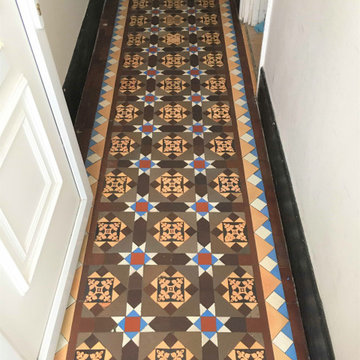
This client owned a property in Haringey, North London, which had a classic Victorian tiled floor laid in the hallway. Unfortunately, the floor was in a bad state, the tiles were dull and dirty and there was a missing section by the bottom of the stairs that had been back filled with cement. Fortunately for him however his neighbour decided to remove their front path which was made with matching tiles and so he was able acquire replacements from him. He then contacted us to see if we could use those tiles to fill in the missing ones and revive the whole floor with a clean and seal at the same time.
Before quoting for the restoration work, I paid a visit to the property to survey the floor. I can give quotes from photographs, but much prefer to visit and conduct a test clean, and in this case, I was able to check the spare tiles he had acquired. From that I emailed a quote which the client was happy with, so we arranged a date to return and do the work.
This was a large job, so I teamed up with Jackson Davis the Central London Tile Doctor and whilst Jackson started on cleaning the floor, I took the reclaimed tiles outside and carefully grinded off the excess cement and adhesive from them and cleaned them by hand. We managed to do this by about 3pm. Jackson and I work on a lot of jobs together so it made sense to work as a bubble from the beginning of Covid so we could continue to work together, with two of us on the job it also means we can get the job done quicker.
Cleaning the floor involved applying a 200-grit diamond burnishing pad to the tile lubricated with a strong dilution of Tile Doctor Remove and Go, the slurry was then rinsed off the floor with more water and then extracted with an industrial vacuum. The process was repeated on stubborn areas until we were satisfied the tiles were really clean.
We then moved onto carefully removing the cement from the floor at the bottom of the stairs and cleaning up the base. Once done the newly renovated replacement tiles were laid in place using a rapid setting adhesive which meant they could be grouted later that day before heading home. The floor was then left overnight to dry off.
We then returned the following day and took some moisture readings with the damp meter. The readings were within the expected range, so we were good to go ahead and apply the sealer. If the floor is not dry the seal will not cure properly, and this can lead to a patchy finish.
Three coats of Tile Doctor Colour Grow were applied to seal the tiles. This is a colour intensifying impregnating sealer that works from with and will gives the Victorian tiles durable protection, ideal for a high traffic area such as the hallway. In addition, Colour Grow is a fully breathable sealer so it will allow for moisture to rise through the tile and evaporate, this is critical for floors of this age that will not have the benefit of a damp proof membrane installed under the floor.
The hallway is now looking transformed by the work we did, we certainly thought so, but more importantly our client was very happy with the result and now has the floor he hoped for.
Andrew Newstead
North London Tile Doctor
Find the right local pro for your project

 Good Earth Water Gardens
Granite stream with driftwood waterfall.
This is an example of a mid-sized tropical partial sun backyard gravel water fountain landscape in Kansas City for summer.
This is an example of a mid-sized tropical partial sun backyard gravel water fountain landscape in Kansas City for summer.
 Skill Construction & Design, LLC
It sparkles, it shimmers, it glitters, its glass. Glass mosaics are everywhere, from gorgeous kitchen backsplashes like this one, to color baths and reflective fireplaces. But as beautiful as this backsplash is, it’s only the beginning of this great kitchen.
Our kitchen begins with a little bump, a simple little peninsula with room for one. Upon the deep dark espresso cabinets sits the contrasting countertop. The super glossy white stone with subtle swirls reflects the colors of the glass mosaics. We gave the peninsula a little overhang and pulled up an enticing contemporary stool.
Although the kitchen space is fairly large, two walls contained openings to other spaces, while a third contained a large and sunny bay window. Rather than bottle neck our traffic flow, we chose to make the most of the walls we had. We started with a deep undermount stainless steel sink with a far-reaching faucet with pull out spray. Beside this, we placed our contemporary stainless steel dishwasher.
To keep the feeling open and airy we installed dark floating shelves, which really pop against our multicolored glass backsplash. We added lighting under the bottom shelf for extra sparkle, as well as the perfect task lighting.
We needed some wall cabinets, not just for storage but to compliment our microwave. Above the stainless steel stove our matching microwave serves multipurpose, from cooking, to venting, to task lighting the stove. When space counts, make the most of it. We nestled our stove beside the dishwasher, giving ourselves room for a landing zone at the end. The cooking area feels even more spacious set next to our large bay window.
To give us the greatest amount of storage, we added a floor to ceiling pantry. Although it is only 12″ deep, it’s 48″ wide. The clean “slab” style door create an uncluttered look that compliments the patterning of the floor. We used 6″ x 24″ porcelain wood look flooring. This flooring exploded on the market not too long ago, giving you the look of hardwoods, without fear of water, dents and scratches. The floor will never need to be refinished, no matter how much abuse it takes.
Look at all that storage. There’s even room on the bottom for that huge mixer we all seem to have. The pantry gives us plenty of room for all we need to store and it’s 12″ depth means it’s easy to find what you’re looking for. No more pulling out half your stored items just to find that product in the very back.
We round out this fabulous kitchen with a full-sized, bottom freezer, French door refrigerator. Espresso panels encase the sides while a deep and tall upper cabinet gives us room to store some more. By placing the refrigerator between the two entrances to the kitchen, family and friends can get a beverage without getting in the cook’s way.
To direct our lighting around the room and focus on specific areas, we used a long track of spot lights with a contemporary look. Between the window in the daytime, spots and undercabinet lights at night, the kitchen is always bright, even with the darker cabinetry.
http://www.rjkconstructioninc.com/
 Metropolitan Custom Homes
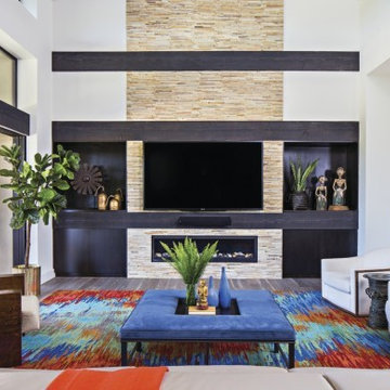
PRIMARY COLORS The Noakeses are not afraid of color, which found an outlet in the brilliant red, orange and blue of the Tufenkian Borealis Pacific Fire rug anchoring the living room. On the following spread, the homeowners’ art hangs on a dining room wall and is the soulmate to the living room rug’s deeply saturated colors as well as to the bright oranges in the wool and silk rug under the dining table.
Glamour is a driving force in the house, but it never overwhelms. As a backdrop in the dining room, golden Lori Weitzner wallpaper lines the display shelf where Perry and Suzy Noakes display treasures from their travels.
In the kitchen, a grouping of seeded blown glass cylinder pendants illuminates Bright Group stools and a generously proportioned island that’s big enough to seat eight guests.
The entry’s bright-red lacquered console is a place for the homeowners’ Buddha collection to get attention.
Pieces from Laura Britt’s sustainable furniture line Vervano populate the bedroom, including the Noakeses use for media storage.
Pieces from Laura Britt’s sustainable furniture line Vervano populate the bedroom, including the chair underneath the windows
The gray theme continues in the master bath, where vein-cut travertine slabs on the floor set off the sculptural flair of the bathtub.
“Homes didn’t mean anything to us,” says Perry Noakes, “except as a place to put our keys and get ready for the next journey.” The retired high-tech company executive and his wife, Suzy, are avid globe-trotters. The couple had also lived in Asia for 15 years as part of Perry’s work. Finding a place to live was a well-rehearsed exercise that figured into their system for settling in to a foreign country. But all that changed when Perry and Suzy decided to downsize to a new house in Austin. A friend told them about a spec house under construction, the project of a dream team of Austin-based design professionals that included builder Keith Husbands, architect Bob Wetmore of Cornerstone Architects, and interior designer Laura Britt and her staff. “We went to see it,” says Perry, “and loved it.” The couple quickly bought the framed-out 5,800-square-foot building.
The fact that the two-story dwelling was near a golf course was a bonus for the two golfers, but the low-slung four-bedroom, four-bath house also backs up onto a nature preserve. “The land offered us great opportunity to nestle the house into the topography, giving us both privacy and stunning views,” says Wetmore, who had to negotiate his design for the native stone, stucco and metal house to fit onto the steeply sloping and oddly elongated lot. The Hill Country contemporary house stretches out just below the rim of the slope, comfortably settled into the topography courtesy of terraced landscaping that defines the front approach to the house. “We turned a negative into a positive,” says Wetmore about the difficult site. The rough-and-ready landscape accounts for the building’s quiet dynamics, which Wetmore chronicled with the roofline, a series of horizontal areas that correspond to transitional spaces inside, interrupted by a clerestory that caps the entry and living room.
The process of taking a house from the framing stage to completion was a new experience for the couple. “We had never participated in the building process,” says Suzy. They threw themselves into it as if it were just another one of their adventures. “I think of it as my first project after I retired,” says Perry.
The budding design enthusiast so endeared himself to Britt that she and her staff awarded him with a beret to wear to design meetings, in honor of his artistic verve. “We were able to redesign a lot of the house since we came into the process so early,” says Suzy. “The house started as a spec house,” says Britt, “but it quickly became a custom home with the Noakeses’ involvement.”
Britt started the process by helping the couple select materials and lighting, opting for an earthy glamour that became the touchstone of the house. For pure wow factor, the living room’s stone and steel fireplace—sliced horizontally by three massive wood beams—is a tour de force of drama. In the kitchen, an oversize island (big enough to seat eight) is topped with a slab of dramatically veined marble; the countertops are a quieter quartzite. In the master bath, bold vein-cut travertine pavers on the floor are a counterpoint to the linear-cut mosaic tiles that back the vanity and reach all the way to the skylit ceiling. The pièce de résistance is the shimmering white pebble wall behind the free-standing tub that creates the effect of water frozen in free fall.
Britt used contrast as a backdrop to all the drama, opting for a forged metal chandelier in the shape of a lotus leaf in the entry—a worthy match to the darkened-steel front door. She designed a dining room table (through Vervano, her furniture design company) topped with patinaed steel; overhead, a massive steel-framed drum pendant with mica panels casts a delicate glow over the room. The designer was careful to leave wall space for the homeowners’ art collection, as well as to add space wherever possible. The dining room’s asymmetrical built-in is a place to display Buddhas and other pieces the couple has collected in their travels.
“We wanted this house to be about us and who we are,” says Suzy. That’s understandable since, after 16 previous homes that were really just places to live, the freedom of expression is obviously a thrill. Maybe even too much of a thrill—although this house is the couple’s dream home, they were completely enthralled with the design process. Could house No. 17 be the best and last? Maybe not. But if there is another house in the Noakeses’ future, one thing is certain, says Perry: “We won’t make a move without consulting Laura first.”
https://modernluxury.com/interiors-texas/story/smooth-move
 Steven Hill - Calgary Real Estate
Head To Head Negotiations Gets Results For Happy Sellers:
When I was introduced to Steven Hill, I knew from the minute we met “this was the guy” to represent me. Steven has a very calm, soft approach to his dealing with people, unlike the ego driven who spout their credentials to impress. He listens to understand what the client wants rather than telling them what he wants. He assured me he was confident in his ability to sell my property without over promising and I was skeptical, but boy did he deliver on that promise, and some.
Let’s start with the brochures. Sotheby’s brochures blow everyone else out of the water. A piece of paper, with black and white photos, gets lost in the bottom of a purse, or garbage bin, but a Sotheby’s brochure is a piece of art. Steven’s photographer created fabulous photos that took my breath away when the brochure arrived. My house looked beyond amazing yet true to the property. This alone sets Sotheby’s far above the rest by doing more than photocopying a sheet of paper to leave an impression. Very impressed.
Steven and I corresponded everyday and, after 5 days on the market, we accepted a conditional offer. I was thrilled Steven got the sale price I wanted, so quickly. Unfortunately, we found ourselves in a tense situation when the home inspector found a breach in our sewer line. Immediately I got a quote for the repairs, and was fully prepared to cover the expense, but the buyer’s realtor was insisting on a sizeable holdback. This is where we witnessed Steven’s negotiation skills under pressure. He went head to head with the buyer’s realtor, as the buyers and ourselves stood by and watched. Steven insisted he would not allow his clients to have an open wallet, while the buyer’s realtor pushed harder and harder. Steven never once showed how irritated or upset he was by this realtor’s aggressive nature and, in a calm voice, kept insisting an open wallet was not going to work. This was a little unsettling with three days left to lift the conditions and I wasn’t holding out much hope the deal would close. Things looked grim, but once again Steven’s abilities and strong connections shone through…. he found a back up buyer who presented an offer we could not ignore. Of course, Steven had to bring this to the first buyer’s attention and, to everyone’s surprise, all conditions were lifted and we had a firm sale. Not only did I get my asking price but I no longer had to cover the repair expense. Steven was nothing but brilliant.
I believe somewhere along the way Steven and I became friends. I look forward to a “Hi Jane” text from him that always makes me smile. I thoroughly enjoy his kind, caring, easy going nature and his wicked sense of humor. I like his Porsche too
Sponsored
Columbus, OH
Free consultation for landscape design!

Peabody Landscape Group
Franklin County's Reliable Landscape Design & Contracting
 yardscapes Inc.
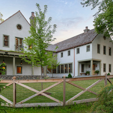
I was initially contacted by the builder and architect working on this Modern European Cottage to review the property and home design before construction began. Once the clients and I had the opportunity to meet and discuss what their visions were for the property, I started working on their wish list of items, which included a custom concrete pool, concrete spa, patios/walkways, custom fencing, and wood structures.
One of the largest challenges was that this property had a 30% (or less) hardcover surface requirement for the city location. With the lot size and square footage of the home I had limits to how much hardcover we could add to property. So, I had to get creative. We presented to the city the usage of the Live Green Roof plantings that would reduce the hardcover calculations for the site. Also, if we kept space between the Laurel Sandstones walkways, using them as steppers and planting groundcover or lawn between the stones that would also reduce the hard surface calculations. We continued that theme with the back patio as well. The client’s esthetic leaned towards the minimal style, so by adding greenery between stones work esthetically.
I chose the Laurel Tumbled Sandstone for the charm and character and thought it would lend well to the old world feel of this Modern European Cottage. We installed it on all the stone walkways, steppers, and patios around the home and pool.
I had several meetings with the client to discuss/review perennials, shrubs, and tree selections. Plant color and texture of the planting material were equally important to the clients when choosing. We grouped the plantings together and did not over-mix varieties of plants. Ultimately, we chose a variety of styles from natural groups of plantings to a touch of formal style, which all work cohesively together.
The custom fence design and installation was designed to create a cottage “country” feel. They gave us inspiration of a country style fence that you may find on a farm to keep the animals inside. We took those photos and ideas and elevated the design. We used a combination of cedar wood and sandwich the galvanized mesh between it. The fence also creates a space for the clients two dogs to roam freely around their property. We installed sod on the inside of the fence to the home and seeded the remaining areas with a Low Gro Fescue grass seed with a straw blanket for protection.
The minimal European style custom concrete pool was designed to be lined up in view from the porch and inside the home. The client requested the lawn around the edge of the pool, which helped reduce the hardcover calculations. The concrete spa is open year around. Benches are on all four sides of the spa to create enough seating for the whole family to use at the same time. Mortared field stone on the exterior of the spa mimics the stone on the exterior of the home. The spa equipment is installed in the lower level of the home to protect it from the cold winter weather.
Between the garage and the home’s entry is a pea rock sitting area and is viewed from several windows. I wanted it to be a quiet escape from the rest of the house with the minimal design. The Skyline Locust tree planted in the center of the space creates a canopy and softens the side of garage wall from the window views. The client will be installing a small water feature along the garage for serene noise ambience.
The client had very thoughtful design ideas styles, and our collaborations all came together and worked well to create the landscape design/installation. The result was everything they had dreamed of and more for their Modern European Cottage home and property.

 Envision Web
Stuart Wade, Envision Virtual Tours
Envision Virtual Tours and High Resolution Photography is your best choice to find just what you are looking for in the Ellijay, Ga. area .Ellijay, Georgia, known as the “Apple Capital” of Georgia, is located between the Ellijay and Cartecay Rivers where they join to make the Coosawattee River and is the county seat of Gilmer County, Georgia. The origin of the city’s name is not certain but thought to be the English derivative of an Indian word(s) meaning “many waters”, “place of green things” or “new ground”. Some histories say it may have been named for an Indian chief.
Inhabited for countless years by the Cherokee people indigenous to the North Georgia, the area was first mentioned as a village and trade center before the onslaught of white settlers inhabited the region. During the 1830’s both white settlers and Indians occupied Ellijay. During the original land lottery in 1832, Martin Scalf acquired the 160 acre lot where the town now stands. In 1833, Clemonds Quinland bought 10 acres from Scalf, retained one acre for himself and donated the rest of the purchase to the County. A plan for twenty town lots, streets and a public square was created and the streets were oriented to allow maximum sunlight exposure to the buildings.
Proceeds from lot sales were used to build a jail and courthouse and pay other city expenses. During this same year, Gilmer County was appropriated $800.00 from the State to build a school, and a three-acre lot was donated for the city cemetery. On December 29, l834, Ellijay was incorporated and designated as the County seat of Gilmer County. By 1837, the town had twenty dwellings, three stores and one attorney. Most of these early buildings were of log construction.
Many roads led to Ellijay by 1849. The population had grown to 150 by 1850 and the town at five stores. Some wood-frame buildings were being constructed at this time and in 1854, a new courthouse was built in the center of the square, replacing the earlier building. The County’s first newspaper was the Ellijay Courier, started in 1875, and during this time period, Ellijay was a stop on the stagecoach line. The railroad bridge over the Cartecay River was completed in 1884 and the town now had rail service.
With the arrival of the railroad and subsequent tracks to White Path, Ellijay began to grow much faster. Many hotels were constructed and land was donated for a depot east of town. More industries, such as a cheese factory and the Shippen Brothers Lumber Mill, located in Ellijay. By 1898, the city had expanded its limits in every direction and now included the depot.
By 1900, all the buildings on the town square were brick. This included the recently completed Hyatt Hotel. Most of the other buildings in town were still of log construction, but new wood-frame buildings were being built. The Shippen Brothers Lumber Company production was expanding and exporting their lumber to Europe. Within the next few decades, this company grew to be one of the largest employers in Ellijay, often with five to six million feet of lumber in the yard at one time.
The population of Ellijay grew to 659 by 1910, and began to acquire many new modern conveniences such as electric lights and power, a telephone company and many new businesses.
Then in 1912, a fire ravaged the city, destroying 23 buildings. As a result, many new buildings were constructed under new and stricter fire and safety guidelines. The population, however, decreased slightly at this time to 632 in 1920.
During the 1920’s the town’s population began to grow again and, by this time, apples were being shipped out of the county and new storage facilities were built. Chickens were also shipped to markets outside of Ellijay and Gilmer County.
From the mid 1930’s to 1950, Ellijay received much assistance from the Federal WPA Programs. The old courthouse was removed from the center of town square and the Hyatt Hotel was remodeled to be the new courthouse. A park was created on the site of the old courthouse and the streets around the square were paved. A new street was built at this time entering town from the northeast. Other new roads, bridges, sidewalks and gutters were constructed to improve the city. A school and gymnasium were also built and other structures improved.
This growth began to impact the city’s infrastructure and in the l950’s and l960’s, a period of upgrading water systems, roads, and power supplies began. New low-rent housing appeared in l960 and a new hospital was built in l957. Georgia Highway 5 was widened in l962, new buildings around the square replaced old ones and some were remodeled. In 1974, the hospital was enlarged.
Currently, Ellijay attracts tourists who love the small-town feel and friendly atmosphere. Hotels and restaurants, unique shops, antiques and art galleries lend their charms to those who visit. A new courthouse constructed to resemble the old one, new streetscaping, family-oriented downtown events and the beautification of the square have stepped up the social and economic activity and have made Ellijay a popular destination.
 Skill Construction & Design, LLC
It sparkles, it shimmers, it glitters, its glass. Glass mosaics are everywhere, from gorgeous kitchen backsplashes like this one, to color baths and reflective fireplaces. But as beautiful as this backsplash is, it’s only the beginning of this great kitchen.
Our kitchen begins with a little bump, a simple little peninsula with room for one. Upon the deep dark espresso cabinets sits the contrasting countertop. The super glossy white stone with subtle swirls reflects the colors of the glass mosaics. We gave the peninsula a little overhang and pulled up an enticing contemporary stool.
Although the kitchen space is fairly large, two walls contained openings to other spaces, while a third contained a large and sunny bay window. Rather than bottle neck our traffic flow, we chose to make the most of the walls we had. We started with a deep undermount stainless steel sink with a far-reaching faucet with pull out spray. Beside this, we placed our contemporary stainless steel dishwasher.
To keep the feeling open and airy we installed dark floating shelves, which really pop against our multicolored glass backsplash. We added lighting under the bottom shelf for extra sparkle, as well as the perfect task lighting.
We needed some wall cabinets, not just for storage but to compliment our microwave. Above the stainless steel stove our matching microwave serves multipurpose, from cooking, to venting, to task lighting the stove. When space counts, make the most of it. We nestled our stove beside the dishwasher, giving ourselves room for a landing zone at the end. The cooking area feels even more spacious set next to our large bay window.
To give us the greatest amount of storage, we added a floor to ceiling pantry. Although it is only 12″ deep, it’s 48″ wide. The clean “slab” style door create an uncluttered look that compliments the patterning of the floor. We used 6″ x 24″ porcelain wood look flooring. This flooring exploded on the market not too long ago, giving you the look of hardwoods, without fear of water, dents and scratches. The floor will never need to be refinished, no matter how much abuse it takes.
Look at all that storage. There’s even room on the bottom for that huge mixer we all seem to have. The pantry gives us plenty of room for all we need to store and it’s 12″ depth means it’s easy to find what you’re looking for. No more pulling out half your stored items just to find that product in the very back.
We round out this fabulous kitchen with a full-sized, bottom freezer, French door refrigerator. Espresso panels encase the sides while a deep and tall upper cabinet gives us room to store some more. By placing the refrigerator between the two entrances to the kitchen, family and friends can get a beverage without getting in the cook’s way.
To direct our lighting around the room and focus on specific areas, we used a long track of spot lights with a contemporary look. Between the window in the daytime, spots and undercabinet lights at night, the kitchen is always bright, even with the darker cabinetry.
http://www.rjkconstructioninc.com/
 Tile Doctor Ltd
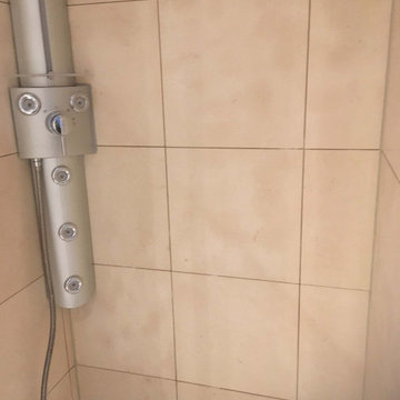
I was asked to look at renovating a shower cubicle at a property in in Manchester city centre that had been clad in White Limestone tiles. I understood the bathroom had been installed 12 years prior, but now the tiles were looking grubby, mouldy and dirty.
The client had lived at the property for the last two years and in an attempt to resolve the problems had used a few different household products such as flash and bleach, they had tried everything, and nothing had helped. I suspected that these strong acidic cleaners had actually made the problem worse by stripping off what was left of the sealer that was protecting the Limestone, allowing dirt to become ingrained in the stone.
I visited the property and ran a few cleaning tests in the shower cubicle with Tile Doctor products. This allows me to see which product will have the best results and gives the customer confidence that we can resolve their issues. The results were immediate, they could see the difference and they were happy to accept my quote and agree a date for my return to complete the work.
I arrived several weeks later and made a start. The tiles were scrubbed by hand with a strong dilution of Tile Doctor Remove and Go with excellent results. This product is designed to remove coatings and sealers, and in this case, it did a great job of drawing out the ingrained stains and dirt build-up. This removed what was left of the sealer and took off most of the dirt and mould. The Limestone tiles and grout were then rinsed with water to remove the soil.
Next I needed to restore the smooth surface of the limestone which had been etched by the use of strong acidic cleaning products. To do this I used a set of six-inch diamond burnishing pads attached to a hand buffer to hone and restore the stone.
I then dried the shower tiles and grout with a heat gun checking the moisture levels with damp meter until I was satisfied it was completely dry.
The last step was to re-seal the Limestone and Grout using a couple of coats of Tile Doctor Colour Grow. This is natural coloured intensifying sealer which provides durable protection to the surface allowing it to breathe and enhancing the colours.
The Customer was amazed with the difference and left the following feedback!
“Kamila was friendly, professional and kept me informed about what to expect before she took on the job and during the tile cleaning. The tiles look absolutely amazing after her work – I feel as though I have a brand new bathroom! Kamila also gave me helpful tips on looking after limestone tiles. I can’t recommend her highly enough.”
For future cleaning I recommended the use of Tile Doctor Aqua-Pro which is a pH neutral shower tile cleaner designed for use on sealed surfaces. Most cleaning products you find in supermarkets are overly strong and will erode the sealer prematurely, so when choosing a cleaning product always read the label and make sure it’s safe to use on Sealed Stone tiles.
Alex Logonzy
Greater Manchester Tile Doctor
 American Home Remodeling
Bathroom Remodel in Laguna Woods, CA: Elegant Calacatta White Sentrel Shower Walls
A beautiful bathroom remodel does not always require changing the entire layout or starting from scratch. Sometimes, the right combination of updated materials, modern fixtures, and thoughtful design can make an existing bathroom feel dramatically more inviting. This bathroom remodel in Laguna Woods, California, is a great example of how homeowners can refresh a bathtub and shower area with an elegant new look while keeping everyday functionality in mind.
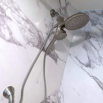
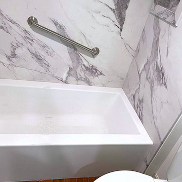
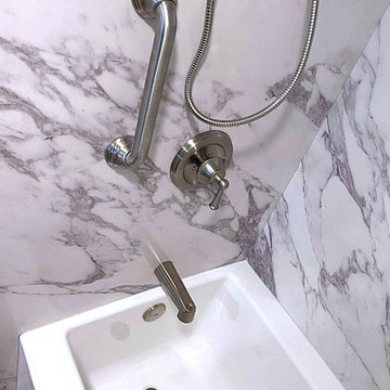
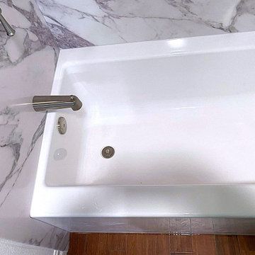
One of the standout features of this project is the Calacatta White Sentrel wall system. With its bright white background and flowing gray marble-inspired veining, these walls create the sophisticated appearance of natural stone while offering a practical alternative to traditional tile. Paired with brushed nickel fixtures, a handheld showerhead, and a supportive grab bar, the finished space brings together style, convenience, and comfort.
Calacatta White Sentrel Walls Create a Beautiful Marble Look
The first thing that catches your attention in this Laguna Woods bathroom remodel is the Calacatta White pattern. Its dramatic gray veining moves across a clean white background, creating the appearance of elegant marble without the busy look that can sometimes come from smaller individual tiles.
The large-format appearance helps create a more continuous design throughout the bathing area. Instead of numerous grout lines interrupting the pattern, the wall panels provide a smoother visual finish that allows the marble-inspired details to stand out.
For homeowners considering a bathroom remodel in Laguna Woods, Calacatta White is an excellent option when the goal is to create a bright, clean, and timeless bathroom. The neutral color palette also makes it easier to coordinate the rest of the space with different flooring colors, cabinetry, countertops, and bathroom accessories.
The pattern works particularly well in bathrooms where homeowners want a little luxury without choosing a design that feels overly trendy. Its white and gray tones offer a classic look that can complement both traditional and contemporary homes.
Brushed Nickel Fixtures Complete the Design
The fixtures in this Laguna Woods bathroom remodel provide a beautiful complement to the Calacatta White walls. The brushed nickel finish introduces a soft metallic appearance that works naturally with the gray veining throughout the wall pattern.
Rather than competing with the marble-inspired design, the fixtures help tie the entire bathing area together. The finish also offers a versatile look that can work with a variety of bathroom styles.
The shower features an overhead showerhead along with a handheld showerhead connected by a flexible hose. Having both options provides additional convenience for everyday bathing. The handheld sprayer can be useful for rinsing, cleaning the shower area, and directing water where it is needed.
The coordinated shower controls and tub fixtures help maintain a consistent appearance throughout the space. These details may seem small, but choosing finishes that work together is an important part of creating a polished bathroom remodel.

 Alair Homes Plano
Our clients house was built in 2012, so it was not that outdated, it was just dark. The clients wanted to lighten the kitchen and create something that was their own, using more unique products. The master bath needed to be updated and they wanted the upstairs game room to be more functional for their family.
The original kitchen was very dark and all brown. The cabinets were stained dark brown, the countertops were a dark brown and black granite, with a beige backsplash. We kept the dark cabinets but lightened everything else. A new translucent frosted glass pantry door was installed to soften the feel of the kitchen. The main architecture in the kitchen stayed the same but the clients wanted to change the coffee bar into a wine bar, so we removed the upper cabinet door above a small cabinet and installed two X-style wine storage shelves instead. An undermount farm sink was installed with a 23” tall main faucet for more functionality. We replaced the chandelier over the island with a beautiful Arhaus Poppy large antique brass chandelier. Two new pendants were installed over the sink from West Elm with a much more modern feel than before, not to mention much brighter. The once dark backsplash was now a bright ocean honed marble mosaic 2”x4” a top the QM Calacatta Miel quartz countertops. We installed undercabinet lighting and added over-cabinet LED tape strip lighting to add even more light into the kitchen.
We basically gutted the Master bathroom and started from scratch. We demoed the shower walls, ceiling over tub/shower, demoed the countertops, plumbing fixtures, shutters over the tub and the wall tile and flooring. We reframed the vaulted ceiling over the shower and added an access panel in the water closet for a digital shower valve. A raised platform was added under the tub/shower for a shower slope to existing drain. The shower floor was Carrara Herringbone tile, accented with Bianco Venatino Honed marble and Metro White glossy ceramic 4”x16” tile on the walls. We then added a bench and a Kohler 8” rain showerhead to finish off the shower. The walk-in shower was sectioned off with a frameless clear anti-spot treated glass. The tub was not important to the clients, although they wanted to keep one for resale value. A Japanese soaker tub was installed, which the kids love! To finish off the master bath, the walls were painted with SW Agreeable Gray and the existing cabinets were painted SW Mega Greige for an updated look. Four Pottery Barn Mercer wall sconces were added between the new beautiful Distressed Silver leaf mirrors instead of the three existing over-mirror vanity bars that were originally there. QM Calacatta Miel countertops were installed which definitely brightened up the room!
Originally, the upstairs game room had nothing but a built-in bar in one corner. The clients wanted this to be more of a media room but still wanted to have a kitchenette upstairs. We had to remove the original plumbing and electrical and move it to where the new cabinets were. We installed 16’ of cabinets between the windows on one wall. Plank and Mill reclaimed barn wood plank veneers were used on the accent wall in between the cabinets as a backing for the wall mounted TV above the QM Calacatta Miel countertops. A kitchenette was installed to one end, housing a sink and a beverage fridge, so the clients can still have the best of both worlds. LED tape lighting was added above the cabinets for additional lighting. The clients love their updated rooms and feel that house really works for their family now.
Design/Remodel by Hatfield Builders & Remodelers | Photography by Versatile Imaging
Sponsored
Columbus, OH
Free consultation for landscape design!
Peabody Landscape Group
Franklin County's Reliable Landscape Design & Contracting
 American Home Remodeling
Bathroom Remodel in Laguna Woods, CA: Elegant Calacatta White Sentrel Shower Walls
A beautiful bathroom remodel does not always require changing the entire layout or starting from scratch. Sometimes, the right combination of updated materials, modern fixtures, and thoughtful design can make an existing bathroom feel dramatically more inviting. This bathroom remodel in Laguna Woods, California, is a great example of how homeowners can refresh a bathtub and shower area with an elegant new look while keeping everyday functionality in mind.
One of the standout features of this project is the Calacatta White Sentrel wall system. With its bright white background and flowing gray marble-inspired veining, these walls create the sophisticated appearance of natural stone while offering a practical alternative to traditional tile. Paired with brushed nickel fixtures, a handheld showerhead, and a supportive grab bar, the finished space brings together style, convenience, and comfort.
Calacatta White Sentrel Walls Create a Beautiful Marble Look
The first thing that catches your attention in this Laguna Woods bathroom remodel is the Calacatta White pattern. Its dramatic gray veining moves across a clean white background, creating the appearance of elegant marble without the busy look that can sometimes come from smaller individual tiles.
The large-format appearance helps create a more continuous design throughout the bathing area. Instead of numerous grout lines interrupting the pattern, the wall panels provide a smoother visual finish that allows the marble-inspired details to stand out.
For homeowners considering a bathroom remodel in Laguna Woods, Calacatta White is an excellent option when the goal is to create a bright, clean, and timeless bathroom. The neutral color palette also makes it easier to coordinate the rest of the space with different flooring colors, cabinetry, countertops, and bathroom accessories.
The pattern works particularly well in bathrooms where homeowners want a little luxury without choosing a design that feels overly trendy. Its white and gray tones offer a classic look that can complement both traditional and contemporary homes.
Brushed Nickel Fixtures Complete the Design
The fixtures in this Laguna Woods bathroom remodel provide a beautiful complement to the Calacatta White walls. The brushed nickel finish introduces a soft metallic appearance that works naturally with the gray veining throughout the wall pattern.
Rather than competing with the marble-inspired design, the fixtures help tie the entire bathing area together. The finish also offers a versatile look that can work with a variety of bathroom styles.
The shower features an overhead showerhead along with a handheld showerhead connected by a flexible hose. Having both options provides additional convenience for everyday bathing. The handheld sprayer can be useful for rinsing, cleaning the shower area, and directing water where it is needed.
The coordinated shower controls and tub fixtures help maintain a consistent appearance throughout the space. These details may seem small, but choosing finishes that work together is an important part of creating a polished bathroom remodel.
 American Home Remodeling
Bathroom Remodel in Laguna Woods, CA: Elegant Calacatta White Sentrel Shower Walls
A beautiful bathroom remodel does not always require changing the entire layout or starting from scratch. Sometimes, the right combination of updated materials, modern fixtures, and thoughtful design can make an existing bathroom feel dramatically more inviting. This bathroom remodel in Laguna Woods, California, is a great example of how homeowners can refresh a bathtub and shower area with an elegant new look while keeping everyday functionality in mind.
One of the standout features of this project is the Calacatta White Sentrel wall system. With its bright white background and flowing gray marble-inspired veining, these walls create the sophisticated appearance of natural stone while offering a practical alternative to traditional tile. Paired with brushed nickel fixtures, a handheld showerhead, and a supportive grab bar, the finished space brings together style, convenience, and comfort.
Calacatta White Sentrel Walls Create a Beautiful Marble Look
The first thing that catches your attention in this Laguna Woods bathroom remodel is the Calacatta White pattern. Its dramatic gray veining moves across a clean white background, creating the appearance of elegant marble without the busy look that can sometimes come from smaller individual tiles.
The large-format appearance helps create a more continuous design throughout the bathing area. Instead of numerous grout lines interrupting the pattern, the wall panels provide a smoother visual finish that allows the marble-inspired details to stand out.
For homeowners considering a bathroom remodel in Laguna Woods, Calacatta White is an excellent option when the goal is to create a bright, clean, and timeless bathroom. The neutral color palette also makes it easier to coordinate the rest of the space with different flooring colors, cabinetry, countertops, and bathroom accessories.
The pattern works particularly well in bathrooms where homeowners want a little luxury without choosing a design that feels overly trendy. Its white and gray tones offer a classic look that can complement both traditional and contemporary homes.
Brushed Nickel Fixtures Complete the Design
The fixtures in this Laguna Woods bathroom remodel provide a beautiful complement to the Calacatta White walls. The brushed nickel finish introduces a soft metallic appearance that works naturally with the gray veining throughout the wall pattern.
Rather than competing with the marble-inspired design, the fixtures help tie the entire bathing area together. The finish also offers a versatile look that can work with a variety of bathroom styles.
The shower features an overhead showerhead along with a handheld showerhead connected by a flexible hose. Having both options provides additional convenience for everyday bathing. The handheld sprayer can be useful for rinsing, cleaning the shower area, and directing water where it is needed.
The coordinated shower controls and tub fixtures help maintain a consistent appearance throughout the space. These details may seem small, but choosing finishes that work together is an important part of creating a polished bathroom remodel.
 American Home Remodeling
Bathroom Remodel in Laguna Woods, CA: Elegant Calacatta White Sentrel Shower Walls
A beautiful bathroom remodel does not always require changing the entire layout or starting from scratch. Sometimes, the right combination of updated materials, modern fixtures, and thoughtful design can make an existing bathroom feel dramatically more inviting. This bathroom remodel in Laguna Woods, California, is a great example of how homeowners can refresh a bathtub and shower area with an elegant new look while keeping everyday functionality in mind.
One of the standout features of this project is the Calacatta White Sentrel wall system. With its bright white background and flowing gray marble-inspired veining, these walls create the sophisticated appearance of natural stone while offering a practical alternative to traditional tile. Paired with brushed nickel fixtures, a handheld showerhead, and a supportive grab bar, the finished space brings together style, convenience, and comfort.
Calacatta White Sentrel Walls Create a Beautiful Marble Look
The first thing that catches your attention in this Laguna Woods bathroom remodel is the Calacatta White pattern. Its dramatic gray veining moves across a clean white background, creating the appearance of elegant marble without the busy look that can sometimes come from smaller individual tiles.
The large-format appearance helps create a more continuous design throughout the bathing area. Instead of numerous grout lines interrupting the pattern, the wall panels provide a smoother visual finish that allows the marble-inspired details to stand out.
For homeowners considering a bathroom remodel in Laguna Woods, Calacatta White is an excellent option when the goal is to create a bright, clean, and timeless bathroom. The neutral color palette also makes it easier to coordinate the rest of the space with different flooring colors, cabinetry, countertops, and bathroom accessories.
The pattern works particularly well in bathrooms where homeowners want a little luxury without choosing a design that feels overly trendy. Its white and gray tones offer a classic look that can complement both traditional and contemporary homes.
Brushed Nickel Fixtures Complete the Design
The fixtures in this Laguna Woods bathroom remodel provide a beautiful complement to the Calacatta White walls. The brushed nickel finish introduces a soft metallic appearance that works naturally with the gray veining throughout the wall pattern.
Rather than competing with the marble-inspired design, the fixtures help tie the entire bathing area together. The finish also offers a versatile look that can work with a variety of bathroom styles.
The shower features an overhead showerhead along with a handheld showerhead connected by a flexible hose. Having both options provides additional convenience for everyday bathing. The handheld sprayer can be useful for rinsing, cleaning the shower area, and directing water where it is needed.
The coordinated shower controls and tub fixtures help maintain a consistent appearance throughout the space. These details may seem small, but choosing finishes that work together is an important part of creating a polished bathroom remodel.

 TVL Creative Ltd.
This project is an incredible transformation and the perfect example of successful style mixing! This client, and now a good friend of TVL (as they all become), is a wonderfully eclectic and adventurous one with immense interest in texture play, pops of color, and unique applications. Our scope in this home included a full kitchen renovation, main level powder room renovation, and a master bathroom overhaul. Taking just over a year to complete from the first design phases to final photos, this project was so insanely fun and packs an amazing amount of fun details and lively surprises. The original kitchen was large and fairly functional. However, the cabinetry was dated, the lighting was inefficient and frankly ugly, and the space was lacking personality in general. Our client desired maximized storage and a more personalized aesthetic. The existing cabinets were short and left the nice height of the space under-utilized. We integrated new gray shaker cabinets from Waypoint Living Spaces and ran them to the ceiling to really exaggerate the height of the space and to maximize usable storage as much as possible. The upper cabinets are glass and lit from within, offering display space or functional storage as the client needs. The central feature of this space is the large cobalt blue range from Viking as well as the custom made reclaimed wood range hood floating above. The backsplash along this entire wall is vertical slab of marble look quartz from Pental Surfaces. This matches the expanse of the same countertop that wraps the room. Flanking the range, we installed cobalt blue lantern penny tile from Merola Tile for a playful texture that adds visual interest and class to the entire room. We upgraded the lighting in the ceiling, under the cabinets, and within cabinets--we also installed accent sconces over each window on the sink wall to create cozy and functional illumination. The deep, textured front Whitehaven apron sink is a dramatic nod to the farmhouse aesthetic from KOHLER, and it's paired with the bold and industrial inspired Tournant faucet, also from Kohler. We finalized this space with other gorgeous appliances, a super sexy dining table and chair set from Room & Board, the Paxton dining light from Pottery Barn and a small bar area and pantry on the far end of the space. In the small powder room on the main level, we converted a drab builder-grade space into a super cute, rustic-inspired washroom. We utilized the Bonner vanity from Signature Hardware and paired this with the cute Ashfield faucet from Pfister. The most unique statements in this room include the water-drop light over the vanity from Shades Of Light, the copper-look porcelain floor tile from Pental Surfaces and the gorgeous Cashmere colored Tresham toilet from Kohler. Up in the master bathroom, elegance abounds. Using the same footprint, we upgraded everything in this space to reflect the client's desire for a more bright, patterned and pretty space. Starting at the entry, we installed a custom reclaimed plank barn door with bold large format hardware from Rustica Hardware. In the bathroom, the custom slate blue vanity from Tharp Cabinet Company is an eye catching statement piece. This is paired with gorgeous hardware from Amerock, vessel sinks from Kohler, and Purist faucets also from Kohler. We replaced the old built-in bathtub with a new freestanding soaker from Signature Hardware. The floor tile is a bold, graphic porcelain tile with a classic color scheme. The shower was upgraded with new tile and fixtures throughout: new clear glass, gorgeous distressed subway tile from the Castle line from TileBar, and a sophisticated shower panel from Vigo. We finalized the space with a small crystal chandelier and soft gray paint. This project is a stunning conversion and we are so thrilled that our client can enjoy these personalized spaces for years to come. Special thanks to the amazing Ian Burks of Burks Wurks Construction for bringing this to life!


 Bosler Earth Design
Daniel Bosler Photography
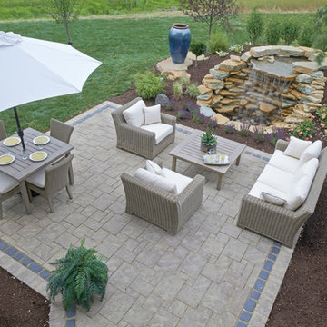
Inspiration for a large contemporary front yard garden path in Los Angeles.
Inspiration for a large contemporary front yard garden path in Los Angeles.
 Envision Web
Stuart Wade, Envision Virtual Tours
Envision Virtual Tours and High Resolution Photography is your best choice to find just what you are looking for in the Ellijay, Ga. area .Ellijay, Georgia, known as the “Apple Capital” of Georgia, is located between the Ellijay and Cartecay Rivers where they join to make the Coosawattee River and is the county seat of Gilmer County, Georgia. The origin of the city’s name is not certain but thought to be the English derivative of an Indian word(s) meaning “many waters”, “place of green things” or “new ground”. Some histories say it may have been named for an Indian chief.
Inhabited for countless years by the Cherokee people indigenous to the North Georgia, the area was first mentioned as a village and trade center before the onslaught of white settlers inhabited the region. During the 1830’s both white settlers and Indians occupied Ellijay. During the original land lottery in 1832, Martin Scalf acquired the 160 acre lot where the town now stands. In 1833, Clemonds Quinland bought 10 acres from Scalf, retained one acre for himself and donated the rest of the purchase to the County. A plan for twenty town lots, streets and a public square was created and the streets were oriented to allow maximum sunlight exposure to the buildings.
Proceeds from lot sales were used to build a jail and courthouse and pay other city expenses. During this same year, Gilmer County was appropriated $800.00 from the State to build a school, and a three-acre lot was donated for the city cemetery. On December 29, l834, Ellijay was incorporated and designated as the County seat of Gilmer County. By 1837, the town had twenty dwellings, three stores and one attorney. Most of these early buildings were of log construction.
Many roads led to Ellijay by 1849. The population had grown to 150 by 1850 and the town at five stores. Some wood-frame buildings were being constructed at this time and in 1854, a new courthouse was built in the center of the square, replacing the earlier building. The County’s first newspaper was the Ellijay Courier, started in 1875, and during this time period, Ellijay was a stop on the stagecoach line. The railroad bridge over the Cartecay River was completed in 1884 and the town now had rail service.
With the arrival of the railroad and subsequent tracks to White Path, Ellijay began to grow much faster. Many hotels were constructed and land was donated for a depot east of town. More industries, such as a cheese factory and the Shippen Brothers Lumber Mill, located in Ellijay. By 1898, the city had expanded its limits in every direction and now included the depot.
By 1900, all the buildings on the town square were brick. This included the recently completed Hyatt Hotel. Most of the other buildings in town were still of log construction, but new wood-frame buildings were being built. The Shippen Brothers Lumber Company production was expanding and exporting their lumber to Europe. Within the next few decades, this company grew to be one of the largest employers in Ellijay, often with five to six million feet of lumber in the yard at one time.
The population of Ellijay grew to 659 by 1910, and began to acquire many new modern conveniences such as electric lights and power, a telephone company and many new businesses.
Then in 1912, a fire ravaged the city, destroying 23 buildings. As a result, many new buildings were constructed under new and stricter fire and safety guidelines. The population, however, decreased slightly at this time to 632 in 1920.
During the 1920’s the town’s population began to grow again and, by this time, apples were being shipped out of the county and new storage facilities were built. Chickens were also shipped to markets outside of Ellijay and Gilmer County.
From the mid 1930’s to 1950, Ellijay received much assistance from the Federal WPA Programs. The old courthouse was removed from the center of town square and the Hyatt Hotel was remodeled to be the new courthouse. A park was created on the site of the old courthouse and the streets around the square were paved. A new street was built at this time entering town from the northeast. Other new roads, bridges, sidewalks and gutters were constructed to improve the city. A school and gymnasium were also built and other structures improved.
This growth began to impact the city’s infrastructure and in the l950’s and l960’s, a period of upgrading water systems, roads, and power supplies began. New low-rent housing appeared in l960 and a new hospital was built in l957. Georgia Highway 5 was widened in l962, new buildings around the square replaced old ones and some were remodeled. In 1974, the hospital was enlarged.
Currently, Ellijay attracts tourists who love the small-town feel and friendly atmosphere. Hotels and restaurants, unique shops, antiques and art galleries lend their charms to those who visit. A new courthouse constructed to resemble the old one, new streetscaping, family-oriented downtown events and the beautification of the square have stepped up the social and economic activity and have made Ellijay a popular destination.

 Mottram Architecture
Timber frame homes offer unique challenges during a remodel. What often makes them beautiful and attractive to most homeowners, also makes them challenging for space requirements.
Context: The lovely couple that owned this home were struggling with some interesting floor plan challenges that just didn't work for their family. The loved the beautiful timbers and woodwork of their home, but the dramatically sloping ceilings on the second floor, particularly in the bathroom, just didn't work for this 1 1/2 bath home. Needing to use the skylight to approach the toilet was a less then ideal scenario. Although the bathroom footprint was more then adequate, the sloped ceiling only made half of the space useable. Check out the Before/After post on our blog to see the photos of the house pre-renovation. As much as they loved all the wood features in their home, another challenge they had was light. The wood ceiling made everything inside the house darker, even with a fantastic array of south facing windows, there were spaces in the home that felt dark and small. When they contacted us they wanted to know how could they make their brighter and more inviting, were there solutions to the 2nd floor sloped ceiling issues, and if they were going to do all of this work, how could they make their home more comfortable and efficient. A nagging water leak in the upstairs bathroom spurred them into action and here is how we solved their dilemma.
Conclusion: First, we added a little dormer to the rear of the house so we could get full headroom in nearly all of the upstairs bathroom! Then we decided to extend that dormer one more timber bay over to create a walk in closet with natural light and plenty of space. Since we were contemplating energy efficiency, we resolved a nagging issue that is present in a lot of timber frame construction, air tightness. Commonly found in timber frame construction, fiberglass insulation is installed in the rafter bays and board ceilings are installed over top. Unfortunately, board ceilings are anything but air tight, and fiberglass insulation needs to be in an airtight cavity for maximum effectiveness. So we were able to solve two issues at the same time for this homeowner. We removed the board ceiling and fiberglass insulation, we dense packed the rafter bays with cellulose insulation, and installed sheetrock in place of the boards. The boards were salvaged for re-use by the homeowner, and the space and light quality was dramatically improved. Some may think that losing the board ceiling took something away from the space, but what you'll see in the pictures is that it highly accentuates the heavy timbers and really makes them stand out in a beautiful way. Now with this added airtightness, better insulation, and brighter space, the homeowner hardly runs their wood stove, and it's so quiet in the space, an added bonus from changing the insulation. It became necessary to also add a sheetrock ceiling to the living room to hide the plumbing from the new bathroom layout above. Changing this ceiling gave the homeowner some real quality lighting that was lacking in the living room before. The brighter ceiling and new lighting layout completely transforms the living room into a space you want to hang out, even though the layout didn't change at all. When the homeowner saw the finished spaces she said "I can't believe this is my house, I want to live in this house"
Energy Efficiency: I touched a little on the efficiency above, but like all projects done with Mottram Architecture, we always want to leave you with a little extra. Timber frame construction with board ceilings and fiberglass insulation are notoriously leaky! If you want to know what we think about fiberglass insulation, check our our blog post on Why Fiberglass Insulation Sucks. By installing cellulose insulation and covering it with sheetrock we were able to greatly reduce the heat flowing out of this home. It not only improves cashflow it improves the comfort level in the space. Who wants to sit in their living room and feel a draft? Let us remind you, we are not saying cellulose insulation is an air barrier, we use the sheetrock to help with that, but it does significantly reduce the air flow over fiberglass insulation. And when we reduce the airflow, we reduce the heat flow. And when we reduce the heat flow, we reduce the need to re-heat that drafty air from outside. When it comes to energy efficiency the first and best place to start is air infiltration. We greatly reduced the air infiltration with the new insulation, but we also added a hat and warm boots. What I mean by that is, we improved the insulation in the roof, and we installed insulation in the basement. Maybe it's a silly analogy, but when you think about keeping warm, we always start with the hat and boots! With sustainability in mind, the next project will be to add a deck to the front of this house with rain catchment barrels from the metal roof. They are planning to plant a garden in the spring and the rain catchment system will help to irrigate the new garden.
Builder: East Shore Builders
Photographer: Michael Eric Berube
211