
Search results for "Storage forces" in Home Design Ideas
 Nathan Taylor for Obelisk Home
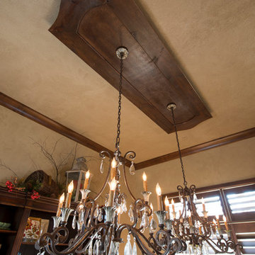
The interior of the home went from Colonial to Classic Lodge without changing the footprint of the home. Columns were removed, fur downs removed that defined space, fireplace relocated, kitchen layout and direction changed, breakfast room and sitting room flip flopped, study reduced in size, entry to master bedroom changed, master suite completely re-arranged and enlarged, custom hand railing designed to open up stairwell, hardwood added to stairs, solid knotty alder 8’ doors added, knotty alder crown moldings added, reclaimed beamed ceiling grid, tongue and groove ceiling in kitchen, knotty alder cabinetry, leather finish to granite, seeded glass insets, custom door to panty to showcase an antique stained glass window from childhood church, custom doors and handles made for study entry, shredded straw added to wall texture, custom glazing done to all walls, wood floor remnants created an antique quilt pattern for the back wall of the powder bath, custom wall treatment created by designer, and a mixture of new and antique furnishing were added, all to create a warm, yet lived in feeling for this special family.
A new central stone wall reversed with an over scaled fireplace and reclaimed flooring from the East became the anchor for this level of the home. Removing all the “divisions” of space and using a unified surface made unused rooms, part of the daily living for this family. The desire to entertain large group in a unified space, yet still feel like you are in a cozy environment was the driving force for removing divisions of space.
Photos by Randy Colwell
 Lands End Development - Designers & Builders
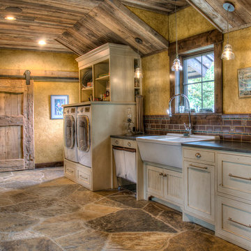
Dedicated laundry room - large rustic galley slate floor and multicolored floor dedicated laundry room idea in Minneapolis with white cabinets, granite countertops, yellow walls, a side-by-side washer/dryer and black countertops
 SGDI - Sarah Gallop Design Inc.
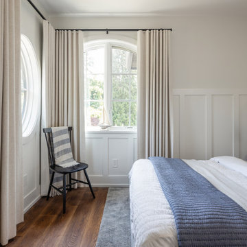
Inspiration for a large coastal guest medium tone wood floor, brown floor and wall paneling bedroom remodel in Vancouver with white walls
Find the right local pro for your project
 Drury Design
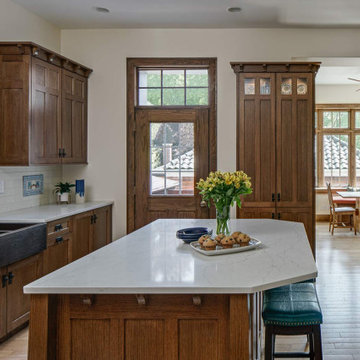
The 100-year old home’s kitchen was old and just didn’t function well. A peninsula in the middle of the main part of the kitchen blocked the path from the back door. This forced the homeowners to mostly use an odd, U-shaped corner of the kitchen.
Design objectives:
-Add an island
-Wow-factor design
-Incorporate arts and crafts with a touch of Mid-century modern style
-Allow for a better work triangle when cooking
-Create a seamless path coming into the home from the backdoor
-Make all the countertops in the space 36” high (the old kitchen had different base cabinet heights)
Design challenges to be solved:
-Island design
-Where to place the sink and dishwasher
-The family’s main entrance into the home is a back door located within the kitchen space. Samantha needed to find a way to make an unobstructed path through the kitchen to the outside
-A large eating area connected to the kitchen felt slightly misplaced – Samantha wanted to bring the kitchen and materials more into this area
-The client does not like appliance garages/cabinets to the counter. The more countertop space, the better!
Design solutions:
-Adding the right island made all the difference! Now the family has a couple of seats within the kitchen space. -Multiple walkways facilitate traffic flow.
-Multiple pantry cabinets (both shallow and deep) are placed throughout the space. A couple of pantry cabinets were even added to the back door wall and wrap around into the breakfast nook to give the kitchen a feel of extending into the adjoining eating area.
-Upper wall cabinets with clear glass offer extra lighting and the opportunity for the client to display her beautiful vases and plates. They add and an airy feel to the space.
-The kitchen had two large existing windows that were ideal for a sink placement. The window closest to the back door made the most sense due to the fact that the other window was in the corner. Now that the sink had a place, we needed to worry about the dishwasher. Samantha didn’t want the dishwasher to be in the way of people coming in the back door – it’s now in the island right across from the sink.
-The homeowners love Motawi Tile. Some fantastic pieces are placed within the backsplash throughout the kitchen. -Larger tiles with borders make for nice accent pieces over the rangetop and by the bar/beverage area.
-The adjacent area for eating is a gorgeous nook with massive windows. We added a built-in furniture-style banquette with additional lower storage cabinets in the same finish. It’s a great way to connect and blend the two areas into what now feels like one big space!
 Chester County Kitchen & Bath
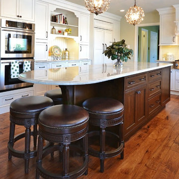
 The need for a kitchen better suited to entertaining was the driving force behind the start of this great kitchen remodel. The original kitchen and adjacent living area were redesigned to encompass a new larger kitchen with semiformal eating area along with a wet bar and great cozy sitting room. The clients Christine and Steve along with the interior designer Sharon Ryan made great choices in products and finishes to give these new spaces a fresh new look that blended seamlessly with the rest of the home. The kitchen designer John Noland used Fieldstone Cabinetry in the LaGrange door style ( Beaded inset ). The perimeter kitchen cabinetry is finished in Dove paint with a latte glaze complimented by the island and bar cabinetry in Cherry wood with Hazelnut Stain. The expansive new kitchen countertops are Taj Mahal Quartzite with a sleek apron front sink from Kohler. The bar top granite is Peacock with a stainless steel undermount bar sink. Everything from new random width hardwood flooring, window replacement, cabinetry and finishes were done by CCKAB’s lead contractor Don Pitt and assistant Dan. Everyone involved in this great kitchen project did an awesome job and what a result.
 Fiorito Interior Design
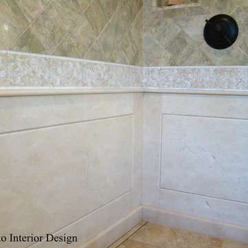
Like many California ranch homes built in the 1950s, this original master bathroom was not really a "master bath." My clients, who only three years ago purchased the home from the family of the original owner, were saddled with a small, dysfunctional space. Chief among the dysfunctions: a vanity only 30" high, and an inconveniently placed window that forced the too-low vanity mirror to reflect only the waist and partial torso--not the face--of anyone standing in front of it. They wanted not only a more spacious bathroom but a bedroom as well, so we worked in tandem with an architect and contractor to come up with a fantastic new space: a true Master Suite. In order to refine a design concept for the soon-to-be larger space, and thereby narrow down material choices, my clients and I had a brainstorming session: we spoke of an elegant Old World/ European bedroom and bathroom, a luxurious bath that would reference a Roman spa, and finally the idea of a Hammam was brought into the mix. We blended these ideas together in oil-rubbed bronze fixtures, and a tiny tile mosaic in beautiful Bursa Beige marble from Turkey and white Thassos marble from Greece. The new generously sized bathroom boasts a jetted soaking tub, a very large walk-in shower, a double-sided fireplace (facing the tub on the bath side), and a luxurious 8' long vanity with double sinks and a storage tower.
The vanity wall is covered with a mosaic vine pattern in a beautiful Bursa Beige marble from Turkey and white Thassos marble from Greece,. The custom Larson Juhl framed mirrors are flanked by gorgeous hand-wrought scones from Hubbardton Forge which echo the vine and leaf pattern in the mosaic. And the vanity itself features an LED strip in the toe-kick which allows one to see in the middle of the night without having to turn on a shockingly bright overhead fixture. At the other end of the master bath, a luxurious jetted tub nestles by a fireplace in the bay window area. Views of my clients' garden can be seen while soaking in bubbles. The over-sized walk-in shower features a paneled wainscoting effect which I designed in Crema Marfil marble. The vine mosaic continues in the shower, topped by green onyx squares. A rainshower head and a hand-held spray on a bar provides showering options. The shower floor slopes gently in one direction toward a hidden linear drain; this allows the floor to be read as a continuation of the main space, without being interrupted by a center drain.
Photo by Jeff Fiorito
 Amanda George Interior Design
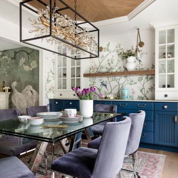
A whimsical English garden was the foundation and driving force for the design inspiration. A lingering garden mural wraps all the walls floor to ceiling, while a union jack wood detail adorns the existing tray ceiling, as a nod to the client’s English roots. Custom heritage blue base cabinets and antiqued white glass front uppers create a beautifully balanced built-in buffet that stretches the east wall providing display and storage for the client's extensive inherited China collection.

Sponsored
Columbus, OH

Hope Restoration & General Contracting
Columbus Design-Build, Kitchen & Bath Remodeling, Historic Renovations
 Laura Jones & Company, LLC
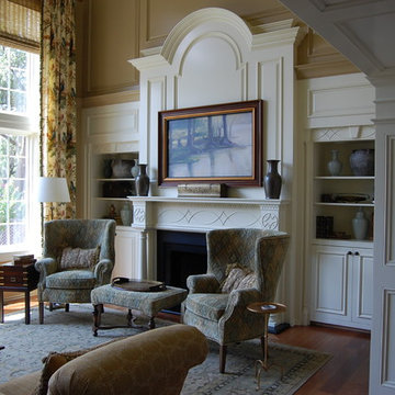
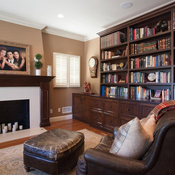
Example of a mid-sized classic formal and enclosed medium tone wood floor and brown floor living room design in Charleston with beige walls, a standard fireplace, a wood fireplace surround and no tv
 Custom Design & Construction
We were excited when the homeowners of this project approached us to help them with their whole house remodel as this is a historic preservation project. The historical society has approved this remodel. As part of that distinction we had to honor the original look of the home; keeping the façade updated but intact. For example the doors and windows are new but they were made as replicas to the originals. The homeowners were relocating from the Inland Empire to be closer to their daughter and grandchildren. One of their requests was additional living space. In order to achieve this we added a second story to the home while ensuring that it was in character with the original structure. The interior of the home is all new. It features all new plumbing, electrical and HVAC. Although the home is a Spanish Revival the homeowners style on the interior of the home is very traditional. The project features a home gym as it is important to the homeowners to stay healthy and fit. The kitchen / great room was designed so that the homewoners could spend time with their daughter and her children. The home features two master bedroom suites. One is upstairs and the other one is down stairs. The homeowners prefer to use the downstairs version as they are not forced to use the stairs. They have left the upstairs master suite as a guest suite.
Enjoy some of the before and after images of this project:
http://www.houzz.com/discussions/3549200/old-garage-office-turned-gym-in-los-angeles
http://www.houzz.com/discussions/3558821/la-face-lift-for-the-patio
http://www.houzz.com/discussions/3569717/la-kitchen-remodel
http://www.houzz.com/discussions/3579013/los-angeles-entry-hall
http://www.houzz.com/discussions/3592549/exterior-shots-of-a-whole-house-remodel-in-la
http://www.houzz.com/discussions/3607481/living-dining-rooms-become-a-library-and-formal-dining-room-in-la
http://www.houzz.com/discussions/3628842/bathroom-makeover-in-los-angeles-ca
http://www.houzz.com/discussions/3640770/sweet-dreams-la-bedroom-remodels
Exterior: Approved by the historical society as a Spanish Revival, the second story of this home was an addition. All of the windows and doors were replicated to match the original styling of the house. The roof is a combination of Gable and Hip and is made of red clay tile. The arched door and windows are typical of Spanish Revival. The home also features a Juliette Balcony and window.
Library / Living Room: The library offers Pocket Doors and custom bookcases.
Powder Room: This powder room has a black toilet and Herringbone travertine.
Kitchen: This kitchen was designed for someone who likes to cook! It features a Pot Filler, a peninsula and an island, a prep sink in the island, and cookbook storage on the end of the peninsula. The homeowners opted for a mix of stainless and paneled appliances. Although they have a formal dining room they wanted a casual breakfast area to enjoy informal meals with their grandchildren. The kitchen also utilizes a mix of recessed lighting and pendant lights. A wine refrigerator and outlets conveniently located on the island and around the backsplash are the modern updates that were important to the homeowners.
Master bath: The master bath enjoys both a soaking tub and a large shower with body sprayers and hand held. For privacy, the bidet was placed in a water closet next to the shower. There is plenty of counter space in this bathroom which even includes a makeup table.
Staircase: The staircase features a decorative niche
Upstairs master suite: The upstairs master suite features the Juliette balcony
Outside: Wanting to take advantage of southern California living the homeowners requested an outdoor kitchen complete with retractable awning. The fountain and lounging furniture keep it light.
Home gym: This gym comes completed with rubberized floor covering and dedicated bathroom. It also features its own HVAC system and wall mounted TV.
 Mark Brand Architecture
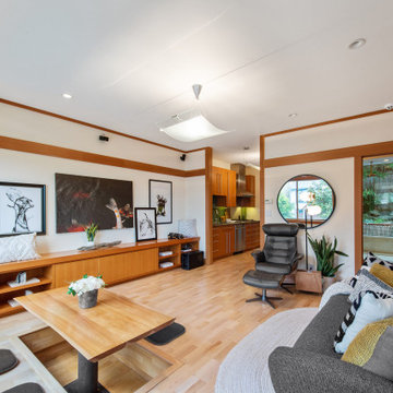
The design of this remodel of a small two-level residence in Noe Valley reflects the owner's passion for Japanese architecture. Having decided to completely gut the interior partitions, we devised a better-arranged floor plan with traditional Japanese features, including a sunken floor pit for dining and a vocabulary of natural wood trim and casework. Vertical grain Douglas Fir takes the place of Hinoki wood traditionally used in Japan. Natural wood flooring, soft green granite and green glass backsplashes in the kitchen further develop the desired Zen aesthetic. A wall to wall window above the sunken bath/shower creates a connection to the outdoors. Privacy is provided through the use of switchable glass, which goes from opaque to clear with a flick of a switch. We used in-floor heating to eliminate the noise associated with forced-air systems.
 Drury Design
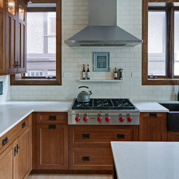
The 100-year old home’s kitchen was old and just didn’t function well. A peninsula in the middle of the main part of the kitchen blocked the path from the back door. This forced the homeowners to mostly use an odd, U-shaped corner of the kitchen.
Design objectives:
-Add an island
-Wow-factor design
-Incorporate arts and crafts with a touch of Mid-century modern style
-Allow for a better work triangle when cooking
-Create a seamless path coming into the home from the backdoor
-Make all the countertops in the space 36” high (the old kitchen had different base cabinet heights)
Design challenges to be solved:
-Island design
-Where to place the sink and dishwasher
-The family’s main entrance into the home is a back door located within the kitchen space. Samantha needed to find a way to make an unobstructed path through the kitchen to the outside
-A large eating area connected to the kitchen felt slightly misplaced – Samantha wanted to bring the kitchen and materials more into this area
-The client does not like appliance garages/cabinets to the counter. The more countertop space, the better!
Design solutions:
-Adding the right island made all the difference! Now the family has a couple of seats within the kitchen space. -Multiple walkways facilitate traffic flow.
-Multiple pantry cabinets (both shallow and deep) are placed throughout the space. A couple of pantry cabinets were even added to the back door wall and wrap around into the breakfast nook to give the kitchen a feel of extending into the adjoining eating area.
-Upper wall cabinets with clear glass offer extra lighting and the opportunity for the client to display her beautiful vases and plates. They add and an airy feel to the space.
-The kitchen had two large existing windows that were ideal for a sink placement. The window closest to the back door made the most sense due to the fact that the other window was in the corner. Now that the sink had a place, we needed to worry about the dishwasher. Samantha didn’t want the dishwasher to be in the way of people coming in the back door – it’s now in the island right across from the sink.
-The homeowners love Motawi Tile. Some fantastic pieces are placed within the backsplash throughout the kitchen. -Larger tiles with borders make for nice accent pieces over the rangetop and by the bar/beverage area.
-The adjacent area for eating is a gorgeous nook with massive windows. We added a built-in furniture-style banquette with additional lower storage cabinets in the same finish. It’s a great way to connect and blend the two areas into what now feels like one big space!
 Capital Kitchen & Bath
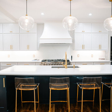
This kitchen remodel is the definition of elevated everyday living, where clean lines, warm textures, and intentional function come together in a space designed to truly perform.
The quartz countertops & full height backsplash give the entire kitchen a clean, luminous feel while providing durable, low-maintenance performance for real everyday living.
A large statement island was created by expanding the kitchen footprint and eliminating the unused formal dining room. The island adds generous prep space, comfortable seating, and the perfect gathering spot for morning coffee or evening entertaining.
Tucked seamlessly into the cabinetry is a hidden walk-in pantry with wet bar & storage galore, keeping the kitchen's visual lines beautifully uncluttered.
And for effortless hosting, a dedicated beverage station- in the kitchen- featuring an ice maker and refrigerator creates a functional mini-hub for drinks, snacks, and celebrations.
Modern. Functional. Timeless. This is more than a kitchen remodel, it’s a space designed to make daily life feel beautiful and effortless.
 Sherman Associates
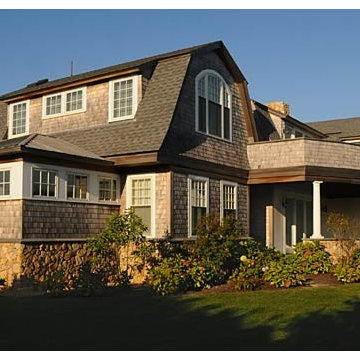
Views of the Atlantic and Katama Bay from the second floor were a driving force behind the Design of this home built several years ago in Edgartown. The Gambrel roof provides great headroom on the second floor with dormers in critical areas for windows and doors. Subtle curves soften the edges and a mix of materials help to reduce the scale and add interest to the exterior. The Porte Cochere provides access to the pool area as well as an entire wall of storage closets for the trappings of summer. Attention to detail and more than ample natural light make this house a very pleasant experience.

 Alair Homes Plano
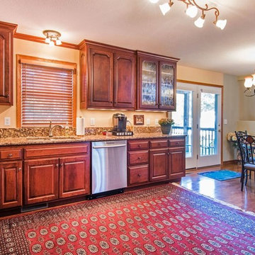
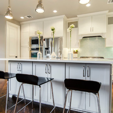
From cut up and cut off to open, functional, and beautiful. Another complete kitchen gut by Hatfield Builders & Remodelers. This kitchen was cut off from the dining room by a wall and had an odd angled wall that forced the kitchen into an awkward shape. The awkward wall was removed and a new large opening was created to the dining room and front living area. This creates a dramatic view of the kitchen as you enter the home. The large eat in island provides great prep area. Floorplan design by Chad Hatfield, CR, CKBR. Interior Design by Lindy Jo Crutchfield, Allied ASID, our on staff designer. Photography by Lauren Brown of Versatile Imaging.
 Klopf Architecture
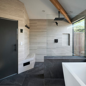
Built for the Bluff, A Sea Ranch Home is Remade from the Inside Out
The house had always been grounded, on an ocean bluff at The Sea Ranch. It sits unencumbered, adjacent to one of the most dramatic stretches of the Sonoma coast with protected commons meadow to the east, uninterrupted Pacific views to the west, and a bluff trail running alongside. What it lacked was the feeling of home, one that could hold up its own against the natural landscape.
The owners are entrepreneurs with deep involvement across tech, real estate, and development and they know how things are built. The Sea Ranch house had been in their lives for years, a second residence and a place for family to gather. Built for a different time, it felt more compromising than comfortable. Sitting in a closed off nook, the kitchen fit one cook at a time and turned its back on the rest of the house. The entry was dim and compressed, divided by a structural column that presented itself at exactly the wrong moment. The primary suite was small relative to the view outside it. A large rear bedroom sat behind a lowered ceiling with a bathroom that had never been added. The house was certainly worth the trouble of doing it right.
What followed was not one project but four, each with its own design challenge, each addressed over a period of time.
Where the House Meets the Ocean
The most complex piece of the project, in both structural and spatial terms, was the kitchen expansion. The existing room was a single-person galley squeezed in as an afterthought with no meaningful connection to the dining room, the living space, or the deck outside. To make it useful for a family that cooks and gathers, it needed to grow outward into an existing patio and flow into the rooms around it.
A big challenge was the roofline. Several planes at different pitches and angles converged directly where additional volume was needed. A new form had to join that geometry without reading as a correction. The solution found the simplest possible connection between the existing angles, a roofline that from outside the structure, appears entirely original. From the bluff trail where the addition is visible, there is no discernible seam.
Inside, the kitchen is now open to the living and dining rooms without interruption. A large sliding glass door connects the space onto the rear deck. The deck itself was expanded and oriented so that the body of the house shields it from the coastal wind which is a common consideration that determines whether outdoor space at The Sea Ranch actually gets used. The result is a room that works for large family gatherings where no one feels cutoff, and one that makes the boundary between being inside and outside easy to ignore.
Welcoming Light
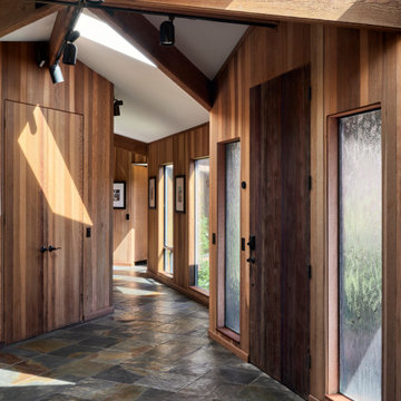
A structural column stood at the convergence of eight distinct roof planes in the entry. It was load-bearing, but it was also the reason the entry had always felt like a hallway rather than a welcoming arrival.
With the structural engineer, a custom steel connector was designed to receive beams from six separate directions, redistributing the load through a single new continuous beam. The column was surgically removed. Three triangular skylights were then cut into the roof above, their shapes drawn from the
existing geometry of the planes around them. The entry is now bright and open. The skylights feel native to the structure because they follow the logic already present in the roof.
Two Suites, Two Views
At opposite ends of the house, the two bedroom suites were each reconfigured, and each found a different way to introduce more of the landscape into the room.
An addition to the primary suite extended the structure outward to create a wraparound plan with a loop from the bedroom through bath and closet that had not been possible before. The expansion opened a slot view from the tub and shower toward the ocean. The view is precise and private. The ocean view is present and deliberate.
The rear bedroom absorbed an adjacent storage room to transform it into a full second suite with a vaulted ceiling, a large bathroom with a tub, a shower, and a sauna. A private fenced garden courtyard sits just beyond the glass bringing the outdoors inside. The tub was placed so that, looking past the courtyard and through the bedroom beyond, the ocean is visible at the far end. It is a long view and it makes the room feel larger and more settled than its footprint would suggest.
Glass on Four Sides, Fire at the Center
The main living and gathering room had always been caught between two competing facts: glass on four sides meant exceptional views but at The Sea Ranch, it also meant a cold room. A 360-degree cylindrical fireplace was added at the center on a raised stone base, providing radiant heat in every direction and giving the room a focal point around which a group naturally orients itself, whether that means two people at the end of the day or the whole family after dinner.
Owners Who Picked Up the Tools
The owner was not a passive client. they came with construction knowledge, specific ideas, and the desire to be an active part of the process, a dynamic that other architects may had found difficult, which Klopf Architecture accepted as an asset. They took it upon themselves to complete some of the work during construction, including the installation of a new radiant heating system beneath the floors.
The radiant system added to the older and less-desirable forced-air setup. At The Sea Ranch, that change matters as the house sits close enough to the ocean and moving air competes with the sound of it, where radiant heat does not. Solar panels were added to the roof as part of the new system. Insulation was upgraded throughout the walls, roof, and crawl space. The house that had always had the right setting now holds warmth the way a house on the bluff should.
They were also deeply involved in the design and selections throughout, and the finished house reflects both of them in ways that are specific rather than generic. The process took longer and moved through more iterations than a more arms-length relationship might have allowed. The result is more defined and personal because of it.
The Landscape Holds Priority
Every exterior decision was shaped by The Sea Ranch Design Standards, which require that buildings defer to the landscape around them rather than compete with it. Because this house sits on the bluff and is visible from the public trail, the additions faced a close review. Existing materials were matched. Geometries were resolved. The additions had to become indistinguishable from the original building.
From the trail, the house reads exactly as it always has — low, cedar-clad, secondary to the meadow and the water. The setting holds priority. Inside, the house has been remade.
Klopf Architecture Project Team: Geoff Campen and Trenton Jewett
Contractor: Shawn Bettega Construction
Photography: ©2025 Mariko Reed
Year Completed: 2023
Location: The Sea Ranch, CA
 Burgin Design • Remodel
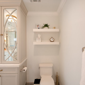
A desire for more space and an updated look in their 1960’s home were the driving forces for the Cops family’s new bathroom remodels.
We began with a great design by Tamara Stratton relocating a hall bathroom which allowed us to combine the former hall bath space with the master, essentially doubling it. We added more lighting, updated finishes, a new, round window in the guest bath with water jetted cut tile, Pental Quartz countertops, Starphire shower glass enclosure, a floating shower bench and a linen storage cabinet with decorative grids.
In addition to the two bathrooms, we also turned a guest bedroom into a brand new office space with custom cabinetry and recessed lighting. The Cops family is now enjoying their new space and loving their home even more.
 Level Custom Build
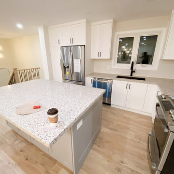
We removed the kitchen and dining partition wall and installed a flush beam to open up the space. The steep roof pitch forced us to install pillars to support the beam as our clients wanted a flush beam installation but we were still able to accomplish an very open feel even with the pillars. The kitchen was given a simple shaker design with a few unique features our clients had their hearts set on (i.e. the wine rack in the island). We installed 'Fittes' vents throughout the home to give it a consistently contemporary feel. For lighting we installed new pot-lights throughout the entire home and replaced the dining room chandelier with a more contemporary ceiling light.
 MP DESIGN
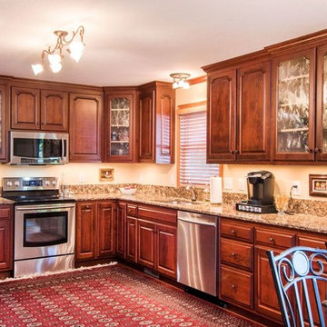
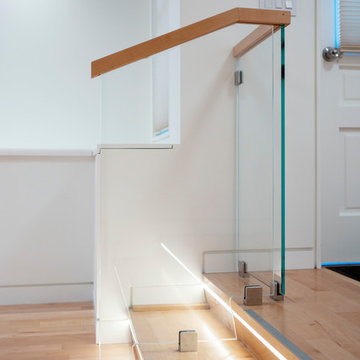
Condo remodel in a 2 unit Victorian building in Noe Valley District, San Francisco, CA. The unit was fully sound proofed to mitigate noise penetration from unit above. The forced air was replaced with hydronic floor under new hardwood sprung floors (electrical floor and bench heating in Master Bath). The Master Bath and kitchen was remodeled. The lighting and electrical upgraded. All doors replaced with glass paneled doors. All casings/trims replaced with recessed casings/trims. We also added a long custom storage unit with acrylic LED lit operable lids. The 2 Bedroom were each outfitted with one mirrored barre wall.
Photos: MP DESIGN
 Klopf Architecture
Built for the Bluff, A Sea Ranch Home is Remade from the Inside Out
The house had always been grounded, on an ocean bluff at The Sea Ranch. It sits unencumbered, adjacent to one of the most dramatic stretches of the Sonoma coast with protected commons meadow to the east, uninterrupted Pacific views to the west, and a bluff trail running alongside. What it lacked was the feeling of home, one that could hold up its own against the natural landscape.
The owners are entrepreneurs with deep involvement across tech, real estate, and development and they know how things are built. The Sea Ranch house had been in their lives for years, a second residence and a place for family to gather. Built for a different time, it felt more compromising than comfortable. Sitting in a closed off nook, the kitchen fit one cook at a time and turned its back on the rest of the house. The entry was dim and compressed, divided by a structural column that presented itself at exactly the wrong moment. The primary suite was small relative to the view outside it. A large rear bedroom sat behind a lowered ceiling with a bathroom that had never been added. The house was certainly worth the trouble of doing it right.
What followed was not one project but four, each with its own design challenge, each addressed over a period of time.
Where the House Meets the Ocean
The most complex piece of the project, in both structural and spatial terms, was the kitchen expansion. The existing room was a single-person galley squeezed in as an afterthought with no meaningful connection to the dining room, the living space, or the deck outside. To make it useful for a family that cooks and gathers, it needed to grow outward into an existing patio and flow into the rooms around it.
A big challenge was the roofline. Several planes at different pitches and angles converged directly where additional volume was needed. A new form had to join that geometry without reading as a correction. The solution found the simplest possible connection between the existing angles, a roofline that from outside the structure, appears entirely original. From the bluff trail where the addition is visible, there is no discernible seam.
Inside, the kitchen is now open to the living and dining rooms without interruption. A large sliding glass door connects the space onto the rear deck. The deck itself was expanded and oriented so that the body of the house shields it from the coastal wind which is a common consideration that determines whether outdoor space at The Sea Ranch actually gets used. The result is a room that works for large family gatherings where no one feels cutoff, and one that makes the boundary between being inside and outside easy to ignore.
Welcoming Light
A structural column stood at the convergence of eight distinct roof planes in the entry. It was load-bearing, but it was also the reason the entry had always felt like a hallway rather than a welcoming arrival.
With the structural engineer, a custom steel connector was designed to receive beams from six separate directions, redistributing the load through a single new continuous beam. The column was surgically removed. Three triangular skylights were then cut into the roof above, their shapes drawn from the
existing geometry of the planes around them. The entry is now bright and open. The skylights feel native to the structure because they follow the logic already present in the roof.
Two Suites, Two Views
At opposite ends of the house, the two bedroom suites were each reconfigured, and each found a different way to introduce more of the landscape into the room.
An addition to the primary suite extended the structure outward to create a wraparound plan with a loop from the bedroom through bath and closet that had not been possible before. The expansion opened a slot view from the tub and shower toward the ocean. The view is precise and private. The ocean view is present and deliberate.
The rear bedroom absorbed an adjacent storage room to transform it into a full second suite with a vaulted ceiling, a large bathroom with a tub, a shower, and a sauna. A private fenced garden courtyard sits just beyond the glass bringing the outdoors inside. The tub was placed so that, looking past the courtyard and through the bedroom beyond, the ocean is visible at the far end. It is a long view and it makes the room feel larger and more settled than its footprint would suggest.
Glass on Four Sides, Fire at the Center
The main living and gathering room had always been caught between two competing facts: glass on four sides meant exceptional views but at The Sea Ranch, it also meant a cold room. A 360-degree cylindrical fireplace was added at the center on a raised stone base, providing radiant heat in every direction and giving the room a focal point around which a group naturally orients itself, whether that means two people at the end of the day or the whole family after dinner.
Owners Who Picked Up the Tools
The owner was not a passive client. they came with construction knowledge, specific ideas, and the desire to be an active part of the process, a dynamic that other architects may had found difficult, which Klopf Architecture accepted as an asset. They took it upon themselves to complete some of the work during construction, including the installation of a new radiant heating system beneath the floors.
The radiant system added to the older and less-desirable forced-air setup. At The Sea Ranch, that change matters as the house sits close enough to the ocean and moving air competes with the sound of it, where radiant heat does not. Solar panels were added to the roof as part of the new system. Insulation was upgraded throughout the walls, roof, and crawl space. The house that had always had the right setting now holds warmth the way a house on the bluff should.
They were also deeply involved in the design and selections throughout, and the finished house reflects both of them in ways that are specific rather than generic. The process took longer and moved through more iterations than a more arms-length relationship might have allowed. The result is more defined and personal because of it.
The Landscape Holds Priority
Every exterior decision was shaped by The Sea Ranch Design Standards, which require that buildings defer to the landscape around them rather than compete with it. Because this house sits on the bluff and is visible from the public trail, the additions faced a close review. Existing materials were matched. Geometries were resolved. The additions had to become indistinguishable from the original building.
From the trail, the house reads exactly as it always has — low, cedar-clad, secondary to the meadow and the water. The setting holds priority. Inside, the house has been remade.
Klopf Architecture Project Team: Geoff Campen and Trenton Jewett
Contractor: Shawn Bettega Construction
Photography: ©2025 Mariko Reed
Year Completed: 2023
Location: The Sea Ranch, CA
 Klopf Architecture
Built for the Bluff, A Sea Ranch Home is Remade from the Inside Out
The house had always been grounded, on an ocean bluff at The Sea Ranch. It sits unencumbered, adjacent to one of the most dramatic stretches of the Sonoma coast with protected commons meadow to the east, uninterrupted Pacific views to the west, and a bluff trail running alongside. What it lacked was the feeling of home, one that could hold up its own against the natural landscape.
The owners are entrepreneurs with deep involvement across tech, real estate, and development and they know how things are built. The Sea Ranch house had been in their lives for years, a second residence and a place for family to gather. Built for a different time, it felt more compromising than comfortable. Sitting in a closed off nook, the kitchen fit one cook at a time and turned its back on the rest of the house. The entry was dim and compressed, divided by a structural column that presented itself at exactly the wrong moment. The primary suite was small relative to the view outside it. A large rear bedroom sat behind a lowered ceiling with a bathroom that had never been added. The house was certainly worth the trouble of doing it right.
What followed was not one project but four, each with its own design challenge, each addressed over a period of time.
Where the House Meets the Ocean
The most complex piece of the project, in both structural and spatial terms, was the kitchen expansion. The existing room was a single-person galley squeezed in as an afterthought with no meaningful connection to the dining room, the living space, or the deck outside. To make it useful for a family that cooks and gathers, it needed to grow outward into an existing patio and flow into the rooms around it.
A big challenge was the roofline. Several planes at different pitches and angles converged directly where additional volume was needed. A new form had to join that geometry without reading as a correction. The solution found the simplest possible connection between the existing angles, a roofline that from outside the structure, appears entirely original. From the bluff trail where the addition is visible, there is no discernible seam.
Inside, the kitchen is now open to the living and dining rooms without interruption. A large sliding glass door connects the space onto the rear deck. The deck itself was expanded and oriented so that the body of the house shields it from the coastal wind which is a common consideration that determines whether outdoor space at The Sea Ranch actually gets used. The result is a room that works for large family gatherings where no one feels cutoff, and one that makes the boundary between being inside and outside easy to ignore.
Welcoming Light
A structural column stood at the convergence of eight distinct roof planes in the entry. It was load-bearing, but it was also the reason the entry had always felt like a hallway rather than a welcoming arrival.
With the structural engineer, a custom steel connector was designed to receive beams from six separate directions, redistributing the load through a single new continuous beam. The column was surgically removed. Three triangular skylights were then cut into the roof above, their shapes drawn from the
existing geometry of the planes around them. The entry is now bright and open. The skylights feel native to the structure because they follow the logic already present in the roof.
Two Suites, Two Views
At opposite ends of the house, the two bedroom suites were each reconfigured, and each found a different way to introduce more of the landscape into the room.
An addition to the primary suite extended the structure outward to create a wraparound plan with a loop from the bedroom through bath and closet that had not been possible before. The expansion opened a slot view from the tub and shower toward the ocean. The view is precise and private. The ocean view is present and deliberate.
The rear bedroom absorbed an adjacent storage room to transform it into a full second suite with a vaulted ceiling, a large bathroom with a tub, a shower, and a sauna. A private fenced garden courtyard sits just beyond the glass bringing the outdoors inside. The tub was placed so that, looking past the courtyard and through the bedroom beyond, the ocean is visible at the far end. It is a long view and it makes the room feel larger and more settled than its footprint would suggest.
Glass on Four Sides, Fire at the Center
The main living and gathering room had always been caught between two competing facts: glass on four sides meant exceptional views but at The Sea Ranch, it also meant a cold room. A 360-degree cylindrical fireplace was added at the center on a raised stone base, providing radiant heat in every direction and giving the room a focal point around which a group naturally orients itself, whether that means two people at the end of the day or the whole family after dinner.
Owners Who Picked Up the Tools
The owner was not a passive client. they came with construction knowledge, specific ideas, and the desire to be an active part of the process, a dynamic that other architects may had found difficult, which Klopf Architecture accepted as an asset. They took it upon themselves to complete some of the work during construction, including the installation of a new radiant heating system beneath the floors.
The radiant system added to the older and less-desirable forced-air setup. At The Sea Ranch, that change matters as the house sits close enough to the ocean and moving air competes with the sound of it, where radiant heat does not. Solar panels were added to the roof as part of the new system. Insulation was upgraded throughout the walls, roof, and crawl space. The house that had always had the right setting now holds warmth the way a house on the bluff should.
They were also deeply involved in the design and selections throughout, and the finished house reflects both of them in ways that are specific rather than generic. The process took longer and moved through more iterations than a more arms-length relationship might have allowed. The result is more defined and personal because of it.
The Landscape Holds Priority
Every exterior decision was shaped by The Sea Ranch Design Standards, which require that buildings defer to the landscape around them rather than compete with it. Because this house sits on the bluff and is visible from the public trail, the additions faced a close review. Existing materials were matched. Geometries were resolved. The additions had to become indistinguishable from the original building.
From the trail, the house reads exactly as it always has — low, cedar-clad, secondary to the meadow and the water. The setting holds priority. Inside, the house has been remade.
Klopf Architecture Project Team: Geoff Campen and Trenton Jewett
Contractor: Shawn Bettega Construction
Photography: ©2025 Mariko Reed
Year Completed: 2023
Location: The Sea Ranch, CA
20